
E-commerce gets a consistency check
Retailers are no longer just selling products online—they are managing rental logistics, translating brand identity across ads and product pages, and building storefronts for niche technical audiences. Each of those ambitions puts pressure on the same underlying asset: a unified, scalable design system. Teams at Nuuly, Ruggable, and GitHub’s agency partner Design Business Company explain how consolidating on Figma helped them meet those demands.
Nuuly: Two systems for two sides of rental
Nuuly, launched in 2019, wants to make clothing rental a habit for everyday wear, not just special occasions. "Nuuly celebrates the idea of change," says Laura Petrini, Director of User Experience. "We're giving customers access to changing their style so they can express themselves and get creative with their wardrobe."
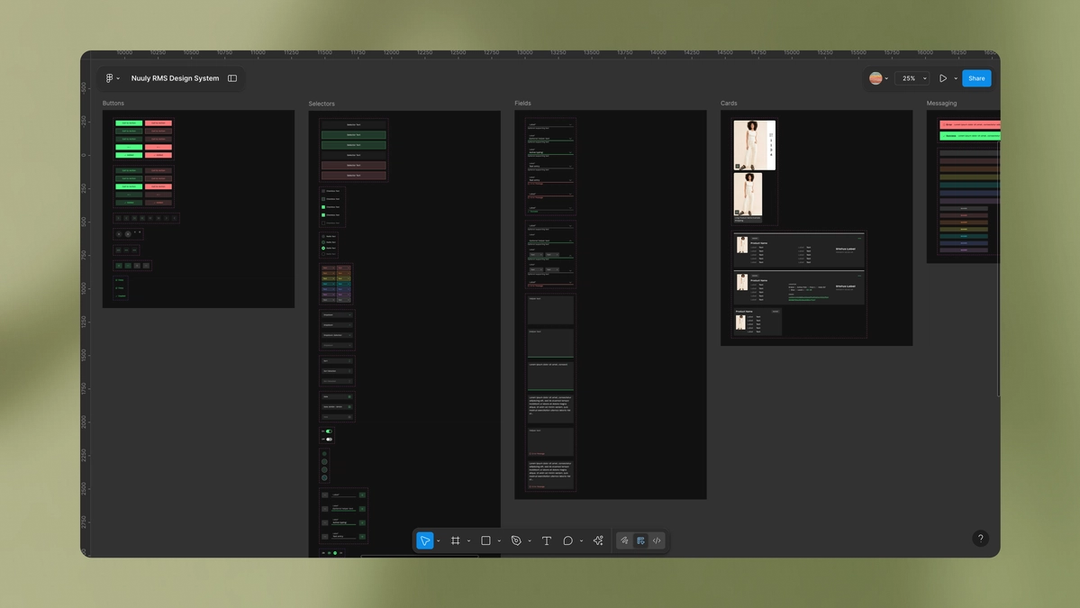
Because the subscription model is still young, Nuuly built much of its own backend technology for circular inventory management, cleaning, and repairs. That meant building two distinct design systems from scratch—one facing customers, the other handling rental logistics. Both were designed with scale in mind. "We set up our design system with color and type tokens that can be easily swapped out, giving the brand room to grow as the seasons turn over," says Petrini.
The My Nuuly feature is a good example of the customer-facing philosophy in action. It represents the customer's rental bag and walks them through more than 26 possible rental statuses—from current state to what happens next. The intent is to strip the experience down to its simplest form, even as the underlying logistics stay complex.
Managing those systems was cumbersome before the team moved to Figma in 2023. "Our original design systems were broken up due to constraints of file size, and since they needed to be synced to our server, performance was slow," says Erica Benamy, Principal UX Designer. "We ended up managing a total of 16 files. We took migrating to Figma as an opportunity to consolidate and rebuild in two simple Figma libraries."
The result was faster iteration. Native prototyping has also improved design handoff. "It's made us a lot more nimble and feeling really in tune with each other as an organization," Benamy says. The migration pulled in other departments as well. Content design and studio photography teams now work in Figma alongside UX, and FigJam and Figma Slides are used across the wider business for brainstorming and reviewing features like The Thrift Shop, a final-sale section where subscribers can buy items outright.
For customers, the payoff is quicker enhancements to the rental experience. Internally, the team spends more time on creative exploration and collaboration.
Ruggable: One library instead of copying and pasting
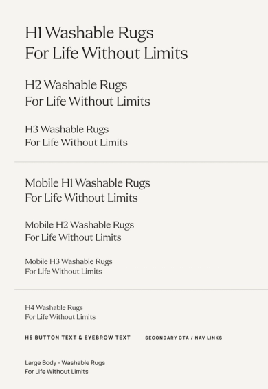
When Director of UX Product Design Alicia Clapper joined Ruggable six years ago, workflows were siloed. Social ads, homepage content, and product detail pages lived in separate tracks, producing a disjointed journey for shoppers who often take ten days or more to decide on a rug purchase. "Historically, the UX and e-commerce team had been pretty separate from brand and creative," Clapper says. Their work sat across several tools and was manually organized in Google Drive. Without a centralized component library, colors, fonts, buttons, and footers were constantly re-created. "We were simply copying and pasting from one page to another and editing them based on the project and content," she says. "Version control was non-existent."
The UX team migrated to Figma five years ago for the sake of alignment. Design, prototyping, and testing now happen in one place. Moving from design to development is roughly ten times faster with Dev Mode; designers can prepare files by checking a box instead of writing manual annotations. "The feeling was, 'This is perfect. We don't need anything else,'" Clapper recalls.
Other teams joined after the platform proved itself. Brand, Creative, Retention, and Acquisition teams now collaborate in Figma, leaving comments and refining components to match the brand. The 2024 rebrand made the case for wider adoption clear. "The ease of updating and implementing our design system in Figma after our 2024 rebrand inspired other teams to want to use it," she says. Product managers now bring multiple teams into FigJam for cross-functional sessions—an improvement Clapper says one PM described as fun, engaging, and productive.
The ease of updating and implementing our design system in Figma inspired other teams to want to use it. This was a big catalyst for wider adoption.“The ease of updating and implementing our design system in Figma inspired other teams to want to use it. This was a big catalyst for wider adoption.”
That consistency across touchpoints builds a sense of familiarity that matters for sales. "There's a familiarity that resonates with people," Clapper says. "And it really strengthens trust with the brand and allows them to find what they are looking for and make the purchase."
Figma powers GitHub's developer-focused Shopify storefront
GitHub's online Shop sells coding-related apparel, collectibles, and lifestyle goods. The company partnered with creative studio Design Business Company (DBCo) to redesign the storefront on Shopify, with a goal of amplifying the brand and building community among developers. The project involved a new design system, branded merchandise, product photography, and packaging, all produced in Figma. The redesign eliminated the need for cumbersome manual updates and made room for developer-centric touches throughout the shopping experience.
An embedded, collaborative workflow
DBCo, founded by Stewart Scott-Curran, Judson Collier, and Jordan Egstad, embeds within client teams rather than operating as a traditional outside agency. Clients see the design work in progress, creating an ongoing conversation instead of waiting weeks for presentations. That approach suits the early- and mid-stage startups that make up most of DBCo's client list. "Clients get to help us correct the direction so much more quickly. That's a huge time savings," Jordan says.
At the start of a project, DBCo invites clients to a shared Figma mood board where anyone can drop ideas and leave comments. That setup serves as the primary feedback channel, offering context and granularity that other tools lack. The GitHub store redesign involved more than two dozen people, including stakeholders from GitHub's Shop, Brand, Design, and Web teams plus accessibility consultants. Mapping everything in the file meant collaborators could jump in at any point and orient themselves to the project.
A reusable starting point for design systems
After the brainstorming phase, DBCo built out the design system using its Construct Design System, a universal foundation configured with Figma variables. Construct sits at "the sweet spot between having enough system in place to be helpful and having too many constraints," says Jordan, who notes it condenses a day and a half of work into roughly 30 minutes.
[The Construct Design System] condenses a day and a half’s worth of work to just 30 minutes.“[The Construct Design System] condenses a day and a half’s worth of work to just 30 minutes.”
Prototyping enables playful, developer-centric details
Prototyping played a critical role, particularly for product pages. These designs often involved eight variants covering size, color, and customization, requiring conditional UI and what Jordan describes as "nerdy, idiosyncratic developer moments." One such detail: when someone enters the Konami Code (↑↑↓↓←→←→BA), the site images transform into ASCII art.
"Developers use words and letters as tools, so we thought, 'We've got to find a way to animate and bring these words to life,'" Jordan says. "We came up with different motion studies and dropped them into prototypes so that we could really get a sense of how the interface would respond with different transitions, button hover states, and things like that. Helping GitHub visualize the designs and having them feel tangible was really helpful in arriving at a decision."
The close collaboration across multiple teams in a single file produced a cohesive retail experience from browsing to checkout to delivery, designed for a discerning audience. As Judson puts it: "Developers are good bullshit detectors. We were challenged to make sure that we were being true to the form and true to the work of developers because whatever we did, we wanted to do it at a very high bar."
E-commerce today extends beyond the "add to cart" click. As the market grows, delivering strong digital experiences across the full customer journey, from awareness to purchase, becomes more important. Giving teams space to brainstorm ambitious ideas, prototype quickly, and get those ideas in front of customers is essential.