Building an identity with room to move
Config 2025 was a year-round project for Figma’s Brand Studio. Ten months before the conference landed in San Francisco and London, the team began shaping a visual identity that had to work across main-stage screens, physical spaces, attendee badges and swag for more than 10,000 in-person attendees and tens of thousands of virtual viewers. The brief stayed deliberately loose, according to Creative Director Damien Correll. Rather than starting from moodboards, the team opened with concepts—a move that keeps the system adaptable. As Correll put it, constraining the concept without constraining the execution is key to building something flexible.
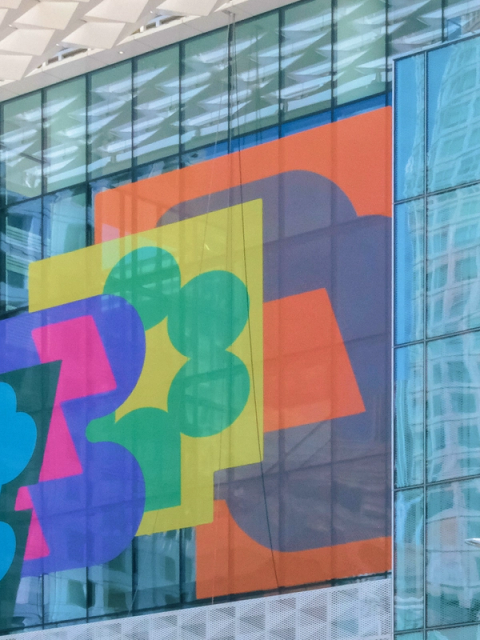
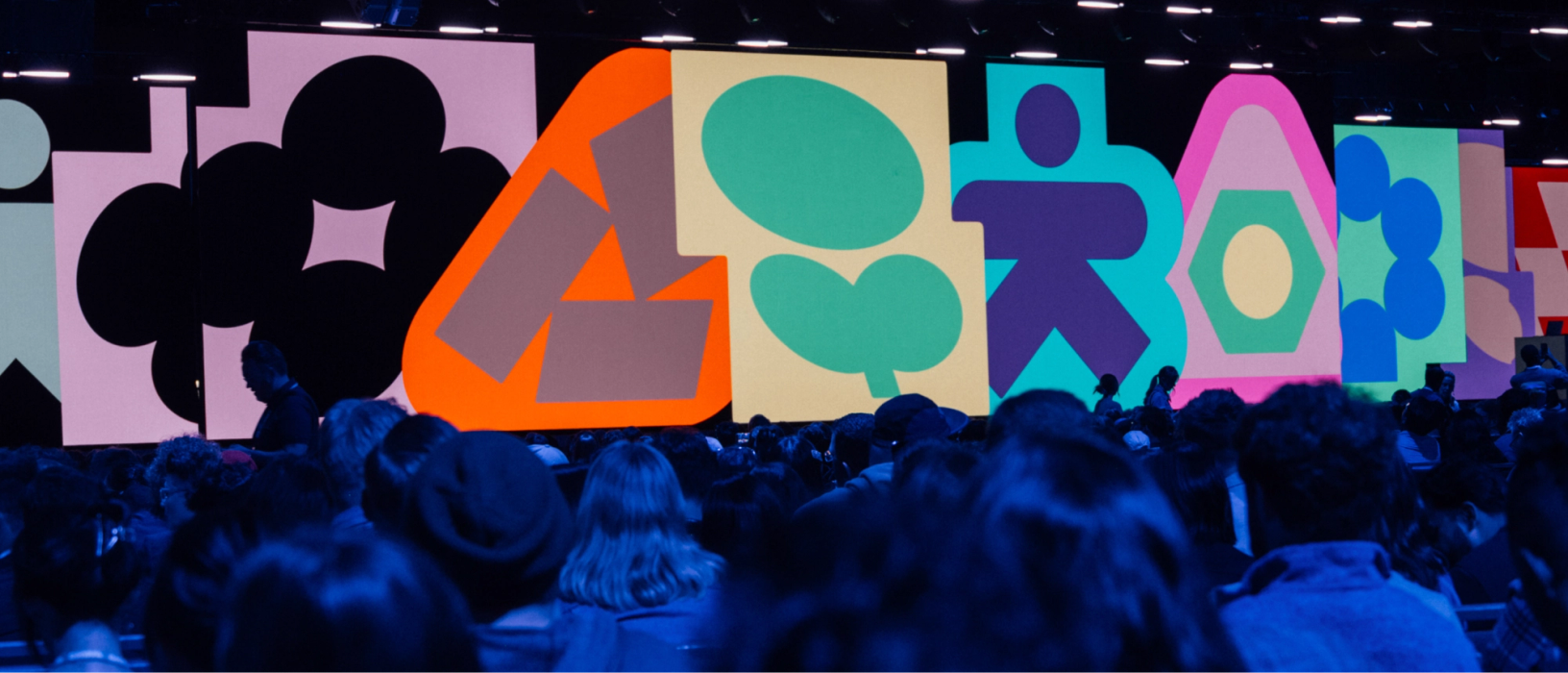
The identity centered on expressive animated glyphs built from basic primitives. “Form—shapes, glyphs, and primitives—sits at the core of the Figma brand,” said Leandro Castelao, Design Manager and creative lead for Config 2025. Each glyph pairs an inner and outer element that respond to one another, conveying dynamism and adaptability. That responsiveness carries into motion, where a single glyph can ripple outward and transform a full composition. Built as components in Figma, the glyph library gave vendors and partners an easy way to swap and customize elements across different surfaces.
Because the event plan would inevitably shift, the concept needed room to stretch. The system had to span social posts, massive digital screens and physical installations without falling apart. It also had to align with the product story: knowing Figma Draw and Figma Sites were in the launch lineup, the team anchored the visual concept on craft and creative expression. “These launches were about empowering users to express themselves in unexpected ways, so our concept was all about achieving greater expression,” said Castelao.
Work on the identity coincided with a recent brand refresh, giving the team a new palette and typeface—Figma Sans—to adapt. They leaned on a condensed cut of the typeface and applied the refreshed color library. “Config was a perfect opportunity to test and stretch the new palette,” Castelao said. For Correll, this let the core brand and the Config brand stay in dialogue rather than drift apart.
From screens to surfaces
The Brand Studio also designed the Config web experience and the Config.new landing page in Figma Sites. Brand Designers Catherine Bui and Andy Luce built separate light and dark themes for the San Francisco and London events, with background colors, text colors, and UI elements defined for each. They set up color palettes for talk tracks like Keynote, Design Craft, Product Management, and Dev & Code as variables in Figma, matching each speaker’s photo background. “We designed the theme colors to be consistent across the two events for wayfinding, while still showcasing a diverse set of colors for each event,” said Bui.
Type hierarchy balanced visual interest with utility, using both condensed and regular Figma Sans. The web surface is dense, so information had to stay digestible—with the condensed cut serving display and header roles. Glyphs were used sparingly, reserved for moments like keynote speaker reveals or the end of a registration flow. “Without intention, the glyphs can start to feel decorative and lose their purpose,” Bui noted. Still, details pulled from the glyphs, like alternating round and sharp corners, appeared in speaker photos, carousel items, and navigation buttons.
Motion and sound in parallel
At Figma, motion design doesn’t wait for static branding to lock. “Here it’s in the front, with everybody on the same level,” said Motion Design Manager Chad Colby. Short timelines demand parallel workstreams, but the approach is also philosophical: animation is deeply tied to the rest of the identity. Brand Motion Designers Ben Hill and Gilles Desmadrille worked inside Figma to gather assets, lay out motion ideas, and build storyboards for the conference’s opening film. The resulting motion language—codified in a library and toolkit—guided how glyphs, typography, and photography would animate, while leaving room for external vendors to adapt it.
The team partnered with Copenhagen-based design and animation studio Relay on the film that preceded CEO Dylan Field’s keynote. Flashes of grids, gradients, textures, and code hinted at upcoming product launches while building anticipation. “Taking that visual identity and using it to tell a dynamic story was both a design and a motion challenge, but it ensured the film was grounded in substance, and not just eye candy,” said Colby.
A deliberate choice: dropping the frame rate from 60 to 15 frames per second gave the film a more tactile, handmade feel. The principle of highlighting handicraft—part of the broader brand refresh—extended to lobby displays at San Francisco’s Moscone Center. The lower frame rate puzzled external A/V vendors expecting smoothness, but it fit the message. “We create software for creatives, and the creative process is messy,” said Hill. The motion and design support that maker process.
Sound received similar attention. London-based studio Sounds Like These produced sonic palettes for walk-on music, product launch videos, and ambient moments throughout the day. The goal wasn’t a generic upbeat track. “Figma is a digital design tool, but there are humans behind it, crafting with it,” said Correll. The instrumentation skewed digital while staying warm and organic.
One of the most effective uses was quiet: a minute-long ambient animation before the opening film that signaled attendees to take their seats. Sounds Like These suggested the idea of an orchestra warming up—audiences might hear motifs from the score but as someone finding the groove. The track replaced a PA announcement, keeping the mood intact. “The music was a nice, subtle cue to everyone that Config was about to start,” Correll said.
Taking the brand into physical space
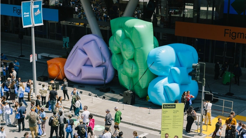
Brand Designer Maria Chimishkyan led the spatial design work, covering wayfinding, structures, wall graphics, and activations throughout the Moscone Center. The supersize inflatables placed around the conference were a centerpiece, naturally drawing attendees for photos.
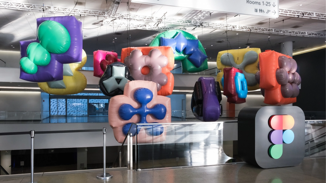
The inflatables grew directly out of the brand's glyph system. "The glyphs we were using in the brand identity had this larger-than-life, expansive feeling," says Maria, "so we thought: Why not literally expand them?" The team worked with Los Angeles–based experiential studio VTProDesign, which pitched two material options: glossy and matte. The matte finish "felt almost like a fabric and was surprisingly nice," says Maria, but the team chose glossy so that "light could hit all the curves and accentuate the forms." At their scale, the inflatables had a natural "droopiness," which the team accepted rather than fighting it with internal framing. "You don't really want to fight that medium and totally obliterate what is lovely about it," she says.
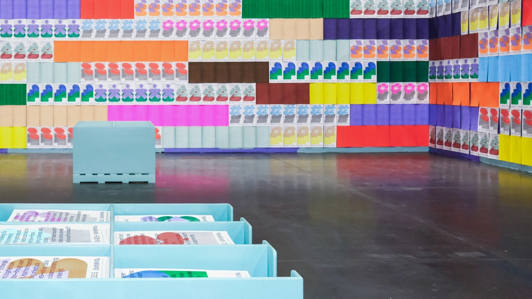
Attendees could also get hands-on at two interactive stations. A "glyph synthesizer," built with Sounds Like These and VTProDesign, let people control the sonic palettes designed for the event. A risograph station, meanwhile, allowed attendees to print their own posters and personalize them with stamps. Many of the risograph posters on display carried quotes from Practice, a book on design and craft edited by Figma's Story Studio and designed by Other Means; every attendee received a copy in their swag bag. "There's an imperfection and a texture to riso that is really lovely," says Maria, tying the medium to the event's themes of craft and practice.
A deconstructed identity for the street
Config Commons returned for a second year as an informal gathering space, but this time it took over Howard Street directly outside the Moscone Center and ran for the full event. That longer runtime changed the design problem, says Leandro: "We had to create something that felt unique on the first day, but stayed alive for the next two days." Brand Designer Chelsea White, who led the project, also had to manage the space's proximity to the main conference. "Config Commons needed to feel less buttoned up, but since it was right in front of the Moscone Center, it interacted with the core brand a lot," she says, so the relationship needed to feel close enough "that it didn't feel wrong."
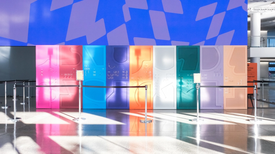
To build that relationship, Chelsea stripped back the core Config identity. She took the glyphs and reduced their color count, removed interior shapes, and layered the forms tightly. The result, she says, "feels a little less polished." Working with brand experience agency Set Creative, she selected materials and structures that felt "simple, humble and clever": metal bleachers, exposed scaffolding, and raw wood facades. Damien describes the goal as a balance between feeling "designed and under-designed."
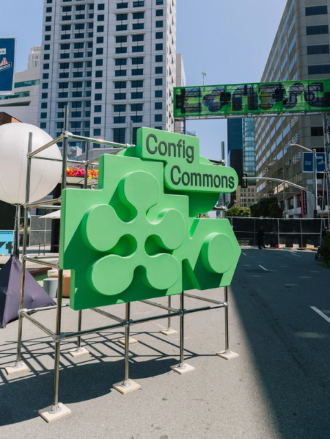
The outdoor setting let natural light act as another design material. Chelsea leaned into embossed forms and cutouts for signage and inflatables, creating "this lovely shadow and light play." An airbrush studio let attendees pick a glyph and color to have airbrushed onto a T-shirt or bandana, and a music stage and intentionally off-brand merch stalls rounded out the block-party atmosphere. For Chelsea, the project clicked when she looked down Howard Street on the first day: "The brand moments were just these pops of color that you encountered down the street. It felt so cohesive."
The sum of the experience
The complete Config experience emerges from all these elements working together—and from the people moving through them. "The best part is when people are in the space, learning new things, playing around with the activations, and connecting with others," says Damien. The aim for the Brand Studio was to capture the creativity and innovation of the product-building community, embracing the ideation and iteration required to get there.
Many hands brought the visual identity of Config 2025 to life. The Brand Studio members involved in this effort include Kaley Aposporos, Cat Bui, Leandro Castelao, Maria Chimishkyan, Chad Colby, Damien Correll, Gilles Desmadrille, Sydney Halle, Ben Hill, Mika Kunisaki, Andy Luce, Jessica Svendsen, and Chelsea White.


