

Why Category Pages Deserve More Design Attention
E-commerce design work tends to cluster around the obvious landmarks: the home page, the product detail page, and the checkout flow. Those are the steps where shoppers make big decisions, so they get the polish. Category pages often sit in between, treated as little more than a grid of product thumbnails.
That is a mistake. Research presented by Jill Kocher Brown, SEO Director at JumpFly, at SMX West 2020 makes the case clearly:
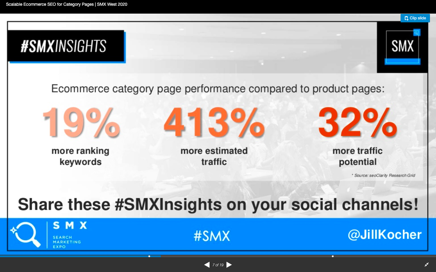
Looking at the top 30 e-commerce sites, Brown found that product category pages outperform product pages on both ranking keywords and traffic. Since much of mobile search happens at the top of the funnel, the category page is frequently the first real interaction a prospective customer has with your store. If those pages are cluttered, slow, or hard to navigate, you lose them before they ever see a single product detail page.
Keep The Critical Elements Above The Fold
Mobile viewports are small, and there is no room for anything that does not directly serve the shopping task. A well-structured mobile category page should put these elements within the first screenful:
- The navigation bar, which can stick to the top or disappear on scroll
- A clear, descriptive category title
- The total product count for the category
- Filter and sort controls
- At least one or two product results that match the search intent
The problem with burying these under promotional content is visible in practice. Search for “kong dog toys,” and you will find category/brand pages like PetSmart’s ranking well:
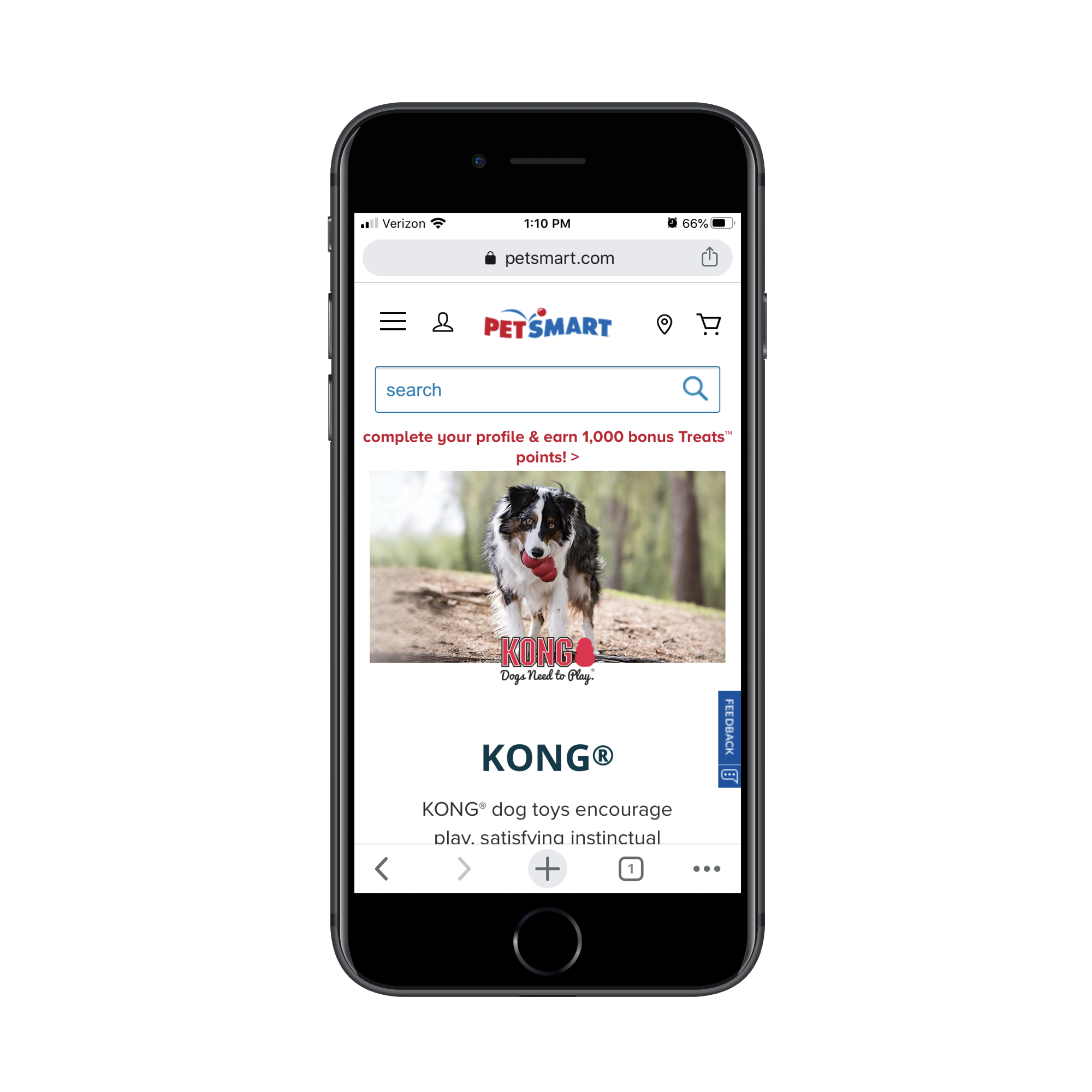
Shoppers arriving from a search engine have already expressed a specific need. They do not want to swipe through multiple informational sections, videos, and subcategory links before they can buy. That content is useful for someone browsing the site casually, but it creates friction for someone who typed a precise query.
Best Buy shows a better structure. The top of its category page is concise, even if its ad placement is debatable:
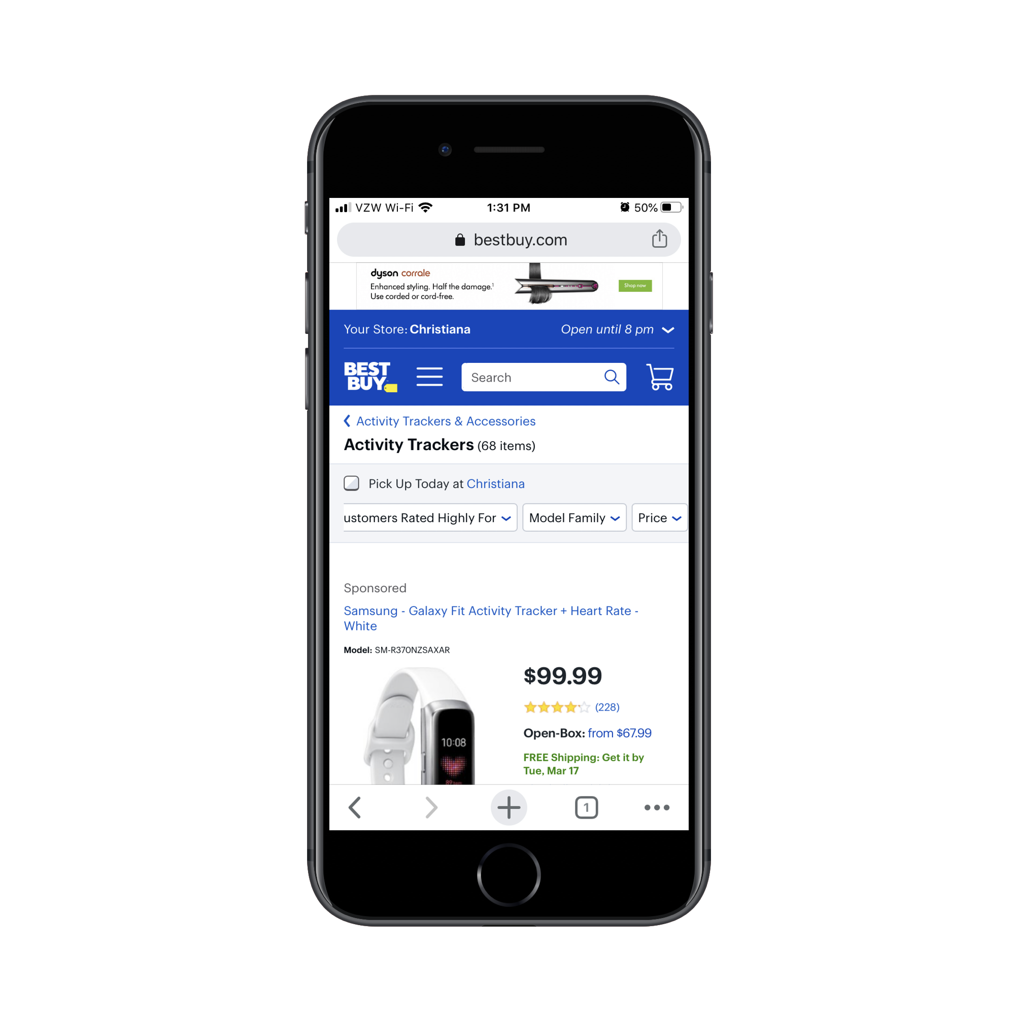
The key difference: Best Buy still serves the additional category information, but it does so below the product results:
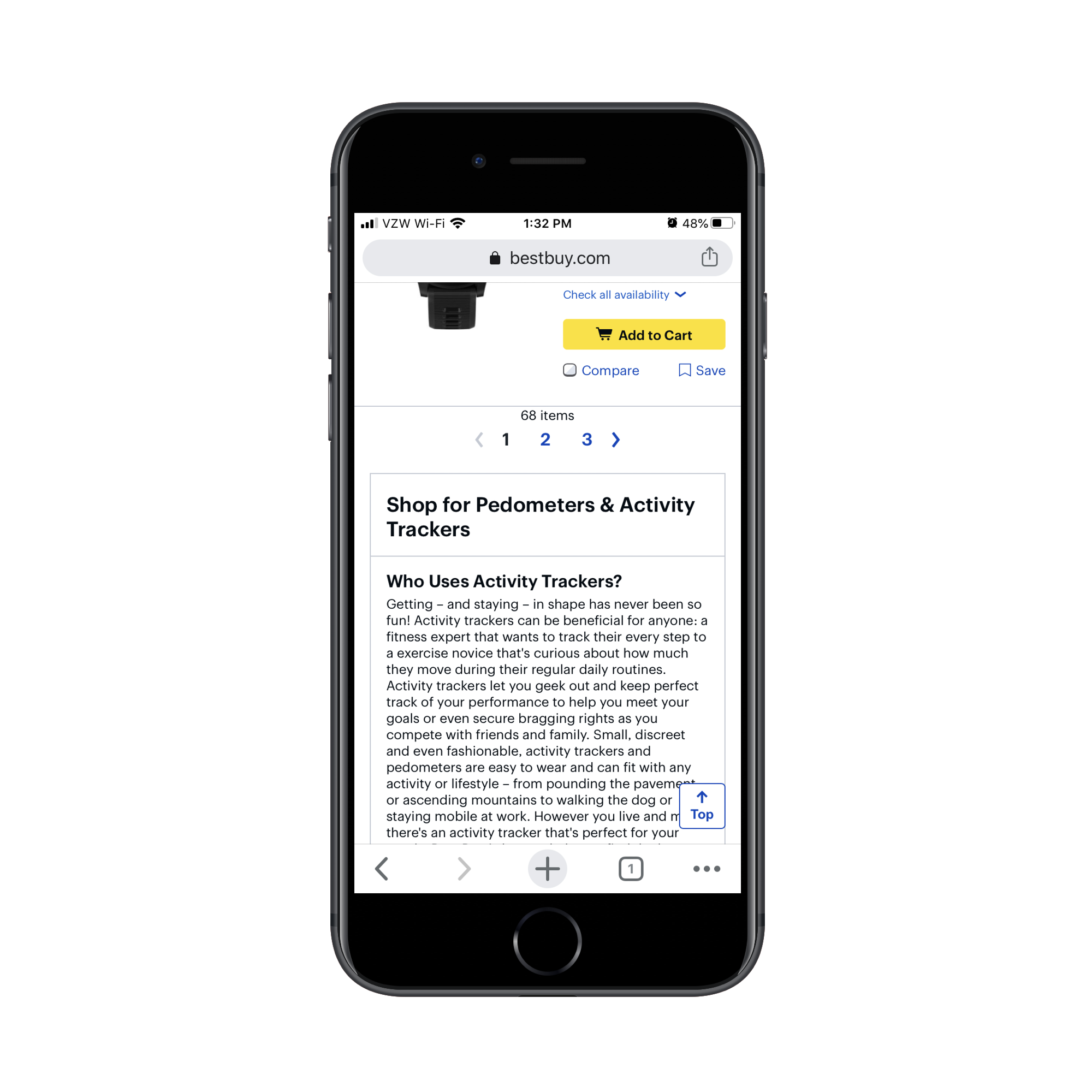
That approach works double duty. New shoppers or browsers who want brand education can find it. And for SEO, that keyword-rich informational block gives the page more relevance than a meta title and description alone can provide.
Show Product Details That Help Decision-Making
Once shoppers reach the product grid, your goal is to let them scan and compare quickly. Each listing needs at minimum:
- A clear, attractive product image
- The product name, with a short descriptor if the name alone is ambiguous
- The price
- Star rating and review count
The rating and review block is the only optional item, and only when a new site wants to avoid drawing attention to a lack of social proof. Everything else is essential. Anything that doesn’t help a shopper choose between one product and the next should be cut.
Chewy’s “kong dog toy” category page is tighter than PetSmart’s, but still carries two pieces of redundant text worth removing:
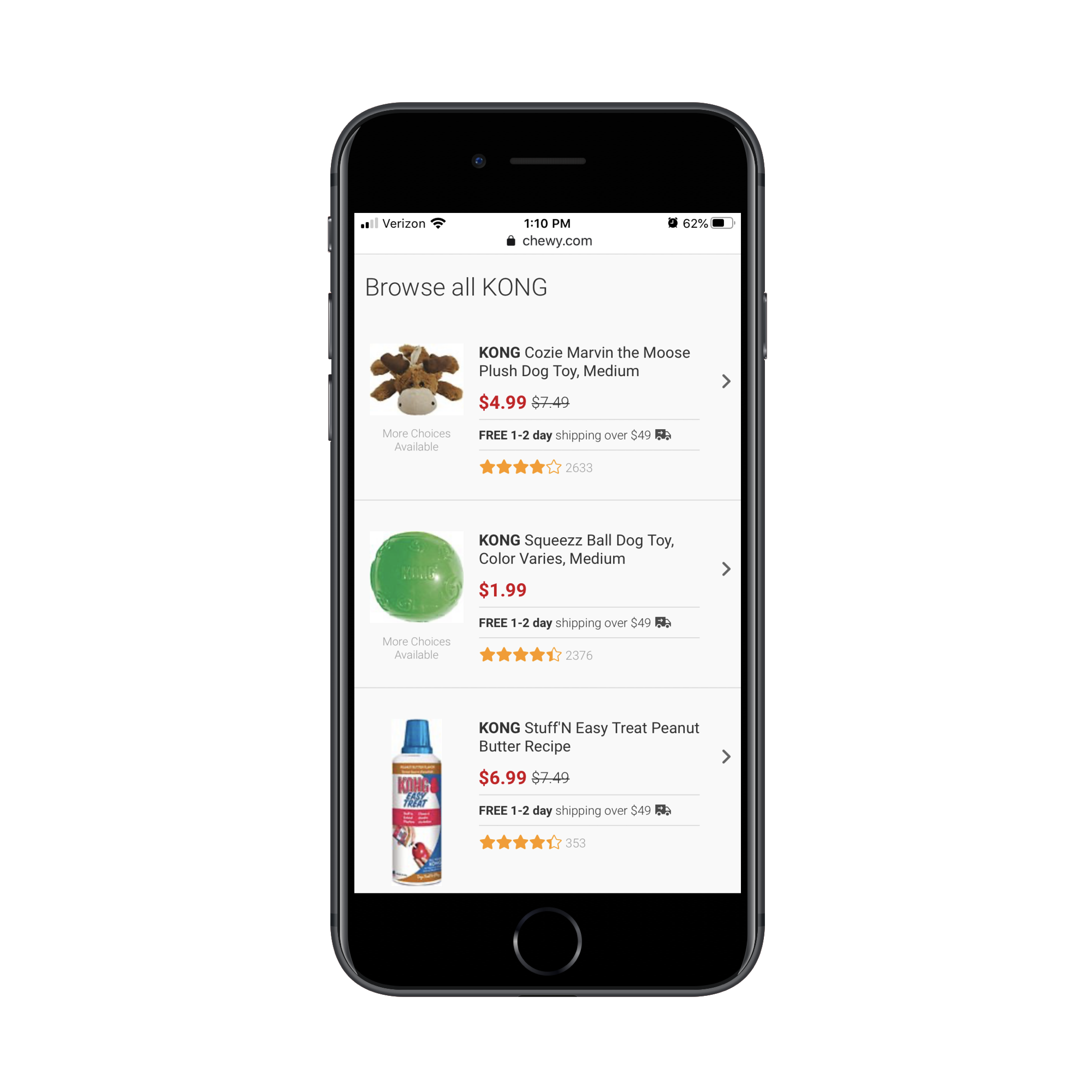
- “More Choices Available” under the product images
- “Free 1-2 day shipping over $49 🚚” sitting between price and rating
The free-shipping notice belongs in a dismissible sticky bar at the top of the site, not in the middle of every product card. And “More Choices Available” explains nothing useful. Similarly, BH Cosmetics product cards could be trimmed:
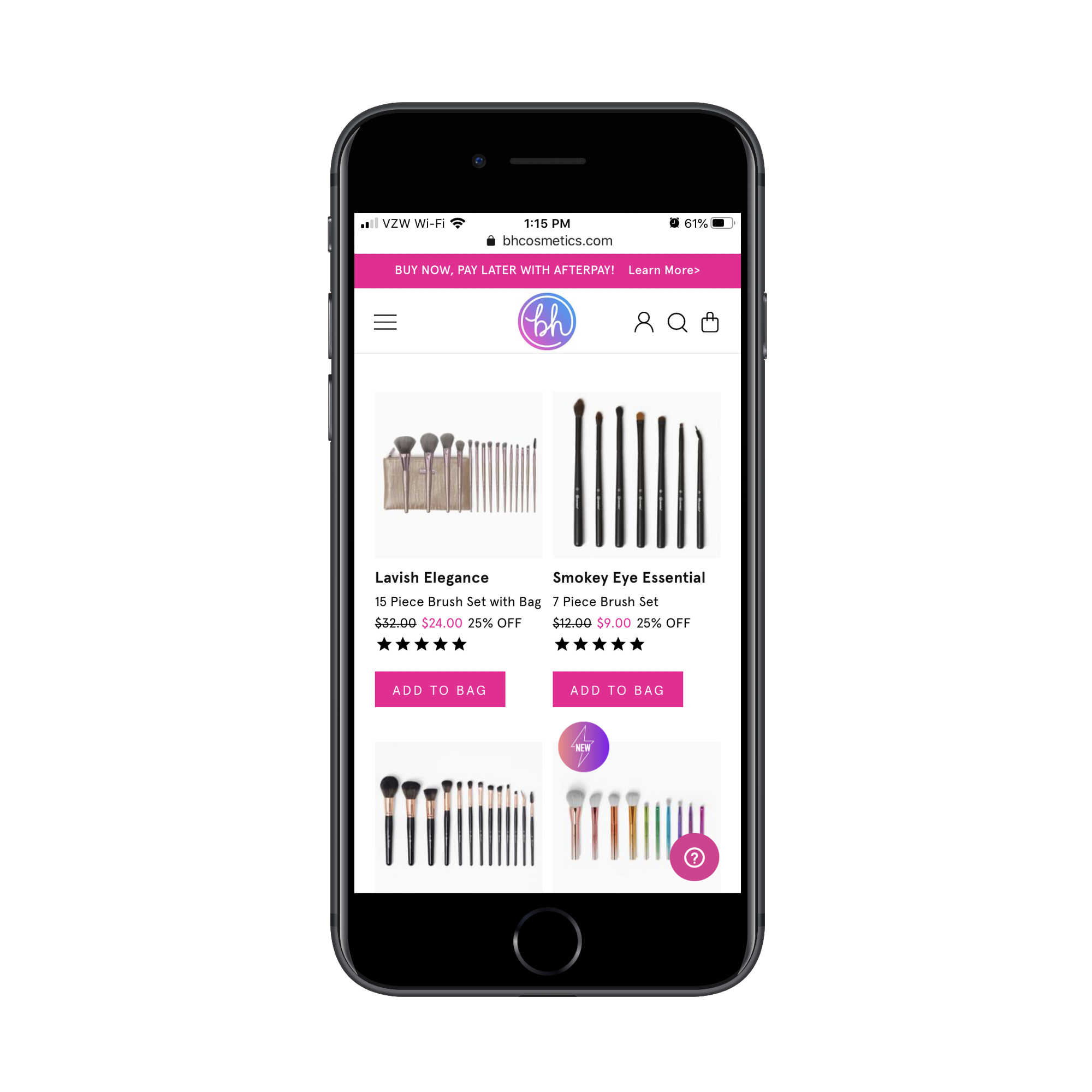
The “Add to Bag” buttons are ineffective on a listing page. A shopper cannot tell from one image whether that is the right product, so the button just invites accidental purchases. The “XX% OFF” badge is likewise redundant; a crossed-out original price next to the new lower price already communicates the deal cleanly.
The right amount of extra detail depends heavily on your product type. For a booking site, a few decision-critical extras help. Expedia’s hotel listings show “Breakfast included” and a countdown on remaining rooms at a special price:

Booking.com crams more into that same space:

All those details in green make each card harder to process, and not all of them matter equally. The safe rule: start with the bare minimum and A/B test additional details before assuming they help conversion.
Control Page Length And Loading Behavior
Category pages are heavy by nature. Dozens of images and product records load at once, and if you keep serving more as the user scrolls, performance degrades and shoppers feel overwhelmed. Pagination is the more reliable pattern, and Walmart demonstrates it:
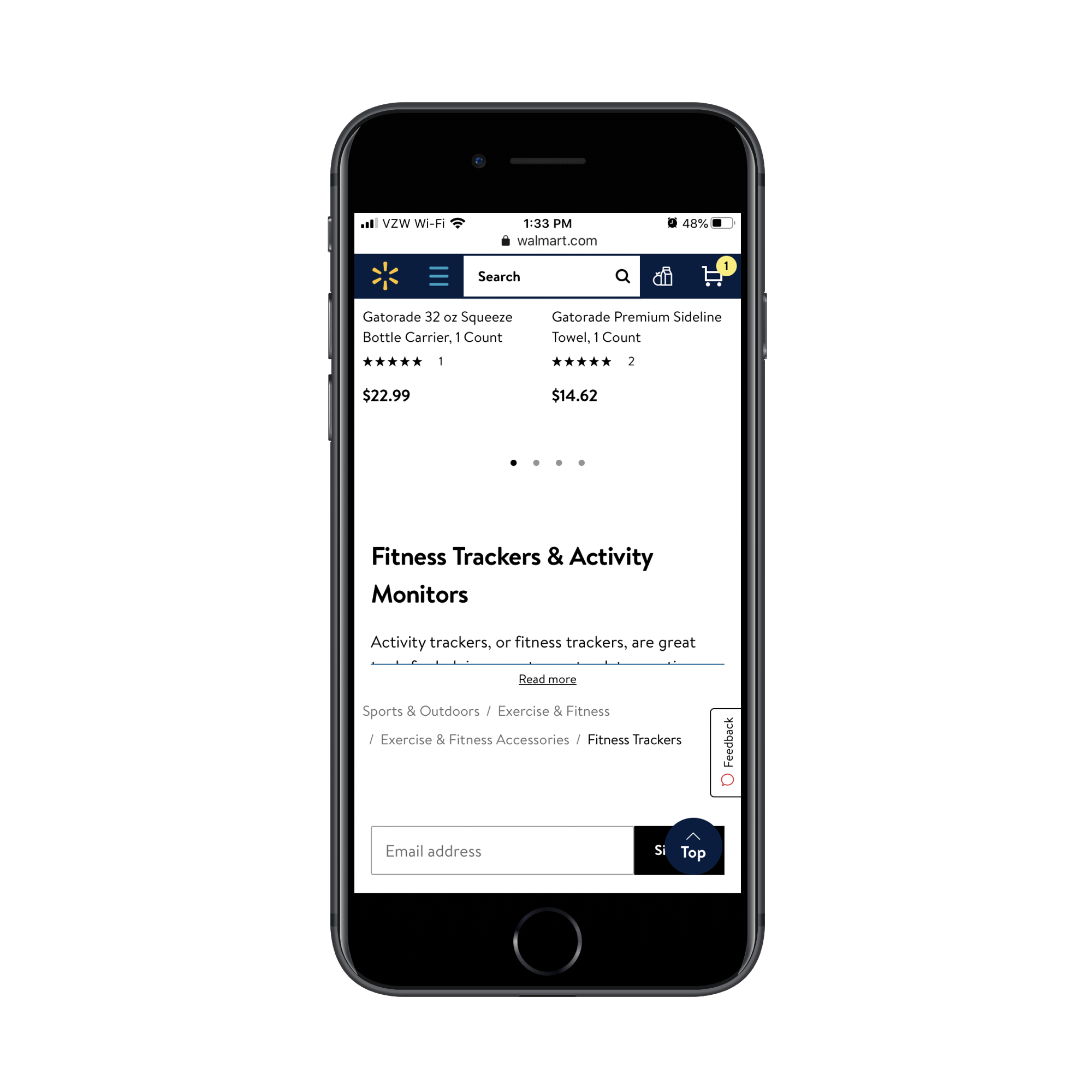
Walmart also lets users toggle between a default grid view and a more compact list view:
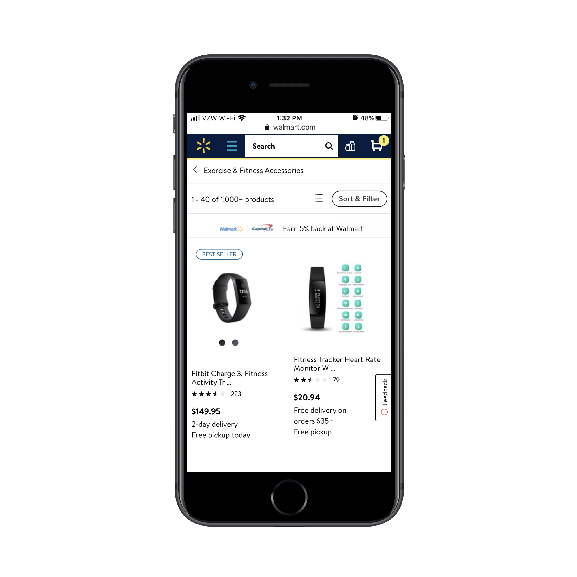
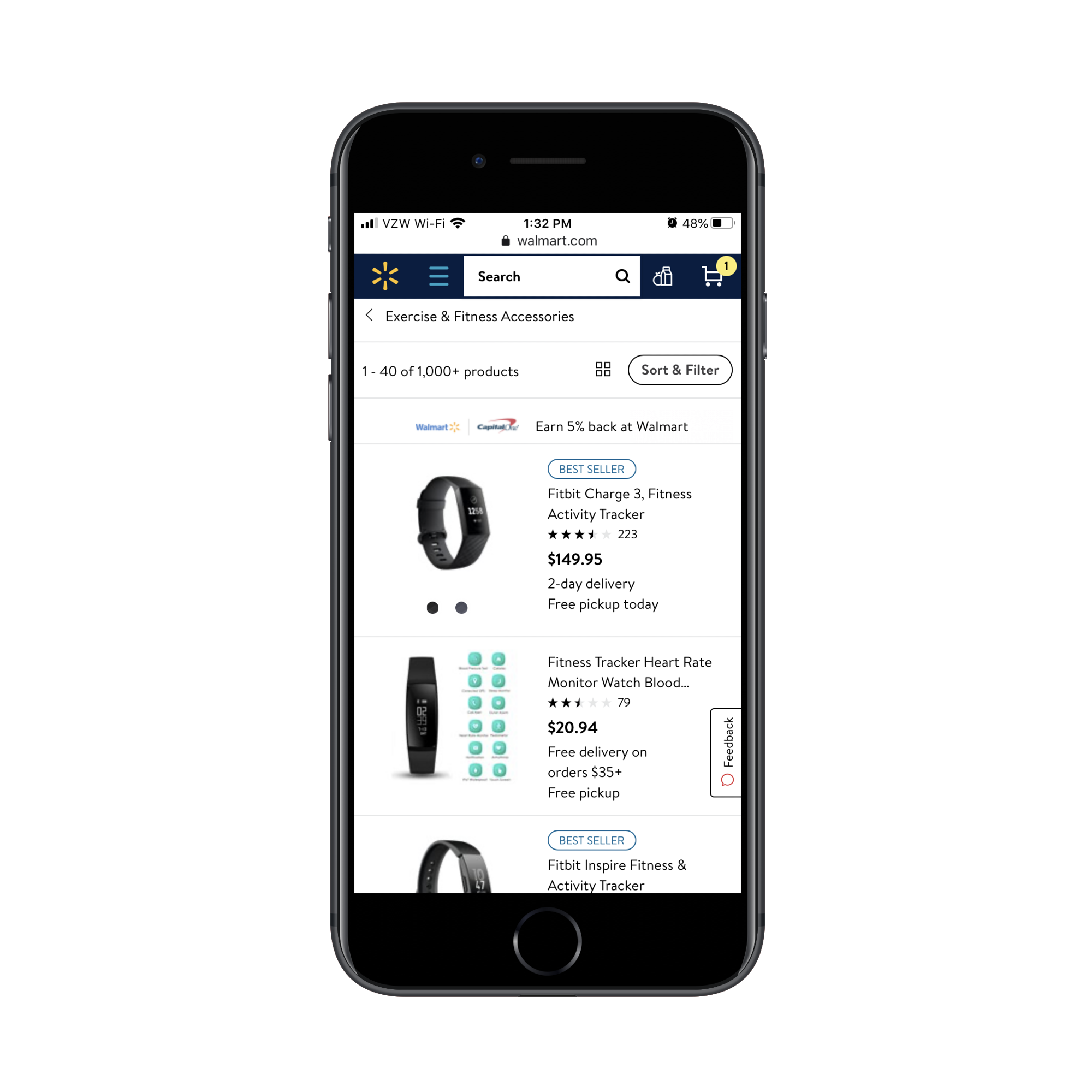
List view packs more products onto each screenful, so shoppers who want to scan many options quickly have a way to do so. Giving users control over that density is a better move than forcing everyone into the same layout.
Default Sort And Filters Shape The Whole Experience
The default sort order on a category page reflects an assumption about what matters most to your customers. Sephora defaults to “Bestselling”:
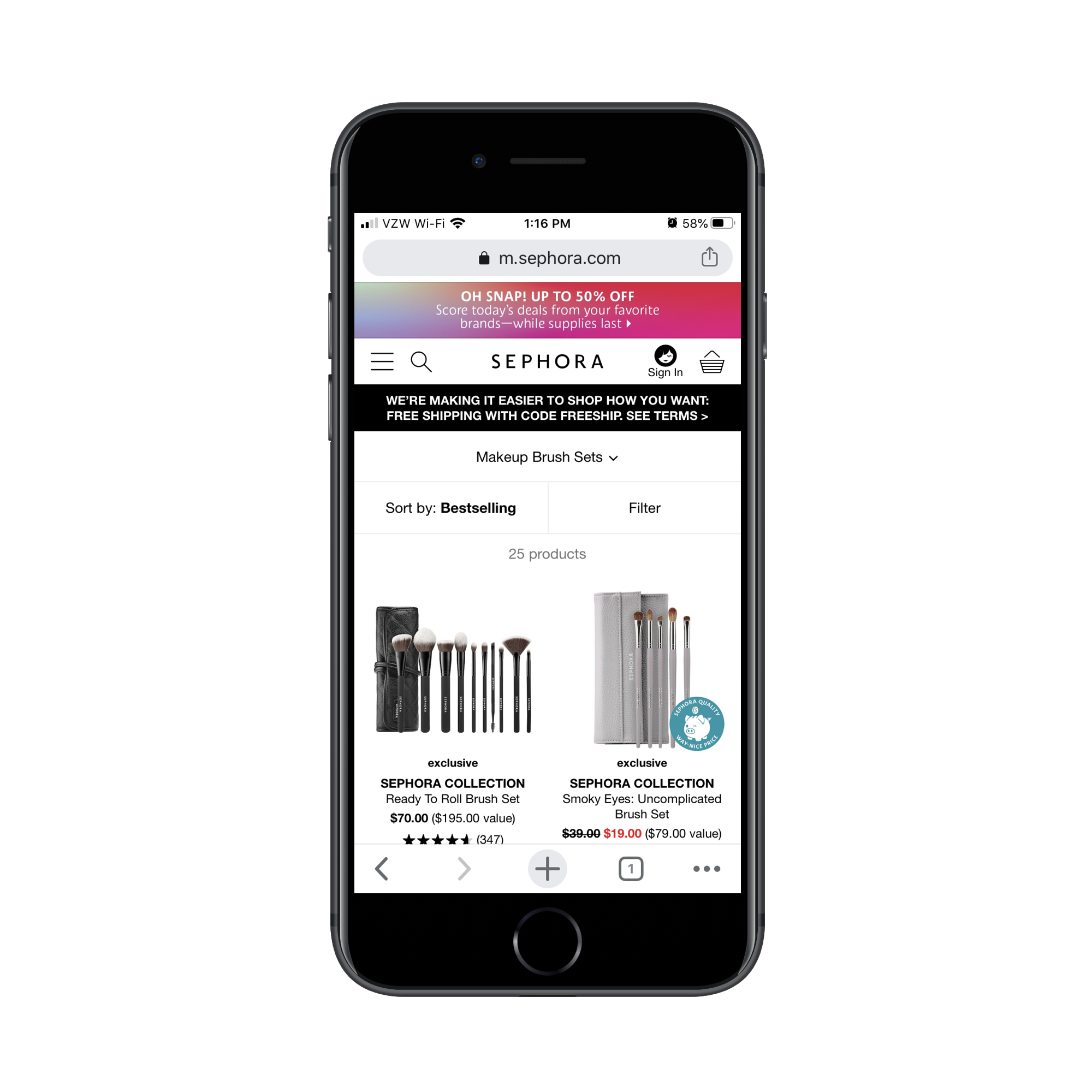
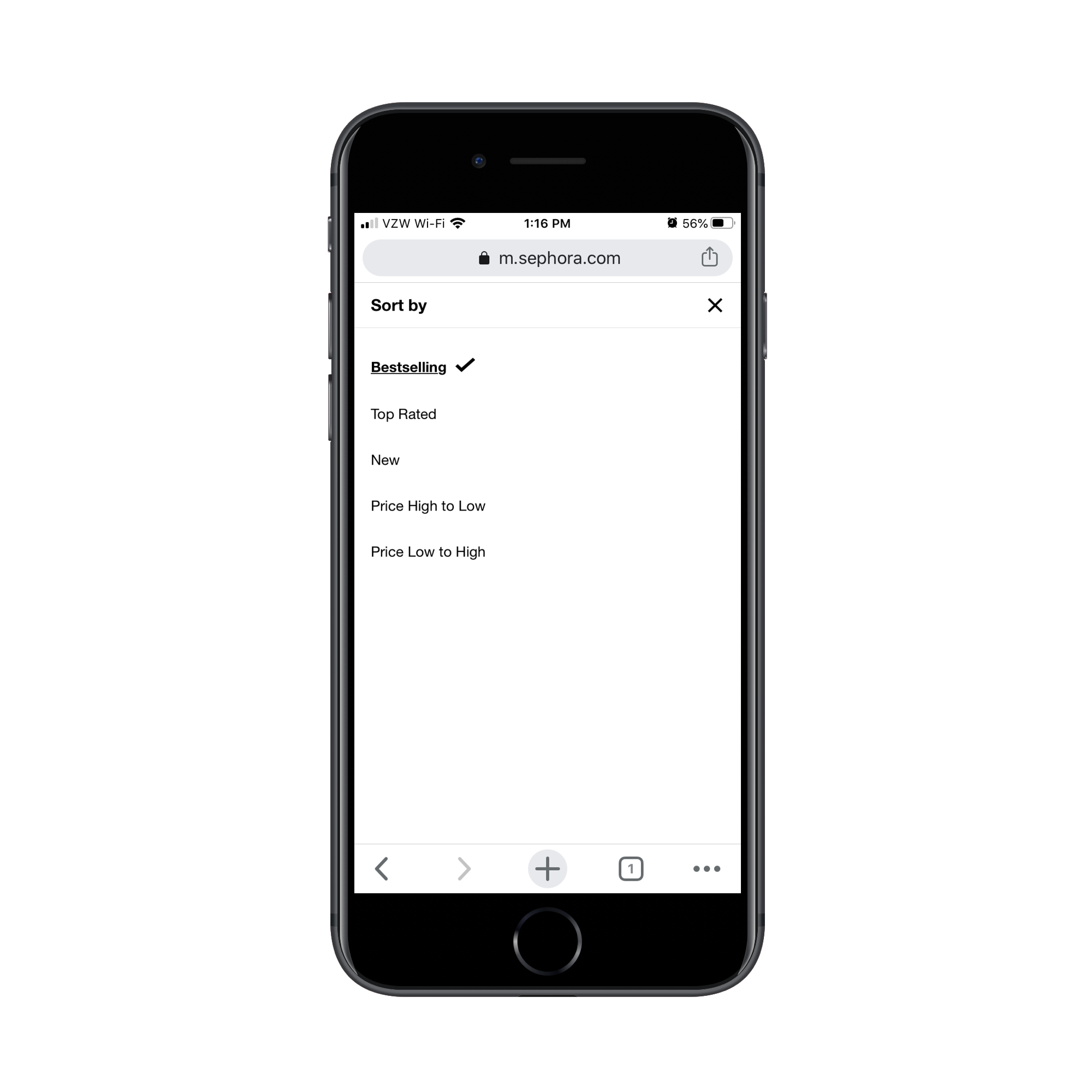
But not every shopper cares most about popularity. Price sensitivity and social proof drive plenty of buying decisions, so sort options like “Price Low to High” and “Top Rated” need to be available:
Filters need the same level of thought. Sephora’s “kong dog toys” equivalent limits filtering to just two brand-name factors:
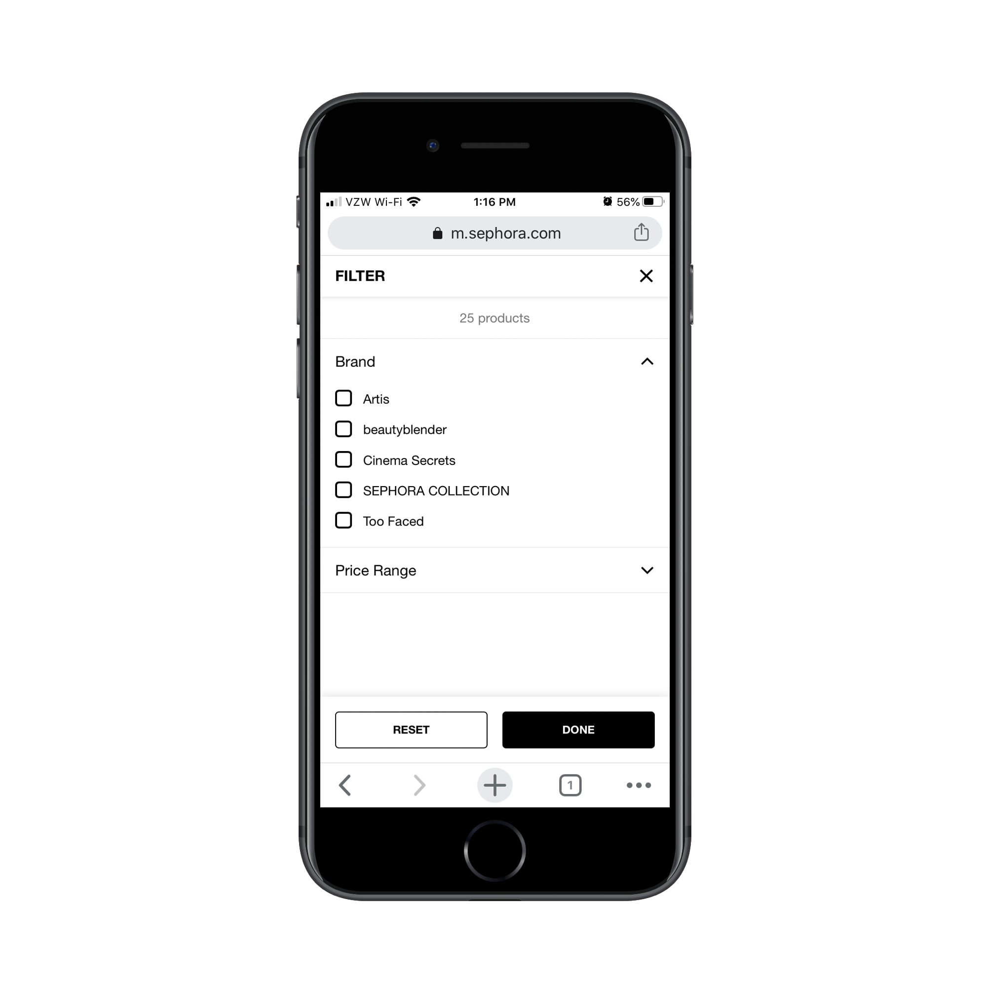
That implies every shopper is fluent in the brand landscape of that category. Most are not. Your own product attributes—categories, tags, features—are the data you already maintain for inventory organization. Expose those to shoppers as filters. Doing so does more than make the interface friendlier. It lets customers narrow to a shortlist, which speeds their decision and lightens the page load. Ulta builds a broader filter set:
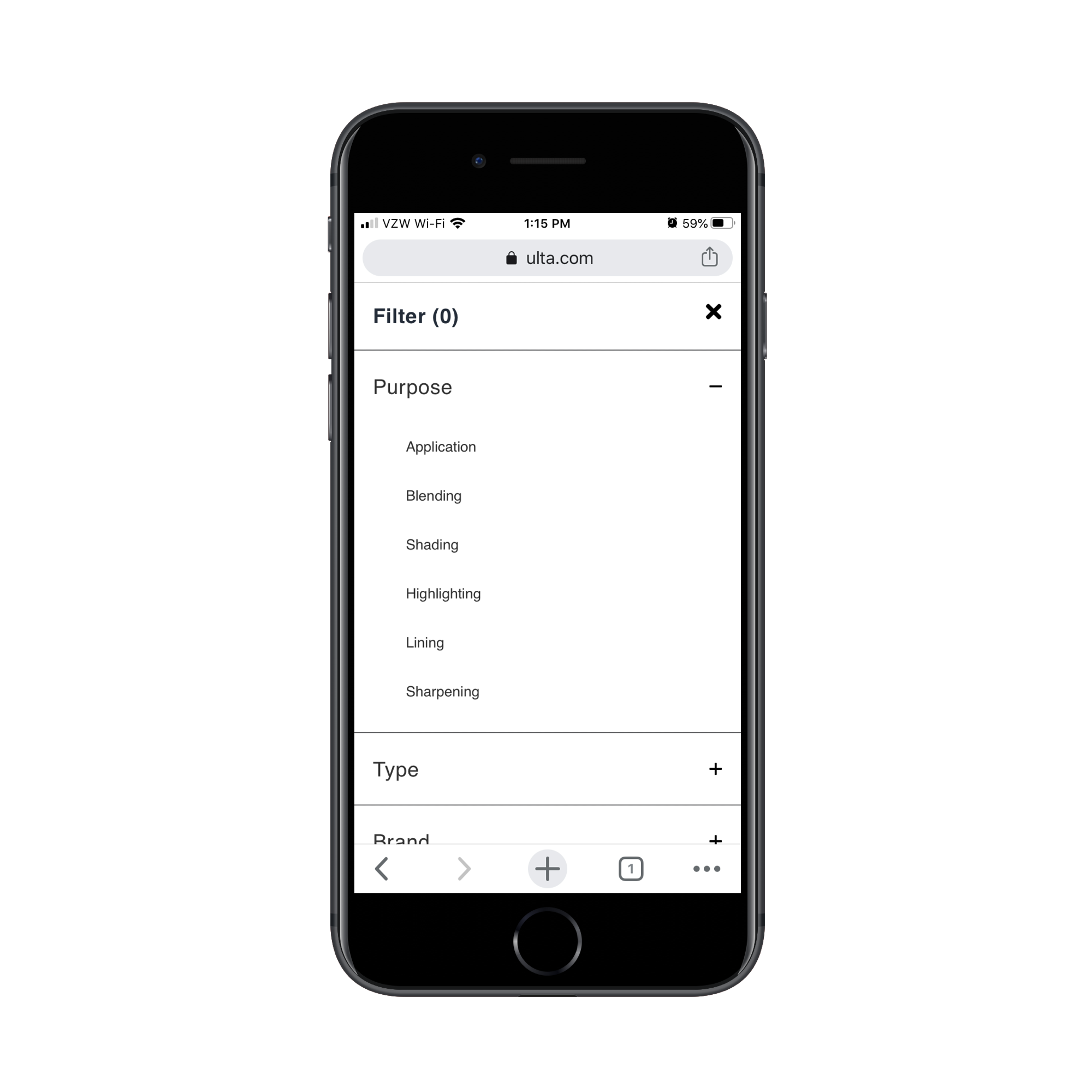
The result is a leaner, better-performing page that supports a faster path to a purchase decision.
Category pages earn their traffic from search, but none of that traffic converts if the page design refuses to get out of the shopper’s way. Keep the essential controls visible, strip the product cards to decision-critical data, and let shoppers control density and precision. Do that, and your category pages will function as the effective intermediary between search intent and a completed order.


