A component library, a toolkit, and a shared contract
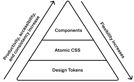
Thumbtack's design system, Thumbprint, is split into distinct layers rather than shipped as a single monolithic package. Daniel O'Connor, Staff Software Engineer at Thumbtack, describes the arrangement as one built for flexibility and efficiency across the home service platform.
What each layer does
- The component library — the implementation layer that ships UI code to product teams.
- The toolkit — the supporting package created for, and subsequently adopted by, other product teams at the company after Thumbprint's own needs drove its development.
- The shared contract between designers and engineers — the language both sides work against when specifying and consuming components.
Why monorepos stop at the home screen
Starting from zero meant working through the foundational reasoning for the system's structure before any code was written. A recurring question: why not house design components in the app's existing monorepo? Because a design system has consumers beyond a single product — it must be shared across several products, some of which live outside that repo — so it needs its own home rather than a slot inside the app.
Governance without gatekeeping
Component creation is not routed through the system team. The team does not sit in the critical path for every new component or design; product teams can invent their own without waiting on the core group. When something a product team builds turns out to be broadly useful, it gets back-ported into the component library rather than the original team abandoning it.
The other stated risk is the core team becoming a bottleneck. Thumbprint is framed as the backbone of the design system rather than the whole of it: it is not meant to solve every problem a product team might encounter, and its most useful role is elevating the design, not serving as the only source of solutions.
Underneath the components
The system also breaks work into utilities — shared functions that handle common patterns so components don't reimplement basics. Among the examples O'Connor cites: layouts, reusable props, and accessibility plumbing, all made available across the codebase so teams in any product domain can reach for the same primitives.
The structure is a response to scale — multiple products, designers and engineers editing the same building blocks concurrently — made possible by layer separation and consolidated utilities.
Layering within layers
A layer can itself be composed of layers, which adds versatility. This pattern is most visible in Thumbprint's React component library, where the modal is split in two. ModalCurtain handles usability and carries no visual styling, while Modal supplies the visuals and is built on top of ModalCurtain, inheriting all of its behavior.
React developers will almost always reach for Modal directly. When that component is too prescriptive for a given case, they are encouraged to use ModalCurtain; the missing functionality can be folded into Modal later if the need proves real.
Tokens can be layered too. Adobe's Spectrum design system, the source notes, includes up to three levels of abstraction in its tokens. There, button-cta-background-color inherits from cta-background-color, which in turn inherits from blue-400. Developers normally reach for the highest token layer that fits their use case.
What the layering buys
Before building Thumbprint, I’m sure that this layered architecture would’ve sounded overly complicated and time consuming. Instead, I’ve found the opposite to be true.“Before building Thumbprint, I’m sure that this layered architecture would’ve sounded overly complicated and time consuming. Instead, I’ve found the opposite to be true.”
Workarounds that unblock instead of block. When a team needs something the system can't or isn't ready to support, it drops to a lower layer of abstraction: ModalCurtain in place of Modal, or a custom button built from Thumbprint Atomic and Thumbprint Tokens. The maintainers gain slack — they aren't forced into bespoke API changes for one-off requests, and can watch which workarounds prove popular before promoting that functionality into a component.
Gradual adoption. A team without the bandwidth to take on the whole system can start with just the tokens layer, which still beats adopting nothing and puts them on the path toward the full system. Wider adoption in turn makes brand updates easier to ship across multiple platforms.
Simpler maintenance of complex components. Separating functionality from visual style lets the team work on one aspect at a time. Changing a button's hover state, for example, can be as small as editing a token in a single codebase — and any team that has adopted even the token layer inherits the change.
Costs of a layered system and how Thumbprint addresses them
Each layer needs its own infrastructure for documentation and publishing. Thumbprint handles this with a monorepo built on Yarn Workspaces and Lerna. When layers live in separate codebases, however, documentation gets harder: for the Thumbprint Tokens codebase, the team created a GraphQL API so the documentation codebase can read from the tokens codebase.
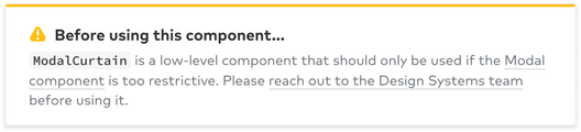
Documentation also carries guidance. Maintainers can flag components with a note asking developers to make contact before using them, and they can present the happy path prominently while keeping the escape hatch subtle — as with the Modal component that ships with built-in padding. The ModalCurtain docs take the opposite approach, telling developers to reach out when the happy path doesn't work.
Guarding the feedback loop
A healthy design system depends on a live feedback loop: when developers receive designs containing components that differ from what the system already provides, they should raise it with the maintainers. If deviating becomes too easy, that loop weakens and maintainers lose valuable input. The layered approach keeps the system from turning into a blocker by offering workarounds, but the cultural side has to support it — engineers and designers need to feel comfortable speaking up when the system doesn't fit. Office hours, one-on-ones with consumers, encouraging contributions, and regular system updates all help build that culture.
Designing for the pit of success
"In stark contrast to a summit, a peak, or a journey across a desert to find victory through many trials and surprises, we want our customers to simply fall into winning practices by using our platform and frameworks. To the extent that we make it easy to get into trouble we fail." —Rico Mariani
Scott Atwood-style framing aside, the term comes from software engineer Rico Mariani; Jeff Atwood of StackOverflow later expanded on it, arguing that systems should make it "easy to do the right things and annoying (but not impossible) to do the wrong things." A layered design system pushes consumers in that direction: the layers supply flexibility, raise adoption, and relieve pressure on the maintainer team, which frees up room for brand rollouts and more deliberate architectural decisions. They also impose a separation of concerns that simplifies building and maintaining the system.
At Thumbtack, the three layers pay off individually — each improves product quality and developer productivity — and together they let a small team maximize its impact for Thumbtack's consumers and, above all, its end users.