
CSS Grid Flag Pattern: No Magic Numbers Required
Jay Freestone has published a clever take on the classic media object design pattern—where an image sits centered beside a title—using CSS Grid to avoid brittle, hard-coded values. The approach relies on an extra pair of rows flanking the title, so the layout flexes naturally with content size.
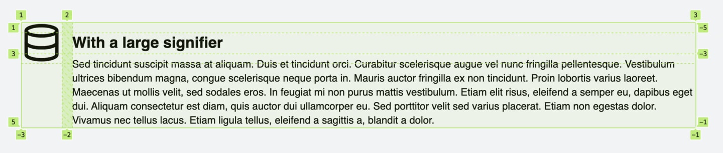
By assigning named grid areas, the image spans the first three rows in the left column while the content occupies the last three rows in the right column. This cleanly separates the visual zones without requiring fixed measurements.
grid-template-areas:
  'signifier .'
  'signifier content'
  'signifier content'
  '.         content';
Freestone’s post goes further, detailing additional tweaks needed for full resilience across edge cases. It’s a sharp example of shifting your mental model: slice the design into arbitrary grid cells, then place items on any rectangular mix of those cells with the alignment you need—no guesswork involved.


