

Real-Time Dashboards Are Decision Tools, Not Data Screens
Real-time dashboards in fleet management, healthcare, logistics, and finance are no longer passive displays of live metrics. They are decision assistants operating under pressure, where delays carry real costs. Yet many of these systems fail at their core job: they present data without guiding users toward what needs attention.
The failure mode is consistent. A fleet operations team I worked with monitored dozens of vehicles across multiple cities. The dashboard showed fuel consumption, live GPS positions, and driver updates in real time, yet the team still struggled to identify urgent issues. The data was present; priorities, alerts, and context were not.
Designing for real-time use differs fundamentally from designing static reports. Users face limited time and high cognitive load, so they need clarity on actions, not just access to raw numbers. Interface elements like layout hierarchy, alert colors, grouping, and motion can help, but they only work when driven by a clear understanding of what the user must decide in that specific moment.
How Users Process Live Updates
Humans can only process a small amount of information at once. Without proper context or visual cues, rapidly updating dashboards overwhelm users and push attention away from critical data. Several techniques help users parse updates efficiently:
- Delta indicators and trend sparklines. Delta indicators show value changes at a glance; sparklines are compact line charts that reveal trends over time in minimal space. A sales dashboard might display a green upward arrow next to revenue, paired with a sparkline showing the past week's sales trend.
- Subtle micro-animations. Small animations draw attention to changes without causing distraction. A soft pulse around a changing metric signals activity without overwhelming the viewer.
- Mini-history views. Letting users scroll back a few minutes to review recent updates reduces reliance on memory and supports verification of data trends.
Many live dashboards fail when treated as static reports instead of dynamic tools for quick decision-making.
Common pitfalls include overcrowded interfaces where too many metrics compete for attention, flat visual hierarchy that gives no emphasis to critical data, changes that update instantly with no record or explanation, and excessive refresh rates that create unnecessary motion and cognitive strain for data that doesn't need constant updates.
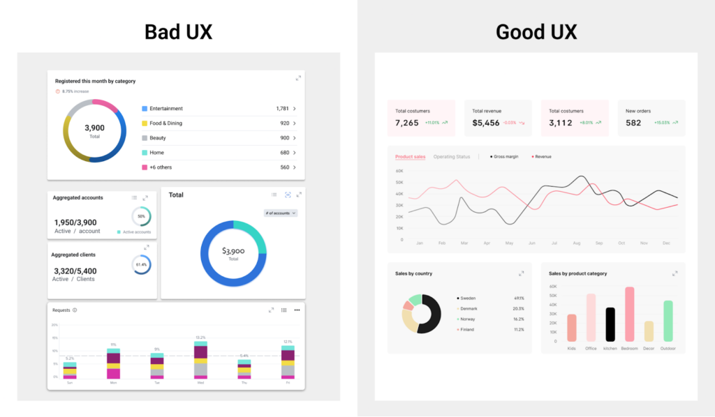
Managing Cognitive Load and Stress
Under stress, users rely on intuition and focus only on immediately relevant information. Dashboards that update too quickly or present conflicting alerts cause delayed actions or mistakes. Design should prioritize the most important data first, offer snapshot or pause options so users can process information at their own pace, and use clear indicators to show whether an action is required or everything is operating normally.
In real-time environments, the best dashboards balance speed with calmness and clarity. They are not just data displays but tools that promote live thinking and better decisions.
Personalization also helps manage cognitive load. Custom metric selection, alert preferences, and adjustable update pacing let users tailor dashboards to their roles—operations managers might focus on system health while sales directors prioritize revenue KPIs—making the dashboard more relevant and efficient.
| Cognitive Challenge | UX Risk in Real-Time Dashboards | Design Strategy to Mitigate |
|---|---|---|
| Users can’t track rapid changes | Confusion, missed updates, second-guessing | Use delta indicators, change animations, and trend sparklines |
| Limited working memory | Overload from too many metrics at once | Prioritize key KPIs, apply progressive disclosure |
| Visual clutter under stress | Tunnel vision or misprioritized focus | Apply a clear visual hierarchy, minimize non-critical elements |
| Unclear triggers or alerts | Decision delays, incorrect responses | Use thresholds, binary status indicators, and plain language |
| Lack of context/history | Misinterpretation of sudden shifts | Provide micro-history, snapshot freeze, or hover reveal |
Common Cognitive Challenges in Real-Time Dashboards and UX Strategies to Overcome Them.
Using Layout, Color, and Motion to Drive Focus
Visual elements do more than improve appearance; they help users interpret live data quickly. Arrange elements so the most important data stands out. Place critical figures like sales volume or system health in the upper left corner to match common scanning patterns. Limit visible elements to about five to prevent overload and group related data into cards for better scannability.
Color communicates meaning in data visualization. Red or orange signals critical alerts and negative trends; blue and green represent positive or stable states. Neutral tones like gray support background data and help key colors stand out. Ensure accessibility with strong contrast and pair colors with icons or labels. For example, bright red can highlight outages while muted gray marks historical logs.
Animation should clarify, not distract. Smooth transitions between 200 and 400 milliseconds communicate changes effectively. Upward motion in a line chart reinforces growth; hover effects provide feedback. Thoughtful motion makes changes noticeable while maintaining focus.
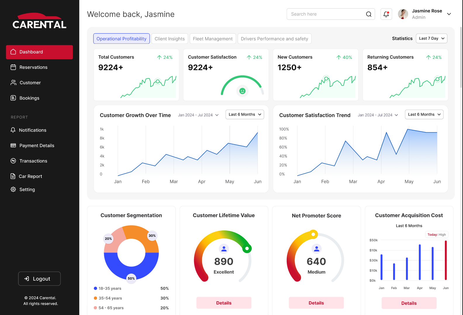
Layout, color, and animation create an experience that allows fast, accurate interpretation of live data. By reducing mental effort and highlighting anomalies or trends, real-time dashboards support continuous monitoring rather than just display.
| Element | Placement & Visual Weight | Purpose & Suggested Colors | Animation Use Case & Effect |
|---|---|---|---|
| Primary KPIs | Center or top-left; bold, large font | Highlight critical metrics; typically stable states | Value updates: smooth increase (200–400 ms) |
| Controls | Top or left panel; light, minimal visual weight | Provide navigation/filtering; neutral color schemes | User actions: subtle feedback (100–150 ms) |
| Charts | Middle or right; medium emphasis | Show trends and comparisons; use blue/green for positives, grey for neutral | Chart trends: trail or fade (300–600 ms) |
| Alerts | Edge of dashboard or floating; high contrast (bold) | Signal critical issues; red/orange for alerts, yellow/amber for warnings | Quick animations for appearance; highlight changes |
Design Elements, Placement, Color, and Motion Strategies for Effective Real-Time Dashboards.
Making Change Understandable
If users cannot interpret changes quickly, the dashboard fails regardless of its visual design. Sparklines are among the most effective tools for this. They show whether a metric is trending up, down, or steady without axes or labels cluttering the view. Placing a sparkline next to monthly revenue immediately reveals if performance is improving or declining, even before the viewer reads the number.
When using sparklines effectively:
- Pair them with metrics like revenue, churn rate, or user activity so users see both the value and its trajectory at once.
- Remove clutter like axis lines or legends unless they add real value.
- Highlight the latest data point with a dot or accent color, since current performance often matters more than historical context.
- Limit the time span. Too many data points compress the sparkline and hurt readability; a focused window like the last 7 or 30 days keeps the trend clear.
- Use sparklines in comparative tables. Placed across product lines or regions, they reveal anomalies or emerging patterns that static numbers may hide.
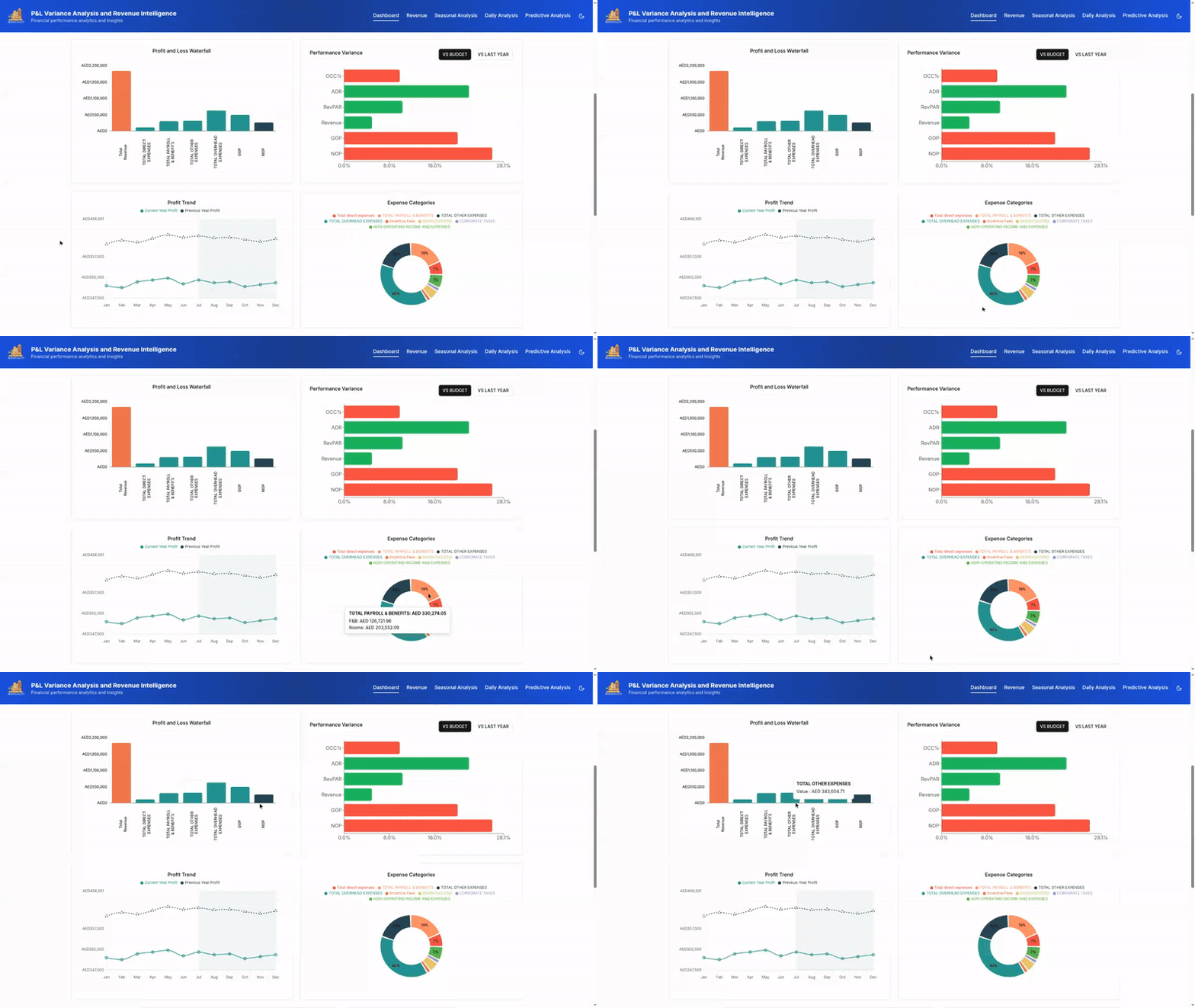
Combine sparklines with directional indicators like arrows and percentage deltas for quick interpretation. Pairing "▲ +3.2%" with a rising sparkline shows both direction and scale of change. Do not rely solely on color to convey meaning—1 in 12 men is color-blind, so red and green alone can exclude users. Add shapes and icons alongside color cues.
Micro-animations counter change blindness, which is the tendency to miss non-salient updates. When numbers update, use fade-ins or count-up transitions to indicate change without distraction. If a list reorders as teams shift positions, a smooth slide animation under 300 milliseconds helps users maintain spatial memory and prevents disorientation.
Layout is equally critical for clarifying change. Modular cards with consistent spacing and alignment highlight key metrics. Arrange cards in a sortable grid that allows filtering by severity, recency, or relevance. Collapsible sections manage dense information while keeping important data visible for quick scanning.
In a logistics dashboard, a card labeled "On-Time Deliveries" might display a weekly sparkline. If performance dips, the line flattens or turns slightly red, a downward arrow appears with a −1.8% delta, and the updated number fades in. This gives instant clarity without requiring users to open a detailed chart.
In high-velocity environments like product analytics, logistics, or financial operations, dashboards must reduce ambiguity and help teams detect change, understand its impact, and take action.
Reliability as a Design Material
In real-time environments, data quality is never guaranteed. Networks degrade, APIs stall, and datasets arrive incomplete. Dashboards that ignore these conditions don't just look bad — they actively mislead. A dip in a trendline can be misread as a market shift when it is only a stream delay. Missing categories in a bar chart can drive flawed decisions if the gap isn't obvious.
Designing for these realities starts with a simple principle: every data point should be accompanied by its condition. Interfaces must show not just what the data says, but how current and complete it is. Skeleton UIs are one effective pattern for this. These greyed-out, animated placeholders preview the structure of incoming data, signaling that the system is working rather than stalled. A financial dashboard, for example, might show the outline of a candlestick chart filling in as new prices arrive.
Cached Snapshots and Quiet Recovery
When data is unavailable, cached snapshots from the most recent successful load — labeled with timestamps such as “Data as of 10:42 AM” — keep users oriented. This works well in operational dashboards, where teams can continue acting confidently even if real-time updates are temporarily out of sync.
For connectivity failures, auto-retry mechanisms with exponential backoff give the system several quiet chances to recover before bothering the user. If retries fail, a clear banner such as “Offline… Reconnecting…” maintains transparency. This approach has prevented users from reloading entire dashboards unnecessarily, particularly in areas with unreliable Wi-Fi.
Accessibility and Freshness Cues
Reliability and accessibility overlap in real-time interfaces. Updates must be announced without disrupting focus. ARIA live regions quietly narrate significant changes for screen reader users, all controls must remain keyboard-accessible, and animations should respect prefers-reduced-motion for users with vestibular sensitivities.
A compact pattern worth standardizing is the Data Freshness Indicator: a small widget showing sync status, the last-updated time, and a manual refresh button. It improves transparency and reinforces user control. Because different users interpret these cues differently, advanced systems support personalization — analysts might want detailed update logs, while business users see simpler statuses like “Live,” “Stale,” or “Paused.”
Reliability in data visualization is not about promising perfection. It is about creating a resilient, informative experience that supports human judgment by revealing the true state of the system.
Users who understand what the dashboard knows, what it doesn't, and what actions it is taking are more likely to trust the data and make better decisions.
Case Study: Fleet Management
A car rental client struggled with fragmented operational data. Vehicle locations, fuel usage, maintenance schedules, and downtime alerts were scattered across static reports, spreadsheets, and disconnected systems. Fleet operators manually cross-referenced data sources for basic dispatch tasks, which caused missed warnings and inefficient routing.
The redesign focused on both layout improvements and how users interpret and act on information:
- Instant visibility of KPIs. High-contrast cards at the top made key performance indicators instantly visible. Fuel consumption anomalies that previously went unnoticed for days were flagged within hours.
- Clear trend visualization. Booking forecasts, utilization graphs, and city-by-city comparisons highlighted performance trends. A weekday-weekend booking chart helped a regional manager spot underperformance and plan targeted vehicle redistribution.
- Unified operational snapshot. Cost, downtime, and service schedules were grouped into one view, letting the operations team assess fleet health in under five minutes each morning.
- Predictive context. Visual cues showed peak usage periods and historical demand curves, allowing dispatchers to prepare for forecasted spikes and reduce customer wait times.
- Live map with real-time status. A color-coded map displayed vehicle status — green for active, red for urgent attention, gray for idle — so supervisors could quickly reroute resources.
- Role-based personalization. Fleet managers prioritized financial KPIs, while technicians filtered for maintenance alerts and overdue service reports.
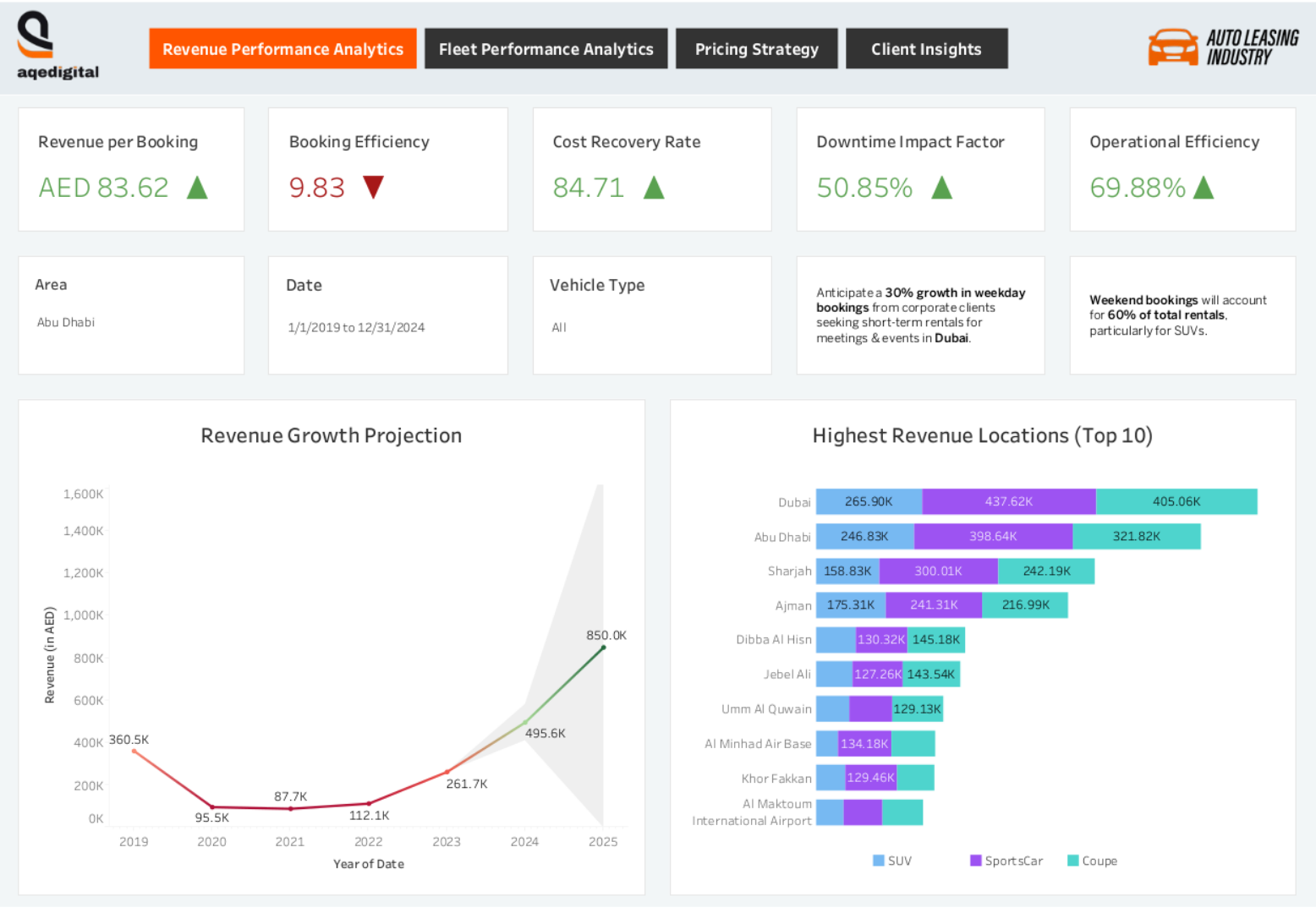
The dashboard became a shared reference for teams with different goals. Operators stopped searching for insights because the system presented them inline with tasks and decision-making. The result was real-time problem solving with fewer manual checks and stronger cross-role alignment.
Case Study: Hospitality Revenue
A hospitality group with 11 hotels in the UAE had data from bookings, events, food and beverage, and profit and loss spread across disconnected dashboards. The strategic redesign consolidated everything:
- All revenue streams — rooms, restaurants, bars, and profit and loss — were merged into a single filterable dashboard. A revenue manager could filter by property to determine whether a drop in restaurant revenue was tied to lower occupancy or was an isolated issue.
- Disconnected charts were replaced with a unified visual narrative. The dashboard revealed how event bookings influenced bar sales or staffing, shifting teams from passive data consumption to active interpretation.
- AI modules for demand forecasting, spend prediction, and pricing recommendations were embedded. Managers tested rate changes with interactive sliders and instantly saw effects on occupancy, revenue per available room, and food and beverage income.
- Compact, color-coded sparklines beside each metric showed short- and long-term trends, making seasonal shifts or channel-specific patterns visible without switching views.
- Predictive overlays such as forecast bands and seasonality markers were added to performance graphs. If occupancy rose but lagged behind seasonal forecasts, the dashboard surfaced the gap for early action.
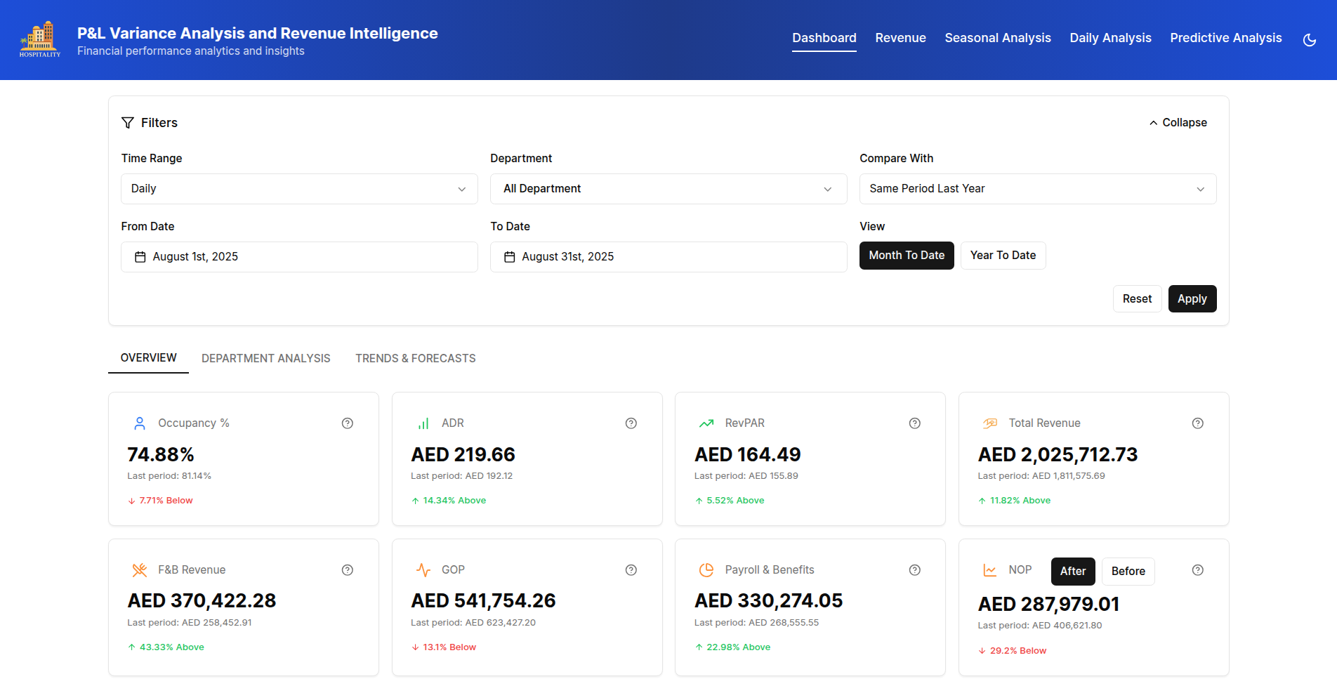
By aligning the dashboard structure with real pricing and revenue strategies, the client moved from static reporting to forward-looking decision-making. Teams from finance to operations could interpret data according to their specific roles.
Case Study: Healthcare Interoperability
A multi-specialist hospital faced fragmented patient data. Doctors consulted separate platforms for electronic health records, lab results, and pharmacy systems to understand a patient's condition — a process that slowed decisions and increased safety risks. The redesign unified these sources:
- Integrated patient medical history. Lab reports, medications, and allergy information appeared in one view. A cardiologist could review cardiac markers alongside active medications and allergy alerts in the same place.
- Upgraded lab report tracking. Each test showed type, date, status, and a summary with labels such as Pending, Completed, and Awaiting Review. Sparklines and color-coded indicators helped clinicians spot abnormalities quickly.
- Medication management module. Prescription entry, viewing, and exporting included dosage, frequency, and prescribing physician details. Specialists could customize views to highlight drugs relevant to their practice.
- Rapid filtering options. Searches by patient name, medical record number, date of birth, gender, last visit, insurance company, or policy number let billing staff locate patients by insurance details while clinicians filtered by visits or demographics.
- Visual transparency through interactive tooltips. Alerts and flagged data points explained their rationale, giving clinicians immediate context such as why a lab value was marked critical.
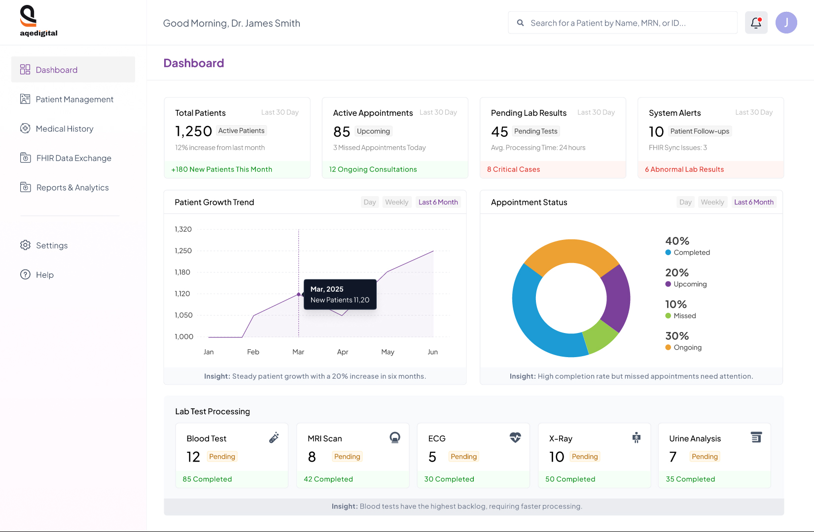
This design encourages active decision-making instead of passive data review. Interactive tooltips provide the reasoning behind alerts, helping clinicians understand implications and next steps without delay.
UX Lessons Across Domains
- Design should drive conclusions, not just display data. Contextualized data enabled faster decisions. A logistics dashboard flagged high-risk delays so dispatchers could act immediately.
- Complexity should be structured, not eliminated. Timelines, layering, and progressive disclosure handle dense information. A financial tool grouping transactions by time blocks eases cognitive load without losing detail.
- Trust requires clear system logic. Users trusted predictive alerts only after understanding their triggers. A healthcare interface added a “Why this alert?” option that explained the reasoning.
- The aim is clarity and action, not visual polish. Redesigns improved speed, confidence, and judgment. In real-time contexts, confusion delays are more harmful than design flaws.
Designing for Decisions, Not Data Volume
Real-time dashboards succeed when they help users act quickly and confidently, not when they simply display the most data. The most effective designs reduce noise and prioritize the metrics that matter, supporting decision-making under the pressure of complex, fast-moving environments. The goal is to balance visual clarity with cognitive ease, respecting human limits around memory, stress, and attention while still meeting technical requirements.
What to Prioritize in Dashboard UX
Structure the interface so that key metrics appear in a clear, deliberate order, making priorities obvious without explanation. For example, a support manager should see open tickets before response times, because the former is the primary driver of action. Beyond ordering, a few practical principles guide the design:
- Use subtle micro-animations and small visual cues to signal changes, helping users spot trends without causing distraction.
- Show data freshness and sync status prominently to build trust in the information being displayed.
- Plan for edge cases like incomplete or offline data so that the experience remains consistent and predictable.
- Maintain accessibility by ensuring high contrast, ARIA labels, and full keyboard navigation.
Common Pitfalls to Avoid
Equally important is knowing what undermines a dashboard’s usefulness. Avoid crowding the interface with too many metrics, which forces users to sort through noise to find signal. Do not rely solely on color to communicate critical information, as this fails for users with color vision deficiencies and in low-light environments. Refrain from updating all data simultaneously or too frequently, as this can trigger cognitive overload. Finally, never hide failures or delays; transparently showing issues lets users adapt their actions to the real state of the system.
Ultimately, view real-time dashboards as decision assistants rather than control panels. When users say, “This helps me stay in control,” it signals that the design respects their cognitive limits and truly enhances their ability to make decisions. That outcome is the definitive measure of success.


