
UI3: A Redesign Built on Feedback
Figma's biggest interface update since 2019, UI3, launched this year as a ground-up rebuild aimed at reducing the complexity that had accumulated across the product. The core goal was to give teams more canvas space while keeping essential tools within reach, but the beta phase proved that not every initial decision served that mission. Floating panels, a signature of the new design, were found to slow people down. As Product Manager KC Oh put it, "Speed is a feature." The team reversed course, making panels docked and resizable, with floating retained only for specific contexts like Figma Design's Minimize UI, Figma Slides' grid view, and FigJam. The panels now also support horizontal scrolling, a long-standing user request that proved trickier to implement than expected.
The toolbar moved to the bottom across Figma products, and the new Actions menu places AI features within easy reach. The eyedropper tool got a refresh as well, allowing users to reuse styles and variables, cycle through color formats, or create a new style or variable directly from the picker. User response suggests the balance landed well: Joey Banks of Baseline noted that hiding the layer panel to see more of the canvas is "a small thing, but it makes a big difference."
Core Workflows: Multi-edit and Typography
Multi-edit reached Figma Design in March, later expanding to Figma Slides. The feature is designed to accommodate different working approaches—whether you work in a structured way or a more exploratory, freeform style. Designer Advocate Mallory Dean describes it as adaptive to the user. The same update cycle brought more powerful typography: text styles can now be overridden with italics, bold, and underline, and users can apply text decoration to underlines. The font picker was improved to automatically detect local fonts, and mixed paragraph spacing is now supported within a single text node.
Organizational and Performance Improvements
File management saw a wave of new tools this year, including file pinning, improved search filters, page dividers, and split tabs. For teams operating across organizations, Figma streamlined how drafts work, added content transfer tools, and refined file move workflows. Auto Layout was redesigned with a suggest feature to help make designs responsive more easily.
On the performance side, dynamic page loading now helps manage the largest design files more efficiently, with optimized memory usage for smoother operation in big files. A revamped memory management system and improved multiplayer experience aim to keep teams working without interruption. Admins got a new sidebar navigation and a dedicated content tab, while the underlying infrastructure gained localized file hosting in the EU, better handling of large asset libraries, and strengthened security controls for Enterprise teams.
Not Just Serious: A Bit of Fun
For April Fun Day, Figma shipped old-school cursors as a throwback to earlier digital design eras, from DOS and Y2K to skeuomorphism and Windows Vista—a feature the team itself calls one "no one asked for at all."
AI that reduces friction, not adds flash
Much of Figma’s AI work this year targeted small but persistent pain points rather than headline-grabbing tricks. Finding the right file or component has long been a drag, and visual search now lets you locate assets by uploading an image or selecting an area on the canvas. Asset search also understands context, so you can find components even when your naming doesn’t match exactly. As Reddit Product Designer Branden Thornton puts it, “I don't even have to go and ask. So small, but hence powerful.” Rename layers applies the same kind of cleanup to file organization.
Generating realistic placeholder content is another area where AI saves time. Replace text content fills designs with plausible copy, while Rewrite, Translate, and Shorten text adjusts wording directly. Make an image creates and edits visuals on the canvas, and Remove background isolates subjects without requiring a switch to another tool. FigJam’s AI-powered mindmaps have become a popular way to explore ideas, and you can now generate a Figma Slides deck outline from a FigJam board, plus presenter notes once the deck is underway.
“There’s a lot of tedium along the journey of bringing great designs to life,” says Noah Levin, Vice President of Design. “Even with a clear vision, you face hurdles just getting to that first draft. We believe AI can help express what’s in your head in new ways—but only if we build it thoughtfully, together.”
We believe AI can help express what’s in your head in new ways—but only if we build it thoughtfully, together.“We believe AI can help express what’s in your head in new ways—but only if we build it thoughtfully, together.”
Rebuilding First Draft
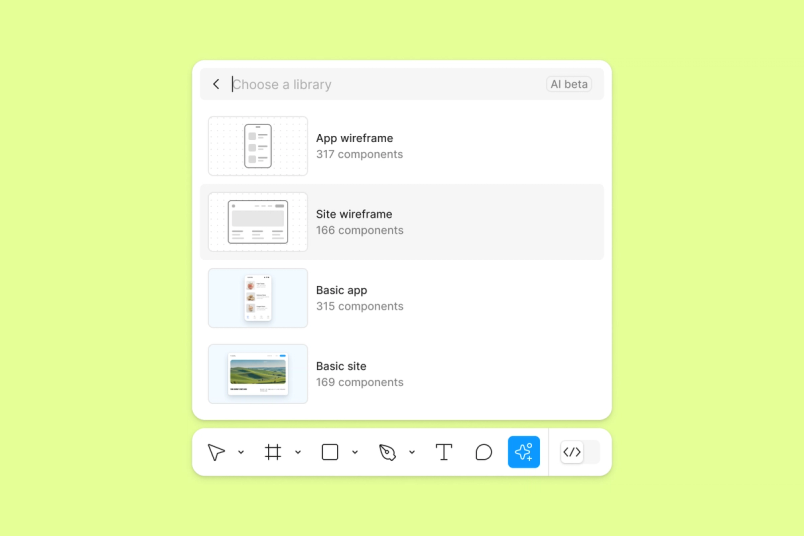
That philosophy led to a rebuild of the Make Designs feature, now renamed First Draft to better reflect its purpose as a starting point for designers. After discovering the underlying design system needed refinement, Figma paused, recalibrated, and reissued the tool with four distinct libraries, letting designers choose their starting point from basic wireframes to high-fidelity designs. The feature remains in limited beta, with plans to extend support to custom libraries so teams can draft ideas using their own design systems.
Dev Mode matures with annotations and Code Connect
“Code Connect is the feature that we’re most excited about,” says Gilson Hoffmeister, Distinguished Technologist at HP. “We can reduce the context switching that developers had to do before. With Code Connect, you can translate components to code. That accelerates the development so much, especially when paired with VS Code. It’s huge.”
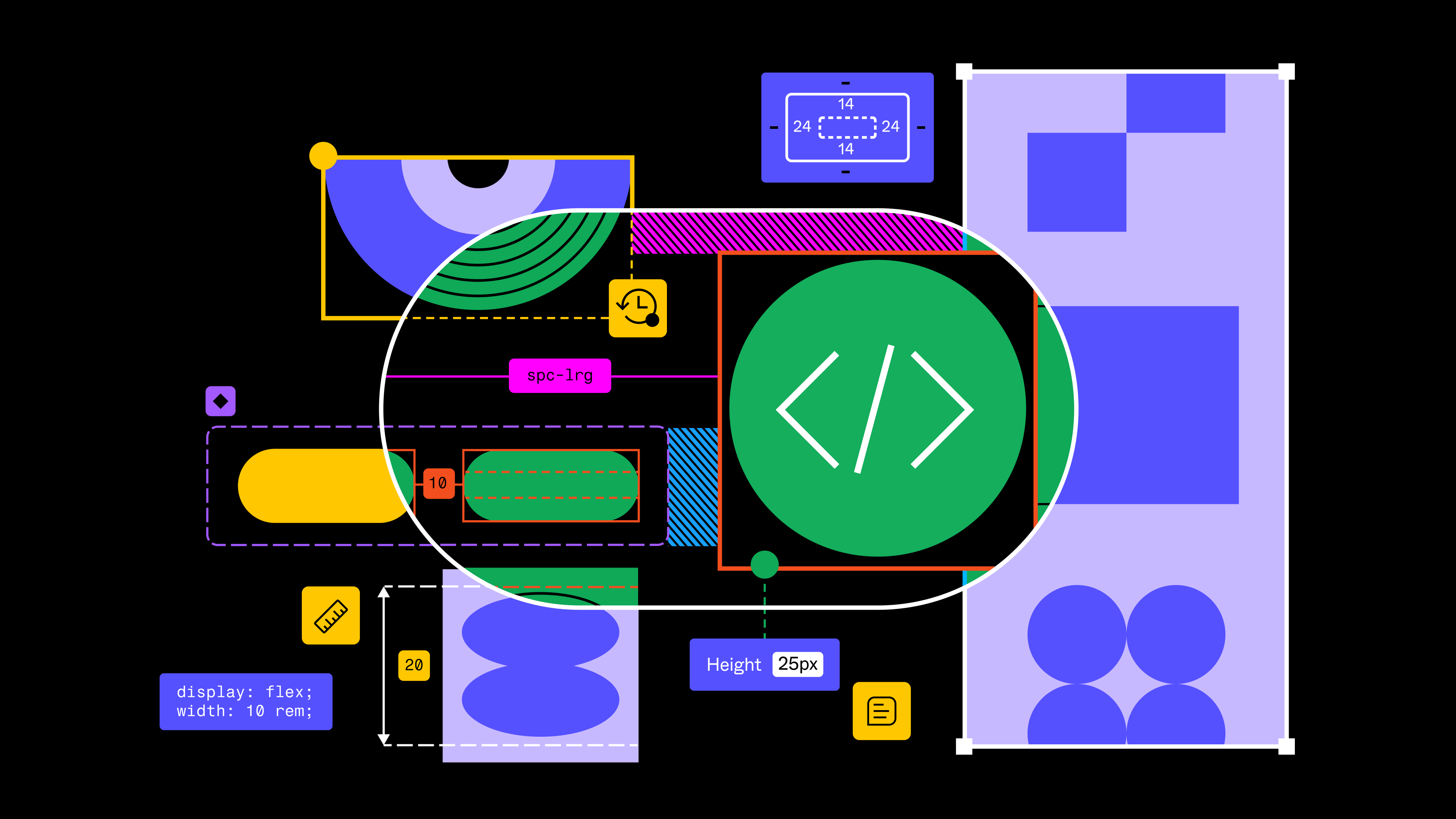
Dev Mode has picked up several additions aimed at making handoff clearer and development faster. New annotation tools streamline designer-developer collaboration, and an improved VS Code extension brings design context directly into code editors. Code Connect makes it easier for developers to adopt the design system accurately by surfacing production-ready code snippets in Dev Mode—whether those snippets come from your own system or a UI kit. Developers can link components to their codebase through a TypeScript configuration, with support for React, iOS, and Storybook frameworks.

“Dev Mode has been great for us,” says Reza Rahman, Staff Software Engineer at GitHub. “It provides a zoomed-in lens on what a developer really needs to focus on, using a language that developers understand. Codegen snippets, in particular, have served as a useful springboard for producing complex layouts, saving us an enormous amount of time.”
Dev Mode will move out of free beta on January 31.
Figma Slides turns decks into a team activity
“The interactivity of being able to poll directly on the spot and see the results in real time is really powerful. It allows everyone on the team, whether you’re a designer, an engineer, a product manager, or any other role in the team, to create awesomely effective decks,” says Charmaine Lee, a Product Manager working on Snapchat’s Lens Studio for AR developers.
With teams creating over 3.5 million presentations in Figma last year, the company launched Figma Slides in open beta to reimagine how decks work. The tool combines familiar presentation features with Figma’s collaborative strength: real-time co-editing in design and presentation modes, smart templates for consistency, and built-in polls and interactions to engage audiences live. Teams can also generate slide deck outlines automatically from their FigJam sessions, smoothing the path from ideation to presentation.
This year’s experimentation with features like tone adjustment in Figma Slides has sparked broader questions at the company. “The success of features like tone adjustment in Figma Slides has inspired us to ask: What other UI patterns are worth reinventing?” says Mallory.
As AI becomes more embedded in workflows, well-structured design systems are increasingly critical—they provide the building blocks that both human and AI collaborators can work with effectively. The AI + Design report found that 89% of respondents expect AI to impact their company’s products in the next year, making robust design systems essential for maintaining consistency at scale.
Design systems mature, and Figma’s own brand gets a rebuild
Design system tooling took a major step forward in 2024, with updates shaped by teams operating at scale. The long-awaited introduction of typography variables gave teams finer-grained control over type, while new variable capabilities for component properties removed the need to detach instances—a meaningful win for maintaining component libraries without compromising their integrity.
Alongside those changes, approved libraries helped organizations enforce quality standards, and deeper variable controls opened the door to more sophisticated theming. The underlying theme, echoed in ongoing conversations with design systems teams, was balancing flexibility with consistency.
To help teams move faster from a blank canvas, Figma introduced UI Kits, bringing design resources from Apple and Google directly into the editor. These ready-to-use assets offer a foundation, particularly useful for those still learning the craft. Mallory, a Figma team member, noted the impact such resources would have had early on: instead of drawing every icon, learners get a simple, complete design system to experiment with.
Figma also turned its attention inward. The UI3 redesign prompted a full rebuild of the company’s own Pattern Library, undertaken by a cross-functional group of designers and engineers to create a new foundation for consistent, accessible products. The Brand Studio followed suit, refreshing the entire visual identity—from the new Figma Sans typeface to a more expressive illustration system and a vibrant color palette—reflecting a brand built for a community that now spans developers, product managers, and entire product teams.
That expanded mission showed up beyond the product, too. A Times Square billboard celebrated creators at every stage, spotlighting six students from NYC nonprofit Mouse.org, whose projects ranged from apps connecting people to food pantries to platforms pairing students with nonprofits. Just blocks away, Amtrak’s team was modernizing the travel experience at Moynihan Station, moving from paper timetables to digital displays and contemporary booking flows. And TikTok product designer Marisa Chentakul flew her parents in from Thailand to see her outfit generator design lit up above the city—proof that the tools are reshaping everyday experiences, not just workflows.
Community plugins and templates push the tools further
The broader creator community continued to extend Figma’s capabilities, with standout plugins tackling key workflow challenges. Unblocked AI and Lummi addressed image editing and generation, Auto Arrange automated element organization, and LottieFiles bridged designs and animation. On the typography front, Peppercorn generated type scales with documentation and variable-based text styles. Other notables included Lil’ Pixel Icon for pixel-perfect vector icons, Charts Modifier for data visualization, and Vector to 3D for dimensional exports.
Plugins also sprang up to streamline work with Figma’s newest features. Handoff, CSS Color Mix, Variables Converter, and Variable History all helped teams work more efficiently, with creators even shipping plugins designed to generate other plugins.
Internal teams were equally active. Razorpay used Dev Mode’s plugin API to drive adoption of its Blade design system, while the design team at IKEA built a custom plugin API to streamline product search experience testing. Their plugin populates designs with real product data and images in a few clicks, replacing a previously time-consuming manual process.
The educational community also stepped up, with educators creating and sharing over 500 new FigJam templates through the Education Creator Program. Frankie Baker, Digital Learning Coach at Frisco ISD, highlighted FigJam’s collaborative value: it removes barriers around confidence, scheduling, and contribution that hamper traditional low-tech collaboration. Figma’s education program expanded to 840 districts across the United States, United Kingdom, and Japan, reaching millions of students. The new Campus Leader program launched at 25 leading US design schools, followed by a campus roadshow.
Config, Framework, and a growing global community
Config 2024 was Figma’s largest gathering yet, with over 10,000 attendees converging in San Francisco. Framework, the design systems conference, brought together system creators from companies like Bumble, GitHub, Verizon, and Hewlett Packard to share practical insights on scaling design systems.
The Friends of Figma (FoF) network grew to 220 groups with 350 leaders worldwide, hosting over 500 events. These ranged from Lima’s Config watch party—featuring an inflatable llama—to Lomé’s Africa Product Keynote on sustainable solutions. The sentiment among attendees was consistent: as one FoF Singapore participant put it, the honest sharing showed that every designer is still a work in progress, with lessons to improve the next project.
To close out the year, Figma released a new song in FigJam, made with Sounds Like These. The track is engineered for a celebratory-yet-focused tone, suited for end-of-year planning, reflective retros, or creative brainstorms.
Looking to 2025, the work continues to center on bridging gaps—between design and development, between early ideas and polished presentations, between imagination and reality—always in partnership with the people using the tools.


