Home/Design & UX/Everything Developers Must Know About Figma — Smashing Magazine
Design & UX
Everything Developers Must Know About Figma — Smashing Magazine
Christine highlights some of Figma’s features and possibilities to help you build a design that aligns with code as much as needed and improve your team work.
CV
Christine VallaureSmashing Magazine
·August 15, 2022
Components, Styles, and Responsive Layouts: A Developer’s Guide to Figma
Figma is more than a drawing board. For development teams, understanding how designers structure files—components, variants, styles, and responsive tools—can make collaboration smoother and handoff far less painful. Here’s what actually matters from the design side.
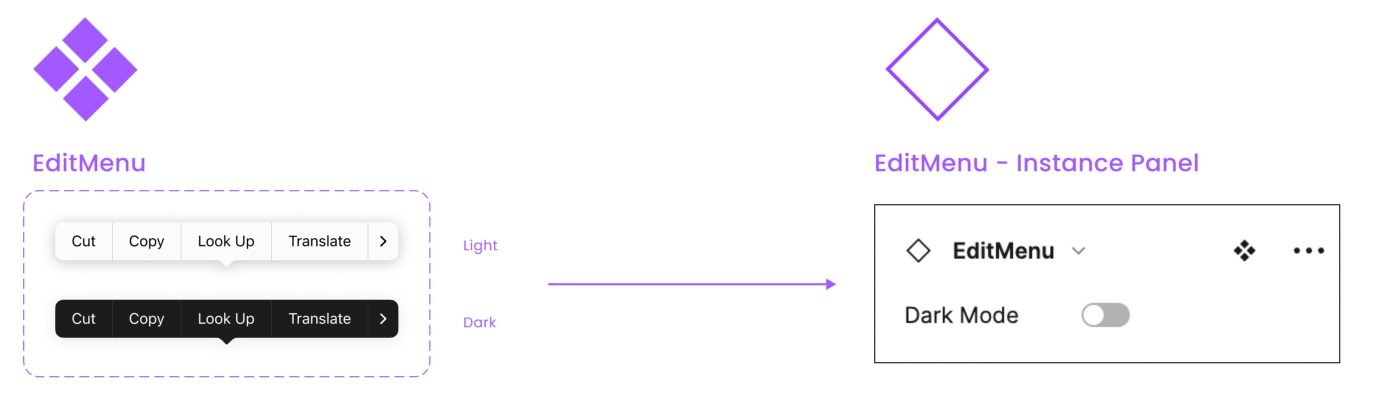
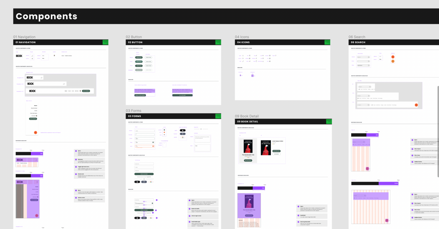
Designers work with reusable UI components and instances in Figma, just as you work with code components. Crucially, components can be nested, allowing teams to follow atomic design principles as they build up complex interfaces from smaller pieces.
Variants for States and Properties
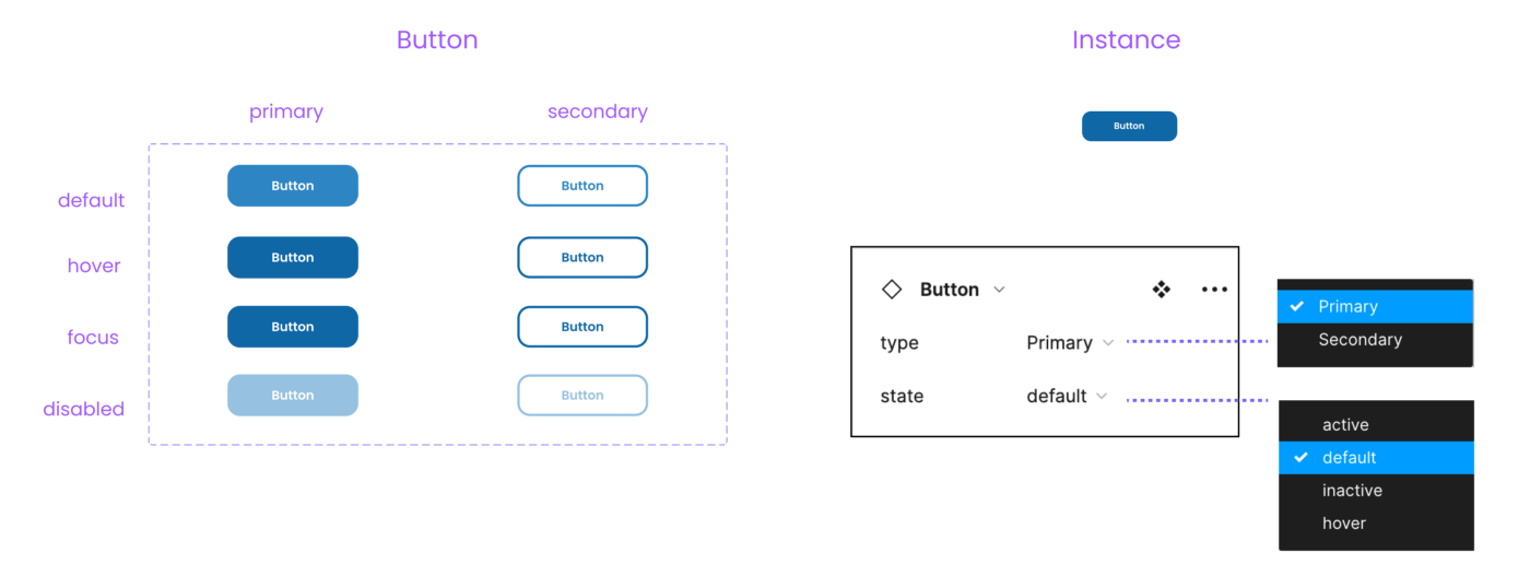
Component sets support variants, which can be swapped directly via the properties panel. This means every state—hover, active, disabled—lives in one documented place. Variants can be one-dimensional or multi-dimensional, with several properties attached.
Since March 2022, Figma supports component properties: text props, swap props, and toggle props, which can be combined. This moves design closer to the component model developers already use.
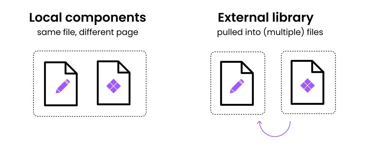
Components—and styles—can be stored locally or in external libraries. Pulling from a shared library into multiple files keeps a single source of truth across projects.
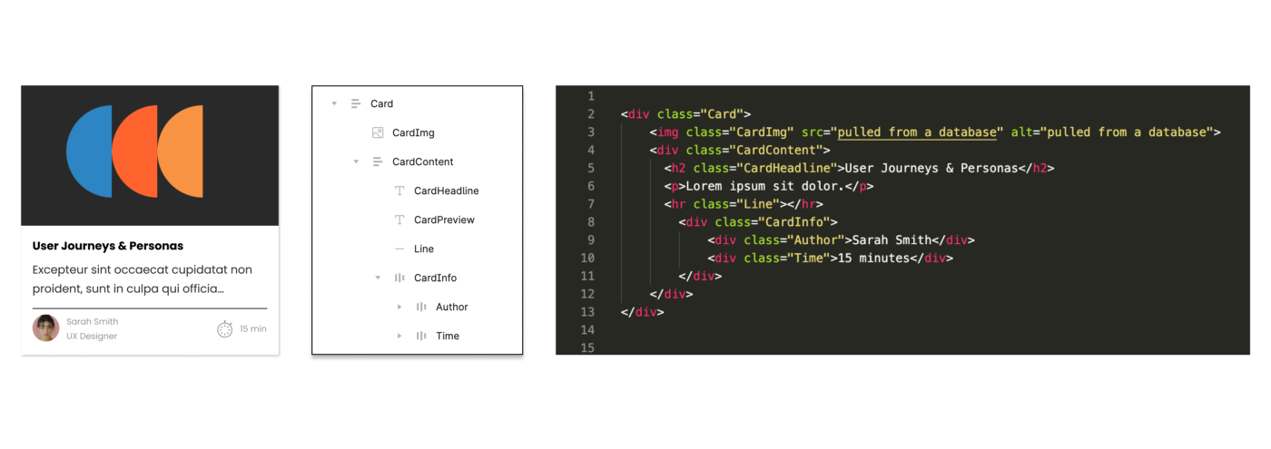
Aligned component names and structures between Figma and the codebase pay off. To get there, design needs visibility into your code structure. A quick session walking through the component tree makes alignment realistic from the start.
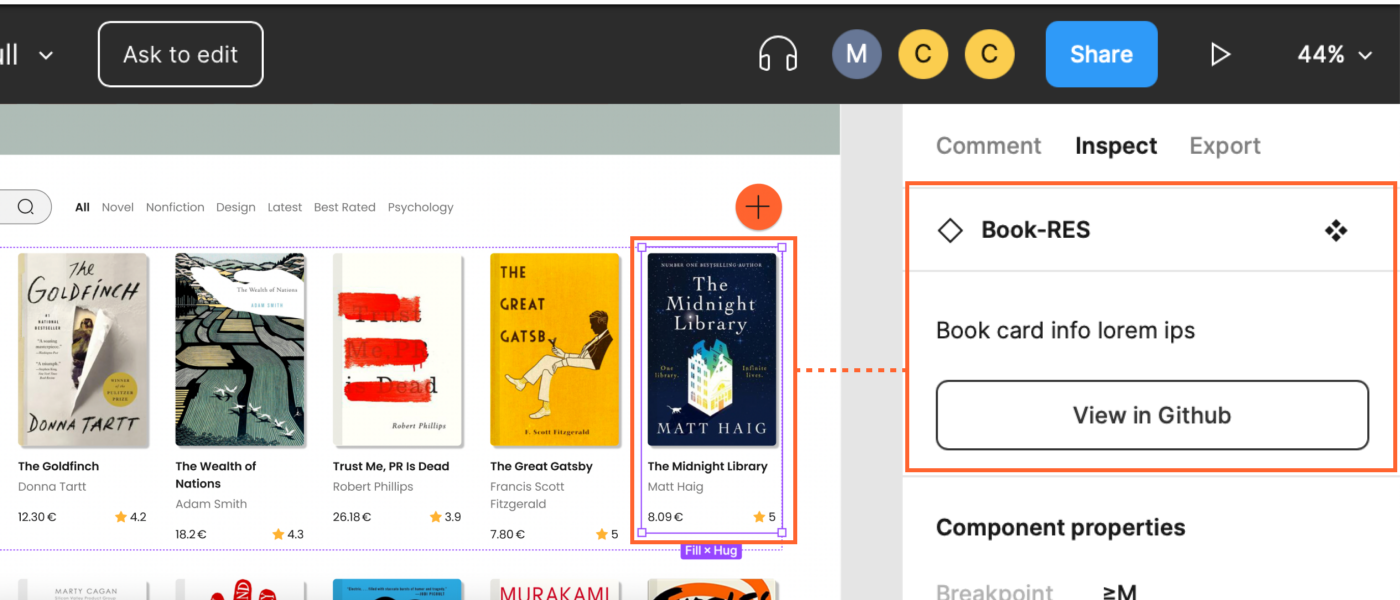
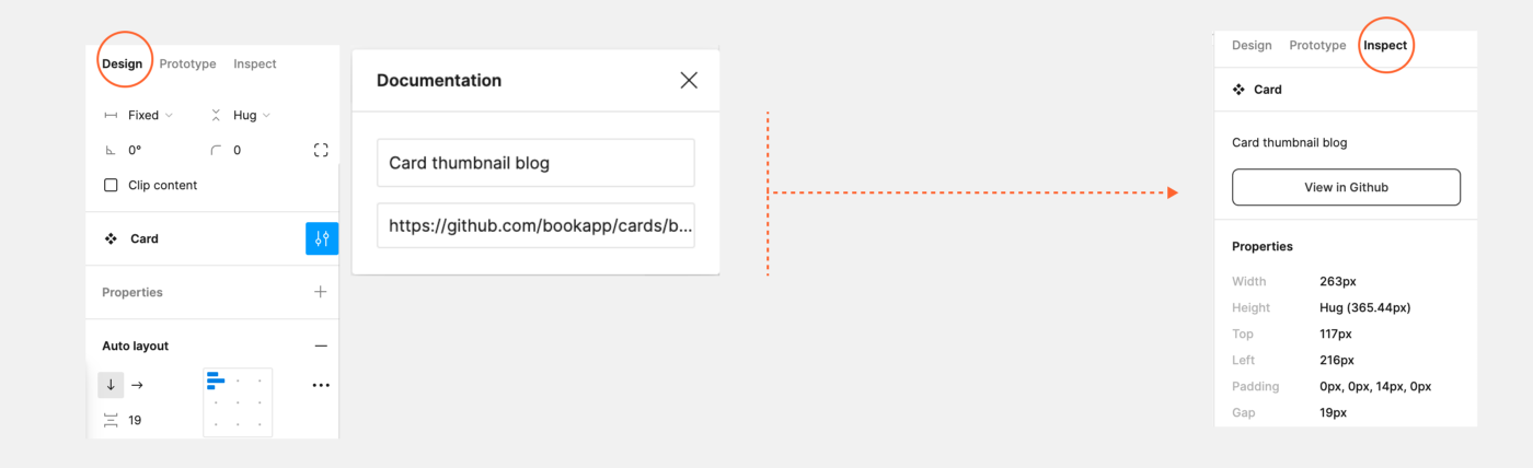
Linking UI components directly to code is simple: add a URL and description in the Figma component documentation. That link shows up as a button in the Inspect tab, pointing straight to a GitHub section or similar. The description also becomes searchable in Figma’s component search, which helps in large systems.
You can also copy any Figma file or frame link (Cmd + L) and embed it live in Notion, GitHub, or other docs. The embed updates automatically as the file changes, making it a solid addition to code-centric documentation.
Swap Libraries for Testing
If two libraries share identical component and style names, you can swap them. This enables test environments in Figma before a new style or component reaches the master file—useful for more advanced, already-aligned setups.
Storybook Connect Plugin
Plugins like Storybook Connect aim to align Figma components with code components directly. Full alignment requires maintenance, however—so reserve it where it delivers value, like a design system. For simple pages, clean components still help but need not map one-to-one to code.
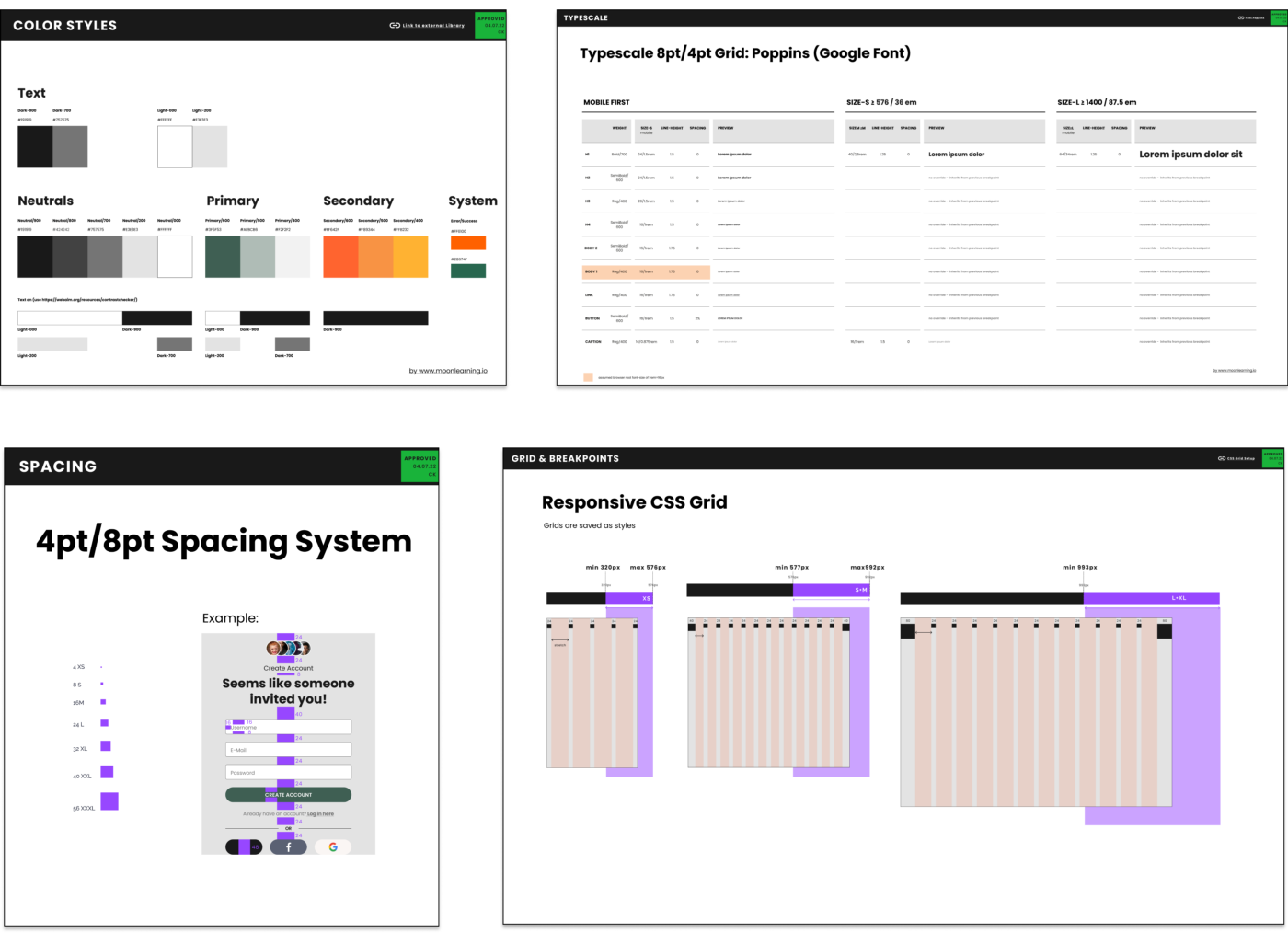
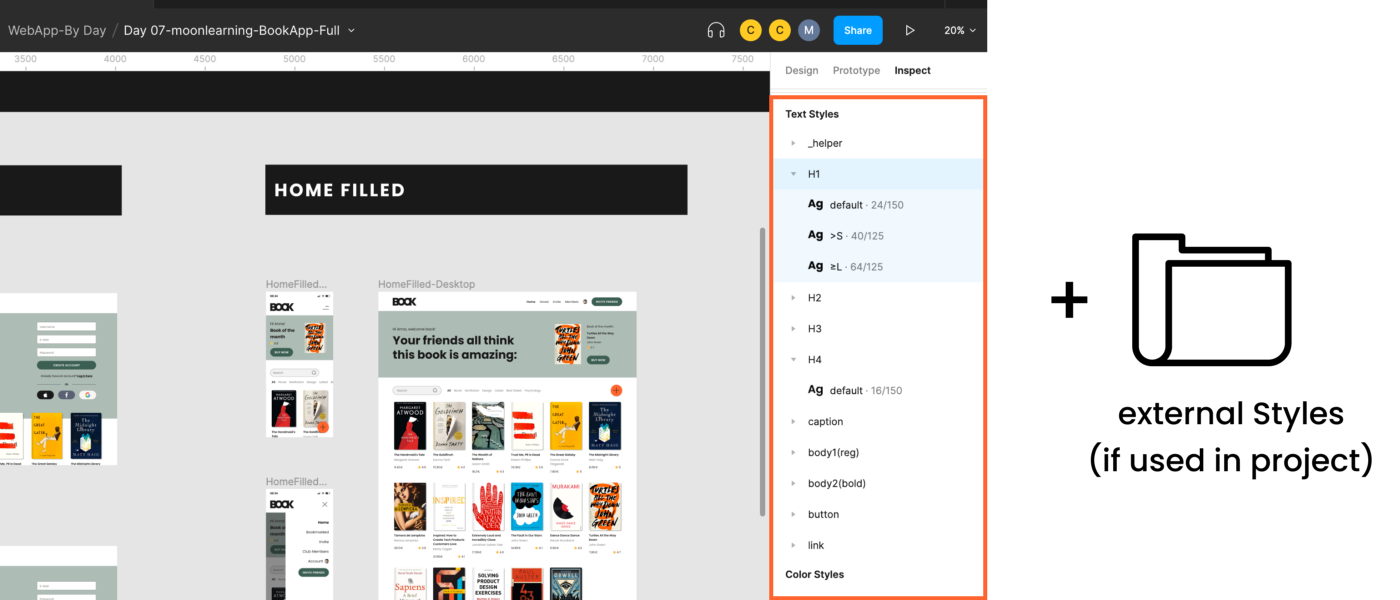
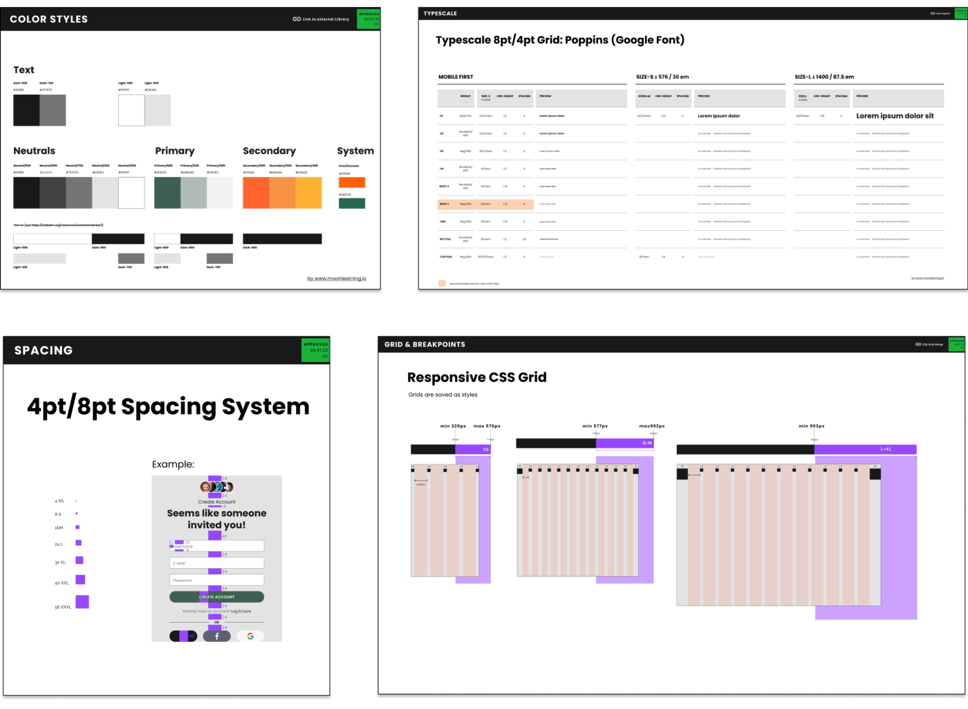
Figma supports styles for color, text, grids, and effects like shadows or blur, which you can reuse across the design. That’s the extent of it—there are no spacing styles and no interdependent tokens. Documentation is usually kept in the Figma file itself or a separate file, and styles can be linked externally.
Figma’s responsive toolset is threefold: Auto Layout, Constraints, and Grids. They work individually or combined, but it’s essential to know that Figma has no automated breakpoints.
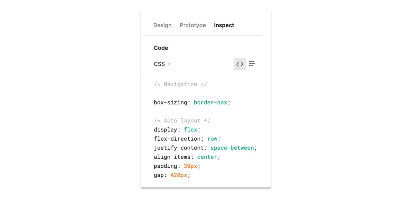
Auto Layout is loosely based on flexbox, visible when you inspect frames. It supports:
Space between items (positive for spacing, negative for stacking)
Padding on each side individually
Alignment
Packed or space-between child distribution for navigations
Resizing behavior: fixed, hug content, or fill container
Nested auto layouts for complex components or full pages
Relative positioning inside auto layout frames
Automatic adaptation to new content while preserving settings
Constraints vs. Auto Layout
Constraints pin elements to the parent frame when it resizes, useful for simple cases. However, they respond only to parent size changes, not content changes. You cannot apply both auto layout and constraints to the same frame—only one approach per frame, aside from relative-positioned exceptions inside auto layout.
Grids and Their Limits
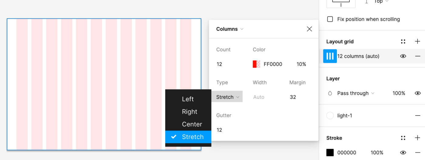
Applying a grid to a frame lets you control columns, gutters, margins, and behavior. When a grid is present, constraints favor the columns as the parent frame, creating straightforward responsive behavior.
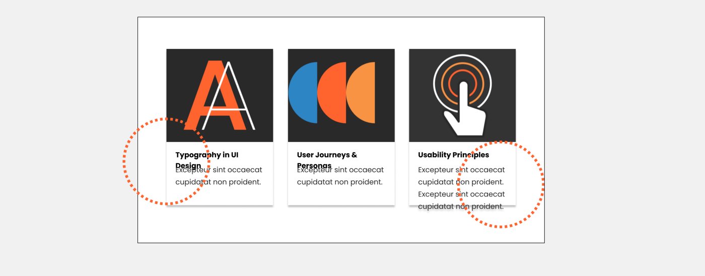
Use auto layout elements inside a parent frame, then apply constraints on that frame. Content reshuffles while parameters remain intact—yet horizontal spacing still won’t scale dynamically.
Pure Auto Layout Approaches
For full control, design entirely with Auto Layout. You can either mimic a grid by setting space-between equal to the gutter, or skip a formal grid system entirely and model flexbox, CSS Grid, or anything else. Mixed fixed and fluid sizing is possible too, though Auto Layout distributes elements equally: unequal 60/40 splits fall back to 50/50 unless you fix the width of one element and let the other stay fluid.
Responsive Testing Without Breakpoints
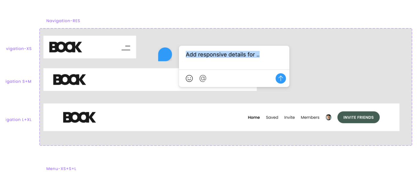
Figma offers no automated breakpoint system, so testing a design from mobile to desktop is a manual process. You can, however, build your own visual breakpoint ranges by hand. Place your auto-layout components inside those ranges and check where adjustments become necessary—for example, switching a full-fluid mobile layout to a fixed-size overlay at a breakpoint you call S. This gives a realistic preview of how components and entire pages will behave.
For responsive grids, the same approach applies. Set up grids for the screen-size ranges you need, save them as styles, and re-apply them when checking each range. If two adjacent breakpoints share a grid, label it accordingly (e.g., Grid: S+M from 576 to 992) so you can split it later if margins change.
Responsive typography is another manual task. While CSS applies media queries automatically, in Figma you must change the text style yourself when crossing a breakpoint. For fluid typography using vw units, clamp(), or calc(), you cannot simulate the behavior in Figma—test that in the browser at specific min and max widths to get a rough estimate.
Once your components and pages are set up responsively, you can feed them into the Breakpoints plugin for a tidy overview of the full responsive range.
Bridging the Design-to-Code Gap
The classic handoff—static design in, browser result out—is a common source of friction between designers and developers. Auto layout narrows that gap, not by eliminating surprises, but by giving both sides a solid, shared foundation for fine-tuning. Some behaviors, such as responsive typography, will always be easier to verify in CSS than in Figma, and that is acceptable. The goal is a constructive dialogue built on mutual understanding of the tools.
In the Inspect tab, Figma suggests that its auto layout is “a thoughtful subset of flexbox”. That is guidance, not a mandate. Figma only offers constraints and auto layout, and neither maps perfectly to CSS. Prefer a more direct technique in the browser? Use it. The implementation decision stays with the development team.
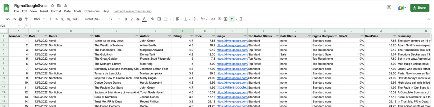
Figma will not connect to a live database, but third-party sync plugins get you close. Plugins such as Google Sheets Sync, Airtable, and Notion Sync let you pull actual content into your designs. Name layers with #columnname, run the plugin, add the link, and sync. Variants can even be swapped dynamically with this method.
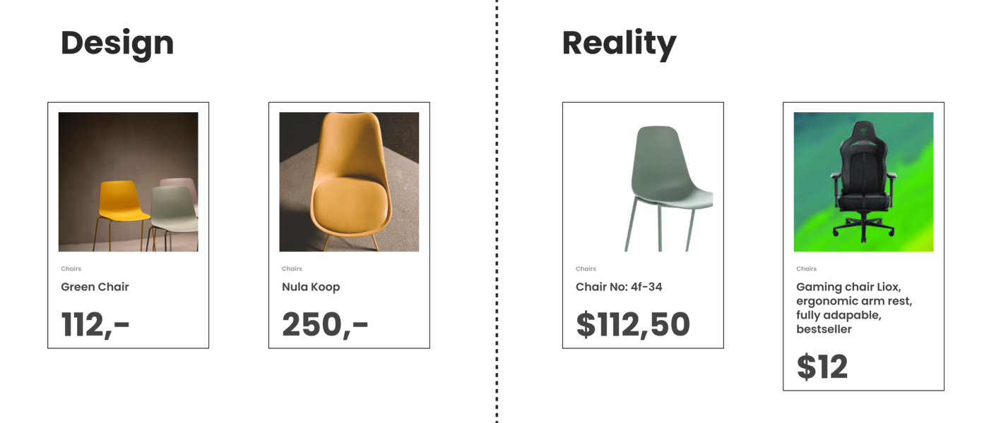
Realistic content is more than a nicety. Testing with real copy and images surfaces layout shortcomings early and reveals whether the underlying database or image library needs attention to meet the brand standard. At a minimum, test components across ideal, minimal, heavy, empty, error, and loading states before release.
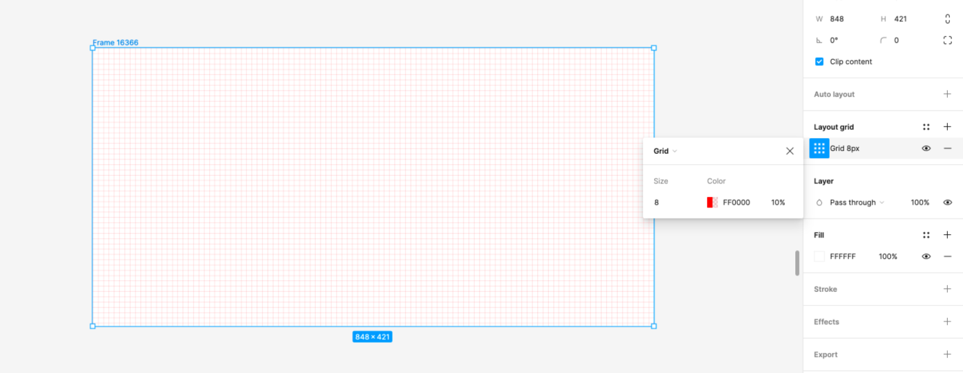
Figma’s background grid option is a visual guide, not a spacing model. Many designers default to a hard grid for spacing because they lack dedicated spacing blocks. You can work around it by setting the nudge amount to 8 (press Cmd + /, search “nudge”, and set it), then using the arrow keys with Shift held to move in increments and Alt held to preview distances.
It is worth pointing out early that CSS has no equivalent background grid. Spacing in CSS is measured from element to element in spacing blocks—including line-height—not against a visible grid. If you explain the soft-grid concept, designers can align their mental model with how spacing works in code.
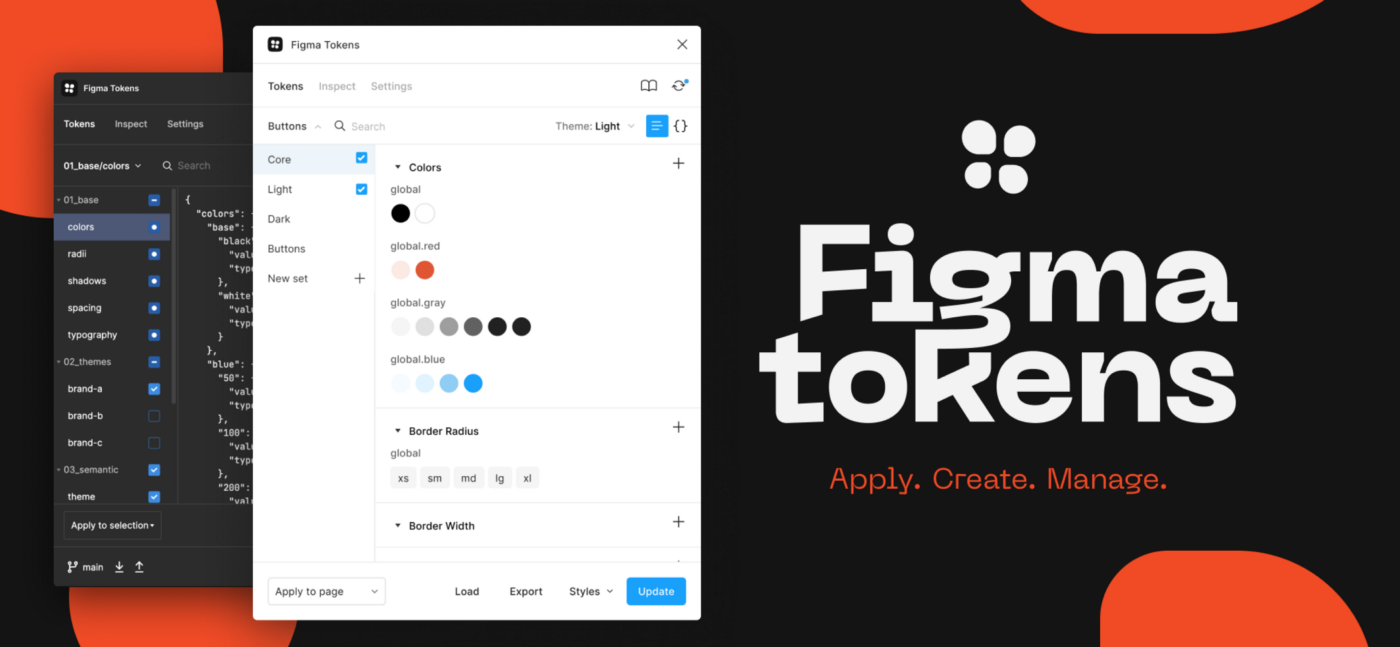
The Tokens plugin provides another path: define the real spacing system as tokens and apply them directly to components, keeping design and code on the same scale.
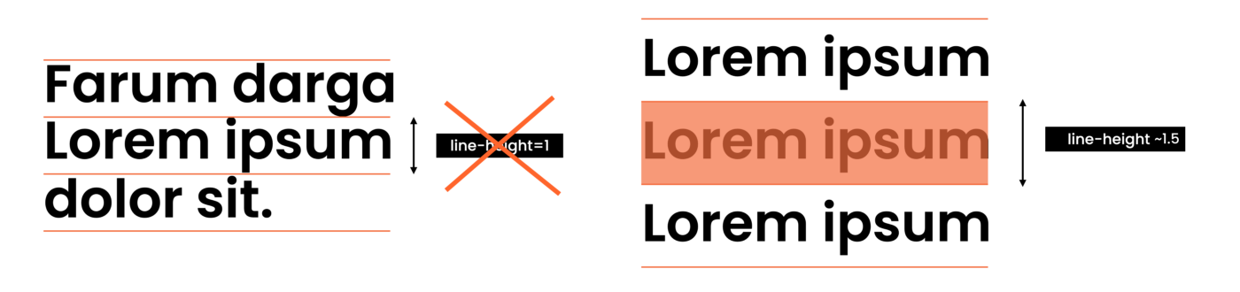
Designers with a print background often expect text to align by baseline. Figma (like CSS) uses line height instead, which creates an apparent surplus of space above and below text frames. The usual fix—manually setting line-height to 1—is a workaround that breaks when text wraps or content length changes. UI design is dynamic: screen sizes shift, content gets added, and translations expand text. A single line today may wrap tomorrow.
Figma also expresses line height in px rather than the unitless notation used in CSS. Percentages work as a shorthand: 1.5 in CSS equals 150% in Figma, although the Inspect tab will still report px. Emphasize that natural line-height is intentional and that designers should not force values to remove perceived whitespace—the CSS layer will handle it equivalently.
Figma operates exclusively in px at 1px=1pt. There are no relative units like rem or em. If a designer hands you a file full of px values, they are not specifying hard-coded output—they are using the only unit the tool offers.
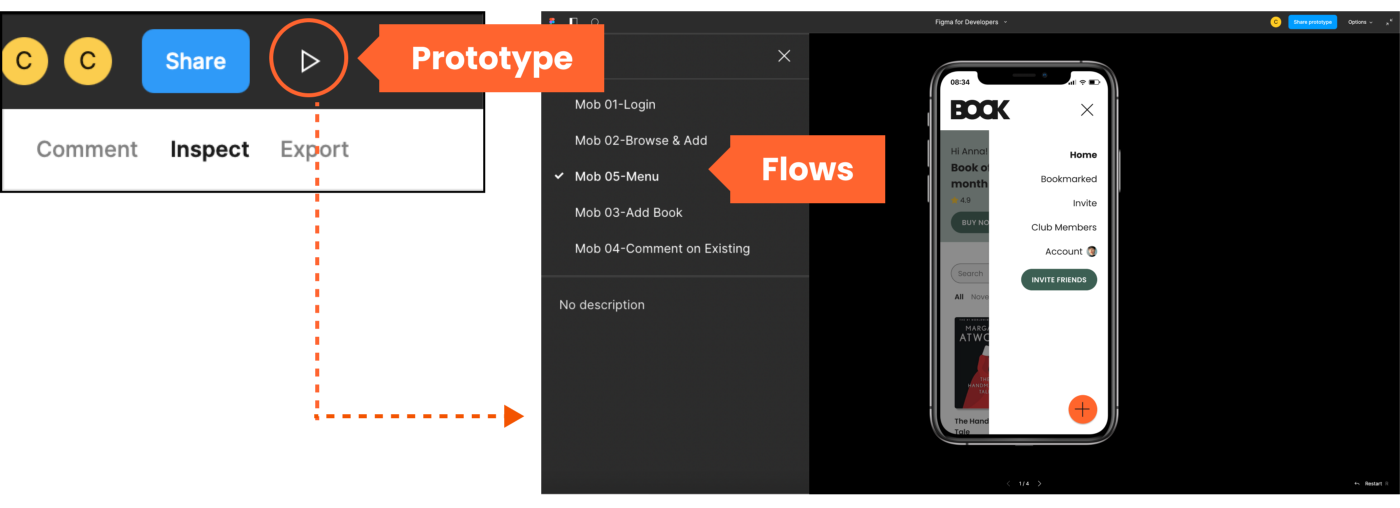
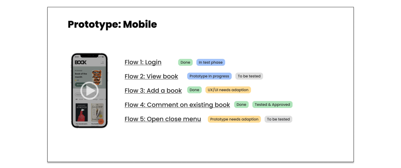
Figma’s prototype mode is surprisingly capable for a design tool. Using the play button in the top-right corner, you can preview full flows by linking frames to pages or overlays and animating between component variants. Each flow lives inside the file layout and is easy to organize for testing and navigation.
A Developer’s Tour of a Shared Figma File
When you are invited to a Figma file with “view only” rights, you get everything you need to pull specs, export assets, and understand the design structure—without waiting on the design team for handoff exports. Here is what you can do once you are in view mode.
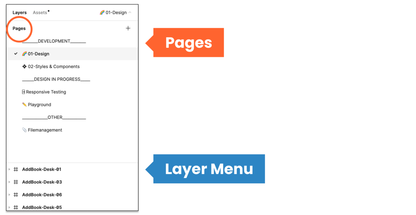
Pages Give Structure
On the canvas you’ll see frames, but the file’s real organization lives in the pages listed above the layers panel. Teams use pages differently—some for versions or sprints, others to separate design, components, and testing areas. Do not skip them; they are the file’s skeleton.
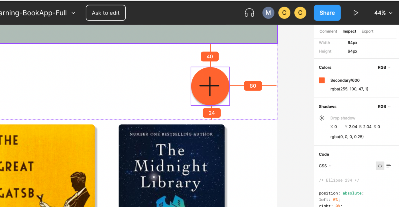
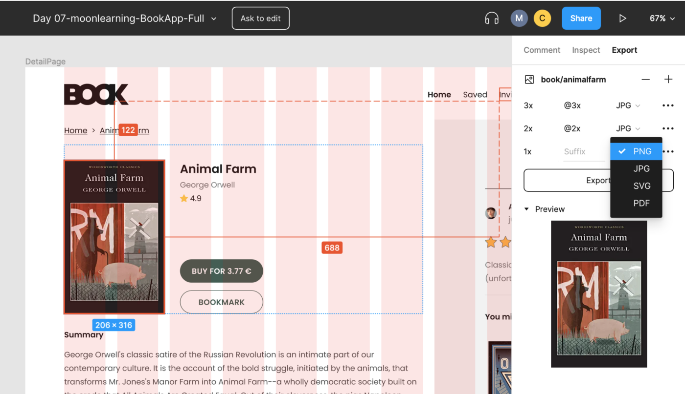
In view mode, the inspect menu opens automatically. Click any element and you see the distance to nearby objects plus the properties in the right-hand panel. You can switch the readout between CSS, iOS, and Android.
Clicking on a component instance also surfaces any linked code documentation and comments in inspect mode—useful when the UI team has attached docs to main components. Any URL works there, but GitHub links render as a nicer custom button.
Click empty canvas space to list all local styles in the file. External library styles won’t appear there, so rely on the design team’s style documentation for the full picture of internal and shared styles.
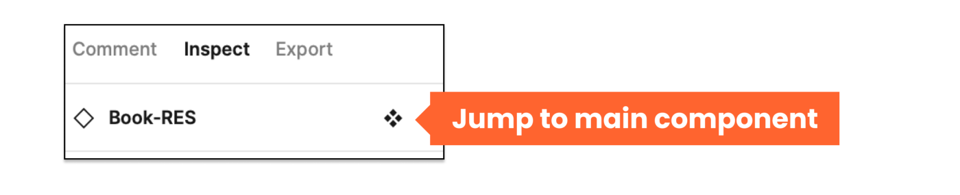
Select an instance and click the diamond icon to skip to its main component. There you find the design specs and measurements. This usually lands you in the Figma UI component library—a local page or an external document with the UI team’s agreed structure. If that page doesn’t exist, ask the design team to create it.
There is no magic automation for a style and component overview in Figma. The design team must set it up and maintain it; the format will vary by team.
Export What You Need, When You Need It
View mode allows asset exports in JPG, PNG, or SVG at any @size. Instead of walking the design team through a bulk export, set size directly: for a custom width, type 300w instead of 3x, and Figma keeps proportions. The same works with h for height.
From view mode you can also hit the play button in the top-right corner to launch the prototype presentation. Designers typically set up flows here, giving you a clear sense of navigation and screen-to-screen behavior.
Tip: The prototype menu lets you generate a shareable link for each flow. Use those links to track design review or testing stages in your team planning tool.
Christine is a UX/UI Designer with a passion for code with over ten years of experience. She is the founder of moonlearning.io , an online learning platform. … More about Christine ↬
Strong UX ideas do not secure investment on their own. Through a worked example, Alex Williams breaks down how to define business value, calculate costs, test causality, and build a credible case for the return on a design initiative. - UX - Design - Business