
Sticky Menus: When They Help and When They Hurt
Sticky headers and menus are a common pattern for keeping primary navigation or calls to action within reach. They stay visible while users scroll, which can speed up navigation and improve the discoverability of key content, particularly on pages where users are expected to switch between different views or compare data.
But sticky menus are not a universal win. They can obscure content, create accessibility issues, and sometimes simply get in the way of the user's primary task. The decision to make a menu sticky should be driven by the job of the page itself.
Assess the Page's Primary Task First
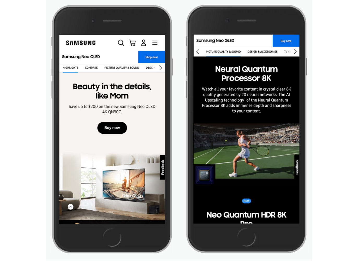
If a page is meant to convey information and users are not expected to navigate much, a sticky menu is unlikely to add much value. In fact, it will just eat up screen real estate. These menus become valuable when the design anticipates heavy navigation within the page: long landing pages, product pages, and filter-heavy interfaces all benefit from persistent access to tabs, A-Z indexes, or section navigation.

Data tables are another scenario where sticky elements earn their keep. When users scan rows and columns to compare items, keeping the header visible helps them stay oriented and reduces mistakes.

Even in these beneficial cases, sticky bars are most effective when they are kept compact, offering no more than roughly five items. This constraint forces teams to prioritize the most critical actions rather than overwhelming users. When you need to expose more options, you can defer to an overflow or overflow-like control.
Beware of Space Constraints and Keyboard Trap
The standard critique of sticky menus is that they take up space on the screen, making it harder to read and interact with the underlying content. On mobile, those constraints become tougher. When keyboards pop up for form entry, they can consume a large amount of the viewport, leaving very little room for both a sticky bar and the form fields themselves. Replacing the sticky menu with an accordion in form contexts can prevent a frustrating user experience.
Sticky menus also require careful handling for keyboard and zoom users. They can cover focusable elements as users tab through a page, and internal anchor links can jump to content hidden behind the sticky bar. The scroll-padding property in CSS should be set to account for the sticky bar's height. Zooming in often breaks these menus altogether, so it is critical to ensure that sticky elements do not interfere with content visibility at higher zoom levels.

Don't Let a Menu Become Its Own Scrollable Region
When a sticky menu holds more items than fit on the viewport, the temptation is to make that menu scrollable. This creates nested scrolling areas, where users may attempt to scroll the page but instead scroll the menu, or lose track of the fact that additional items are hidden below the fold of the sticky pane.
These overly long sticky menus lead to discoverability issues and frustrating mis-taps. The more robust solution is to avoid these long, unscrollable lists. Instead of trying to compress an entire navigation into one floating bar, use an expandable accordion or a drop-down that yields to the content space. That's often a simpler and more forgiving interactive model.

Partially Persistent Menus Can Offer a Middle Ground
An alternative to an always-on sticky header is a menu that appears conditionally. As the user scrolls down to read or interact, the menu hides to free up space. The moment they scroll up — a signal of intent to navigate or revisit — the menu slides back into view.

Timing matters with this pattern. A scroll-up gesture can be a quick, accidental motion, so revealing the menu instantly can feel jarring. A slide-in animation lasting between 300 to 400 milliseconds helps keep the transition natural without distracting the user from the task at hand.
Alternatives to a Sticky Approach
Sticky navigation is not always the answer. One way to sidestep the problem is to keep pages shorter, so users never lose sight of the page's overall structure. If a long page is a requirement, the page can be structured to include internal action points throughout the content. Repeating CTAs or navigation within the flow of the page can reduce the need for a single persistent control.

A table of contents at the very top of the page, anchored to corresponding sections below, can serve the same orientation function as a sticky menu, provided you also give users a simple way back to the top — a static or in-flow "back to top" link accomplishes this.
Prioritize Menu Items Carefully
The final test for any sticky menu is to weigh convenience against obstruction. They are beneficial when the page is inherently action-oriented: save, compare, filter, or navigate across sections. They are most unwelcome when users either need to read deeply or are constrained by limited screen space, such as with mobile forms.
Sticky behaviors also carry accessibility overhead. You have to plan for users who zoom, use keyboard navigation, or jump to anchors, making sure the sticky bar never blocks the content they are trying to reach. If you add a sticky menu, add it because the use case requires it and keep it unobtrusive; the focus of the page should be on its content, not on the chrome around it.
- "The Problem With Sticky Menus, And What To Do Instead", by Adam Silver
- "Sticky Headers: 5 Ways To Make Them Better", by Page Laubheimer
- "A Different Approach To Sticky In-page Navigation", by Corey Snyder


