Why Car HMI Design Is Different
A human-machine interface (HMI) is any interface that lets a user interact with a digital system. For decades, that meant the personal computer. Today, HMI is built into phones, smartwatches, IoT devices, and vehicles. Car HMI design is a younger discipline with its own constraints, and it has quickly become a deciding factor in how users judge a vehicle. Drivers now expect a car to behave like the gadgets they carry every day, and they assess the whole car experience through the quality of its interface.
A Short History of the Digital Cockpit
Digital HMI first appeared in the early 1980s, when the feature count of ordinary vehicles was rising quickly. Designers needed a way for drivers to manage all the new functionality, and two approaches emerged. German manufacturers favored analog controls, adding physical buttons for each feature, while American and Japanese manufacturers opted for screens with dynamic content.
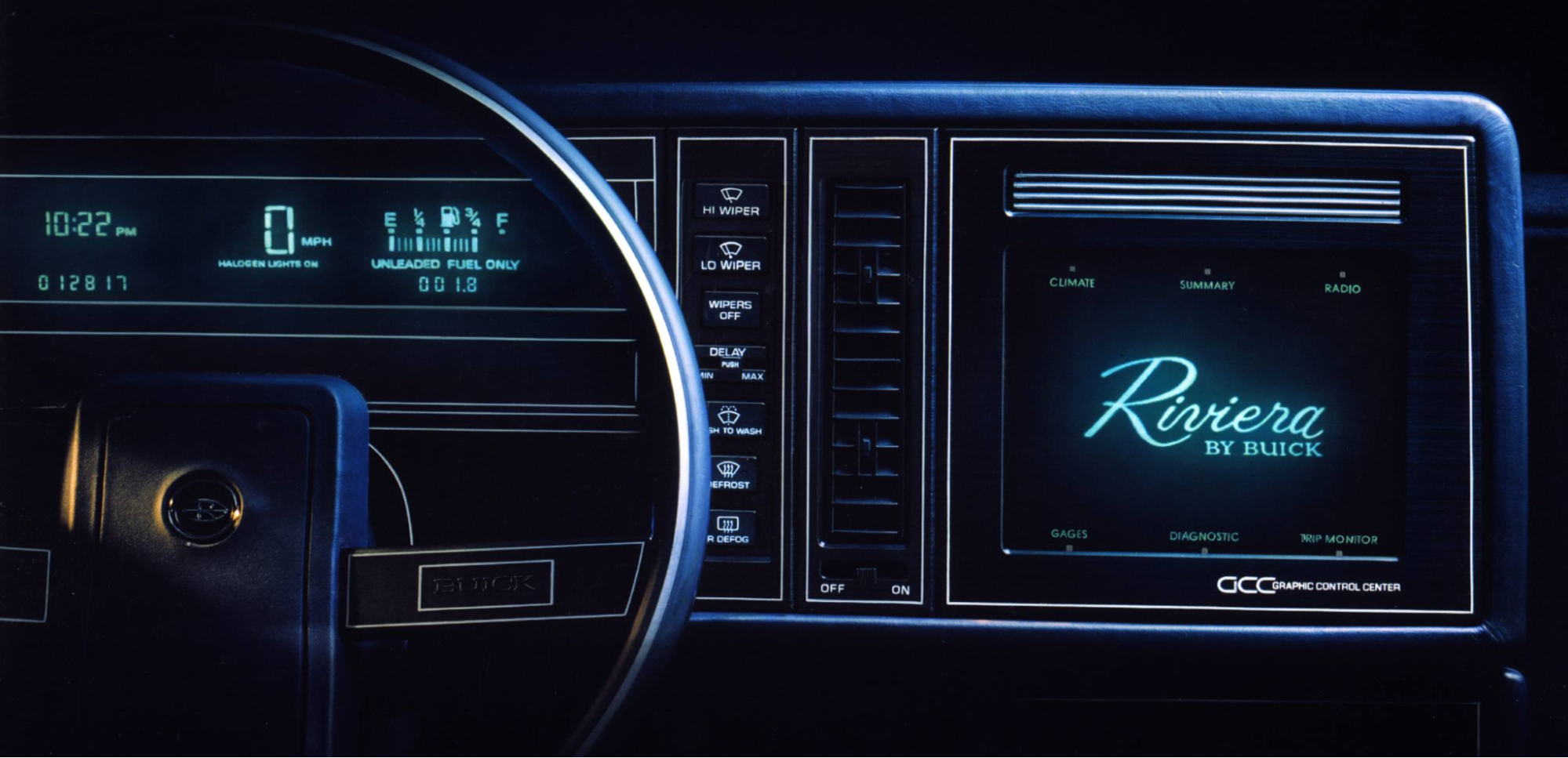
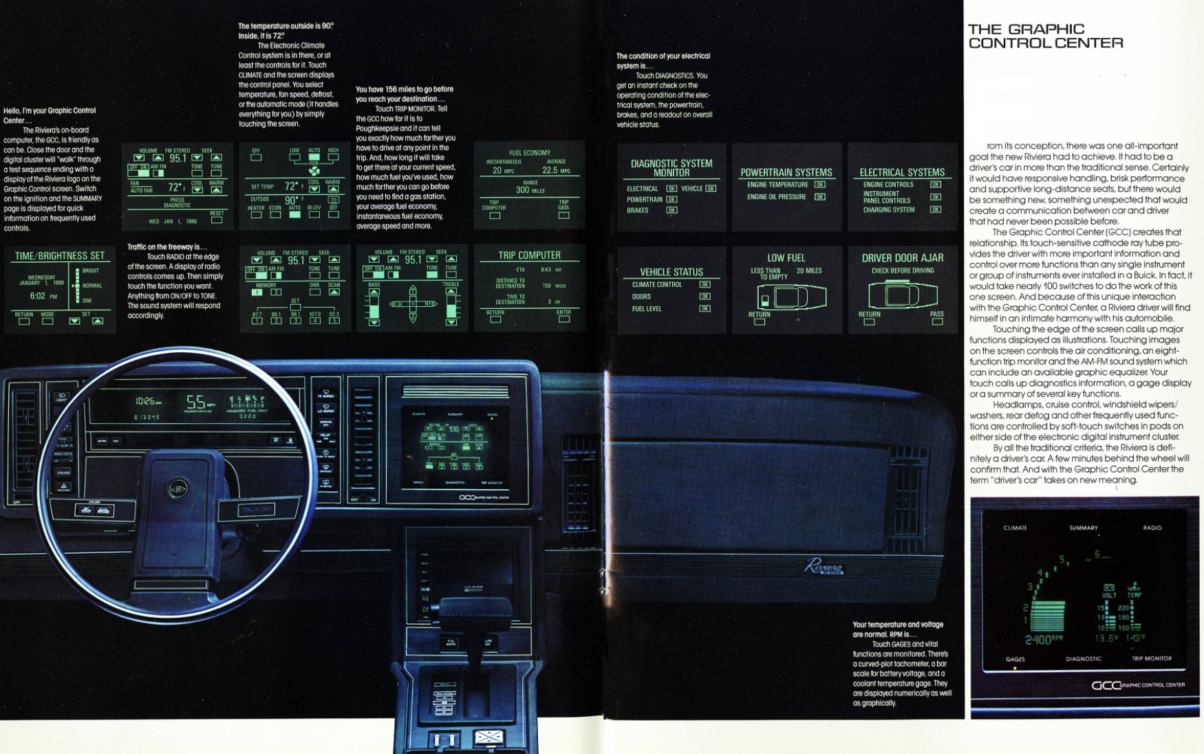
One of the earliest production examples came in 1986 with the Buick Riviera, which used a monochromatic touchscreen to control radio stations and climate settings. The layout was clearly inspired by aircraft instrumentation.
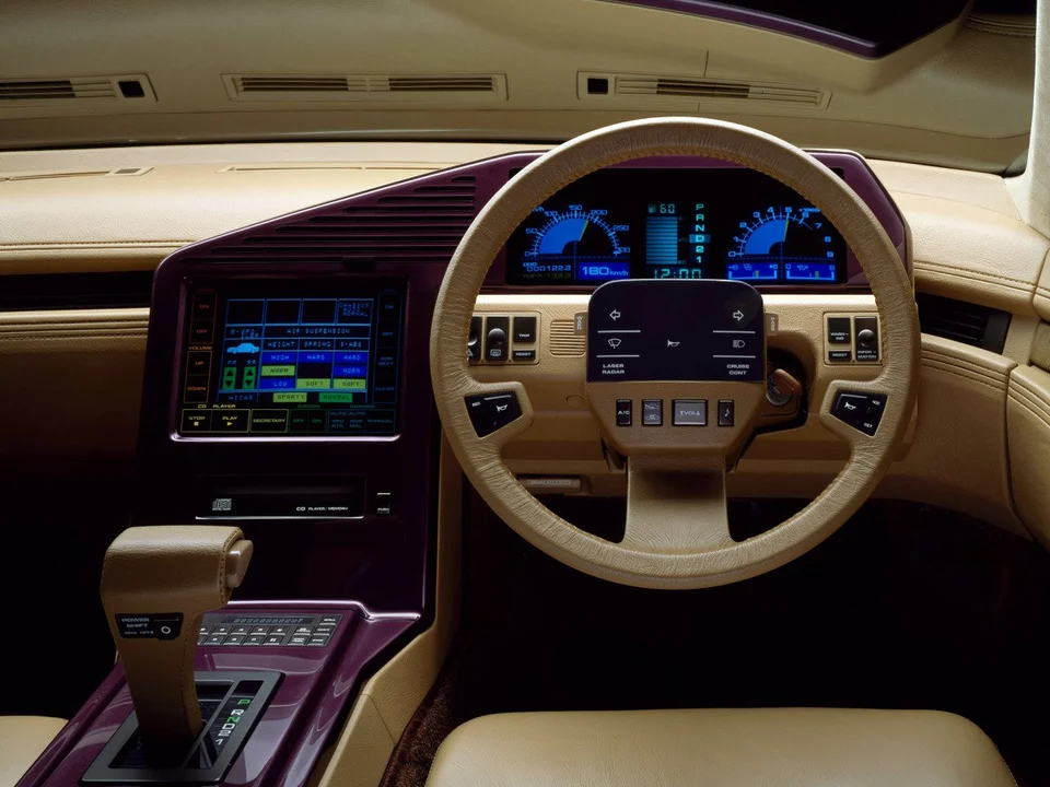
Nissan’s CUE-X concept from 1985 was another milestone. It featured color touchscreens with refined graphics, and the arrangement of its controls looks remarkably close to what we see in modern cars.
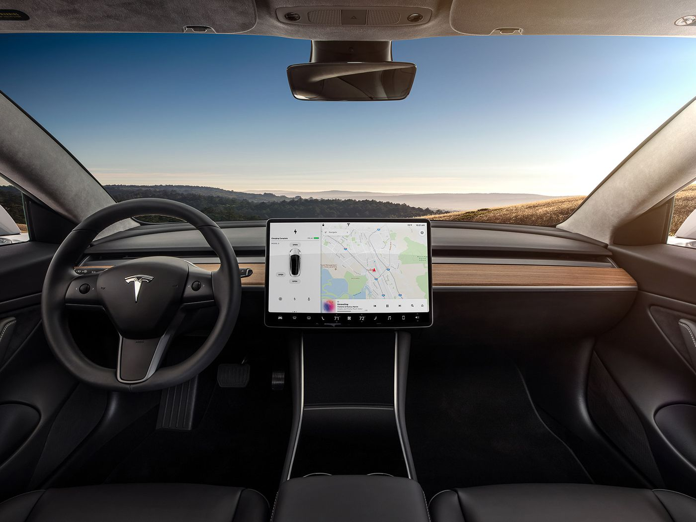
Today’s HMI is a hybrid: part vehicle control center, part entertainment system. The same interface that adjusts climate settings and plots a route is also expected to stream video.
Why Automakers Adopted Digital Interfaces
Digital HMI has only recently reached the mass market. A few years ago, large in-cockpit displays were a luxury-car feature. The shift has come for practical reasons as much as technological ones.
The biggest driver is cost. Building one display into a cockpit and pushing software updates—the way mobile phones get them—is cheaper and more flexible than engineering a full set of physical controls that might need to be redesigned from scratch if the layout does not work.
There is also a market expectation component: buyers now expect a digital interface in any new vehicle, at any price point.
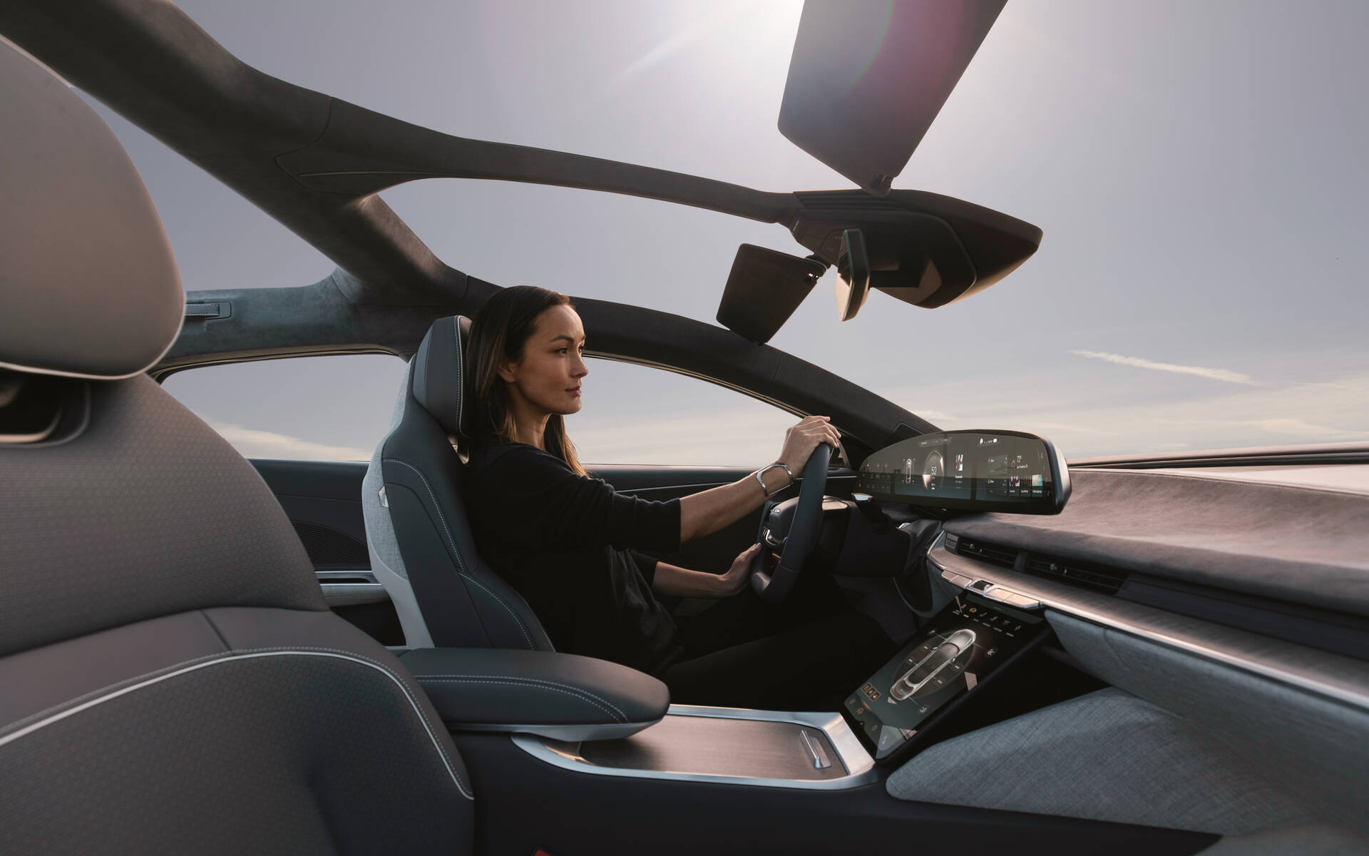
Beyond the business case, digital HMI genuinely improves the driving experience. It delivers value in three concrete areas:
- Better decision-making. Real-time data can be shown in a format that is easy to digest. In an electric vehicle, for example, the driver can see exactly how much energy is consumed based on how aggressively they accelerate.
- Safer driving. The system can warn of hazards, such as drifting toward a lane boundary, and can even intervene to prevent a crash by slowing the vehicle.
- More natural interaction. Voice-controlled HMI allows drivers to issue commands in natural language rather than navigating menus, reducing cognitive load while driving.
Designing Digital HMIs: From Safety To Satisfaction
An effective automotive HMI treats visual appeal and functionality as equally important. When artistry and engineering work together, the interface becomes immersive rather than merely operational. Several key principles guide this balance.
Keep Drivers Informed Without Overwhelming Them
A core usability heuristic from Jakob Nielsen applies directly to vehicle interfaces: always keep the user informed about system status through timely feedback. This matters even more when the user is driving. Any action with consequences must be communicated clearly. Even when the car prevents an accident, the driver needs to know what just happened and why. A visual alert paired with sound provides that crucial context.

Vehicle systems can respond to conditions in two ways:
- Reactive. The system alerts the driver to something it just detected, such as low tire pressure or signs of microsleep.
- Proactive. The system analyzes current data, predicts risk — like icy roads ahead — and warns the driver preemptively.
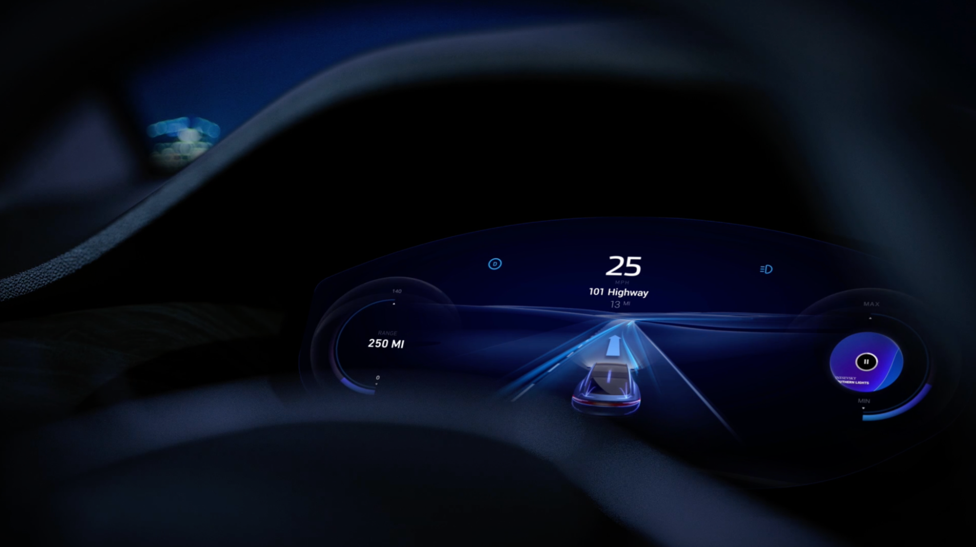
The challenge is delivering these updates without creating information overload. Every alert must be:
- Valuable — relevant to the driver’s immediate situation.
- Timely — presented precisely when needed.
- Clear — easy to scan using chunking and gestalt principles.
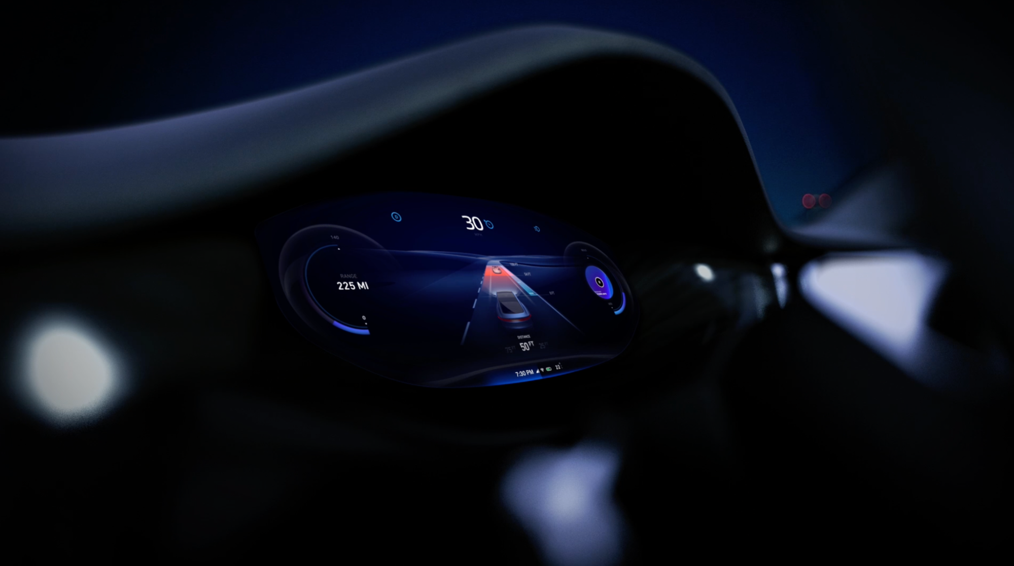
Reduce Cognitive Demands On The Driver
Cognitive load — the mental effort needed to operate the system — should stay low. A few strategies help achieve this.
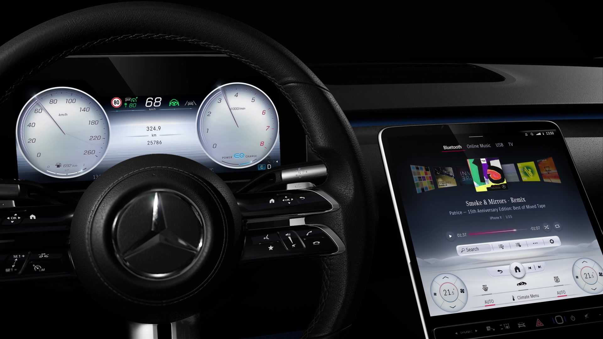
First, do not require drivers to hold information in working memory. The instrument cluster should immediately answer essential questions: cabin temperature, what’s playing, the destination. Second, align the interface with existing mental models. Familiar interaction patterns reduce learning effort significantly.
Replace The Phone, Not Compete With It
Mobile phone use while driving leads to approximately 1.6 million crashes annually, according to a National Safety Council estimate. Drivers will use their phones less if the HMI becomes a true substitute — capable of handling the same core tasks without demanding glances away from the road. Voice should be the primary interaction medium for tasks like adjusting the radio, climate, or sending messages. Design complete voice-driven scenarios that don’t require a visual reference or touch input.
Voice scenarios don’t require a working system to validate. The Wizard of Oz method — where a human simulates system responses — can expose problems in the script before development begins.
Reduce Everyday Friction, Like Finding Parking
People adopt new technology because it helps them reach goals more efficiently. An HMI should tackle common daily routines. Finding parking in metropolitan areas can consume an hour, but navigation systems displaying live parking availability can guide drivers directly to a spot.
Design teams can tackle such tasks using “How might we...” brainstorming. Those system operations are skills, which activate either manually through the interface or automatically when the system recognizes user intent. A learned skill, like predicting the driver is looking for parking, is the ultimate goal — moving systems from customization to personalization.
Augmented reality is one way to present this contextual information directly in the driver’s line of sight. The 2022 Mercedes S-Class head-up display projects graphics onto the windshield, delivering details where the driver already looks.
Make Navigation Effortless
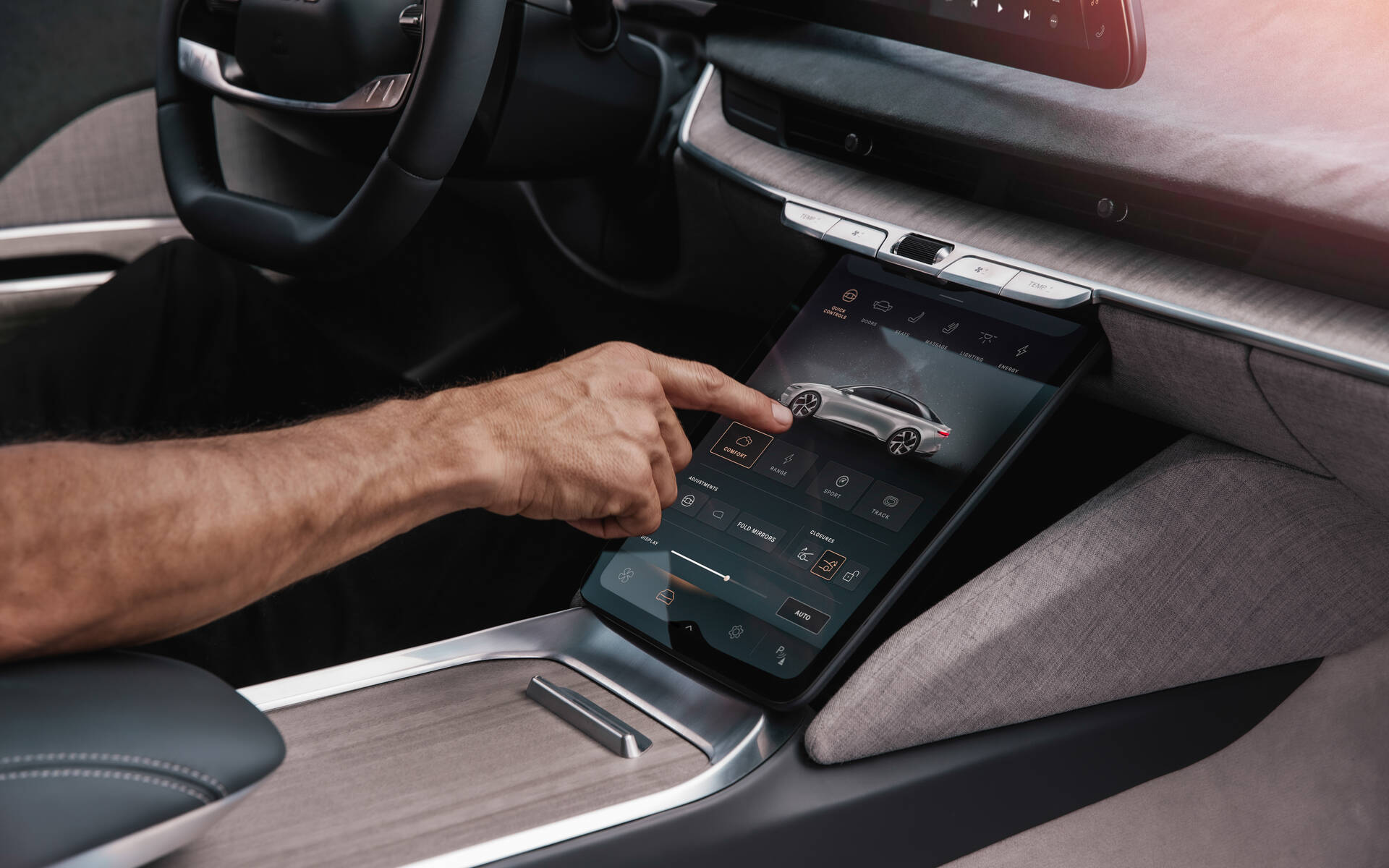
Critical HMI functions must be browsable. Start by defining the system’s navigation hubs — vehicle settings for climate, entertainment, ride comfort — then distribute related skills under those hubs. A user should reach any feature in three taps or fewer, or with one voice command.
Learn User Preferences Instead of Customization Menus
Most users rarely change default settings. While many systems offer customization menus, few truly learn from user experience. A goal is a system that asks rather than guesses. In winter, it might ask “Are you warm enough?”, then remember the response. The system can also use context: it may notice the driver turns on the massage feature only after long workdays, and begin doing so automatically with a simple notification.
These adaptive behaviors create a truly tailored driving experience — and greater user trust and engagement.
Deliver An Inviting Visual Design
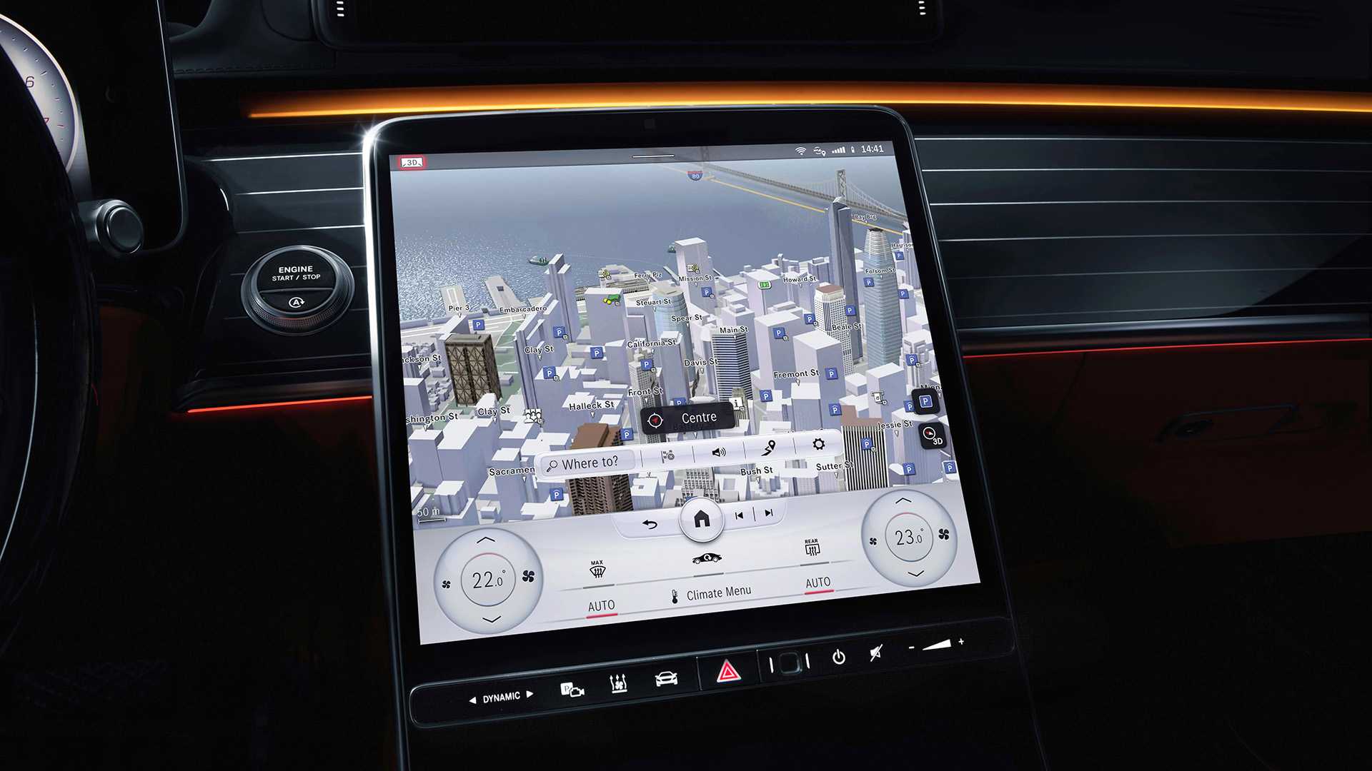
User needs form a pyramid: functional, reliable, usable — and only then pleasurable. Pleasure derives from how the interface makes the user feel. The Aesthetic-Usability Effect says attractive products are perceived as more usable, so visual language must communicate personality and identity.
One example is a detailed 3D rendering of navigation routes: it accelerates spatial orientation and leaves a strong first impression. When testing, look beyond task completion times and errors. Ask participants directly, “How does this design make you feel?”, then dig into those responses. Satisfaction matters alongside measurement.
Designing In-Vehicle Interfaces That Feel Like a Natural Extension of the Driver
Modern Human-Machine Interfaces (HMIs) have shifted the automotive paradigm. The vehicle is no longer a purely mechanical conveyance; it has become an integrated digital gadget, and users interact with it with expectations shaped by their smartphones. This means the quality of the HMI increasingly dictates the perception of the entire car. That places a critical burden on designers to keep pace with these habits to create a driving experience that feels intuitive, responsive, and above all, safe.
Over the past decade, the single largest challenge in car design has shifted from the drivetrain to the dashboard. With more processing power available in the cabin, designers must manage a paradox of having more possibilities while users have less time to engage with them. The core tension is managing driver focus: a feature that is unusable while driving is more than a flaw; it’s a liability.
The Necessity of a Mental Model
Effective automotive UX is not about cramming features into a screen, but rather about building a system that users can quickly grasp and manipulate without looking for too long. If a driver has to read a manual to understand a basic climate function, the interface has failed. The most successful designs leverage familiarity from adjacent realms, especially mobile OS interactions, to flatten the learning curve between vehicles and the devices drivers already use daily.
A sense of control is the first prerequisite. Drivers must feel that the vehicle is reacting to their inputs, not the other way around. This requires immediate visual or haptic feedback for every action and a system that puts the user in charge of system behaviors, rather than automating them out of the hands of the driver without transparency.
Similarly, learnability dictates that a user should be able to enter a new vehicle and understand 80% of the primary features intuitively. The rest can be associated with a shallow learning curve of discovery. If a series of nested menus is required to change the temperature of the passenger seat, the interface places a taxing cognitive load on the driver.
Balancing Distraction and Intelligence
High on your list of criteria must be a strict limit to distraction. Any interaction that takes a driver's eyes off the road for an extended period is an immediate concern. A system that allows for glances but requires sustained visual attention for complicated operations is inherently flawed.
Yet, the future of HMIs lies in their intelligence. Next-generation systems aim to significantly reduce manual "poking" at screens by proactively adapting to context. This requires a system that constantly learns user preferences, observing patterns without being prompted. For example, suggestions for navigation or media should surface intuitively before a request, rather than presenting a long list of widgets. The design challenge is to offer these "proactive" changes without making the auto-recommendation mechanism itself a distraction or an annoyance.
Meeting those criteria isn't just about function; it’s about emotional response. The interaction should look and feel premium enough to elicit a positive reaction. The subtle haptics of a button or the smooth state transition of a screen affects the perceived quality of the machine. When users genuinely like the interface, they use it safely because their interactions align with how they expect the car to feel.
Final Checklist for HMI Design
Assessing an HMI isn't merely about checking off feature availability, it should be anchored by a few holistic principles. At the end of a design cycle, a system must successfully do the following:
- Give users a sense of control;
- Offer good learnability;
- Provide no, or minimal, distraction from driving;
- Constantly learn user preferences and suggest changes proactively;
- Spark a positive emotional response from the users.
Put simply, designing for the future of the automobile means designing for trust. Drivers accept new technology when they feel safe, smart, and authorized to operate their cars. Designers must ensure the interface serves the journey, rather than merely hosting the content.


