Designing for the Moments Users Can't Afford to Fail
Most product design happens under idealized assumptions: a quiet room, a fast connection, a user who is calm and focused. The reality is often messier. Users arrive with distractions, tight deadlines, or genuine emergencies. When stress spikes, cognitive resources shrink, and even familiar interfaces become sources of error. Designing for those moments requires a shift in how we think about flows, defaults, and feedback.

What Stress Does to a User
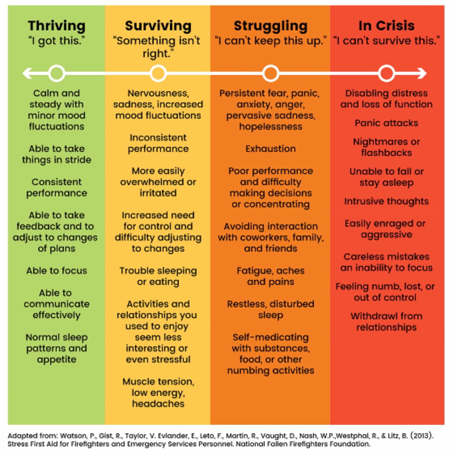
Stress arises when the demands of a situation exceed a person's perceived ability to cope. This mismatch produces a feeling of losing control, which can quickly spiral into frustration and a sense of failure. In a work context, the consequences ripple outward: a failed tool affects the employee, their output, their team, and the organization's processes. The cost of fragility is always higher than the cost of prevention.
Cognitively, stress impairs attention, memory, and logical reasoning. Users under pressure default to fast, intuitive judgments shaped by habit—not careful deliberation. This state, sometimes described as cognitive tunneling, narrows peripheral vision, lowers reading comprehension, and degrades fine motor control. Decisions become hasty, or in the worst case, users freeze entirely. Both outcomes lead to mistakes, often with no time to correct them.

Single-Tasking Over Multi-Tasking
True multitasking is a myth, especially under stress. When users face a large, complex task, they need structure to make reliable progress. Simpler, focused pages outperform sprawling dashboards. The key is to offer a clear plan: break a large workflow into a sequence of small, actionable sub-tasks. Each step should ask a single question or prompt a single action. Showing progress and status helps users maintain a sense of order without adding cognitive load.
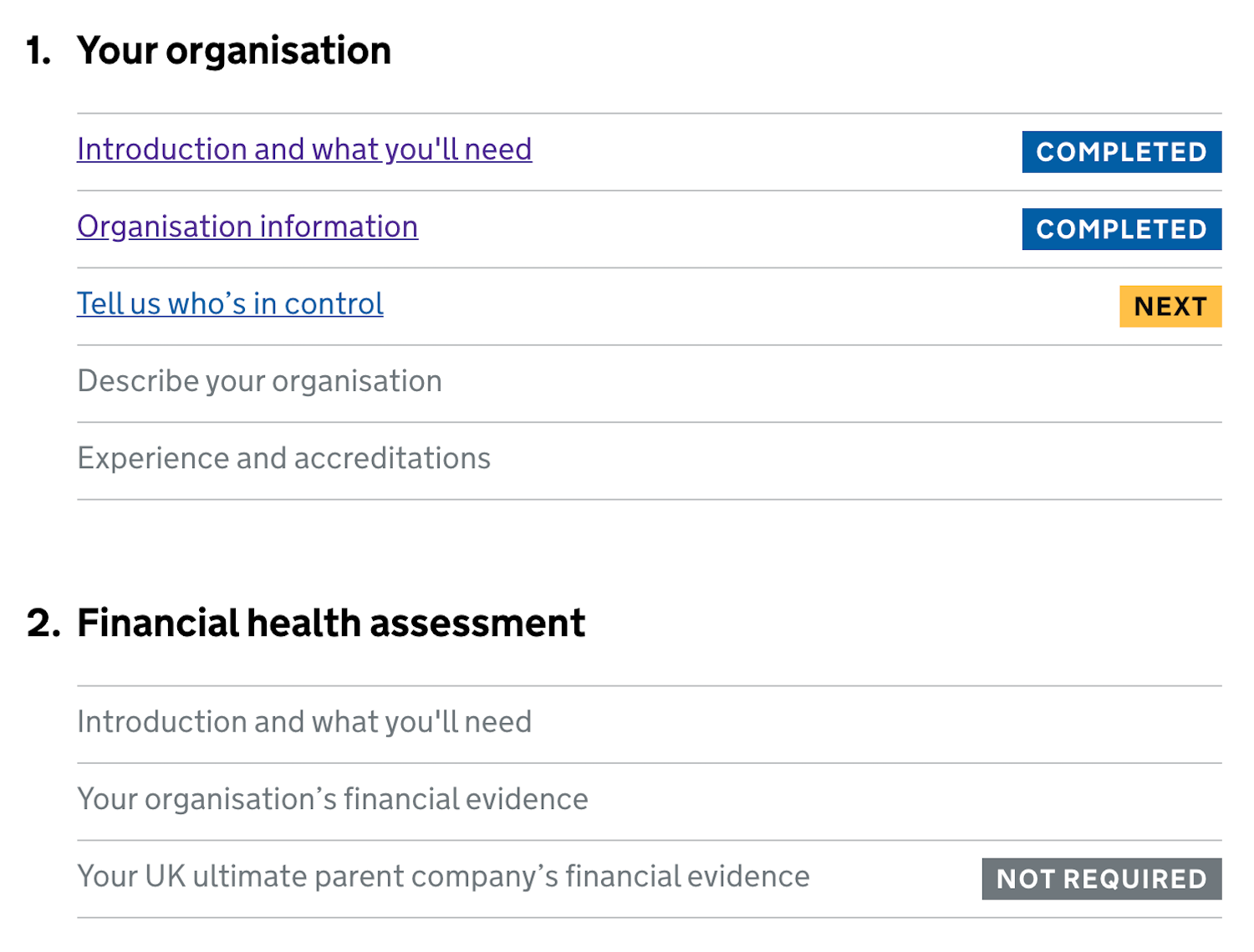
To support accuracy, revisit default settings, presets, and the order of on-screen actions. High-priority options should come first, and high-risk actions should have built-in safeguards such as undo. When a task is genuinely too large to complete in one sitting, consider an explicit task list that lets users pick up where they left off, just as the Gov.uk team demonstrated with their Task List Pattern.
Planning for the Emergency Itself
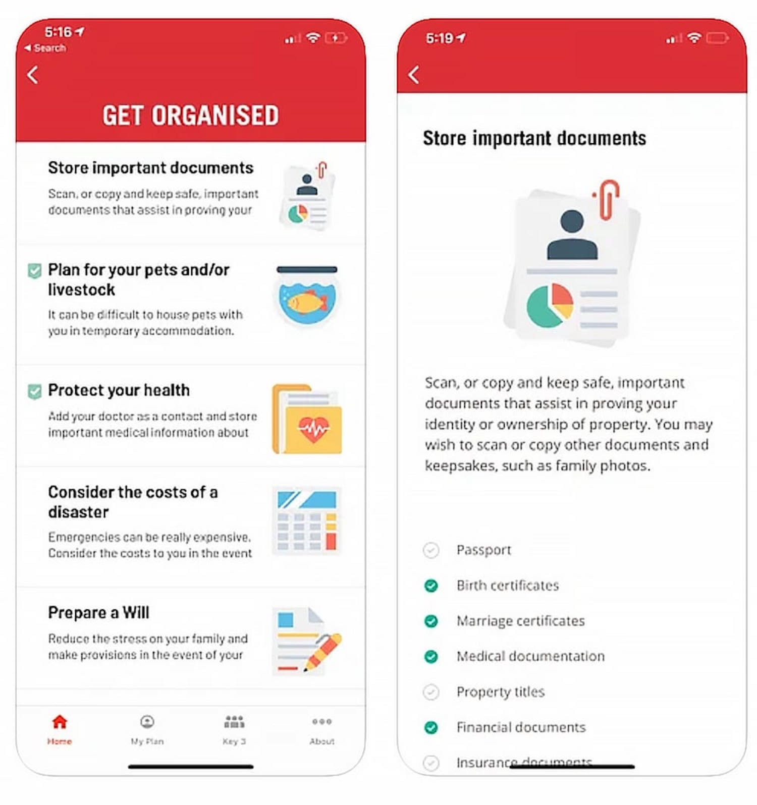
When a real emergency occurs, the best designed product already has a defined response. This means preparing an "emergency mode" well in advance—one that can trigger instant alerts to designated contacts, distribute pre-assigned tasks, or activate a communication channel. The goal is to help users execute a well-rehearsed plan rather than improvise under pressure. The Australian Red Cross's Rediplan App is a useful reference: it moves preparation into a calm, checklist-driven process, so the critical information is ready when it is needed.
The Value of Appropriate Friction
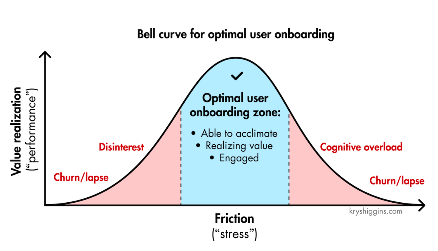
Not all stress is detrimental. In onboarding, a complete lack of friction can be harmful. If users are guided passively through every step, they may never register the personal value the product provides, leading to disengagement. A small amount of well-placed friction forces users to invest effort and recognize what they are gaining. The balance is delicate: too much friction frustrates, too little fails to build commitment. Design for the optimal zone where users are challenged just enough to appreciate the outcome.
Treating Stress Cases as Primary Scenarios
Stress cases are not edge cases. A user visiting a hospital site for lab results or a debt management portal is probably already anxious. If the interface adds confusion, it compounds the problem. To counter this, stress-test your product in environments that mirror reality: noisy, busy, and at peak times. Schedule an annual review to examine fallbacks, error states, and emergency workflows. Content testing and on-location user tests will expose where cognitive load is highest.
When planning for emergencies, verify that every critical flow has a backup. If a primary action fails, what does the user see? Does the interface guide them toward a safe recovery? The design must help people manage failures and exceptions gracefully, not just handle the happy path flawlessly.
Core Takeaways for High-Stakes UX
- Stress disrupts attention, memory, cognition, and decision-making. It narrows focus and pushes users toward habit-driven action.
- Users cannot genuinely multitask. Break tasks into small, sequential steps and present a clear plan of action.
- Prioritize prevention: set smart defaults, place high-priority actions first, and add undo for irreversible steps.
- Favor simpler pages over dense, complex ones—especially under time pressure.
- Design and test an emergency mode with instant alerts and predefined task distribution long before it is needed.
Emergencies will eventually happen. The role of design is to mitigate risk, control damage, and make irreversible mistakes difficult to make. In the moments that matter most, good UX is not about delight—it is about reliability.