
Attention Is a Design Material
Competing interests for users’ time and attention are everywhere. While it’s tempting to chalk up capturing attention to luck, there are concrete tactics designers can use to reliably gain and hold it. The question isn’t just how to design for attention, but also why we need it in the first place — and whether we’re using it respectfully.
Two Kinds of Attention
Researchers have yet to settle on a single definition of attention, but for practical purposes we can treat it as the moment users become mentally aware enough to interpret, understand, and act on what a product presents visually, physically, or audibly. Within that frame, two subtypes matter most:
- Transient Attention — Brief, almost reflexive. A flash of light, a ping, a status change. It pulls someone in for a split second and then lets go.
- Sustained Attention — Deep focus. The concentration needed to process complex material, complete a workflow, or watch a long video.
Neither type is inherently better. A download-complete sound only needs transient attention — enough for users to decide their next step. But once they open the file, sustaining their attention requires thoughtful layout, clear progress indicators, and content that supports concentration.
First Impressions and Sustained Engagements
We’ve long known that first impressions matter. Research from 2006 suggests users form judgments about a website in under half a second. That’s an extremely narrow window to make a visual case. For products that require data entry or extended workflows, the bar is higher: you need to hold attention long enough for users to interpret instructions, respond, and complete their task.
The Goldfish Myth, Debunked
The frequently repeated claim that human attention spans have shrunk to eight seconds — shorter than a goldfish’s — doesn’t hold up. The “goldfish attention” study cited in a 2015 Time article was actually measuring goldfish memory, which is a fundamentally different cognitive function. And no one has figured out how to measure a goldfish’s attention in the first place.
More importantly, the comparison is irrelevant unless you’re designing for fish. The real question isn’t whether attention spans are shrinking; it’s whether our designs are worthy of the attention users choose to give.
Earning Attention Respectfully
Jakob Nielsen’s Law of the Internet User Experience reminds us that users spend most of their time on other sites, and therefore expect yours to work like the ones they already know. Rephrased for attention: users spend most of their time on other sites and life activities, so you need to understand exactly why and how long you need their attention — and not make them spend more time on your site than necessary.
Once you have a user’s attention, what do you intend to do with it? That answer shapes the design. If you only need a brief interaction, you can rely on transient cues. If the task demands sustained focus, you must structure the experience to support it.
Questions to Ask Before Designing
Product teams should answer a specific set of discovery questions to ensure the product is intentional and ethical. User research should answer a parallel set of questions about the audience. Both are mandatory for responsible UX design — they force clarity on why someone should choose your product over existing alternatives.
A B Questions for your product team and stakeholders Questions for your user research to answer Why should people use your product? How do users currently accomplish the task or meet the need your product solves? How long do you need their attention?
How does your product differ from the competition?Why do they use similar/competing products? Why do you want their attention? Are users accomplishing a task (transactional) vs. looking for information (educational)? What else is competing for users’ attention during use (context)? Why do you deserve their attention? How quickly can users accomplish the task using your product? Are there potential ethical issues with increasing attention/engagement with your product? What additional information or help do users need to make the experience self-explanatory?
The first set of questions (Column A) validates whether the product has a justified reason to exist. If you can’t answer them, the product needs more discovery. The second set (Column B) ensures the solutions you design will actually gain and hold attention in ways that respect the user.
These aren’t abstract exercises. Common UX research methods are the most effective way to get real answers:
- Interviews — One-on-one conversations that let you explore attitudes and behaviors, adjusting questions based on feedback you receive.
- Contextual Inquiry — Observing users in their natural environment. You learn about the distractions and competing tasks that will shape how they interact with your product. Different contexts reveal different design challenges.
- Usability Testing — Tactical validation. Does your design actually work? Do users understand what to do? Do the elements meant to attract and hold attention do so effectively?
The Tactical Toolbox
Once you’ve decided where attention-seeking elements are justified, you need concrete tactics. These aren’t exhaustive, but they’re backed by research on how human attention operates in practice.
Motion and Sound
Motion is one of the most reliable ways to capture transient attention. Research shows our visual system involuntarily notices sudden movement in peripheral vision. That makes it useful for surfacing a status change, highlighting a critical action when a user is struggling, or guiding the eye to a specific screen region.
But motion has limits. The research underpinning its effectiveness typically assumes normal or corrected vision, so it isn’t a substitute for accessibility. It also carries risk: animation can frustrate as easily as it can guide. Before adding motion, ask what it communicates, how often it recurs, and whether it genuinely strengthens the relationship between interface elements. Motion that merely delays users or forces them to watch an unnecessary sequence will cost you their attention rather than earn it.
Sound offers a complement to visual cues. It can alert users to changes without demanding their eyes, and it’s essential for contexts where hands-free interaction matters — voice assistants, turn-by-turn navigation, or wearable devices where a screen may not be practical. Audio design deserves the same care as visual design; when applied thoughtfully alongside visuals, it can reinforce the message without becoming noise.
The Power of Progress
Progress indicators do more than show a task is underway — they hold attention by answering the question “how much longer?” A visible sense of forward movement keeps users invested in even mundane workflows like form completion.
Consider Your Progress Bar Interactive
If your progress bar reflects pages in a multi-step form, let users click back to an earlier step without forcing them to re-walk the entire sequence. Allowing navigation to any visited step respects their time and keeps them engaged when they return to continue.
Conversely, stopping progress deliberately can be an effective way to force attention onto something critical. Interrupting routine flow with a message that requires acknowledgment is a proven method for delivering important information — dating apps used this during the 2020 racial justice uprisings to ensure users saw their statements before continuing to matches.
That technique wears thin quickly. If you interrupt users too often, they’ll become desensitized or resentful. It’s effective when the message truly matters, not as a default mechanism for capturing email subscriptions.
Reduce the Noise
When a user faces an unfamiliar interface, immediate wayfinding may matter more than any attention-grabbing flourish. The best way to hold attention is often to strip away competing elements. A complex statistical platform that opens with a clear set of starting actions guides attention far better than one that unloads every feature at once — users can explore capabilities progressively once they’ve invested in the tool.
The opposite is equally instructive. Purposeful clutter, like media giants deploying ads against their own users to push subscriptions, fragments attention and makes the experience feel dated regardless of the underlying technology.
Shortcuts and Speed to Outcome
If you believe your users operate with limited attention, do the work of meeting them partway. E-commerce should offer Buy Now options that bypass checkout steps, allow saved carts and wish lists for later return, and pre-populate fields again once users have created accounts. Each removed step counts.
For content-heavy products, radical summarization helps: strip unnecessary fields from forms, show concise information views, and give upfront time estimates for videos or articles. Users should never lose work because a session expired — persistence and saved progress are attention economics, not just convenience.
Gamification With Purpose
Education research shows gamification can elevate attention in contexts where sustained engagement is necessary for learning. The key to effective gamification is rewarding meaningful behavior — recognition for accomplishments, leaderboards, or social comparison in fitness apps is a way of celebrating genuine progress.
Before gamifying, determine your audience, the exact behaviors to encourage, what genuinely motivates users, and how you will measure success. Gamification designed merely to increase usage — especially in an ethically questionable product — is a disservice to users. Sometimes the right solution is holding attention only as long as the task genuinely requires.
Give Them Something to Do
Active participation sustains attention better than passive consumption. Tactile gestures like swiping and scrolling create a reinforcing loop between physical action, immediate visual feedback, and reward. But the same mechanisms behind the engagement of popular dating or social apps are connected to problematic phone usage patterns.
Physical engagement isn’t inherently wrong — health apps for conditions like Parkinson’s or recovery from stroke create immeasurable value with it. But tactile action only works when it supports the deeper purpose. An action that conveys irrelevant feedback adds nothing; in mobile banking, allowing a swipe-to-refresh on a balance is useful, but you could also anticipate how a user repeatedly refreshing is anxiously awaiting a deposit notification. A contextual intervention that explains your bank’s update schedule can reroute that attention productively, letting users disengage at the right moment.
When Attention Strategies Backfire
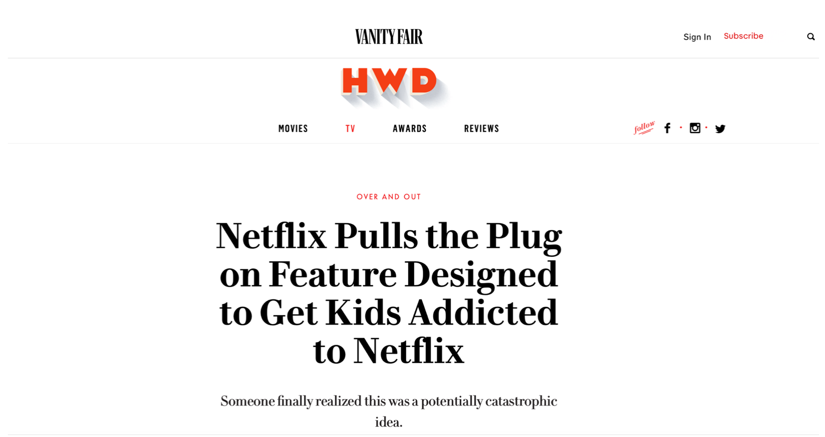
Designing for attention carries real risk. If product teams cannot clearly justify why they seek user attention, the consequences go beyond losing trust — they can damage a brand. Netflix discovered this after exploring a badging and rewards system meant to gamify children’s viewing habits. The feature was quickly criticized as an attempt to push kids toward more screen time, and Netflix withdrew it after negative press and development costs had already piled up.
The Ethical Weight of Engagement
The push for engagement is not just a business concern. Excessive digital use can harm users’ mental health, and ignoring that fact raises ethical questions. Research into “Internet addiction” dates back to the 1990s, beginning with Young’s (1996) seminal study that established the field of problematic online use. Since then, the conversation has only grown more urgent. In 2018, the World Health Organization classified “gaming disorder” as a diagnosable condition, lending institutional weight to the idea that digital experiences can have pathological effects.
Designers have a responsibility to acknowledge that their work can be addictive and to build safeguards into their products. Nintendo’s early adoption of parental controls demonstrates this commitment. Apple’s Screen Time feature takes a similar approach, creating awareness of usage and helping prevent overuse. The lesson is simple: once users have completed their task, the product should not work overtime to keep them around.
Putting Principles Into Practice
There is no universal solution for capturing and holding user attention. The strength of the design lies in experimentation and in genuinely understanding the people you build for. Using the tactics discussed here — alongside continuous feedback from users — is the most reliable path to making informed decisions about when and how to earn attention.
If you have made it this far, you have already demonstrated more focus than a goldfish. Use that focus wisely: the next time you design an interaction, ask yourself not just how it captures attention, but whether it deserves to hold it.


