How Users Actually Read Pricing Pages
Before any design decisions are made, it helps to understand how people interact with pricing pages. Usability research reveals several consistent behavior patterns that directly influence how a pricing table should be structured.
The Lawn Mower Pattern and Header Checks
When users explore a feature comparison table, they typically follow what usability researchers call the "lawn mower pattern": starting in the top-left cell, moving rightward across the row, then dropping down and moving leftward across the next row. This scanning continues methodically, but users also randomly jump into specific attributes they care about, often returning to the table headers to verify they are still looking at the correct plan.
This frequent header verification is a critical detail. When columns are long and headers scroll out of view, users repeatedly scroll up and down the page, losing focus and growing frustrated. On mobile devices, where both plan attributes and column headers can disappear from view simultaneously, this problem becomes especially acute.
Progression Expectations
Left-to-right interfaces create an expectation of progression: free plans appear on the left, expensive enterprise plans on the right, with "Standard" and "Most Popular" options in the center. When features and add-ons are arranged vertically, users expect the default or recommended selections to appear first, followed by options from least to most expensive.
Two-Pass Comparison
Users rarely make a single pass over a pricing table. Testing shows they typically perform at least two distinct comparison scans. The first scan is coarse: assessment of the general scope of features and understanding of the differences between plans. After narrowing down to a plausible candidate, users return to the top of the table and perform a second, more focused scan, exploring their pre-selected plan line by line to verify the choice is sound and nothing important has been missed.
Feature Lists as Reference Material
While some users know exactly which features matter to them, many do not. Feature names can sound important but prove cryptic, and relevance is often a moving target: some features only become useful once discovered. A complete feature comparison serves as an ultimate reference — but it can also be overwhelming on first glance, requiring minutes of interaction and thousands of eye movements. The practical implication is that a full feature matrix should exist on the page, but it does not have to dominate the top of the pricing view.
Not All Features Are Equal
Users will skip irrelevant sections and jump between rows during comparison. Breaking features into logical groups that can be displayed on request helps keep the comparison manageable. Associating each plan with a specific user profile or company type also helps customers quickly locate the plan most likely to fit their needs.
When Simple Pricing Works
The design of a pricing page depends heavily on how complicated the pricing actually is. When pricing is straightforward, the page can be equally simple — as long as the offer is clear.
Stripe demonstrates this approach effectively: all features are highlighted, with testimonials, existing customer logos, integration options, and FAQ placed further down the page. This works because the pricing itself is understandable at a glance.
Algolia follows a similar structure. Instead of featuring the full feature matrix at the top of the page, the company places it further down, keeping the enterprise option visible only near the footer. Add-ons, additional plans, and an FAQ round out the page.
Fathom Analytics takes a different simplification route. Pricing changes based on a single attribute — monthly page views — so the page displays pricing options on the left and all features in a separate right-hand column. There is no plan-by-plan feature breakdown. The calls to action are straightforward: "Get started with a free trial," plus an option to receive two months free by switching to yearly billing.
Some companies go even further. Kissflow shows just three plan options with calls to action, no feature matrix, no essays on features, and no customer testimonials. This minimalism works well for some products, but for complex offerings, customers will need more detail to make a decision.
Handling Complex Pricing Structures
When a product truly has varied plans for different audiences, a simple card layout may not suffice. amCharts, for instance, sells four different license types for each product. Its pricing page displays the options in a matrix format — similar to what you would see when booking a flight or cinema ticket. The key difference from simpler pages is that all pricing options are visible immediately rather than requiring contact with sales to discover.
Not every complex page is handled well. HelloSign's pricing page demonstrates a common failure mode: every attribute is repeated as a standalone block across the page, resulting in many duplicated cells that are difficult to scan. A cleaner approach would list each attribute once in a single column, with checkmarks indicating which plans include it.
There is also a balance to strike between simplicity and explanation. Evernote previously displayed plans in a table without clearly explaining the differences between them. The page also failed to distinguish meaningfully between "Sign up" and "Free trial" — a level of oversimplification that confuses rather than clarifies.
Simple pricing is an asset where possible, but many products genuinely need richer explanations. The challenge is turning a complex set of plans into a scannable, digestible page without losing the details that customers need to make an informed choice.
Beyond The Classic Pricing Table
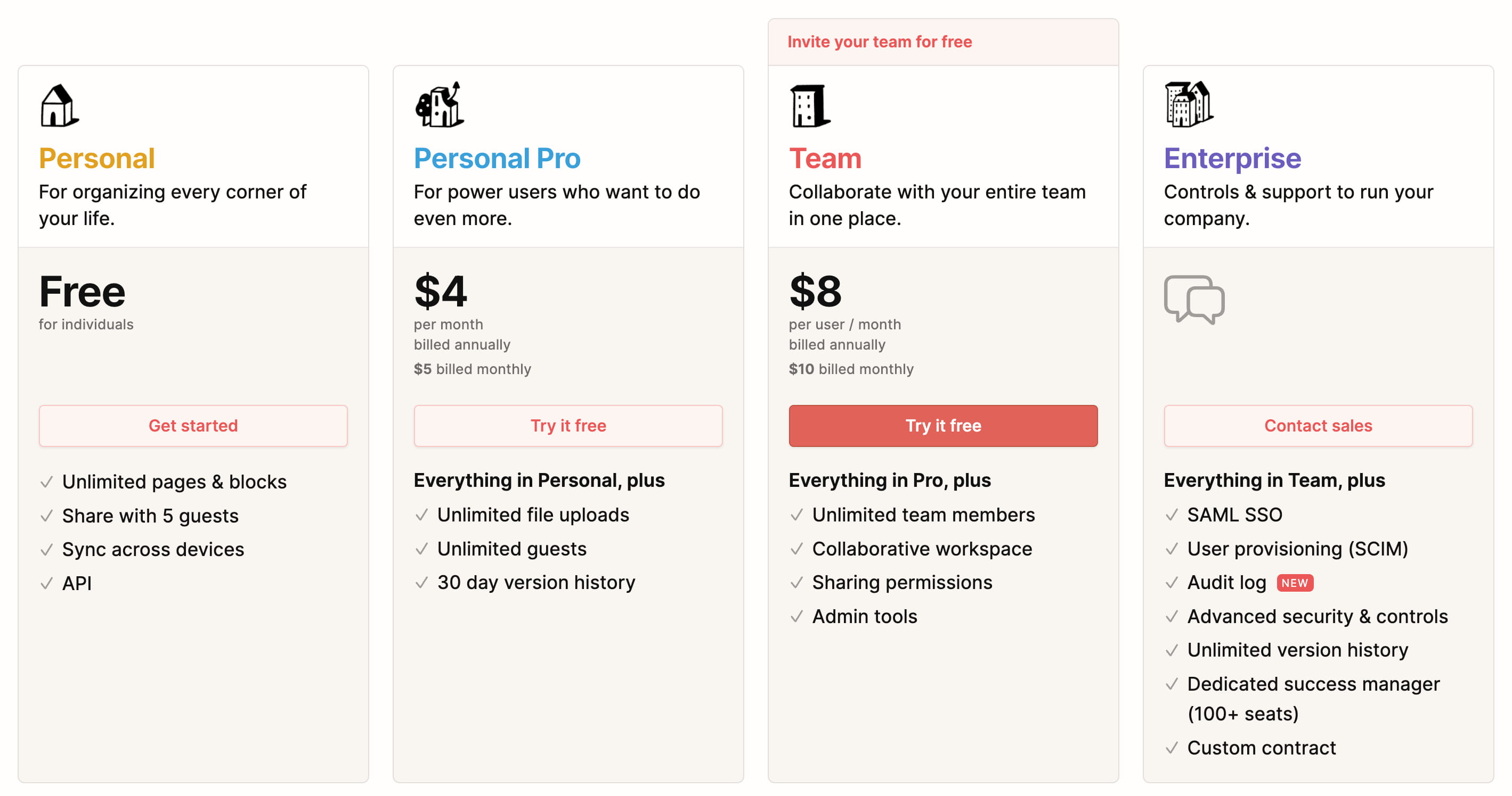
The Notion pricing page offers a interesting variation on the standard layout. All plans are billed annually by default, with an option to switch to monthly when signing up. Each plan clearly explains its intended role and its features, with capabilities expanding as users scan from left to right across the tiers. Further down, a comprehensive feature comparison matrix is presented, with headings repeating for each section and tooltips to reveal details on individual features.

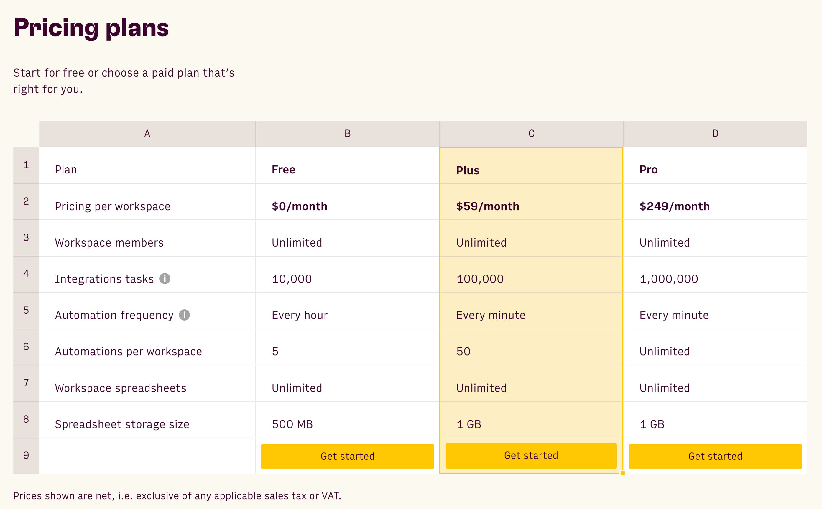
Rows takes a different tack, presenting its plans within a spreadsheet that resembles the calculations users might do on their own. On mobile, each plan column transforms into a standalone card stacked vertically.
Managing Plan Overload
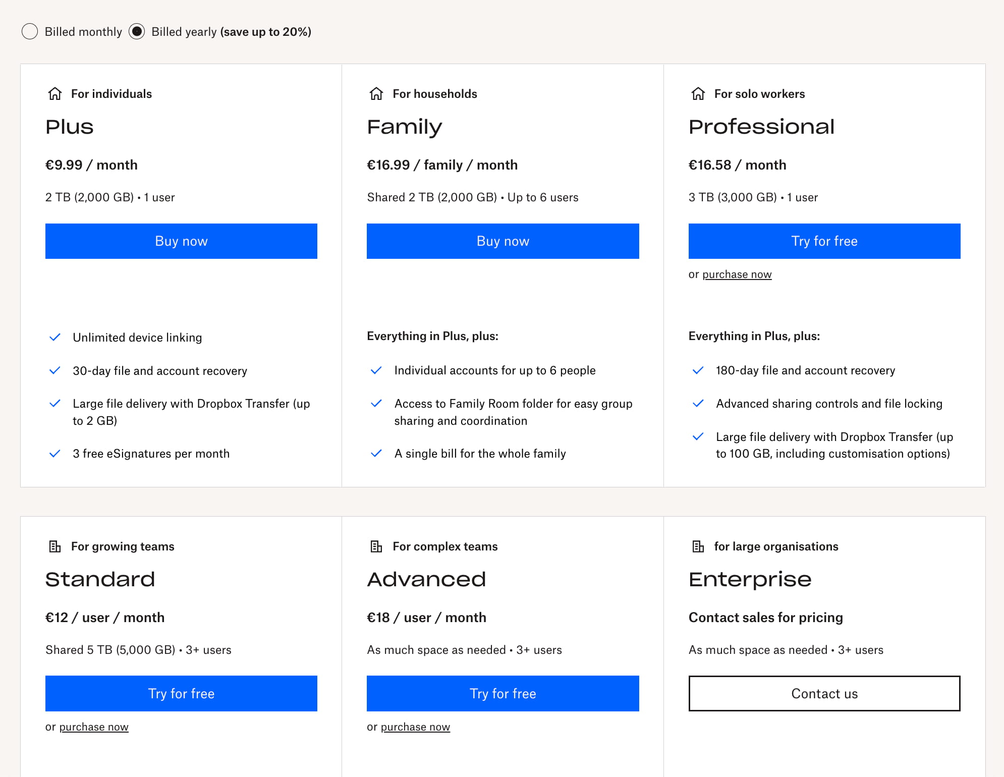
Things get tricky when there are more than a handful of options. Rather than squeezing six plans into a cramped, multi-column view, Dropbox wraps its offerings onto two separate rows. Customers also have the option to try certain plans for free before committing to a checkout.
Zendesk uses tabs to segment its plans, asking users first to specify whether they are looking for individual or enterprise solutions. A dedicated comparison view exists for those wanting to see all four plans side-by-side.
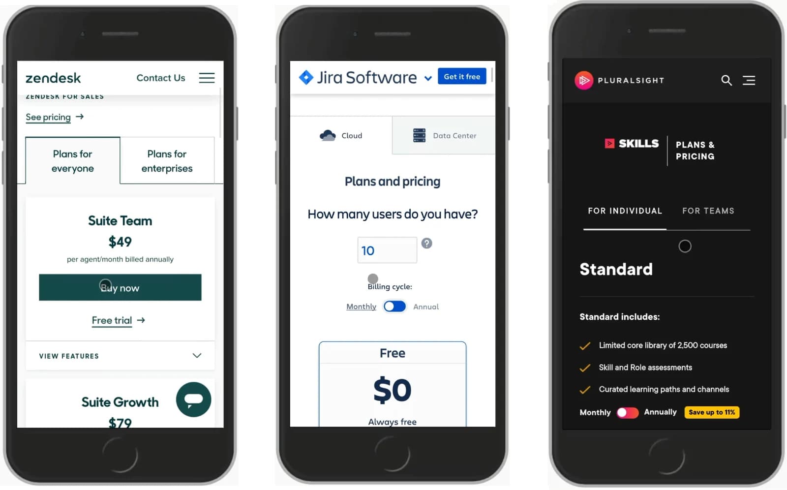
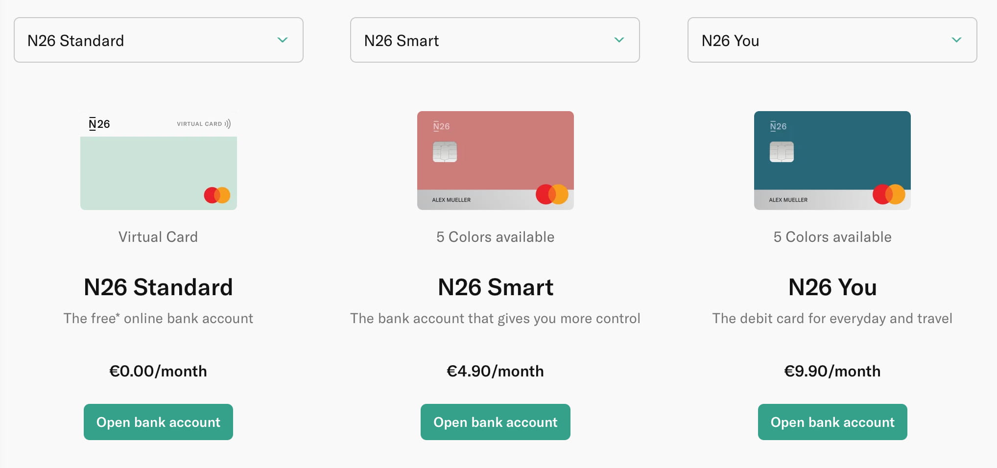
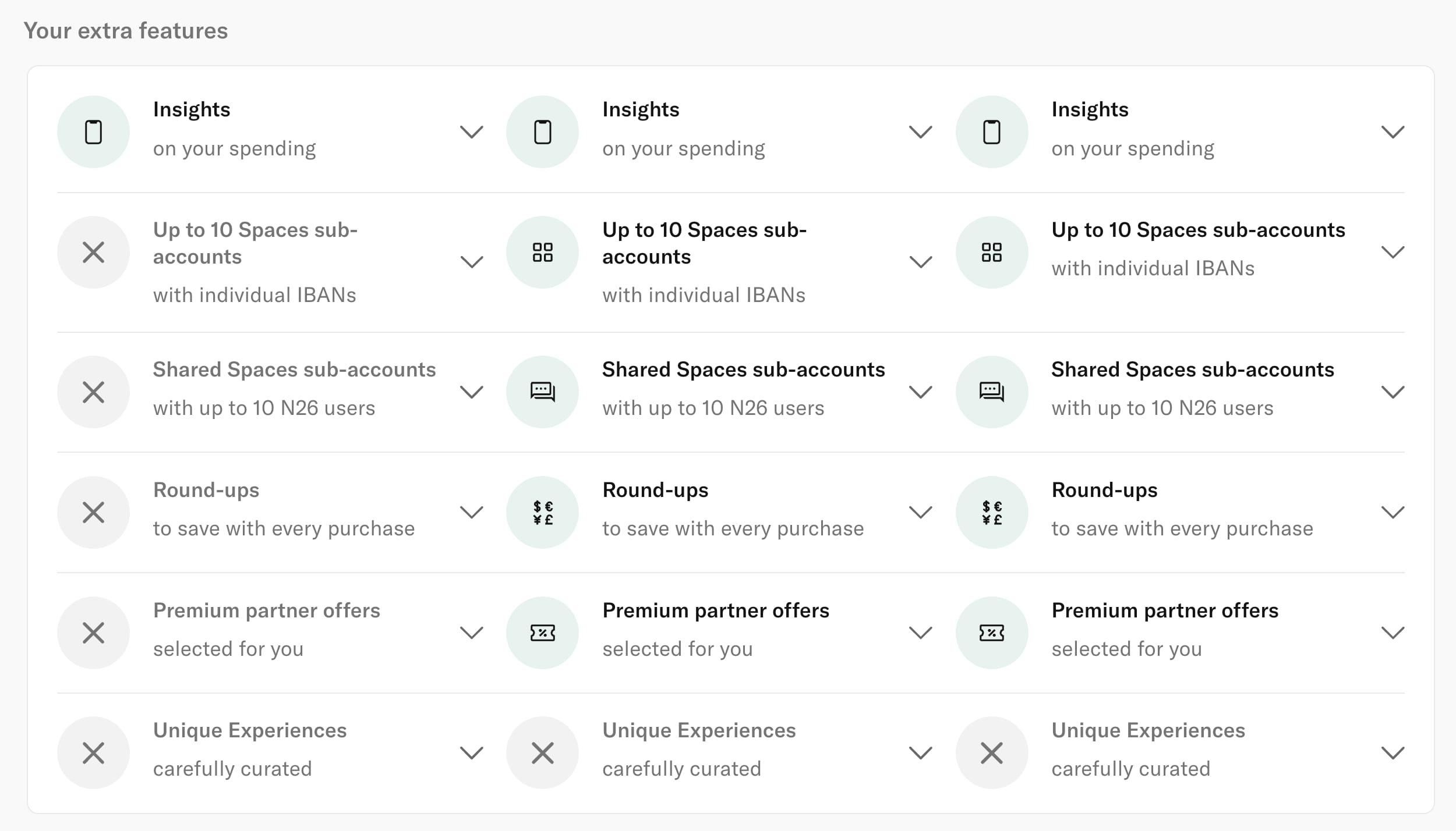
An alternative allows users to curate their own comparison. N26 displays a drop-down menu, letting customers choose which two or three plans they want to study at once, depending on screen size.
The key lesson for dealing with many plans is to avoid horizontal scrolling on a single dense row. Instead, wrap plans, use tabs, or leverage dropdowns to keep the interface navigable.
Prioritizing Key Features
It's tempting to list every developed feature in pricing plans, but this often leads to complexity. An alternative is to emphasize only the most critical differentiators for each plan, making secondary features available only when needed.
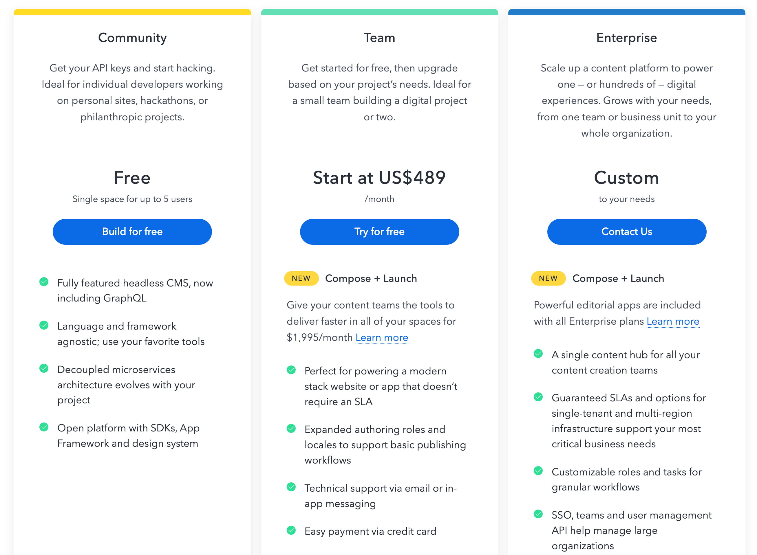
Years of feature additions shouldn't force years of bloat. On Contentful, the pricing page leads with a few key distinctions for its three main plans. The full-fledged feature list exists further down, but it isn't front and center, which makes the initial comparison simpler.
Chargebee presents a generous number of plan details upfront, but the complete comparison table appears only when the user clicks to see all options. This opens in a modal.
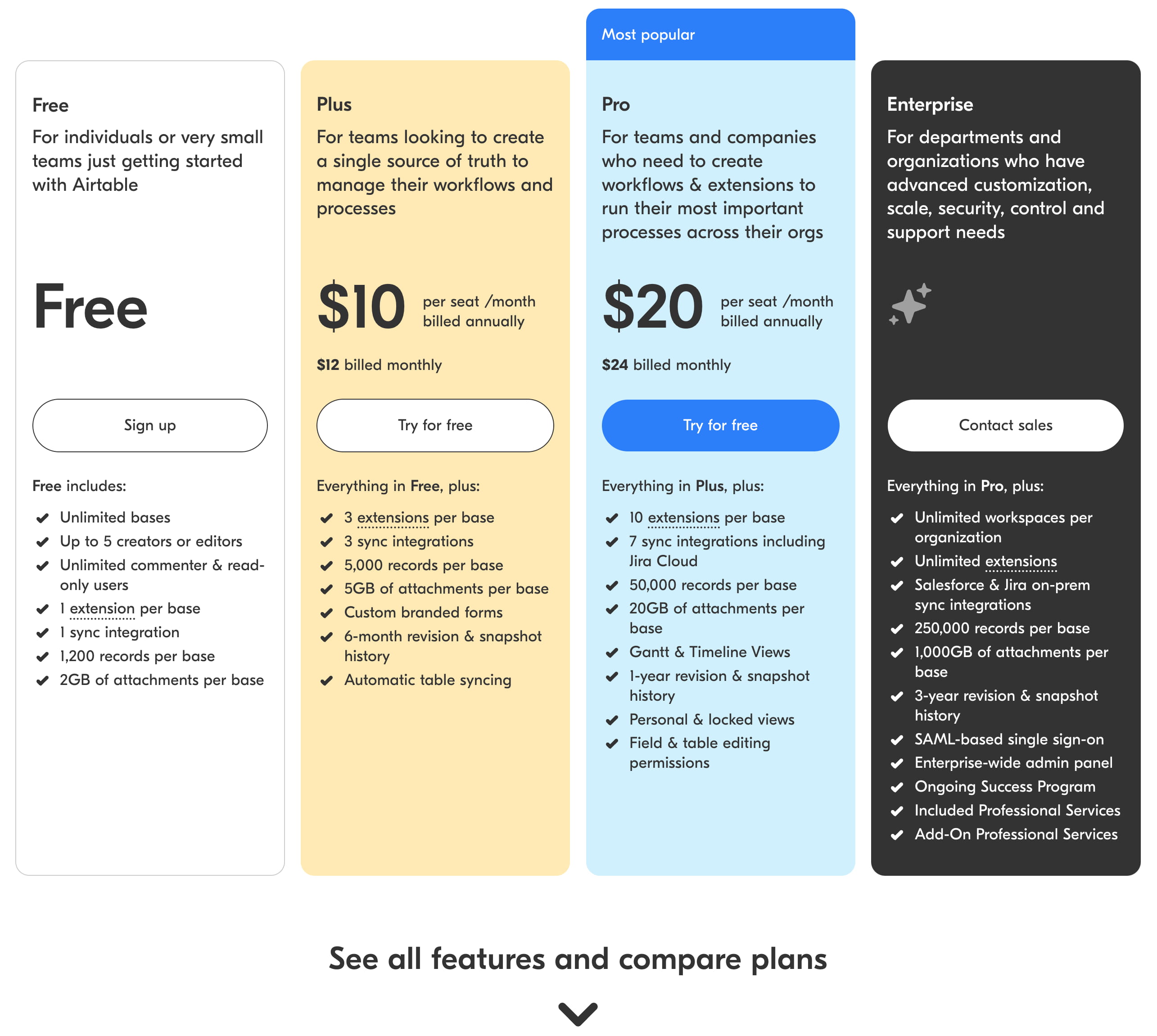
Airtable demonstrates a denser layout. The page's color-coding gives each plan a distinct background color, while prices, calls to action, and feature lists are tightly aligned for easy scanning. The complete feature list comparison lives further down.
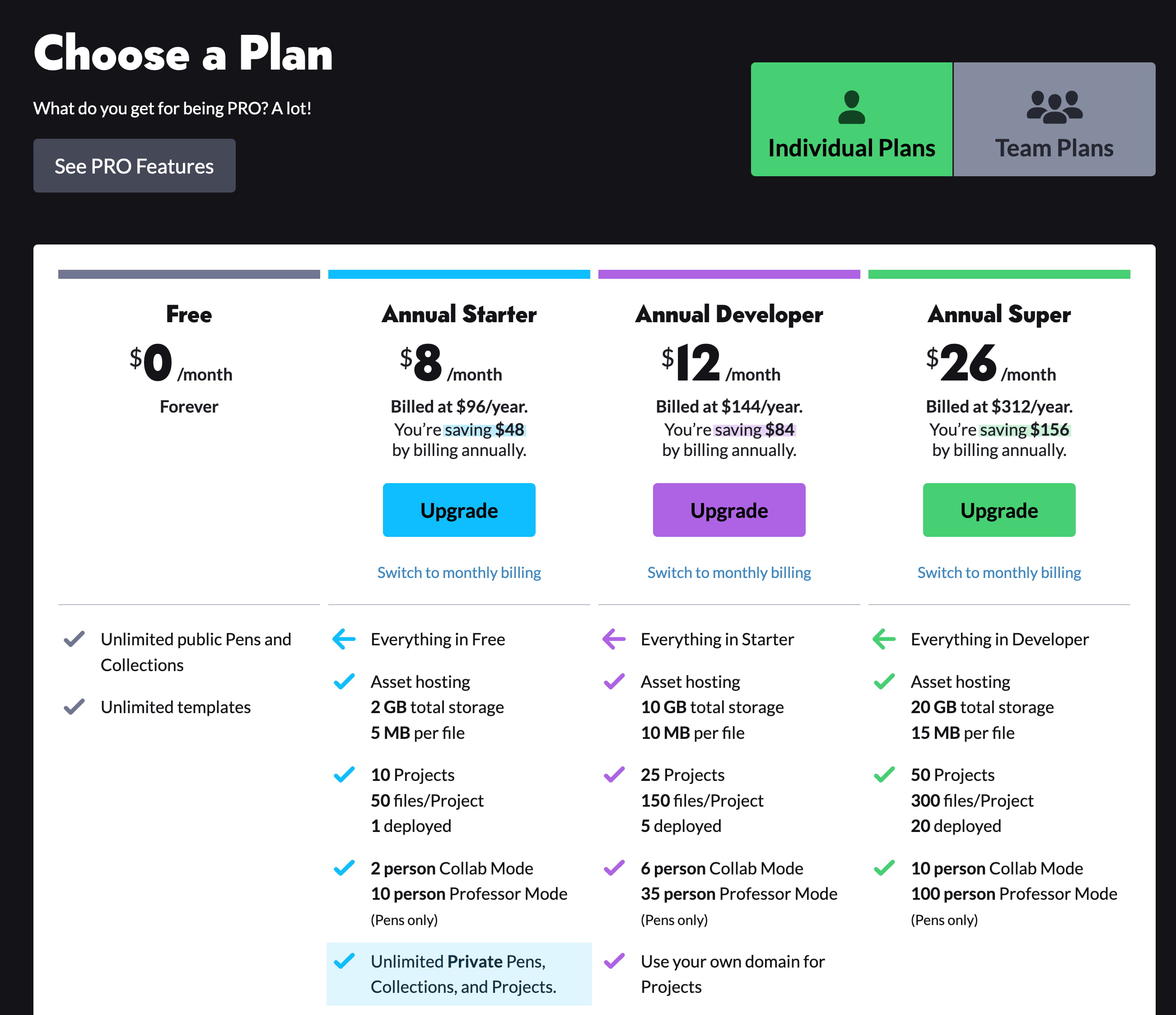
CodePen relies on color too, but focuses on the matrix itself. Users maintain their bearing while scanning via visual clues rather than needing to remember which column is which.
For most products, it’s worth testing whether a concise list of key distinguishing features is more effective than displaying every possible function. Start with fewer items and only add more if plans start to look too similar.
Reading Differences By Row
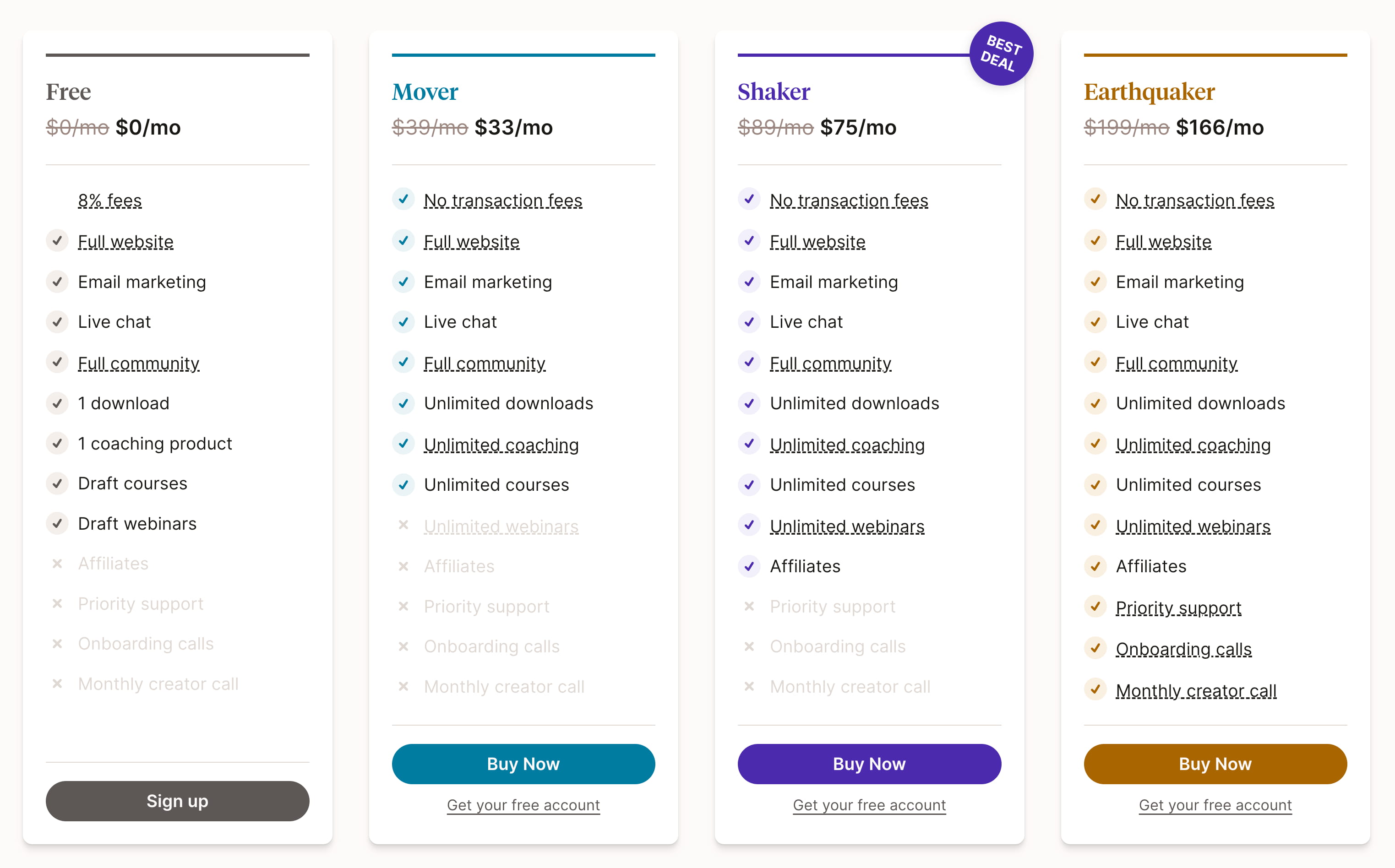
In many examples, features are cumulative from base to premium tiers. But sometimes there are trade-offs. Podia adopts a strategy of hiding unavailable features. It doesn't offer the strongest contrast, but allows users to focus on what is available for each plan row by row.
N26 takes the opposite route, showing both what is available and what is missing. Rows can be expanded with a click for more detail.
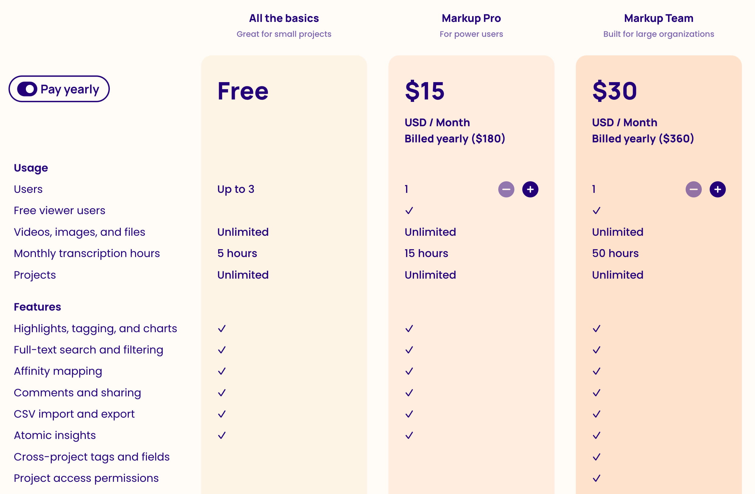
Alternatively, Dovetail highlights the presence rather than the absence of features, orients the user around what each plan offers. This approach can make a scanning matrix slightly easier on the eyes.
Visualizing Once You’re Out of Tables
When the variations between tiers are more nuanced, an entirely different UI can work well, moving away from the traditional comparison matrix.
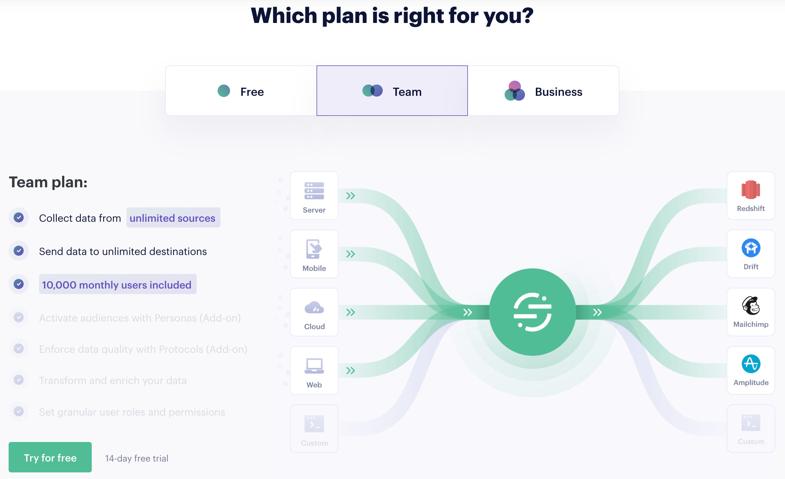
Twilio Segment presents its three plans as separate tabs instead of one table. Switching tabs reforms the page and shows relevant features with a few motion cues, without an actual side-by-side view.
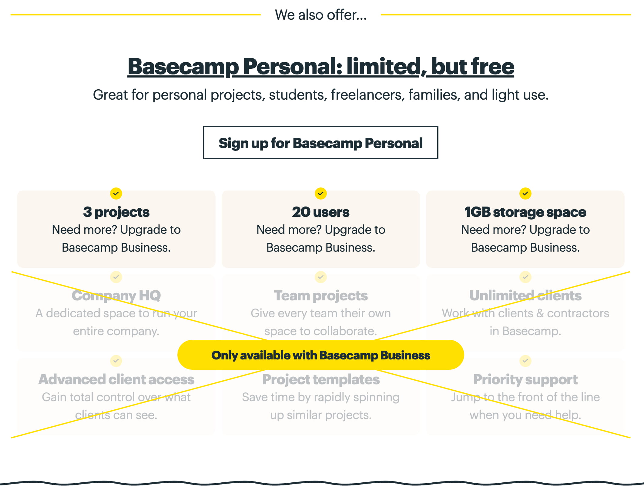
Basecamp highlights its main “business” tier, but clearly showcases the missing features in the cheaper plan. It physically crosses out the elements that aren't included, driving the visual comparison with a simple strikethrough.
Ballpark’s pricing experiments with a dynamic "build-your-bundle" slider. Features adjust as the price shifts—an engaging experience that discusses the plan at a summary level and includes a free concierge option.
Notice what all these examples share: there isn’t a traditional table. This is a defensive strategy. Simplified, tailored approaches to presenting differences can sidestep many of the planning headaches that come with complex matrices.
Show Only The Differences, Or Only The Similarities
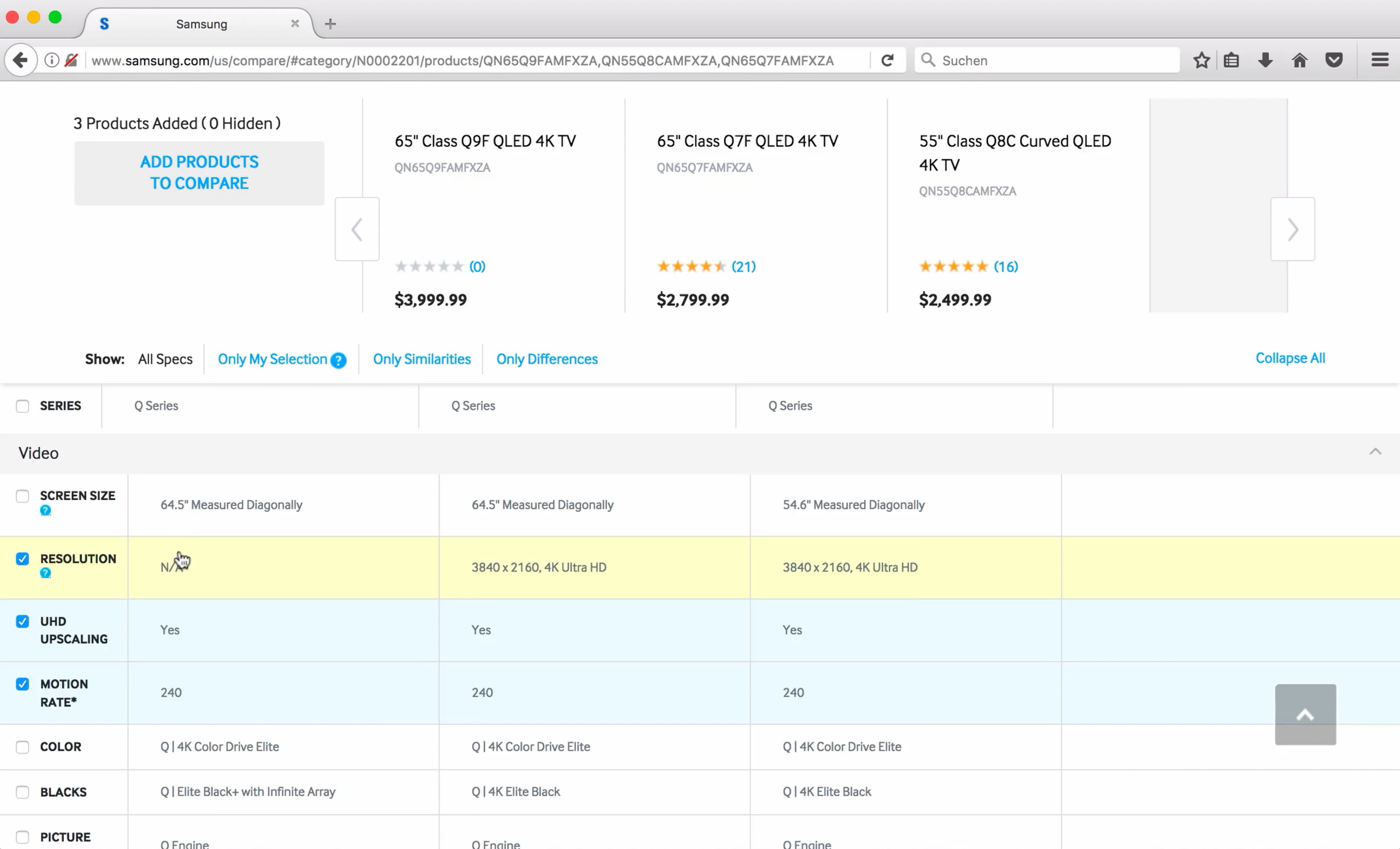
Rather than offering one rich comparison for all complex plans, consider letting users curate the output themselves to order to find the closest cheaper version. The Samsung phone comparison is a good example of this logic applied outside of SaaS. It lets shoppers show only core differences or only similarities, or group features how they like.
Isn't showing only similarities a bit counter-intuitive? Not at all. Users are often looking to “justify” picking a cheaper plan. They might want to see that a lower-tier plan shares many features with a more expensive one. For those folks, highlighting only the shared characteristics helps them settle on something close enough, but cheaper.
Keeping Your Bearings With Sticky Headers
Scrolling through a huge table often causes we forget which column corresponds to which plan. Keeping column titles, CTAs, and even prices fixed to the top of the viewport makes for a smoother exploration. The Contentful pricing page does this by limiting to what matters: the plan’s title and its main call-to-action are always visible.
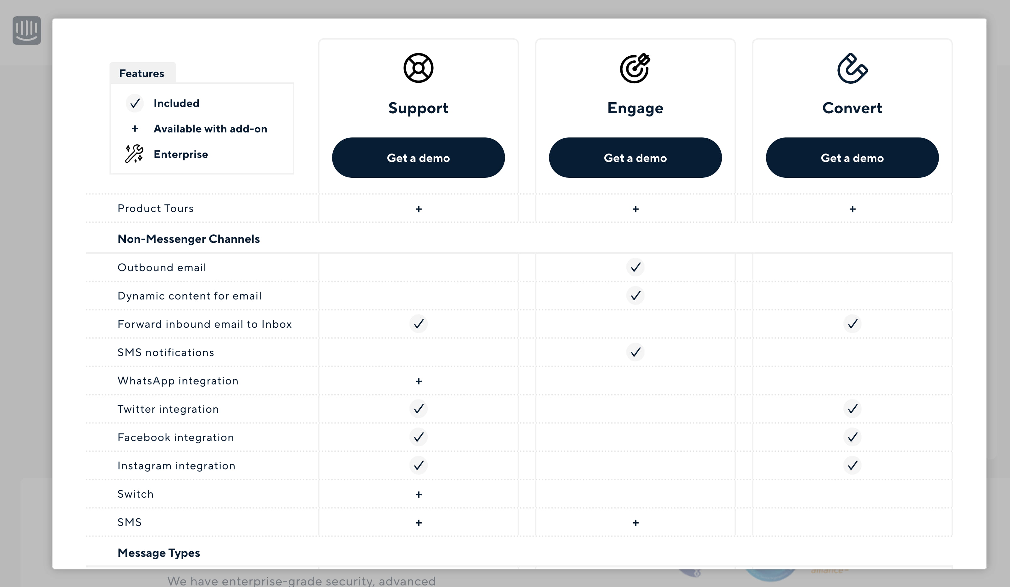
Intercom also does this but puts the table inside a modal dialog. Pricing choices shift above as the user pours over what each one gets.
Dropbox takes it one step further: heading above the sticky row is not just the annual/monthly toggle, but also the actual price point for each choice is always in view.
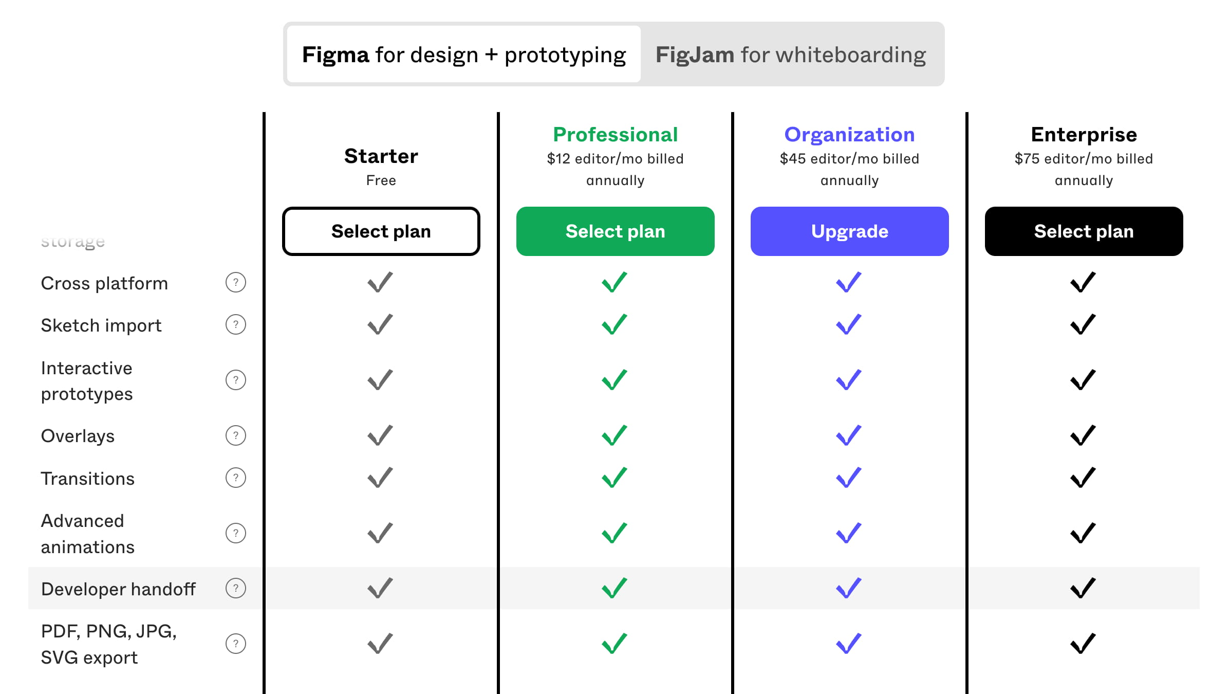
Similarly, Figma has sticky bars that include a "not-so-hidden" set of tabs for toggling. Want to pivot between a quick glance at pricing or the Dev/Seat facts? You can still do that from the floating hero.
Collapsible & Grouped Attributes
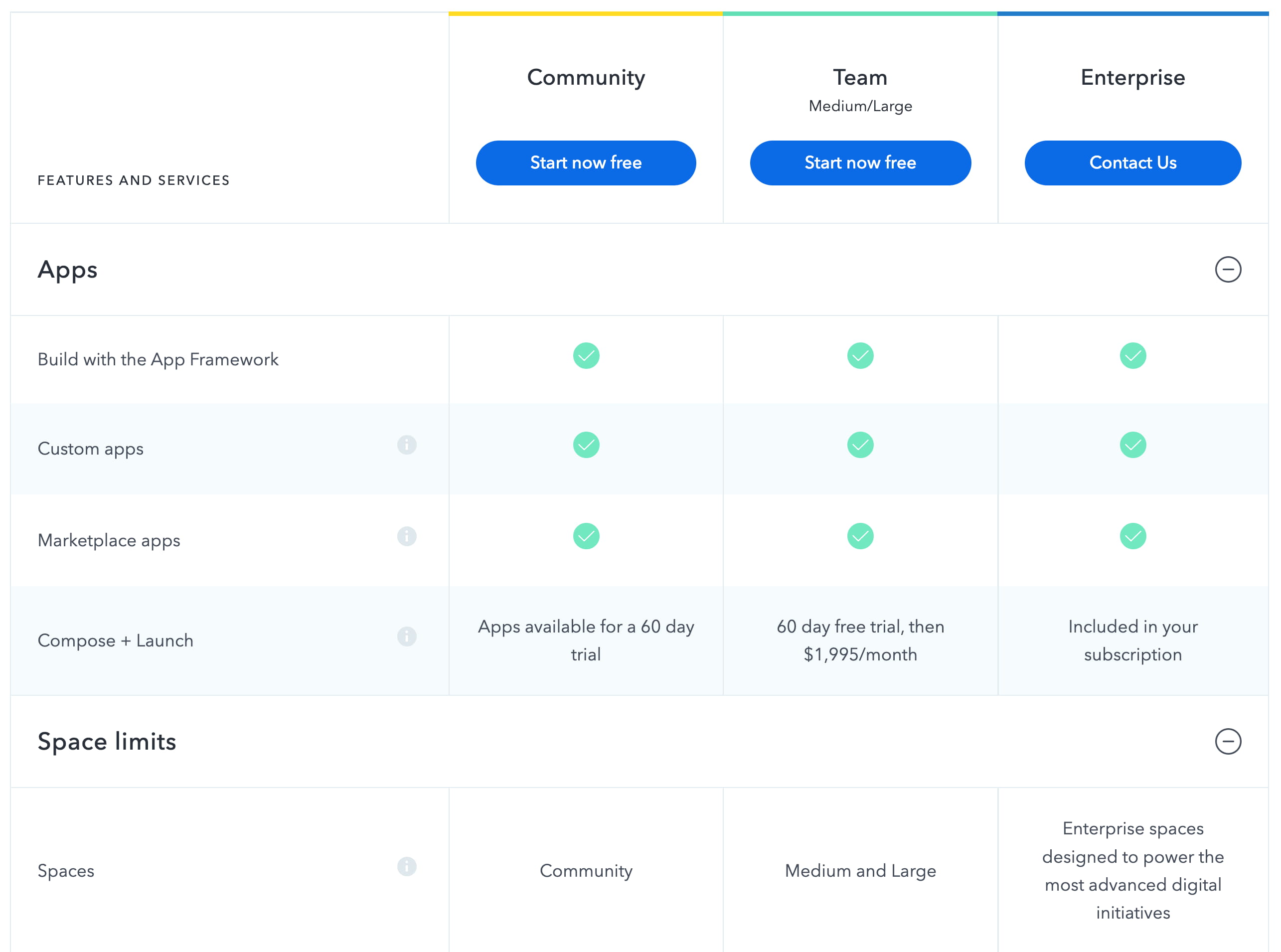
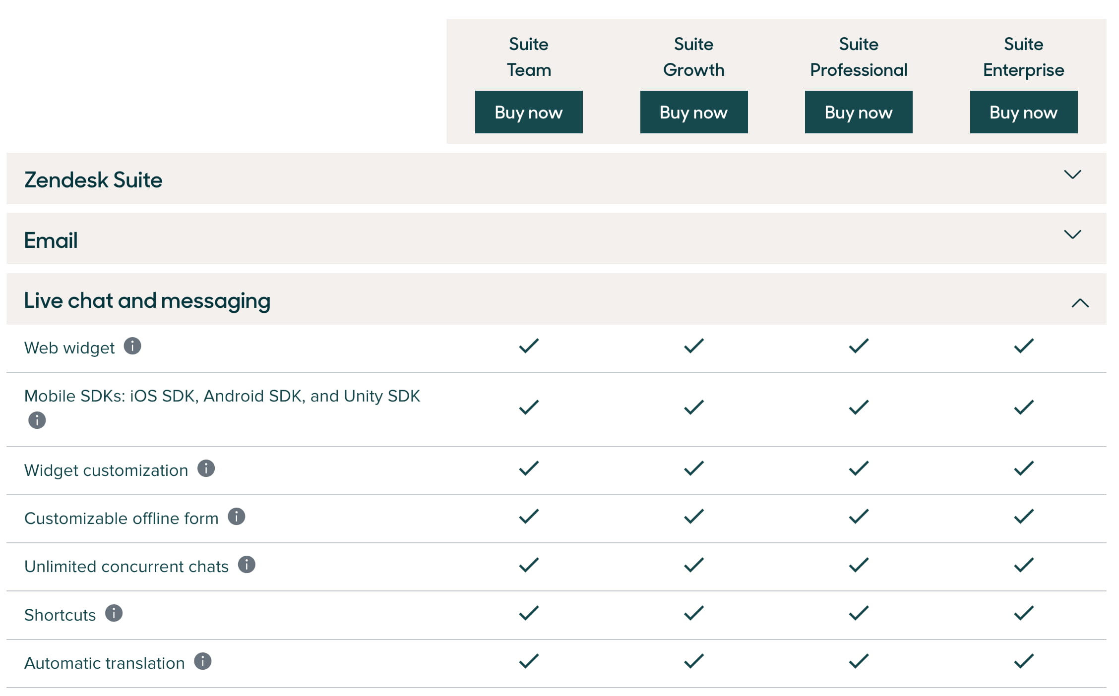
Contentful already proved that entire groups of features don't have to be fully open. Gaining the ability to expand and collapse whole categories is a nice way to help dial pan out, especially when you are scanning lots of rows, similar to organizing information with cards. Users can actively skip over items they don't care about by clicking the header bar that toggles an entire group.
Zendesk stacks everything into neat accordions and section cards, shrinking an onerous read from full togglable banks of features.
If it doesn’t feel native enough yet, just go check out Abketon. The Ableton page treats rows as well-defined cards. Rows for each feature list are grouped in collapsible sections. Instead of the typical “chevron” caret to the right, a simple + icon sits on the left. Clicking one opens up the whole consolidated card block.
In all, you’ve got plenty of choices for making data-rich tables friendly. But how you design for mobile, where all of these nifty columns collapse into single-file stacks, is a challenge we’ll explore next.
Feature Comparison on Small Screens
Feature comparison tables rarely survive contact with narrow viewports. Once you have a few dozen features and at least three plans, the table demands some kind of internal navigation — usually horizontal scrolling, which is slow, error-prone, and fatiguing for users.
For simpler products with fewer than 20 features, a full matrix may be unnecessary. Canva, for instance, drops the table on mobile entirely and relies on accordions, reserving the comparison grid for desktop. Contentful and Hotjar both keep horizontal scroll tables on mobile, but the connection between an attribute and its plan becomes unclear as users move deeper into the matrix.
There are better patterns. Rather than showing a table, ask users what they care about first. Mediamarkt walks users through a sequence of steps, presenting each feature individually and explaining how plans differ for that specific concern — the user never has to synthesize a grid on their own.
Mobile-focused alternatives include:
- Sticky tabs. Mailchimp, Cloudflare, and Canva pin plan names to the top of the screen. As users scroll through features, they switch tabs to compare values. Placing tabs at the bottom of the screen might reduce finger obstruction, but the tab-switching approach itself is worth testing.
- Side-by-side selection. Dropbox lets users pick two plans from a list of five and view them together. Twilio Segment and N26 support swiping gestures between plans.
- Compacted layouts. GitLab tilts its column headings; Framer places attributes on a separate row so four plans fit in one line. Yousign stacks attributes vertically, one row at a time — all of these avoid horizontal scrolling.
- Sticky plan indicators. Netlify repeats the feature list as users scroll and shows the current plan in a sticky bar. Hubspot and Chargebee use a modal with a dropdown to jump between plans — slower than tabs and best treated as a last resort.
Dropdowns for plan navigation should generally be avoided. Tabs or single-row layouts are faster. Tooltips are also worth questioning.
Explaining Features Without Tooltips
Not every feature in a comparison table is self-explanatory. The ubiquitous answer is a tooltip, but tooltips have well-documented problems: they cover content, require focus trapping, and are easy to get wrong from an accessibility standpoint.
Notion shows hints on hover over a question mark icon, but the hints aren’t focusable and therefore not keyboard-accessible; the table disappears on mobile. Airtable goes further with visual previews and short animations on hover, yet still lacks focus styles and keyboard navigation. Mailchimp handles this better: a click or tap opens a nonmodal, focus styles are applied, and keyboard users can tab between features.
Positioning matters too. Cloudflare’s tooltips cover features further down the list, and the info icon’s position doesn’t match the close button’s position, slowing down users who want to scan several features quickly. Fantastical has the same problem: tooltips obscure upcoming rows.
A stronger pattern is the accordion. Podia and Netlify explain every feature in an expandable row. One caveat: users may mistake a + icon for an add-on toggle rather than an expand control — a chevron might be more unambiguous. N26 puts three chevrons per row; tapping any one of them expands the entire row and explains the feature across all plans. Confrere skips tooltips and accordions altogether, linking out to separate pages with detailed feature descriptions.
Beyond text, consider showing an actual preview of the feature, or a use case, inside the expanded row.
Customizing Plans Toward a Perfect Fit
Generic plans rarely fit anyone perfectly. Flexible pricing — where users specify seats, bandwidth, or add-ons — gets them to a relevant price faster. Speedcurve lets users build a plan by choosing page views per month and checks per month. Hotjar adjusts pricing based on package use and expected daily sessions. Mixpanel factors in MTUs and add-ons. Intercom surfaces add-ons and extras on top of a base plan, giving users a full price picture early.
The key metric here is time to relevance: how quickly a user finds the plan that fits their needs, rather than one that merely seems close.
Concrete Pricing Examples
Complex plans invite doubt about what’s included and how the final number is calculated. Intercom spells out its pricing formula, limitations, and important caveats. Gumroad dedicates a large area of its pricing page to explaining how the service works, what the plan includes, and shows a worked pricing example. Explicitly stating that there are no hidden fees can remove a common objection.
Social Proof Before Feature Comparison
Users might not need to compare features at all if they already see themselves in a plan. Explaining who a plan is for — and who already uses it — is social proof at its most useful. Intercom lets customers choose between a plan for very small businesses or regular businesses. Confrere targets roles directly: consultants, physicians, therapists, or hospitals. Adobe XD organizes around segments: individuals, students, businesses, and schools. 15five tells users which plan PeopleOps teams, COOs, or enterprises typically pick.
Testimonials and mini case studies can also anchor a plan. Maze pairs each plan with photos and short stories from brands that use it. Gumroad and Basecamp publish competitive matrices against their main rivals. Intercom even highlights that 53% of businesses chose a specific plan. Twilio Segment, Airtable, Netlify, and Chargebee back their plans with customer logos and testimonials from the people working there.
Key Takeaways for Pricing Table Design
Comparing plans looks straightforward, but a closer look reveals many hidden usability traps. The right structure depends heavily on how many attributes you must compare and how much of that detail is relevant during the decision phase. Some practical guidelines can help you navigate these trade-offs:
- Simple pricing is inherently superior — use it whenever the product allows it.
- For more complex comparisons, try wrapping options, tabs, or dropdowns, depending on the number of comparisons users need to make.
- Avoid overloading users with full feature lists — frontload the key differentiators and move the rest behind controls like accordions or modals.
- When comparing across tiers, either show differences within rows or highlight them visually, with badges or icons.
- Let users toggle “show only differences” or “show only similarities” when their plan sets are feature-dense.
- Use sticky headers to keep column context, but group attributes into accordions to reduce cognitive load.
- On mobile, don’t force horizontal scroll on wide comparison tables. Restructure them into card stacks instead.
- Reframe comparisons as a step-by-step evaluation of one attribute at a time, rather than a full matrix.
- Avoid hover-dependent elements; feature previews should activate on tap or click.
- When text needs more context, expand details inline on a separate row so users don’t lose their place.
- Next to fixed tiers, consider adding customization options so users can build a plan that fits their specific needs.
- Be upfront. Nothing shakes trust more than hidden fees or unclear terms in your pricing copy.
- Highlight a default or popular choice and normalize social proof — it helps users gauge fit before they commit.
Pricing is not a static page; it is a conversation with your customer. Every design decision either removes doubt or reinforces it — so it pays to spend the extra cycle on clarity.
Deepen Your Design Knowledge
If you found value in these patterns, know that they are not isolated observations. They reflect repeated patterns seen across hundreds of successful pages — and many more UI dilemmas are covered in Smashing’s offerings, including video courses with real-world examples. You’ll find further analysis and guidance among the other articles we’ve published over the years, with more to come.