The Role of Breadcrumbs in Navigation
Breadcrumbs are among the least celebrated elements of interface design. Their placement and purpose seem straightforward, yet small details can make them either confusing or genuinely useful. To design them well, it helps to first understand how people actually move through websites.
Usability tests consistently show that users navigate in wildly different ways depending on the task and their familiarity with the site. Search might be ignored on one site while the main navigation carries all the traffic; on another, categories go unnoticed while search queries dominate. Occasionally, breadcrumbs become the most-used navigation component on the entire site.
People rarely browse through every section methodically, and they seldom notice every available navigation element. On frequently visited sites, users stick to a small set of pages and features. They might not recall exactly what they click, but they remember where things are located in the interface.
For first-time visitors, the pattern is different. Users assess the breadth of options by scrolling and exploring menus, opening dropdowns and switching tabs. These journeys can turn into chaotic, time-consuming explorations when signposts are missing or misleading. Once a navigation element fails to behave as expected, users lose trust in it and often abandon the site altogether.
But low navigation or search usage does not automatically indicate poor design. When content is well organized and answers arrive fast — perhaps even from search engine results before the user lands on the page — there is little reason to navigate deeply. Metrics like exit rates and time on page rarely tell the full story. A four-minute visit is not inherently good, and a 30-second visit is not inherently bad.
To evaluate navigation quality, track task-focused indicators over time:
- task completion rates,
- task completion times,
- time to first share,
- customer support inquiries,
- ratio of negative reviews,
- accuracy of submitted data.
Good navigation design supports movement in three directions: forwards, backwards and sideways.
Forwards Navigation
Users arrive with a goal. From a homepage or dashboard, they travel deeper into the hierarchy — from category to subcategory to a specific feature — to complete a task. Well-designed calls-to-action and mega-dropdowns can shorten this route considerably. The smaller the distance between intent and action, the better the experience.
Backwards Navigation
Goals are rarely single and linear. Users change their minds, miss details, get distracted and make spontaneous decisions. When they land on a page that leads nowhere, shows outdated content, hides a needed feature, or when search results are ambiguous, they move back to reorient and try a different path. This back-and-forth is a natural part of exploring.
A simple diagnostic test: give a user a URL and ask them to identify which section of the site they are in, and to locate related sections. On some sites, this is surprisingly difficult. When the current page is not highlighted in the navigation — and a hover menu is required to reveal the active section — moving backwards becomes unnecessarily cumbersome.
Sideways Navigation
Users also move sideways, jumping between levels and related pages while comparing options or exploring connected topics. This is common when browsing alternatives before making a decision. These explorations require consistent signposts that show the current position and hint at what else is available nearby.
Breadcrumbs are often considered a tool only for backward navigation, but they support all three directions. Users step back to a higher level, choose another route and move forward again — and breadcrumbs make that cycle reliable.
When Breadcrumbs Are Actually Needed
Small websites can function perfectly well without breadcrumbs. If the site has several sections but few nested levels, showing the section label next to the page title is often enough to orient users. A prominent section label serves the same purpose as a shallow breadcrumb trail.
Breadcrumbs become valuable as sites grow deeper. When a user lands on a fourth-level page without a clear label indicating where they are, exploring similar content becomes frustrating. Large sites often carry additional content problems: ambiguous headings, repeated sub-section titles across different categories, internal vocabulary that confuses outsiders, and multiple entry points that make it hard to tell where you are.
If a category label is styled too subtly — for example, in light grey above a headline — it may not read as a clickable link to that section, making related exploration unintuitive.
Breadcrumbs are commonly added to assist users arriving from search results, news feeds or messages — visitors with no prior knowledge of the site's structure. They help these users quickly determine where they have landed. Visitors with direct entry points often lack the contextual clues that come from deeper browsing, so a visible trail is especially helpful for them.
As a general rule: breadcrumbs are unnecessary when the navigation tree is shallow or when locating pages is not the primary user goal. If users spend their time filtering data, managing accounts or searching, breadcrumbs contribute little. But when the site spans three or more nested levels and categories multiply, reliable orientation aids become essential to the experience.
Chevrons: A Matter of Direction
Even though breadcrumbs appear to be one of the most consistent interface components, their design isn't without ambiguity. The primary question involves the separator icons themselves: should chevrons point to the right, indicating the path a user has taken, or to the left, showing where each item lives? If users are moving backward through the interface via breadcrumbs, it's logical to question whether a forward-pointing icon is always the right choice.
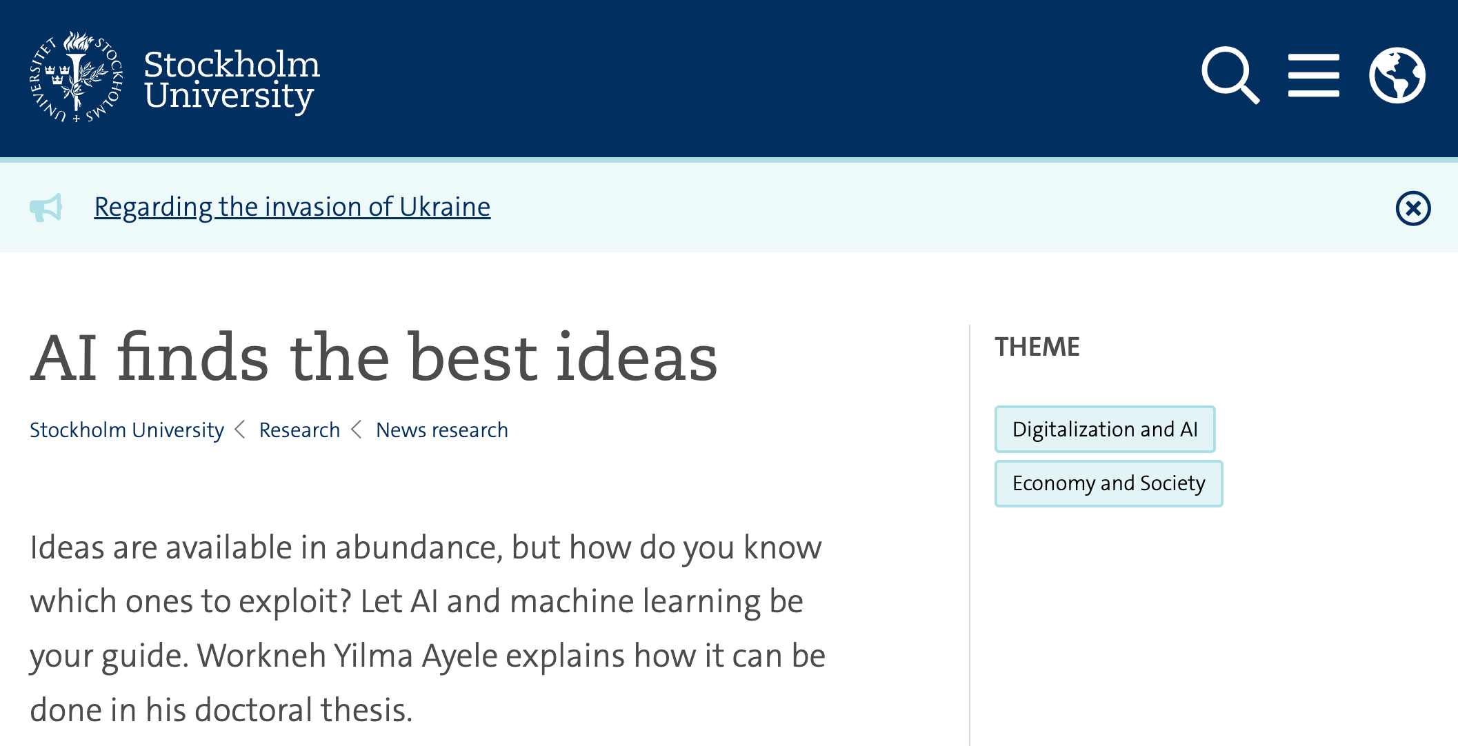
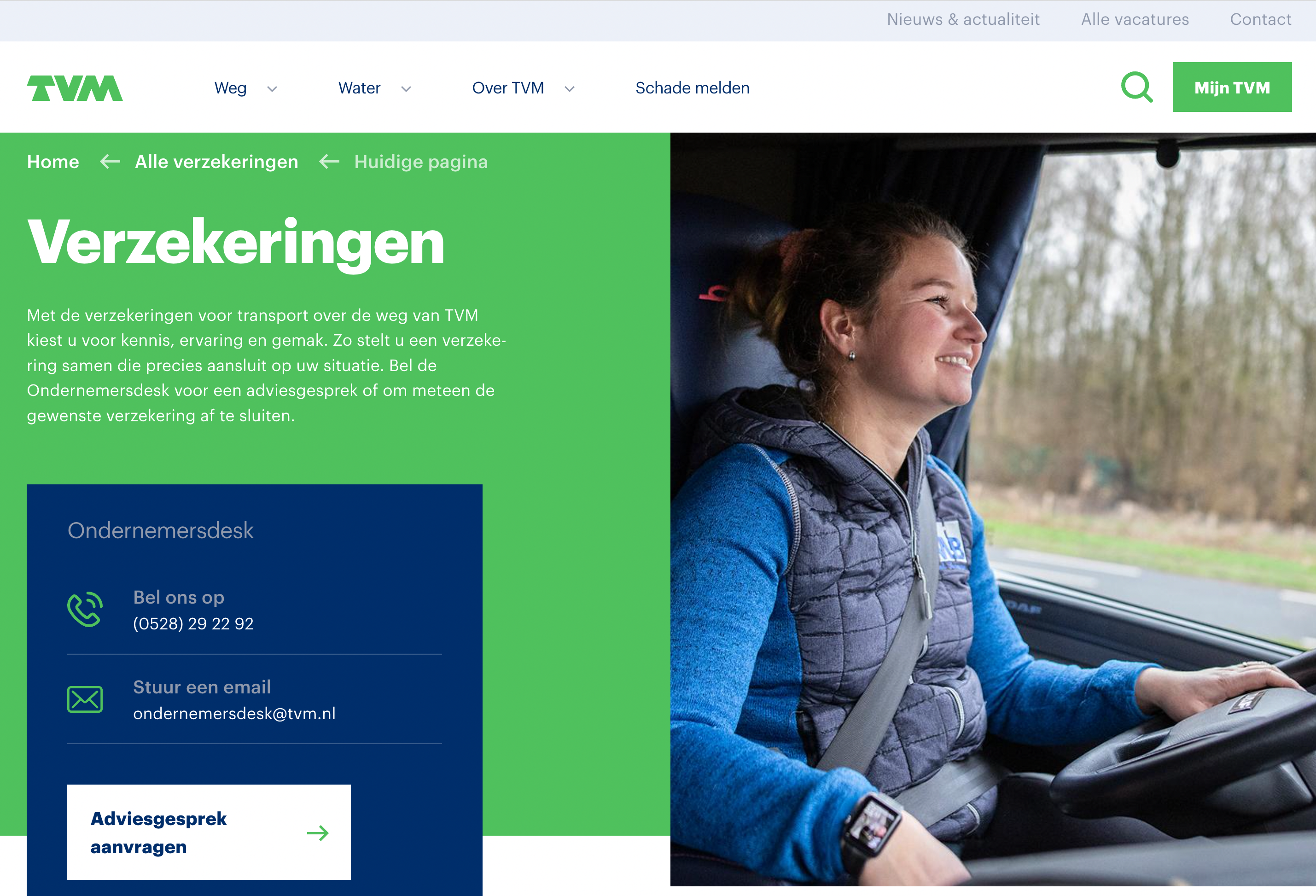
Looking at real-world examples, the Stockholm University website uses left-pointing chevrons. Since breadcrumbs are typically read from right to left, this direction communicates that a section or page resides elsewhere in the hierarchy—an indicator of where content belongs. Similarly, on TVM, the left-pointing arrow shows belonging, not navigation path. In that case, it might be easy to confuse users, since the last breadcrumb ("Current page") sits at the end of the chain with an icon pointing away from the active content.
Right-pointing chevrons on sites like KBC are arguably the more conventional choice. In left-to-right interfaces, right-pointing indicators express the fact that a category contains a subpage or category. Given that web browsing is usually perceived as horizontal, flowing left to right, using right-facing delimiters feels more familiar. Reading in both directions can work, but right-pointing icons remain the safer choice for user expectations.
Positioning: Be Visible and Near the Top
Out of sight doesn't mean out of mind—at least not in the way breadcrumbs are often treated. Breadcrumbs are often scattered across interfaces, sometimes hidden beneath promo headers, images, or even at the very bottom of a page. Yet, to function properly, they need to be both visible and positioned where users naturally look for them.
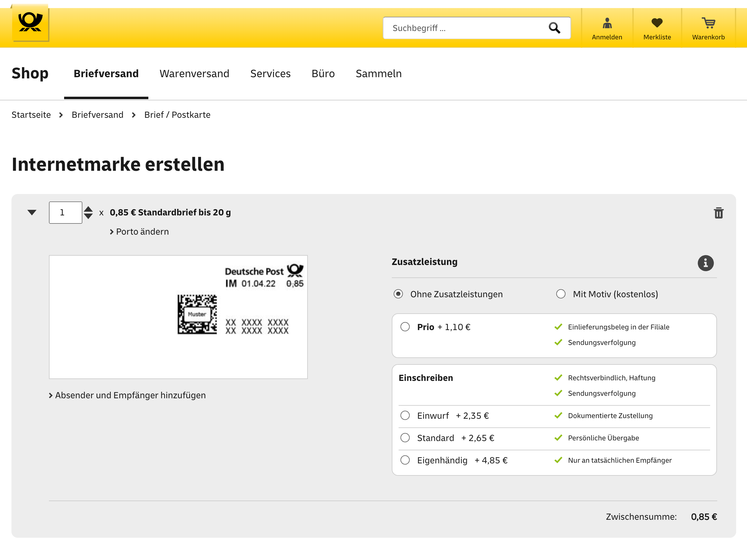
Many sites place breadcrumbs at the top of the page, close to the navigation. Deutsche Post uses that approach, and it works because users associate top-level areas closest to the main page with navigational controls. In contrast, sites like Gothaer drop breadcrumbs just above the footer. While visually polished, the position makes them more difficult to spot, and it's a questionable design decision for user orientation.
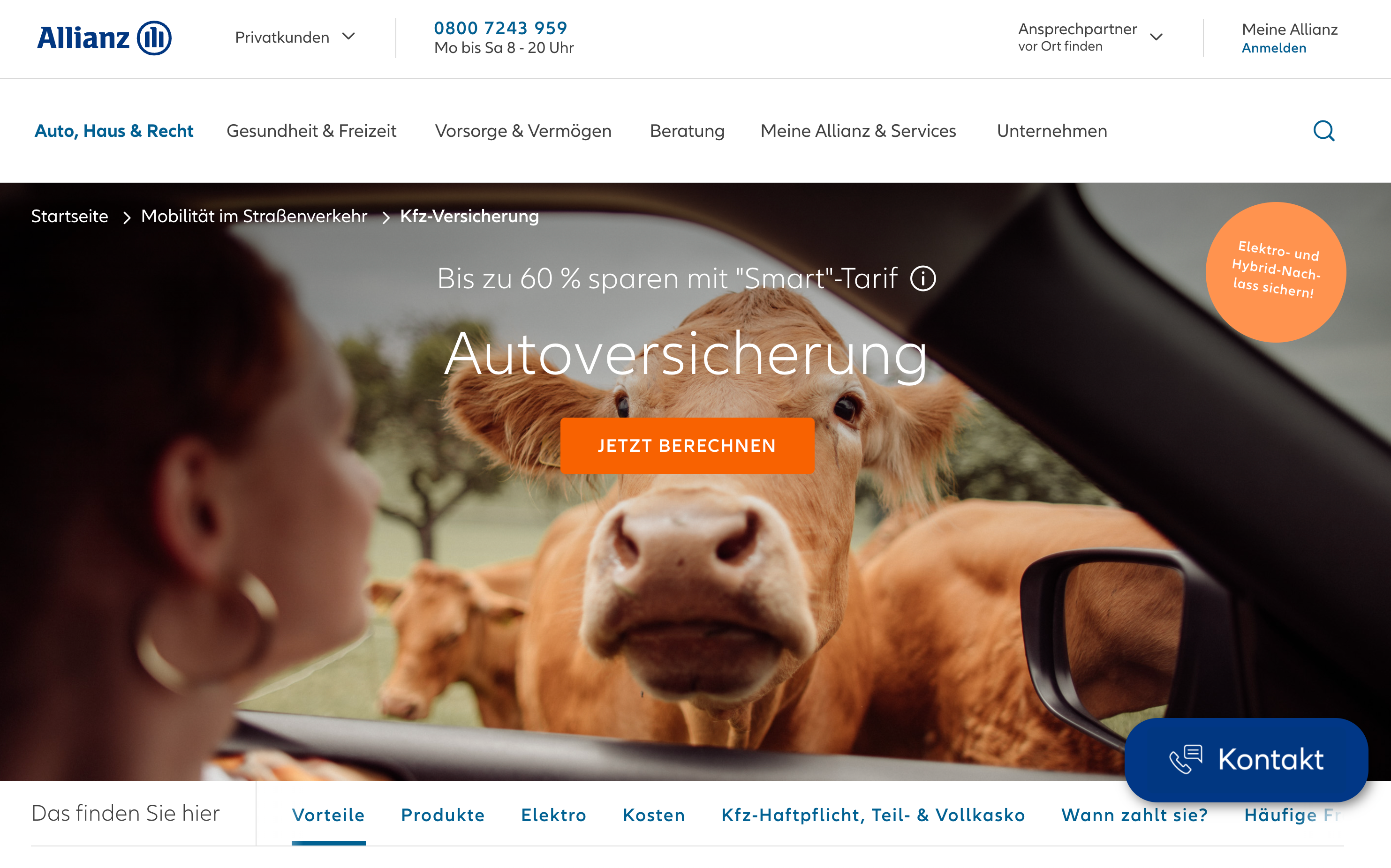
Some sites place breadcrumbs on a visual banner. DHL puts them beneath its primary header image. However, this tends to merge breadcrumbs with promotional content. Users often overlook banners, and in this case the breadcrumbs might be linked—visually and semantically—to the wrong element. Positioning breadcrumbs directly on the image, as seen on Allianz.de, is an improvement. It's simpler to connect the breadcrumbs with the page heading.
A variation on this is a breadcrumbs row that sits above the page's main heading in a dedicated strip, often under the main navigation, similar to what's found on SDU's website: all items are links except for the last one, bolded as the page label. Regardless of where visitors enter a page, they look to the main content for confirmation of where they've landed. That's exactly why breadcrumbs should sit just above that main title—ideally in the area between the global nav and the heading. The sweet spot is close to the top and within eye-level's pre-scroll zone.
Visibility Above the Fold Isn’t Negotiable
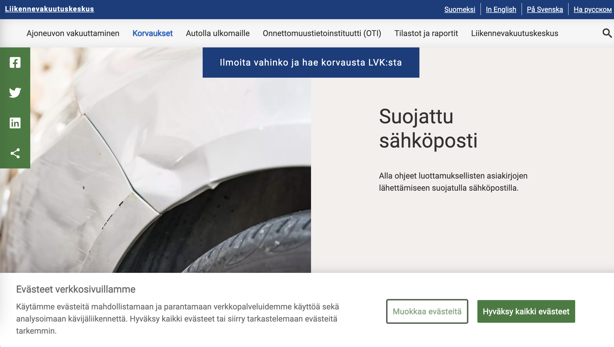
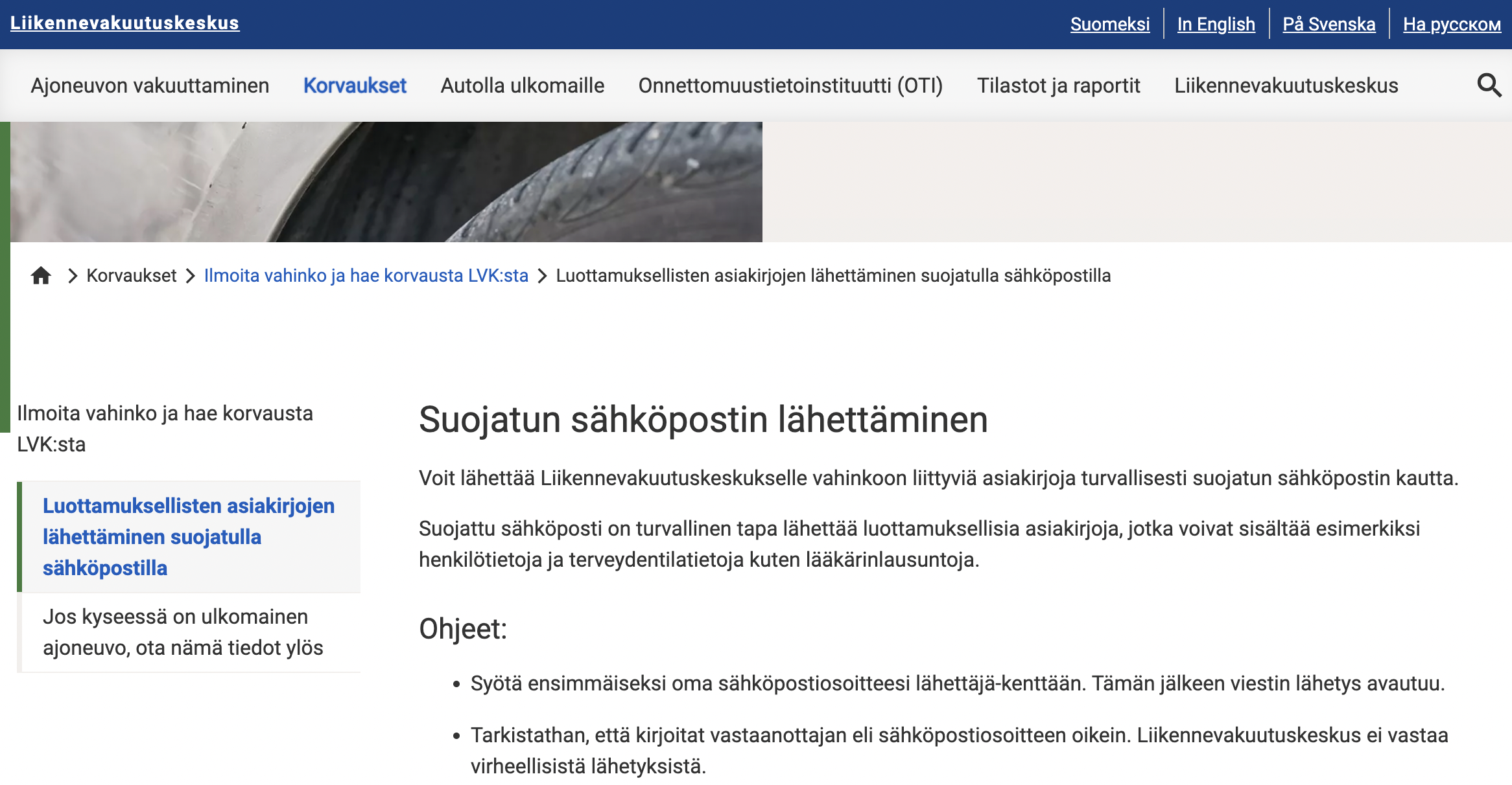
Squeezed by sticky headers, cookie banners, and other UI elements, breadcrumbs can get pushed further down or entirely off-screen, even when placed nominally "above the fold." The LVK.fi homepage offers a case in point: hidden under a cookie prompt, breadcrumbs become nearly invisible. This placement almost forces users to scroll an entire screen before reaching substantive content on every new page they visit.
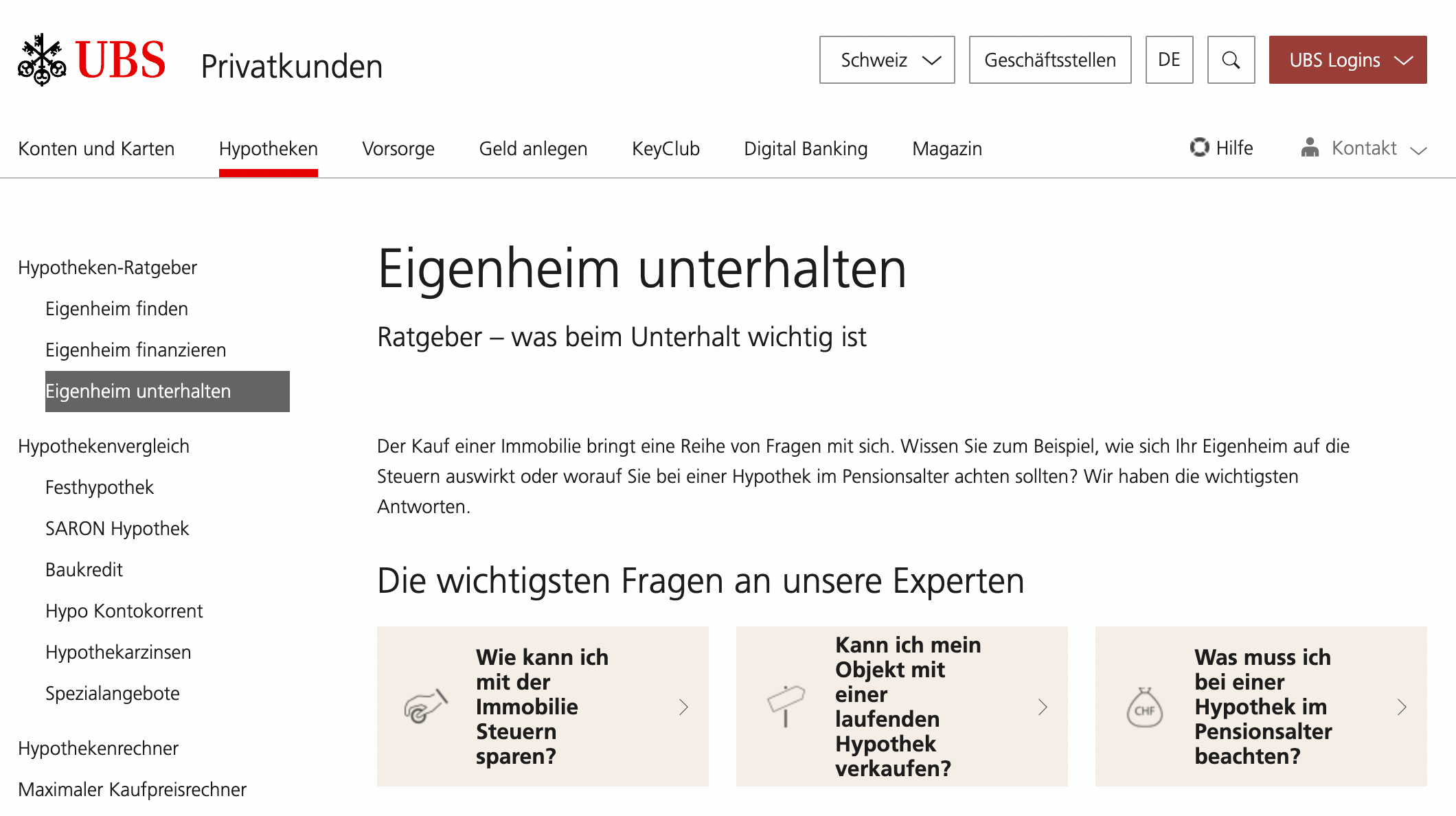
These screenshots illustrate a larger problem beyond visibility: screen realestate. When announcements, navigation stacks, and sticky elements consume more than half of the initial view, the actual content is pushed downward. This setup is a costly trap; the more often users must scroll to begin reading, the more likely they'll leave without completing a task. This problem affects content-heavy university sites like University of Gothenburg, where a large portion of the homepage is taken up by large visuals. By contrast, UBS skips breadcrumbs altogether and relies on stable sidebar navigation, letting users access content instantly.
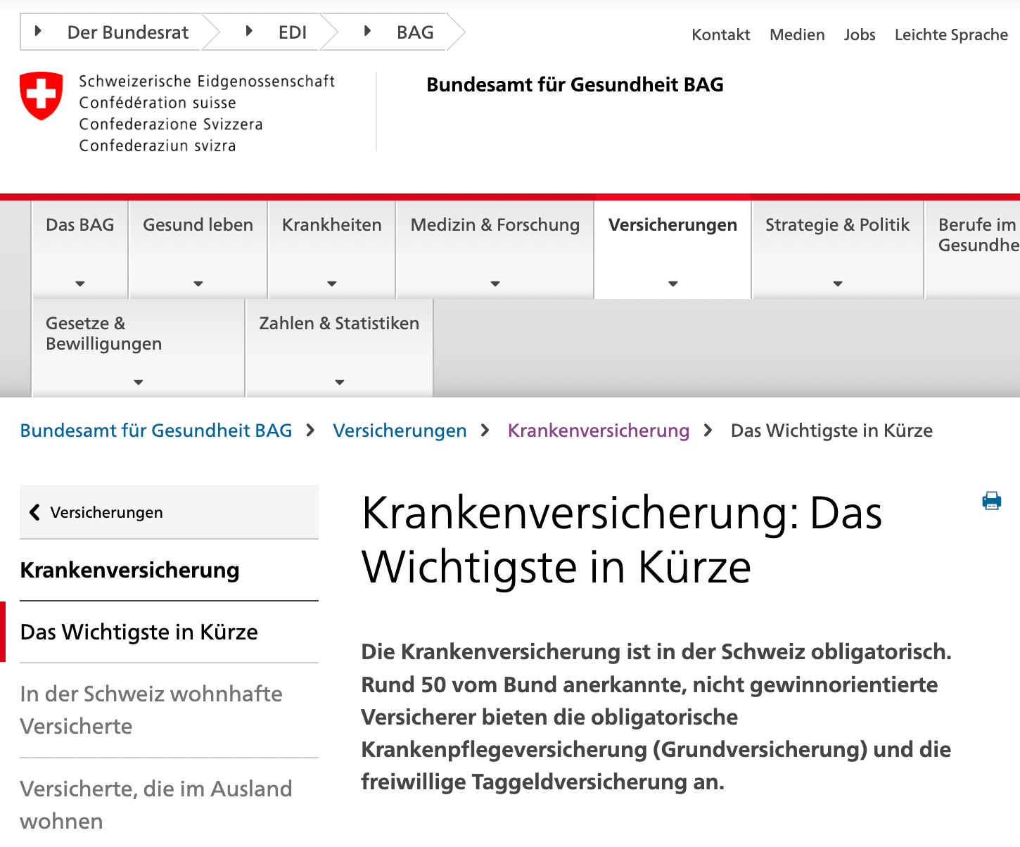
It's worth testing whether hiding a promo or navigation element shifts the user’s attention and improves task completion rates. Sometimes "boring" design—straightforward placement without heavy visuals—proves more effective for users trying to locate where they are. A good example is the very top arrangement used by Bundesrat Switzerland: breadcrumbs placed above primary navigation, acting as a global wayfinding system across a whole family of sites, not just local hierarchy. This concept aligns with Erik D. Kennedy’s laws of locality and functions as an entirely different kind of navigation—be aware not to mix this global breadcrumb approach with the standard one.
Bottom line: to be effective, breadcrumbs must be visible without scrolling, preferably close to the main page heading. This is exactly the place where users naturally search for confirmation of their current location and clues about orientation.
When Links Aren’t Links
Across the web, breadcrumb implementations differ in a subtle but critical way: how many of the crumbs are actually links. Some designs treat every crumb as navigable, while others mix linked items with plain text labels representing intermediate sections. Many sites disable certain crumbs in the middle of the path, leaving only the first and last items clickable.

In Sparkasse’s breadcrumbs, for instance, “Startseite” and “Karten” are real links, but the levels between them are not. There may be sound structural reasons for this, but the established user expectation is that every crumb is a link. Breaking that expectation is a recipe for rage clicks: even if a non-linked crumb is visually differentiated, users often assume the difference is due to the page having been visited before, not because it’s inert.
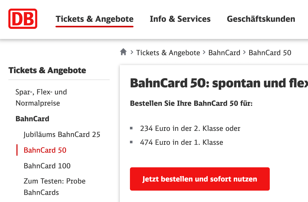
On Deutsche Bahn, text labels and links share nearly identical styling, so users can’t tell what’s clickable until they hover or tab through. Adding plain underlines to links would clarify things considerably.
When a component in an interface behaves differently or fulfills a unique purpose, it needs to stand out. Breadcrumbs typically contain two types of items: the current page (if displayed) and the trail leading up to it. The current page is where the user already is — there is no navigation destination. If it looks exactly like every other crumb, it falsely suggests that clicking it will yield a result. That can lead to users assuming the final crumb is actually the parent page, not the current one, prompting them to click it in hopes of stepping back. When nothing happens, confusion ensues.
To sidestep this ambiguity, either style the current page distinctly or omit it altogether. Gov.uk chose the latter: the current page never appears in the breadcrumb trail, leaving every visible crumb as a genuine link with appropriate :active and :focus states for keyboard navigation. The approach works well because the breadcrumbs sit directly above the page heading.
To Include the Current Page or Not?
Whether the current page belongs in the breadcrumb trail is one of the most common points of divergence. DocuSign’s developer docs include it; Stripe’s docs do not.
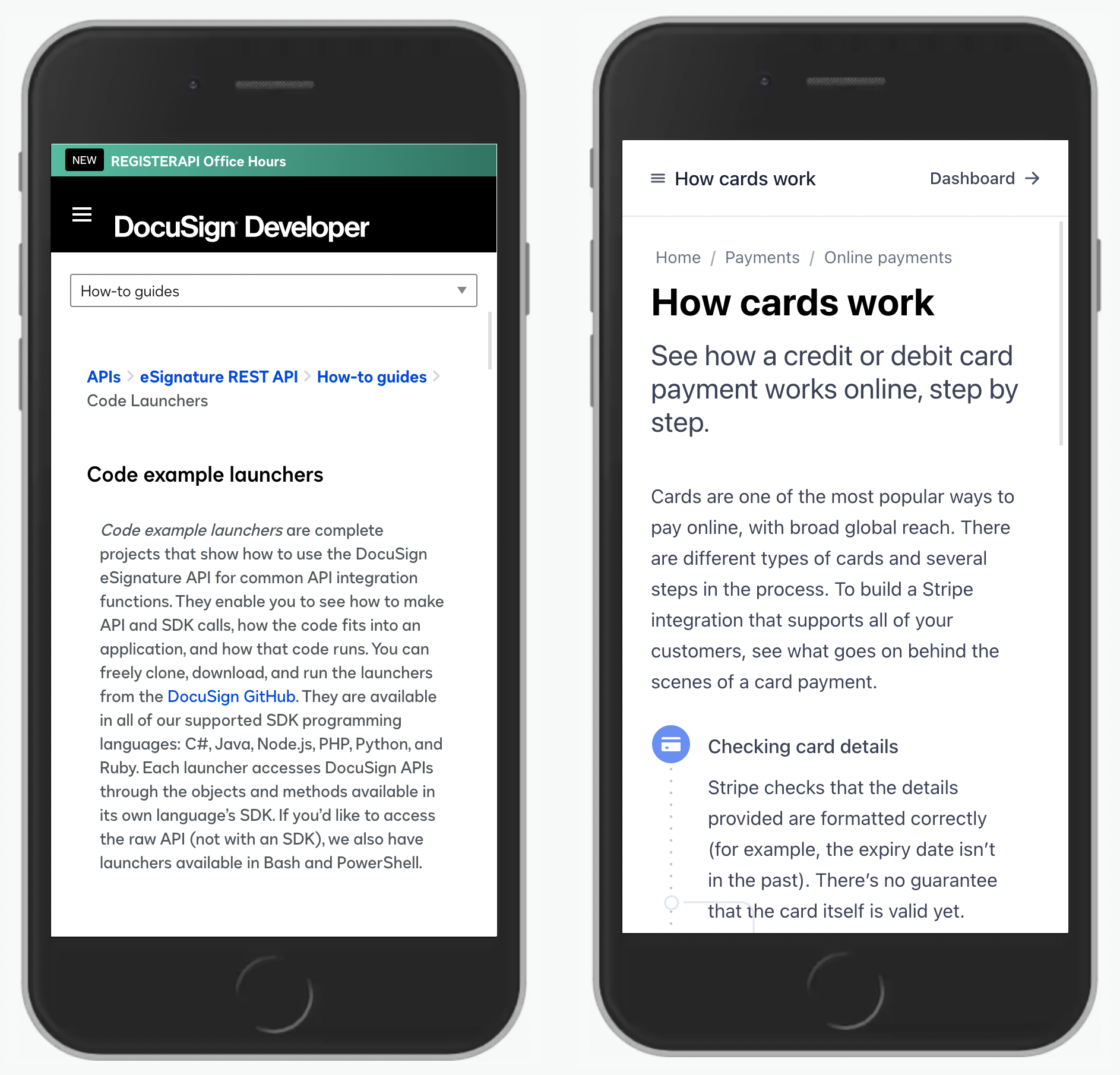
The choice matters less when breadcrumbs appear directly above a heading. In that layout, the last crumb can be safely dropped because the heading itself conveys the current location, particularly if proper semantics expose that heading to screen readers. The farther breadcrumbs sit from the heading, however, the more sense it makes to retain the current page for clarity.
KBC’s implementation is a case in point: the relationship between breadcrumbs and heading is not immediately obvious. Removing the final crumb could lead users to believe they are on a page called “Self Banking,” which isn’t the case. The final crumb matching the page heading strengthens the connection — helpful when the two do align, though they don’t always.
Another scenario favoring inclusion is a sticky breadcrumb bar. On long pages, as users scroll, the trail can serve as a persistent reference point to re-orient them. Either approach works, provided breadcrumbs are close to the heading; when they are, including the current page is less critical than the distance between the two elements.
Handling the Space Crunch
Sites with deep information architectures or pages with long labels — particularly in German and Finnish — often struggle to display the full path. Truncation is a common response, but it trades completeness for brevity.
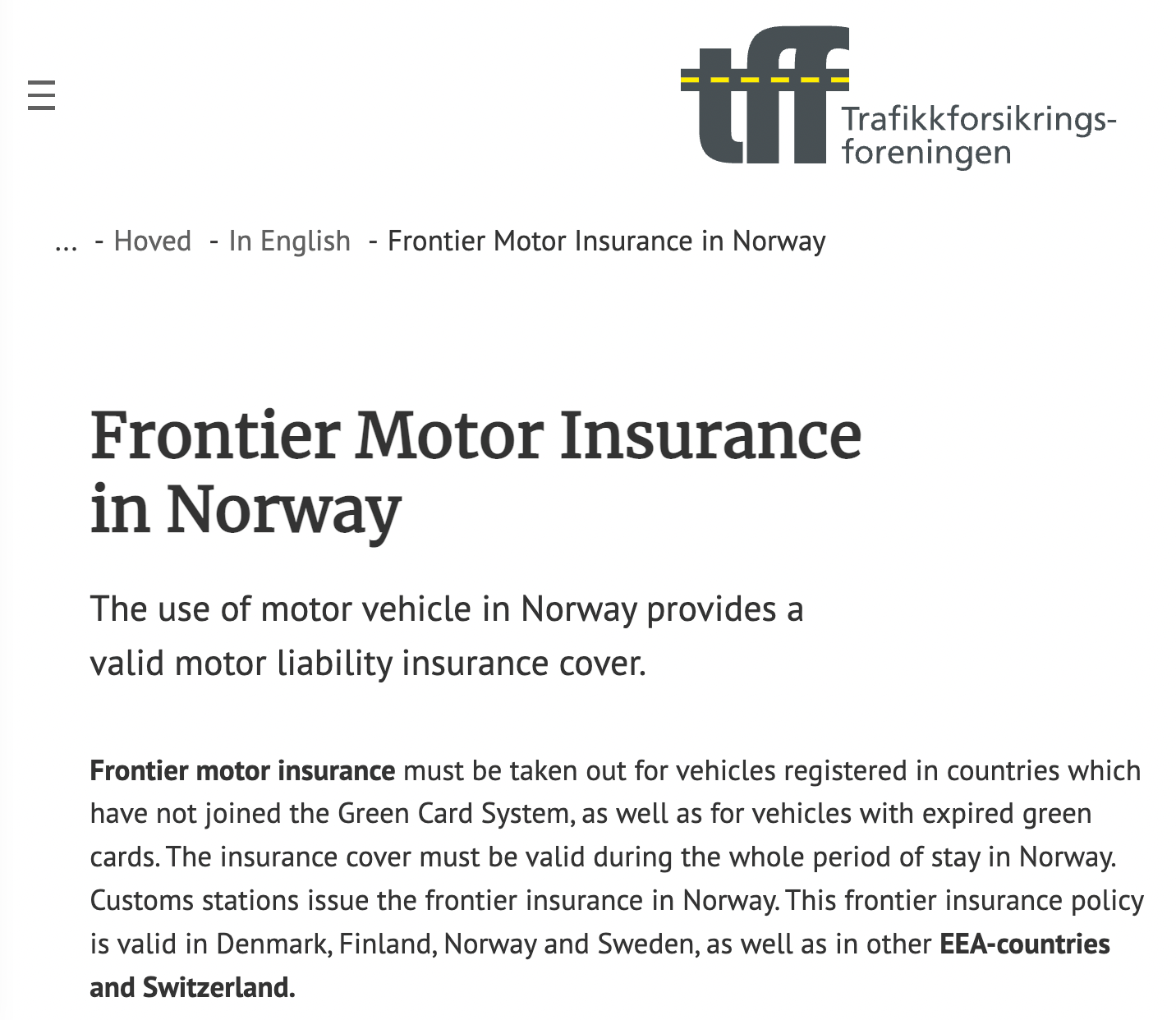
Frontier Motor Insurance collapses intermediate steps into an ellipsis, which removes a title but leaves a link to explore. The trade-off is that users lose visibility into the full path. Alternatively, the entire trail can be wrapped onto multiple lines, though this eats into scarce vertical and horizontal space and is frequently advised against. Some sites, like Swisscom, simply drop breadcrumbs on smaller viewports, compelling users to fall back to global navigation — a costly proposition when the current page must be rediscovered through drill-down menus.
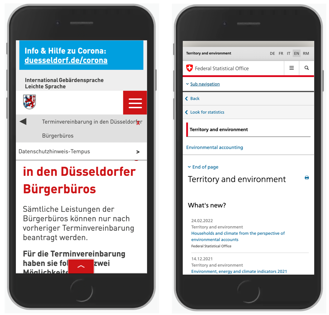
Drop-down menus provide another escape route. But implementations from the City of Düsseldorf and the Federal Statistical Office of Switzerland rely on many arrows pointing in multiple directions, which can be harder to parse.
A cleaner trade-off is to maintain a single line while enabling horizontal exploration. The German Federal Foreign Office displays complete breadcrumb labels; when they overrun the viewport, a fade-out cue invites users to swipe left or right to see the rest. Nothing is truncated; it just requires horizontal scrolling. ADAC applies the same pattern. A more structured variant is a swiper assistant, used by Süddeutsche Zeitung for primary navigation, which could adapt to breadcrumbs as well.
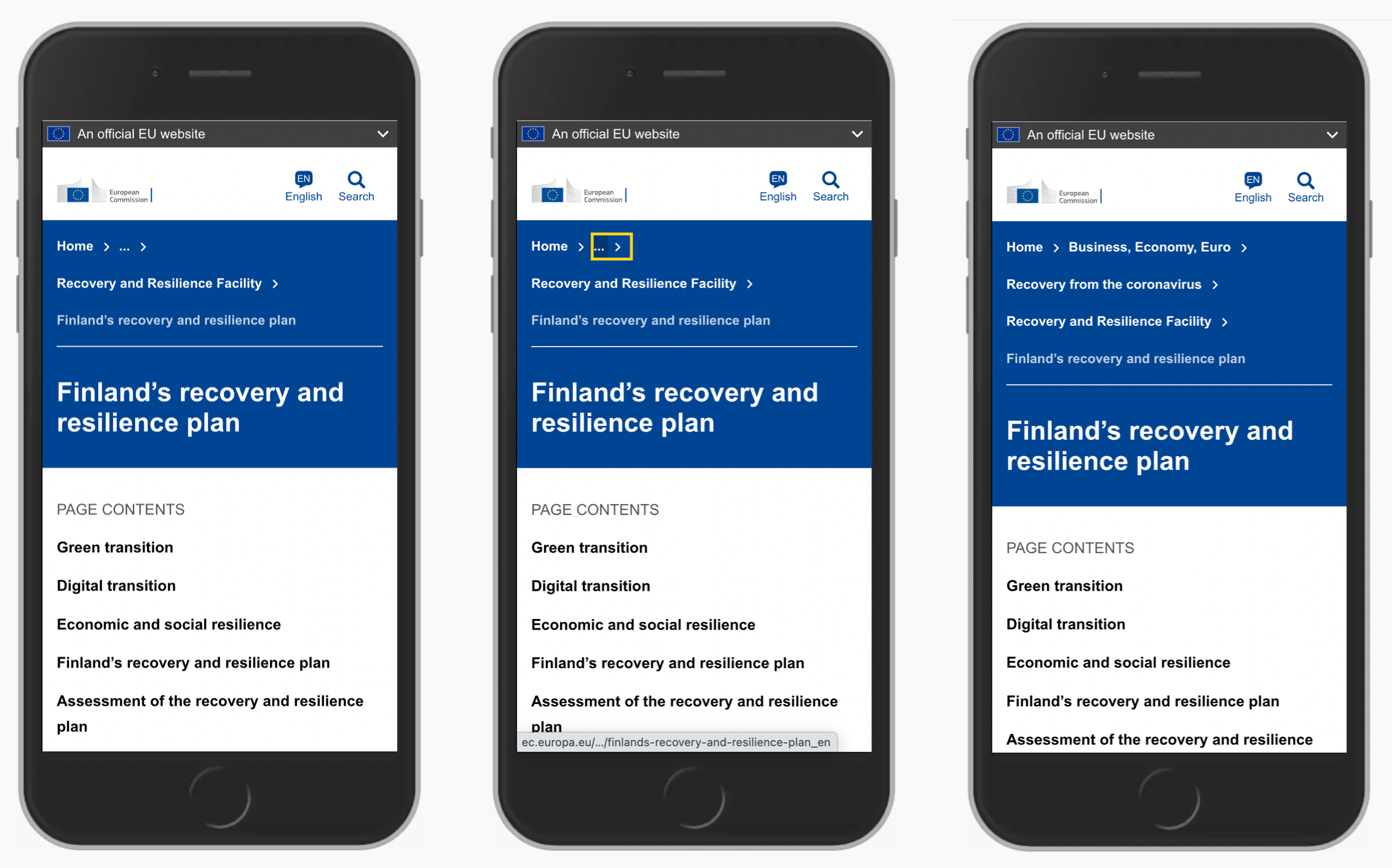
The European Commission’s website offers an interesting twist: the parent of the current page is always fully visible, but higher ancestors are compressed. Tapping or activating the truncated link expands the entire trail — effectively a breadcrumb accordion. Notably, the current page rendering as plain text while breadcrumbs appear as links reinforces their distinct functional roles.
Breadcrumbs That Go Sideways
Thus far, every pattern serves backward navigation exclusively, offering a static map of where the user has been. Moving forward or to a sibling category requires leaving the breadcrumb trail entirely. An evolution of this pattern — “sideways breadcrumbs” — pairs the trail with drop-down menus to support lateral movement.
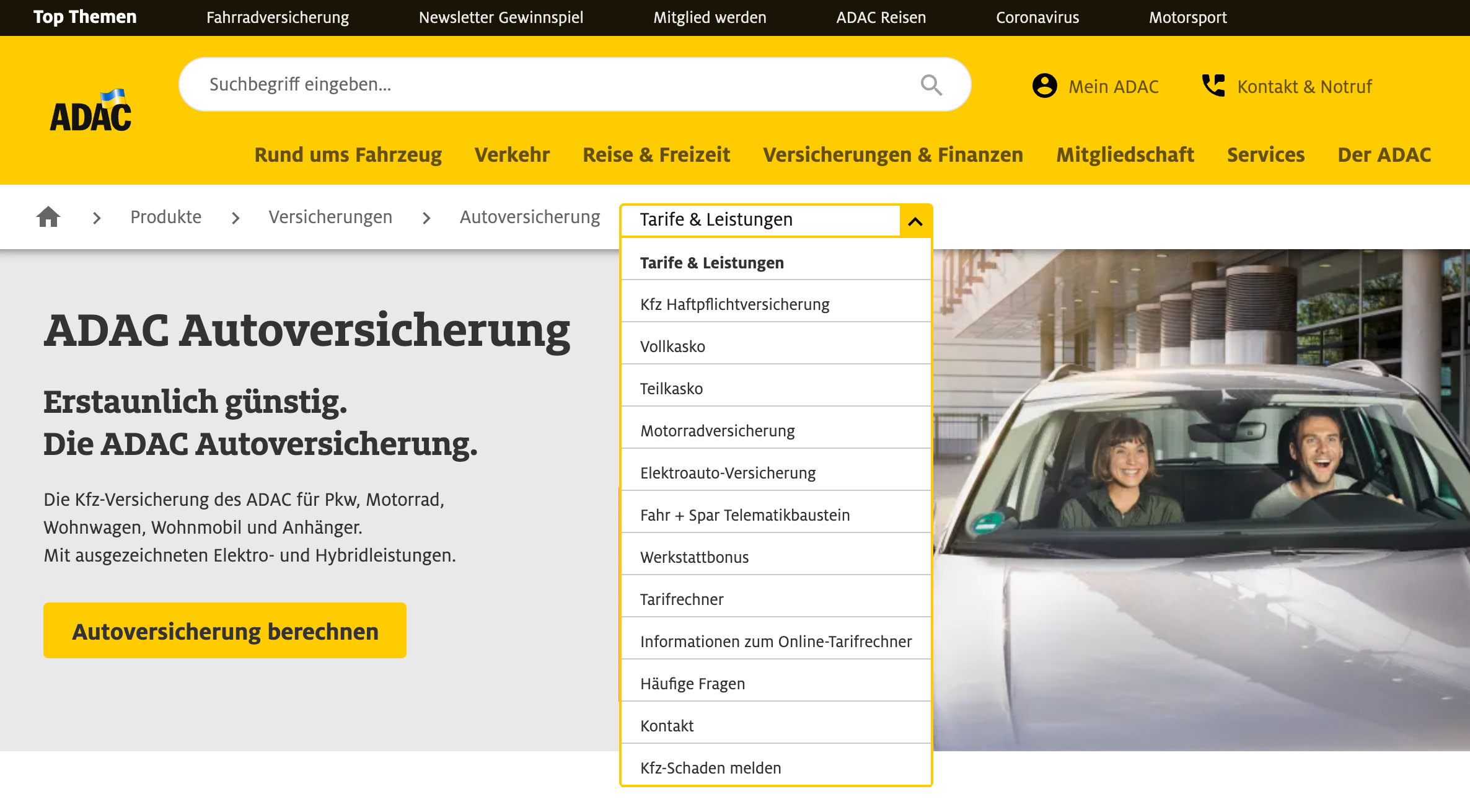
ADAC extends its breadcrumbs with a drop-down that lets users jump between sibling sections of the current page. Though the chevron is absent, the pattern accelerates navigation and occupies far less space than persistent sidebar menus. On mobile, the breadcrumbs convert into a horizontal swiper whose drop-down reveals available options on tap or Enter key.
The City of Düsseldorf applies a look-alike pattern, but the drop-down on the final item — labeled “other topics” rather than the current page — initially seems to offer access to siblings of the parent section, when it really jumps to the current section’s peers. It is a sideways navigation nonetheless. The Federal Statistical Office of Switzerland goes broader, displaying global sideways breadcrumbs that move users between departments across its parent organization’s network of sites. Those breadcrumbs sit at the top of the page — though they disappear on mobile.
Sideways breadcrumbs add value beyond mere location awareness: they map relationships between sections and provide shortcuts between related content with a minimal footprint. As a supplement to or replacement for traditional breadcrumb trails, they merit serious consideration.
Breadcrumbs Are One Tool Among Several
Breadcrumbs support navigation, but they don’t replace it. Used alone, they aren’t enough for users to move through a sizable site efficiently. Breadcrumbs work best when they reinforce other patterns, and several complementary techniques can be layered in alongside them.
Multiple Horizontal Bars
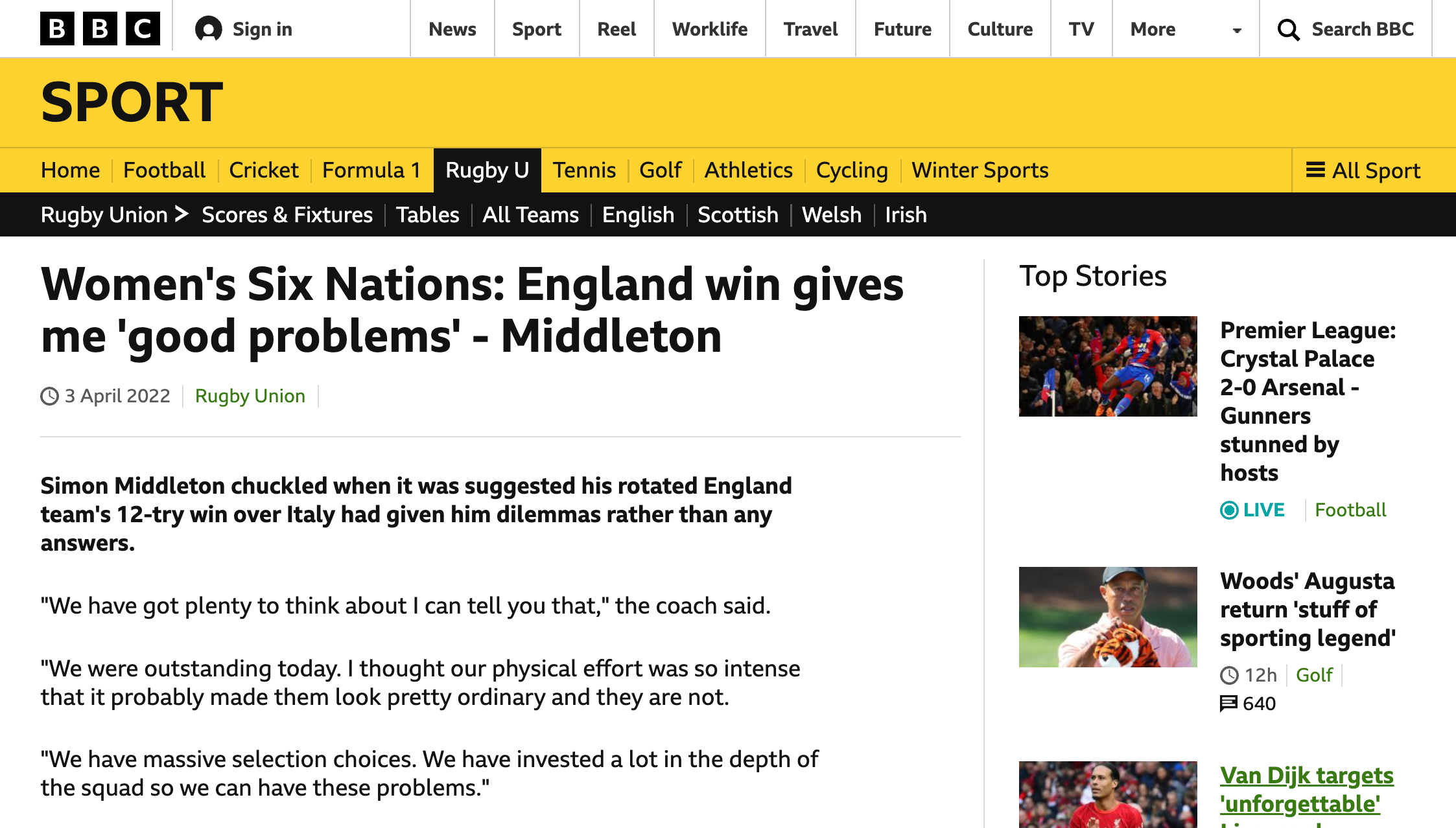
One strong option is horizontal layering: stacking one dedicated navigation bar per level of the hierarchy. This lets users jump directly to any level and see all sibling sections at every tier simultaneously. Large publishers such as the BBC rely on this approach, giving each subsection its own persistent row of links.
Vertical Sidebar Navigation
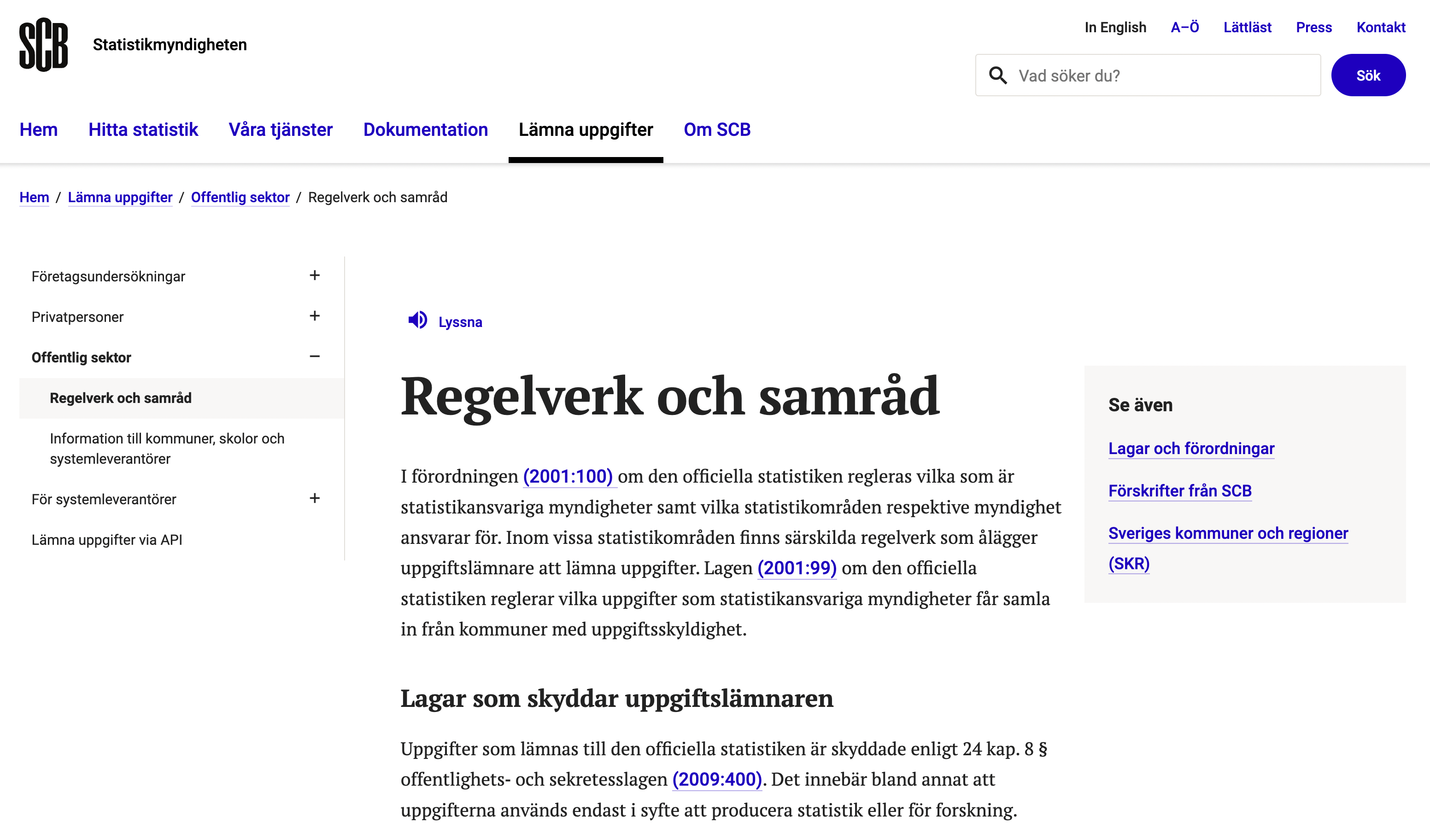
Alternatively, navigation can be laid out vertically in a sidebar. This configuration supports more visible items at once and accommodates expandable accordions without obscuring other choices — a common limitation of horizontal rows. The vertical pattern is a staple of content-heavy government portals; Statistics Sweden uses it consistently across its site.