
Beyond “Click Here”: Writing Links That Work For Everyone
Links are the connective tissue of the web, yet many sites and emails treat them as an afterthought. Slava Shestopalov outlines how common link phrasing and formatting mistakes hurt usability, especially for visually impaired users, and how small changes can make a big difference.
Phrases like “click here,” “by this link,” or “read more” are so ingrained in web writing that few stop to question them. But consider how often you encounter sentences like these:
- Fill in this form by the end of the day.
- Check the equipment policy by the link.
- You can find more information here, here, and here.
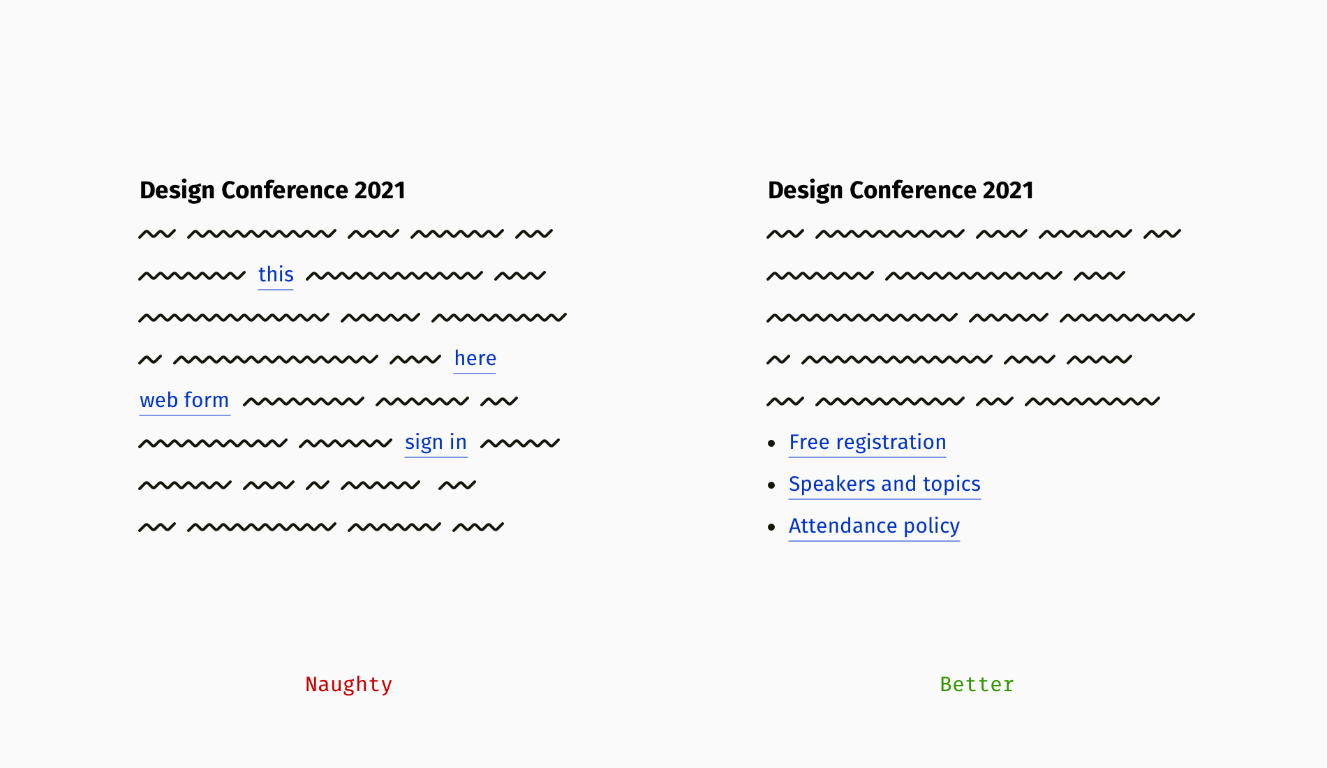
A hyperlink is a combination of a web address and a clickable element, usually a word or phrase. When that element is vague—"this" or "here"—it becomes a poor target for a cursor or a finger, and it offers no transparency about what's behind it. The reader has to re-read the entire surrounding sentence to guess the destination.
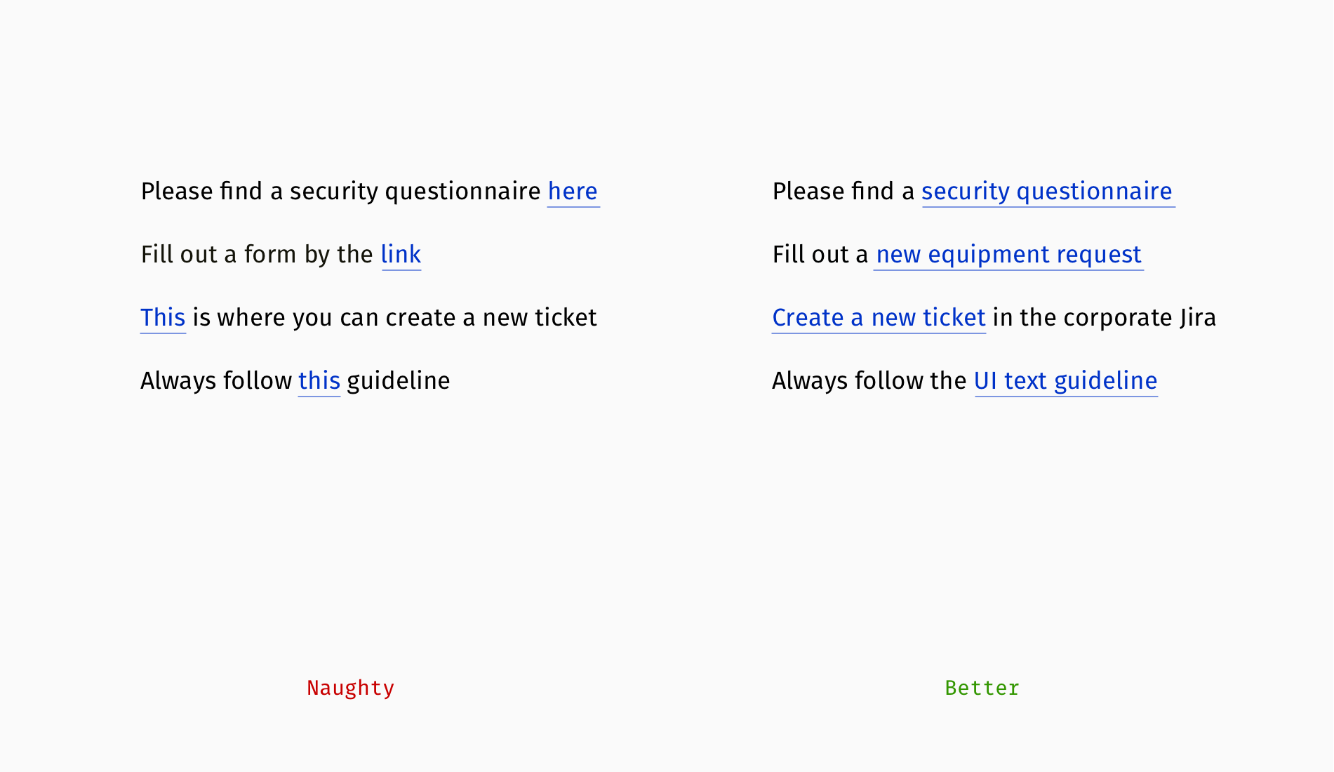
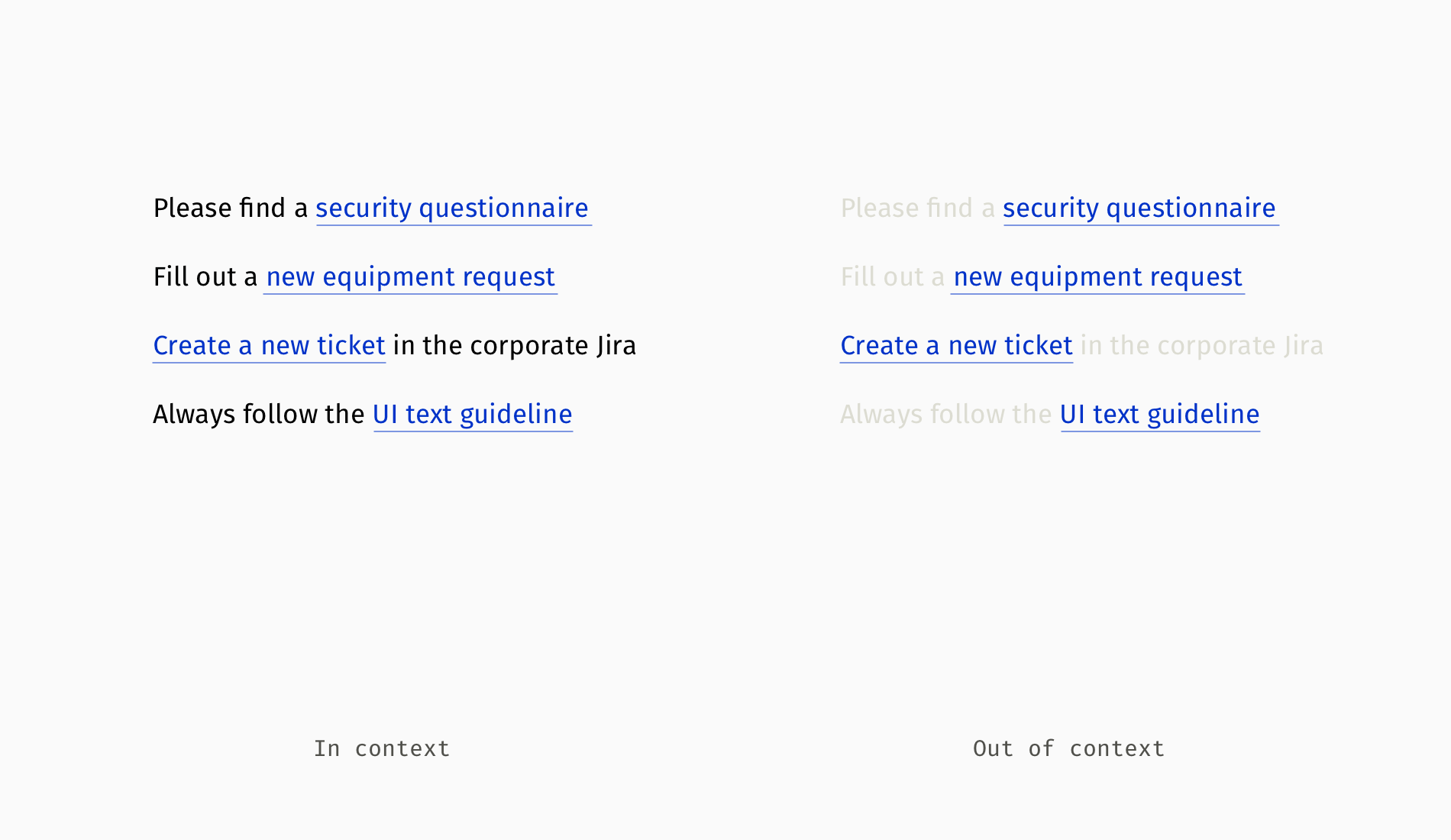
Descriptive link text, on the other hand, attaches the URL to a clear, self-explanatory phrase. This makes the destination obvious and gives users a larger, more convenient target. A well-composed link works out of context, combining a topic (e.g., security, brand) and a format (questionnaire, policy, guideline).
When To Show The URL
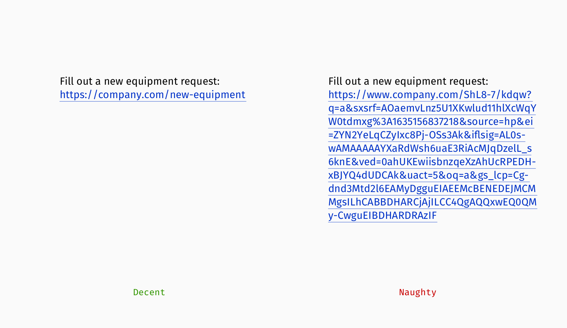
If a web address is short and readable, showing it directly can work well—especially when the audience needs to copy and paste it elsewhere. A chain like M$c0P88%X4LHr&dxQ1A is a different story. Long, indecipherable URLs are rarely worth displaying outright.
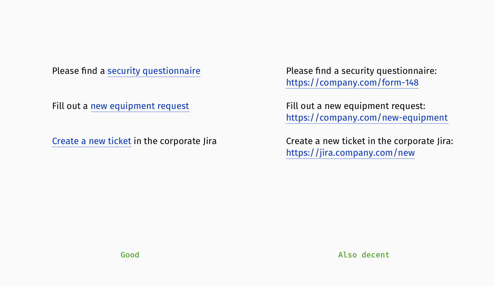
For long URLs, you can embed the address into a succinct phrase or use a shortening service like Bitly or Cuttly. But these tools are not perfect: a shortened link often replaces meaningful parts with random symbols, which look suspicious. Customizing shortened URLs is possible, though it is usually a paid feature.
bit.ly/30SjUa4y(suspicious and unreadable);bit.ly/smashing-books(readable topic);smash.ing/30SjUa4y(recognizable domain);smash.ing/books(fully transparent).
Guiding Users To Downloads
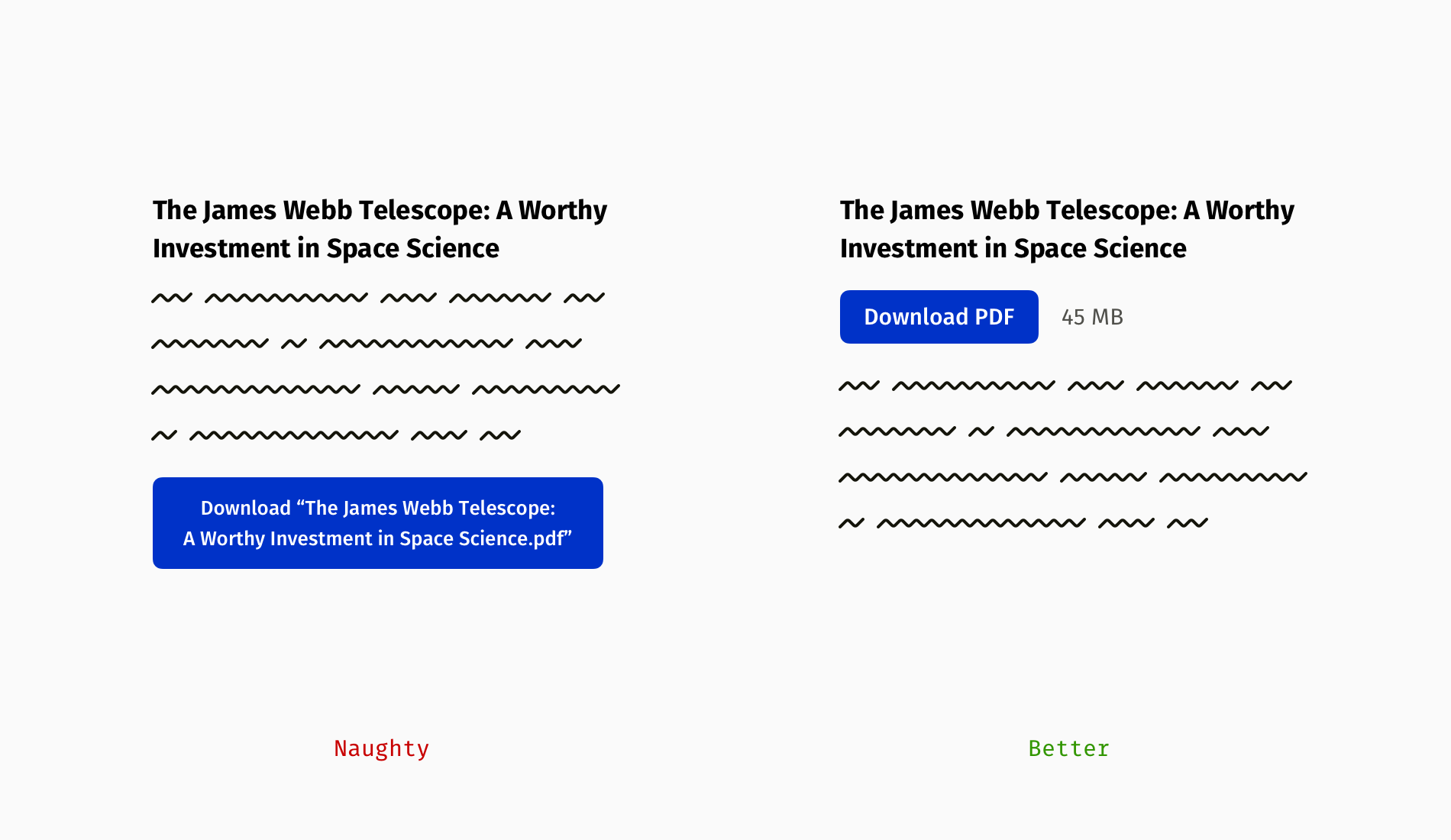
Links to downloadable files require special care. Beyond embedding the link in a descriptive phrase, you should tell users exactly what they're getting: the file format and its size.
- The format tells readers what they can do with the data—whether it's read-only or editable.
- The file size matters to people on costly internet plans, slow connections, or with limited local storage.
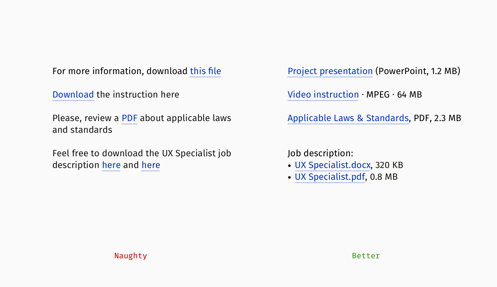
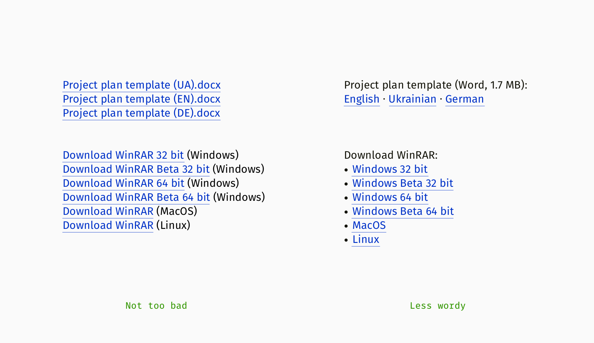
When you share multiple files—for instance, in different formats or versions—each link needs to be correct, but the whole set also needs to be scannable and easy to navigate.
Links Or Buttons: Choosing The Right Element
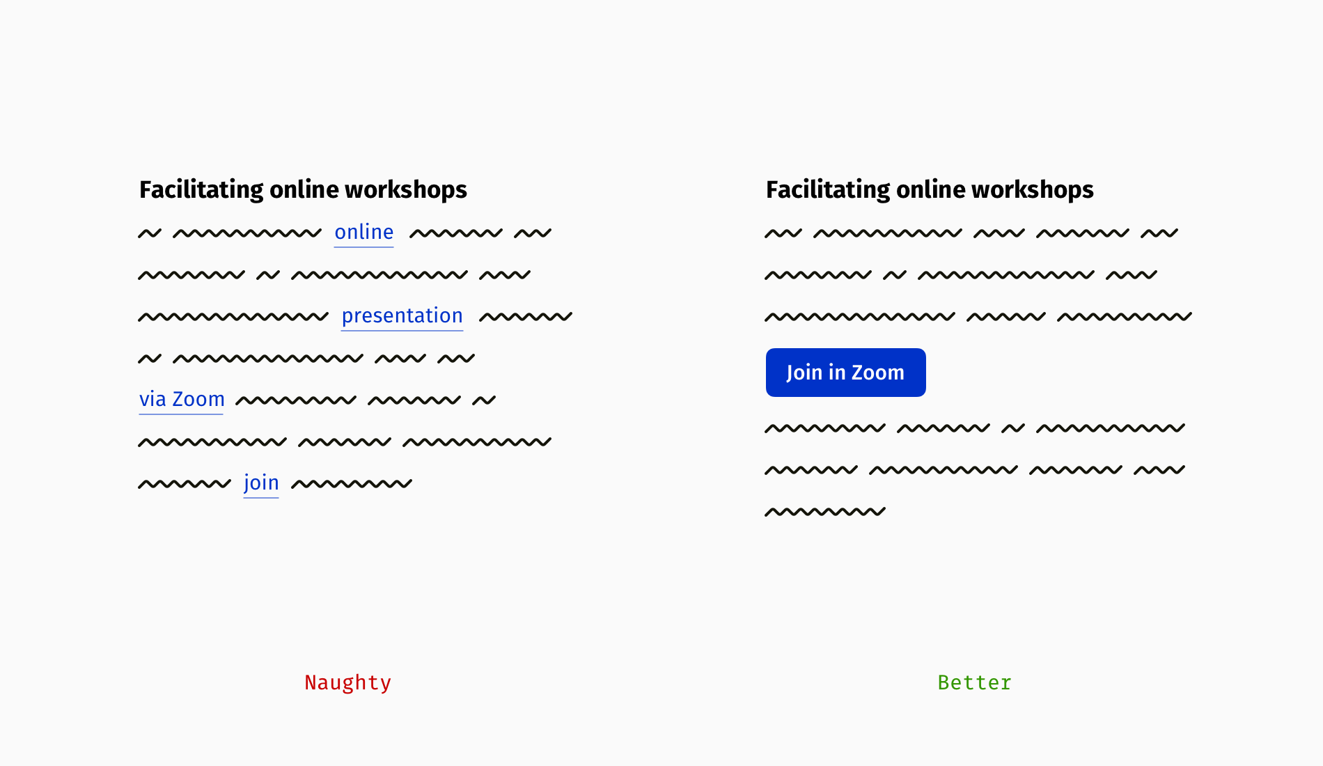
Not all links on a page carry the same weight. When authors want to drive attention to one primary action—"Subscribe to the newsletter," "Buy tickets," or "Get the white paper"—presenting it as a button is often the better choice.
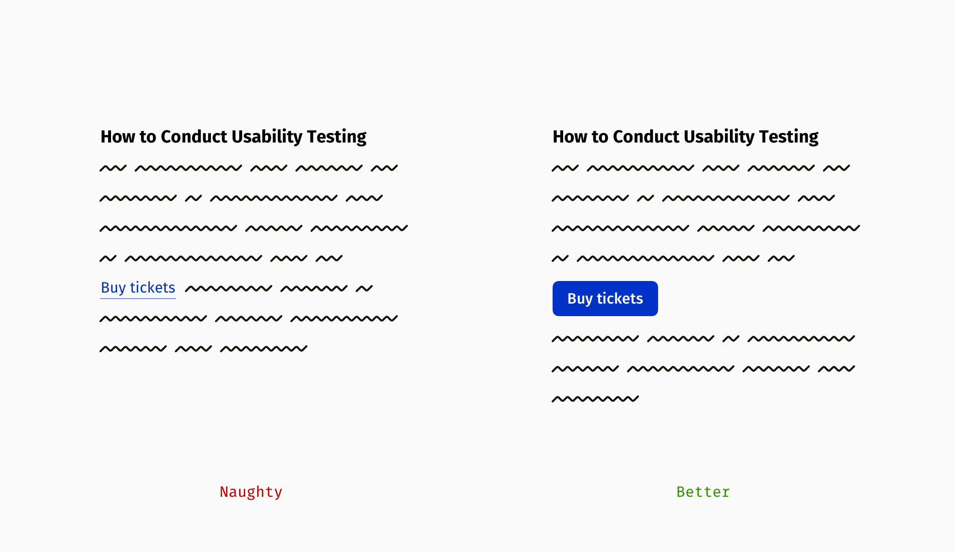
If you cannot build a button due to technical or time constraints, a simple alternative works: place the link on its own line, make it bold, and add spacing above and below.
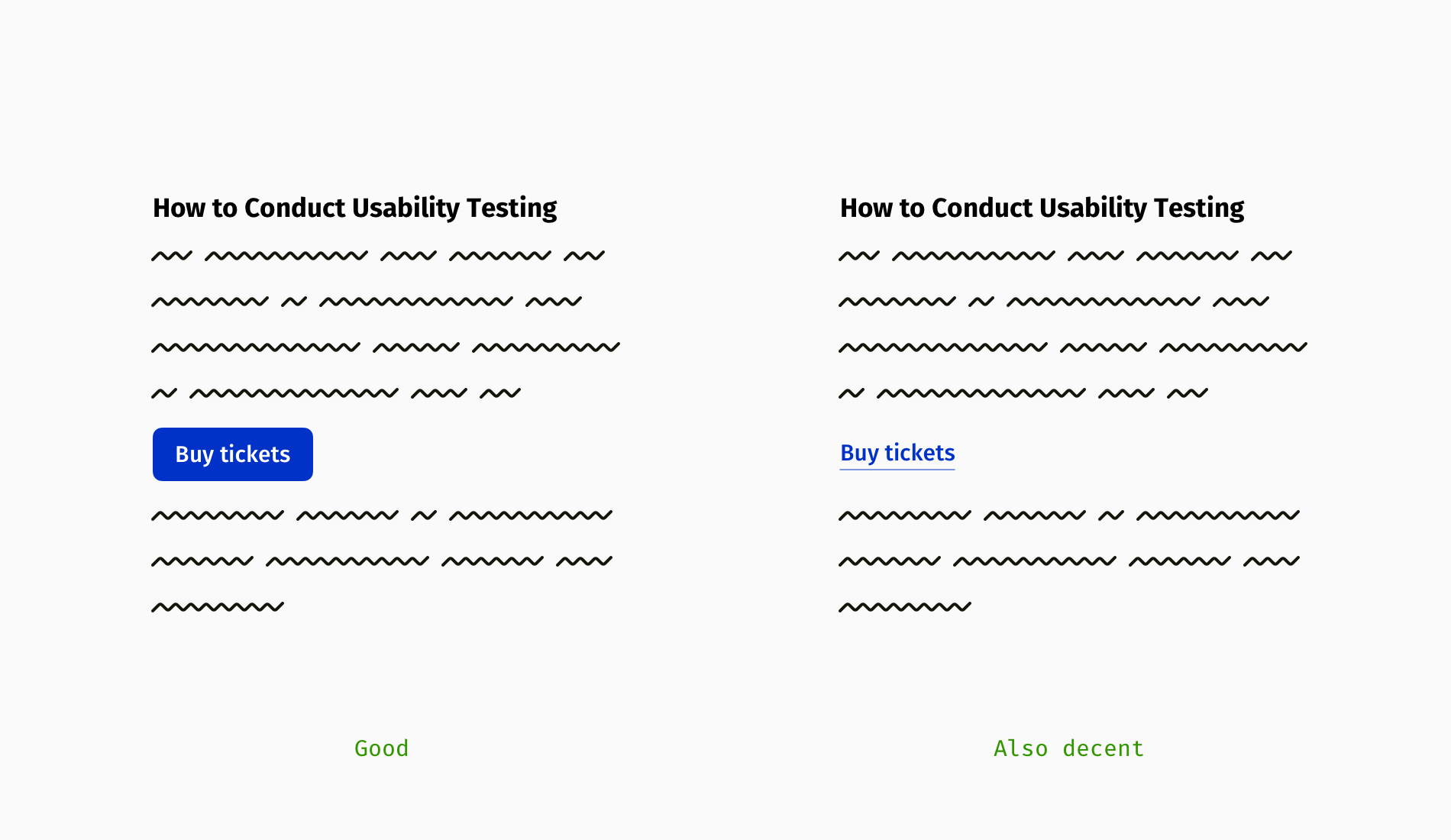
Button text follows its own rules. It should be concise (up to 4–5 words), ideally start with a verb ("get," "buy," "download"), and honestly describe the action. Avoid hiding unpleasant steps such as watching ads, registering, or submitting personal data. Compare "Download the report," which implies the download starts immediately, with "Get the report," which often means the user hands over their contact details first.
Managing Links In Rich Text
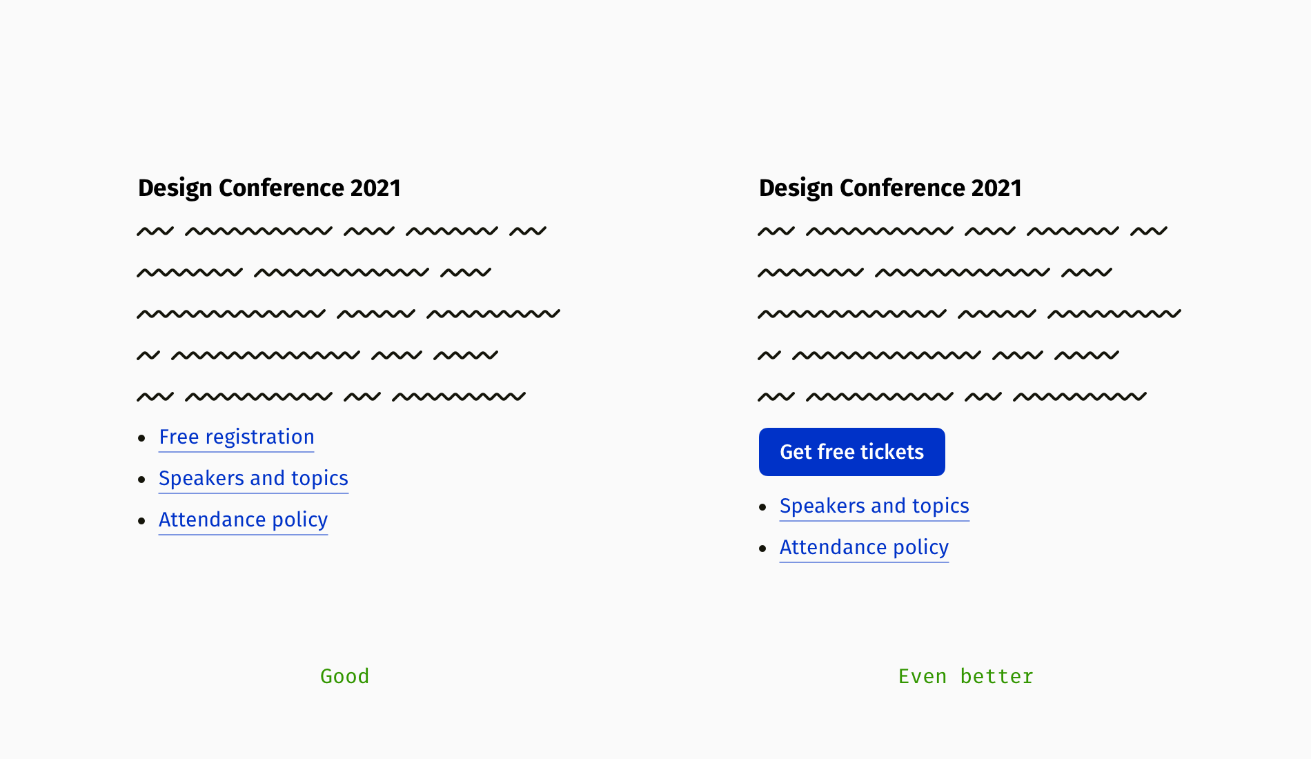
Links make the internet work, but sprinkling URLs into every sentence is not good practice, unless you’re building a cross-connected knowledge base like Wikipedia. The first step is to ensure all those links are necessary. If a link can be cut, cut it. For the rest, grouping them helps: place links in a bulleted list, beside related paragraphs, or under a heading like "Recommended materials."
Grouping works, but if the goal is to drive a specific action, the primary link must stand out—a classic case for a button.
Descriptive links improve usability, but they have a downside: longer phrases can break awkwardly across lines, leaving one part of the link at the end of a line and the rest on the next. This distortion is annoying, particularly in text-heavy pages.
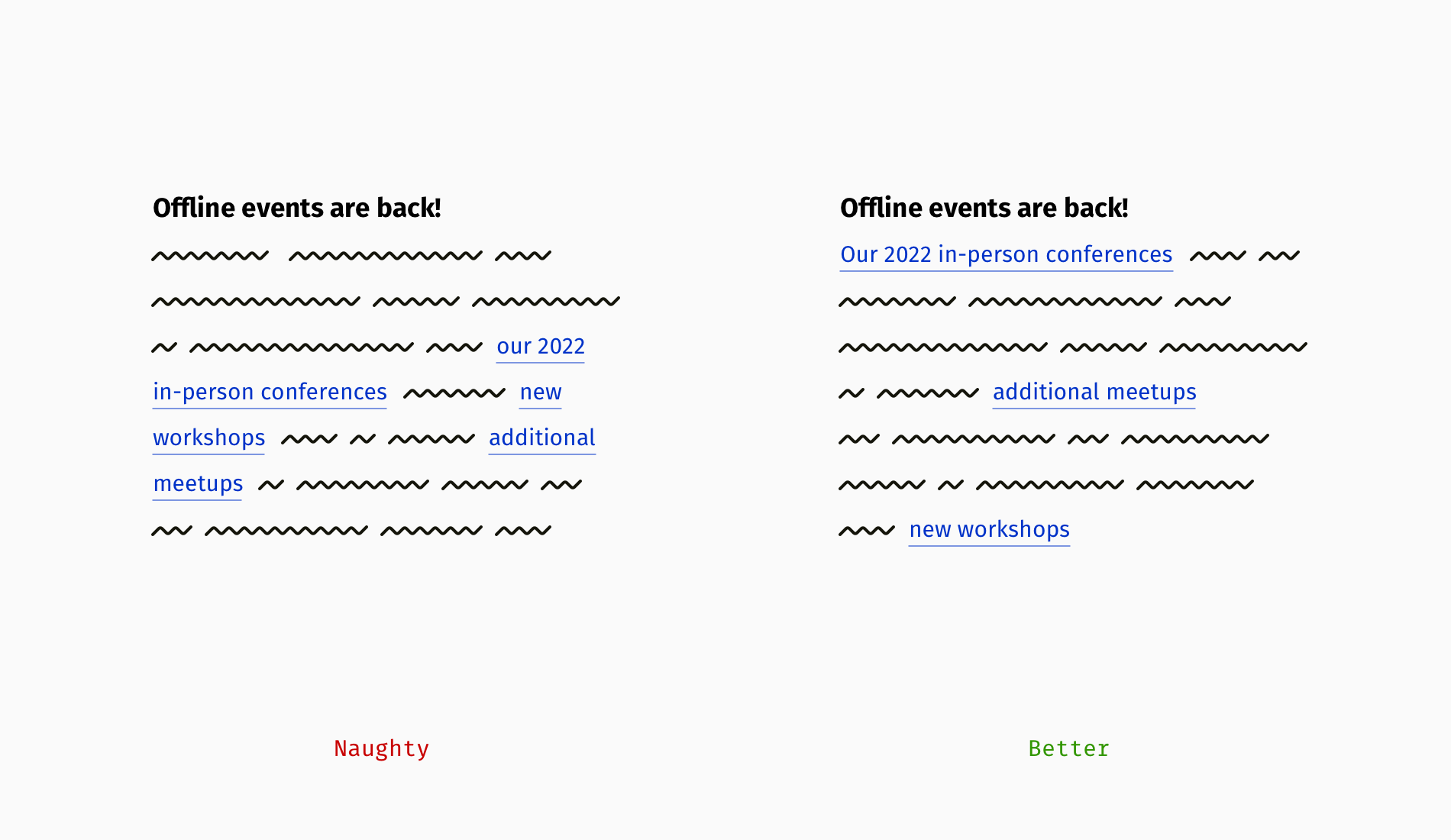
If paragraph width is fixed, you can compose text so links fit within single lines—starting a paragraph with a link can help. Yet browsers and devices render content differently, and links will still shift for some users. That’s why lists remain the safest option for multiple links.
Beyond Pretty Links: Accessibility Considerations
Well-designed links meet visual and technical standards. The Web Content Accessibility Guidelines (WCAG) specify requirements for hyperlinks that go beyond appearance, covering how they are perceived and operated by all users.
Making Links Distinguishable
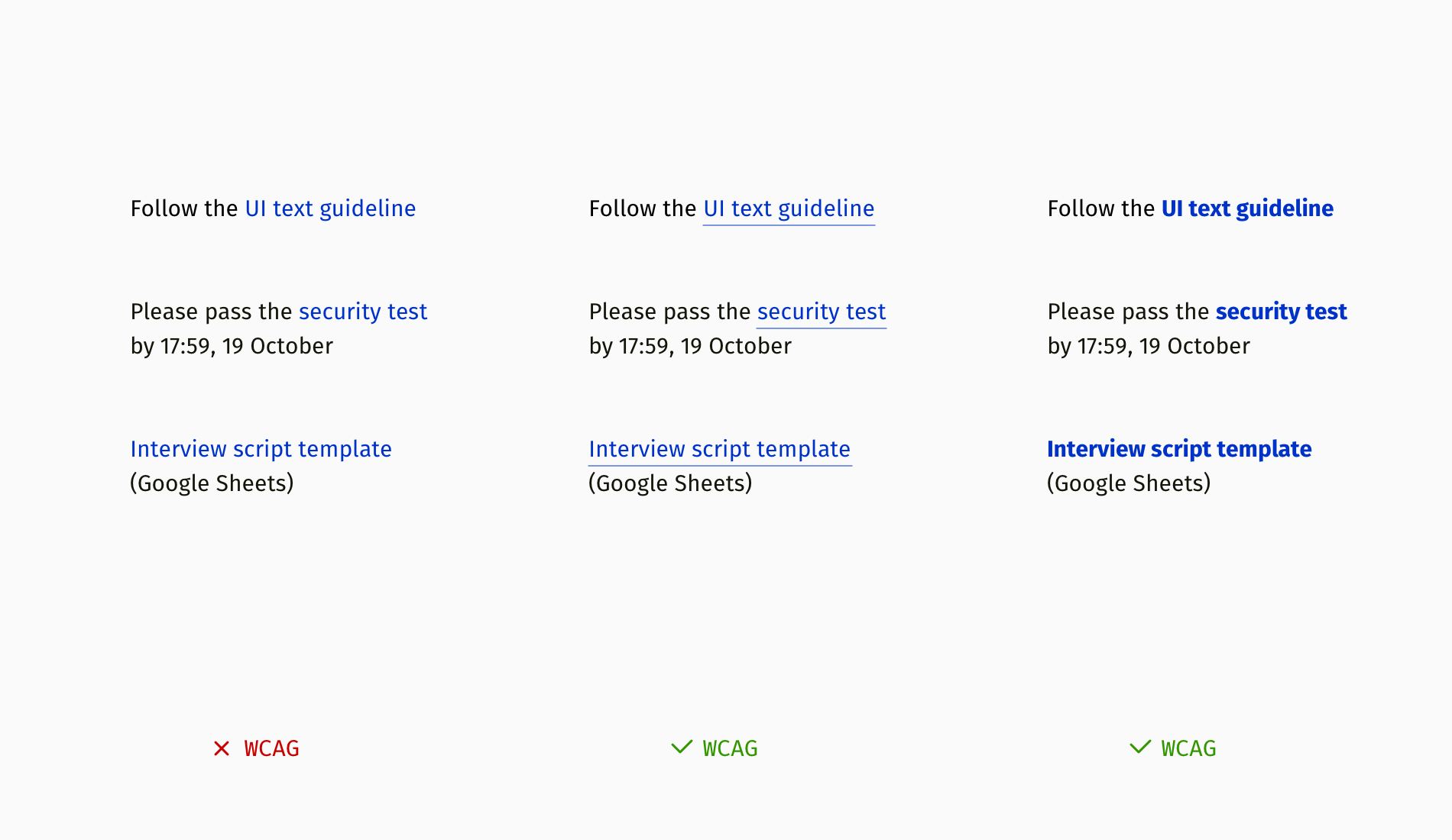
WCAG advises against using color alone to set links apart from body text. Color-dependent styling remains invisible to people with color blindness. Common alternatives include underlining or applying a bold weight to the link text. This visual distinction is a baseline accessibility requirement rather than a stylistic choice.
Contrast Ratios: AA and AAA
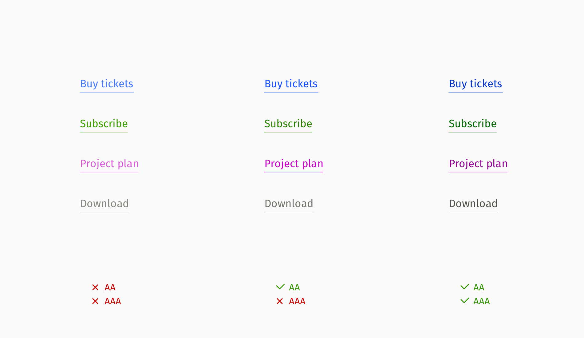
Interactive elements like links must meet WCAG contrast thresholds. The guideline defines two compliance levels:
- AA: the standard for most public-facing websites;
- AAA: a higher bar commonly used on government sites or for audiences with visual impairments.
Under AA, link text and its background must maintain a contrast ratio of at least 4.5:1 for standard-sized text, or 3:1 for large text. You can validate palettes with tools like the Contrast Checker or Figma’s Contrast plugin.
Visible Focus Indicators
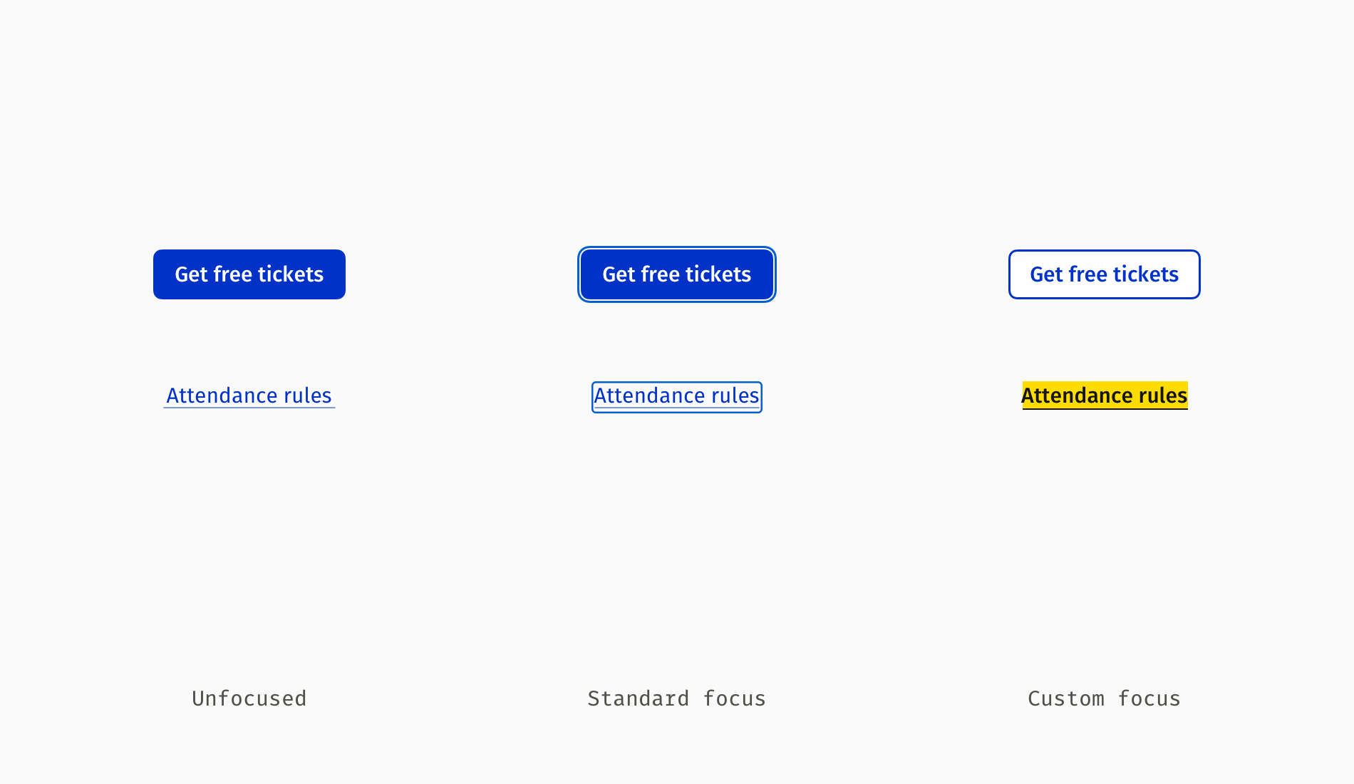
Links—like all interactive components—need a visible keyboard focus state, as described in WCAG’s focus-visible guidance. Browsers apply a default focus outline that some sites override or remove entirely. When custom focus styling makes a link less noticeable, keyboard users lose their place. A clearly visible focus indicator is non-negotiable for navigation.
Clarity for Screen Reader Users
People who are blind rely on screen readers, which vocalize on-screen text. Users often jump from link to link via keyboard shortcuts rather than reading every word. When content is trimmed for visual brevity—such as lists of language versions—link text must retain meaning when spoken aloud.
Short labels without context produce confusing audio output:
“Ukrainian — link, English — link, German — link”
Descriptive, complete phrases are better:
“Download project plan template in Ukrainian — link, download project plan template in English — link…”
The most aggravating pattern, especially on news sites, is hearing repeated generic links:
“Read more — link, read more — link, read more — link”
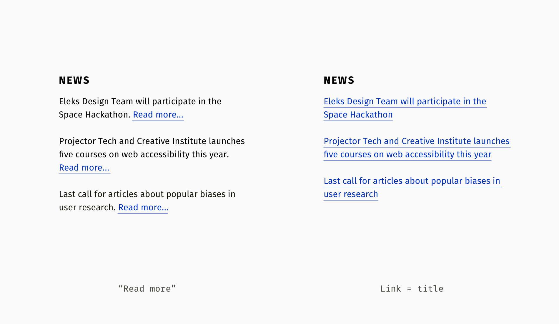
The aria-label attribute lets authors attach explanatory text for assistive technology without changing visible copy. Designers often draft these accessible descriptions and coordinate implementation with developers:
<h4>News</h4>
<p>Eleks Design Team will participate in the Space Hackathon.
<a href="aerospace-hackathon.html" aria-label="Read more about Eleks participation in the Space Hackathon">Read more...</a>
</p>
<p>Projector Tech and Creative Institute launches five courses on web accessibility this year.
<a href="new-courses.html" aria-label="Read more about new courses on accessibility by Projector Institute">Read more...</a>
</p>
When article titles are already wrapped in links, the need for aria-label extensions on “Read more” disappears entirely.
<h4>News</h4>
<h5><a href="aerospace-hackathon.html">Eleks Design Team will participate in the Space Hackathon</a>
</h5>
<h5><a href="new-courses.html">Projector Tech and Creative Institute launches five courses on web accessibility this year</a>
</h5>
Repeated Destinations
A less obvious usability problem is duplicating the same URL multiple times, such as when a title, hero image, and introductory line all link to the same article. For sighted users this is harmless; for blind users it means hearing identical link text multiple times, slowing their navigation through a page.
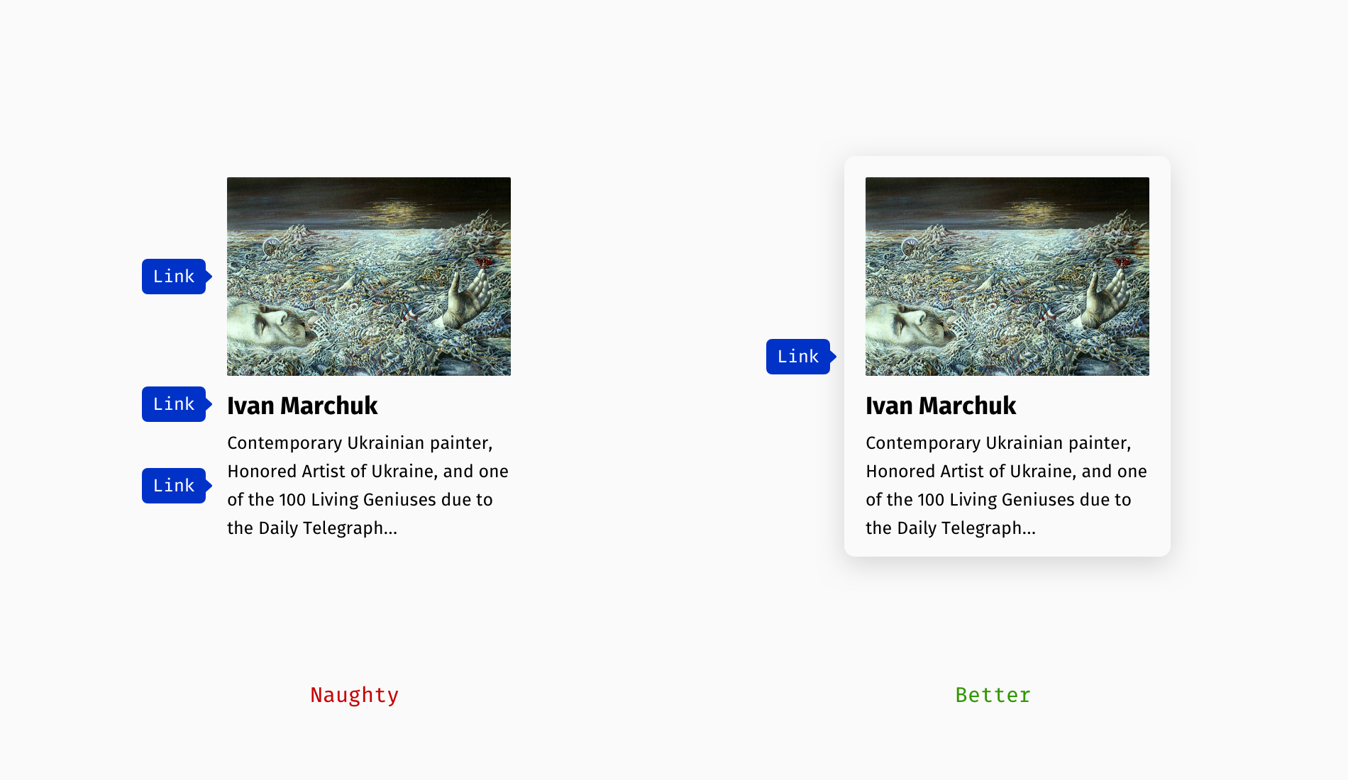
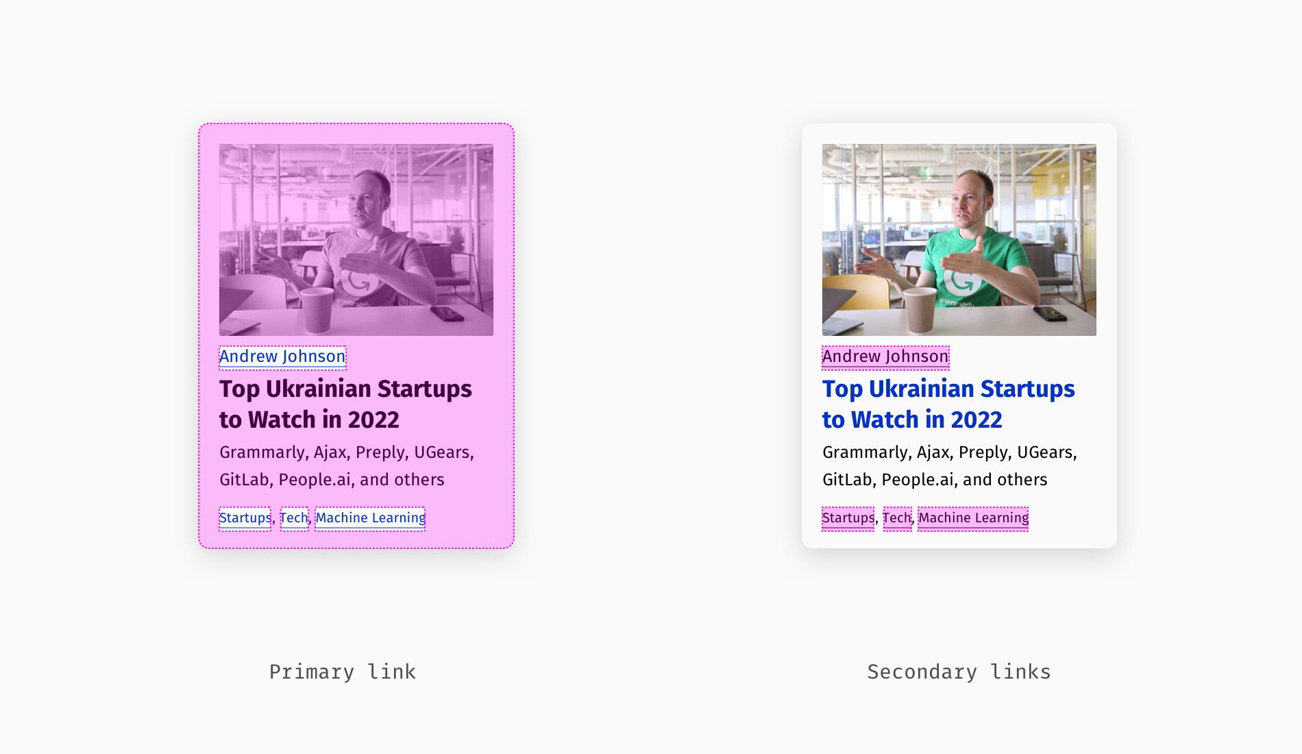
However, the situation is different when a card contains distinct destinations: the article itself, an author profile, and topic tags. It is acceptable—and common—to wrap the primary link around the whole card, leaving the minor links accessible separately.
The same duplication appears in event invitations where a Zoom link is repeated in the description, logistics section, and closing. Beyond looking messy, repeated identical links force screen reader users to wade through redundant information.
Guides for Further Reading
- “Using
aria-labelFor Link Purpose,” Web Content Accessibility Guidelines (WCAG) - “How To Make ‘Read More’ Links Accessible,” Vision Australia
- “Writing Hyperlinks: Salient, Descriptive, Start With Keyword,” Marieke McCloskey, Nielsen Norman Group
Related Smashing Magazine articles cover adjacent territory, from open-source authoring pain points to WCAG-conformant interactive element sizing, chart accessibility, and visual storytelling.


