
Why Interactive Components Matter
Figma’s Interactive Components feature, now in beta, lets designers attach interactions and animations directly to variants. Every instance created from that component inherits the same behaviors, which collapses complex prototype flows into single, reusable frames. Where a conventional prototype might require four screens and eight separate interactions to demonstrate a working switch, the same behavior now lives inside one component with two variants — and can be duplicated freely without multiplying wiring.
This does more than cut the number of frames: it shifts the maintenance burden. Because the interaction logic is defined once on the component, later edits propagate everywhere the component appears. That makes prototypes easier to build, update, and reason about, which in turn lowers the cost of iterating on interaction design early in a project.
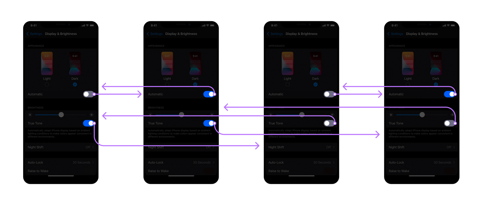
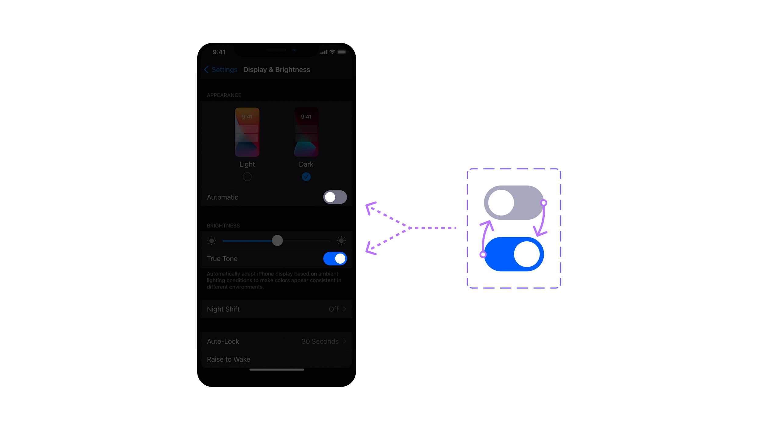
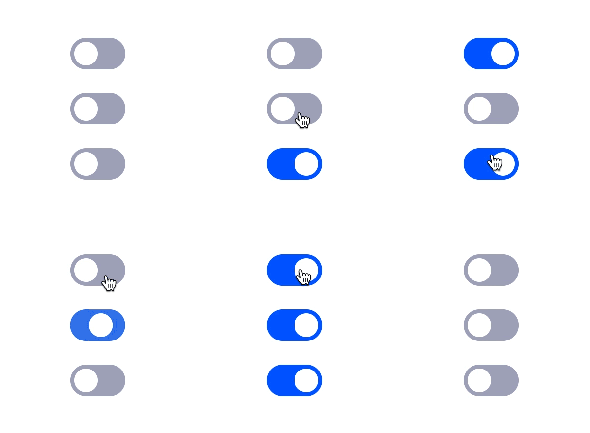
With interactive components, the same switch behavior is expressed as a single frame and a component that contains both the OFF and ON states. Duplicating the switch adds no extra screens or connections:
Getting Access and Trial Files
Interactive Components is not in the stable Figma release. You need to request beta access through Figma’s sign-up form; approval typically arrives within two to three days. There is no cost to join.
The examples in this article are available as a Figma community file. You can duplicate it once your account has beta access and follow along directly.
Core Concepts You’ll Reuse
Interactive components build on existing Figma mechanics. If you already work with components and variants, the interaction layer below is the only unfamiliar piece.
Components and Variants
A component is a master object whose copies — instances — stay linked to it. Changes to the component update every instance, though instances can carry their own overrides for style or other properties. Variants are the available states of a component, usually distinguished by size, color, or UI state such as pressed or disabled.
The Interaction Details Panel
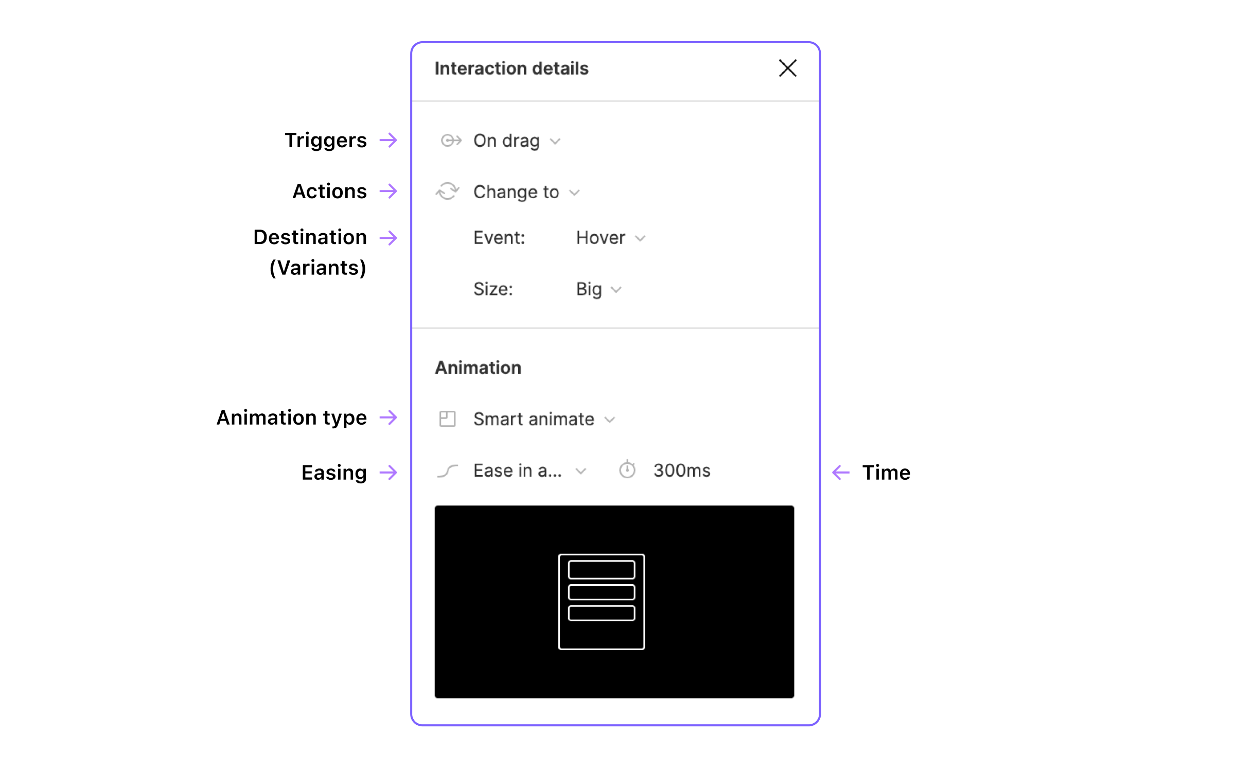
This panel is where you define triggers, actions, destinations, and animation parameters for an interactive component. All of these controls follow the same patterns used in normal Figma prototypes, but here they are scoped to a component rather than a full frame.
Triggers
Triggers are the events that start an interaction from the hotspot. Options include On Click, On Drag, While Hovering, While Pressing, Key/gamepad, Mouse Enter, Mouse Leave, Mouse Down, Mouse Up, and After Delay. The full trigger reference is documented in Figma’s prototype trigger docs.
Actions and Destinations
When an interaction fires, the action determines what happens. Interactive components specifically rely on the Change To action, which swaps the component’s current variant for a destination variant. Other actions such as Navigate To, Open Overlay, and Scroll To remain available for frame-level prototypes, but component state changes are driven by Change To.
Animation and Easing
Figma offers a set of predefined transitions, but Smart Animate is the practical choice for interactive components: it matches layers by name and interpolates between their differing properties automatically, which makes natural state transitions easy to achieve. Easing controls how motion accelerates over time. Ease In and Out suits toggles fine, Linear works well for loops, and custom curves are also supported if you need a specific feel.
Building Your First Interactive Component
A common starting point is a simple switch with two states (Off and On), replicated using variants.

Set Up The Base Component
Start by creating the component's visual elements:
- With the Rectangle tool (
R), draw a grey rectangle (#A7A9BC) sized56x32px with a corner radius of16px. - Using the Ellipse tool (
O), place a white circle (#FFF) of24x24px over the rectangle's left side, leaving4px of spacing.
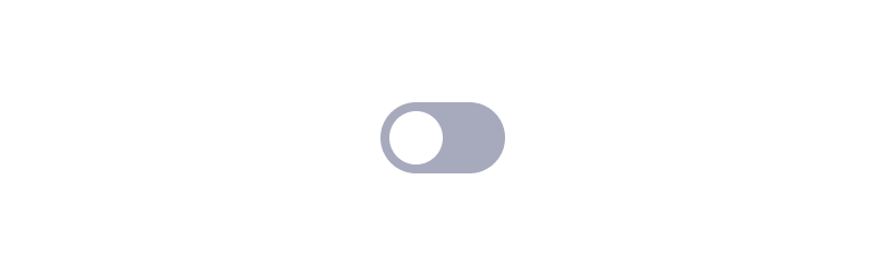
Select both elements and combine them into a single component using Ctrl/Cmd + Alt + K, or click the Component icon in the top toolbar.
Note: Key notation references Windows first, where Ctrl equates to Cmd on Mac, and Alt corresponds to Alt/Option. Shift is identical on both platforms.
Add And Style Variants
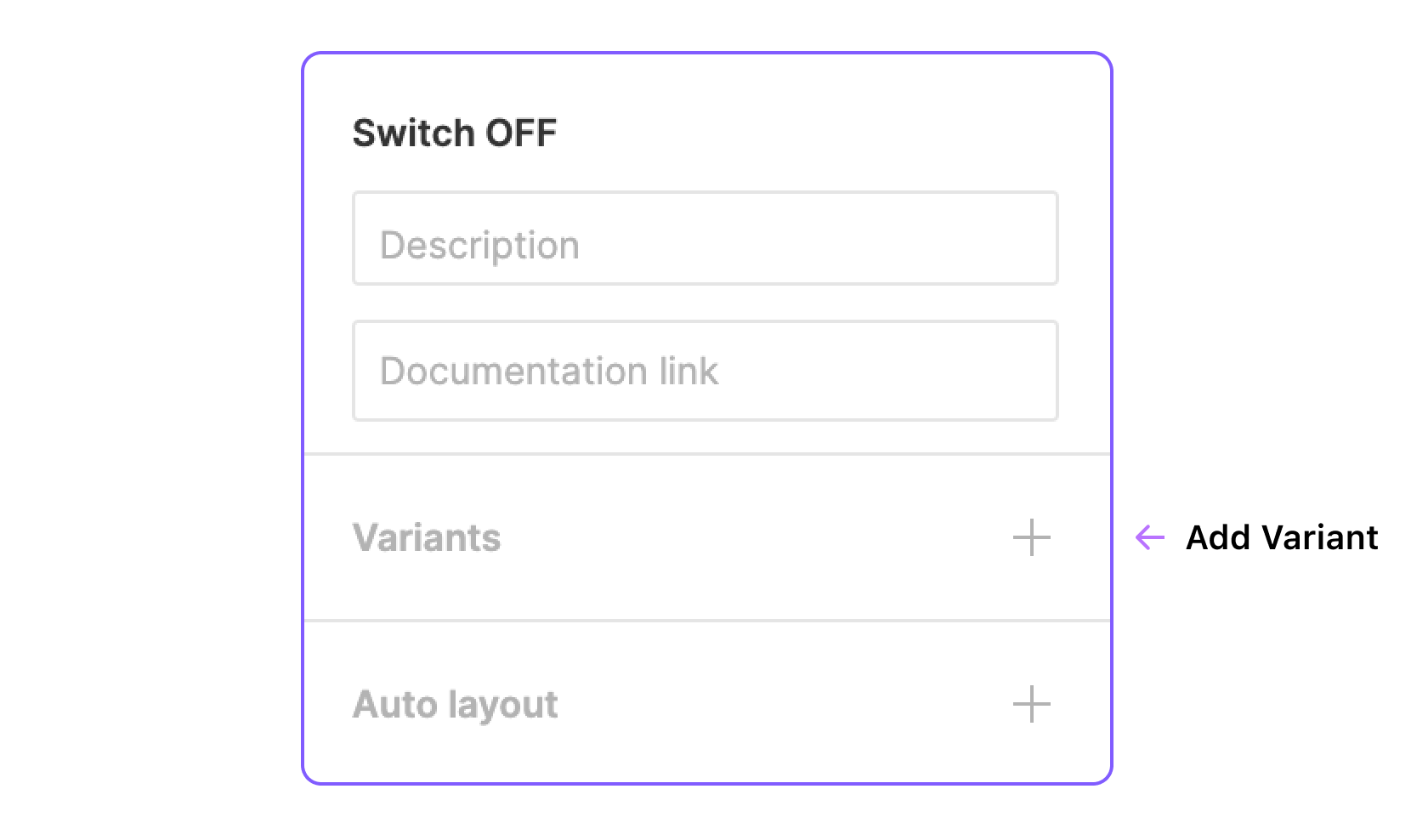
Select the component you created, then in the Design tab of the right panel, click the plus button next to Variants.
This action generates a purple dashed frame, which groups your variants together.
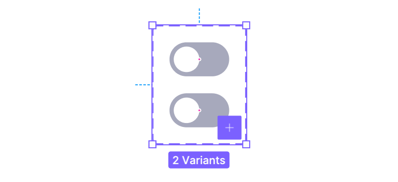
You should now have two variants. Designate the first for the Off state and the second for On.
- For the On state, apply an active style—try a blue background (#0B5FFF) and slide the circle to the right.
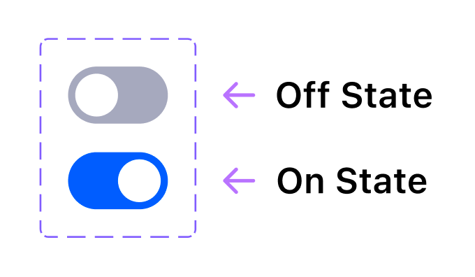
These two states will toggle between each other when the user clicks the switch.
Useful tip: To add more variants, select a component inside the group and click the purple plus button; Figma duplicates the selection and resizes the frame. You can also resize the frame manually and freely duplicate or arrange components within it.
Combine Existing Components
Instead of duplicating within a group, you can create components separately and merge them as variants. Select two or more components and choose the “Combine as variants” action in the right panel.

This approach is practical when updating an existing library, as it avoids recreating components from scratch.
Name The Variants
Variant names don't alter the final output unless duplicated, but clear naming improves organization for collaborators. Select the entire group to rename the variant property (default is "Property 1"). For states, rename it to "State".
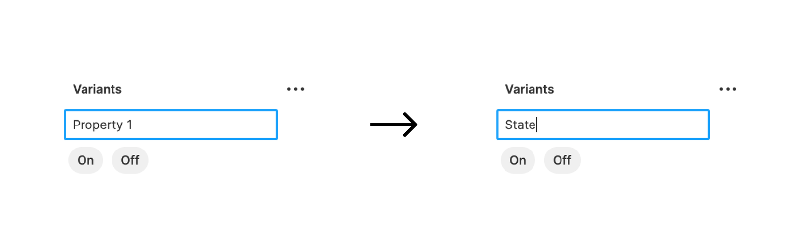
Select an individual variant to rename it from the default labels ("Default", "Variant 2"). For the switch, name them "Off" and "On". The layer names will automatically update to State=Off and State=On.
Fun fact: With only two variants named "Off" and "On", the destination control displays a switch instead of a dropdown.
Wire The Interaction
With components and variants ready, it's time to add the interactions:
- Switch to the Prototype tab in the top-right corner.
- Select the Off variant (marked with a blue dot) and drag its edge to the On variant.

- Make sure the entire variant is selected, not just a background layer, so the interaction responds even when the user clicks the circle.
- Set the trigger to On Click.
- Keep the action as Change To.
- Choose Smart Animate with Ease In And Out for a smooth transition.
The configuration reads: when the user Clicks the Off state, Change to the On state using Smart Animate with Ease In And Out over 300 milliseconds.
- Apply the same settings in reverse. Connect the On variant back to Off. Figma retains the previous interaction settings, so dragging a new connection should auto-fill the details—just double-check them.
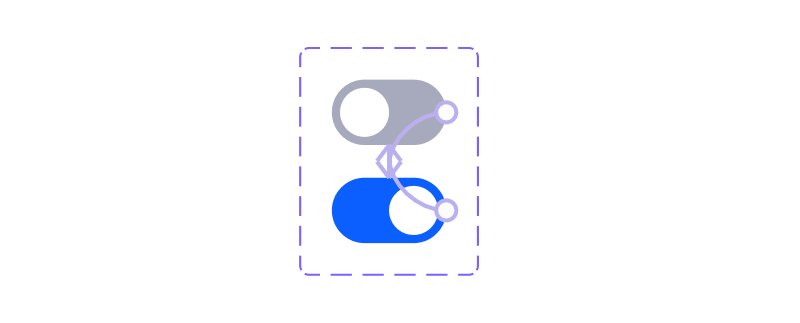
To test, add a variant into a frame, select the frame, and click the presentation (play) button above the tabs.
Each switch instance should toggle independently. Duplicate the component multiple times in the frame (at least three) and activate them individually in presentation to see the feature at work.
Working With Multiple States
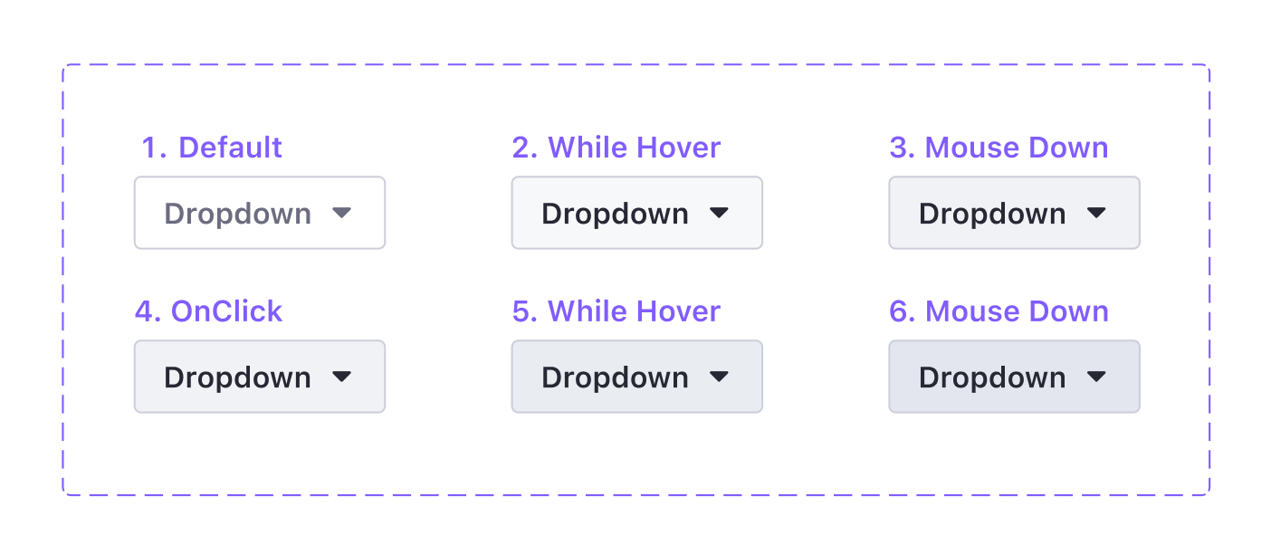
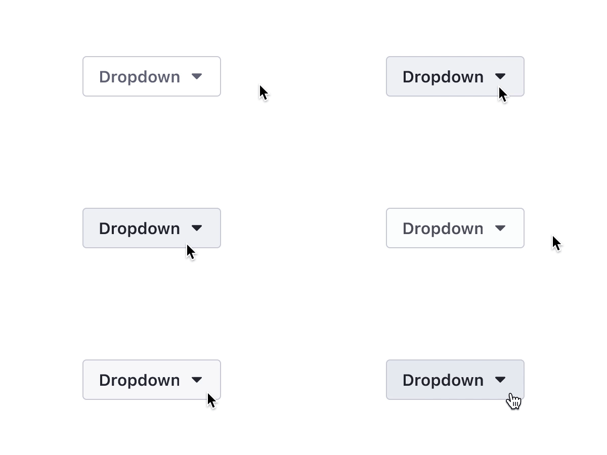
Connect more variants to build realistic interactions. A classic example is a button with six variants that share small background color changes, representing different UI states.
State And Trigger Mapping
- Default — Default,
- Hover — WhileHover,
- Pressed — MouseDown,
- Active — MouseUp (On Click works as well),
- Hover while Active — WhileHover,
- Pressed while Active — MouseDown.
Useful tip: Use MouseDown to simulate a pressed state before release, then trigger the transition with MouseUp. This nuance makes the button feel far more tactile.
Nesting Interactive Components
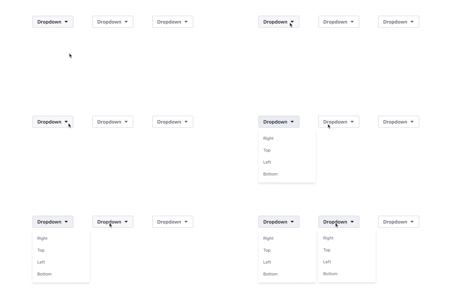
As with regular components, interactive components can be nested. For instance, a single Dropdown component could contain nested Dropdown Button and Dropdown Menu interactive components. This setup lets you define how button clicks open or close the menu and precisely control which button variant triggers which menu state.
Note: Menu options can be built as a separate nested component, with text overrides applied per instance.
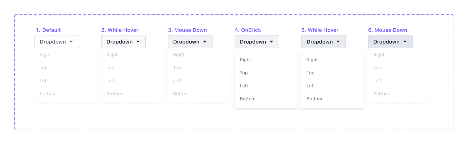
Nesting delivers modularity: interactions are defined once and can be combined with other elements. A Dropdown Menu can be dropped into a card component without reconnecting its logic each time.
Connecting Variants To Frames
Variants can also navigate to external frames. Use the On Click trigger with a Navigate To action, just like standard prototypes. In a dropdown example, each menu action can connect to a separate frame matching the menu's four directions (Right, Top, Left, Bottom).
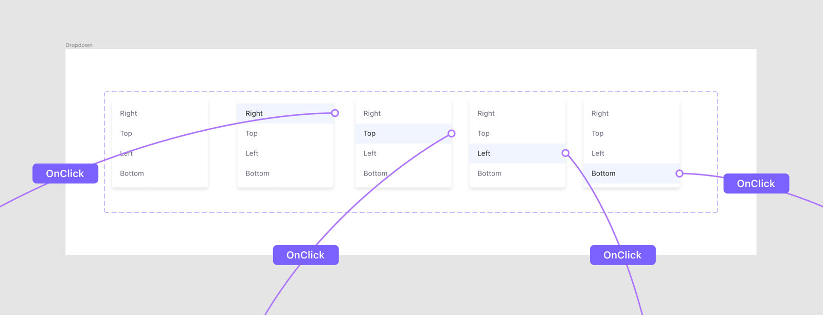
Clicking an action navigates as expected. The advantage is that reusing the Dropdown Menu in another project carries all its built-in interactions, eliminating repetitive connections.

This workflow is especially valuable in product design, where high-fidelity prototypes often require many frames. Nested and interactive components dramatically reduce wiring overhead, supporting reusable prototype libraries with consistent behavior.
Beyond Basic Interactions: Effects and Animations
Interactive components can do more than simple state changes. With a bit of creativity and the right use of variants, you can build loops, spinner-like rotations, micro-interactions, and even the illusion of 3D movement directly inside Figma prototypes.
Creating Loops and Spinners
The After Delay trigger makes infinite loops possible. By setting the delay to its minimum value of 1 ms and connecting two or more variants to swap automatically, you can create loading indicators and other repetitive animations.
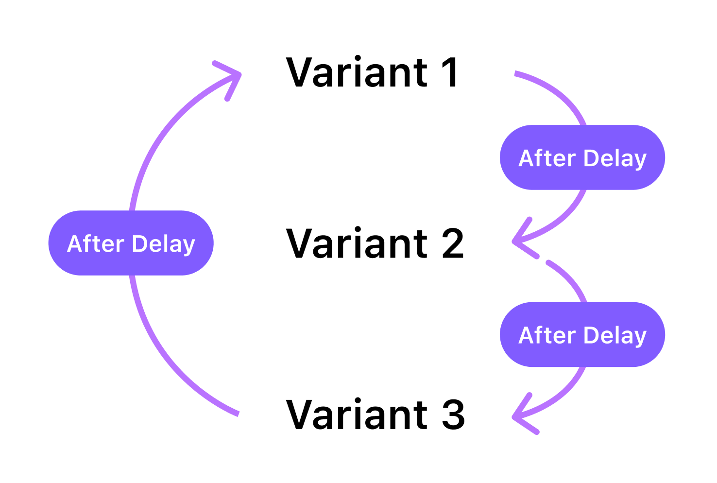
The 1 ms value is the minimum allowed, making the state change almost instantaneous, which is ideal for smooth-looking cycles. If you want a visible pause between states, you can use a higher delay value.
Rotating Elements With Three-Point Loops
Figma has a notable limitation when it comes to rotation: it only supports values from -179º to a maximum of 180º. There is also no way to specify a rotation direction. Trying to animate from 0º to 180º and back will cause the element to swing back and forth, not complete a full circle.
To work around this and achieve a full 360-degree rotation effect, you need at least three variants. For a basic example using a triangular shape:

- Create a component with three variants, for instance VariantA, VariantB, and VariantC.
- Apply rotations to the elements inside the variants, not to the variants themselves.
- For VariantA, set the element rotation to
0º and connect it to VariantB. - For VariantB, set the rotation to
-120º and connect it to VariantC. - For VariantC, set the rotation to
120º and connect it back to VariantA to close the loop. - Set all interactions to use After Delay (1ms) with a Linear easing.
This setup creates a continuous spinning motion, though it may have tiny, almost imperceptible pauses at each state change. For a more organic feel, you can vary the animation time between different variants to simulate a curved easing instead of a constant linear one. For very complex spinners, however, it is often better to create them in a dedicated animation tool and import them as GIFs into your prototype.
Adding Micro-Interactions
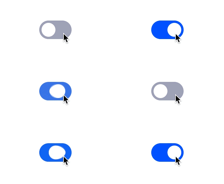
Interactive components make it easy to add state-specific feedback. To enrich a basic switch component with a press effect, you can use both the MouseDown and On Click triggers.
Building the Component Structure
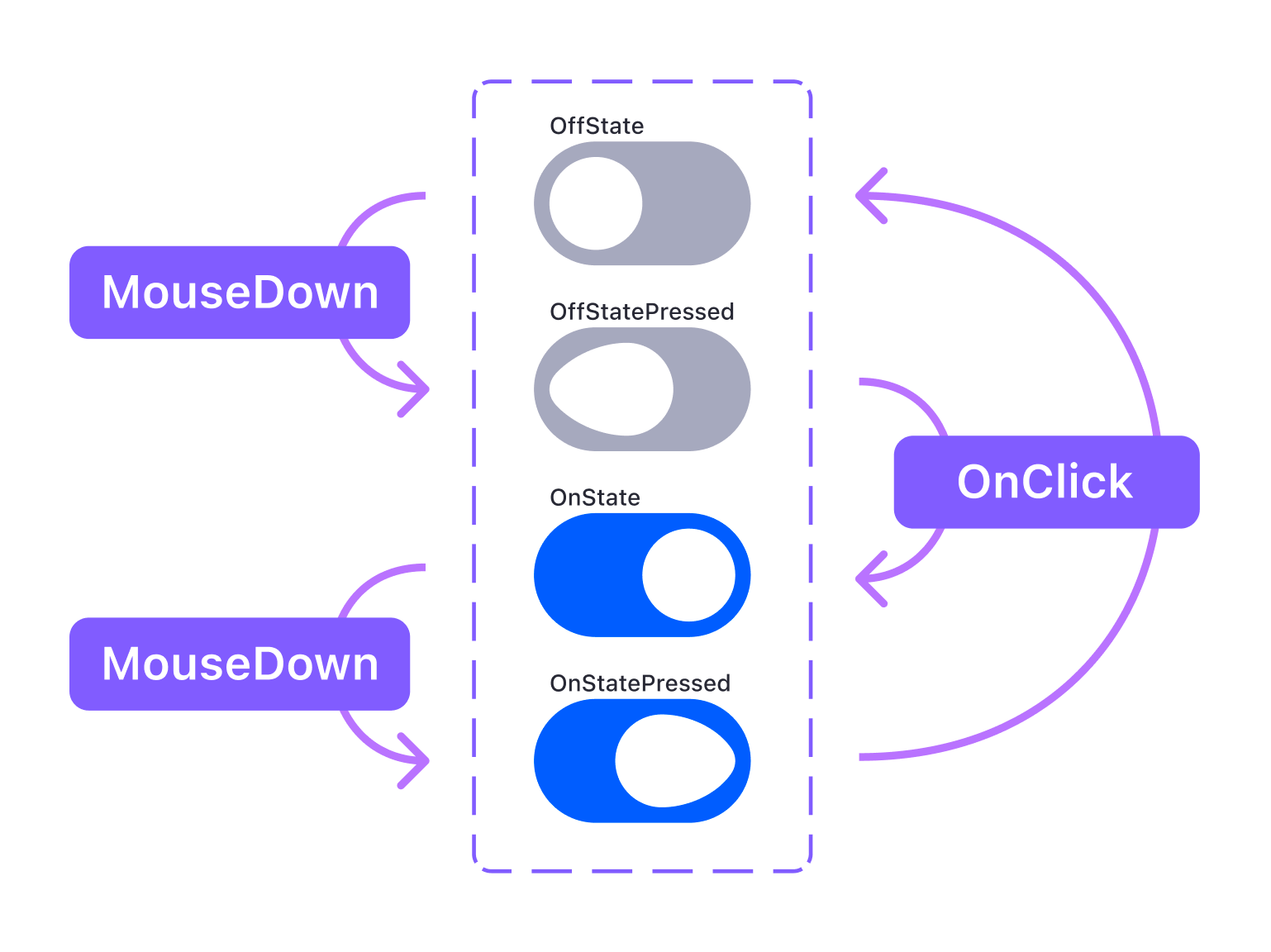
To create this effect, you need to modify the switch's internal structure:

- Duplicate the existing Off state switch.
- Add a new ellipse shape of
16*24px on top of the existing circular handle. - Combine the two ellipses into a single boolean group using the Union operation.
- Apply a
32px border-radius to the union layer that creates the distorted, pill-like shape shown in the example. - Turn this into a component using
Ctrl/Cmd+Alt+K.
You will need four variants total: OffState, OffStatePressed, OnState, and OnStatePressed. The Mouse Down trigger simulates the mouse being held down, which moves the larger ellipse 8 px to create the distortion. The On Click trigger handles the final state change between Off and On.
Simulating 3D Rotation With Image Sequences
This technique uses a sequence of images to create a 3D rotation effect. Unlike a simple GIF, it gives you control over the playback, allowing you to build a prototype that lets users rotate an object, like a car on a product page. This example uses nine images for the rotation sequence.
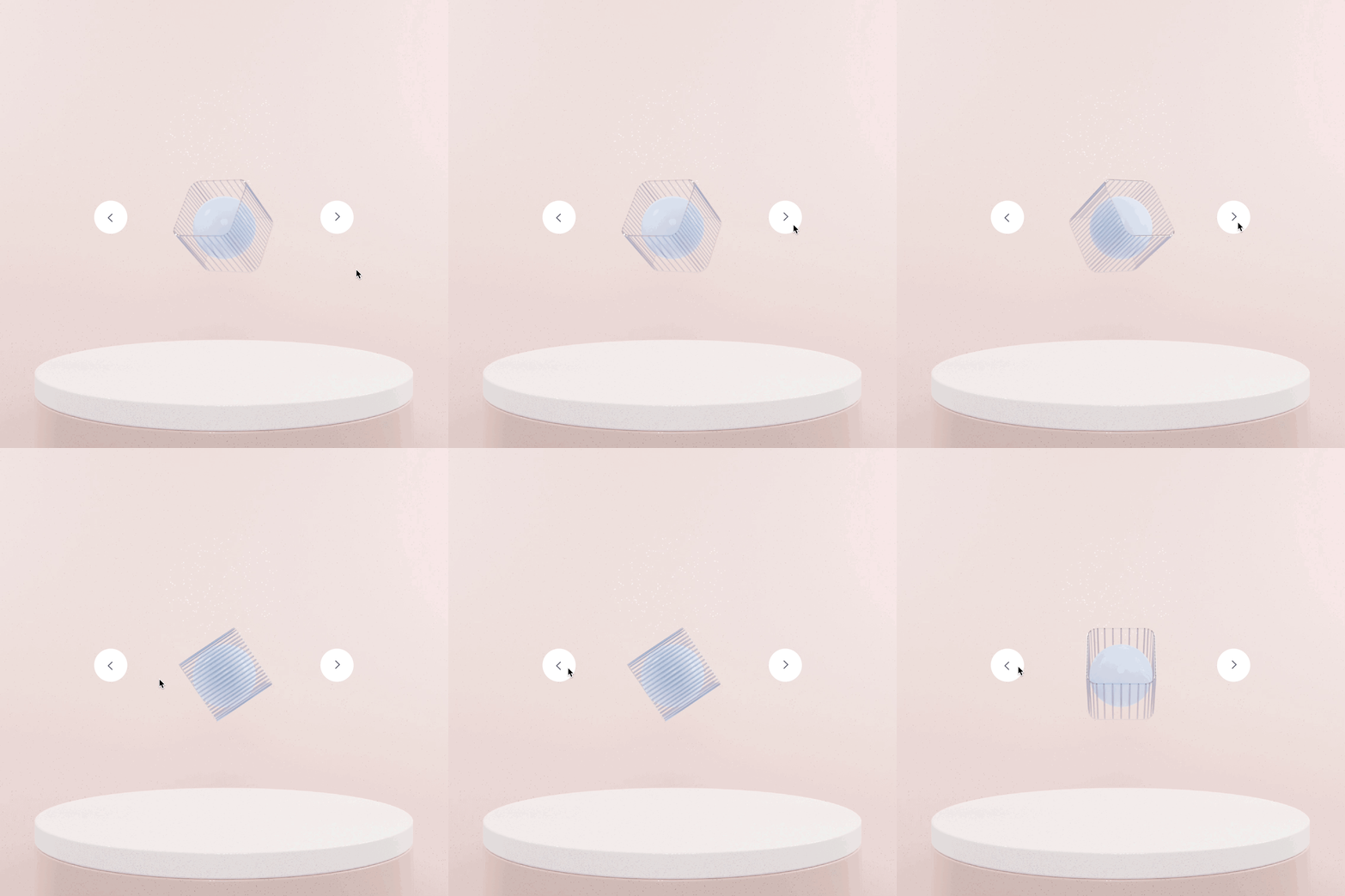
The setup involves these key steps:
- Create one variant for each image in the sequence, placing one image in each.
- Create arrow buttons that will act as the interactive hotspots.
- Connect the right arrow to the next variant in the sequence, repeating this for every state.
- Similarly, connect the left arrow to the previous variant.
- Use the Instant animation rather than Smart Animate to avoid any fade in/out and create a crisp, realistic sense of movement.
A More Capable Prototyping Toolbox
As interactive components mature, they become a powerful asset for design teams. Proficiency with variants is key to building richer, more realistic prototypes efficiently. This allows designers to shift focus from fighting the tool to perfecting the user experience and the design details itself.
Experiment with the triggers and animation timings, try nesting different interactive components, and see how far you can push the feature.


