Why Language Selectors Fail
Most language selector problems aren't visual — they're structural. A traveler in Tokyo with an English browser still gets pushed to a Japanese site. A German resident with a Polish delivery address can't check out in English because the interface couples language to shipping country. The component might be perfectly visible, but the logic underneath makes it useless for anyone outside the assumed default profile.
These failures stem from embedding personal assumptions into interface logic. Defaults make sense for the majority, but they break entirely for travelers, expats, VPN users, and anyone purchasing across borders. The fix isn't a better-looking dropdown — it's decoupling presets, allowing overrides, and letting users state their intent explicitly.
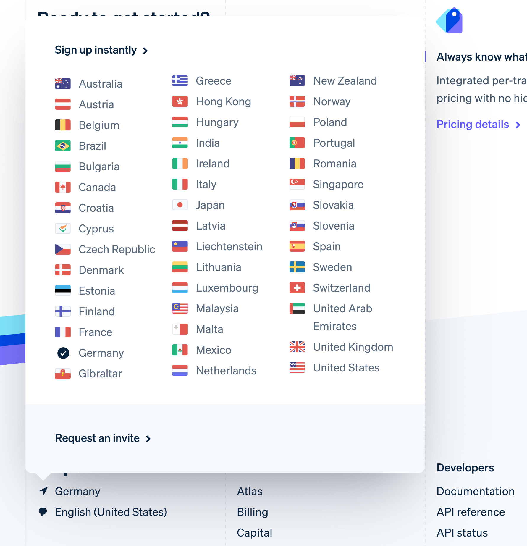
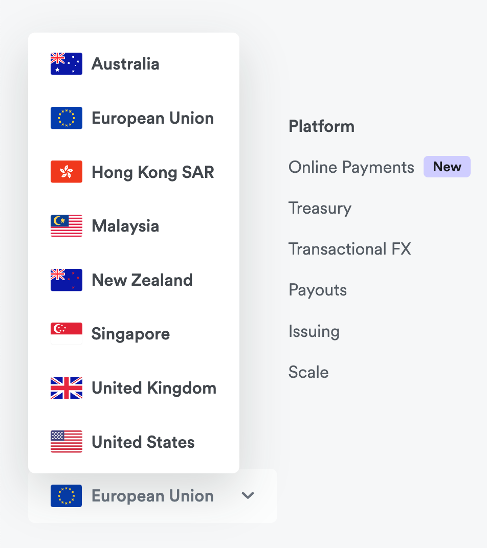
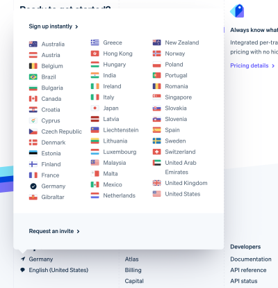 Stripe with a popover allowing users to jump to a different country in the footer.">
Foundations: Placement and Labels
When asked to change country or language, most users first check the page header; if nothing appears there, they jump to the footer. Beyond those locations, article translations near the content title follow the laws of locality — users expect language options adjacent to the piece they're reading.
Country flags work reasonably well as indicators, and users will recognize globe or translation icons when flags are absent. But visibility is only half the equation. The real usability challenges emerge in how options are grouped, labeled, and presented — without introducing accessibility and auto-translation problems.
Redirects: Nudge, Don't Assume
Auto-redirects based on IP address or browser language are common but fundamentally flawed. A location in Tokyo doesn't mean the user reads Japanese. A Dutch locale preference doesn't mean the user wants delivery to the Netherlands. And when a preferred locale isn't available, fallback languages can serve users content in a language they barely understand.
Location-based redirects tend to be less problematic than language-based ones, but both are error-prone. The core issue: user preferences cannot be inferred reliably without asking. Polite nudging toward a regional site is reasonable — especially when connecting from abroad — but an unconditional redirect strips users of agency. The frustration that follows often goes untracked because abandonment happens on the "other" website, managed by entirely different teams.

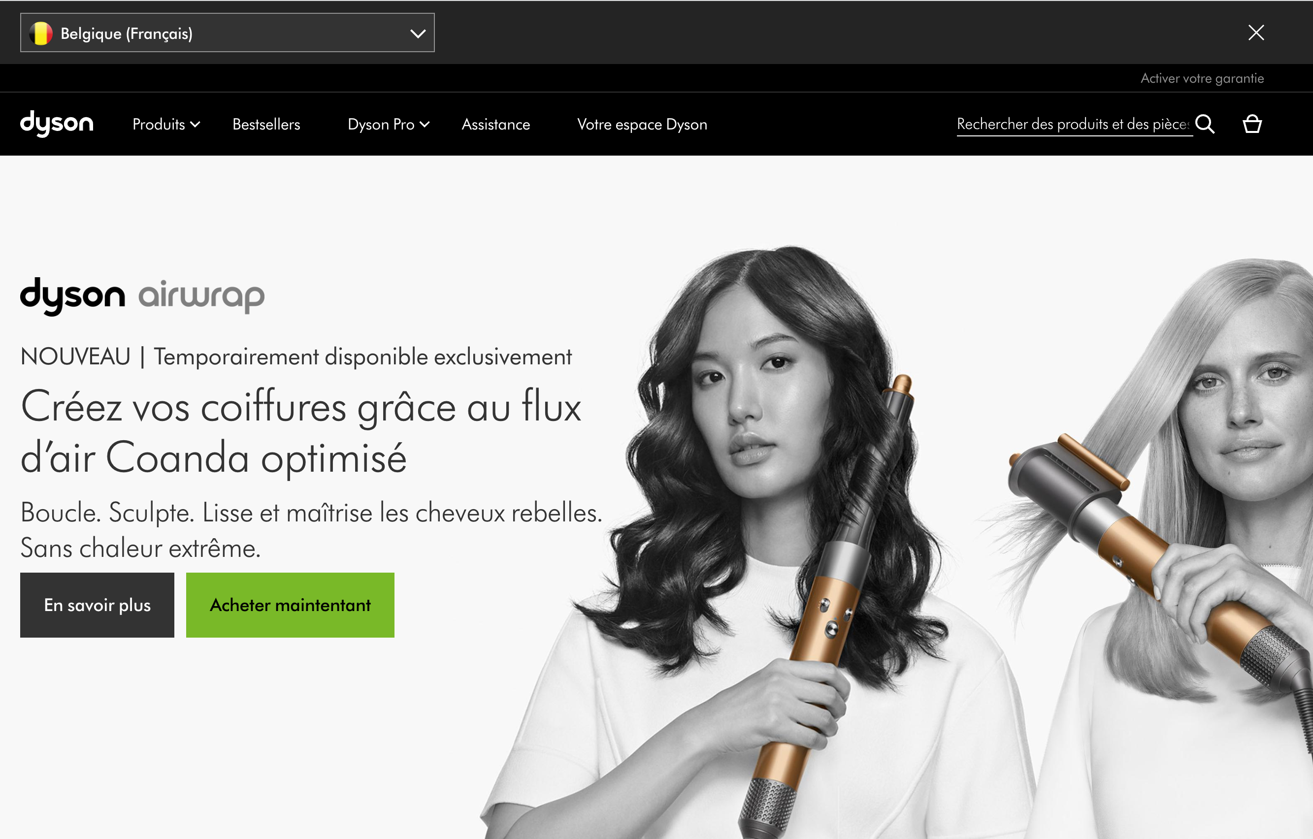
Dyson takes a measured approach, encouraging users to select a region and language through a dismissible bar in the header on first visit. The selector remains accessible in the footer for anyone who dismisses the prompt.
Backcountry, a US outdoor retailer, cut off all non-US visitors following GDPR in 2018 with an unconditional redirect. Without a VPN, users cannot even reach the site to purchase a gift for someone in the US.
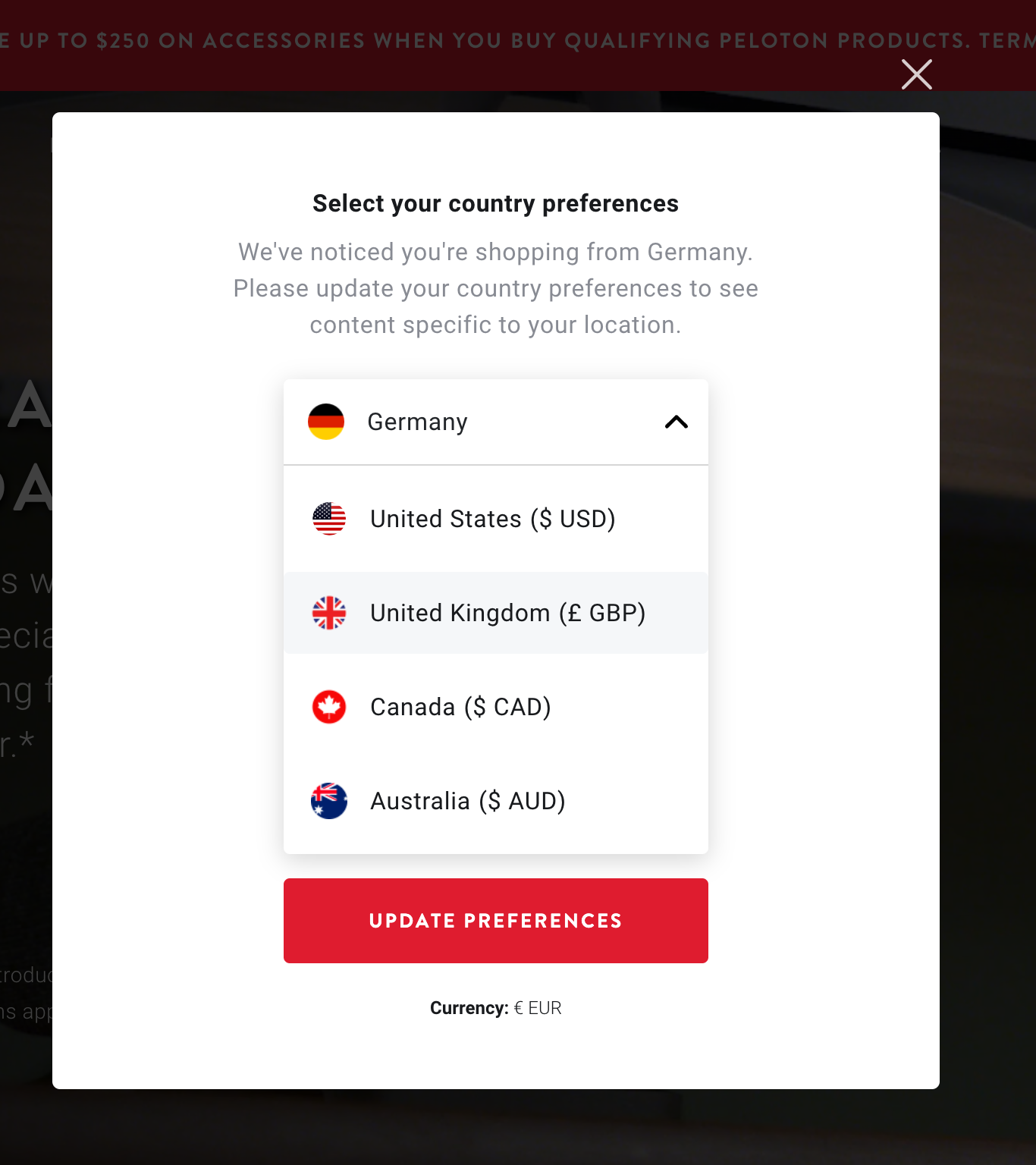
Audi redirects users to a "best fit" country automatically, but provides a modal reachable from a header link where users can search for alternatives. BMW avoids redirects altogether, offering a "BMW in your country" option in the header that opens a modal listing all regional options, with a best-fit recommendation highlighted.
IKEA skips automatic redirects in favor of an expansive country selector that understands domains, endonyms, and languages. The interface lets users change country, though language options aren't always adjustable independently.
The Coupling Problem
Many sites assume location, language, and currency travel together — a German user should see German in euros. This reasoning works for many visitors, but breaks down in realistic scenarios that are less rare than designers often assume:
- A user on a German VPN who doesn't speak German
- A short-term visitor in Germany who can't read the language
- A German resident whose company card settles in USD
- Someone buying from a US store and shipping to a US friend while connecting from Germany
- A US visitor who must collect a VAT number because a German office's credit card will be charged
Adidas illustrates this rigidity: choosing Poland as delivery destination forces the interface into Polish, even if the user reads English and needs German shipping details. There's no path to select English with delivery to Poland.
Decoupled, Independent Choices
Separating presets into independent selections solves these problems without abandoning defaults. Mondraker groups countries into tabs at the top and provides a separate language selector distinct from country selection. Monese presents two separate tabs in the header for language and country, allowing independent specification.
This pattern can extend beyond language and location. Currency, automatic translation, units of measurement, and date formatting all represent independent preferences that users may wish to customize separately from their geographical context.
Wildly Flexible Approaches
A different strategy completely sidesteps the country/language pairing by offering universal options upfront. Netflix takes this approach with its sign-in page — a simple two-field card provides language selection and a phone number input, setting a baseline for the entire experience.
Valve's Steam platform went further by combining language choice with a delivery country selector in its checkout flow. Users navigating the store can select their Steam language independently from their physical location.
The Pattern Behind Robust Selectors
Component visibility remains critical — most users will find a header selector first, then search the footer. But these established patterns of language selection are just one piece: effectively managing regional offers, policies, currencies, and deliveries requires resilience to context switches and less-than-ideal browser auto-detect. This challenge, like the language selector itself, needs flexibility and a clear structure that avoids leaving users stranded in settings they didn't intend to be in.
Personalizing Beyond Language and Location
Language and location often serve as the first indicators of whether a site suits a visitor. But for many businesses, delivering real value means allowing users to refine those settings further. A growing number of sites now expose controls that let visitors align the experience with their specific needs.
Revolve.com, for instance, applies presets for language, country, and currency based on IP and browser locale, yet lets users override each one. The header displays a compact hint combining a flag, language abbreviation, and currency symbol. This decoupling of shipping destination, display language, and payment currency lets visitors see final prices—including delivery costs—in familiar terms.
Airbnb goes a step further by suggesting languages and regions in groups while still permitting manual overrides. Users can also opt in to auto-translate descriptions and reviews to English, which is helpful when comparing stays across borders. A globe icon in the header triggers the settings panel, allowing travelers to switch locales and keep prices in one currency while reviews render in a language they understand.
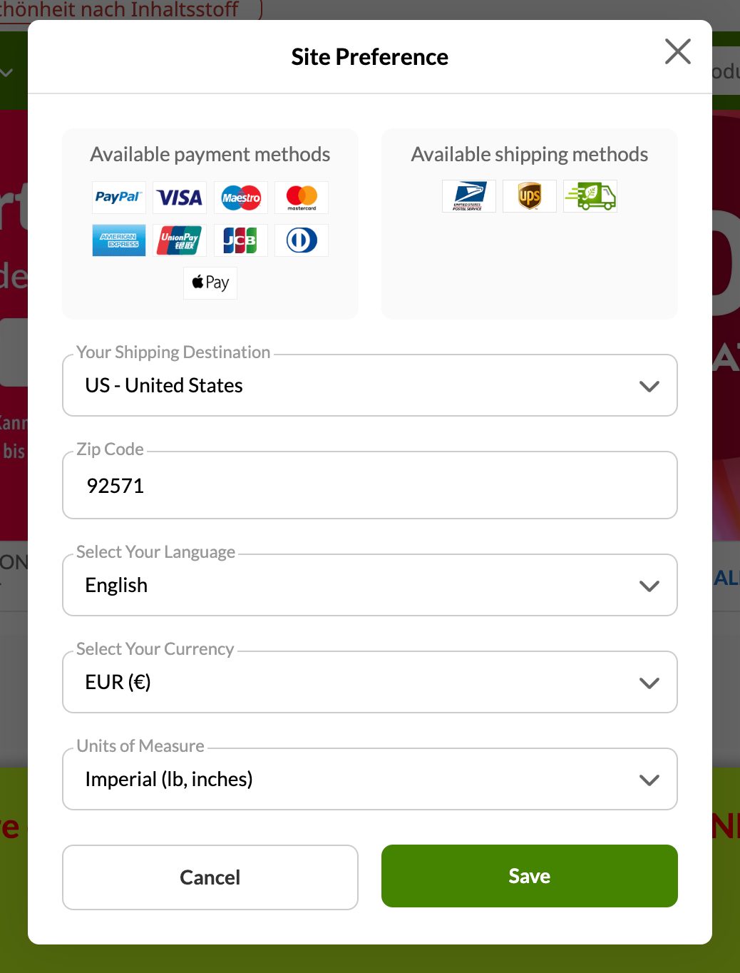
iHerb offers an unusually comprehensive set of preferences. Besides language, currency, and shipping destination—with ZIP code support for US orders—users can choose preferred units of measure and check available payment and shipping methods. The interface favors smart autocomplete inputs over traditional <select> dropdowns, which are often slower to navigate.
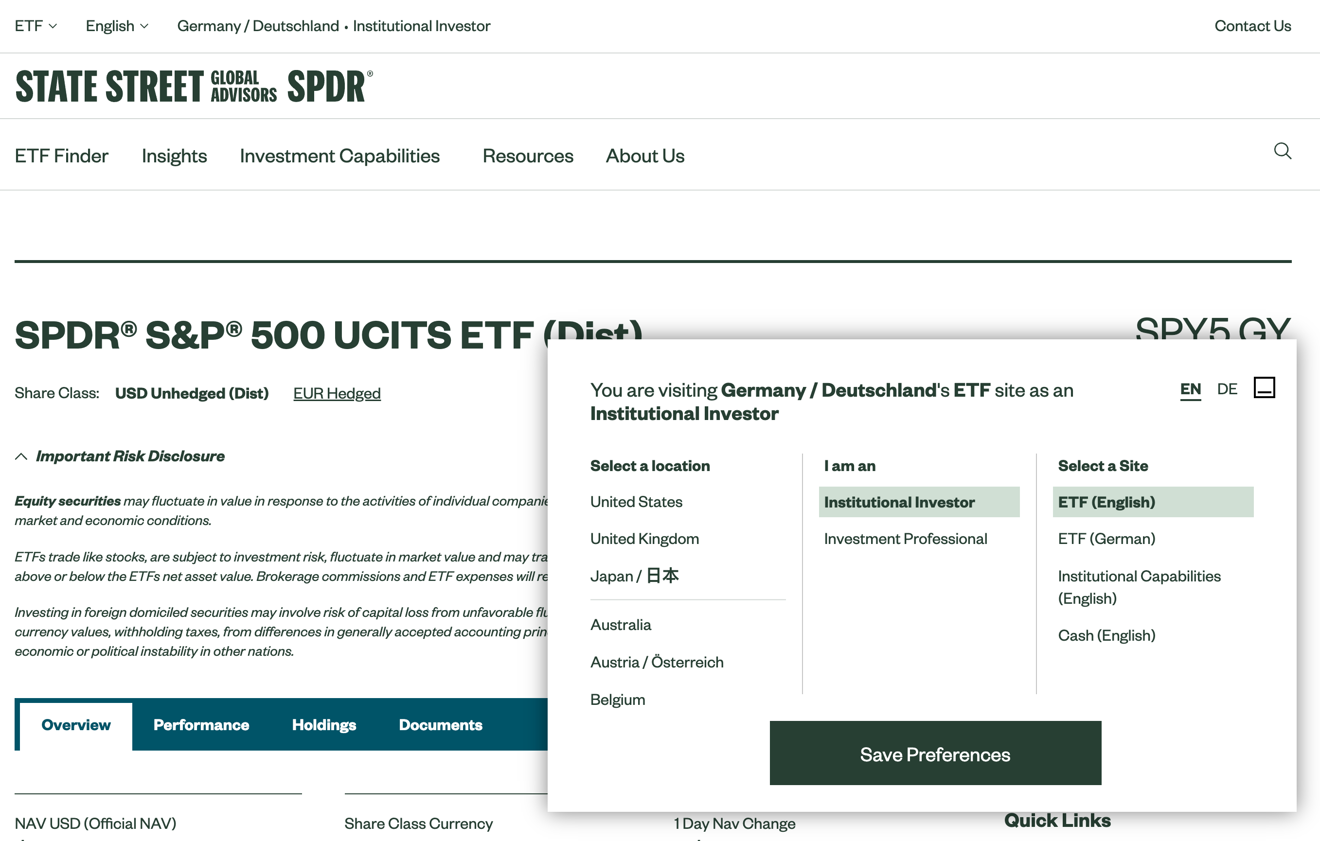
State Street Global Advisors presents a different angle. On first visit, a modal explains the assumptions the interface is making about the visitor's location and interests. Users can then adjust their location, specify their professional role, and select a preferred site type. This approach acknowledges that context matters: a retail investor and an institutional advisor may need entirely different content.
A few adjustments that can meaningfully customize an experience include:
- Shipping location
- Preferred currency
- Units of measure
- Time and date formatting
- Time zone preferences
- Level of experience
The real design challenge is where to place these controls—in a settings page, a sidebar, the header, or the footer—and whether to show them proactively on entry.
Why Non-Modal Dialogs Deserve Attention
Modal windows are rarely the right default. They interrupt the user and demand immediate action, which makes them disruptive. They are justified for critical warnings, data loss risks, or mutually exclusive choices, but for preference selection, they can feel heavy-handed.
Some sites do prompt a modal on the first visit to capture intent before the user proceeds. Others silently apply defaults and let users adjust later, sometimes in a dialog and sometimes on a dedicated page. While modals are certainly noticeable, usability tests show that visitors often dismiss them instinctively, sometimes before registering what they contain.
The opposite problem affects global navigation: users who are focused on finding a product may never notice subtle currency, measurement, or shipping options. They tend to discover extra settings only when a language change becomes necessary. This leaves designers with a tradeoff between visibility and disruption.
Booking.com avoids a single tabbed modal altogether. Instead, it uses separate header buttons for currency and language. The system infers initial settings and applies them, but users can override them easily. Rather than using dropdowns, all options appear in plain text, making them searchable via the browser's find function.
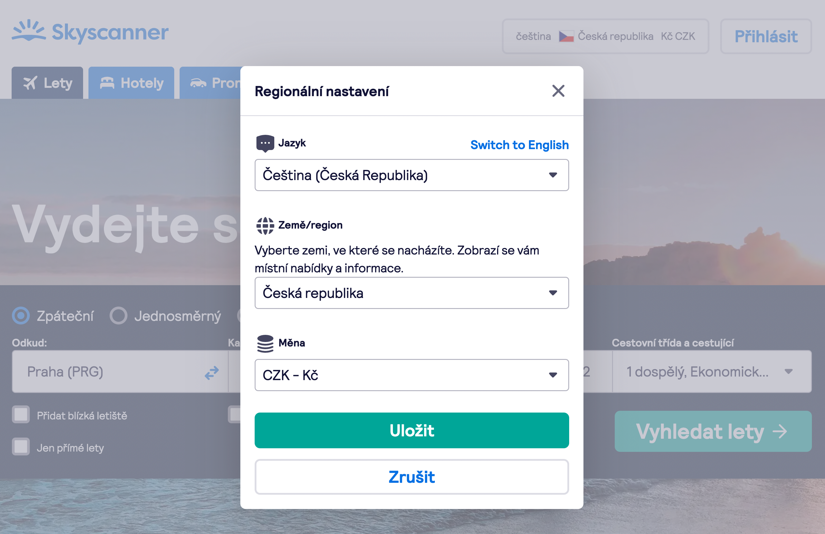
Skyscanner, by contrast, groups all customization options behind one large button, with drop-downs for each attribute. A safe fallback to English is always available if a user makes an unintended change.
Which approach wins? That depends on usability testing. A modal shown on entry may be justified here because it gives users tangible value they might not otherwise discover. But a less intrusive alternative could perform just as well: a non-modal dialog that doesn't block content.
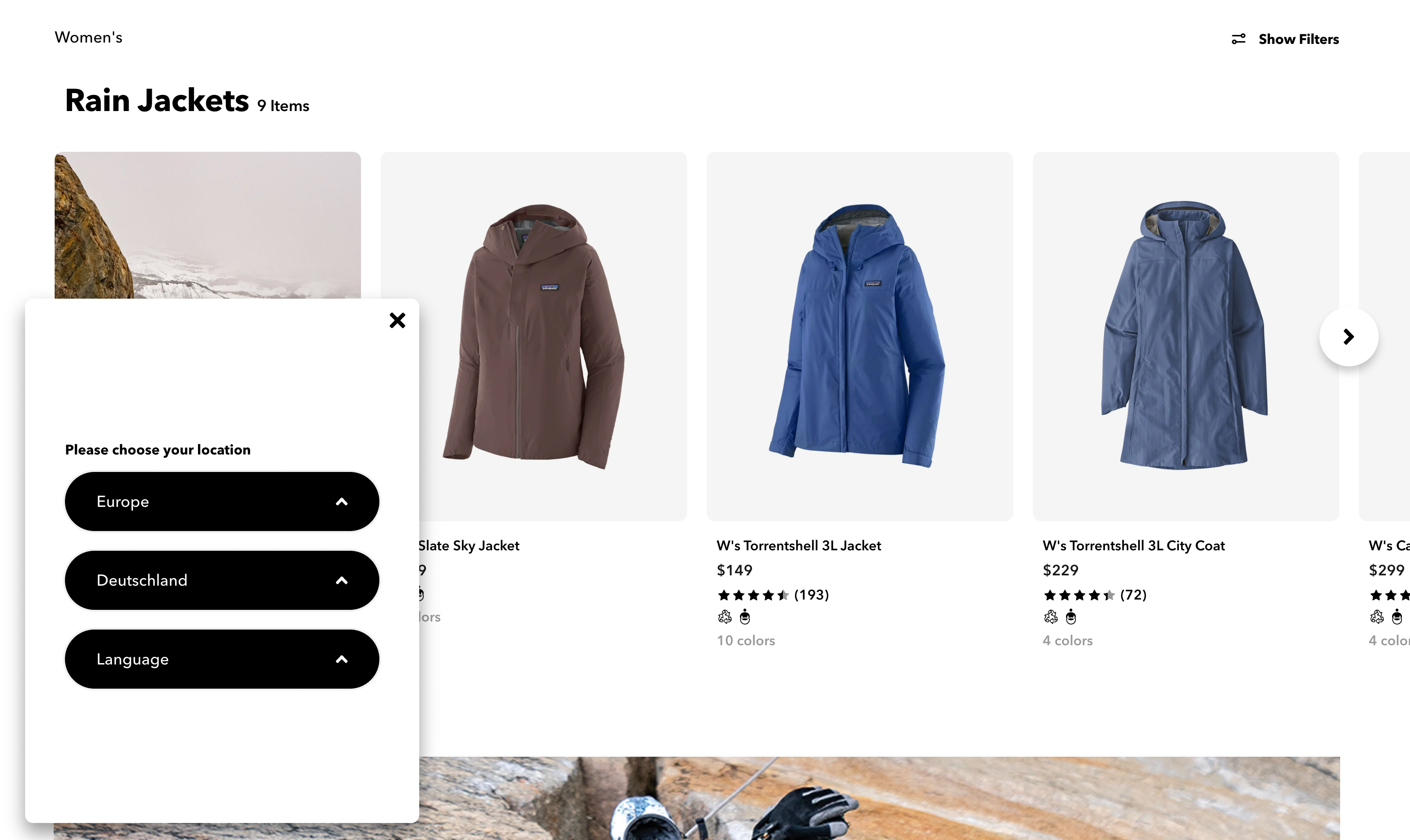
Patagonia demonstrates this pattern. A sticky, non-modal preference panel appears at the bottom left corner upon entry. Users can set location and language, save choices as a cookie, and recall the same controls later from the footer.
In this design, the preference pane sits in the corner without blocking the main content. Visitors can scroll, navigate, and copy text freely. The panel can be collapsed or minimized, yet it requires an action from the user—slightly more intrusive than a silent header link, but far easier to notice than one.
If you're unsure which approach suits your project, start with a link in the navigation bar and measure design KPIs. Then test a non-modal option, and finally a modal. The results may surprise you—modals can outperform expectations when they offer clear value.
Grouping Countries in Click-Through Menus
Large companies face the pain of listing dozens of options in a compact overlay. Scrolling through a long list inside a small widget is tedious, so many sites move the choice to a dedicated page or break it down by geography.
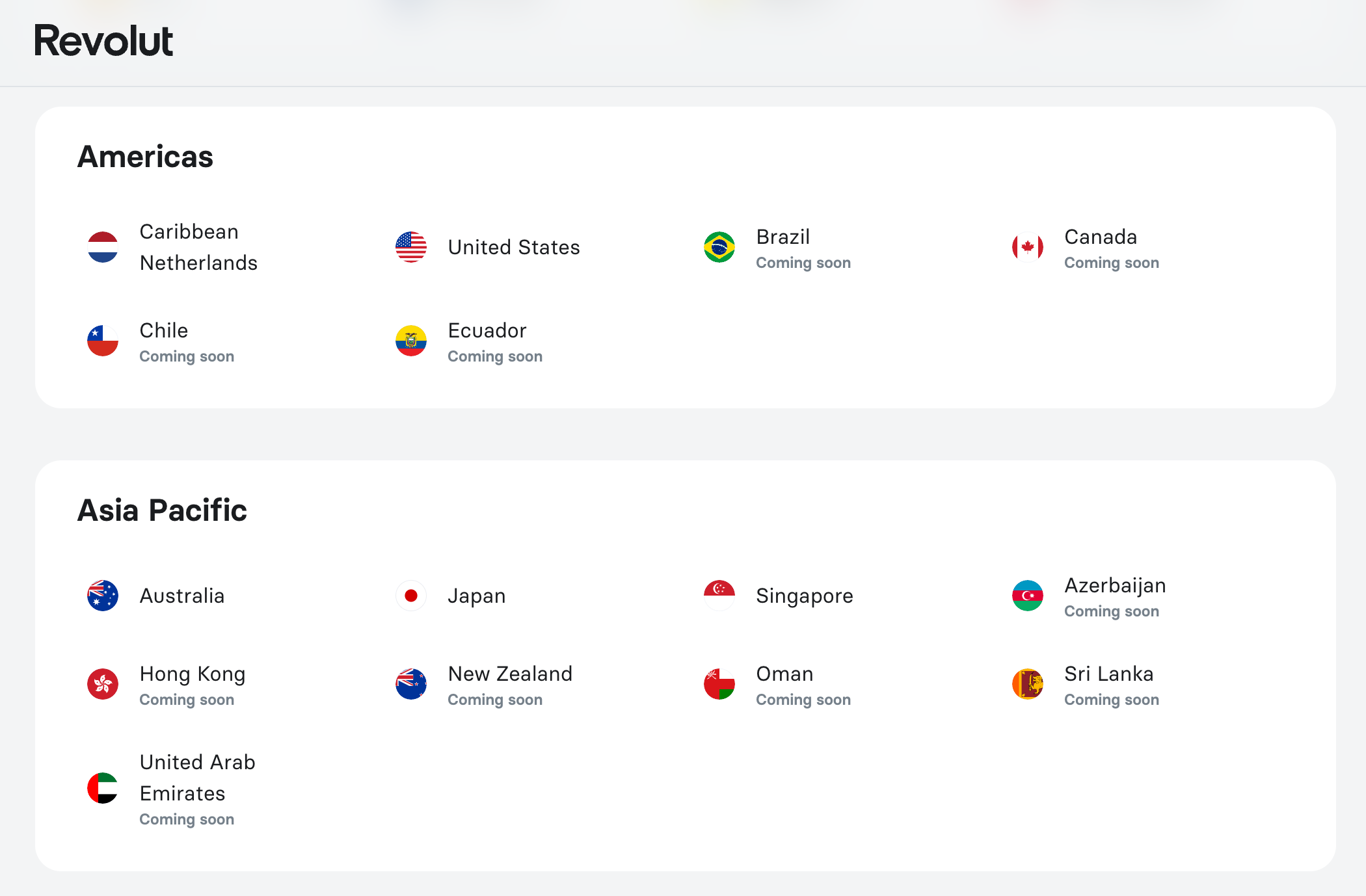
Revolut lists all countries on a full page, with names in English, organized alphabetically and grouped by region. The page also indicates locations that are not yet available. Adding a filter to hide unavailable options—such as a toggle or tab—could improve the experience further.
Logitech shows country names in their local languages: "Deutschland" for Germany and "中文" for China. This removes the assumption that users must read English to find their destination. The page groups countries geographically across columns, which aids scanning.
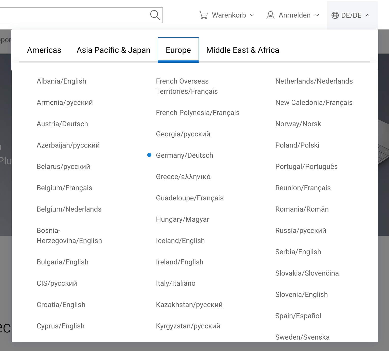
Dell uses tabs to split countries by region, avoiding one overly long page. No flags are used, which makes skimming more difficult, but the combination of countries and languages in one view cuts down on scrolling.
Cisco's compact overlay uses vertical tabs rather than horizontal ones, keeping the selection dense and straightforward. One limitation of any tab-based layout is that content remains invisible to in-browser search—users must select a region before seeing its contents.
eDreams relies on a vertical accordion for country selection. This takes up more vertical space but allows users to scan all options in a single pass from top to bottom.
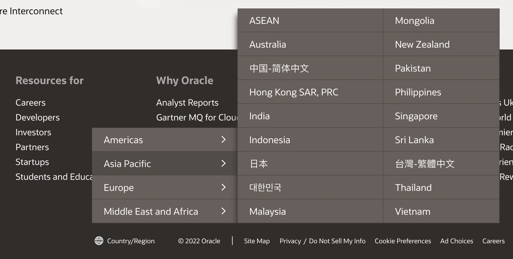
Oracle offers a click-through overlay menu with grouped countries, which is compact and does not require a separate page. When you have a large list of languages or regions, a single page with autocomplete suggestions is often more effective than tabs with cryptic labels. Grouping within accordions can help when lists get overwhelming.
Designing Autocomplete for Language Selection
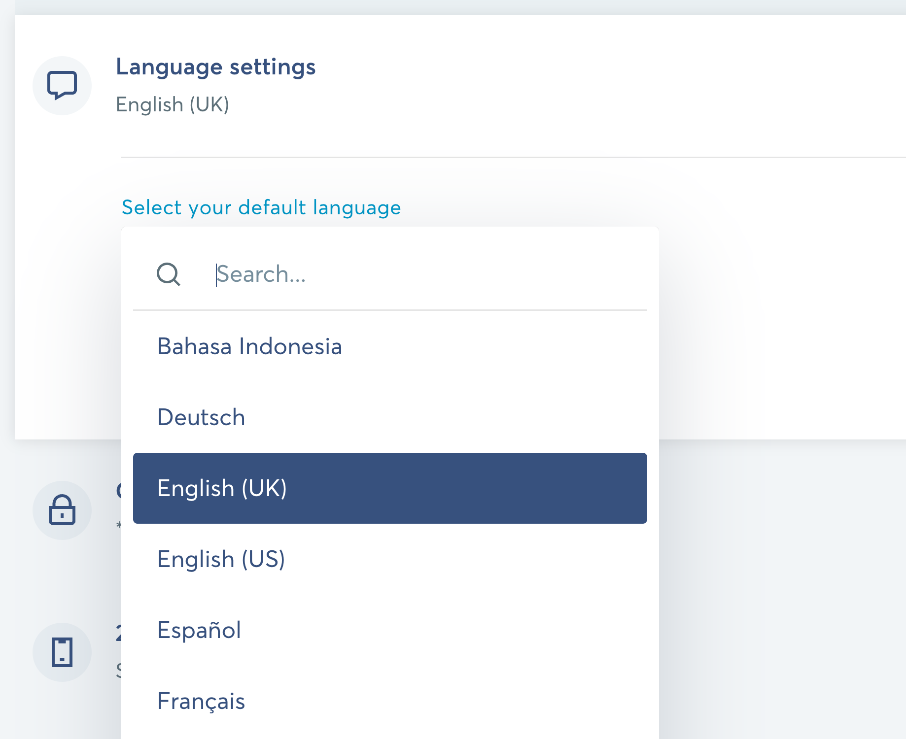
Autocomplete for language and country selection is surprisingly tricky. Users may type abbreviations, English names, or local endonyms. Supporting all of these demands careful data modeling. Additionally, suggestions should ideally surface both countries and languages, with distinctions for multi-language regions and support for major languages like English, French, or Spanish.
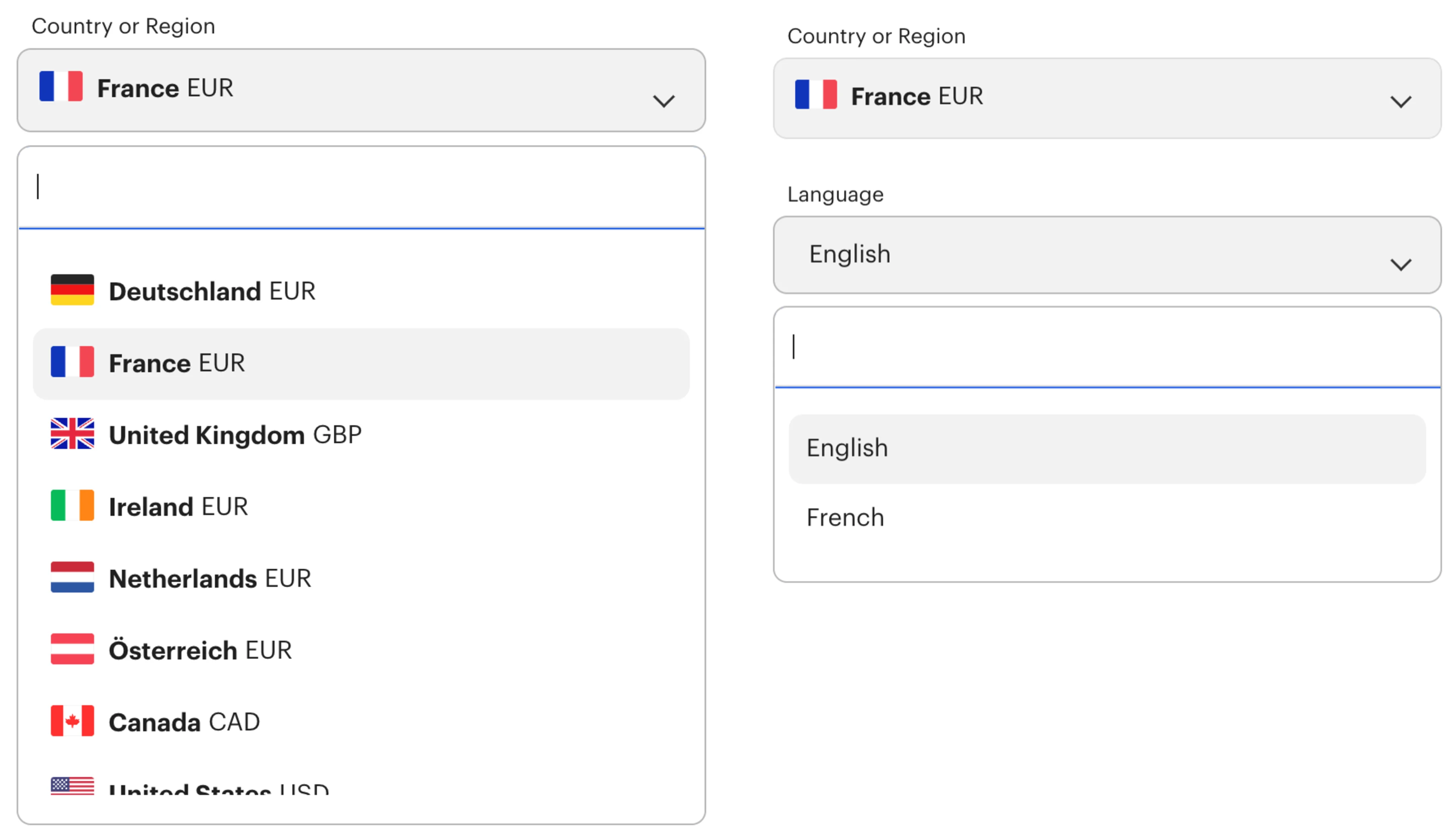
Framework handles this by offering separate autocomplete fields for country and language. On focus, the most common options appear highlighted, sparing users from scrolling through the full list. But this pattern has a flaw: if a user's country is missing from the list, they hit a dead end. Indicating nearby alternatives could help.
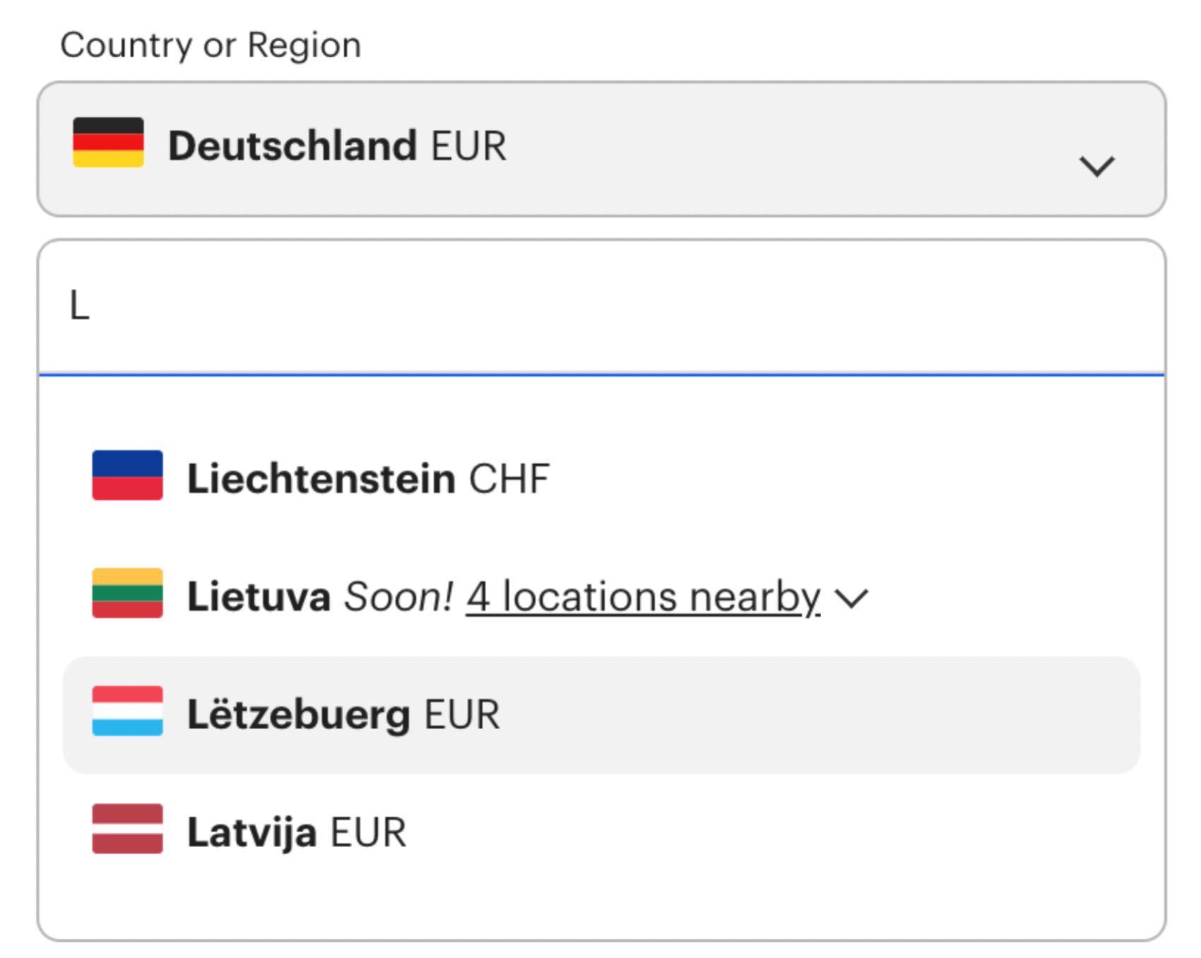
The "4 locations nearby" pattern from a mock-up illustrates one possibility: clicking opens an accordion that indents the closest alternatives to the selected country. This approach might not suit banking applications, where legal constraints matter, but it could help users look for a local office when their own country isn't listed.
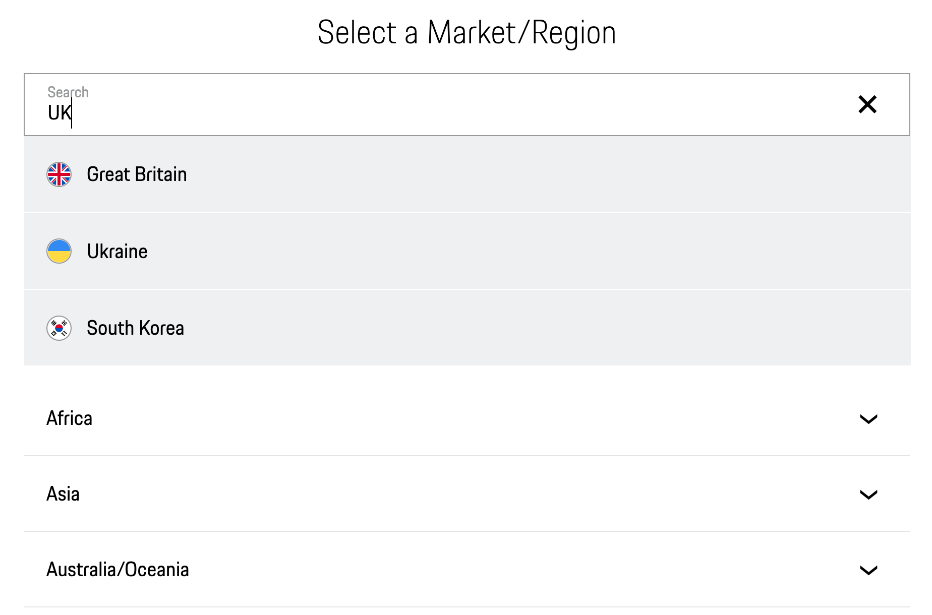
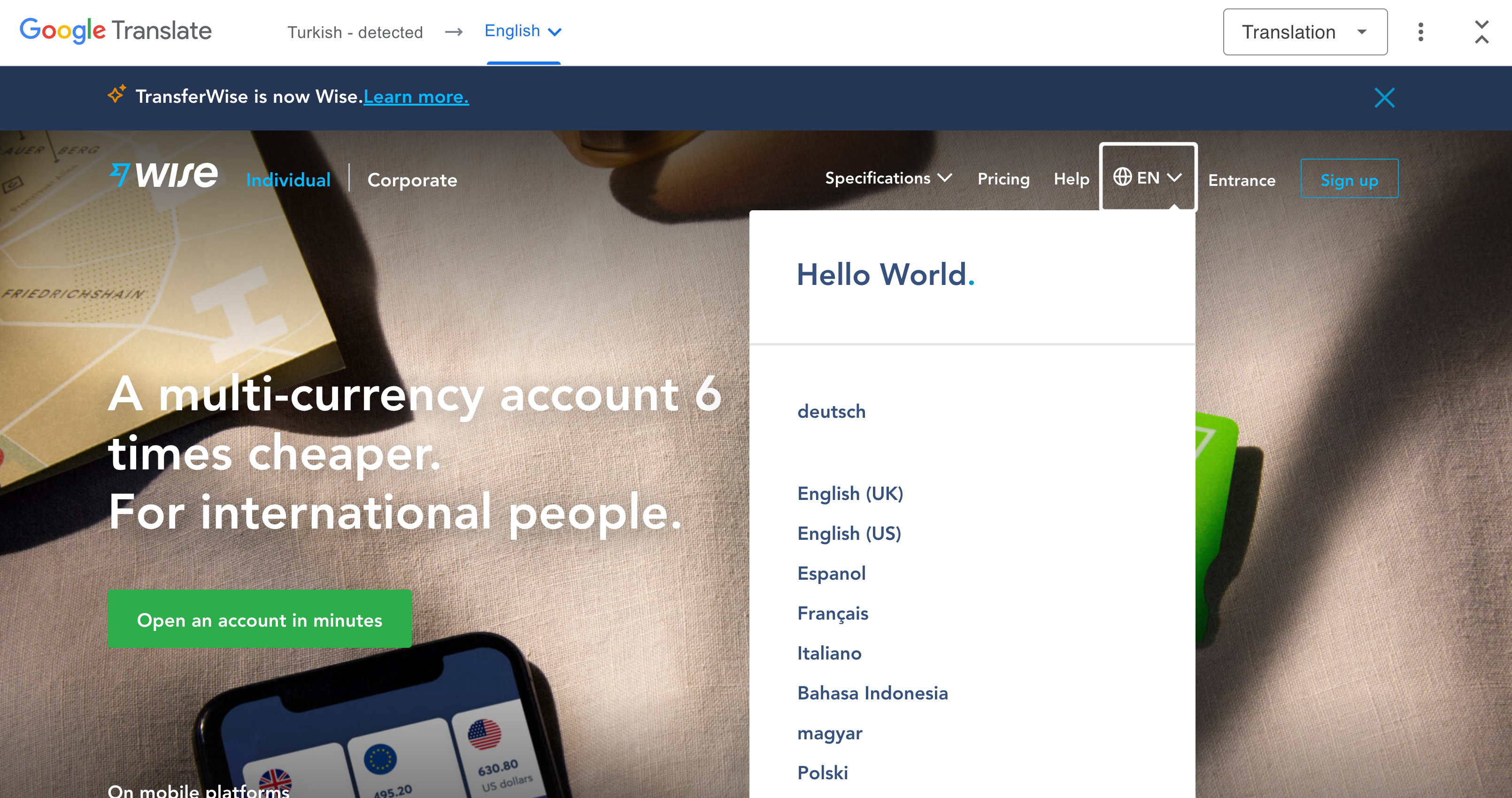
Wise also uses autocomplete for language selection, with each language displayed in its local name and, when duplicates exist, qualified by the country it refers to. Porsche pairs an accordion with autocomplete in a page overlay, supporting abbreviations and showing flag icons alongside options.
Autocomplete is certainly a useful addition. But when testing it, pay close attention to what users actually type. Making suggestions work across dozens of languages—complete with appropriate synonyms and shorthands—often consumes far more effort than anticipated.
Grouping By Region Or Language
When the same content serves multiple locations, separate entries aren’t always necessary. Daniel Marchini’s concept groups multiple country flags into a single choice — Portuguese appears once for Portugal and Brazil, Spanish once for Mexico and Spain. This works only when the experience is genuinely identical across those regions, but it can streamline a long list for users who match that target group.
Airwallex takes a broader approach, grouping all European countries under a single “European Union” option. That’s sensible when a service is available throughout the EU, but it can create friction: a user looking specifically for the Netherlands may not immediately connect the country with the regional group label.
Flags Signal Countries, Not Languages
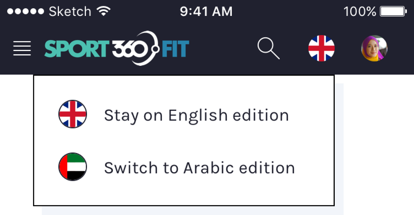
The reflex to pair a language with a flag is understandable — flags are visually distinctive and easy to scan. The problem, as James Offer points out, is that languages cross borders. French speakers live in Canada, Vietnam, Senegal, and Switzerland; tying French to a single flag would misrepresent most of them.
Zsolt Szilvai’s usability testing for a UAE-focused app surfaced the same issue: users balked at seeing Arabic represented by one flag, since the language spans many countries with no single national symbol. Curve.com illustrates the confusion from the other direction: its options include both “International (English)” and “English (United States),” a distinction that flags alone cannot convey.
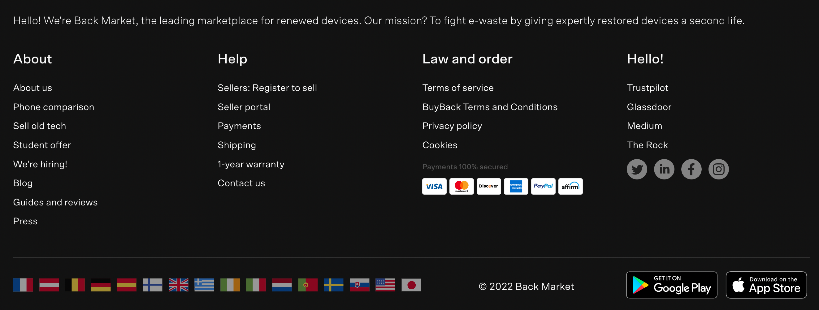
Backmarket uses footer flags to point to local marketplaces — a context where flags work, because the destination is a country-specific site, not a language choice. Bol.com keeps the model clean: a flag-labeled country selector in the upper-right corner for location, and plain text for language. The rule that holds across these examples: flags for choosing a country, text for choosing a language, with autocomplete as a useful supplement when the list of countries or languages grows.
Write Language Names In Their Own Script
Language labels should not assume the user reads English. Listing options as Deutsch and 中文 rather than German and Chinese lets speakers recognize their own language immediately. The trade-off is that users who do not read those scripts may struggle to find a familiar option if they are not in their home locale.
Booking.com offers a practical mitigation: it labels the current language in the local format but provides a detectable hint that the control changes the language. A similar approach is to prefix the current selection with the word “Language” or to keep a dedicated “English” link in the header. Extra chrome to help discovery is justified when the selector itself is localized.
Icons As Neutral Signifiers
For language-only selectors, flags are often the wrong visual cue — and the globe or translate icons can serve instead. The official language icon exists and is free to use, but it has not reached the recognition level of a globe. Placement matters more than icon choice when users scan for the control.
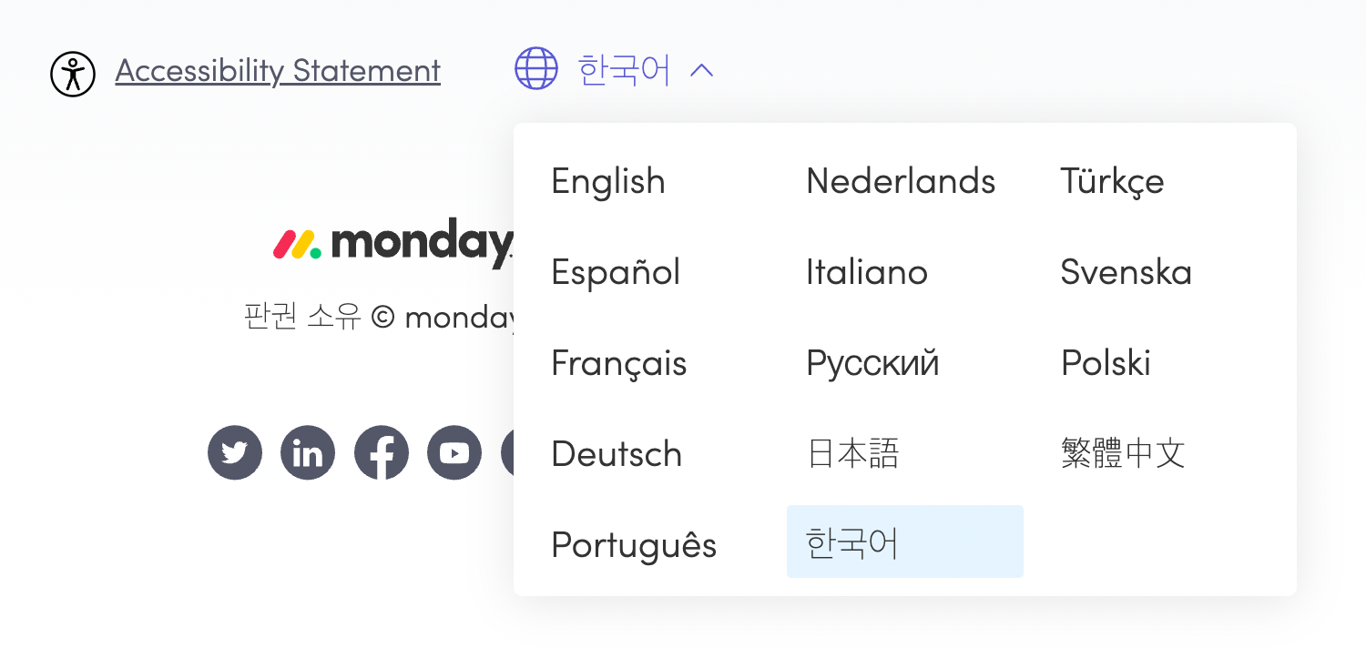
Tomorrow.one restricts its globe-labeled selector to the footer. Since its pages are short, that is acceptable, but on longer pages or infinite scroll layouts, a footer-only entry point may be effectively unreachable. Atlassian avoids that failure by showing the selector in the footer and, when the visitor’s browser language differs from the current locale, prompting a change at the top of the page. Monday.com puts the list at the very top, with options spread across three columns and the current choice highlighted. The European Commission site skips flags entirely, using an alphabetically ordered list of local language names with a clear active state.
Skip Abbreviations
Abbreviations like “EN” or “DE” are compact but fragile. As Szilvai found in testing, browser auto-translation can mutate these shorthands into meaningless text, breaking menus and confusing the layout. Using the full local name removes that failure mode entirely — translators will handle the labels, and users can still find their language.
N26 and Wise both lean on shorthands in the header trigger. Wise avoids the worst side effects by expanding to full language names on click and adding a distinct focus state for the current selection. Disabling the selected item, as N26 does, is sensible, though the muted style may need a contrast pass — and a sticky header makes a redundant footer entry unnecessary.
A Practical Checklist
- Nudge users rather than auto-redirecting.
- Keep location, language, and other settings as independent choices.
- Let users set custom preferences for currency, units, and time zones.
- Prefer a non-modal dialog for the picker.
- Split long option lists into tabs, accordions, or sections.
- Offer an autocomplete input for search.
- Use flags only for country selection, not for languages.
- Consider globe or translate icons over flags for languages.
- Write language names in their own script, e.g. Deutsch not German.
- Avoid shorthands or initials.
- Keep the selector in the header and footer and fully keyboard-accessible.