
Why framework-agnostic UI pays off
Crossing frameworks — React, Svelte, Vue, Angular, Solid — is routine for anyone who has built web apps for a while, and the recurring cost is rebuilding the same low-level UI: buttons, tabs, dropdowns. Define them once in a framework-neutral way and every stack can share them. Web components are that mechanism.
One caveat up front: server-side rendering for web components is immature. Declarative shadow DOM (DSD) is the SSR path, but as of this writing it isn't integrated with application frameworks like Next, Remix or SvelteKit. If SSR is a requirement, check DSD's current status before committing; otherwise the approach below works.
What a web component can (and can't) do
A web component is a custom HTML element — <yummy-pizza> and the like — defined from scratch. You write a JavaScript class that inherits from HTMLElement, declare its properties, attributes and styles, and specify the markup it renders.
The independence that makes custom elements exciting is also the limit: a web component can't reach into a JavaScript framework. A React component that fetches data and renders another React component can't be reproduced as one, because the web component has no way to render a React component.
Web components shine as leaf components: the last nodes in a component tree, which receive props and render UI. They are not the components in the middle of the tree passing data or setting context — just UI pieces that look the same regardless of which framework powers the app.
Starting point: a counter
The examples here are hand-written vanilla web components with no tooling. That adds boilerplate, but avoids teaching another dependency; Lit and Stencil exist to strip that boilerplate and are worth a look.
First, a class inheriting from HTMLElement:
class Counter extends HTMLElement {}Then register the element, guarding against double registration:
if (!customElements.get("counter-wc")) {
  customElements.define("counter-wc", Counter);
}
And render it:
<counter-wc></counter-wc>Everything else is your own code. connectedCallback, a common lifecycle method, fires when the component is added to the DOM, and since this is the element itself, all the familiar DOM APIs are available. A minimal implementation could just do:
class Counter extends HTMLElement {
  connectedCallback() {
    this.innerHTML = "<div style='color: green'>Hey</div>";
  }
}

if (!customElements.get("counter-wc")) {
  customElements.define("counter-wc", Counter);
}
which works fine:

Adding content and state
A useful counter needs a <span> for the value and a <button> to increment it. Create the content in the constructor and append it once the component is in the DOM:
constructor() {
  super();
  const container = document.createElement('div');

  this.valSpan = document.createElement('span');

  const increment = document.createElement('button');
  increment.innerText = 'Increment';
  increment.addEventListener('click', () => {
    this.#value = this.#currentValue + 1;
  });

  container.appendChild(this.valSpan);
  container.appendChild(document.createElement('br'));
  container.appendChild(increment);

  this.container = container;
}

connectedCallback() {
  this.appendChild(this.container);
  this.update();
}
If manual DOM creation bothers you, innerHTML is an option, or a template element stored once as a static class property and cloned per instance — or a tool like Lit or Stencil.
The component also needs a settable value property:
#currentValue = 0;

set #value(val) {
  this.#currentValue = val;
  this.update();
}
It's a standard class property with a setter plus a second property holding the value, using private class field syntax so nothing outside the component can touch it. This is standard JavaScript supported in all modern browsers; _value is a fine alternative if you prefer.
Then the update method:
update() {
  this.valSpan.innerText = this.#currentValue;
}
It works:
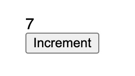
This isn't code to maintain at scale; a working example is available, and Lit and Stencil are designed to make it simpler.
A color attribute and an increment property
To make the counter configurable, it accepts a color attribute that controls the displayed value's color, plus an increment property so consumers can step by 2, 3, 4 at a time. Attributes are observed by declaring a static observedAttributes property listing the attributes the component listens for:
static observedAttributes = ["color"];With that in place, the attributeChangedCallback lifecycle method runs whenever any observed attribute is set or updated:
attributeChangedCallback(name, oldValue, newValue) {
  if (name === "color") {
    this.update();
  }
}
The update method now uses it:
update() {
  this.valSpan.innerText = this._currentValue;
  this.valSpan.style.color = this.getAttribute("color") || "black";
}
Finally, the increment property:
increment = 1;Consuming the component from Svelte
In Svelte, the component can be used like this:
<script>
  let color = "red";
</script>

<style>
  main {
    text-align: center;
  }
</style>

<main>
  <select bind:value={color}>
    <option value="red">Red</option>
    <option value="green">Green</option>
    <option value="blue">Blue</option>
  </select>

  <counter-wc color={color}></counter-wc>
</main>
The counter renders, increments, and the dropdown changes the color. Svelte renders the color attribute in the template and calls setAttribute on the underlying element when the value changes — the same handling it applies to any HTML element's attributes.
The increment prop is different: it isn't an attribute but a property on the class, so it must be set on the component instance. Start with some variables:
let increment = 1;
let wcInstance;
The counter increments by 1 or by 2:
<button on:click={() => increment = 1}>Increment 1</button>
<button on:click={() => increment = 2}>Increment 2</button>
To reach the instance, use Svelte's bind:this directive — the analogue of a React ref:
<counter-wc bind:this={wcInstance} color={color}></counter-wc>Then listen for changes to the increment variable in the template and assign the underlying property:
$: {
  if (wcInstance) {
    wcInstance.increment = increment;
  }
}
A live demo is available. Nobody wants this ceremony for every component or property, though. It would be nicer to set increment in markup like any other component prop and have it just work:
<counter-wc increment={increment} color={color}></counter-wc>That code does work — Svelte handles the legwork (demo). It is standard behavior for essentially all JavaScript frameworks. The manual version was shown for two reasons: it explains how the machinery works, and there is one framework that does not support property setting this way.
React's interop gap

React, the most popular JavaScript framework, lacks basic interop with web components — a well-known problem unique to it. It is fixed in React's experimental branch but wasn't merged into version 18; progress can be tracked at custom-elements-everywhere.com. A live demo shows the behavior.
The workaround is a ref: grab the instance and set increment manually when the value changes.
import React, { useState, useRef, useEffect } from 'react';
import './counter-wc';

export default function App() {
  const [increment, setIncrement] = useState(1);
  const [color, setColor] = useState('red');
  const wcRef = useRef(null);

  useEffect(() => {
    wcRef.current.increment = increment;
  }, [increment]);

  return (
    <div>
      <div className="increment-container">
        <button onClick={() => setIncrement(1)}>Increment by 1</button>
        <button onClick={() => setIncrement(2)}>Increment by 2</button>
      </div>

      <select value={color} onChange={(e) => setColor(e.target.value)}>
        <option value="red">Red</option>
        <option value="green">Green</option>
        <option value="blue">Blue</option>
      </select>

      <counter-wc ref={wcRef} increment={increment} color={color}></counter-wc>
    </div>
  );
}
There is a live demo. Hand-coding this per property doesn't scale, but there are options.
Option 1: attributes only
Attribute values are strings. The color attribute worked in the React demo while increment did not, so an attributes-only approach gets fairly far: numbers can be converted to and from strings, and objects could be JSON stringified and parsed. Eventually a function will need to cross into the web component, and at that point the options run out.
Option 2: add a level of indirection
Lit ships @lit-labs/react, which generates a React component per web component from a property list. It's clever, but it means a one-to-one mapping of hand-created React components. A better fit is a single React component that takes the web component's tag name (counter-wc) plus its attributes and properties, renders the element, attaches a ref, and sorts out which inputs are properties and which are attributes:
<WcWrapper wcTag="counter-wc" increment={increment} color={color} />wcTag is the tag name; everything else is passed along. Here's the implementation:
import React, { createElement, useRef, useLayoutEffect, memo } from 'react';

const _WcWrapper = (props) => {
  const { wcTag, children, ...restProps } = props;
  const wcRef = useRef(null);

  useLayoutEffect(() => {
    const wc = wcRef.current;

    for (const [key, value] of Object.entries(restProps)) {
      if (key in wc) {
        if (wc[key] !== value) {
          wc[key] = value;
        }
      } else {
        if (wc.getAttribute(key) !== value) {
          wc.setAttribute(key, value);
        }
      }
    }
  });

  return createElement(wcTag, { ref: wcRef });
};

export const WcWrapper = memo(_WcWrapper);
The interesting line is the last:
return createElement(wcTag, { ref: wcRef });This creates an element with a dynamic name — the same call React transpiles JSX into (createElement("div")) — and is available when needed directly.
The layout effect loops through every prop and tests with an in check against the instance and its prototype chain, which catches getters and setters on the class prototype; anything not found is treated as an attribute. Values are set only if they've actually changed.
useLayoutEffect is used rather than useEffect so updates apply before content renders, and it has no dependency array, so it runs on every render. Since React re-renders often, the component is wrapped in React.memo — the modern equivalent of React.PureComponent — so it re-renders only when props change by simple equality. The one risk: mutating an object prop in place without re-assigning won't produce updates, but that practice is strongly discouraged in React anyway.
Some may dislike passing the tag name to <WcWrapper> and prefer @lit-labs/react's per-component approach; use whatever is comfortable. One advantage of the wrapper is how easily it can be deleted. If React merges proper web component handling from its experimental branch into main:
<WcWrapper wcTag="counter-wc" increment={increment} color={color} />becomes:
<counter-wc ref={wcRef} increment={increment} color={color} />A codemod — realistically a global search and replace with a RegEx — could rewrite every usage, after which <WcWrapper> can be removed entirely.
The blurry preview component
The original goal was to move the image preview from the earlier post into a web component usable in any framework, and React's interop gap added most of the detail. Here is the entire component; a working demo cycles between three books in three programming languages. Each book URL is unique every time, so throttle the Network tab in DevTools to watch the previews.
View entire code
class BookCover extends HTMLElement {
  static observedAttributes = ['url'];

  attributeChangedCallback(name, oldValue, newValue) {
    if (name === 'url') {
      this.createMainImage(newValue);
    }
  }

  set preview(val) {
    this.previewEl = this.createPreview(val);
    this.render();
  }

  createPreview(val) {
    if (typeof val === 'string') {
      return base64Preview(val);
    } else {
      return blurHashPreview(val);
    }
  }

  createMainImage(url) {
    this.loaded = false;
    const img = document.createElement('img');
    img.alt = 'Book cover';
    img.addEventListener('load', () => {
      if (img === this.imageEl) {
        this.loaded = true;
        this.render();
      }
    });
    img.src = url;
    this.imageEl = img;
  }

  connectedCallback() {
    this.render();
  }

  render() {
    const elementMaybe = this.loaded ? this.imageEl : this.previewEl;
    syncSingleChild(this, elementMaybe);
  }
}
The component observes and reacts to a registered attribute:
static observedAttributes = ['url'];

attributeChangedCallback(name, oldValue, newValue) {
  if (name === 'url') {
    this.createMainImage(newValue);
  }
}
That causes the image component to be created, showing only once loaded:
createMainImage(url) {
  this.loaded = false;
  const img = document.createElement('img');
  img.alt = 'Book cover';
  img.addEventListener('load', () => {
    if (img === this.imageEl) {
      this.loaded = true;
      this.render();
    }
  });
  img.src = url;
  this.imageEl = img;
}
Next is the preview property, which holds either the base64 preview string or the blurhash packet:
set preview(val) {
  this.previewEl = this.createPreview(val);
  this.render();
}

createPreview(val) {
  if (typeof val === 'string') {
    return base64Preview(val);
  } else {
    return blurHashPreview(val);
  }
}
It defers to whichever helper function is needed:
function base64Preview(val) {
  const img = document.createElement('img');
  img.src = val;
  return img;
}

function blurHashPreview(preview) {
  const canvasEl = document.createElement('canvas');
  const { w: width, h: height } = preview;

  canvasEl.width = width;
  canvasEl.height = height;

  const pixels = decode(preview.blurhash, width, height);
  const ctx = canvasEl.getContext('2d');
  const imageData = ctx.createImageData(width, height);
  imageData.data.set(pixels);
  ctx.putImageData(imageData, 0, 0);

  return canvasEl;
}
Then the render method:
connectedCallback() {
  this.render();
}

render() {
  const elementMaybe = this.loaded ? this.imageEl : this.previewEl;
  syncSingleChild(this, elementMaybe);
}
And a few helper methods tying it together:
export function syncSingleChild(container, child) {
  const currentChild = container.firstElementChild;
  if (currentChild !== child) {
    clearContainer(container);
    if (child) {
      container.appendChild(child);
    }
  }
}

export function clearContainer(el) {
  let child;

  while ((child = el.firstElementChild)) {
    el.removeChild(child);
  }
}
It's more boilerplate than a framework implementation would need, but the payoff is reuse in any framework — with a wrapper needed for React for now.
Tooling around the edges
- Lit provides the React wrapper mentioned above; Stencil supports a separate output pipeline just for React; Microsoft has published a wrapper similar to Lit's, attached to the Fast web component library (
@microsoft/fast-react-wrapper). - Every framework besides React sets web component properties for you, though some have special syntax. In Solid.js,
<your-wc value={12}>always assumesvalueis a property; anattrprefix overrides it:<your-wc attr:value={12}>.
The trade-off
Web components remain an underused part of the web platform. They reduce dependence on any single JavaScript framework when managing UI or leaf components. Writing those components as web components rather than in Svelte or React won't be as ergonomic, but the result is broadly reusable.