

Wrapping Tailwind Classes in Semantic React Components
Tailwind's utility-first approach gives developers low-level class names that map directly to CSS properties. That's convenient for rapid styling, but it can quickly lead to components cluttered with long, repetitive class strings. One way to keep code maintainable is to hide those utilities behind React components that expose a cleaner, prop-based interface.
This article walks through three practical patterns for building reusable React components with Tailwind under the hood. Each method lets you move from markup like this:
<button className="bg-blue-500 hover:bg-blue-700 text-white font-bold py-2 px-4 rounded">
  Enable
</button>
to this:
<Button size="sm" textColor="white" bgColor="blue-500">
  Enable
</Button>
The second version is easier to read and reuse: it uses props like size, textColor, and bgColor instead of a long chain of class names. You'll need basic React experience to follow along.
Method 1: Toggling Classes Programmatically With classnames
The simplest way to adapt Tailwind in React is to keep the class names but control them through props. The classnames npm module is a small utility that makes conditional class toggling much cleaner.
Consider a typical Twittter-style button implementation:
// This could be hard to read.
<button className="bg-blue-500 hover:bg-blue-700 text-white font-bold py-2 px-4 rounded">Enable</button>

// This is more conventional React.
<Button size="sm" textColor="white" bgColor="blue-500">Enable</Button>
You can improve this by accepting props directly and building the class string conditionally:
// Button.jsx
import classnames from 'classnames';

function Button ({size, bgColor, textColor, children}) {
    return (
        <button className={classnames("bg-${bgColor} text-${textColor} font-bold py-2 px-4 rounded", {
    "text-xs": size === 'sm'
    "text-xl": size === 'lg',
    })}>
        {children}
    </button>
    )
};

export default Button;
In this Button component:
sizeswitches betweentext-xsandtext-xl;bgColortakes a value for Tailwind'sbg-*utilities;textColormaps totext-*utilities;childrenpasses through any nested content.
Using the component then looks like this:
import Button from './Button';
<Button size="sm" textColor="white" bgColor="blue-500">Enable</Button>
Interactive Components With Class Toggling
For more complex components, the same principle applies. A dropdown, for example, can rely on toggling Tailwind's hidden and block classes based on state.
Here's the React interface you might expose:
<Dropdown
  options={\["Edit", "Duplicate", "Archive", "Move", "Delete"\]}
  onOptionSelect={(option) => {
    console.log("Selected Option", option)}
  }
/>
The consumer only sees options and an onOptionSelect callback — no Tailwind classes are visible. Under the hood, the dropdown state controls visibility:
import classNames from 'classnames';

function Dropdown({ options, onOptionSelect }) {

  // Keep track of whether the dropdown is open or not.
  const [isActive, setActive] = useState(false);

  const buttonClasses = `inline-flex justify-center w-full rounded-md border border-gray-300 px-4 py-2 bg-white text-sm leading-5 font-medium text-gray-700 hover:text-gray-500 focus:outline-none focus:border-blue-300 focus:shadow-outline-blue active:bg-blue-500 active:text-gray-200 transition ease-in-out duration-150`;

  return (
    // Toggle the dropdown if the button is clicked
    <button onClick={() => setActive(!isActive)} className={buttonClasses}>
      Options
    </button>
    // Use the classnames module to toggle the Tailwind .block and .hidden classes
    <div class={classNames("origin-top-right absolute right-0 mt-2 w-56 rounded-md shadow-lg", {
      block: isActive,
      hidden: !isActive
    })}>
    // List items are rendered here.
    {options.map((option) => <div key={option} onClick={(e) => onOptionSelect(option)}>{option}</div>)}
   </div>
  )
}

export default Dropdown;
When the trigger button is clicked, an onClick handler flips an isActive flag. The menu's class list then switches between hidden and block accordingly.
This approach is direct and effective: it separates logic into props and keeps the class output predictable. It works well for both static and interactive components.
Method 2: Centralizing Design Tokens in Constants
A different strategy is to define all your component variations in a constants file. This works nicely for building out a design system because it centralizes the mapping between props and class names.
Create a theme.js file:
// theme.js (you can call it whatever you want)
export const ButtonType = {
    primary: "bg-blue-500 hover:bg-blue-700 text-white font-bold rounded",
    secondary: "bg-blue-500 hover:bg-blue-700 text-white font-bold rounded",
    basic: "bg-white hover:bg-gray-700 text-gray-700 font-bold rounded",
  delete: "bg-red-300 hover:bg-red-500 text-white font-bold rounded"
};

export const ButtonSize = {
  sm: "py-2 px-4 text-xs",
  lg: "py-3 px-6 text-lg"
}
Here, ButtonType and ButtonSize hold the class strings for each variant. Your Button component then reads from these constants:
import {ButtonType, ButtonSize} from './theme';

function Button({size, type, children}) {

  // This can be improved. I’m keeping it simple here by joining two strings.
  const classNames = ButtonType[type] + " " + ButtonSize[size];

  return (
    <button className={classNames}>{children}</button>
  )
}
export default Button;
Consumers then use the component with simple, descriptive props:
// Cleaner and well defined props.
<Button size="xs" type="primary">Enable</Button>
Instead of this:
// Exposing class names
<button className="py-2 px-4 text-xs bg-blue-500 hover:bg-blue-700 text-white font-bold rounded">Enable</button>
Updating the look of all buttons across the app becomes a matter of editing theme.js, rather than hunting down class names in disparate component files.
Method 3: Extracting Utilities With @apply
If you prefer to work with custom CSS classes, you can use Tailwind's @apply directive. This lets you compose multiple utilities into a single class, which you then use in your HTML and React components.
Starting with verbose class lists:
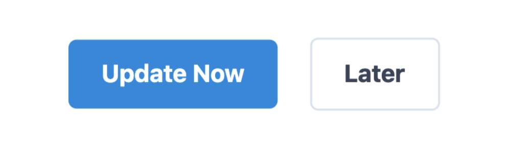
<button className="py-2 px-4 mr-4 text-xs bg-blue-500 hover:bg-blue-700 text-white font-bold rounded">Update Now</button>

<button className="py-2 px-4 text-xs mr-4 hover:bg-gray-100 text-gray-700 border-gray-300 border font-bold rounded">Later</button>
You can group those into custom classes invoked via @apply:
<button className="btn btn-primary btn-xs">Update Now</button>
<button className="btn btn-secondary btn-xs">Later</button>
The React component then uses those class names directly:
import classnames from "classnames";

function Button ({size, type, children}) {
  const bSize = "btn-" + size;
  const bType = "btn-" + type;
  return (
    <button className={classnames("btn", bSize, bType)}>{children}</button>
  )
}

Button.propTypes = {
  size: PropTypes.oneOf(['xs, xl']),
  type: PropTypes.oneOf(['primary', 'secondary'])
};

// Using the Button component.
<Button type="primary" size="xs">Update Now</Button>
<Button type="secondary" size="xs">Later</Button>
To set this up, create a button.css file that defines the classes. This isn't standard CSS — PostCSS compiles it for you during the build:
/\* button.css \*/
@tailwind base;
@tailwind components;

.btn {
  @apply py-2 px-4 mr-4 font-bold rounded;
}
.btn-primary {
  @apply bg-blue-500 hover:bg-blue-700 text-white;
}
.btn-secondary {
  @apply hover:bg-gray-700 text-gray-700 border-gray-300 border;
}
.btn-xs {
  @apply text-xs;
}
.btn-xl {
  @apply text-xl;
}

@tailwind utilities;
Trade-Offs of @apply
While extracting utilities seems logical, it reintroduces some of the problems Tailwind tries to solve. For instance, seeing .btn-primary doesn't tell you that it must be paired with .btn, nor that it conflicts with .btn-secondary. For nested components, you'd need to understand parent-child class relationships that aren't obvious from the markup.
In essence, @apply can lead you back toward tangled CSS, unless you carefully maintain the abstraction.
Which Approach Fits?
Each method is viable depending on the context:
classnamesoffers a lightweight, flexible way to toggle utilities inline.- Constants files provide a central, auditable source for design-system variants.
@applylets you keep custom CSS semantics while still reusing Tailwind's foundation.
All three patterns result in React components with a cleaner, prop-driven API that hides Tailwind's low-level utility classes from the rest of your codebase.


