

Designing for Vulnerability: A Framework for Trust-First Mental Health Apps
Opening a mental health app while anxious should never mean confronting clashing colors, a guilt-trip about a broken streak, or a paywall at the moment of need. For users in distress, such design failures aren't just inconvenient; they can be actively harmful. Designing for mental health means recognizing that the user's emotional state isn't a secondary context — it is the environment in which the product operates.
With over a billion people living with mental health conditions and persistent gaps in care access, evidence-aligned digital support is increasingly vital. The margin for error is thin. Empathy-Centred UX moves beyond functionality to understand and respect the user's psychological needs — but translating this into practice requires a concrete, repeatable approach.
Drawing on product design work in this space, a practical framework emerges from three pillars: onboarding as supportive conversation, interface design for a distressed brain, and retention patterns that build trust rather than pressure. The first of these sets the tone for everything that follows.
Onboarding as First Conversation, Not Checklist
Onboarding is a first impression with outsized stakes, determining whether a vulnerable user continues engaging at all. With up to 20,000 mental-health-related apps on the market, designers face a tension: integrate onboarding's practical goals without making the experience feel clinical or dismissive. The essential move is to design onboarding as the first supportive conversation, delivering a small dose of relief early rather than overwhelming users with data and feature tours.
The Empathy Tool
The goal is to help the user feel seen and understood by delivering a small dose of relief quickly, not just overload them with data and the app's features.
Case Study: Acknowledging the Parent's Load
At Teeni, an app for parents of teenagers, onboarding had to solve two problems: acknowledge the emotional weight of parenting teens and show how the app shares that load, while collecting only enough information to make the first feed relevant.
User interviews surfaced a recurring feeling among parents: "I'm a bad parent, I've failed at everything." The design response was early relief through normalisation — a city-at-night metaphor with lit windows. Directly after the welcome page, users engage with three brief, animated, optional stories based on frequent teenage parenting challenges, allowing parents to recognise themselves. This narrative approach normalises struggles and helps users cope with stress and complex emotions from the start.
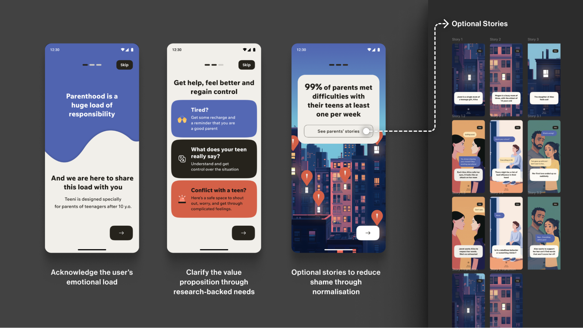
Early usability sessions indicated strong emotional resonance, but post-launch analytics showed the optionality of storytelling must be explicit. The balance is to avoid overwhelming a distressed parent while directly acknowledging their reality: "Parenting is tough. You're not alone."
Progressive Profiling Over Long Forms
To tailor guidance without burdening users, the framework defines minimal data needed for personalisation. First-run onboarding collects only essentials for basic setup — parent role, number of teens, each teen's age. Additional details like specific challenges or wishes are gathered gradually as users progress, avoiding lengthy forms for those needing immediate support.
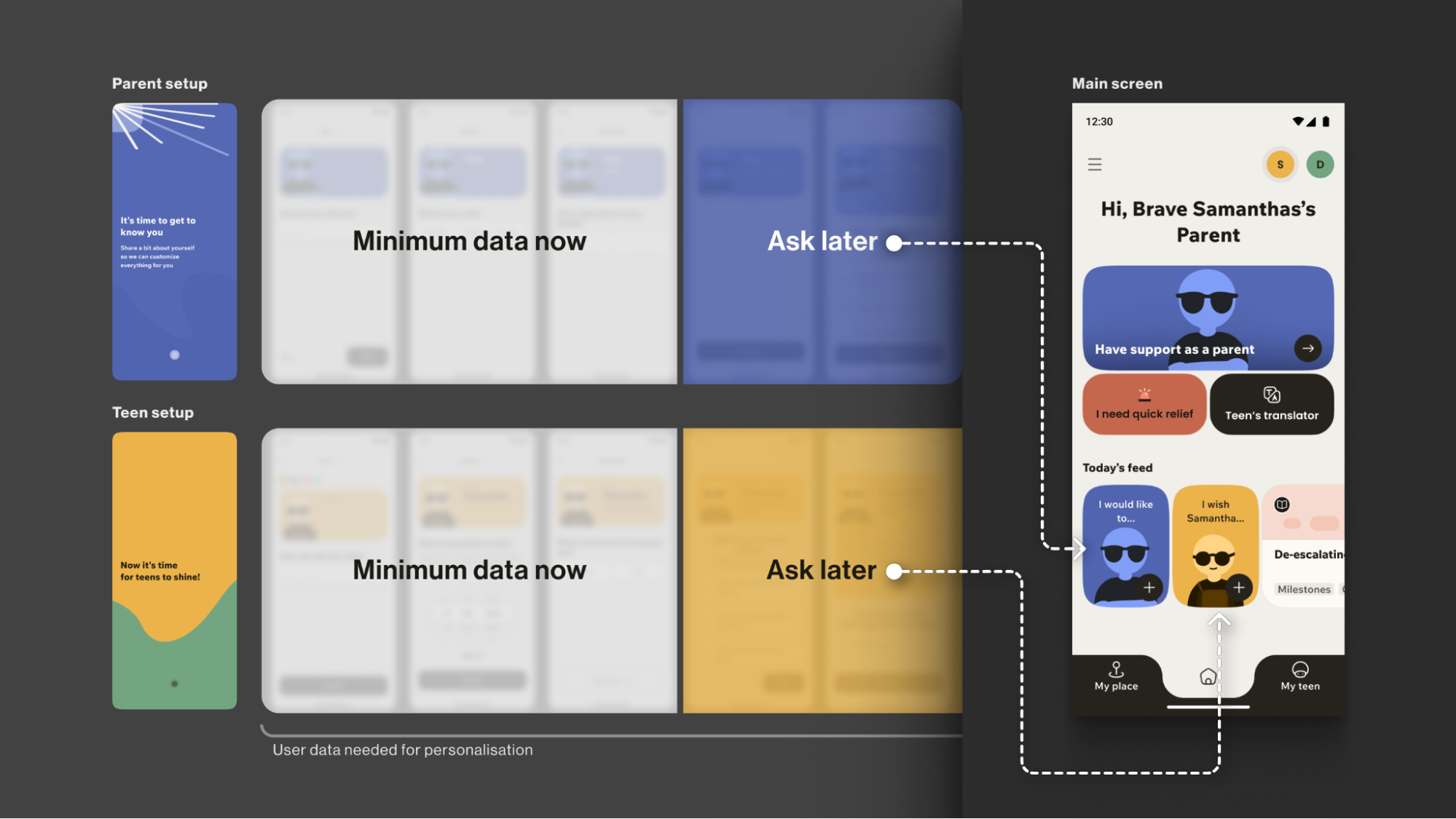
Throughout, consistently supportive language turns a practical process into emotional connection, while preserving an explicit fast path for users who want it.
Onboarding Toolbox: Four Practices
- Use Validating Language
Start with "It's okay to feel this way," not "Allow notifications." - Understand "Why", not just "What"
Collect only what you'll use now; defer the rest via progressive profiling with simple, goal-focused questions. - Prioritise Brevity and Respect
Keep onboarding skimmable, make optionality explicit, and let user testing define the minimum effective length — shorter is usually better. - Keep an Eye on Feedback and Iterate
Track time-to-first-value and step drop-offs; pair with quick usability sessions, then adjust based on what you learn.
This initial conversation creates a foundation of trust, but that trust is fragile. The next concern is ensuring the app's environment itself doesn't break it — which is exactly what interface design for a brain in distress must address.
Designing For Reduced Capacity, Not Reduced People
Anxiety and depression measurably affect cognition. Users in that state process information more slowly, hold less in working memory, and have a shortened attention span. Dense layouts, aggressive contrast shifts, high-saturation palettes and flashing elements are not just visually noisy — they are actively off-putting for someone already struggling to concentrate.
The Empathy Tool
When designing a user flow for a mental health app, I always apply the Web Content Accessibility Guidelines 2.2 as a foundational baseline. On top of that, I choose a "low-stimulus", "familiar and safe" visual language to minimise the user’s cognitive load and create a calm, predictable, and personalised environment. Where appropriate, I add subtle, opt-in haptics and gentle micro-interactions for sensory grounding, and offer voice features as an option in high-stress moments (alongside low-effort tap flows) to enhance accessibility.
The practical takeaway is to design as if guiding the user by hand. Keep forms simple, wording short, and the path to support obvious. When a user is in crisis, they should not have to parse a complex interface to find relief.
The "Cosy Room" Alternative
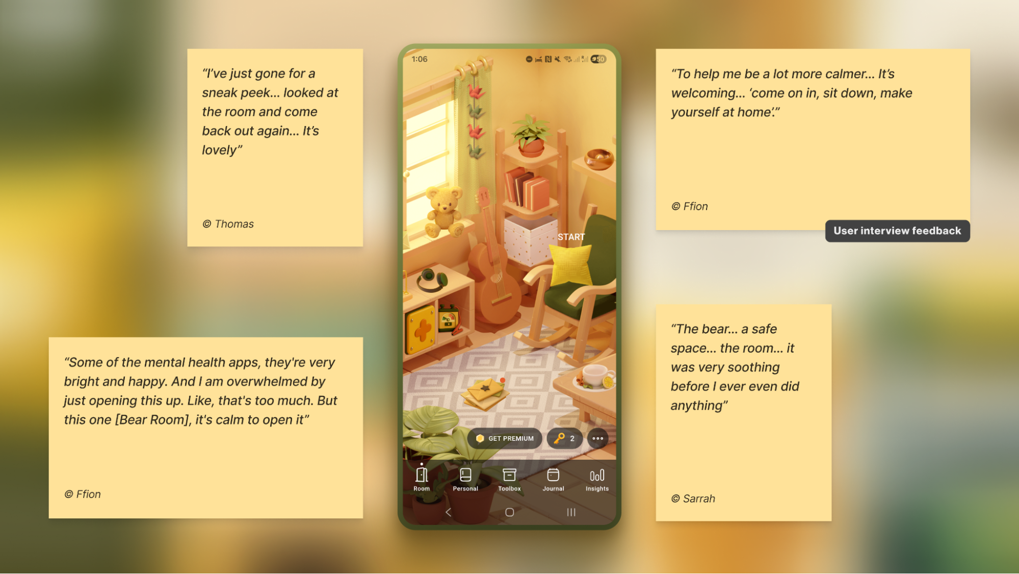
UX research for the stress-relief app Bear Room exposed a recurring failure in mental-health design. User interviews with individuals living with PTSD and depression revealed that mainstream apps often alienate the very people they aim to help. Descriptions like "too bright, too happy, and too overwhelming" came up repeatedly, with participants reporting that such aesthetics intensified their sense of being disconnected.
That feedback drove a low-arousal design strategy, treating the "safe space" not as a theme but as a holistic sensory experience. The interface uses a curated, earthy, non-neon palette, eliminates sudden motion and jarring alerts, and breaks text into small, scannable chunks. Emotional support tools, such as a virtual pillow, are deliberately highlighted for convenience. This is not an aesthetic preference; it is a functional requirement for digital safety.
Attachment is built through subtle, voluntary personalisation. The room features three opt-in "personal objects" — Mirror, Letter, and Frame — each inviting a small act of contribution. These draw on the IKEA effect (PDF), where effort invested in an object increases perceived ownership and value. Frame, for instance, appears as a picture frame on the digital wall. Users can optionally replace the placeholder with their own image — a pet, a person, a landscape — which then displays every time they open the app. It relies on the user's own photo or stored mental image, not on generated content that might feel uncanny. The choice is lightweight, reversible, and designed to make the space feel like "mine" without adding cognitive overhead.
Note: Always adapt to the context. Try to avoid making the colour palette too pastel. It is useful to balance the brightness based on the user research, to protect the right level of the app’s contrast.
Creating Calm In A Bear Room
Emotion Without Words
The Food for Mood app tackled a different problem: how to let users externalise complex feelings without demanding they find the right words. The solution was a visual metaphor — coloured bubbles representing goals and emotional states, with a dense red bubble for "Performance". This lets users express and visualise their inner state directly through the UI.
An informal field test with young professionals compared three interactive prototypes. The standard card layout scored higher on simplicity 5⁄5, but the bubble carousel was rated higher on engagement and positive affect, earning a 4⁄5 simplicity score. Because the simplicity trade-off was minimal and confined to the first seconds of use, the bubble carousel won out for the first iteration, prioritising the emotionally rewarding experience.
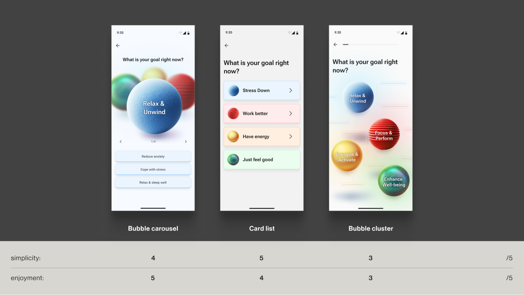
The language of a colour-based metaphor can shorten the distance between feeling and expression, which matters when a user's cognitive resources are already depleted.
Tactile Grounding and Voice as a Lower-Friction Path
Micro-interactions can offer a brief, physical interruption to a spiral of anxious thoughts. Bear Room includes a bubble-wrap popping mechanic for this reason — a satisfying, tactile distraction that is not about points or gamification, but about a controlled sensory break. These effects must remain opt-in and predictable, as unexpected feedback can raise arousal for some users.
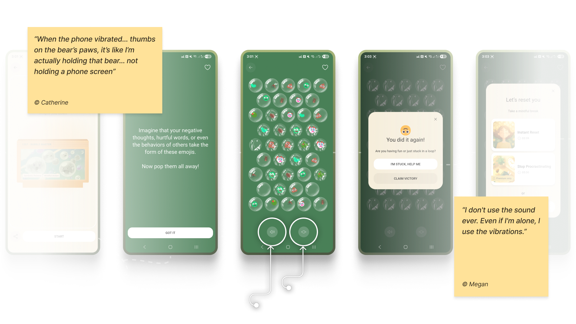
Note: Make tactile effects opt-in and predictable. Unexpected sensory feedback can increase arousal rather than reduce it for some users.
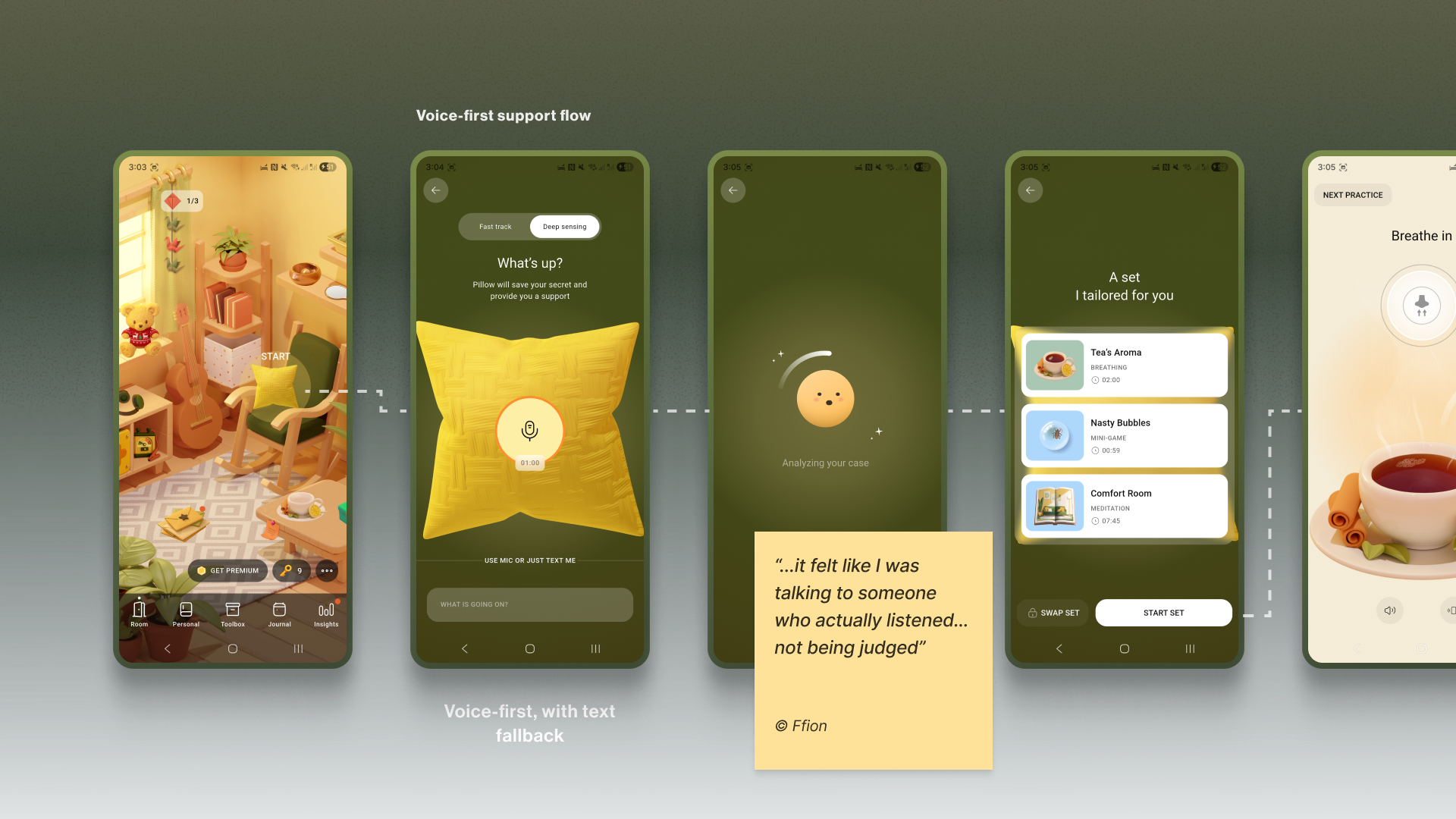
When attention is severely impaired and even a clearly labelled four-option choice is too much, voice input lowers the barrier. The act of putting feelings into words can itself reduce emotional intensity, and spoken input provides richer context for tailoring support.
Both Teeni and Bear Room use voice as a primary input path for flows related to fatigue, overwhelm and acute stress, always with a text alternative. In Bear Room, a prominent mic button invites users to share what is on their mind; the app then analyses the response with AI — explicitly without diagnosing — and suggests tailored coping practices. Teeni’s "Hot flow" targets parents in a similar low-energy state, letting them vent a frustration by voice. The AI responds with one screen of psychoeducational content and, in a few steps, suggests an appropriate calming tool.
Privacy is a gatekeeper for trust. Mental-health data is deeply sensitive, and users are rightfully wary given the frequency of data breaches and third-party sales. The design must show a concise notice before any recording, stating how audio is processed, where it is processed, how long it is stored, and making clear it is not sold or shared, followed by an explicit GDPR-style consent step. An obvious "Delete all data" option is best practice.
Note: Mental-health topics are highly sensitive, and many people feel uncomfortable sharing sensitive data with an app — especially amid frequent news about data breaches and data being sold to third parties. Before recording, show a concise notice that explains how audio is processed, where it’s processed, how long it’s stored, and that it is not sold or shared with third parties. Present this in a clear, consent step (e.g., GDPR-style). For products handling personal data, it’s also best practice to provide an obvious "Delete all data" option.
The Practical Checklist
- Accessibility-Friendly User Flow
Aim to become your user’s guide. Only use the text that is important, highlight key actions, and provide simple, step-by-step paths. - Muted Palettes
There’s no one-size-fits-all colour rule for mental-health apps. Align palette with purpose and audience; if you use muted palettes, verify WCAG 2.2 contrast thresholds and avoid flashing. - Tactile Micro-interactions
Use subtle, predictable, opt-in haptics and gentle micro-interactions for moments of kinetic relief. - Voice-First Design
Offer voice input as an alternative to typing or single-tap actions in low-energy/high-pressure states. - Subtle Personalisation
Integrate small, voluntary customisations (like a personal photo in a digital frame) to foster a stronger emotional bond. - Privacy by Default
Ask for explicit consent to process personal data. State clearly how, where, and for how long data is processed, and that it’s not sold or shared — and honour it.
These patterns honour the user's momentary state, building trust within a session or a single interaction. But the next pillar addresses what earns the trust that keeps a user returning day after day.
Retention Without Manipulation
Mental health apps face a fundamental tension: they must encourage regular use, but the usual engagement tactics — streaks, points, and time limits — can breed anxiety and shame, directly harming the user’s wellbeing. The goal isn't to maximize screen time; it's to nurture a supportive rhythm of use that mirrors the non-linear nature of healing.
The Empathy Tool
Replace anxiety-inducing gamification with retention engines powered by empathy. Design loops that intrinsically motivate users through three pillars: agency (customisable tools), community (supportive connections), and support (the app itself as a consistent, reliable presence). Return visits should feel like a choice, not a chore.
Designing a “Key” Economy
For the Bear Room app, the team reimagined retention mechanics by abandoning punitive streaks for a “Key” economy. Instead of shaming users for missing a day, keys are earned by logging in every third day — a cadence that acknowledges healing isn't a daily grind. Critically, keys never block access to SOS sets or core coping practices; they only unlock additional objects and advanced content. The essential toolkit remains free, and user progress is preserved regardless of engagement level.
The system’s most empathetic feature: users can gift their earned keys to other community members who need them more (still in development). This shifts retention from a self-focused routine into a generous, community-building act, fostering a culture of mutual support where consistent engagement accumulates the capacity to help others.
Why it Works
- It’s Forgiving. Missing a day doesn’t reset progress; it simply delays the next key. No shame.
- It’s Community-driven. Gifting keys transforms retention from a selfish act into a generous one, reinforcing the app’s core value.
Building Safe Human Connection
Bear Room also lets users write and receive anonymous supportive letters from people worldwide. AI-powered anonymity creates a safe space for radical vulnerability — genuine human connection without compromising privacy. This directly addresses the trust deficit by demonstrating that users are not alone in their struggles, a powerful driver for return visits.
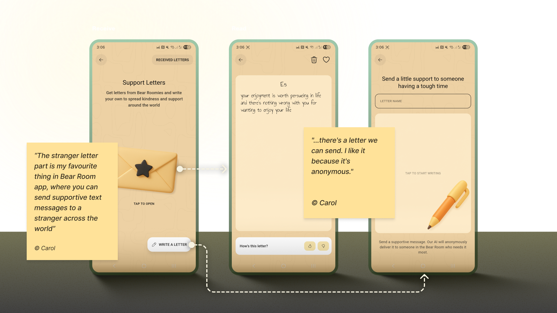
Note: Privacy is always a priority, but especially in mental health. Robust anonymity isn't just a settings toggle here; it's the foundational safety layer that enables vulnerable, supportive exchanges with strangers.
For the Teeni app, the “Teenager Translator” became a retention cornerstone by addressing the precise moment of crisis when parents were most likely to quit. When a parent types in their adolescent's angry words — “What’s wrong with you? It’s my phone, I will watch what I want, just leave me alone!” — the tool immediately delivers an empathetic read of the emotional subtext, a de-escalation guide, and a practical script for a response.
This instant, actionable help at peak frustration transforms the app from passive resource to an indispensable crisis-management tool. Delivering profound value exactly when it's needed creates positive reinforcement that builds habit and loyalty, bringing parents back to navigate their most challenging moments actively.
Your Retention Toolbox
- Reframe Metrics
Replace “You broke your 7-day streak!” with “You’ve practiced 5 of the last 10 days. Every bit helps.” - Compassion Access Policy
Never gate crisis or core coping tools behind paywalls or keys. - Build Community Safely
Facilitate anonymous, moderated peer support. - Offer Choice
Let users control the frequency and type of reminders. - Keep an Eye on Reviews
Regularly monitor app-store reviews and social mentions; tag themes (bugs, UX friction, feature requests), quantify trends, and close the loop with quick fixes or clarifying updates.
Three Pillars for an Empathy-First Launchpad
An Empathy-Centred UX Framework pushes beyond pixels and workflows to the heart of the experience: emotional safety. To embed this philosophy into a structured process, three core pillars provide guidance:
- The Onboarding Conversation
Transform initial setup from a functional checklist into the first supportive, therapy-informed dialogue. Use validating language, keep asking “why” to understand deeper needs, and prioritise brevity and respect so users feel seen from the first interaction. - The Emotional Interface
Design for a low-stimulus digital environment suited to a brain in distress. Muted palettes, calming micro-interactions, voice-first features, and personalisation help create a calm, predictable, safe space. These tools aren't limited to what's been applied here; creativity should always account for user preferences and scientific research. - The Retention Engine
Uphold genuine connection over manipulative gamification. Build lasting engagement through forgiving systems (the “Key” economy), community-driven support (letter exchanges), and tool that offer profound value in moments of crisis (the Teenager Translator). Aim for a supportive rhythm aligned with mental health's non-linear journey.
The Balance Between Health and Engagement
Designers don't typically define an app's success metrics, but our work strongly influences final outcomes. Practical tools in mental health apps must partner with product goals — all tools are grounded in hypotheses, necessity evaluations, testing, and metric analysis.
One critical success component is trust. Though hard to measure, designers build it by creating a UX framework that respects and listens to users, making the app fully accessible and inclusive.
The essential balance is between helping users reach wellness goals and the gaming effect — ensuring they benefit from both the process and the atmosphere. A routine meditation exercise should blend enjoyment with health fulfillment, not trap users in a perpetual gameplay loop. The end goal for the user is always a positive psychological effect.
As apps take on more responsibility for user health, their design requirements grow accordingly. When that balance is achieved, the outcome is more than improved metrics; it's a profound positive impact on users' lives. Empowering a user's wellbeing is the highest achievement our craft can aspire to.



