

Directing Emotional Tone in Digital Products
Design decisions often focus on layout, hierarchy, and component behavior, but how an experience feels as it unfolds is just as critical. The emotional pacing of a flow — the sequence of uncertainty, clarity, relief, and completion — determines whether users stay engaged or bounce. Two competing forces shape this: Emotion in Flow, where mood shifts feel intentional and smooth, and Emotion in Conflict, where a jarring element punctures an ongoing beat. Entertainment media offers sharp illustrations of both, and the lessons map directly onto interface design.
What Smooth Emotional Shifts Look Like
Anime such as Dan Da Dan demonstrates how wildly different tones — horror, comedy, tenderness — can coexist without breaking immersion. In one arc, characters embark on an absurd quest involving a protagonist's "golden genitals"; in another, a mother's child is kidnapped. The shift should be incoherent, yet it isn't. Three mechanisms keep it together:
- Continuity of stakes: Humor releases tension after a mini-resolution, but it never denies the underlying threat or goal.
- Clear mood cues: Music, framing, pacing, and character reactions prepare viewers for the next feeling, so transitions feel like riding a wave rather than being yanked.
- One emotional anchor: Relationships remain the focal point, so the scene's heart stays intact regardless of tonal shifts.
Products achieve the same effect by sequencing emotional beats as prepare → transition → resolve. Users should never be ambushed by a mood change; they should be primed for it.

When Emotional Signals Collide
James Gunn's Superman provides a counterexample. During a heartfelt, intimate conversation between Lois and Clark, a running gag plays in the background — a monster being beaten with a baseball bat. The humor diverts attention exactly when the scene demands emotional investment. The result is tonal whiplash rather than release.
This failure stems from specific causes:
- Increased cognitive load: Processing two competing emotional signals at once introduces extraneous cognitive load. Users — or viewers — must interpret tone and intent concurrently with the primary task, slowing comprehension and amplifying stress.
- Competing beats: A joke overlaps the climax of a serious moment, so attention turns to the switch itself, not the feeling.
- No tonal handoff: The intimate beat never lands before humor arrives, making the moment feel undercut rather than resolved.
In interfaces, this is the confetti appearing before a payment confirms, a witty error message in a high-stakes banking flow, or a promotional modal interrupting a critical task. Each instance forces users to decode a secondary signal they didn't ask for.

Emotion as a Memory Driver
Users don't remember the average of an experience — they recall peaks and endings. A frustrating high point or an abrupt conclusion defines the product's memory. Emotional responses operate across three layers, outlined in Don Norman's Emotional Design, and alignment across all three is necessary:
- Visceral (gut): First impressions from visuals, motion, and sound. A steady skeleton loader reassures; a gentle chime validates without shouting; consistent easing signals what changed.
- Behavioral (doing): Task completion smoothness. Predictable steps, actionable error states, and inline validation prevent friction from becoming stress.
- Reflective (meaning): The story users tell themselves afterward. Clean closure — "Done. You'll get X by Friday" — builds trust; a small recap sparks pride without spectacle.
Microinteractions serve as the connective tissue. Each has a trigger, rules, feedback, and loops or modes. Done well, they bridge emotional states; done poorly, they break the flow.
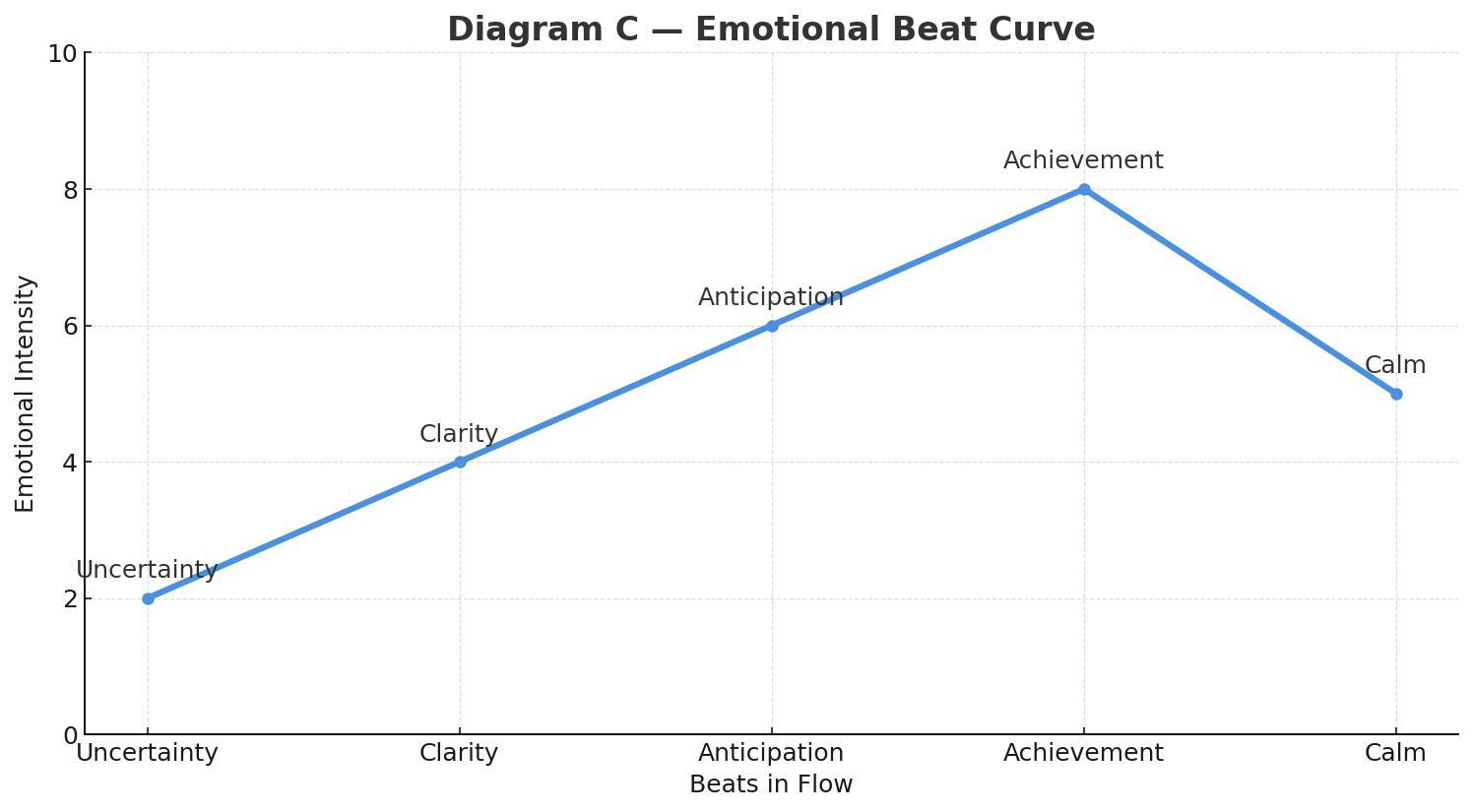
These layers map naturally onto a five-stage emotional beat sequence:
- Uncertainty sits at the visceral and early behavioral levels, where sensory cues convey what's happening.
- Clarity is behavioral — the point where system intent and the user's next action lock together.
- Anticipation blends behavioral action with reflective prediction of the outcome.
- Achievement is a reflective peak, where success, trust, and overall feel get evaluated.
- Calm/Closure is primarily reflective, letting users decide whether the product is worth returning to.
Errors and setbacks belong inside this arc, not outside it. A well-built recovery state treats failure as an obstacle in a journey: it acknowledges the problem, explains what happened, and guides the next step without introducing emotional noise. When failure is a beat rather than a rupture, flow survives.
Flow Versus Conflict in Practice
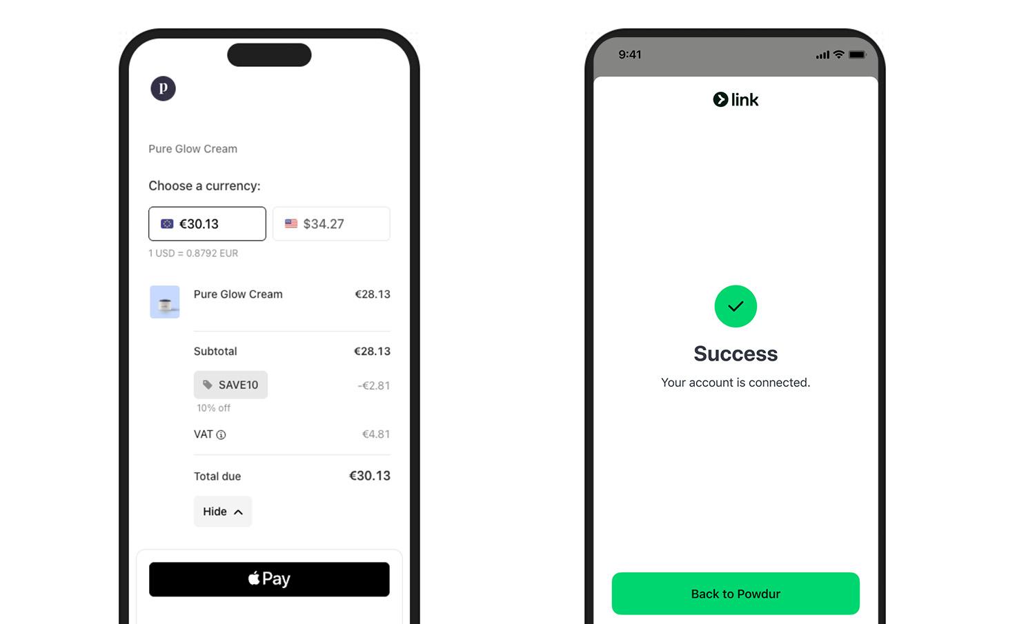
Emotion in Flow appears in well-designed checkout experiences: concise steps, predictable progress, and a crisp success state — a checkmark with an optional subtle haptic. The success peak lands, and the receipt or next-step prompt provides closure.
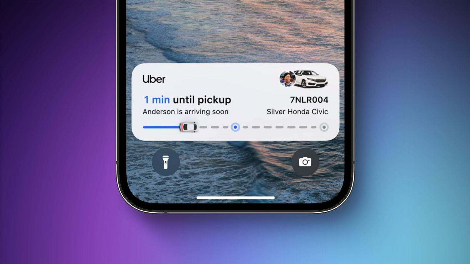
Ride-hailing apps also execute this well. Progressive status updates such as "Driver arriving," "2 min away," and "Arrived" convert uncertainty into clarity, with motion easing each transition rather than announcing it.
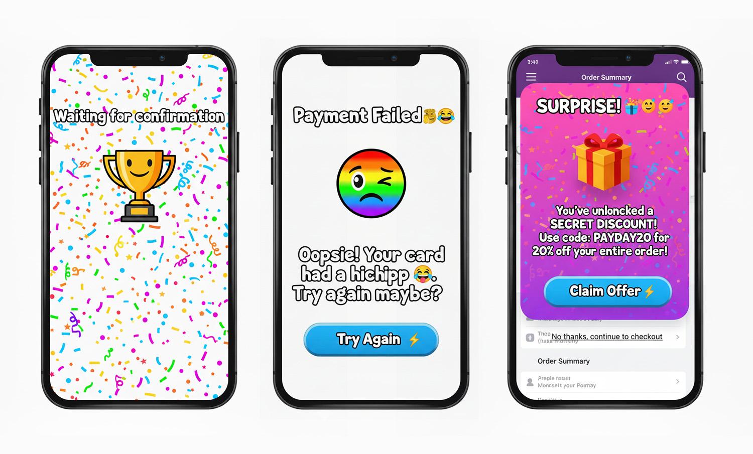
Emotion in Conflict manifests through identifiable patterns, without naming specific offending products:
- Jokes in serious moments: Cheeky error copy in money, health, or security contexts — users are already stressed, and humor amplifies irritation.
- Celebration before resolution: Confetti or loud sounds before a transaction confirms. The party interrupts the climax.
- Hard state jumps: Surprise modals or full-screen takeovers mid-task, delivering an abrupt tonal cut with no preparation.
Building Emotional Flow by Design
For each core flow — onboarding, payment, recovery — document the intended feelings at every step: uncertainty → clarity → anticipation → achievement → calm. Attach specific copy, motion, and microinteraction details to each beat.
A tone matrix based on risk level and state keeps messaging appropriate. High-risk errors call for calm, plain, solution-focused language, such as "We couldn't verify your ID. Try again or contact support." Low-risk empty states allow lightness, like "Nothing here yet. Want to start with a sample?" Mature products often drift toward misplaced delight by habit; a useful self-check is to ask whether the flow remains humane without humor or celebration — or whether those elements were masking friction.
Engineer one distinct peak — the moment of success — and one clean ending, such as confirmation plus the next step. Recall and satisfaction should be measured at both points.
Microinteractions should bridge states, not spotlight them. Small, consistent motion can prepare users for a significant change. Success deserves a subtle settle — a slower ease-out and an optional light haptic. For repeated failures, the tone should shift from upbeat to supportive, guiding the user forward.
In usability testing, ask not just "Was that easy?" but "What feeling changed here?" Responses like "confused → amused → confused" reveal conflict, not flow. Iterate on transitions, not only screens.
Fixing Emotional Conflict Fast
- Jokes in serious moments: Replace with calm, direct language and a clear path to recovery.
- Celebration before resolution: Delay celebration until after confirmation; scale it down for high-risk tasks.
- Hard state jumps: Pre-announce transitions and maintain framing with meaningful motion.
- Cross-team tone drift: Centralize voice and tone guidelines with examples per risk level and state.
Not every tonal shift is a mistake. Security warnings, legal confirmations, and safety-critical alerts benefit from deliberate abruptness — disruption signals importance. The problem is accidental conflict, where designers interrupt a beat unintentionally and users experience whiplash rather than understanding.

Great experiences are directed experiences. Studying Dan Da Dan shows how to move audiences through feelings without losing them: prepare, transition, resolve. The Superman scene demonstrates the alternative — humor colliding with a heartfelt moment. Map emotional beats, align tone to task risk, and let microinteractions bridge the space between states. Users will remember the right peak and the right end, not the whiplash in the middle.


