Making accessibility part of every team role
Accessibility can feel overwhelming, especially for teams tackling it for the first time. The range of issues to consider is broad because it must account for a wide variety of abilities. But accessibility is not a single person's job — it works best when every discipline on the team owns a piece of it. Project managers, UX designers, and developers each have specific contributions that, combined, build a more inclusive product.
Project managers: build it into the process
The project manager's main goal should be to make accessibility a standard part of every milestone, treated with the same priority as performance and user experience. A few practical steps can help embed that mindset:
- Make accessibility training available to the team.
- Identify critical user journeys in the site or application.
- Incorporate an accessibility checklist into the team process.
- Evaluate the site or application with user studies where possible.
Training and resources
Providing time for the team to learn about accessibility makes it easier to address early in the process. Helpful free resources include:
- Web Accessibility by Google — a multi-week interactive training course.
- Accessibility Fundamentals — written guides and best practices.
- Material Guidelines: Accessibility — UX best practices for inclusive design.
Identify critical user journeys
Every application has primary actions users must complete. In an e-commerce app, for instance, adding an item to the cart is essential for every user. Secondary actions, like changing an avatar photo, may be nice to have but are not critical.
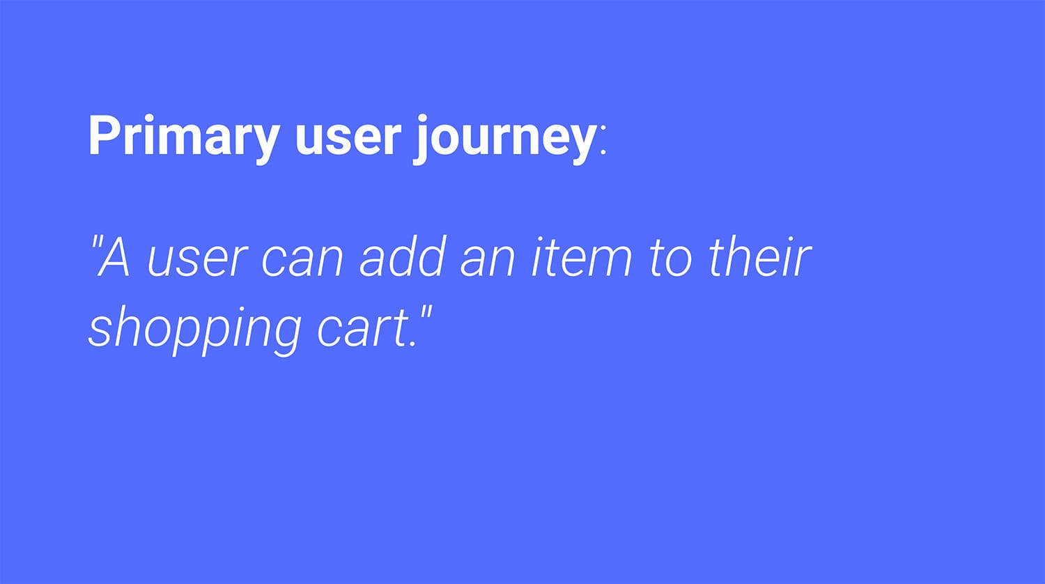
Defining which actions are primary and which are secondary helps prioritize accessibility work. Combined with a checklist, these journeys can be tracked to prevent regressions and measure progress.
Use an accessibility checklist
Because accessibility is so broad, a checklist helps ensure nothing is missed. Industry examples include the WebAIM WCAG Checklist and the Vox Accessibility Guidelines.
With a checklist, you can triage the primary and secondary actions and build a matrix of each step to identify missing accessibility components.
Evaluate with user studies
Observing real users is the most effective way to find gaps. For existing products, this quickly surfaces weak points. For new projects, early studies can prevent costly development of hard-to-use features. Strive for a diverse participant pool — include keyboard users and those relying on screen readers or magnifiers.
UX designers: design beyond your own perspective
Designers naturally bring their own biases to their work. Without colleagues or users with disabilities, it's easy to unintentionally design for a narrow audience. Asking "what types of users might rely on this design?" can lead to more inclusive choices. Key techniques include:
- Ensuring content has sufficient color contrast.
- Defining the tab order.
- Providing accessible labels for controls.
- Offering multiple ways to interact with the UI.
Color contrast matters
Low-contrast text and images are hard to read, particularly for users with vision impairments. Contrast is measured by comparing the luminance of foreground and background colors. For text below 18pt (or 14pt bold), a minimum ratio of 4.5:1 is recommended; larger text can be adjusted to 3:1.
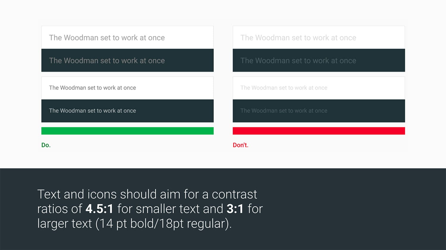
Tools like Google's Material Color Tool, Lea Verou's Contrast Ratio app, and Deque's aXe can help measure contrast.
Define the tab order
For keyboard users, the tab key is their cursor. The tab order should follow the reading order, flowing top to bottom, with important items earlier in the sequence for efficient access.
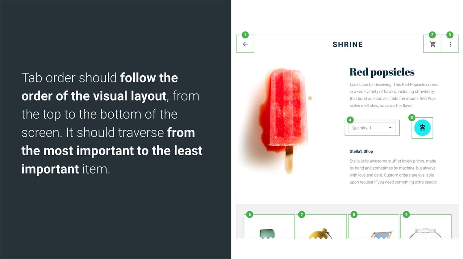
Creating a mock with numbered focus order helps communicate intent to developers and QA testers so it can be correctly implemented and verified.
Accessible labels for controls
Screen reader users depend on labels for information that is otherwise visual. A magnifying-glass search icon can be labeled "Search" to bridge that gap. Effective labels are succinct, avoid stating the control type or state (these are announced automatically), and use action verbs like "Search" rather than descriptions like "magnifying glass."
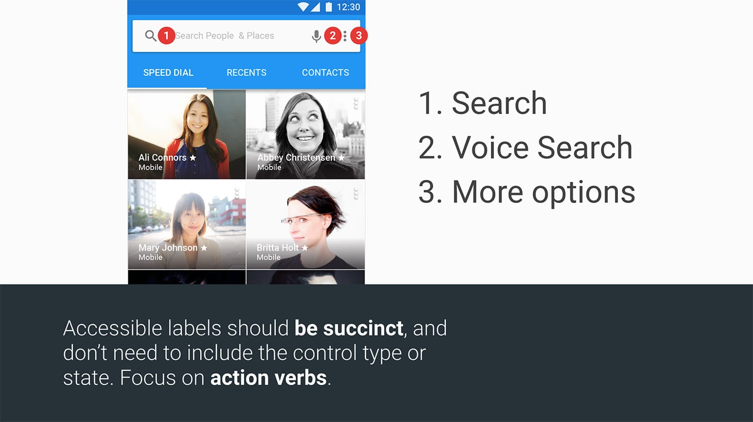
Consider creating a labeled mock of all controls to share with development and QA for implementation and testing.
Multiple ways to interact and understand
Not everyone uses a mouse. Designers should plan for keyboard interaction, including defining clear focus states for when users tab or press arrow keys. Planning these early avoids forced retrofits later. Also, avoid relying on color alone to convey meaning — a red underline on an invalid text field is missed by users with color vision deficiencies, so adding helper text covers more bases.
Building the mechanics: the developer’s checklist
This is where the design meets the code. The developer’s job is to wire up the semantics and focus management so that what looks right also works right. Keep these points in view while implementing:
- The tab order is logical.
- Focus is properly managed and visible.
- Interactive elements have keyboard support.
- ARIA roles and attributes are applied as needed.
- Elements are properly labeled.
- Testing is automated.
Native elements versus custom controls
Sticking to native HTML gives you a running start. Elements like input, button, and select are automatically part of the tab order and come with built-in keyboard handling. Generic containers such as div and span don’t. If you build a control out of one of those, you’re on the hook for making it accessible.
You have two options for a div-based control:
- Add
tabindex="0"to make it focusable. In most cases, you’ll also need to add keypress handling manually. - Replace it with a
buttonelement, if it acts like a button. Native buttons are easy to style and include keyboard support for free.
Moving focus when the page changes
When content appears or changes, you need to move the user’s focus to that new context. A modal dialog is the canonical example: if a keyboard user opens a dialog but focus stays on the triggering button, their only path forward is tabbing through the rest of the page until they stumble onto the dialog. Moving focus into the new content the moment it renders keeps their experience efficient.
Keyboard support for non-native interactions
Custom widgets like carousels and dropdowns need keyboard support you write yourself. The ARIA Authoring Practices Guide is the reference here: it details the standard UI patterns and the exact keyboard actions each is expected to handle.

For a technical walkthrough on adding keyboard support, see the roving tabindex section of Google’s accessibility fundamentals.
Adding semantics with ARIA
Keyboard support isn’t the only thing missing from a div — it also has no useful semantic meaning on its own. If a div is the foundation of your dropdown menu, you need ARIA to layer in the roles, states, and properties so assistive technology can interpret the control correctly. The ARIA Authoring Practices Guide maps out which of those you should apply for each pattern, and many of its entries include sample code.
Naming the controls
For native inputs, the <label> element does double duty. It gives you a visible text prompt and, under the hood, provides the input with an accessible name that screen readers announce.
That built-in mechanism doesn’t extend to custom controls. For widgets you build out of Custom Elements or plain divs and spans, you’ll have to reach for aria-label or aria-labelledby to give them a name in the accessibility tree.
Putting the tests on autopilot
Manual checks for every accessibility issue are unsustainable and error-prone. Automate what you can. There are solid industry tools for catching common problems quickly.
aXe from Deque Systems is available as a Chrome extension and as an aXe-core Node module, the latter being useful for continuous integration environments.
Lighthouse is Google’s open source audit tool for Progressive Web Apps. In addition to checking for Service Worker support and a Web App Manifest, it runs a series of best-practice checks that includes a set of accessibility tests.
Accessibility is a team function
Accessible products aren’t the output of a single specialist — they’re the result of everyone applying their part of the process. This guide gave each role a starting toolkit: designers on contrast and color, content on plain language, and developers on semantics and focus. Together, those pieces shape an experience that works for more people.
For deeper material, see the free Udacity course or browse the accessibility docs on web.dev.


