

Forty Years of Incremental UX: When Small Wins Aren't Enough
For the better part of four decades in UX leadership roles, my teams and I typically settled for making incremental improvements to legacy products and squeezing new features into existing design frameworks. This approach built awareness of UX gradually — first with development and product management partners, then further afield as contributions earned recognition. But while UX awareness grew, UX maturity barely moved.
Bottom-up attempts to drive innovation as an individual contributor hit territorial walls. The unspoken message from engineering and product colleagues was clear: "That's not your job. UX needs to stay in its lane." Proposing new development projects or painting a vision for future products was considered exclusive territory for engineering and product management.
When I went over their heads to pitch innovation initiatives directly to VPs or the CEO, the response was predictable. They'd call it "good initiative" and then require more research and a thorough ROI analysis before moving forward. In effect:
"Great idea, but before I invest time and resources, you need to bring me the broom from the Wicked Witch of the West."
Translation: the proposal carried too much risk, and rather than reject it outright, they'd assign an impossible task and revisit later. It was the ultimate dodge.
Working for corporate innovation teams was marginally better but still limited. I helped product teams solve thorny design problems and invent new products, yet remained an outsider who didn't fully grasp each division's history, constraints, and business domain. The teams saw me as an "expert with a hero complex" flying in to save the day, invited or not.

The Right Play at the Right Time
By the time I joined Edmentum as Director of User Experience in 2012, I was convinced that lasting culture change wouldn't come from consulting engagements, executive coaching, design thinking workshops, or one-week design sprints. Those yielded one-off successes but never shifted corporate culture. The only path was a breakthrough project with participation from every department. And given that I was nearing the end of the corporate phase of my career, this was my best shot at getting it right.
Edmentum was — and remains — a top education technology company, born from PLATO (Programmed Logic for Automatic Teaching Operations), a computer-based education platform created in 1960 by Donald Bitzer at the University of Illinois. After a merger with Archipelago Learning (creator of Study Island), the company was rebranding as Edmentum when I arrived. It was my first role at a smaller, privately-owned company, and my first designing products for teachers, administrators, and students.
The UX director position was entirely new at Edmentum. The company had one full-time UX designer plus three contractors. On Nielsen Norman Group's UX Maturity Scale, I'd place it at Stage 3, Emergent: leadership acknowledged UX's value and created this role to build a strategy — but serious work lay ahead.
Phase 1: Discovering the Real Problem
The Listening Tour and a Defining Field Visit
I began with a listening tour. My boss, the Chief Technology Officer, gave me a list of people across development, product management, support, professional services, QA, marketing, and sales to interview. I needed to understand priorities, accountability metrics, and what worried them most. That's how I'd recruit allies.
Meanwhile, customers pointed to our PLATO Courseware product as needing the most UX attention. I accompanied a professional services consultant on a customer visit to observe how users interacted with it. The teachers we met had been trained on Courseware only a week earlier but had requested another session so they could take better notes — they'd already forgotten basic tasks. They called Courseware the "clicky system" because of the overwhelming number of clicks required to accomplish anything.
At the end of the session, one teacher turned to me:
Teacher: It just seems like it's longer and more convoluted than it has to be. I want to be able to choose a student and then do what I want to do with that student from there. You can edit it. You can delete it. You can manage it or whatever. That's just an idea.
Me: That's a very good idea. That's why I'm here.
She called it "just an idea," but in a few sentences she had articulated the core problem — and the solution. If this was the biggest obstacle for her, it likely was for many other customers too. The breakthrough project was born.
App World Versus My World
PLATO Courseware was a collection of "mini apps" grouped logically in the UI. Part of the design used a task-first approach (Create a Class, Assign PLATO Courses); the other used an object-first approach for teacher-created items (Classes, Assignments). Either way, the gap between task start and successful result rambled across a confusing, multi-screen workflow riddled with excessive clicking.
The deeper issue was architectural. When a teacher launched Courseware, she encountered "App World," a menu of functions arranged for developers' convenience — perfectly sensible to an engineer, but the teachers I met wanted to enter "My World," populated by their classroom of students. The design was fundamentally backward: pick a function first, then select a student to apply it to. Teachers wanted the opposite — pick the student first, then choose an action. The product's home screen didn't even show the students, the very object of focus. That was the root of the whole problem.
Phase 2: Envisioning the New Framework
Building the Prototype with a "Question Answering Machine"
Back at the office, I set out to design a new framework for our flagship product. My goals were straightforward: make the application a window into the teacher's world; embed the actions a teacher performs directly into her primary objects of focus (students and student groups); and build what we called a "question answering machine" — a system that provides answers to every question a teacher might ask about student performance.
But first I needed a UX designer who could turn those goals into design architecture and a working prototype. I called Mike Boston, a former colleague from UnitedHealth Group — the most knowledgeable, deeply-thinking designer I knew for solving wicked hard problems. I showed him the video from my teacher visit and my list of three design problems.
Teaching is data-intensive. To individualize learning, teachers analyze hundreds of data points per week. Tuesday's lessons respond to Monday's performance; students are grouped by reading level, classroom behavior, and learning pace based on real-time data from prior assignments. "The Thing" — our question answering machine — would help teachers manage that data load. Mike and I began by listing all the questions teachers would want to ask:
- Which students are making good progress on their assignments, and which are struggling?
- Which students do I need to check in with this morning?
- How did Maria do on the remedial instruction I gave her yesterday?
- Are my students on pace to complete the course by the end of the semester?
With two teacher spouses between us, we validated our assumptions quickly. But a list of user questions is useful for feature derivation, not for telling a convincing story about how a product will be used, what problems it solves, and how it delivers value. So we converted the question list into a user experience narrative starring a teacher named Mrs. Pamela Jones and her student Maria Alvarez. From that narrative we built a clickable prototype for further research and internal communication. After a few weeks, we had a rudimentary prototype and a story — ready to pitch to the executive leadership team.
Selling The Breakthrough Upward
Three months into the role, the new UX director got a slot on the executive leadership team’s agenda. The pitch rested on a short video of a teacher venting about the “clicky system,” followed by a side-by-side count of the clicks required to get anything done. Then came the story of “a week in the life of Mrs. Jones and her student Maria,” told through a working prototype of the proposed redesign.
That prototype was early and rough:
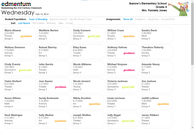
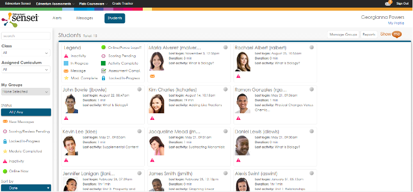
What it showed, though, was a different way to think about the product. Instead of a flat maze of features, users would see their classroom as a set of student cards. Each card carried the essentials — last assignment, reading group, most recent activity — plus alerts for anything that needed a teacher’s attention. A JavaScript plugin called Isotope supplied the memorable moment: filters animated the cards so they flew across the screen to isolate, say, only the students who needed intervention.
The demo worked. The CEO stood up and called it “an entirely new product,” and the sales VP was smiling from the back. The ten-minute meeting ran long and remade the roadmap — the project was slotted in after the current release shipped.
The Political Misstep That Nearly Killed It
The win was fragile. The author had navigated several classic barriers to UX innovation but missed one: he had not brought the core product team into the project before going to leadership. The development director and the chief product owner found out about the proposal through the grapevine, and they were right to be angry.
After only three months, the UX director was light on domain knowledge and ignorant of the company’s Agile delivery process. From the product team’s perspective, he had delivered the easy part — the flashy executive pitch — while leaving them to handle the hard part: turning a brand-new interaction framework into shippable software with unknown technical risk. Without their backing, the project would die in delivery.
The fix was to repair the relationship directly. Had he brought them in after the first prototype iterations, he could have leaned on their domain expertise and co-presented the vision. As it happened, both partners eventually became advocates who improved the design substantially once fully engaged.
Iteration Outside The Agile Machine
Once the executive team had said yes, the project hired a dedicated software engineer to take over prototype work so the designer could focus on solving problems. For the next few months, a four-person core team — design, product ownership, development leadership, and UX direction — refined the concept and expanded the teacher question list. The goal was to keep the design work clear of the Scrum process.
This buffer was intentional. A novel product’s discovery phase cannot be squeezed into sprint-sized stories; the team needs a holistic view of how the thing looks and behaves before breaking it into increments. A “sprint zero” won’t do the job. Applying Scrum too early is like assembling a jigsaw puzzle a piece at a time only to discover the picture is incoherent.
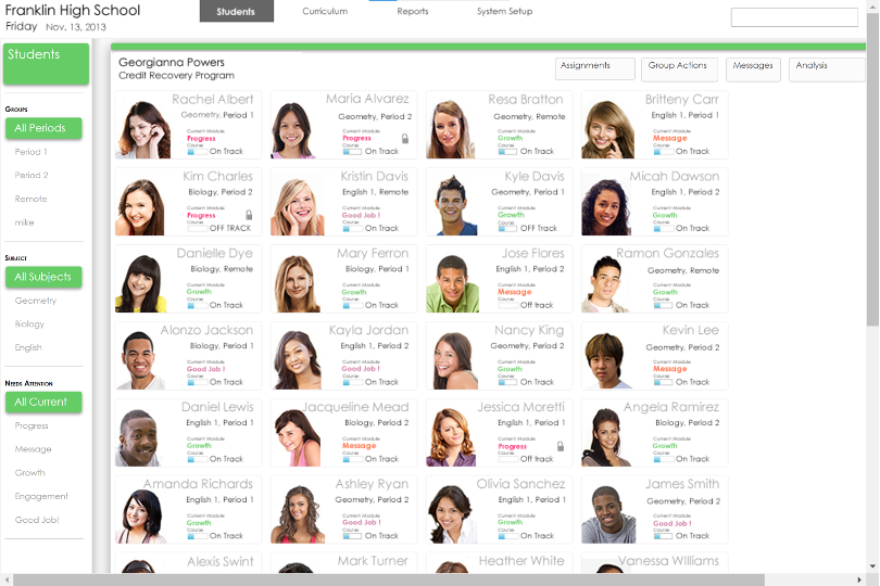
Three months in, the concept had settled into three tiers. The top level was the classroom view, with small per-student cards and filters for sorting and grouping on any attribute:
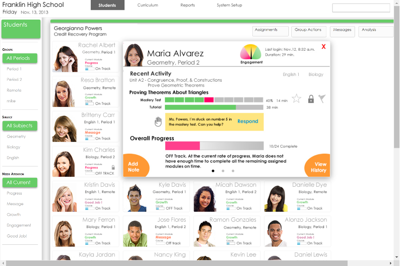
One level down, a larger card per student expanded on progress details and exposed actions for the teacher to take:
And the third tier opened a large view of per-course data, with room for note-taking and assigning remedial work:
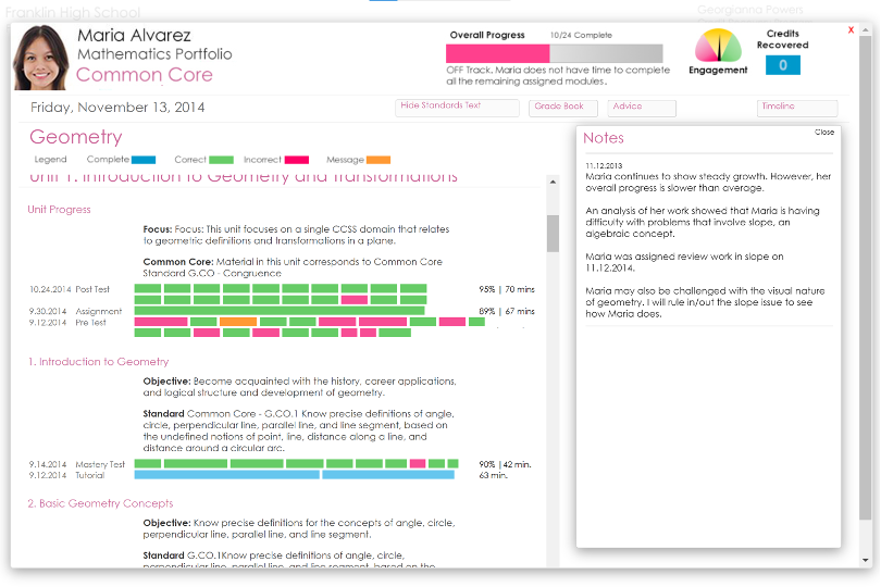
The final prototype overshot what any single release could build, which was exactly the point — it mapped an ultimate vision to build toward.
From Prototype To Product
Once development began, the marketing director proposed hiring an outside firm to create a full branding package — name, logo, and color palette. After several working sessions to convey the value proposition, the product got its name and identity: Edmentum Sensei.
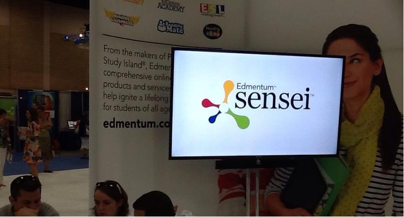
At the company’s trade show expos that year, Edmentum Sensei was a headline product. Attendees responded positively; the team collected Best In Show awards and received coverage in industry press.
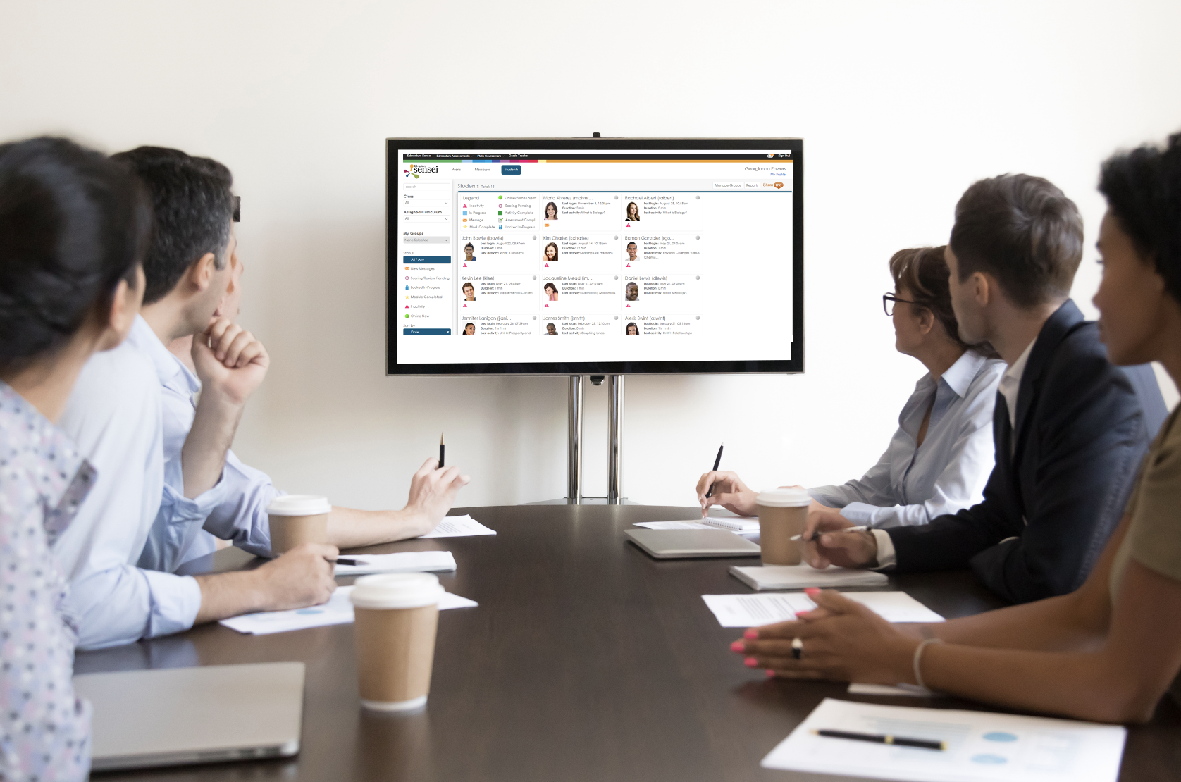
The results also showed up in revenue. Sales reported that the product “practically sold itself,” contributing to new contracts and repeat business. The office joke was that UX should carry its own sales quota.
What The Effort Unlocked
In the years that followed, the UX team tripled in size and adapted the Sensei model for Study Island. More importantly, the organization had shifted its UX maturity from an “emergent” state to the top of Nielsen Norman Group’s “user-driven” level on the strength of one flagship project.
Research-led innovation became standard operating procedure. Travel to customer sites was never questioned. UX accountability spread beyond design to every function in the company.
None of that would have happened by squeezing incrementally into existing products. The breakthrough came from insisting on bolder work. The playbook that worked:
- Do the research. Existing customers know the gaps.
- Hire the best help you can find.
- Build a vision prototype that can tell a story.
- Enlist allies early and broadly — good design alone does not survive without good politics.
- Lead with customer pain: show users’ own words, then show the fix.
- Iterate long and hard, with real customer feedback, before turning anything over to delivery.
- Build on the legacy system to minimize development risk.
- Measure the business impact — sales data ties the project to the bottom line.
A breakthrough project is not a universal cure for UX maturity, but it is an unusually effective accelerator. And the work does not end at launch — the formula only holds if you run it again.


