Dev Mode after a year: what actually moved the needle
When Figma introduced Dev Mode at Config 2023, I was curious but cautious. As an engineering manager at Decathlon, I have seen plenty of tools promise to close the gap between design and development—and most fall short. After a year of using it with our team, Dev Mode has proved genuinely useful, and most of the value comes from unexpected places.
The biggest win has been Code Connect, which maps Figma components directly to the component code we actually ship. That link solves recurring problems around property alignment, naming conventions, and state management—problems that get worse when components are structured differently in code than they appear in design. The lessons below are what we learned integrating Dev Mode into our design system workflow.
Token hierarchy and variable scoping
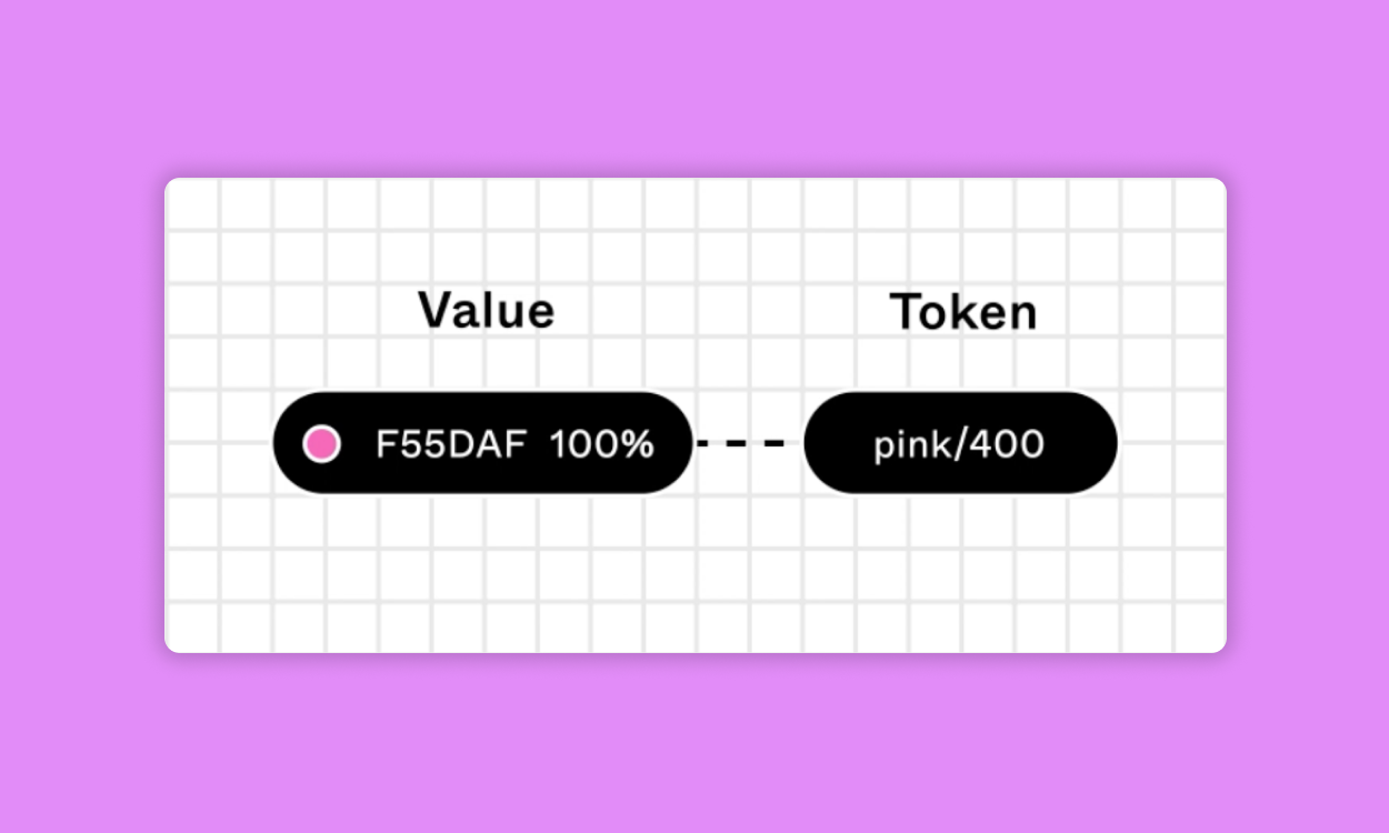
Design tokens capture the small, repeatable decisions that define a visual language. Showing tokens clearly in the tool improved handoff more than anything else we tried.
We started with Figma variables and used variable aliasing to build a clear hierarchy for the tokens. That semantic structuring made theming easier to understand and apply across teams.
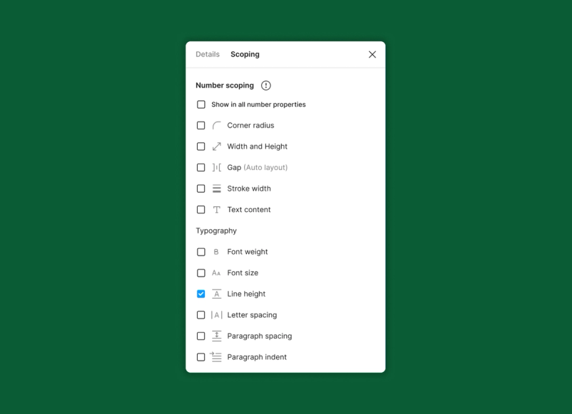
Variable scoping also gives us precise control: we prevent mistakes such as using background colors for text or spacing values for border radii. We customized the code syntax so variable names match developer conventions on each platform. Now when we update a color token, developers immediately see the matching code change.

Better inspection for complex layouts
Dev Mode’s inspection tools handle complicated layout scenarios well. We use Flexbox often, and the feature generates code that is clean and easy to implement.
The design systems team can inspect properties in depth—CSS, iOS (SwiftUI, UIKit), or Android (XML, Compose) styles—entirely within the development environment. The VS Code extension adds autocompletion for navigating through CSS, Compose, or SwiftUI implementations.
Definition of done includes documentation
Keeping design system documentation current has always felt like a separate job. Design intent often gets lost in translation between design and development. Dev Mode’s documentation and annotation features changed how we share information.
Annotations let designers define properties and context directly in the file. They can mix free text with values like alignment or sizing and add measurements to clarify spacing. Designers link directly to annotations when coordinating with developers.
Every component in our system now carries its documentation—GitHub source code, README files, and playground links. The rule we adopted: if it is not linked in Figma, it does not exist. That consistently reduces time spent hunting for resources.
Code Connect has supercharged this. Mapping actual component code to Figma components increased design system adoption across product teams. I recommend making Code Connect part of each component’s “definition of done” so the right code documentation is available at the point where developers look for it.
Plugins and custom automation
Dev Mode works well out of the box, but plugins let us fit it to our workflow:
- GitHub and Jira integrations link issues and pull requests directly to components, improving tracking and implementation accuracy.
- Figma for VS Code lets developers inspect designs without leaving their editor.
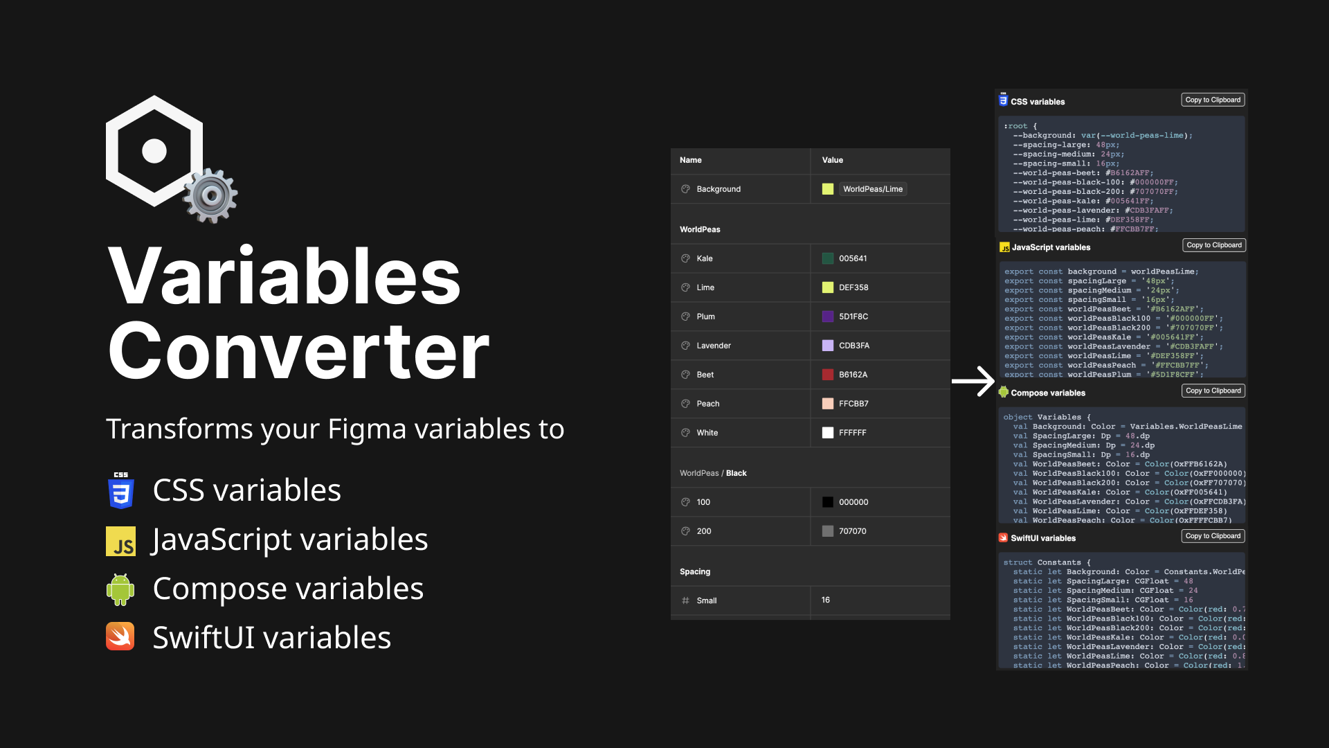
Do not be afraid to build custom solutions. I created the Variables Converter plugin, which translates Figma variables into CSS Custom Properties, JavaScript variables, Compose variables, and SwiftUI variables. It is now used by over 5,000 Figma users.
For deeper integration, the Figma REST API supports substantial automation, especially the variables endpoints. The Figma variables GitHub Action Example shows bi-directional syncing between Figma variables and design tokens.
Playground testing surfaces edge cases
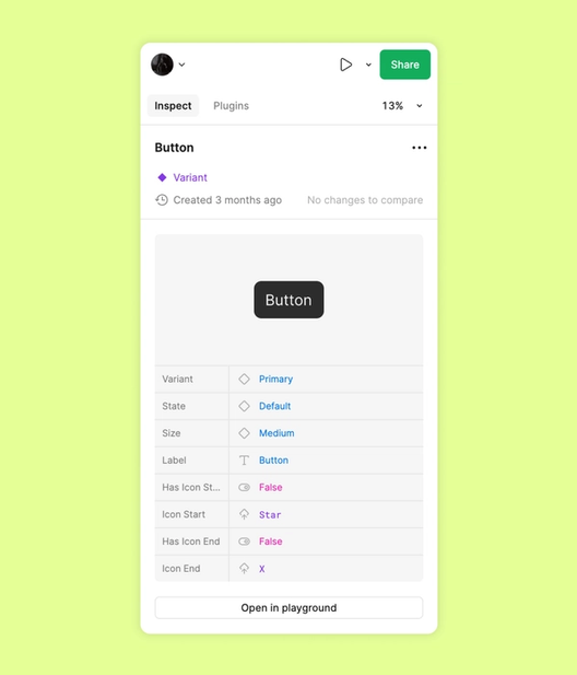
The component playground in Dev Mode is good for experimentation. It appears in the inspect panel when a component or instance is selected. When we introduced a multi-variant Chip component, the playground let us test configurations and identify edge cases we had missed in the original design.
Code Connect works with the playground, updating live as parameters change. Our Chip component maps to three distinct web components, and the playground shows real-time code updates as we modify properties.

Version control and visual comparisons
The compare changes feature is essential for a design systems team. We track component changes over time, compare versions side by side, and revert to earlier iterations.
It works well with branching, letting teams develop updates in parallel without destabilizing the main system. When we improved the accessibility of our button component, the visual comparison feature made the change legible for the entire product organization, which reduced friction around the update.
Focus view for final review
Dev Mode’s focus view isolates designs that are ready for development. It gives access to the Inspect and Plugins tabs while presenting a clean, distraction-free view of the design.
That isolation helps when examining individual layers, checking version history specific to a design, and verifying all changes are in place before marking a component complete. We used it extensively while finalizing the button updates, checking details carefully before handing off to developers.
Collaboration starts before code
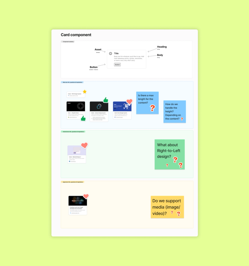
Dev Mode works best when it is not the only shared space. The teams that get the most out of it treat it as part of a larger collaboration loop that begins earlier in the process. Kicking off projects with joint FigJam sessions gives designers and developers a neutral ground to define component properties, variants, and intended behaviors before anything is built. From there, moving into Dev Mode keeps that same conversation alive as the work becomes concrete.
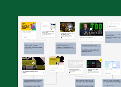
This flow between ideation and implementation prevents the usual handoff friction. Instead of designers throwing work over a wall and developers interpreting it in isolation, both sides can inspect the same artifacts, question assumptions, and reach alignment while details are still cheap to change. The result is that silos break down naturally because the workflow never forces a hard boundary between thinking and building.
Treat the workflow as a product
Dev Mode is not a static tool to be configured once and forgotten. It needs the same iterative attention as the design system itself. As component libraries evolve, so should the way teams navigate and consume them inside Dev Mode.
One useful mechanism is running regular System Usability Scale (SUS) surveys, perhaps quarterly, to measure how comfortably both designers and developers work with the shared libraries. Those scores highlight where the setup is smooth and where it causes friction. Feeding those results back into the next cycle of adjustments keeps the process from going stale, and each round of feedback makes the next one more informed.
Learning is part of the job
Dev Mode has been evolving quickly since launch, and teams that bake exploration into their routines benefit the most. That means setting aside dedicated time to track new releases and test updated capabilities rather than waiting for a project to force the issue.
Figma’s own webinars, documentation, and community forum are practical starting points. Coupling that ongoing education with a few key performance indicators for how the team adopts the tool gives you a way to measure whether the learning is translating into better output or just filling time.
The verdict after one year
A year in, Dev Mode has measurably improved the design system workflow, especially in bringing design and engineering teams closer together. The hardest problems remain around very complex components, where no handoff tool is a complete substitute for direct communication. But for teams that struggle with adoption of their design system or with keeping designers and developers on the same page, the tool is worth a serious trial.
Start small, expect friction in the first few weeks, and customize the setup to your workflows. The payoff is better consistency, fewer misunderstandings, and a more cohesive user experience across products.
Laurent Thiebault is an Engineering Manager at Decathlon and a Design System consultant.


