
A community brand, rebuilt from the ground up
Friends of Figma has grown far beyond a simple meetup program. With more than 250 chapters spread across 82 countries and over 900 events held last year alone—spanning workshops, webinars, craft talks, and casual gatherings—the initiative now serves as a primary hub for designers to connect locally. As the program’s footprint has expanded, so has the need for a visual identity that matches its scale and diversity. Figma has responded with a complete brand refresh designed not as a top-down mandate, but as a flexible toolkit for local leaders.
The new system was built with two guiding principles. The first was distinctiveness: the brand needed to feel like Figma, but not be a carbon copy. Maintaining a visual tie to the parent brand helps chapters attract new members and sponsors, particularly in regions where the design community is still developing. The second principle was adaptability. The toolkit needed to allow each chapter to reflect its own city, culture, and personality. "We wanted to create the feeling of a brand that's connected through a shared spirit, not through shared outcomes," says Figma Brand Designer Andy Pressman. "It's a democratic design system at heart that is intended to be shared, owned, and driven by the chapters."
It’s a democratic design system at heart that is intended to be shared, owned, and driven by the chapters.“It’s a democratic design system at heart that is intended to be shared, owned, and driven by the chapters.”
A global system with local constraints
The visual language starts by deconstructing the Figma logomark, pulling apart its basic geometric shapes to serve as building blocks for new arrangements. According to Pressman, this represents "the basic shapes coming together like distinct chapters forming a shared community." These elements inform everything from color palettes to chapter badges and sticker templates.
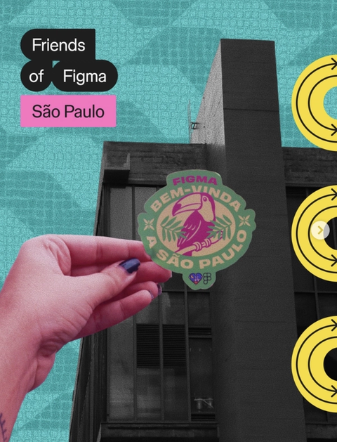
Rather than imposing strict rules, the system operates on a philosophy of minimal constraint. All chapters share a core color system but are given the freedom to select six additional colors from a curated palette. The toolkit offers basic templates for stickers—enough to provide graphic structure—while leaving the content inside those shapes entirely open to interpretation. "The idea was to set just enough constraints to unlock creativity," says Pressman.
Photography guidelines follow a similar logic. The focus is on capturing the local environment at street level, prioritizing imagery that resonates with residents. "What do you see walking around town that somebody in your neighborhood is going to understand and connect with?" Pressman asks. A set of reference templates demonstrates how these pieces fit together, offering a menu of options rather than a prescriptive layout. "It's tricky to create a consistent system that has no hard requirements," he notes. "You can look at these examples, and pull out any elements to mix and match."
Chapters making the brand their own
Local leaders have already embraced the refresh and adapted it to their own contexts. In São Paulo, chapter leader Marianna Piacesi drew on the city's iconic geometric sidewalk patterns designed by Mirthes Bernardes. Layering those textures with bright colors and urban signs, she captured the city's "organized chaos." In New York City, leader May Zhou referenced the MTA subway system, using its line colors and emphasis on connectivity as a metaphor for what the chapter aims to foster.
Heritage is also a recurring theme. Rusmir Arnautoviċ, the Bosnia and Herzegovina chapter leader, chose colors inspired by the region's mountains, rivers, and forests, and worked cultural touchstones into sticker designs—including carpet patterns and Bosančica, a 10th-century script. In Portugal, leaders Bruno Figueiredo and Salomé Reis collaborated with chapters in Lisbon and Porto on a regional identity that remains visually uniform yet locally specific: each city uses Portuguese tile motifs but with distinct mascots, such as sardines for Lisbon, swallows for Porto, and bears for Coimbra.

Finding community
For many leaders, the new identity is as much about signaling inclusion as it is about aesthetics. "For the first time, it feels like we're not just following global design—we're contributing to it in our own voice," says Muhammad Iqbal, leader of the Islamabad chapter. The sentiment is echoed by Mexico City's Carolina Delgado, who describes the program as a way to make design "not just a profession, but a lifestyle."
Whether you are new to the field or have decades of experience, the invitation is open-ended. As São Paulo's Piacesi puts it: "If you're curious, you already belong."


