
Spinners versus skeleton screens
Loading indicators don't stop users from abandoning a slow site, but chosen well they can make the wait feel shorter. Animated spinners are the default because they're trivial to implement and usually good enough. Skeleton loaders serve a narrower set of cases and cost more to build and maintain, but in those cases they deliver a noticeably better loading experience.
A spinner (or progress bar) tells the user that something will load eventually. While it is on screen, the user waits passively, cannot interact with other elements and consumes no content. Spinners take up the entire screen without making any content available.
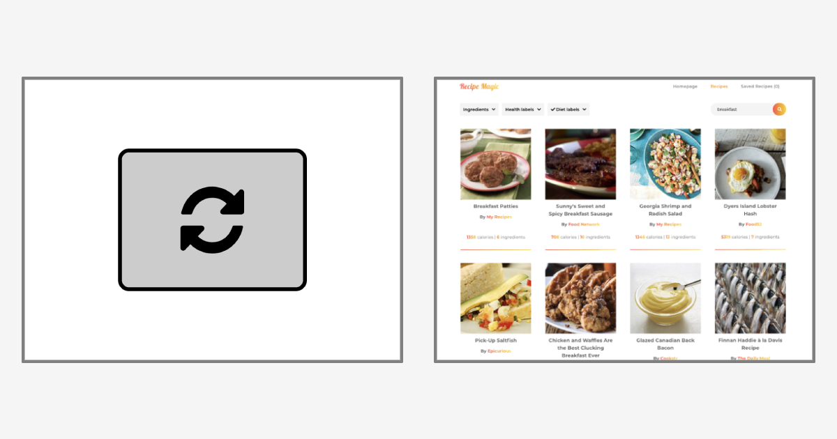
A skeleton loader (or skeleton screen) instead signals that content is about to load. Empty boxes with a solid color or gradient stand in for the content in transit. Since content usually arrives gradually, users keep a sense of progress and perceive the page as loading faster, and they wait actively: they can interact with the page or consume whatever has already rendered.

None of this excuses poor performance. Loading components must not be used to paper over problems — unoptimized assets or code, slow back-end responses — that can actually be fixed. Loading UI is a last resort for delay that is genuinely unavoidable.
Deciding whether a skeleton is warranted
Skeleton loaders complement full-screen loading elements rather than replace them, and only once certain conditions around content and layout hold. Work through these questions in order.
Can the wait be avoided?
Avoiding loading outright is always the best UX. Confirm the delay is real and not the product of fixable performance problems; reducing fetch and render time stays the first priority.
Did the user trigger the load, and is feedback required?
User actions sometimes start additional loading — lazy-loaded images entering the viewport while scrolling, content fetched on a button click. Whenever a user needs feedback on an action that started loading, include a loading indicator. Without one, users can't tell that their action kicked off background work.

Is the layout consistent and predictable?
Skeleton loaders work best when the type and layout of incoming content can be anticipated. A skeleton that doesn't roughly match the final content triggers layout shift, leaving users confused and disoriented. Reserve skeletons for elements whose content is predictable and whose layout is consistent.

Is some content already available?
Skeletons pay off most when other sections or elements are already on the page while they are active. Gradual loading — static content on first paint, async content filling in as it arrives — keeps users oriented and expecting completion at any moment. A screen consisting only of skeletons is not meaningfully better than one covered by a full-page spinner or progress bar.

A bare-bones, reusable implementation
The typical skeleton implementation is over-engineered and high-maintenance: a dedicated skeleton UI component per layout, with its own CSS, or complete layouts rebuilt from elaborate gradient trickery. Both are highly specific, so every change to the real layout forces a matching update to the skeleton and the codebase accumulates overhead. The alternative rests on one observation: layout styles (spacing, grid, flex, block) come from the main component already, so skeleton loaders only need to replace content, not the whole component.
The example is a three-column grid of six cards, with a button click simulating async loading, written in plain HTML, CSS, and JavaScript, though the approach ports to most stacks and frameworks. Each card uses this markup, with explicit image dimensions and a 1px transparent placeholder image so the image skeleton stays visible until the real image loads:
<div class="card">
  <img width="200" height="200" class="card-image" src="..." />
  <h3 class="card-title"></h3>
  <p class="card-description"></p>
  <button class="card-button">Card button</button>
</div>
Two CSS classes
Instead of rebuilding the layout, the skeleton styles take effect only when a parent class is present, and touch only presentation and content, leaving them independent of the element's layout:
.loading .loading-item {
  background: #949494 !important; /* Customizable skeleton loader color */
  color: rgba(0, 0, 0, 0) !important;
  border-color: rgba(0, 0, 0, 0) !important;
  user-select: none;
  cursor: wait;
}

.loading .loading-item * {
  visibility: hidden !important;
}

.loading .loading-item:empty::after,
.loading .loading-item *:empty::after {
  content: "\00a0";
}.loadingon the parent activates skeleton mode..loading-itemoverrides an element's presentational styles to draw a skeleton box, while the element's layout and dimensions are preserved and inherited. It also hides child elements, keeping at least an empty space character (\00a0) inside so the element still renders its box.
Applying the classes requires no new HTML, only extra class attributes:
<div class="card loading">
  <img width="200" height="200" class="card-image loading-item" src="..." />
  <h3 class="card-title loading-item"></h3>
  <p class="card-description loading-item"></p>
  <button class="card-button loading-item">Card button</button>
</div>
Once content is loaded, removing the loading class from the parent hides all skeleton styles. Two classes are enough for virtually any element, and the skeletons follow layout and markup changes on their own — remove the card description or move the title above the image and no skeleton CSS needs editing. Per-element overrides can be layered on with the .loading .target-element selector. The classes also work on non-empty elements: a button whose text is ready but whose required data isn't still gets skeletonized and hidden until that data arrives.
.loading .button,
.loading .link {
  pointer-events: none;
}
Multi-line placeholders and layout shift
One issue shows up in the example: the page jumps slightly at load. That is a layout shift — a three-line .card-description was represented by a one-line placeholder, so the container's dimensions change when the content arrives. It is mild here but can genuinely disorient users in worse cases. The fix lives in the placeholder itself, since that content gets replaced anyway: add a few <br /> elements to simulate multiple lines.
<div class="card loading">
  <img width="200" height="200" class="card-image loading-item" src="..." />
  <h3 class="card-title loading-item"></h3>
  <p class="card-description loading-item"><br/><br/><br/></p>
  <button class="card-button loading-item">Card button</button>
</div>
Basic HTML shapes the skeleton this way, rather than CSS padding or similar tricks that add code overhead for content of arbitrary length. As a bonus, <br /> inherits the properties that affect content dimensions, such as line height and font size, and   can add spacing inside inline placeholders. The same snippet was also applied to a page using the Bootstrap CSS framework without any changes or overrides — it carries no text simulation — and to other elements including input, label, and a, to show how far it stretches.
Accessibility
Skeletons without accessibility (a11y) support can confuse users with visual disabilities and screen reader users.
Contrast
The example uses high-contrast skeletons that stand out compared with the low-contrast ones common in the wild; low-contrast UI is hard for some users to perceive. WCAG requires a 3:1 minimum contrast for non-text UI components. The draft "Media queries level 5" spec includes a prefers-contrast media query, which would let you give high-contrast users a stronger background and everyone else a subtler one. Until that query is widely supported, ship high-contrast skeletons by default.
/* NOTE: as of the time of writing this article, this feature is not supported in browsers, so this code won't work */

.loading .loading-item {
/* Default skeleton loader styles */
}

@media (prefers-contrast: high) {
  .loading .loading-item {
    /* High-contrast skeleton loader styles */
  }
}
Animation
Animated skeletons can overwhelm users with visual disorders to the point of making a site unusable. Suppress animations for users who prefer reduced motion; the media query is broadly supported and safe to use without caveats.
.loading .loading-item {
  animation-name: skeleton;
  background: /* animated gradient background */;
}

@media (prefers-reduced-motion) {
  .loading .loading-item {
    animation: none !important;
    background: /* solid color */;
  }
}
Screen readers
Additional ARIA markup doesn't affect content or presentation but helps screen reader users understand page state. The example combines the aria-hidden attribute with visually hidden text: aria-hidden="true" removes the inert content from the accessibility tree while the visually hidden element announces that loading is in progress. (Adrian Roselli has detailed research on accessible skeletons for implementations built as separate components.)
<div class="card loading">
  <span aria-hidden="false" class="visually-hidden loading-text">Loading... Please wait.</span>
  <img width="200" height="200" class="card-image loading-item" aria-hidden="true" src="..." />
  <h3 class="card-title loading-item" aria-hidden="true"></h3>
  <p class="card-description loading-item" aria-hidden="true"><br/><br/><br/></p>
  <button class="card-button loading-item" aria-hidden="true">Card button</button>
</div>
Markup is shown for a single card rather than the whole grid, which keeps the example focused; aria-hidden could equally be applied to the grid container with one visually hidden indicator before it. When content has finished loading and sits in the DOM, toggle aria-hidden to false on the content containers and to true on the visually hidden loading indicator.
The result
Skeleton loaders need a different approach from spinners. The common failings — dedicated skeleton components with narrow CSS, gradient reconstructions with magic numbers — badly limit reuse. Only the content needs replacing, not the component. With two CSS classes, these skeletons inherit their layout from the default styles and turn empty containers into solid boxes. They attach to virtually any HTML element, extend easily, and stay accessible without bloating the markup or duplicating UI components.