Onboarding That Fits the Audience
Onboarding is about helping users find value in a product quickly and easily — and "quickly" and "easily" mean different things to different people. A salesperson evaluating a platform has different expectations than a developer who will build on it. The platformOS team spent over three years researching, building, and iterating on their onboarding to serve a mixed technical and non-technical audience. The result was a multi-award-winning developer experience, built through continuous feedback and adjustment rather than a single grand launch.
platformOS is a model-based application development platform for front-end developers and site builders. It automates infrastructure provisioning and DevOps — the combination of development methodologies, practices, and tools that lets teams evolve products faster by merging development and operations into a single workflow across the entire application lifecycle. The developer portal is the foundation for onboarding, education, and support, but the team had to design for more than just developers.
Four Audience Segments, Four Sets of Needs
During the discovery phase of their Design Thinking process, the team mapped four proto-personas: Experienced Developers, Junior Developers, Site Builders, and Marketplace Owners. They revalidated these a year later and found the audience had shifted. Junior Developers needed more detail to understand and start working with the product. Site Builders were the smallest group, so the team prioritized building a strong foundation for developers first, knowing that would eventually support site builders. The Marketplace Owners segment split into two distinct audiences: Agency Owners with sales/marketing backgrounds, and Business Analysts with enterprise backgrounds in business management or transformation.
The current target audience has four segments:
- Experienced developers
- Junior developers
- Agency Owner, Sales/Marketing
- PM, Business Analyst
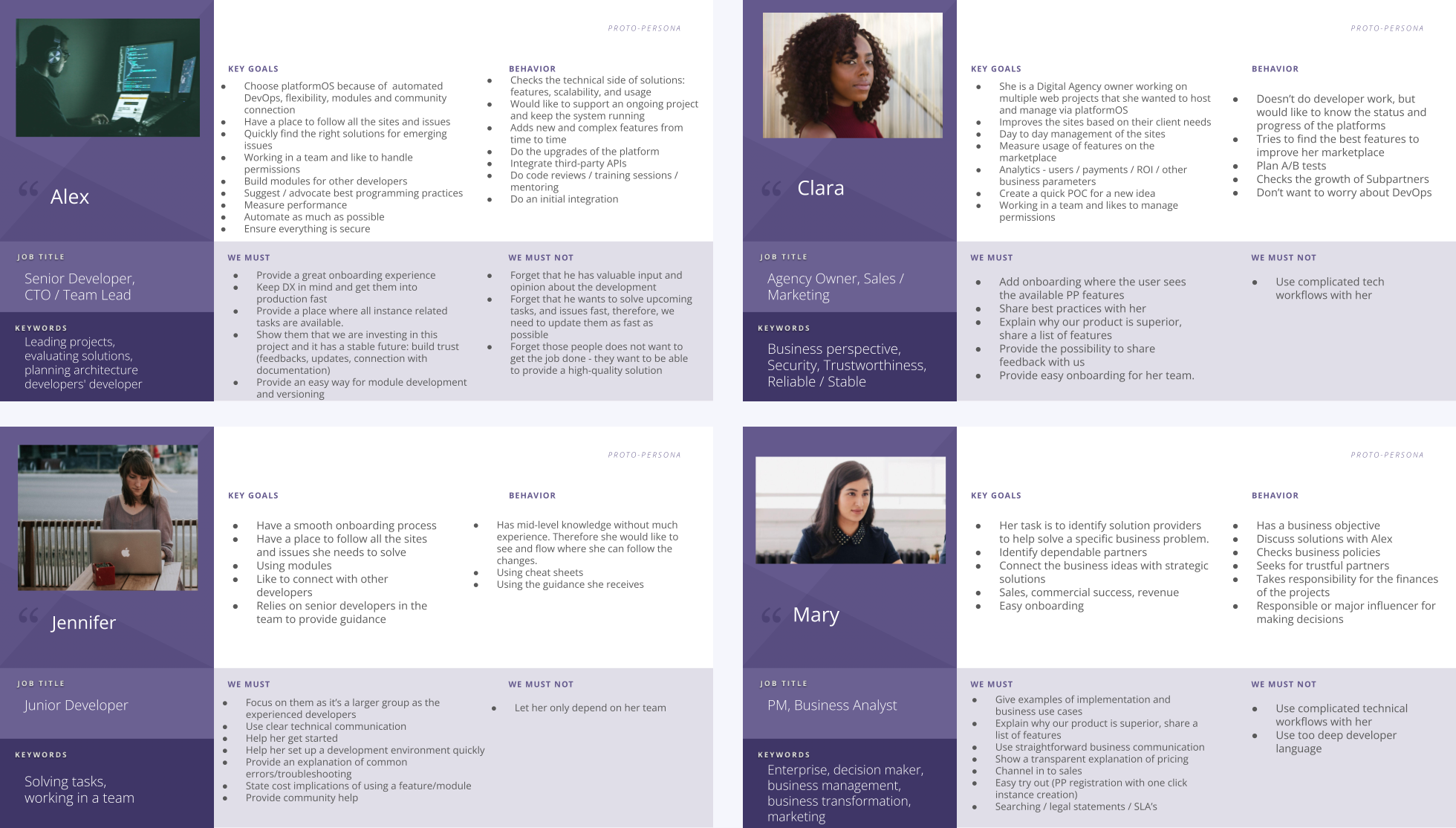
Each segment needs a different entry point into the product:
- Agency Owners manage multiple web projects on the platform. They don't work on the platform themselves but want visibility into status and progress without worrying about DevOps. They care about business perspective, security, and being part of a reliable ecosystem with a helpful community.
- Business Analysts evaluate solution providers for specific business problems. They need scalable, long-term solutions that are easy to evaluate and demonstrate key business value in action.
- Junior Developers need to learn the basics with guidance from experienced community members. They require clear technical communication about setting up a dev environment and troubleshooting common errors.
- Experienced Developers seek reliability, flexibility, and performance. They need to evaluate fit quickly, see how their projects could work on the platform, and confirm the platform has a future with a solid community.
All segments wanted an actionable onboarding where they could interact with the product based on their technical level. The team identified three onboarding journeys with different levels of depth:
- Non-technical: A 1-click route from Partner Portal registration through creating a demo site and installing a blog module via a setup wizard.
- Semi-technical: A sandbox for experimentation where users can clone a demo site from GitHub and optionally follow a "Hello, World!" guide.
- Technical: A full tutorial for creating an app on platformOS — from setting up a development environment through deployment and testing. This path covers basic concepts, main building blocks, and platform logic with workflow recommendations.
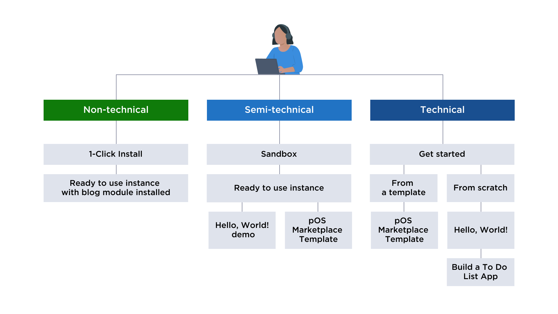
Understanding these audience segments and their shifting needs helped the team prioritize onboarding tasks and keep the focus on what each group actually required. The key was not just building one good onboarding flow, but maintaining a plan while staying agile enough to adjust as the audience evolved.
Methods And Tools: What We Used And Why
We approached the documentation challenge with a set of methods chosen to match different stages of the project. A Design Thinking process guided the overall product development. User research supplied insights and validated directions. A Docs as Code workflow handled our remote, distributed collaboration. And a topic-based content strategy let community members contribute from the very beginning.
The Design Thinking Framework
Because the developer portal plays a strategic role in product adoption, we needed a creative process that could address business problems with an open mind. Design Thinking gave us a user-centric approach that supports problem-solving and innovation. Our goals were to:
- help the community use the documentation site as early as possible;
- measure user needs and iterate based on feedback;
- keep long-term user and business goals in view while progressing step by step.
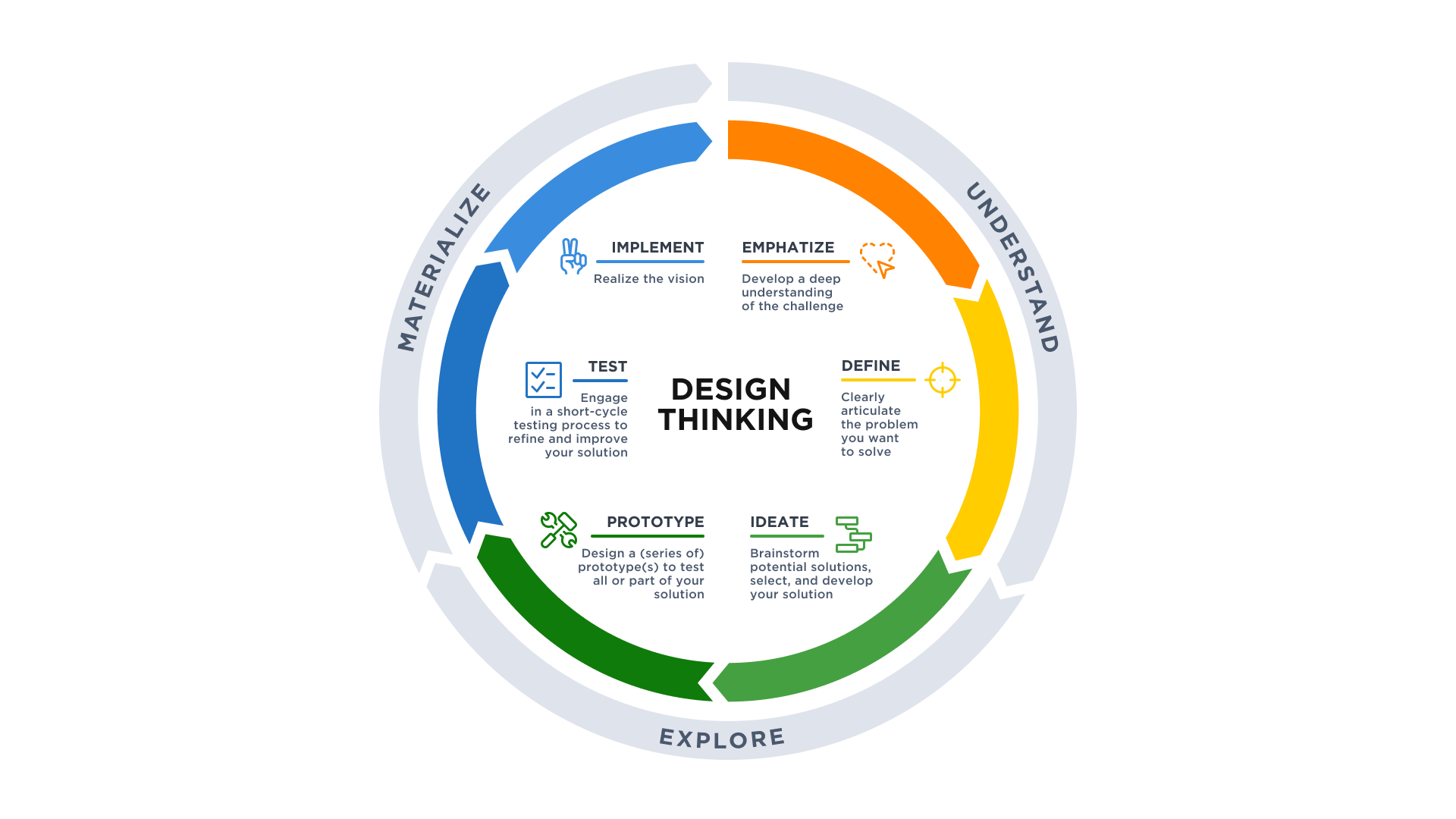
We moved through the standard Design Thinking stages:
- Empathize. In-depth interviews and workshops helped us understand our audience, documentation needs, and existing versus missing content.
- Define. We created personas and a Content Inventory.
- Ideate. A Card Sorting exercise surfaced ideas for features and content.
- Prototype. Findings led to a sitemap, prioritized content requirements, layouts, and wireframes. Content production began based on the discovery results.
- Test. We followed an iterative Docs as Code approach, running quick feedback loops, deploying frequently, and refining features and content based on real-user input.
User Research Methods
Different product stages call for different research methods, depending on time constraints, business plans, and the maturity of a feature. Over the past three years, we drew on the following:
- Interviews. Conversations with users, sales, and support staff on their experiences with various topics.
- Remote usability testing. Users completed tasks while we observed. We used two variants:
- Moderated: Conducted via screen-sharing software with participants in their usual work environments. This suits complex tasks where real-time interaction matters.
- Unmoderated: Users completed tasks independently. With no moderator present, we measured simpler tasks and overall satisfaction.
- Card sorting. Users grouped items into categories, revealing their mental model for the information architecture.
- Tree tests. We validated IA logic by asking users to locate elements in the navigation and describe their next steps.
- Surveys and questionnaires. Quantitative data collection on specific topics to support deeper research into user motivations.
- Analytics review. Analysis of usage patterns to spot breaks in flow, which we fixed directly or investigated further with usability research.
Docs As Code Workflow And CI/CD
Engaging users in an Agile, iterative process from the discovery phase onward let us validate assumptions quickly and modify course as needed. Since our internal team and community participants are spread across locations, we needed a collaboration workflow that supported remote work on changes of any size, with version control robust enough for multiple authors. We also wanted to open-source the documentation for duplication and reuse.
The Docs as Code approach — writing documentation with the same tools and workflows as software code — satisfied these requirements. It integrates documentation into the product team's culture, giving both writers and developers ownership of the content. In our case, the contributor base also included UX researchers, project managers, and users in various roles.
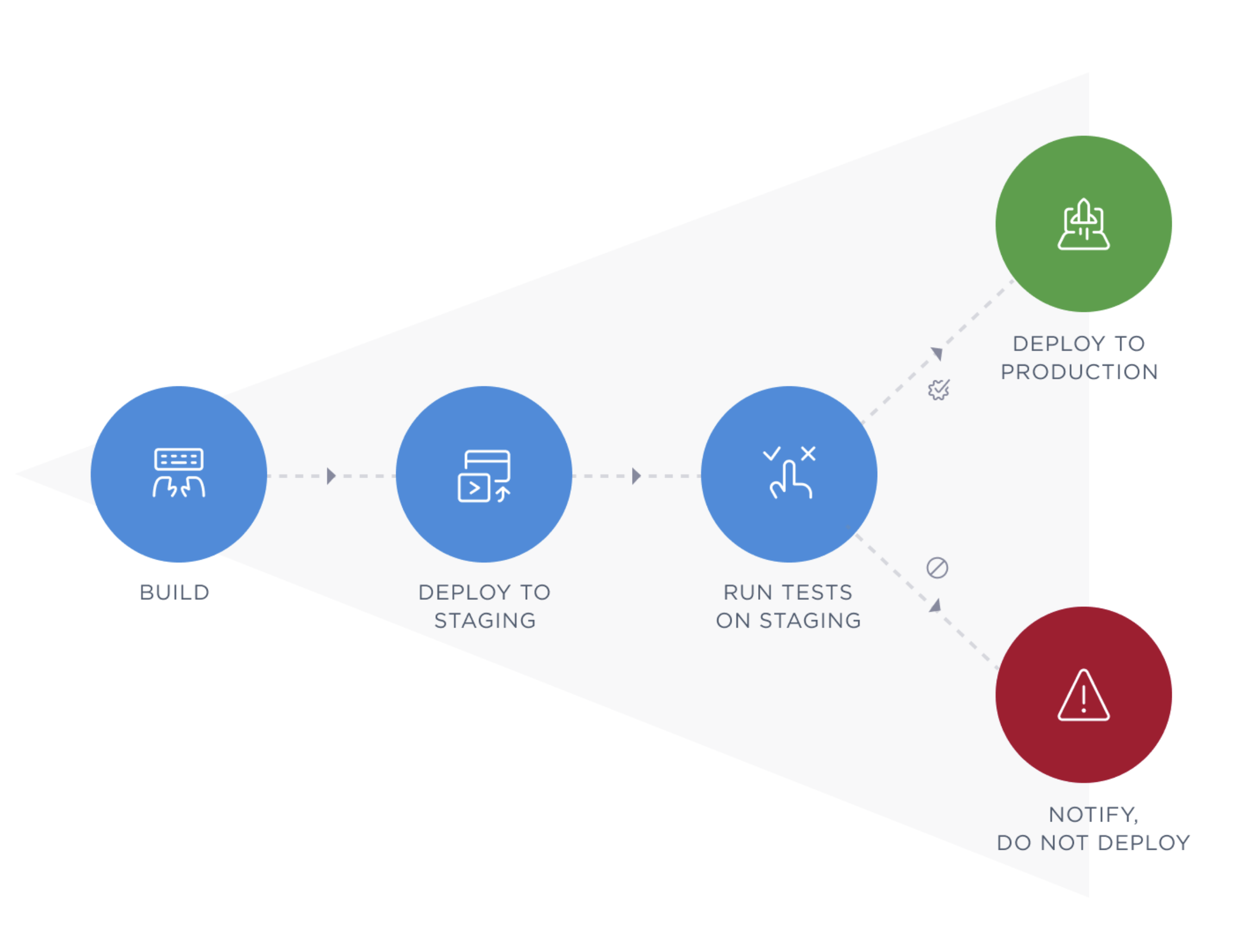
Our documentation lives in a separate GitHub repository. We work locally on dedicated branches and send pull requests for review before merging to a central branch. A staging site mirrors the production documentation for previews. Once changes are accepted, a CI/CD pipeline — specifically GitHub Actions — runs test scripts automatically. Successful tests deploy the codebase to staging and then production with a notification sent to the team. Failed tests generate an error report. Updates ship continuously, sometimes merging several changes in a day, sometimes once or twice a week.
The Editorial Workflow
Docs as Code is the foundation of our processes, but an effective workflow needed a clear editorial structure that works for all participants — internal and external writers, developers, and other contributors — across writing, review, and editing. It also had to be simple enough to welcome new contributors. Project management lives in git as well; contributors can add tickets to report issues or requests. The workflow steps are:
- Write new content in Markdown using templates. Any editor producing GitHub Flavored Markdown works.
- Submit the topic as a pull request on GitHub.
- Review. A peer-review system covers code and docs alike, with both technical reviewers (developers) and writers examining each topic.
- Edit as needed. Repeat the review step until approval.
- Merge the approved pull request.
- Deploy to staging, then to production.
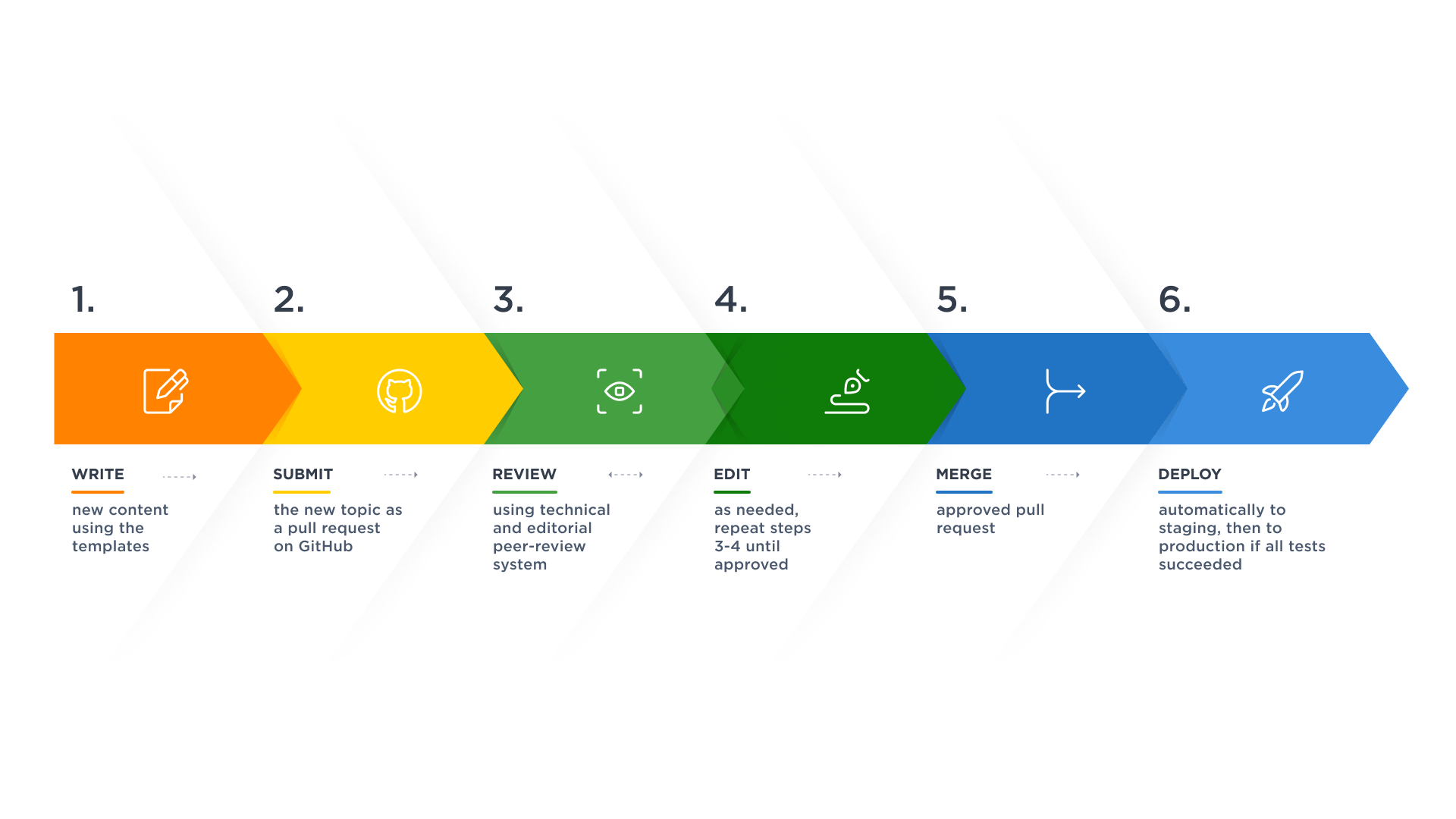
This same process applies to every contributor. Guidelines and ready-to-use templates lower the barrier to participation.
Content Production And Community Contribution
Early on, we adopted the Content First approach. We planned which content types we would need, and then outlined each type's structure. Those outlines became templates, ensuring consistency and encouraging contribution. Topic-based authoring, inspired by DITA (Darwin Information Typing Architecture), shaped our three content categories: tutorials for tasks, concepts for background context, and references (like our API Reference). The onboarding consists of tutorials linking out to concepts and references when needed.
"DITA, short for Darwin Information Typing Architecture, is an XML standard, an architectural approach, and a topic-based writing methodology where content is authored in topics rather than in larger documents or publications. A DITA topic must make sense in its own right."
Involving users continuously from the start validated assumptions and allowed for quick modification. This approach proved time- and cost-efficient: we edit and rewrite constantly, but we avoid producing large amounts of work that ultimately get discarded because they don't match user needs. Transparent collaboration also builds trust. Our community always knows what we're working on and how the documentation evolves, and members see that their feedback informs our direction. In exchange, they have to be comfortable critiquing half-finished work, and we have to handle sometimes passionate criticism constructively.
Making Contribution Easy
Our Contributor Guide lays out pathways for every segment of the audience. Quick edits like typos or links can be done directly on the GitHub UI. Heavier work — new content or git-based contributions — flows through the full Docs as Code process. This approach proved especially valuable for the onboarding itself: we received direct feedback on friction points and could fix and verify issues immediately. For those writing substantial sections, we provide guidance and templates:
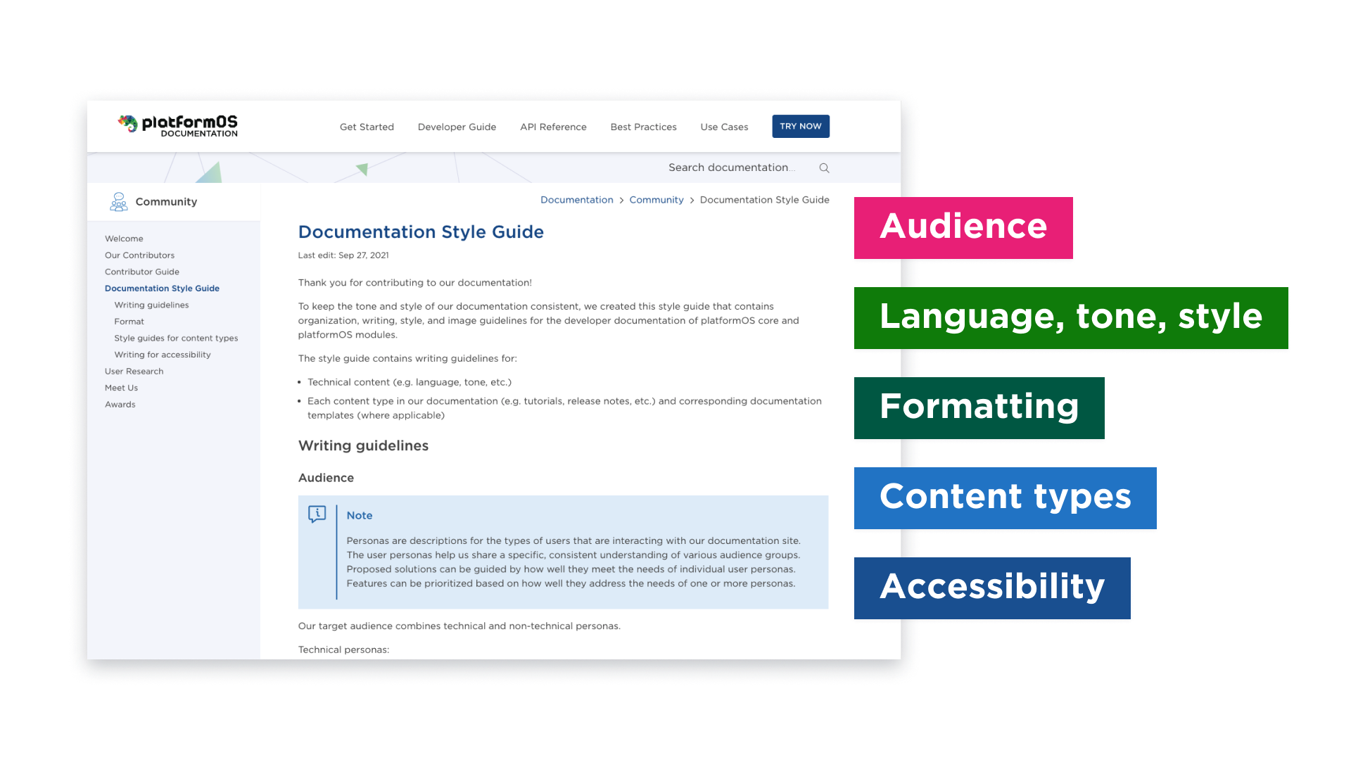
- Style guide. Covers language and tone for technical content, plus instructions per content type (tutorials, concept topics, and so on).
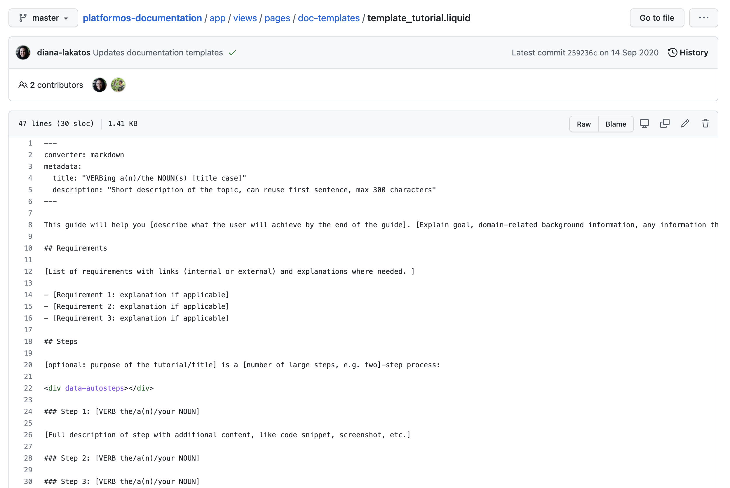
- Templates. Although the site renders Liquid pages, contributors write in Markdown, which we convert to Liquid. Templates include locked content and placeholders with explanatory notes on format and any constraints — for example, title conventions or character limits.
Every contributor receives recognition on our Contributors page as well as the GitHub repository's README.
Communication Across Time Zones
Our team and users span multiple continents, so we rely heavily on asynchronous communication, with real-time tools when useful. Even video conference sessions become somewhat asynchronous by recording them for later discussion. We use several channels:
- Community site. Question and answer channels where members can also upvote and downvote. The feature set is still expanding.
- Slack support. Dedicated channels for questions, idea sharing, and direct access to team members. Community members tell us this direct communication helps them share learnings, align module development with each other's plans, and allocate resources based on broader activity. Conversations here seed the documentation with the topics people care about most.
- Video conferences. Regular Zoom Town Halls give members and the platformOS team a space for announcements, feature demos, and face-to-face discussion. We rotate the timing to accommodate different time zones and post every recording.
- User experience research. At larger release milestones, we conduct user interviews and circulate a survey to clarify the roadmap for the next development phase.
Keeping everyone informed is just as important. We use:
- Status reports. Published on the blog, these cover accomplishments, current work, and near-term plans, often including calls for contribution and research participation, plus UX findings. Opt-in email delivers them too.
- Release notes. Updates on new features, improvements, and fixes.
- Blog. Best-practice articles and general news.
Accessibility And Inclusiveness
Accessibility starts in the design phase, where we use Figma's Able accessibility plugin. The site is regularly tested for compliance. From a technical writing perspective, clear, concise, and well-structured copy supports accessibility and usability. Every documentation topic follows a predefined structure specific to its type (task, concept, or reference), per topic-based authoring principles. Semantic HTML matters, so we avoid styling text outside Markdown, which gets converted to HTML directly. This practice allows screen readers to navigate properly and helps maintain consistency across future design updates. The style guide also enforces a review pass for accessible and inclusive language throughout the content.
Iterating to an Onboarding Flow That Works
A Round-Based Development Process
The team started with a discovery phase to map business goals against user needs. From there, they built out full user journeys and a sitemap, which was then cut down to a first MVP. Since that point, the workflow has settled into a repeating cycle: gather feedback, identify improvements or new directions, define a solution based on resources and goals, and ship it. A long-term plan guides the work, but near-term actions get the focus.
Five distinct rounds shaped the developer portal's onboarding experience:
- Exploring requirements with Design Thinking and Card Sorting to prioritize content by persona.
- Planning and prototyping an onboarding flow with a 1-click journey and a sandbox.
- Studying how existing platform users worked and continued to adjust for newly discovered audience segments.
- Reorganizing content when the volume of topics made the existing structure unsustainable.
- Fine-tuning for accessibility, inclusive language, and clarity.
Round 1: Discovery and Persona Definition
Early workshops used Design Thinking to define proto-personas with detailed needs and expectations. This groundwork guided ideation and helped prioritize features against documented user goals.
To build a Content Inventory, the team:
- Listed each proto-persona's needs based on the problems they were solving with the platform;
- Audited all existing content from the previous docs site, separating useful, reusable, and obsolete material;
- Reviewed competitor sites to feed the design process.
Card Sorting sessions with workshop participants connected the content inventory items and revealed the relations between topics. This informed the Information Architecture, including sitemap and navigation. High-priority user journeys were highlighted on the sitemap so the most critical persona needs got the most attention. For the four core personas, the priorities were:
- Experienced Developers: Quickstart guide, How to guide, API docs;
- Junior Developers: Quickstart guide, Tutorials, Conceptual documentation;
- Site Builders: Quickstart guide, Tutorials, FAQ, Forum;
- Marketplace Owners: About platformOS, Blog.
The Information Architecture phase concluded with templates for content types, wireframes, and content production close behind.
Round 2: Onboarding Strategy and Usability Validation
A revalidation of the proto-personas revealed a shifting audience. The original four segments had expanded to include Agency Owners, Sales/Marketing, and PM/Business Analyst profiles. Interviews with 20 platformOS users established how long they had been on the system, what their key "aha" moments were, and what struggles they hit. The findings split their needs into two streams: a simpler journey for non-technical users and a deeper path for developers who wanted to grasp platformOS internals.
The onboarding strategy targeted three outcomes:
- linking the developer portal, partner portal, and platform so a first visit walked through one coherent flow;
- offering an explicit set of actionable steps;
- letting users quickly self-identify the most fitting journey.
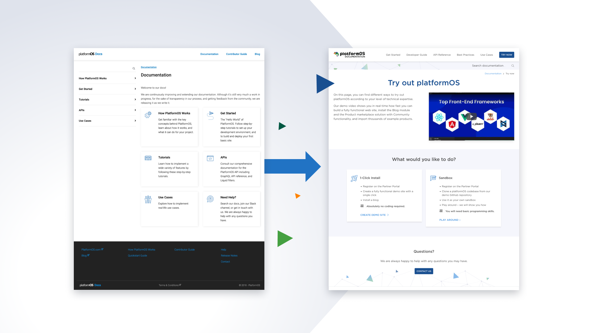
Remote usability tests have validated the onboarding flow, which links the Documentation site with the Partner Portal and originally offered users three journeys based on programming experience. Early test results pushed the team to show only the two fastest options — a 1-click install and a basic "Hello world" app. The longer Get Started guide explaining how to build a to-do app was moved behind those quick-start choices.
The Instance welcome screen was redesigned to make next steps obvious, and supporting UI copy was optimized for non-technical users. Since the flow crosses multiple sites, the design shows upfront that the user is still on the selected track with clear step indicators and consistent wording.
Round 3: Field Studies and Onboarding Interviews
A remote field study extended the picture of how prospective and experienced platformOS users approach the system, including both successes and pain points. Four themes dominated:
- Development with pOS — workflow preferences, version control habits, tooling;
- Community and collaboration — support channels and discussions;
- Developer Portal — overall experience, blocks, and requested improvements;
- Partner Portal — patterns of usage and dashboard preferences.
Key insights and follow-ups:
- The platform's flexibility is a strength and a learning hurdle. Solution: templates to aid onboarding.
- platformOS is too new for much external documentation like StackOverflow; support currently runs through Slack, Town Hall meetings, status reports, and release notes. Solution: a searchable Community Site for peer-to-peer help.
- Users could generally find documentation but search precision was lacking and tutorial naming caused confusion. Solution: content reorganization and search function fixes.
- The Partner Portal was used by experienced devs mainly at project start, while junior devs wanted in-context help on the instances page. Agency Owners and Business Analysts needed payment and analytics views. Permission handling and instance hierarchy were persistent problems. Solution: a Partner Portal redesign with restructured instance and permission information.
Round 4: Structural Reorganization
The Tutorials section was renamed to Developer Guide to host expanded concept topics. A comprehensive Get Started area was built for newcomers and the Developer Guide serves everyone from just-finished beginners to veterans. This editing split visibly separated the onboarding zone of the site, creating the modern structure: a direct first-time tutorial followed by deeper onboarding material.
At this round, the Tutorials section held 136+ topics grouped in 27 clusters, with more planned. Another Card Sorting run tested better organization against user mental models. The resulting seven categories — Data management, Schema, Templates, Modules and Module examples, Partner Portal, Third-Party Systems, and Best Practices — fit the original 27 topics into an information structure that matched user expectations.
Round 5: Templates and Accessibility
The latest round introduced a template-based starting option. The pOS marketplace template delivers a fully working marketplace demo — complete with user onboarding, ad listings and ads, purchase and checkout, and online payment. Users can deploy it quickly using the accompanying tutorial and go straight to customizing the front- and back-end code.
Content work continues, with a focus on clarity, accessibility, and inclusive language. Regular accessibility reviews cover terminology, gender-neutral pronouns, and informative link text while avoiding ableist metaphors and colloquialisms. The team's accessibility decisions on the platformOS Developer Portal are documented separately with concrete examples of what was changed and why.
What Comes Next
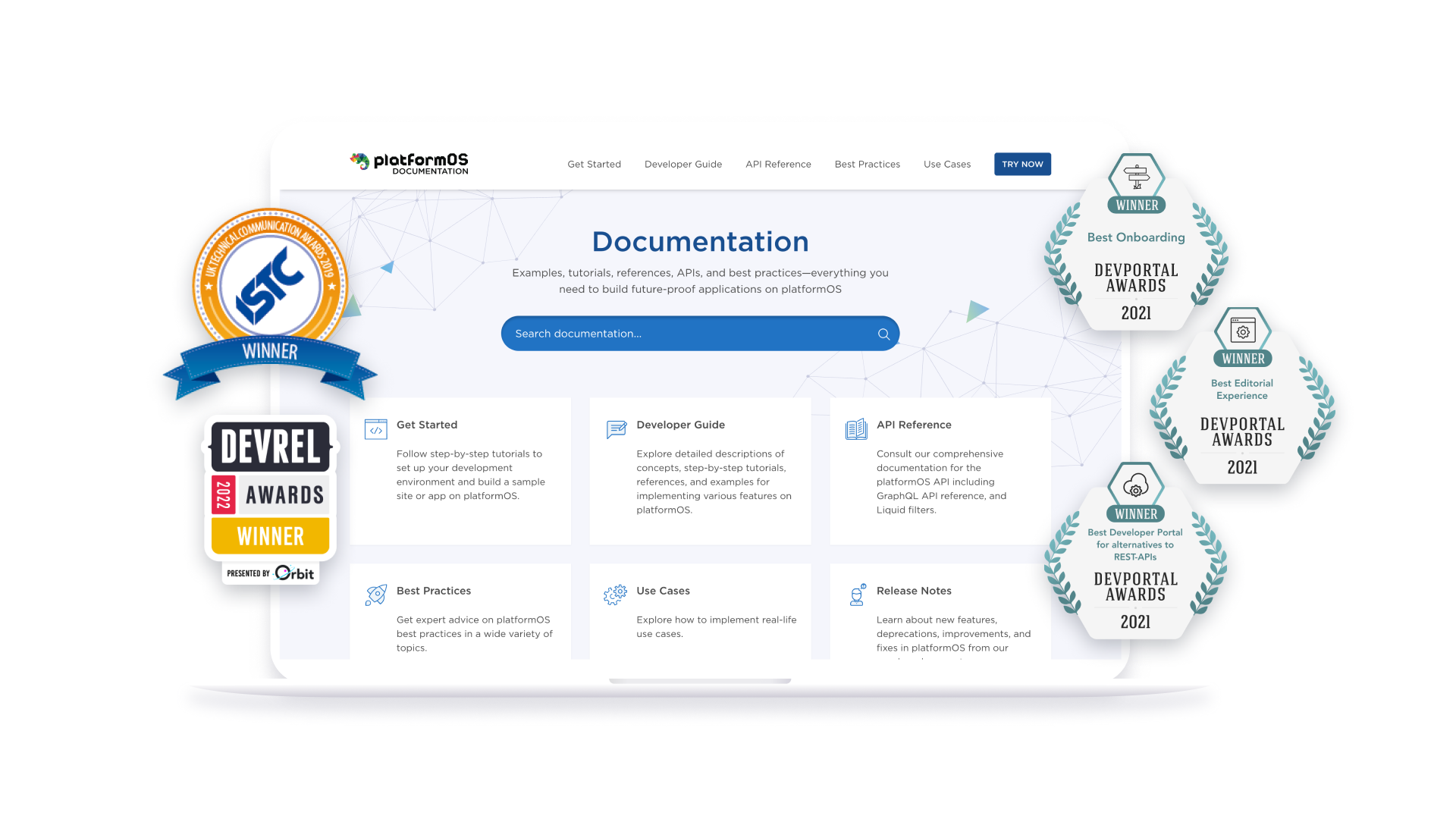
The platformOS Developer Portal has been well received by the community and has earned several peer-reviewed awards. The team plans to continue the same cycle of validation and improvement that has guided the project so far. A developer education program is in the works for an upcoming community site. It will include learning pathways designed to match different user learning styles and provide routes for deeper involvement in the developer community.
Key Takeaways
After years of refining the onboarding process, the team distilled its experience into a set of practical lessons.
- Don’t aim for perfection on the first pass. Treat every adjustment as progress and stay open to change.
- Know your audience, and be ready to change your assumptions. Revalidate and shift target audience segments based on what you learn.
- Build a toolkit of user research methods. Know when to use each approach, and give users several channels for offering feedback.
- Adopt a workflow that supports constant iteration. The editorial process should not block updates. Docs as Code is a good fit for this.
- A product is never finished. Updating and reshaping a flow that already exists is a normal part of the process.
- Iteration and prioritization are essential. They make it possible to deliver large volumes of work over time.
The team hopes this case study offers useful guidance for anyone building an onboarding experience for their own product.