Modularity at Shopify: Progress Report
Over three years ago, Shopify formed a team to investigate how to make its Rails monoliths more modular. The goal was to create smaller, independent units of code, or components, to help the system scale toward ever-increasing capability and complexity. The original vision promised easier onboarding, faster and more stable test suites run only on affected components, and the freedom to change a component without worrying about impact on unrelated parts of the system — developers should feel like they are working on a much smaller app than they actually are.
That idea hasn’t changed, but nearly every detail of the implementation has. The core monolith now holds over 2.8 million lines of Ruby and 500,000 commits, and Rails offers no built-in patterns or tooling for managing that complexity. Work has been ongoing for two and a half years, led by the Architecture Patterns team, and while far from finished, the effort is already paying off.
Parts of the codebase that underwent heavy refactoring are now easier to understand because their relationships with the rest of the system are clearer. Developers are more aware of the design consequences of their changes, and new feature implementations now more often improve existing code rather than degrade it. Exceptions are automatically triaged to components, letting teams act on issues without wading through the monolith-wide exception stream. With each component explicitly owned by a team, whole-codebase chores like Rails upgrades are easily distributed. That clearly defined ownership is one factor enabling Shopify to run its main monolith on the newest, unreleased revisions of Rails.
The People Problem
A single centralized team cannot make complex change happen on a large scale by working against the momentum of hundreds of developers adding features. Even if it could, the design would degrade as soon as the team shifted focus. Long-running architecture changes on an actively developed system are primarily a people problem — the average developer’s behavior must change, and developers are an integral part of the system.
Behavior change, as modeled by Stanford’s Behavior Design Lab, requires three things: ability, motivation, and prompt. Prompts are the easy part; automated tooling and targeted manual code reviews provide those. Building ability and motivation is harder, especially when the change runs against common Ruby on Rails community practices and requires a view of the system far larger than the area most individual developers work on.
One early misstep was investing heavily in patterns for component boundary interfaces and pushing developers to use them everywhere. This strategy added rules — friction that had to be learned, remembered, and followed — but didn’t solve the problems actually holding developers back. In some cases, the pressures led developers to redefine their problems to fit the provided solution, which degraded the overall state of the monolith.
The current approach focuses on finding areas where motivation is present and the prompt is easy, but developers are held back by lack of ability. A common obstacle is legacy code and tooling built on outdated assumptions — for instance, that all Active Record models are accessible everywhere, when in the componentized world their usage should be restricted to the owning component. Helping developers overcome such concrete barriers is where the team’s effort now goes.
Growing a Grassroots Movement
Recognizing that a centralized team cannot force this change alone, the effort works to create a grassroots movement among Shopify’s developers. The team gives internal talks, writes documentation, shares wins, embeds in other teams, and pairs with people across the company. Embedding and pairing ensure the problems being solved are the ones product developers actually struggle with, avoiding ivory tower syndrome where solutions don’t match problems, while also giving the central team context on different codebase areas and business domains.
The Architecture Guild exemplifies this grassroots approach. Started after the first year of componentization, the guild runs a Slack channel and bi-weekly meetups — an open forum for architectural discussion and growing architecture-conscious mindsets. Most contributions come from other teams, not the Architecture Patterns team. Today the guild has roughly 400 members and 54 documented meetups with notes and recordings shared company-wide. Starting a similar effort from scratch today, the Architecture Patterns team would establish such a forum from day one, it said, to get as many people on board as early as possible and to spread software design knowledge siloed in specific teams.
Additional internal resources round out the effort: the Developer Handbook, an online resource documenting how software is built at Shopify, and Developer Talks, a weekly livestreamed and recorded internal series on software development.
What Would Be Done Differently
Looking back, some things stand out as strategies the team would not repeat. The heavy push for interface consistency was a mistake — it didn’t increase ability or motivation, didn’t solve the hard problems, and didn’t explain the reasons or long-term goals well enough. The team now provides general suggestions on interface consistency but has far fewer hard rules.
Making code more modular is often difficult because the underlying assumptions of legacy code and tooling no longer hold. Developers struggle to overcome these outdated constraints, not with following abstract rules. The key lesson from two and a half years of work: all large-scale change starts with understanding and influencing developer behavior, works from the grassroots up, takes a holistic view of architecture, applies tooling carefully, and stays aware of the tradeoffs involved.
Encapsulation Alone Won’t Fix a Dense Dependency Graph
Building a clean public interface around every component hides internals, but it doesn’t automatically make the system easier to work with. A public interface is only stable if the components that depend on it are few enough to reason about; a widely shared interface becomes hard to evolve precisely because everything uses it. When Shopify’s engineering team analyzed the dependency graph between components, they found it dense enough that every component depended on more than half of all others, with circular dependencies throughout—both direct two-component loops and longer chains that loop back to the starting component.
Those cycles and dense edges defeat the purpose of componentization. A change to any member of a cycle can break every other member; a change to a heavily depended-on component can break nearly everything, forcing developers to hold an enormous amount of context to make even a small edit. In large swaths of the codebase, the “public interface” turned out to be little more than a thin extra layer of indirection over existing control flow. That made refactoring harder — now each change had to touch additional files — and made it no easier to reason about systems in isolation. The simplest possible interface wrapping around a problematic implementation simply leaks the original design flaw into a new class, spreading it into more files and making it harder to fix.

The simplest possible way to introduce a public interface to a private implementation
The fix isn’t just better interface design; it’s directionality. Conversations about which way dependencies should point consistently surface underlying design problems, like objects holding too many responsibilities or missing abstractions. Because nearly everything in the shop system depends on the Shop class, that class needs to depend on almost nothing to avoid creating cycles. Shopify’s team uses two tools to steer the arrows: moving responsibilities into the component that depends on them, and applying inversion of control so that source-code dependencies run contrary to the control flow, e.g., through a publish/subscribe mechanism like ActiveSupport::Notifications. This guidance pushes central classes like Shop toward becoming mostly empty containers holding only an identity plus a few abstract concepts.
This layered approach determines priority: clean up dependencies crossing layer boundaries first, before tackling fine-grained coupling within a layer. Platform components like Platform and Shop Identity serve the others; supporting components like Merchandising and Inventory build on the former but expose their own external APIs; and front-end components like Online Store are primarily customer-facing. This diagram shows how aligning those dotted-line edges matters first:
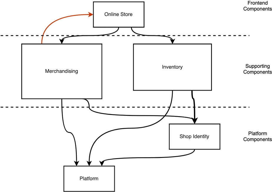
Dependencies diagram between Platform, Supporting, and Frontend components
Loose Coupling Must Come With High Cohesion
Decoupling was an early priority for Shopify, in part because it’s easy to see progress with that visible change. Yet a purely decoupling-minded effort had a notable gap: cohesive code that belonged together still spanned component boundaries. In some cases, the team even cemented that broken state. Small functional changes would land across many components, requiring developers to know and coordinate changes across all of them.
That’s why Shopify’s team focuses on Change Locality — the degree to which code that changes together actually lives together. It is a proxy for both loose coupling and high cohesion, and it makes the codebase feel smaller, which is a real goal in a monolith of this scale. Measuring it is tractable: the team is building automation that analyzes all pull requests to see which components they touch, aiming for that number to fall over time.
A subtlety on cohesion surfaced during this work: much of the legacy code exhibiting cohesion is informational cohesion, grouping code around data, which often comes naturally from designing a Rails schema. That pattern hinders change locality, though. The team found that aiming for functional cohesion — grouping code by the task it performs — aligns much better with how developers actually think about a business domain, and it has improved how understandable business logic has become.
Components Follow the Same Design Rules as Classes
Sound component design usually starts with sound class design. SOLID principles apply to classes, but the same concern (the package principles) applies to larger units like components — common closure: classes that change together are packaged together; stable dependencies: depend in the direction of stability; stable abstraction: abstractness increases with stability. Shopify’s experience mirrored the literature: if code is badly behaved at the method and class level, it’s nearly impossible to distill well-structured components from it. Conversely, developers who can apply SOLID principles in their daily work scale those skills naturally to the component level.
To see strong component boundaries emerge organically, the team argues, better design skills need to happen at a more local level first, and that’s ultimately a matter of cultivating both developer motivation and ability. Shopify has had hands-on optics on this through crafting workshops with Sandi Metz, who — per the team — genuinely excites people about software design. Books on design and repeated workshop practice can shift an organization’s default from preserving existing boundaries to refining the underlying responsibilities that cross them.
Tooling: The Second Wave
The first attempts at modularizing Shopify’s monolith relied heavily on custom-built infrastructure. Over time, the team has shifted toward more standard mechanisms and stricter analysis tools, largely based on what those early experiments revealed.
Rails Engines Become the Default
Early components leaned on a lot of bespoke code, but they increasingly resembled Rails Engines in structure and behavior. Going forward, Shopify is standardizing on engines. They are the only modularity mechanism built into Rails, they look like familiar Rails applications, and, unlike full apps, multiple engines can run in the same process. If a component ever needs to be extracted, an engine can be converted into a standalone application with relative ease.
Engines are not a perfect fit. A recurring pain point is that libraries and tooling tend to assume a Rails application layout rather than an engine’s slightly different structure. Engines can also declare their own gem dependencies, which requires a predictable process for consolidating them into a single set for the host application. Despite these rough edges, multiple production applications at Shopify are successfully using engines for modularity and the approach is now the standard.
Static Typing for Boundaries
Explicit contracts are what make strong component boundaries useful; they allow developers to work with a component without reading through its implementation. Shopify’s first attempt at codifying these contracts was a hash schema validation library called Component::Schema, built on dry-schema. While serviceable initially, the team hit problems with breaking changes and the runtime cost of validating more complex contracts.
When Stripe released Sorbet in 2019, Shopify—already involved in its development—adopted it heavily. Sorbet is now the primary tool for specifying input and output contracts at component boundaries. Properly configured, it adds almost no runtime overhead, is more stable than the earlier approach, and offers more advanced capabilities like interfaces.
An entrypoint formerly expressed with Component::Schema is now written as Sorbet signature.
Static Analysis Replaces Call Tracing
Shopify’s original architectural diagnostics came from a tool called Wedge, which logged every method call during CI test executions to detect cross-component traffic. The results were frequently unhelpful. Call graph logging produces massive amounts of data, and attribution is often ambiguous: if a method inherited from a class in component A calls into component C, which component is the call actually from? The tool also required instrumenting the entire test suite, taking over an hour per run.
Wedge’s successor, Packwerk, analyzes static constant references instead. The line Shop.first contains both a reference to the Shop constant and a method call. Packwerk only tracks the constant reference, since static references are explicitly introduced by developers and thus far more actionable. A full Packwerk run on Shopify’s largest codebase takes minutes, which allows it to be integrated directly into Pull Request checks, rejecting changes that break the dependency graph or component encapsulation before they hit the main branch. Packwerk is planned for open source release.
Two Strategies for Partitioning a Monolith
In practice, large architectural reorganizations rarely reach a truly complete state. Whatever the long-term plan, the interim structure is likely to last longer than anyone would like. It makes sense, then, to choose a partitioning strategy based on which intermediate state is most useful.
One approach is to draw lines based on a target vision, then strengthen those lines over time. Shopify’s main monolith uses this method, guided by Domain-Driven Design. Components map to subdomains of commerce and every file has a designated ownership team. The upside is clear stewardship even before boundaries are fully built; the drawback is that most components still lack complete, enforced boundaries because of the sheer volume of legacy code involved.
For some of Shopify’s other large applications, the team has tried the opposite: extracting small parts into tightly isolated components first, then growing them by transferring responsibilities over time. This results in clean, well-defined examples amid a still-unstructured codebase. Clean boundaries versus organized ownership—that is the trade-off each strategy represents. Shopify chose ownership first given the number of engineers working in its main codebase.
The State of the Modular Monolith
Feature development continues at full speed while modularization proceeds in parallel. The main monolith currently contains 37 components, each with public entrypoints covering most of its responsibilities. Packwerk actively restricts dependencies on roughly a third of those components, and Shopify is working to make enforcement compelling enough for the rest to adopt it voluntarily.
The immediate goal is not total acyclicity—though that remains the long-term ambition—but removing as many edges from the dependency graph as possible, making the system progressively easier to reason about.
Other monolithic applications at Shopify are going through similar componentization efforts, some aiming for a modular monolith and some expecting to separate into services eventually. That split is not taken lightly: turning one application into a distributed system increases complexity considerably. Service extraction only happens for clearly justified cases. Storefront rendering is one example, because its read-only, high-throughput traffic benefits from independent scaling. Credit card vaulting is another, since isolating sensitive data from the rest of the system is a hard requirement.
Shopify is also working to make modular structure the default for all new Rails applications. New projects should be generated with several separately tested engines from the outset—no top-level app folder to reorganize later.
Open Problems
Two issues remain the primary blockers to Packwerk’s broader adoption. The first is making the dependency graph easier to clean up. This means encouraging dependency inversion through patterns like publish/subscribe in place of direct method calls. The second concerns cross-component data queries:
- The GraphQL API exposes a partially circular graph to customers, while the internal component implementation should ideally be acyclic.
- GraphQL query execution and ElasticSearch reindexing currently depend on Active Record internals, contradicting the “public interface, private implementation” goal.
The long-term vision for the main monolith is to have separate, isolated test suites for the majority of its components.