What Counts as an Immersive LLM Chat Experience
"Immersive LLM chat experience" is an umbrella term for full-screen products such as Claude, ChatGPT, GitHub Copilot, Gemini, America.gov, Glean and similar sites and web apps:
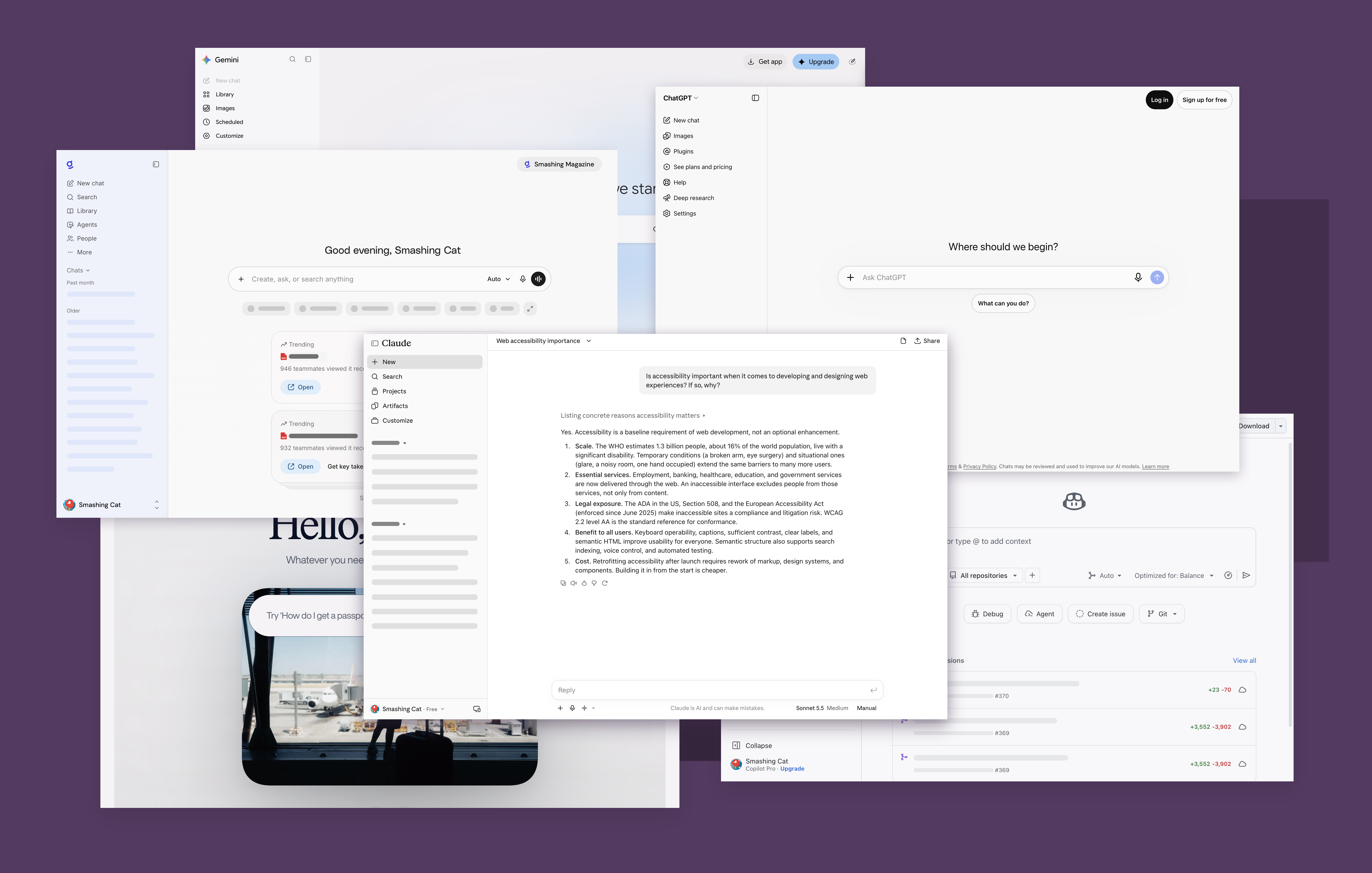
Most of what follows applies equally to web apps and native apps, since these experiences are usually built with web technologies and wrapped in Electron or Tauri.
The term excludes pop-up chats, inline text generation utilities and summarization tools — those have their own considerations. Treat this as a starting point that also informs those simpler experiences.
Chat UIs Are Just Interactive Web Content
Through the lens of the Web Content Accessibility Guidelines, there is nothing special about chat-based UIs. They are interactive experiences built with web technologies, and the losses described above — along with their legal liability — are access barriers just like any other barrier in web content.
The social model of disability applies: exclusion can be created by the built environment, as with an elevated entryway that replaces stairs with a gently sloping ramp.
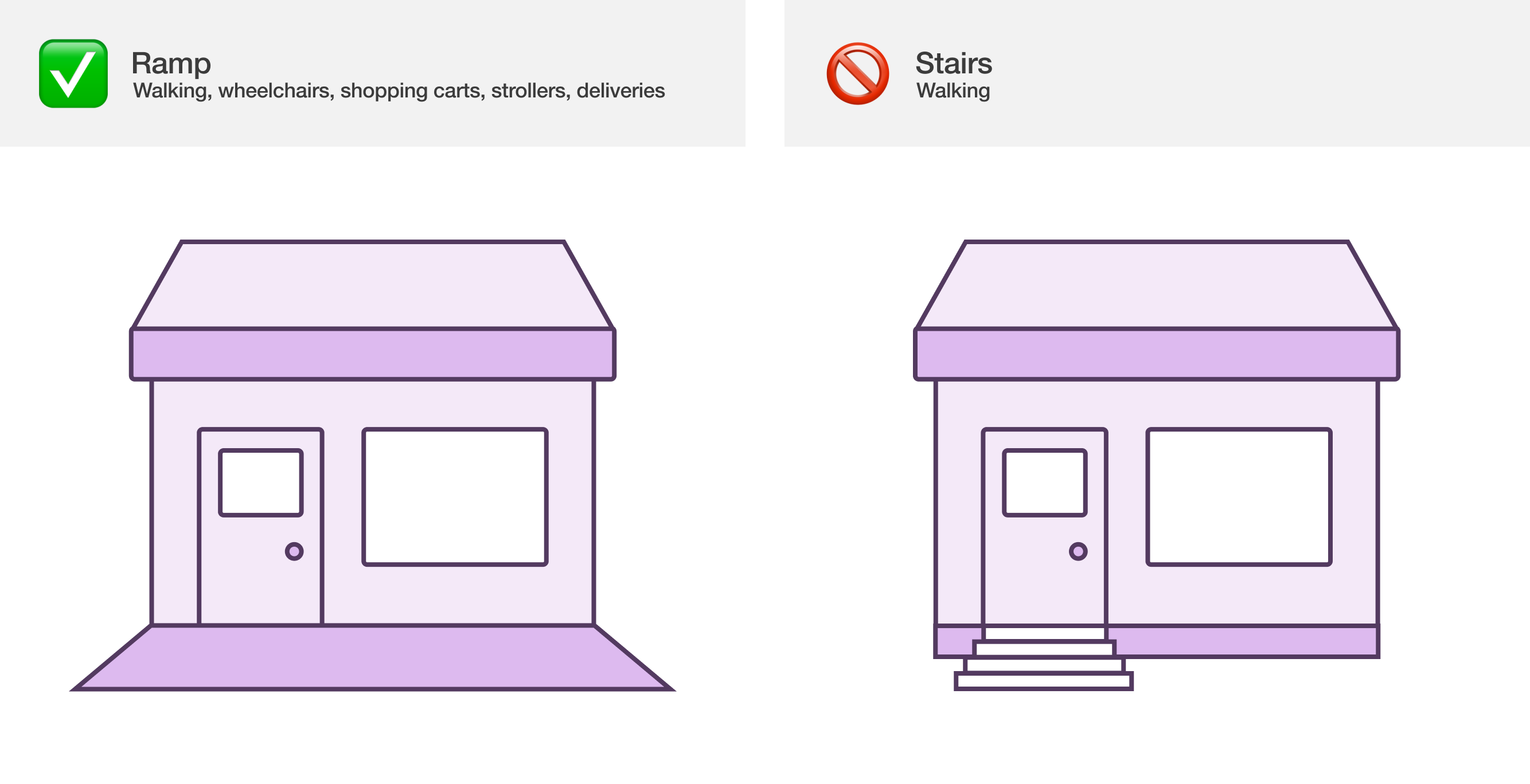
Digital experiences are built environments too. Operating an LLM chat comes down to two established activities: inputting and submitting text, and reading content and acting on it. Whether those interactions are facilitated or not is what matters.
Software creation carries an overwhelming visual bias — a highly visual culture produces outputs that unconsciously reflect and reinforce it. The work is to be aware of and think through non-visual considerations.
Not all disabilities are blindness or low vision conditions, but many core chat interactions need specific accommodations for both. Consider the main flow against the social model: type words into an input and send, wait for the LLM to parse the message, then read the generated reply.
Here is what someone who can fully see the screen experiences versus someone using a screen reader who cannot see the screen, or large portions of it:
A sighted user sees the reply appear. A screen reader user does not know new content has arrived, because focus is still on the input that sent the prompt and no non-visual mechanism signals the new content. The goal is an equivalent experience, and live regions are the starting point.
Announcing Replies with Live Regions
Live region announcements let someone know what the LLM responded with without moving focus away from the prompt input — the equivalent of a sighted user glancing up to read the reply. If this is your first attempt at live regions, read TetraLogical's article on why live regions fail; they are tricky to get right.
One common pitfall: avoid applying aria-live to each LLM response message. Use a dedicated live region area instead:
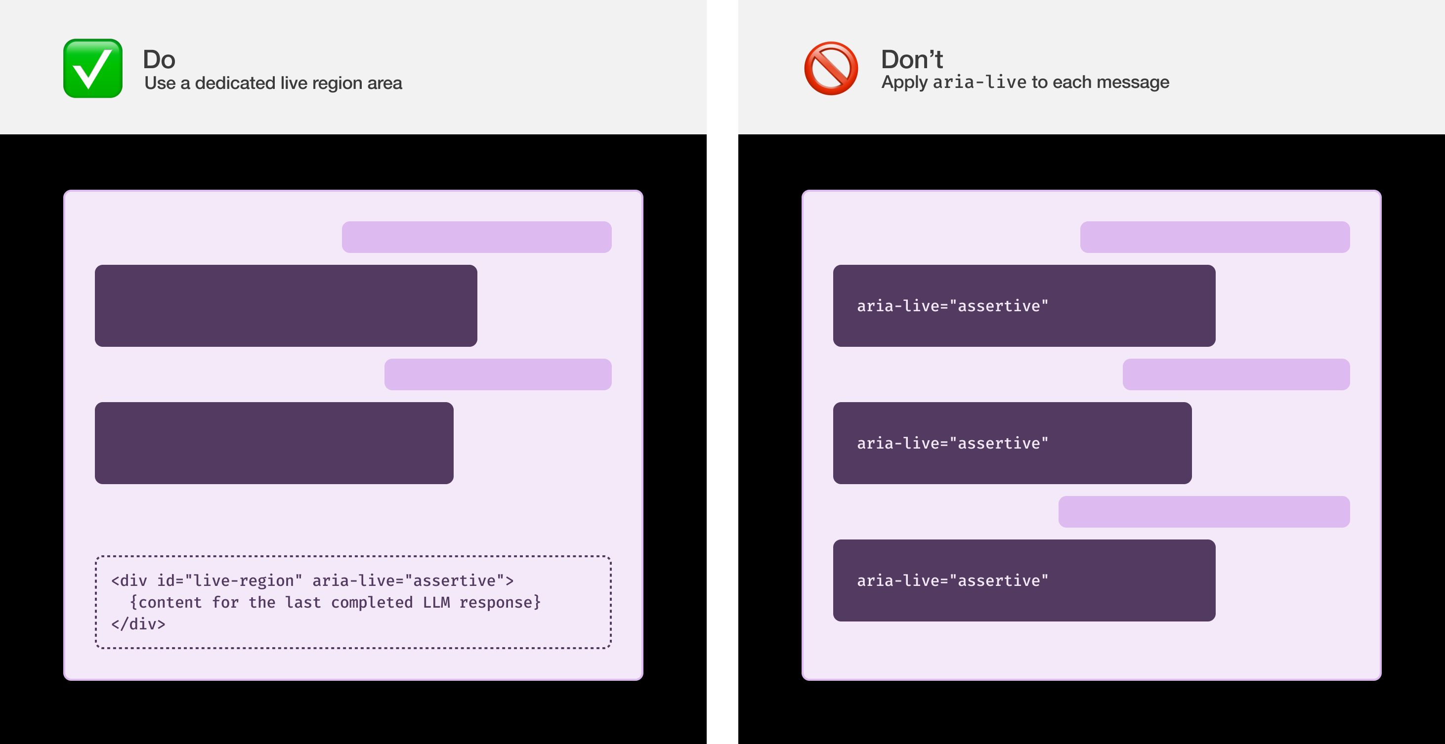
Place the live region at the end of the DOM and use it for all live region messaging. This approach is more stable and reliable, which matters for making sure everyone understands what the experience communicates.
The announcement should fire when the LLM's reply shows up in full on screen:
The result: the message can be read visually, or heard, or felt on a refreshable braille display.
Usability Details That Make the Difference
These considerations separate a compliant-yet-unusable outcome from something that genuinely works for the person using it.
Announce only the completed message
Announcing the message while it streams in can produce a juddering, confusing experience that is hard to parse. Wait until streaming completes, then announce the message's content in full:
Communicate that a request is processing
Responses often take time. Processing is typically indicated in one of three ways: with text, with a loading animation, or with both. These cues are usually visual only, so without them the experience may feel stalled or crashed — especially for large or complicated requests.
When text is shown on screen: trigger a companion live region announcement at the same moment the loading text appears, using the same string as the visual text to ensure parity of experience:
When a text-less loading animation is shown: still communicate the loading state to assistive technology. An announcement that a reply is loading after a set amount of time creates an equivalent experience; it need not be verbose — "Loading" can suffice:
Inclusive user research suggests five seconds after prompt submission is the sweet spot for triggering the loading message. Repeat it every five seconds until the LLM completes its reply — and announce the reply immediately when streaming finishes, without waiting for the next five-second cycle.
After the initial "Loading" message, consider randomly selecting from a set of different phrases indicating a response is being formulated. This helps when someone might think the loading experience itself has crashed or stalled.
On ariaNotify()
ariaNotify() will eventually be able to replace the TetraLogical live region technique. It is a welcome platform addition that will cut down the hacks and headaches of creating and managing live regions. Baseline lists cross-browser availability for the method as of publication, but two factors apply:
- Evergreen browsers do not guarantee something is immediately available; many factors can keep someone from running the latest browser version.
- Many people who rely on assistive technology hesitate to upgrade — a learned, risk-averse behavior meant to avoid breaking the primary mechanism they use to operate a device.
A ariaNotify() polyfill exists, but you must weigh whether it has the full, wide range of support found in the actual compared with the dedicated DOM live region technique, and whether its support policy suits your organization's level of accessibility buy-in. Realistically, that means holding off on ariaNotify() for now in favor of the tried and true live region technique.
Giving each message a navigable identity
Screen reader users navigate primarily by headings, so every chat message should carry a visually hidden heading of its own. The pattern wraps each message in an article element and prefixes it with a heading whose level depends on context — an h2 in a real session, since the session title occupies the h1.
<article>
  <hX
    class="sr-only"
    aria-label="You said/{agent name} said"
    tabindex="-1">
    You said:/{agent name} said:
  </hX>
  <div>
    {message body}
  </div>
</article>
- The
articleelement encapsulates a single message. hxstands for the heading level, withh2used in the concrete example.class="sr-only"hides the text visually while leaving it available to screen readers.aria-labelrepeats the heading's string verbatim, working around screen reader bugs and preserving the name portion of WCAG's Name, Role, Value criterion when the heading receives focus.tabindex="-1"is what makes that focus possible.{agent name}is a placeholder for the LLM's name — Claude, Copilot, ChatGPT and the like. The example agent is called "Cody."
With real content, the markup reads as follows:
<article>
  <h2
    class="sr-only"
    aria-label="You said:"
    tabindex="-1">
    You said:
  </h2>
  <div>
    what are the strengths and drawbacks of using utility css?
  </div>
</article>

<article>
  <h2
    class="sr-only"
    aria-label="Cody said:"
    tabindex="-1">
    Cody said:
  </h2>
  <div>
    Utility CSS trades cleaner global styling for faster, more explicit component styling. It works best with component-based frameworks, where repeated class groups can be encapsulated. It is less attractive when semantic HTML must stay visually uncluttered or styling changes independently from templates.
  </div>
</article>
The "You said:"/"Cody said:" prefix exists because sighted users rely on visual cues such as left or right alignment to tell speakers apart.
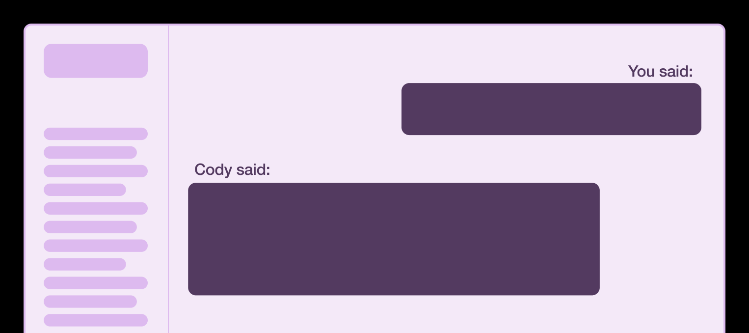
The prefix does the same job in text: it identifies who owns the message. That lets someone skim a conversation to re-establish who said what and when, much as a sighted user scrolls upward.
Landmarks: enough to orient, not enough to clutter
Landmark regions around the major areas of the chat let people learn the layout and jump between areas quickly:
navfor the list of sessionsmainfor the session messagesformfor the prompt inputasidefor a sidebar showing code or other generated content
For someone who cannot see the screen, this is the equivalent of the quick eye movements and head tilts sighted users make when first scanning a layout.
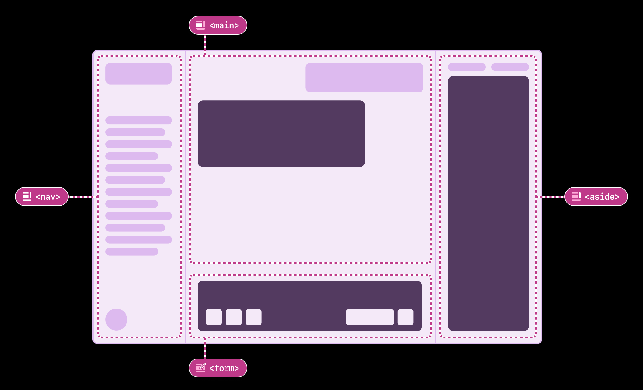
Wrapping individual messages in section or other landmark elements is worth avoiding. Each one adds to the landmark list a screen reader generates, which makes navigation more laborious — a real problem in long sessions with many messages. Consider which is easier with a keyboard when moving from the prompt area back to the sessions area:
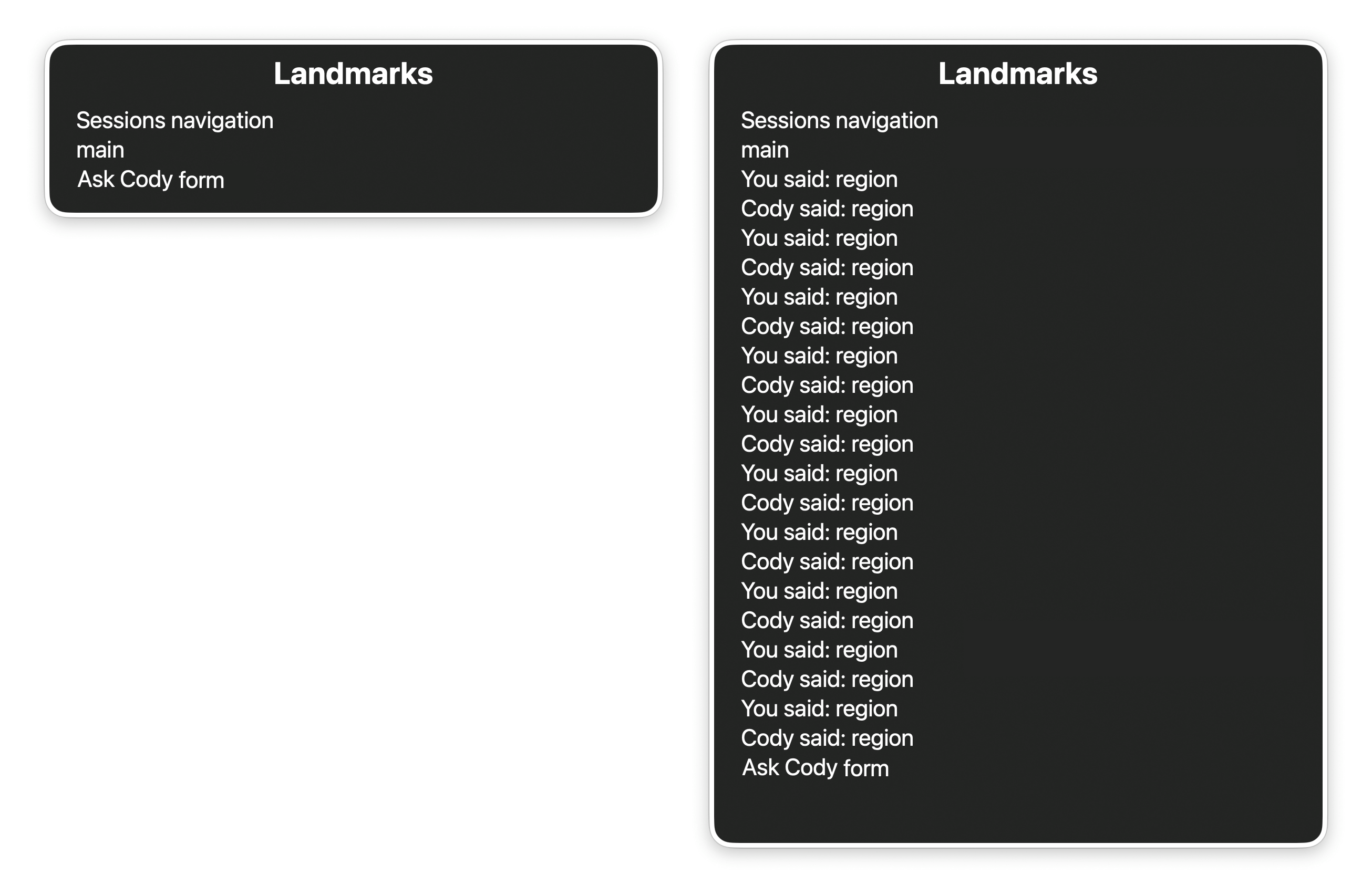
Here the visually hidden headings act as the dedicated mechanism for moving through the conversation.
Skip links and composite widgets
Two further mechanisms speed up movement around the experience.
Skip links
Skip links jump to another area of the same page or view. "Skip to main content" is standard on mature sites and apps, and an immersive chat experience should be no exception: place a skip link to the main conversation area in the DOM ahead of any other visually shown content.
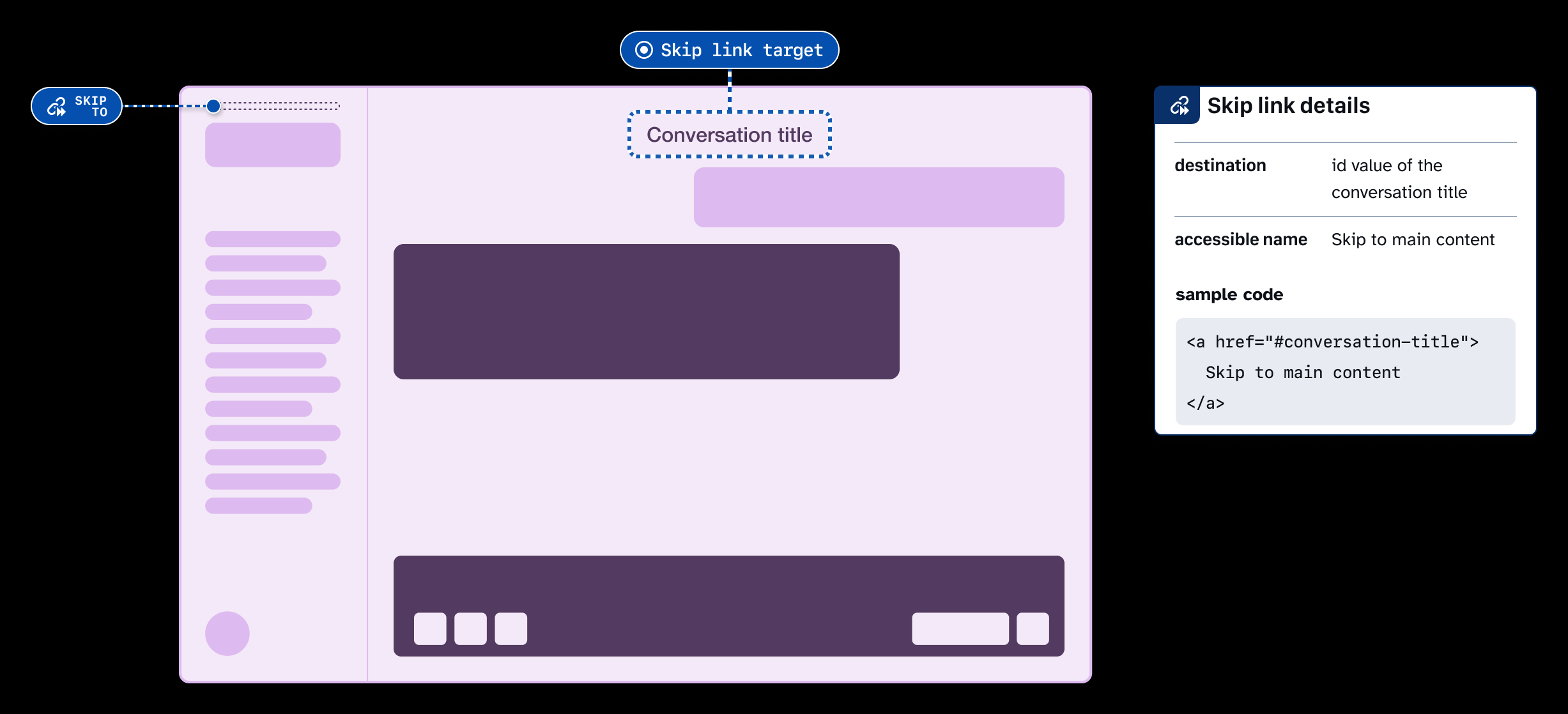
Additional skip links can jump to the prompt input, or bypass the conversation list to reach profile information and settings.
Composite widgets
Composite widgets suit a discrete region containing several interactive elements, with the developer managing focus so that the region is a single tab stop and its children are reached via the keyboard. Conversation lists should be built this way so someone can move within the list and past it quickly.
For a keyboard-only user, tabbing through 50 sessions 50 times versus once is a stark difference — and for people with motor control conditions those keypresses can be fatiguing or painful. Once focus lands on the list composite widget, Up and Down move through the session items.
HomeandEndjump to the first and last session items.- Typeahead matches typed characters against the start of a session title, as with items in a
selectmenu.
Skip the feed pattern
A feed pattern brings focus-management corner cases and usability expectations that work against keyboard-only users, and it costs significant prototyping effort to resolve. The simpler article-plus-visually-hidden-heading approach is effective, understood by assistive technology users, and far easier to maintain.
Control + F6 navigation
F6/Shift+F6 is an older technique some Windows screen reader users employ to hop between areas of installable desktop apps — close to navigating by landmark.
An LLM chat experience is effectively an app in its own right, so the behavior can be recreated:
Control+F6/Control+Shift+F6for web experiences, since the browser already binds plainF6.F6/Shift+F6for native apps built with web technologies, which are expected to behave like native apps regardless of how they were built.
Implementing it
Give each landmark an id and tabindex="-1", and make sure every landmark other than main has an accessible name via aria-label or aria-labelledby. Then add an event listener for the key combinations, moving focus to the next landmark in sequence on Control+F6 and to the previous one on Control+Shift+F6.
Discovery and focus placement
Younger or less experienced screen reader users may never have encountered F6 navigation. Mention it in the accessibility section of the settings menu, and expose it as a re-bindable shortcut if the application supports keyboard shortcut rebinding.
Two areas deserve extra care. Put focus directly on the prompt input rather than its parent form landmark, so the user lands in the action. For the conversation, put focus on the visually hidden heading of the last displayed message — a data attribute such as data-last-message helps manage this. F6 and Shift+F6 then hop between input and output and back again, enabling rapid keyboard-based review and iteration.
Verify text scaling
Increase the text size and confirm nothing clips or produces horizontal overflow. People enlarge text more often than you might expect, and they resize windows too. Chat interfaces tend to use smaller text to fit more on screen, which makes testing with a larger browser font size especially worthwhile.
Expose preferences for announcements and motion
An LLM chat surface typically carries a set of user preferences. Handled well, those settings are one of the cheapest ways to accommodate different ways of working.
Choosing how much gets announced
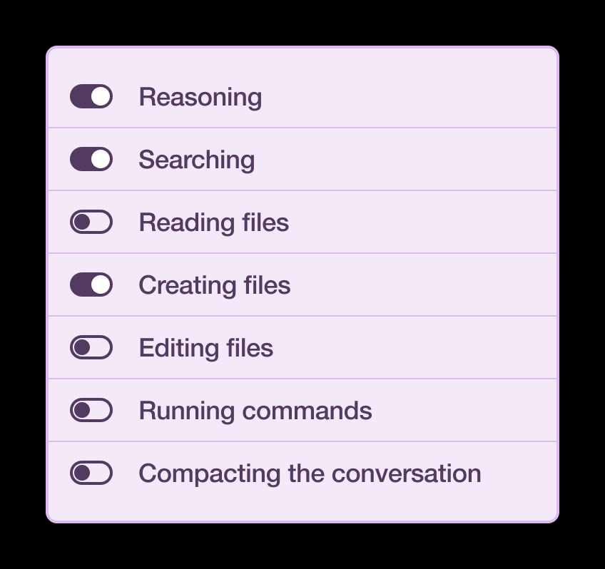
Agentic and coding-oriented LLMs emit interim activity: research and reasoning steps, code search, tool calls. Visually these get a de-emphasized treatment relative to the final response, on the premise that the result matters more than the method. Pushing each one through a live region can bury the reader, especially when several actions fire in quick succession.
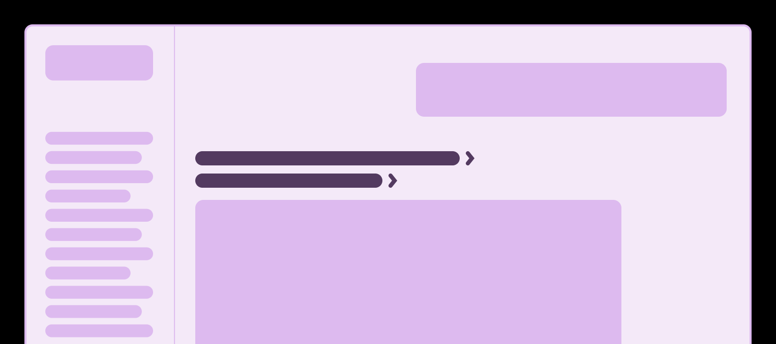
The fix is a preference that switches off announcements for ancillary output while leaving the content in place on screen. It mirrors what a sighted person does when skimming past those items. Because the toggle runs both directions, re-enabling it restores parity of experience for anyone who wants to track each action as it happens. Hiding versus showing these blocks visually is worth exploring too, since unfamiliar technical jargon can be a burden for people with attention or cognitive considerations.
Motion and transition time
Loading spinners, streaming transcriptions, expanding and collapsing panels — these can pull focus away from someone with attention or cognitive considerations and interrupt their flow. A toggle that reduces transition time to zero addresses it.
Defaults matter here. If the device operating system has already requested reduced motion, honor that by starting the toggle in its off state, which you can detect through the prefers-reduced-motion media feature. Still provide a way back, so animation can be re-enabled even when the OS request is present.
App-level audio without device-wide muting
Sound effects can disrupt focus in much the same way. Letting people silence them per app means they needn't mute the whole device — which matters if they depend on white noise or focus music from another application. Where a sound cue was carrying a notification, several alternatives are available:
- Native notifications, which land in a known, centralized place many people already have habits and settings for.
- Badging, the familiar dot over an application icon.
- Email, less immediate but threaded into an existing asynchronous stream.
- In-app banners, intentionally lower priority than email but consistently visible when someone checks in on their own schedule.
Rebindable, removable shortcuts
Any shortcut system should allow editing and disabling, both wholesale and one binding at a time. That lets people resolve collisions with other installed applications and align bindings with their expectations. Assistive technology conflicts are the obvious case, but differing language keyboard layouts belong on the list as well.
Curating what a live region actually says
Live regions announce plain text strings, read start to finish in one pass. Any semantics an HTML element would have contributed are stripped out. So the string itself has to be both clear and worth hearing — and building that logic carries real cost.
Note: Parsing and processing strings — including strings used for live regions — is both a brittle and finicky experience. It is also invisible and unglamorous infrastructure.
The act of creating and maintaining this specialized logic often requires far more time and investment than most organizations are willing to expend. Consider keeping up with refactors, localization, and the maintenance budget this will all require.
Only take on special content announcements if you’re absolutely sure you can stay on top of it.
Two content types earned special handling in the author's implementation: tables and code blocks.
Tables
Cell text read without table, th, tr and td semantics sounds arbitrary, and the row/column relationships are gone. The workaround is a concise announcement stating how many rows and columns there are, plus a general description of what the table shows and any trends it highlights:
Table containing a performance audit, with 4 columns and 36 rows. Audit is broken down by severity.Code
Flatten a code block into a single string and the line breaks vanish, leaving gibberish; multiply that by a large block and nobody wants to hear it spelled out character by character. Announce instead the filename or file type together with the line count:
settings.json, 738 lines.The underlying message still holds the real content, ideally marked up with proper semantics, so it can be revisited and navigated as an actual table or code block. Treat the live region text as a preview that sets expectations — the audio counterpart of skimming a response as it streams and then scrolling back to read it carefully.
Let disabled users judge the result
All of the above grew out of trying approaches and observing which held up. Disabled people should be treated as the experts on their own lived experience rather than second-guessed against other sources. Inclusive user research is how you learn whether an experience is usable in practice, and it is what moves a product past baseline compliance toward something equitable.