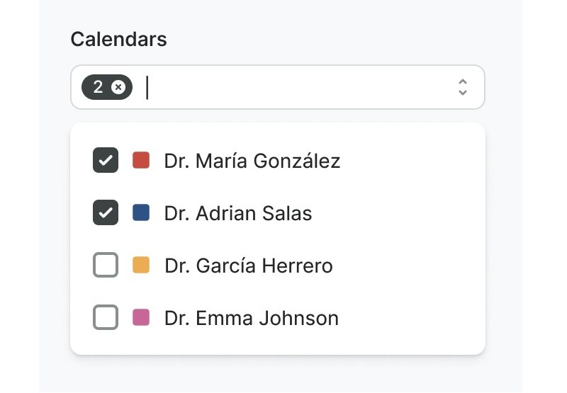
List Controls Are Not Interchangeable
Combobox, multiselect, listbox, and dropdown may look alike at a glance, but each serves a distinct purpose. The deciding factors are usually the number of available options and how much of that list needs to be visible up front.
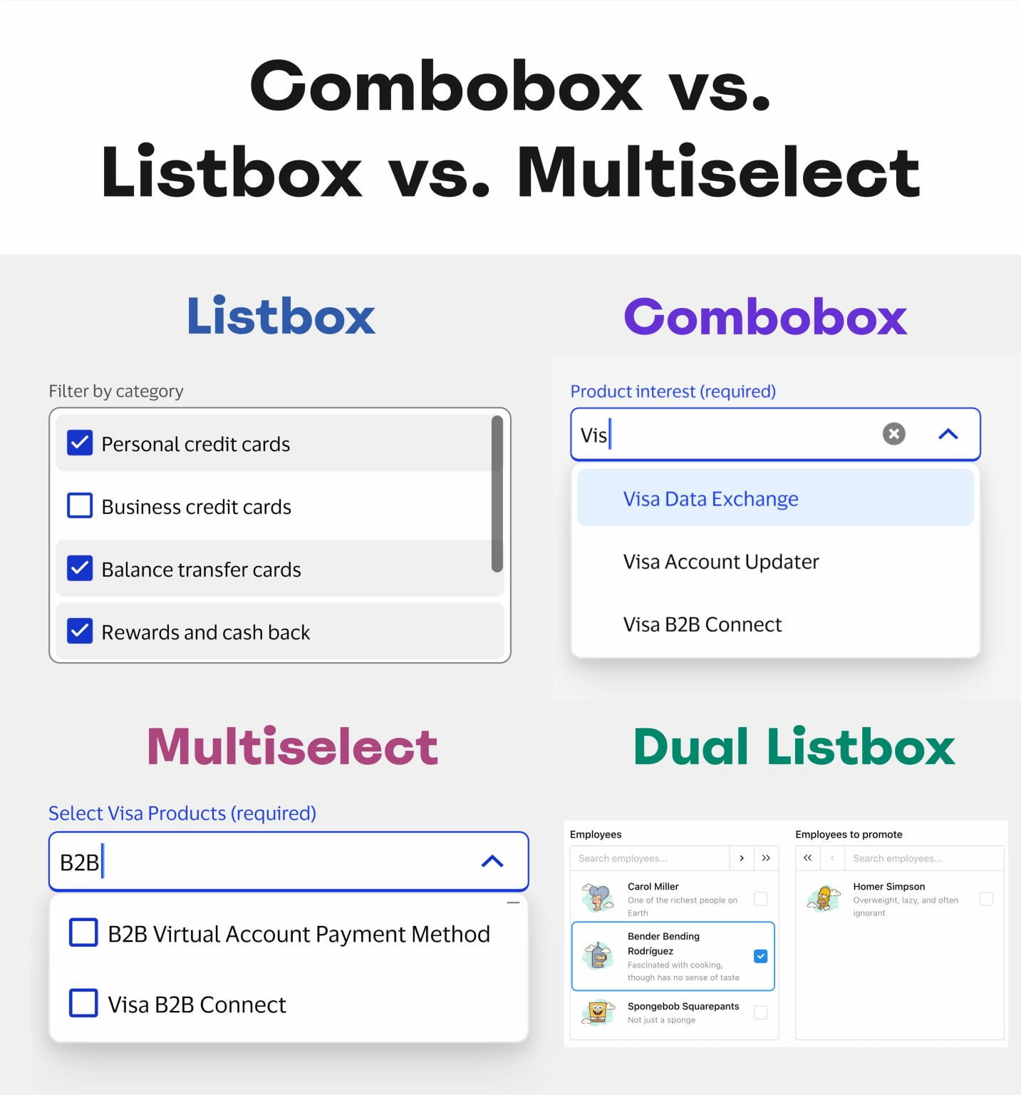
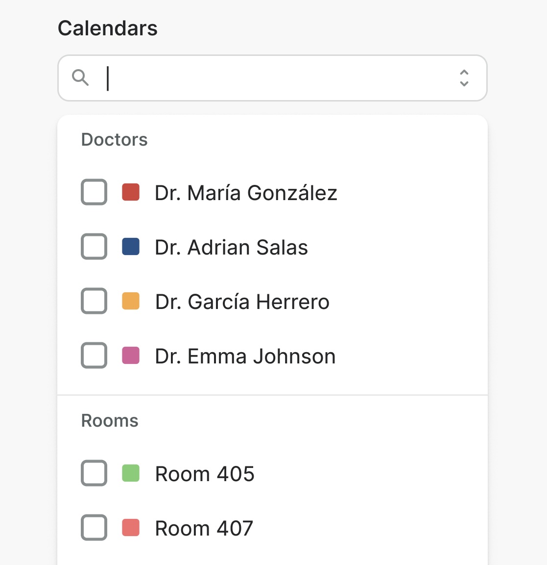
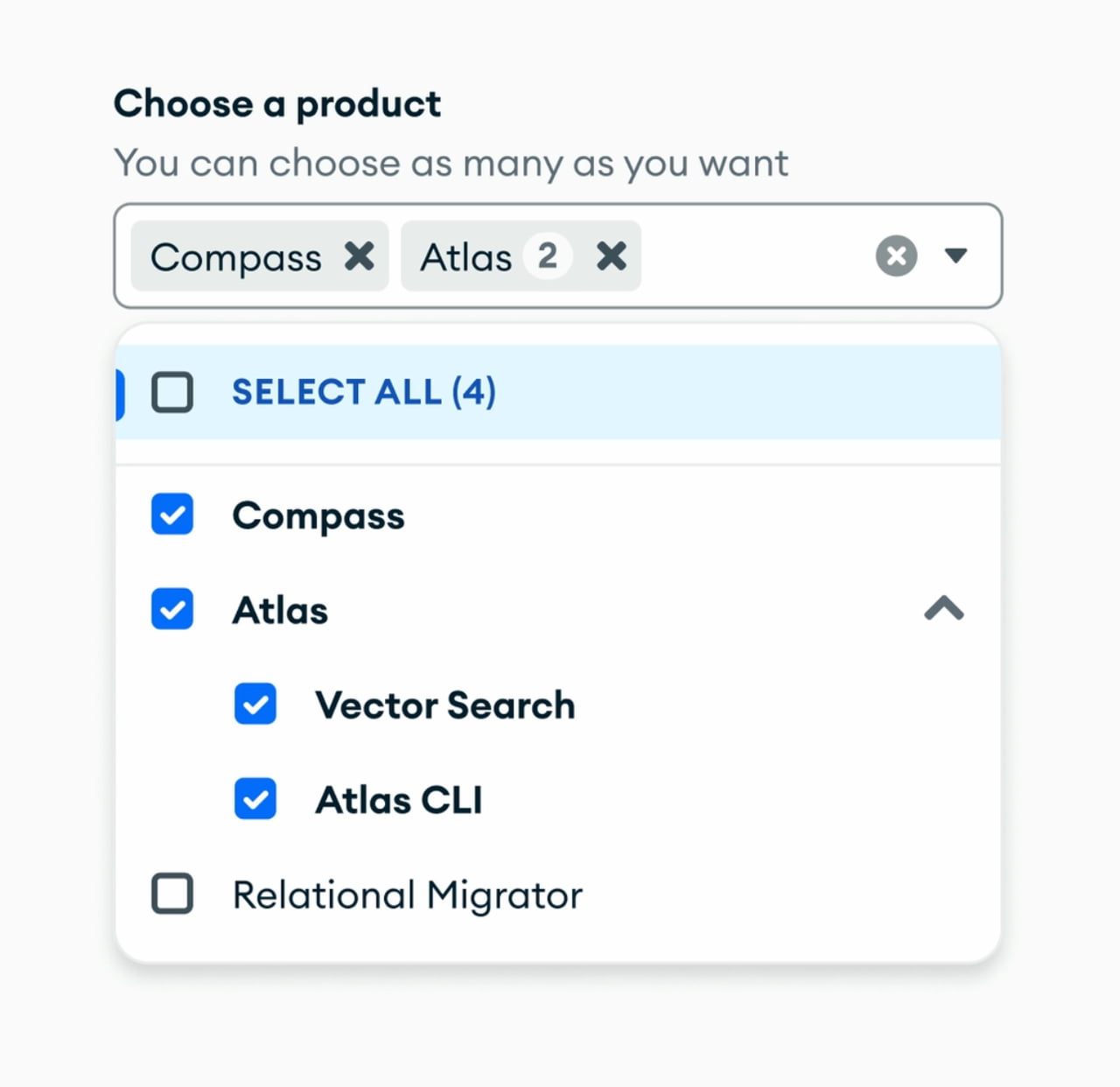
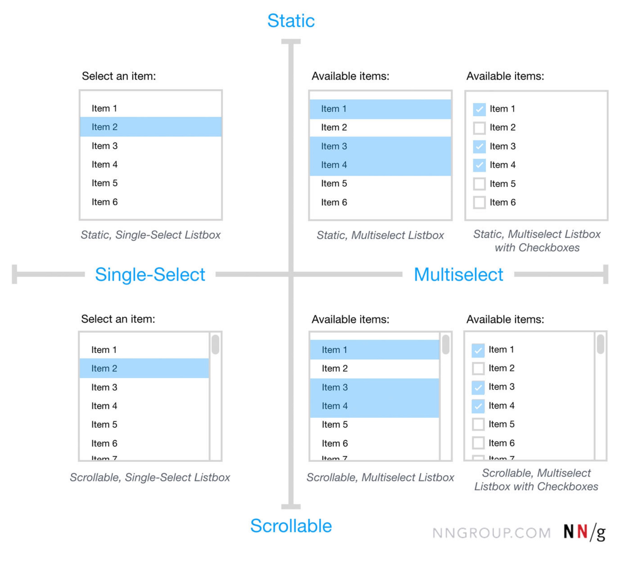
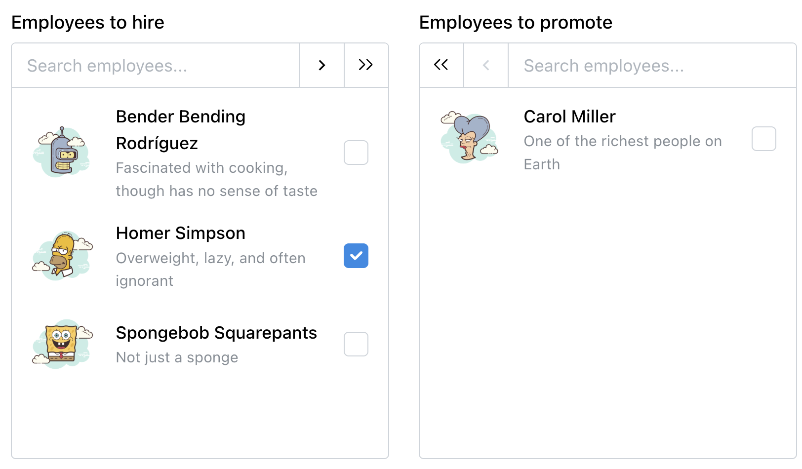
A dropdown keeps its list hidden until triggered. A combobox pairs filtering with single selection: users type to narrow the list, then pick one item. A multiselect works the same way but allows several selections, commonly rendered as pills or chips. A listbox shows all options at once, scrolling when needed, which suits users who want to survey every choice. A dual listbox, sometimes called a transfer list, lets users shuttle items between two side-by-side lists, typically for bulk operations.

Lists can also include nesting, trees, and group selection, but one rule of thumb applies broadly: never hide frequently used options. If a choice is made routinely, hiding it behind an interaction adds friction. Preselect it, or when only two or three options dominate, surface them as chips or buttons and leave the rest behind an interaction. Clutter is a smaller cost than forcing repeated hunting for common selections.
Matching the Widget to the Task
Not every list needs a complex selection mechanism. For lists under five items, plain radio buttons or checkboxes are usually the clearest. Once the list grows to hundreds of entries, such as selecting a country, filtering becomes essential, and combobox or multiselect controls are the right fit.
Listboxes shine when users need to compare many options simultaneously, especially when they will pick several from the same view. They also work well for filters that are used often. The dual listbox deserves more attention than it gets: for complex assignments like setting roles or distributing tasks, it is the only control in this family that shows the full selection list beside the source list before committing. In many cases it is faster, more precise, and more accessible than drag-and-drop.
Accessibility and Interaction Details
All list controls need keyboard support, particularly arrow-key navigation. Users who type to filter will often keep their hands on the keyboard to make the final selection.
Additional considerations:
- For lists with seven or more options, add “Select All” and “Clear All” controls.
- When using a combobox with a long list, reveal the full set on click or tap; otherwise, options may never be discovered.
- Keep presentation honest: static labels should not look like buttons, and interactive elements should not be styled as passive text.
Naming Matters in the Design Process
Calling everything a “dropdown” muddles intent. Dropdown implies a hidden list, multiselect implies checkable multiple choices, combobox implies a text input, and listbox is simply a permanently visible set of selectable items. Using precise terminology helps designers, engineers, and users align on behavior and expectations before implementation begins.