

Anatomy Of A Document
Before getting into implementation, it helps to understand the data structures at play. A rich-text document is a tree of nodes, each representing content like paragraphs, headings, images, or code blocks. Nodes can hold properties relevant to what they render — an image node stores its src, a code block stores its language. Nodes fall into a few rendering categories:
- Block nodes occupy their own line and the full available width, much like HTML block-level elements. Top-level nodes in a document are always block nodes, and they can nest other block or inline nodes.
- Inline nodes render on the same line as preceding content, like links or inline images. SlateJS treats these as first-class nodes, whereas other libraries like DraftJS use entities for the same purpose.
- Void nodes are a SlateJS-specific third category, used for content like media that has no editable children. We'll rely on these later for rendering images.
Attributes ride alongside nodes to describe non-content properties. Character styles — bold, italic, underline — are attached as attributes on text nodes. The same pattern can express paragraph styles like h1 through h6 if you prefer not to model headings as distinct node types. The JSON below shows how SlateJS represents a document at this granular level, with each style change spawning its own text node annotated with the relevant attribute.
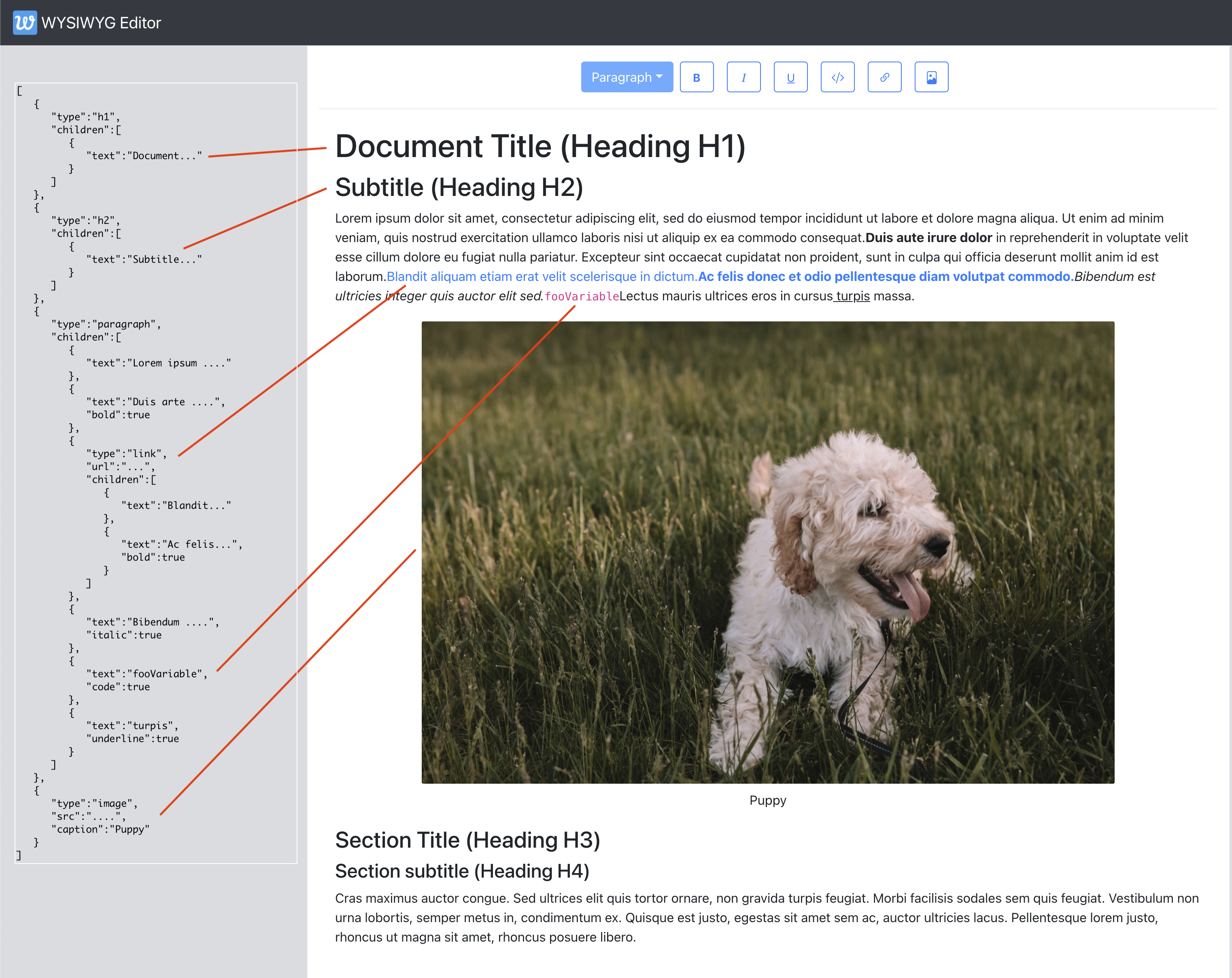
A few structural conventions are worth noting:
- Text nodes look like
{text: 'text content'}. - Node properties, such as
urlon a link orcaptionon an image, live directly on the node object. - Character style changes break text into separate nodes. Styled text like Duis aute irure dolor becomes its own node with
bold: true, and the same applies to italic, underlined, or code-styled runs.
Locations And User Selection
To edit content effectively, the editor needs coordinates that point to specific positions in the document tree. These location objects also let the UI respond to user selections in real time — knowing whether the cursor sits inside a link can trigger a contextual edit menu, or detecting an image selection can surface resize controls. SlateJS defines three levels of locational granularity:
- Path: An array of numbers locating a node in the tree, like
[2,3]for the third child of the second top-level node. - Point: A path plus an offset, such as
{path: [2,3], offset: 14}, identifying the 14th character of that child node. - Range: A pair of points —
anchorandfocus— mirroring the browser's Selection API. The anchor is where selection started, focus where it ended. A collapsed range, where both points coincide, behaves like a blinking text cursor.
Consider a user selecting the word ipsum in the sample document:
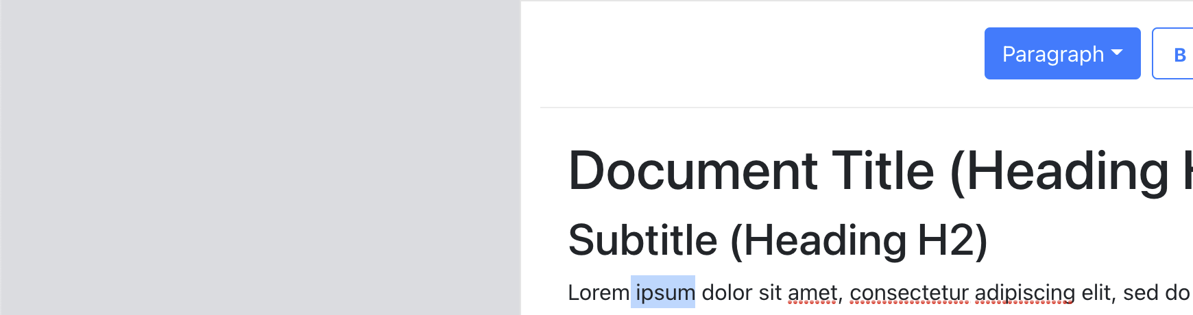
ipsum. (Large preview)That selection is encoded as a range with an anchor and focus point:
{
  anchor: {path: [2,0], offset: 5}, /*0th text node inside the paragraph node which itself is index 2 in the document*/
  focus: {path: [2,0], offset: 11}, // space + 'ipsum'
}`
Standing Up The Editor Shell
We'll build on a create-react-app foundation, layering in SlateJS and Bootstrap components for the UI. Starting inside a new wysiwyg-editor directory:
npx create-react-app .
yarn start
Next, install the Slate dependencies:
yarn add slate slate-react
The slate package is the core, while slate-react supplies the React bindings and rendering machinery. Additional optional packages cover specific functionality like history or lists.
A utils folder will hold shared modules. Our first utility, ExampleDocument.js, exports an initial document with a simple paragraph:
const ExampleDocument = [
  {
    type: "paragraph",
    children: [
      { text: "Hello World! This is my paragraph inside a sample document." },
    ],
  },
];

export default ExampleDocument;
In the components folder, we create Editor.js as a minimal placeholder. Then App.js wires things up: it stores the document in state initialized to the example above, renders the editor, and passes both the document and an onChange handler down so edits flow back into state. React Bootstrap's nav components provide a top navigation bar.
import Editor from './components/Editor';

function App() {
  const [document, updateDocument] = useState(ExampleDocument);

  return (
    <>
      <Navbar bg="dark" variant="dark">
        <Navbar.Brand href="#">
          <img
            alt=""
            src="https://www.smashingmagazine.com/app-icon.png"
            width="30"
            height="30"
            className="d-inline-block align-top"
          />{" "}
          WYSIWYG Editor
        </Navbar.Brand>
      </Navbar>
      <div className="App">
        <Editor document={document} onChange={updateDocument} />
      </div>
    </>
  );
Inside Editor.js, the Slate editor instance is created via createEditor and memoized with useMemo to keep the object stable across re-renders. We also wrap it with withReact, a plugin that grafts DOM and React behavior onto the editor object. Plugins in SlateJS are plain functions that receive the editor and attach configuration — a composable way to extend the core.
// dependencies imported as below.
import { withReact } from "slate-react";
import { createEditor } from "slate";

const editor = useMemo(() => withReact(createEditor()), []);
Two components finish the setup: <Slate /> exposes React contexts used throughout the app, and <Editable /> renders the document for user interaction. The full module structure:
import { Editable, Slate, withReact } from "slate-react";

import { createEditor } from "slate";
import { useMemo } from "react";

export default function Editor({ document, onChange }) {
  const editor = useMemo(() => withReact(createEditor()), []);
  return (
    <Slate editor={editor} value={document} onChange={onChange}>
      <Editable />
    </Slate>
  );
}
At this point the editor is live — users can type and modify the document content, and changes persist to state in real time. Next, we'll teach the editor how to render character styles and paragraph nodes properly.
Beyond Default Rendering
SlateJS ships with built-in rendering for every node type, but a practical editor needs to control how different nodes appear. The library exposes two function props for this: renderElement and renderLeaf. The former handles block-level nodes like headings and paragraphs; the latter handles the lowest-level text nodes, where character-level styles like bold or italics live.
Customizing Block-Level Nodes
When Slate traverses the document tree, it calls renderElement for every node. The function receives three arguments:
attributes: Slate-specific props that must be spread onto the top-level DOM element your function returns.element: The node object itself as it exists in your document structure.children: The children of this node as defined in your document tree.
All rendering logic is consolidated in a dedicated hook, useEditorConfig, which will also hold future editor-wide settings. The hook provides the custom renderElement implementation, and Editor.js applies it to the editor instance:
import { DefaultElement } from "slate-react";

export default function useEditorConfig(editor) {
  return { renderElement };
}

function renderElement(props) {
  const { element, children, attributes } = props;
  switch (element.type) {
    case "paragraph":
      return <p {...attributes}>{children}</p>;
    case "h1":
      return <h1 {...attributes}>{children}</h1>;
    case "h2":
      return <h2 {...attributes}>{children}</h2>;
    case "h3":
      return <h3 {...attributes}>{children}</h3>;
    case "h4":
      return <h4 {...attributes}>{children}</h4>;
    default:
      // For the default case, we delegate to Slate's default rendering.
      return <DefaultElement {...props} />;
  }
}
Because the callback gives you the actual element, you're not limited to simple type checks. Your rendering can branch on any property of the node. For example, an image node might carry an isInline flag; checking that property lets you return different DOM structures for inline images versus block images, without introducing a separate node type.
The Editor component wires in the hook as shown below:
const { renderElement } = useEditorConfig(editor);

return (
    ...
    <Editable renderElement={renderElement} />
);
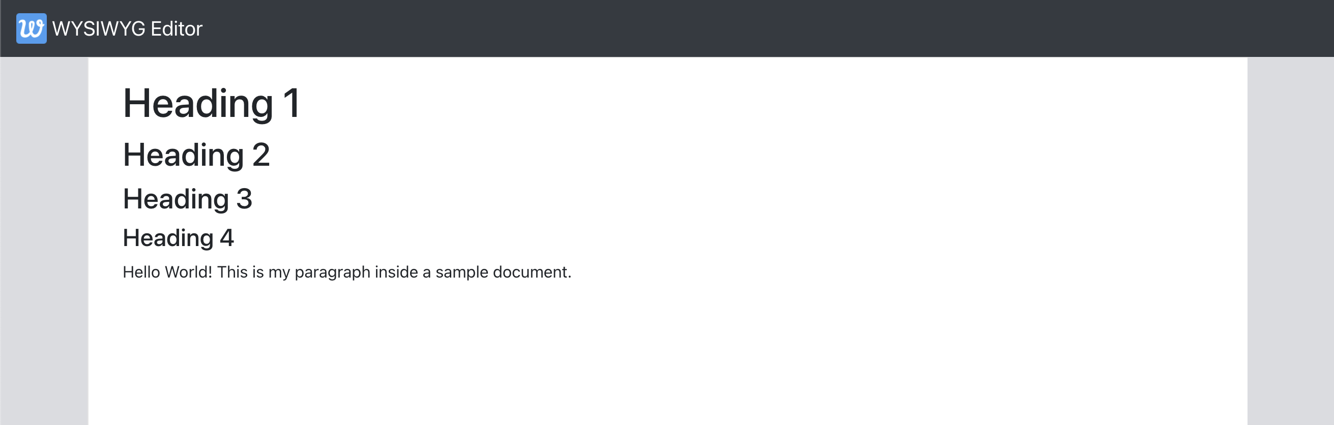
To verify the setup, ExampleDocument is extended with the new heading nodes. The editor should render these according to your rules rather than Slate's defaults:
const ExampleDocument = [
  {
    type: "h1",
    children: [{ text: "Heading 1" }],
  },
  {
    type: "h2",
    children: [{ text: "Heading 2" }],
  },
 // ...more heading nodes
Character-Level Styles
Text nodes are the leaves of the document tree, and Slate offers a parallel renderLeaf prop to customize how they render. Following the same pattern used for renderElement, an implementation for renderLeaf looks like this:
export default function useEditorConfig(editor) {
  return { renderElement, renderLeaf };
}

// ...
function renderLeaf({ attributes, children, leaf }) {
  let el = <>{children}</>;

  if (leaf.bold) {
    el = <strong>{el}</strong>;
  }

  if (leaf.code) {
    el = <code>{el}</code>;
  }

  if (leaf.italic) {
    el = <em>{el}</em>;
  }

  if (leaf.underline) {
    el = <u>{el}</u>;
  }

  return <span {...attributes}>{el}</span>;
}
The key point here is that this approach preserves proper HTML semantics for character styles—bold text renders with <strong>, not a <span> with a bold class. Moreover, renderLeaf hands you the leaf object, so you can react to any custom property. If your editor lets users pick a highlightColor for text, for instance, you'd check that flag on the leaf and attach the appropriate styles in the returned element.
With the leaf rendering in place, the Editor is updated to consume it, and ExampleDocument is filled with text nodes carrying assorted combinations of these character styles:
# src/components/Editor.js

const { renderElement, renderLeaf } = useEditorConfig(editor);

return (
    ...
    <Editable renderElement={renderElement} renderLeaf={renderLeaf} />
);
# src/utils/ExampleDocument.js

{
    type: "paragraph",
    children: [
      { text: "Hello World! This is my paragraph inside a sample document." },
      { text: "Bold text.", bold: true, code: true },
      { text: "Italic text.", italic: true },
      { text: "Bold and underlined text.", bold: true, underline: true },
      { text: "variableFoo", code: true },
    ],
  },
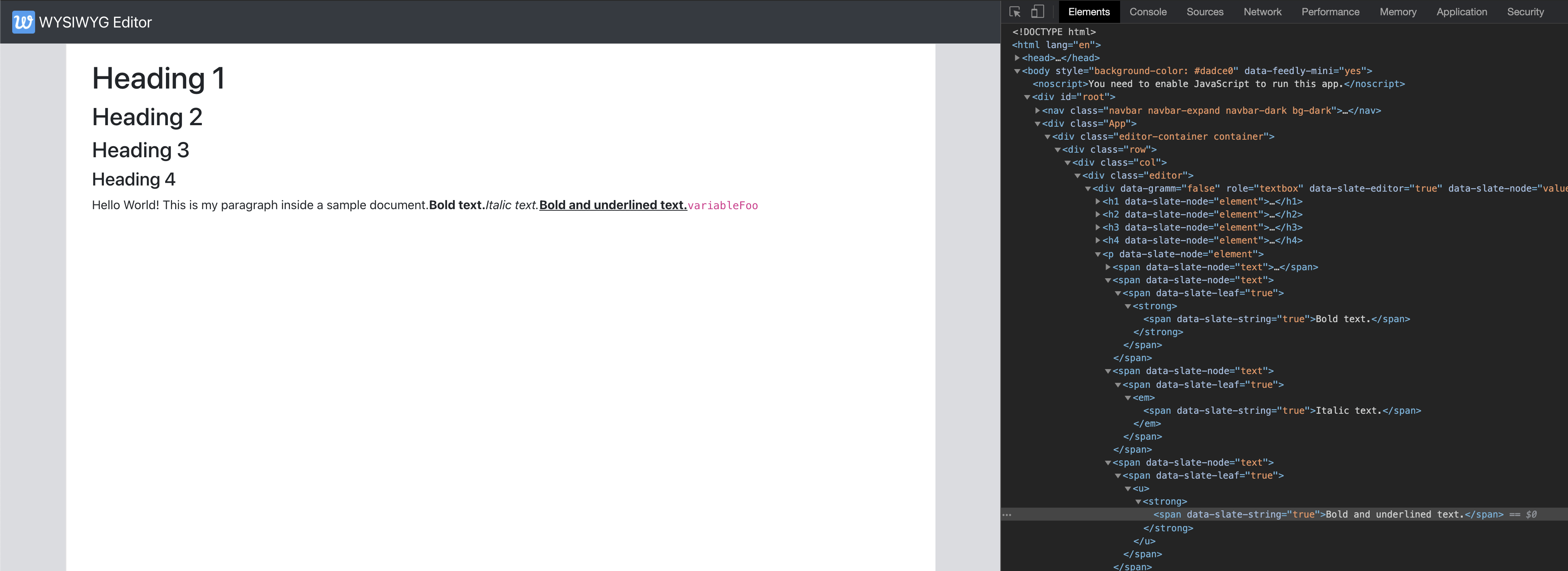
Once these blocks are in place, the paragraph content renders with the correct semantic tags matching the marks applied to each text node.
Wiring Up The Toolbar
The toolbar needs to react to the editor’s selection state and let users apply formatting without losing their place in the document. Before we dive into the implementation details, it’s worth clarifying the core interactions we need to get right. When the cursor sits in a spot with no selection, clicking a character style button should set the style for subsequent typing. When the user has highlighted a range of text, clicking that same button should toggle the style on just those marks. And when text is selected, the paragraph style dropdown must accurately reflect whether the selection shares one consistent block type or spans multiple types.
Tracking Selection Changes
The crucial challenge here is that SlateJS does not expose a dedicated onSelectionChange event. But since the editor fires its onChange callback even when only the selection has shifted, we can capture that signal and persist the current selection in the Editor component’s state. To handle this efficiently, we abstract the logic into a dedicated useSelection hook, which we then use inside the Editor and pass the resulting selection down to the Toolbar component.
Passing the selection as a prop forces the toolbar to re-render on every selection move. Without this pattern, we would be dependent on document content changes to trigger updates — but a user might simply click around the document without typing anything, and we still need the toolbar to reflect the active formatting at the cursor.
For larger editor codebases, storing selection in a state management library with memoized selectors is usually worth the effort. Components that consume selection data can easily render too frequently as users navigate. A selector like isImageSelected computed from the selection state lets a resize menu re-render only when that specific value flips — a pattern supported well by libraries like Redux’s Reselect.
Styling Characters
To determine which character styles are active, we next add a module EditorUtils. This module holds functions that operate on the Slate instance. The getActiveStyles function returns a Set of the active styles; the toggleStyle function toggles a mark on the editor.
# src/utils/EditorUtils.js

import { Editor } from "slate";

export function getActiveStyles(editor) {
  return new Set(Object.keys(Editor.marks(editor) ?? {}));
}

export function toggleStyle(editor, style) {
  const activeStyles = getActiveStyles(editor);
  if (activeStyles.has(style)) {
    Editor.removeMark(editor, style);
  } else {
    Editor.addMark(editor, style, true);
  }
}
Both functions receive the Slate editor object, matching the pattern we will use for other utilities later. For now, a quick note on terminology: Slate refers to character formatting as marks, and we work with them via the Editor interface. We import these helpers into the Toolbar and attach them alongside the buttons.
# src/components/Toolbar.js

import { getActiveStyles, toggleStyle } from "../utils/EditorUtils";
import { useEditor } from "slate-react";

export default function Toolbar({ selection }) {
  const editor = useEditor();

return <div
...
    {CHARACTER_STYLES.map((style) => (
        <ToolBarButton
          key={style}
          characterStyle={style}
          icon={<i className={`bi ${getIconForButton(style)}`} />}
          isActive={getActiveStyles(editor).has(style)}
          onMouseDown={(event) => {
            event.preventDefault();
            toggleStyle(editor, style);
          }}
        />
      ))}
</div>
You may notice we trigger these actions through onMouseDown rather than onClick. There is a known Slate behavior where the selection is reset to null whenever the editor loses focus. If we used regular click handlers, the mere act of mousing down on a button would clear the cursor position and characters would be formatted in the wrong place. Using onMouseDown avoids the blur-related selection reset. (An alternative is tracking the last valid selection ourselves, and we will indeed do that later for a different purpose.)
For keyboard accessibility, Slate lets us configure event handlers on the editor itself. We build a KeyBindings object inside useEditorConfig returning an onKeyDown handler. We then leverage the is-hotkey helper to detect key combinations and route them to the appropriate style toggling.
# src/hooks/useEditorConfig.js

export default function useEditorConfig(editor) {
  const onKeyDown = useCallback(
    (event) => KeyBindings.onKeyDown(editor, event),
    [editor]
  );
  return { renderElement, renderLeaf, onKeyDown };
}

const KeyBindings = {
  onKeyDown: (editor, event) => {
    if (isHotkey("mod+b", event)) {
      toggleStyle(editor, "bold");
      return;
    }
    if (isHotkey("mod+i", event)) {
      toggleStyle(editor, "italic");
      return;
    }
    if (isHotkey("mod+c", event)) {
      toggleStyle(editor, "code");
      return;
    }
    if (isHotkey("mod+u", event)) {
      toggleStyle(editor, "underline");
      return;
    }
  },
};

# src/components/Editor.js
...
 <Editable
   renderElement={renderElement}
   renderLeaf={renderLeaf}
   onKeyDown={onKeyDown}
 />
Handling Paragraph Styles
Character-level marks are straightforward — block-level paragraph styles require locating the right nodes. We want the dropdown to reflect the format of the topmost blocks under the selection. If every block in the selected range shares one type, that type gets shown; if the selection contains a mix of block types, the dropdown should read “Multiple.”
To gather those blocks, we rely on Slate’s Editor.nodes — a helper that traverses the tree starting at a path, point, or range. Its filter options block deserves a bit of explanation:
at
This is the Path, Point, or Range that determines where traversal begins. Its default iseditor.selection. For our block-style detection, the default serves us correctly.match
A predicate evaluated per node; nodes that pass the check get included. Since we care only about paragraphs and headings, we filter explicitly on element blocks.mode
Chooses betweenall,highest, or lowest-level nodes at that location. Settinghighestsaves us from personally climbing the ancestor chain.universal
Determines whether we expect every node to match multiple times in the hierarchy.reverse
Flips the traversal direction relative to the location’s start and end.voids
Limits the search to void elements if set.
These options are shared by a large family of Slate helper functions, and getting comfortable with them pays off as editors grow more complex. An implementation of getTextBlockStyle built on these concepts looks as follows:
# src/utils/EditorUtils.js

export function getTextBlockStyle(editor) {
  const selection = editor.selection;
  if (selection == null) {
    return null;
  }

  const topLevelBlockNodesInSelection = Editor.nodes(editor, {
    at: editor.selection,
    mode: "highest",
    match: (n) => Editor.isBlock(editor, n),
  });

  let blockType = null;
  let nodeEntry = topLevelBlockNodesInSelection.next();
  while (!nodeEntry.done) {
    const [node, _] = nodeEntry.value;
    if (blockType == null) {
      blockType = node.type;
    } else if (blockType !== node.type) {
      return "multiple";
    }

    nodeEntry = topLevelBlockNodesInSelection.next();
  }

  return blockType;
}
Editor.nodes works fine for modestly sized documents, but it may pass over more nodes than it needs for what we’re doing. Given a selection spanning, say, two headings and a paragraph — each wrapping around ten text-level nodes — the current implementation’s all-level traversal can iterate through roughly 25 node entries and apply match checks to each. Since we already know we only need top-level node indexes, a narrower loop would only hit the three actual block entries. The performance gains come into play when an editor has to commit iterative traversals frequently across a document:
export function getTextBlockStyle(editor) {
  const selection = editor.selection;
  if (selection == null) {
    return null;
  }
  // gives the forward-direction points in case the selection was
  // was backwards.
  const [start, end] = Range.edges(selection);

  //path[0] gives us the index of the top-level block.
  let startTopLevelBlockIndex = start.path[0];
  const endTopLevelBlockIndex = end.path[0];

  let blockType = null;
  while (startTopLevelBlockIndex <= endTopLevelBlockIndex) {
    const [node, _] = Editor.node(editor, [startTopLevelBlockIndex]);
    if (blockType == null) {
      blockType = node.type;
    } else if (blockType !== node.type) {
      return "multiple";
    }
    startTopLevelBlockIndex++;
  }

  return blockType;
}
Flipping a paragraph style is much simpler once getTextBlockStyle is in place, because title and body styling overlap at the node level. If the currently active style differs from the dropdown choice, we toggle to the selected one. If they happen to match, we reset the node back to a plain paragraph.
Since a paragraph style lives in the type attribute on the node itself, we just have to update that property. Slate provides Transforms.setNodes for mutating properties on existing nodes:
# src/utils/EditorUtils.js

export function toggleBlockType(editor, blockType) {
  const currentBlockType = getTextBlockStyle(editor);
  const changeTo = currentBlockType === blockType ? "paragraph" : blockType;
  Transforms.setNodes(
    editor,
    { type: changeTo },
     // Node filtering options supported here too. We use the same
     // we used with Editor.nodes above.
    { at: editor.selection, match: (n) => Editor.isBlock(editor, n) }
  );
}
With utilities on both sides ready, the remaining step is wiring the toolbar’s paragraph dropdown to this logic:
#src/components/Toolbar.js

const onBlockTypeChange = useCallback(
    (targetType) => {
      if (targetType === "multiple") {
        return;
      }
      toggleBlockType(editor, targetType);
    },
    [editor]
  );

  const blockType = getTextBlockStyle(editor);

return (
    <div className="toolbar">
      <DropdownButton
        .....
        disabled={blockType == null}
        title={getLabelForBlockStyle(blockType ?? "paragraph")}
        onSelect={onBlockTypeChange}
      >
        {PARAGRAPH_STYLES.map((blockType) => (
          <Dropdown.Item eventKey={blockType} key={blockType}>
            {getLabelForBlockStyle(blockType)}
          </Dropdown.Item>
        ))}
      </DropdownButton>
....
);
Handling Links as Inline Nodes
Links in the editor are implemented as inline SlateJS nodes. The editor configuration marks links as inline nodes and provides a rendering component so Slate knows how to display them.
# src/hooks/useEditorConfig.js
export default function useEditorConfig(editor) {
  ...
  editor.isInline = (element) => ["link"].includes(element.type);
  return {....}
}

function renderElement(props) {
  const { element, children, attributes } = props;
  switch (element.type) {
     ...
    case "link":
      return <Link {...props} url={element.url} />;
      ...
  }
}
# src/components/Link.js
export default function Link({ element, attributes, children }) {
  return (
    <a href={element.url} {...attributes} className={"link"}>
      {children}
    </a>
  );
}
A link node is added to the ExampleDocument to verify rendering, including a case with character styles applied inside the link.
# src/utils/ExampleDocument.js
{
    type: "paragraph",
    children: [
      ...
      { text: "Some text before a link." },
      {
        type: "link",
        url: "https://www.google.com",
        children: [
          { text: "Link text" },
          { text: "Bold text inside link", bold: true },
        ],
      },
     ...
}
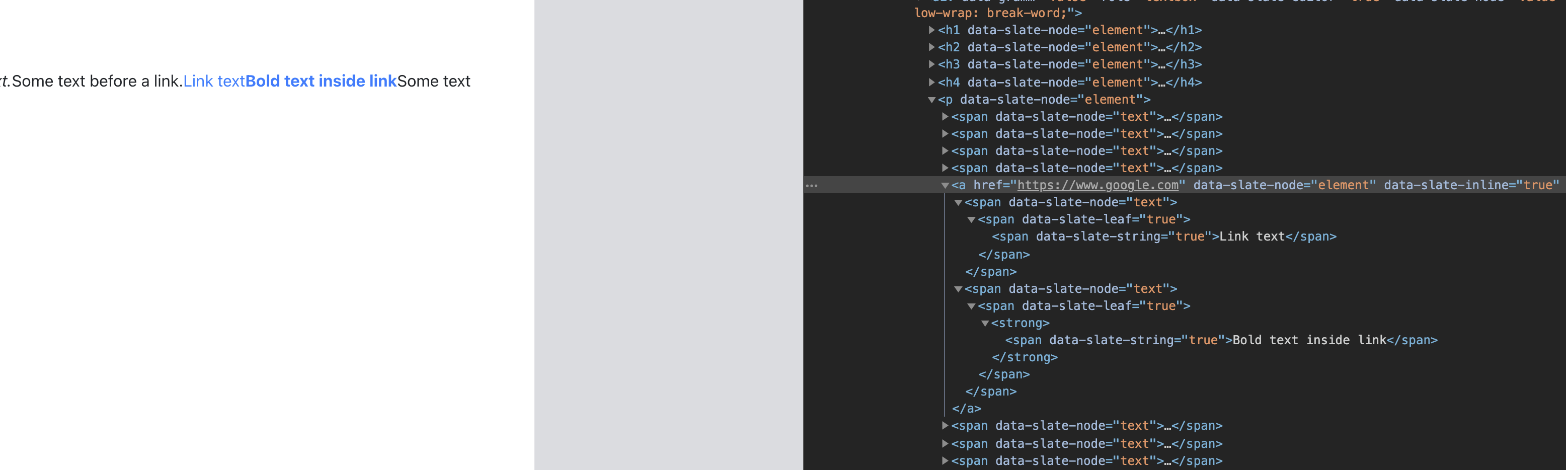
Toolbar Link Toggle
A toolbar button gives users three ways to interact with links:
- Selecting text and clicking converts the selection into a link.
- Clicking with a collapsed cursor inserts a new link at that point.
- Clicking while the selection is inside a link removes the link, reverting it to plain text.
To support these behaviors, the toolbar must detect whether the current selection is inside a link node. A utility function traverses upward from the selection using Slate’s Editor.above helper.
# src/utils/EditorUtils.js

export function isLinkNodeAtSelection(editor, selection) {
  if (selection == null) {
    return false;
  }

  return (
    Editor.above(editor, {
      at: selection,
      match: (n) => n.type === "link",
    }) != null
  );
}
The toolbar button is wired to reflect an active state when the selection is inside a link.
# src/components/Toolbar.js

return (
    <div className="toolbar">
      ...
      {/* Link Button */}
      <ToolBarButton
        isActive={isLinkNodeAtSelection(editor, editor.selection)}
        label={<i className={`bi ${getIconForButton("link")}`} />}
      />
    </div>
  );
The core logic sits in toggleLinkAtSelection. With an expanded selection, wrapping the selected text in a link node requires splitting the containing text node. Slate’s Transforms.wrapNodes handles this by wrapping nodes at a given location in a new container. The reverse operation, Transforms.unwrapNodes, removes links and merges the text back into neighboring nodes.

# src/utils/EditorUtils.js

export function toggleLinkAtSelection(editor) {
  if (!isLinkNodeAtSelection(editor, editor.selection)) {
    const isSelectionCollapsed =
      Range.isCollapsed(editor.selection);
    if (isSelectionCollapsed) {
      Transforms.insertNodes(
        editor,
        {
          type: "link",
          url: '#',
          children: [{ text: 'link' }],
        },
        { at: editor.selection }
      );
    } else {
      Transforms.wrapNodes(
        editor,
        { type: "link", url: '#', children: [{ text: '' }] },
        { split: true, at: editor.selection }
      );
    }
  } else {
    Transforms.unwrapNodes(editor, {
      match: (n) => Element.isElement(n) && n.type === "link",
    });
  }
}
For a collapsed selection, Transforms.insertNodes inserts a new link node at the cursor position.
# src/components/Toolbar.js
      <ToolBarButton
        ...
        isActive={isLinkNodeAtSelection(editor, editor.selection)}
        onMouseDown={() => toggleLinkAtSelection(editor)}
      />
Contextual Link Editing
Adding and removing links covers part of the workflow, but editing URLs still requires support. A popover appears whenever the selection is inside a link, letting the user modify and apply the URL directly. The LinkEditor component renders conditionally based on the selection state.
# src/components/LinkEditor.js
export default function LinkEditor() {
  return (
    <Card className={"link-editor"}>
      <Card.Body></Card.Body>
    </Card>
  );
}
# src/components/Editor.js

<div className="editor">
    {isLinkNodeAtSelection(editor, selection) ? <LinkEditor /> : null}
    <Editable
       renderElement={renderElement}
       renderLeaf={renderLeaf}
       onKeyDown={onKeyDown}
    />
</div>
Positioning the popover requires mapping the link node to its DOM element. Slate’s React API provides ReactEditor.toDOMNode to find the element. The component then uses getBoundingClientRect() on the link’s DOM element and the editor container to compute the popover’s top and left coordinates.
# src/components/Editor.js

const editorRef = useRef(null)
<div className="editor" ref={editorRef}>
              {isLinkNodeAtSelection(editor, selection) ? (
                <LinkEditor
                  editorOffsets={
                    editorRef.current != null
                      ? {
                          x: editorRef.current.getBoundingClientRect().x,
                          y: editorRef.current.getBoundingClientRect().y,
                        }
                      : null
                  }
                />
              ) : null}
              <Editable
                renderElement={renderElement}
                ...
# src/components/LinkEditor.js

import { ReactEditor } from "slate-react";

export default function LinkEditor({ editorOffsets }) {
  const linkEditorRef = useRef(null);

  const [linkNode, path] = Editor.above(editor, {
    match: (n) => n.type === "link",
  });

  useEffect(() => {
    const linkEditorEl = linkEditorRef.current;
    if (linkEditorEl == null) {
      return;
    }

    const linkDOMNode = ReactEditor.toDOMNode(editor, linkNode);
    const {
      x: nodeX,
      height: nodeHeight,
      y: nodeY,
    } = linkDOMNode.getBoundingClientRect();

    linkEditorEl.style.display = "block";
    linkEditorEl.style.top = `${nodeY + nodeHeight — editorOffsets.y}px`;
    linkEditorEl.style.left = `${nodeX — editorOffsets.x}px`;
  }, [editor, editorOffsets.x, editorOffsets.y, node]);

  if (editorOffsets == null) {
    return null;
  }

  return <Card ref={linkEditorRef} className={"link-editor"}></Card>;
}
The link editor includes an input field and apply button, using the isUrl package for validation. When a new link is inserted without a URL, the popover opens immediately so the user can type one in.
# src/components/LinkEditor.js

import isUrl from "is-url";

export default function LinkEditor({ editorOffsets }) {

const [linkURL, setLinkURL] = useState(linkNode.url);

  // update state if `linkNode` changes
  useEffect(() => {
    setLinkURL(linkNode.url);
  }, [linkNode]);

  const onLinkURLChange = useCallback(
    (event) => setLinkURL(event.target.value),
    [setLinkURL]
  );

  const onApply = useCallback(
    (event) => {
      Transforms.setNodes(editor, { url: linkURL }, { at: path });
    },
    [editor, linkURL, path]
  );

return (
 ...
        <Form.Control
          size="sm"
          type="text"
          value={linkURL}
          onChange={onLinkURLChange}
        />
        <Button
          className={"link-editor-btn"}
          size="sm"
          variant="primary"
          disabled={!isUrl(linkURL)}
          onClick={onApply}
        >
          Apply
        </Button>
   ...
 );
Keeping Focus in the Link Editor
A usability issue arises when the user clicks into the link editor input: because the popover renders outside the Editable component, SlateJS treats the editor as blurred, resetting selection to null and hiding the popover. This behavior is documented in a GitHub issue.
To work around it, the editor tracks the previous selection. When focus is lost, the component checks if the prior selection contained a link and, if so, keeps the popover visible. The useSelection hook is updated to remember the previous selection and return it to the editor.
# src/hooks/useSelection.js
export default function useSelection(editor) {
  const [selection, setSelection] = useState(editor.selection);
  const previousSelection = useRef(null);
  const setSelectionOptimized = useCallback(
    (newSelection) => {
      if (areEqual(selection, newSelection)) {
        return;
      }
      previousSelection.current = selection;
      setSelection(newSelection);
    },
    [setSelection, selection]
  );

  return [previousSelection.current, selection, setSelectionOptimized];
}
The editor’s logic then uses this saved selection to decide whether to show the link menu.
# src/components/Editor.js

  const [previousSelection, selection, setSelection] = useSelection(editor);

  let selectionForLink = null;
  if (isLinkNodeAtSelection(editor, selection)) {
    selectionForLink = selection;
  } else if (selection == null && isLinkNodeAtSelection(editor, previousSelection)) {
    selectionForLink = previousSelection;
  }

  return (
    ...
            <div className="editor" ref={editorRef}>
              {selectionForLink != null ? (
                <LinkEditor
                  selectionForLink={selectionForLink}
                  editorOffsets={..}
  ...
);
The LinkEditor component uses the selection reference to locate the link node and position itself beneath it.
# src/components/Link.js
export default function LinkEditor({ editorOffsets, selectionForLink }) {
  ...
  const [node, path] = Editor.above(editor, {
    at: selectionForLink,
    match: (n) => n.type === "link",
  });
  ...
Automatic Link Detection
Word processors commonly convert URLs typed as plain text into link objects automatically. The editor follows a three-step process to reproduce this behavior:
- As the document changes, check the last inserted character. If it is a space, the word before it is a candidate.
- Mark the space as the end boundary, then move backwards character by character to find the word’s start, without crossing into the previous text node.
- Validate the extracted word as a URL and convert it into a link node.
The logic is implemented in identifyLinksInTextIfAny, a utility in EditorUtils called from the editor’s onChange handler.
# src/components/Editor.js

  const onChangeHandler = useCallback(
    (document) => {
      ...
      identifyLinksInTextIfAny(editor);
    },
    [editor, onChange, setSelection]
  );
export function identifyLinksInTextIfAny(editor) {
  // if selection is not collapsed, we do not proceed with the link
  // detection
  if (editor.selection == null || !Range.isCollapsed(editor.selection)) {
    return;
  }

  const [node, _] = Editor.parent(editor, editor.selection);

  // if we are already inside a link, exit early.
  if (node.type === "link") {
    return;
  }

  const [currentNode, currentNodePath] = Editor.node(editor, editor.selection);

  // if we are not inside a text node, exit early.
  if (!Text.isText(currentNode)) {
    return;
  }

  let [start] = Range.edges(editor.selection);
  const cursorPoint = start;

  const startPointOfLastCharacter = Editor.before(editor, editor.selection, {
    unit: "character",
  });

  const lastCharacter = Editor.string(
    editor,
    Editor.range(editor, startPointOfLastCharacter, cursorPoint)
  );

  if(lastCharacter !== ' ') {
    return;
  }
Two SlateJS helpers simplify the traversal:
Editor.before— returns the point before a location, with aunitparameter to navigate by character or word.Editor.string— returns the text content of a range.

cursorPoint and startPointOfLastCharacter after Step 1 with an example text. (Large preview)For example, if the user types ’ABCDE’ as the first text node of the document, the point values are:
cursorPoint = { path: [0,0], offset: 5}
startPointOfLastCharacter = { path: [0,0], offset: 4}
Starting from the space, the utility moves backward character by character until it finds another space or the start of the text node, locating the boundaries of the last word entered.
...

  if (lastCharacter !== " ") {
    return;
  }

  let end = startPointOfLastCharacter;
  start = Editor.before(editor, end, {
    unit: "character",
  });

  const startOfTextNode = Editor.point(editor, currentNodePath, {
    edge: "start",
  });

  while (
    Editor.string(editor, Editor.range(editor, start, end)) !== " " &&
    !Point.isBefore(start, startOfTextNode)
  ) {
    end = start;
    start = Editor.before(editor, end, { unit: "character" });
  }

  const lastWordRange = Editor.range(editor, end, startPointOfLastCharacter);
  const lastWord = Editor.string(editor, lastWordRange);

Once the word is isolated, the utility checks whether it is a valid URL. If so, it converts the range into a link node, following the same approach used for the toolbar button.
if (isUrl(lastWord)) {
    Promise.resolve().then(() => {
      Transforms.wrapNodes(
        editor,
        { type: "link", url: lastWord, children: [{ text: lastWord }] },
        { split: true, at: lastWordRange }
      );
    });
  }
Because identifyLinksInTextIfAny executes within Slate’s onChange, the document update is deferred using Promise.resolve().then(..) to avoid mutating the document during the change callback. The implementation works correctly whether a link appears at the end, middle, or start of a text node.
Images as Void Nodes
In SlateJS, image nodes are treated as Void nodes, analogous to Void elements in HTML. Because Void node contents are not editable text, we can render images cleanly while still keeping full flexibility over how they appear. SlateJS's editable-voids example shows how far that flexibility goes, including embedding an entire editor inside a Void.
To set up image rendering, we configure the editor to treat images as Void nodes and provide the render implementation. The ExampleDocument is updated with an image to confirm that both the node and its caption display correctly.
# src/hooks/useEditorConfig.js

export default function useEditorConfig(editor) {
  const { isVoid } = editor;
  editor.isVoid = (element) => {
    return ["image"].includes(element.type) || isVoid(element);
  };
  ...
}

function renderElement(props) {
  const { element, children, attributes } = props;
  switch (element.type) {
    case "image":
      return <Image {...props} />;
...
``

``
# src/components/Image.js
function Image({ attributes, children, element }) {
  return (
    <div contentEditable={false} {...attributes}>
      <div
        className={classNames({
          "image-container": true,
        })}
      >
        <img
          src={String(element.url)}
          alt={element.caption}
          className={"image"}
        />
        <div className={"image-caption-read-mode"}>{element.caption}</div>
      </div>
      {children}
    </div>
  );
}
Two constraints matter when rendering Void nodes:
- The root DOM element must have
contentEditable={false}. Without it, interacting with the void can cause SlateJS selection errors when it tries to compute selections inside the element. - Even if a Void node has no children (as our image node does), we must still render
childrenand provide an empty text node. That empty text node acts as the selection point for the Void element.
Updating ExampleDocument with an image confirms that the node renders with its caption in the editor.
# src/utils/ExampleDocument.js

const ExampleDocument = [
   ...
   {
    type: "image",
    url: "/photos/puppy.jpg",
    caption: "Puppy",
    // empty text node as child for the Void element.
    children: [{ text: "" }],
  },
];
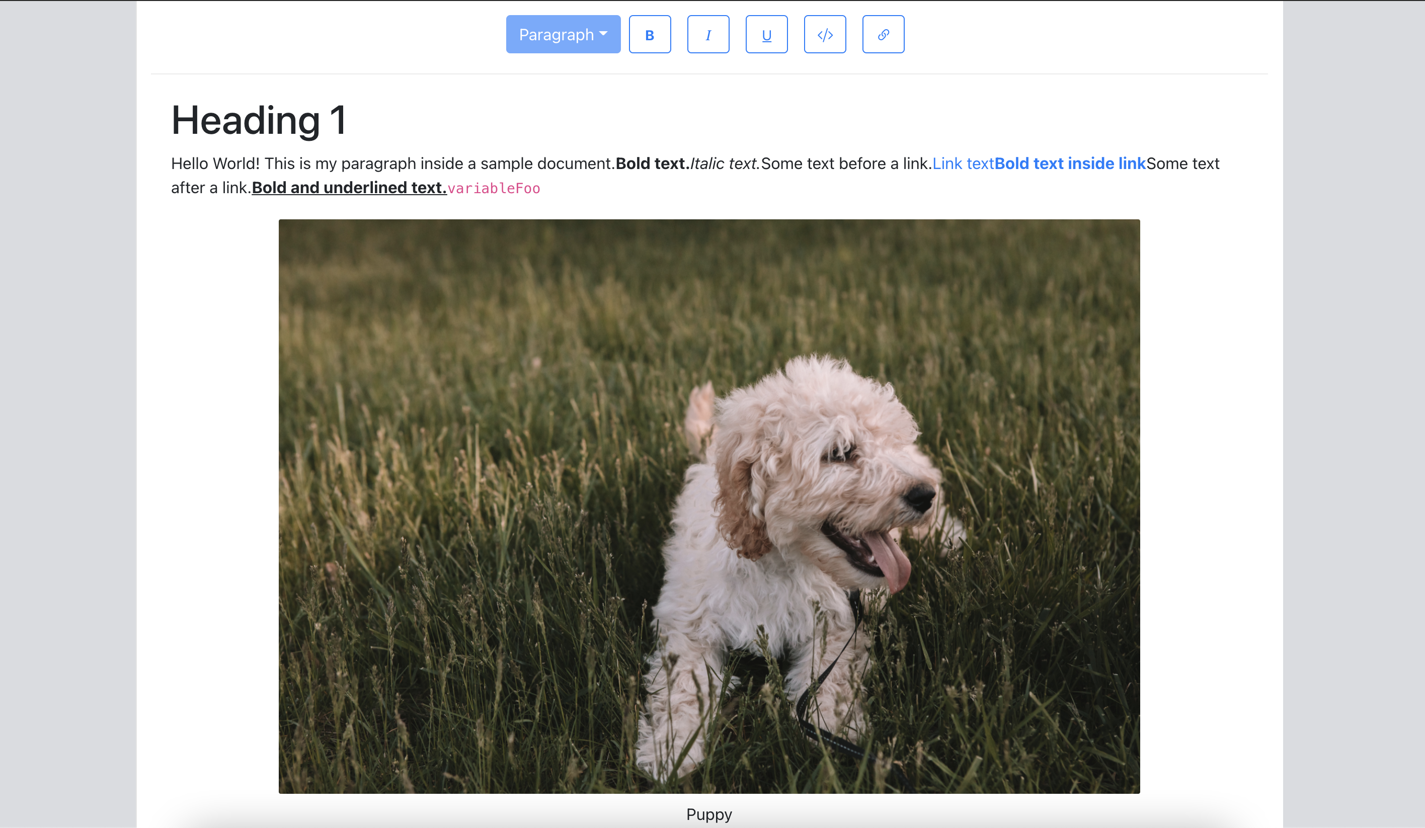
Caption Editing
For caption editing, the desired UX is: clicking the caption switches to a text input; clicking outside or pressing RETURN confirms the change, applies it to the node, and switches back to read mode. The Image component needs a state flag to toggle between read and edit modes. Local caption state tracks the draft while typing, and the onBlur or onKeyDown handlers apply the caption and flip the mode back.
const Image = ({ attributes, children, element }) => {
  const [isEditingCaption, setEditingCaption] = useState(false);
  const [caption, setCaption] = useState(element.caption);
  ...

  const applyCaptionChange = useCallback(
    (captionInput) => {
      const imageNodeEntry = Editor.above(editor, {
        match: (n) => n.type === "image",
      });
      if (imageNodeEntry == null) {
        return;
      }

      if (captionInput != null) {
        setCaption(captionInput);
      }

      Transforms.setNodes(
        editor,
        { caption: captionInput },
        { at: imageNodeEntry[1] }
      );
    },
    [editor, setCaption]
  );

  const onCaptionChange = useCallback(
    (event) => {
      setCaption(event.target.value);
    },
    [editor.selection, setCaption]
  );

  const onKeyDown = useCallback(
    (event) => {
      if (!isHotkey("enter", event)) {
        return;
      }

      applyCaptionChange(event.target.value);
      setEditingCaption(false);
    },
    [applyCaptionChange, setEditingCaption]
  );

  const onToggleCaptionEditMode = useCallback(
    (event) => {
      const wasEditing = isEditingCaption;
      setEditingCaption(!isEditingCaption);
      wasEditing && applyCaptionChange(caption);
    },
    [editor.selection, isEditingCaption, applyCaptionChange, caption]
  );

  return (
        ...
        {isEditingCaption ? (
          <Form.Control
            autoFocus={true}
            className={"image-caption-input"}
            size="sm"
            type="text"
            defaultValue={element.caption}
            onKeyDown={onKeyDown}
            onChange={onCaptionChange}
            onBlur={onToggleCaptionEditMode}
          />
        ) : (
          <div
            className={"image-caption-read-mode"}
            onClick={onToggleCaptionEditMode}
          >
            {caption}
          </div>
        )}
      </div>
      ...
With caption editing done, we add toolbar support for image uploads. To keep the growing code manageable, image-upload handling moves into a useImageUploadHandler hook that returns a callback attached to a file-input element. We'll see shortly why the hook needs previousSelection state.
# src/components/Toolbar.js

const onImageSelected = useImageUploadHandler(editor, previousSelection);

return (
    <div className="toolbar">
    ....
   <ToolBarButton
        isActive={false}
        as={"label"}
        htmlFor="image-upload"
        label={
          <>
            <i className={`bi ${getIconForButton("image")}`} />
            <input
              type="file"
              id="image-upload"
              className="image-upload-input"
              accept="image/png, image/jpeg"
              onChange={onImageSelected}
            />
          </>
        }
      />
    </div>
Upload Server Setup
Before implementing the hook, we set up a local upload target. An Express server with cors and multer handles the file receive path.
yarn add express cors multer
A src/server.js script configures that server and exposes an /upload endpoint to receive the image file.
# src/server.js

const storage = multer.diskStorage({
  destination: function (req, file, cb) {
    cb(null, "./public/photos/");
  },
  filename: function (req, file, cb) {
    cb(null, file.originalname);
  },
});

var upload = multer({ storage: storage }).single("photo");

app.post("/upload", function (req, res) {
  upload(req, res, function (err) {
    if (err instanceof multer.MulterError) {
      return res.status(500).json(err);
    } else if (err) {
      return res.status(500).json(err);
    }
    return res.status(200).send(req.file);
  });
});

app.use(cors());
app.listen(port, () => console.log(`Listening on port ${port}`));
Three-Step Upload Flow
Because a real upload takes time, we want immediate visual feedback. The implementation follows a three-step pattern:
- On image selection, insert an image node at the cursor with an
isUploadingflag so the UI shows a loading state. - Send the file to the server.
- On completion, set the returned URL on the image node and clear the loading flag.
The insertion step hits the same selection problem we saw with the link toolbar button: clicking the Upload button moves focus out of the editor and sets selection to null. Tracking previousSelection preserves the cursor location and tells us exactly where to insert.
# src/hooks/useImageUploadHandler.js
import { v4 as uuidv4 } from "uuid";

export default function useImageUploadHandler(editor, previousSelection) {
  return useCallback(
    (event) => {
      event.preventDefault();
      const files = event.target.files;
      if (files.length === 0) {
        return;
      }
      const file = files[0];
      const fileName = file.name;
      const formData = new FormData();
      formData.append("photo", file);

      const id = uuidv4();

      Transforms.insertNodes(
        editor,
        {
          id,
          type: "image",
          caption: fileName,
          url: null,
          isUploading: true,
          children: [{ text: "" }],
        },
        { at: previousSelection, select: true }
      );
    },
    [editor, previousSelection]
  );
}
Each new image node gets an id assigned via the uuid package. The reason becomes clear in Step 3. The image component uses isUploading to render a loading placeholder in place of the eventual image.
{!element.isUploading && element.url != null ? (
   <img src={element.url} alt={caption} className={"image"} />
) : (
   <div className={"image-upload-placeholder"}>
        <Spinner animation="border" variant="dark" />
   </div>
)}
With Step 1 complete, we verify that selecting a file inserts the node with the loading indicator at the documented location. Step 2 sends the upload request using axios.
export default function useImageUploadHandler(editor, previousSelection) {
  return useCallback((event) => {
    ....
    Transforms.insertNodes(
     …
     {at: previousSelection, select: true}
    );

    axios
      .post("/upload", formData, {
        headers: {
          "content-type": "multipart/form-data",
        },
      })
      .then((response) => {
           // update the image node.
       })
      .catch((error) => {
        // Fire another Transform.setNodes to set an upload failed state on the image
      });
  }, [...]);
}
The upload lands in public/photos. In Step 3, we want to update that node with the returned URL inside the axios promise's resolve() callback. A naive Transforms.setNodes won't work because we can't reliably find the path to the just-inserted node:
editor.selectionis unreliable — the user may have clicked elsewhere during the upload, changing the selection.previousSelectionsuffers from the same problem for the same reason.- SlateJS has a History module tracking document changes, but hunting through history for the last inserted image breaks if the user uploads multiple images concurrently and earlier uploads finish later.
- At this time,
Transform.insertNodesdoesn't return paths for the nodes it inserts.
None of those options are reliable, so we keep the id from Step 1 and use it to locate the image when the upload resolves.
axios
        .post("/upload", formData, {
          headers: {
            "content-type": "multipart/form-data",
          },
        })
        .then((response) => {
          const newImageEntry = Editor.nodes(editor, {
            match: (n) => n.id === id,
          });

          if (newImageEntry == null) {
            return;
          }

          Transforms.setNodes(
            editor,
            { isUploading: false, url: `/photos/${fileName}` },
            { at: newImageEntry[1] }
          );
        })
        .catch((error) => {
          // Fire another Transform.setNodes to set an upload failure state
          // on the image.
        });
With all three steps wired, the end-to-end upload works. One known rough edge is that the loading placeholder forces a fixed size, which can feel jarring when the actual image renders at a very different dimension. Fetching the image dimensions before upload and showing a correctly sized placeholder would smooth that transition. The same hook could naturally extend to videos or documents by rendering those node types similarly.
Where to Go Next
The editor built here covers a core feature set plus a few refinements — link detection, inline link editing, and caption editing are useful exercises in SlateJS internals. Anyone digging further into rich text editing could tackle:
- Collaborative editing.
- Richer document controls: text alignment, font and text colors, inline images, advanced copy-paste.
- Import from common formats like Word documents and Markdown.
SlateJS resources worth consulting:
- SlateJS Examples — implementations of search & highlight, Markdown preview, and mentions.
- API Docs — helper references for complex queries and transformations.
The Slack Channel is active with developers building SlateJS editors, making it a good place for questions and community learning.