
Why your performance tools disagree
Google offers a range of tools for monitoring Core Web Vitals, and they generally fall into two buckets: those that report lab data and those that report field data. Lab data comes from loading a page in a controlled, synthetic environment with predefined network and device conditions. Field data comes from real users visiting your site, which is why it's also called Real User Monitoring (RUM) data.
Understanding that these two data types measure different things is the first step to interpreting why they might tell different stories about the same page. Lab data is designed to be consistent and reproducible, controlling for as many variables as possible so that run-to-run results are comparable. Field data, on the other hand, captures the full range of real-world experiences—different devices, network conditions, and geographic locations.
Chrome tools reporting lab data generally run Lighthouse. Chrome tools reporting field data generally pull from the Chrome User Experience Report (CrUX). Site owners also commonly collect their own field data, which can provide more actionable insights than CrUX alone.
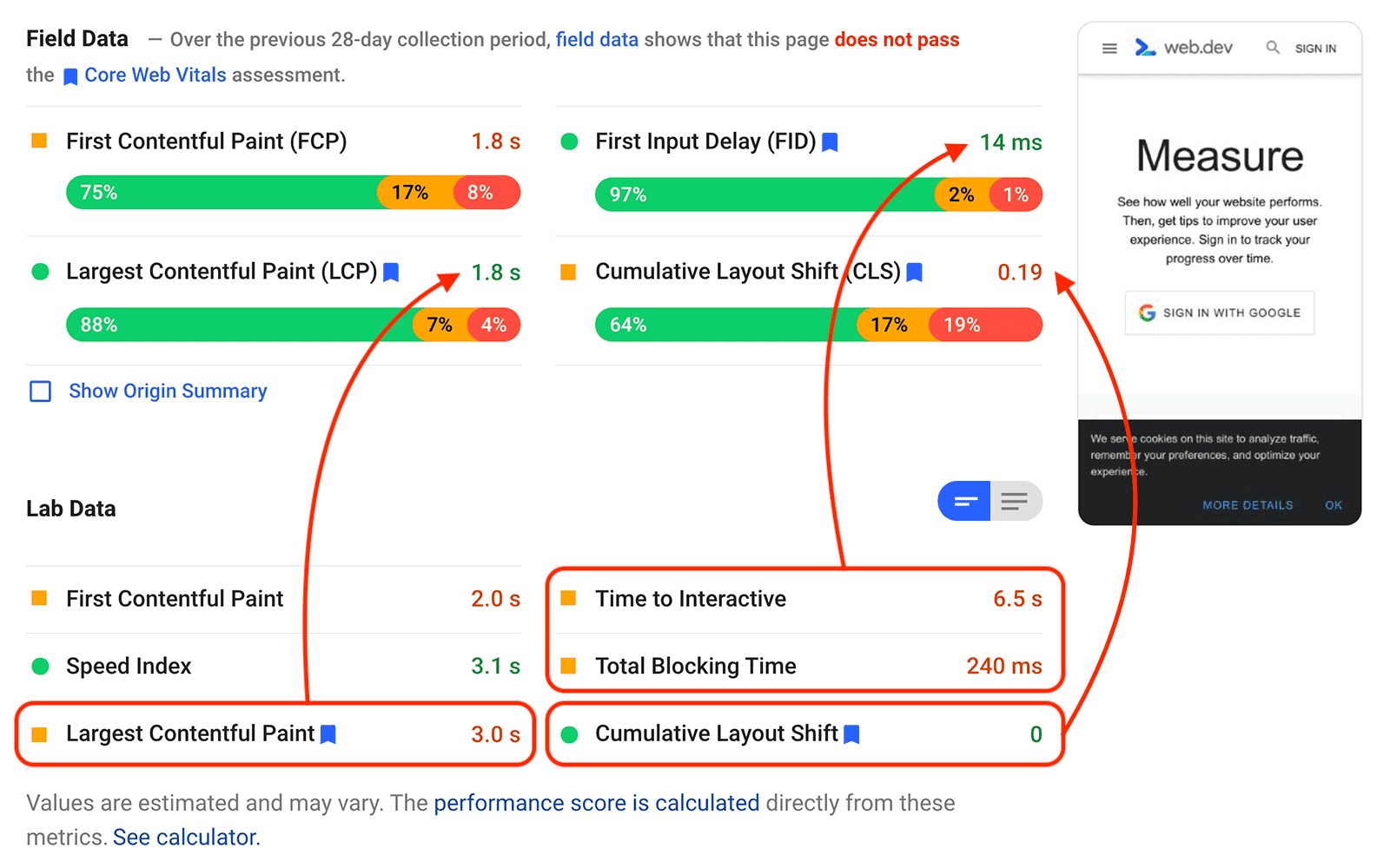
In practice, lab and field results can diverge significantly across all Core Web Vitals metrics. A PageSpeed Insights report from web.dev shows this clearly:
Field data is a distribution, not a single number
One of the most important concepts to grasp is that field data is not one value—it's a distribution of values. Some users may load your page very quickly, while others may have a very slow experience. The complete set of performance data collected from your users is the field data for your site.
CrUX reports, for example, show a distribution of performance metrics from real Chrome users over a 28-day period. In almost any CrUX report, you'll see that some visits have excellent experiences while others have poor ones.
When a tool reports a single number for a metric, it's typically representing a specific point in that distribution. For Core Web Vitals, tools use the 75th percentile as their reference point.
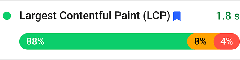
Take the field data for LCP from the screenshot above: 88% of visits saw an LCP of 2.5 seconds or less (good), 8% saw LCP between 2.5 and 4 seconds (needs improvement), and 4% saw LCP greater than 4 seconds (poor). At the 75th percentile, LCP was 1.8 seconds:
Lab data from the same page shows an LCP value of 3.0 seconds. While this is higher than the 1.8 seconds from the field data, it's still a valid LCP value for the page—it's simply one of many values that make up the full distribution of load experiences.

Controlled environments hide real-world variance
A lab test deliberately reduces the number of moving parts: one device, one network, one geographic location. That makes it a good tool for debugging or pre-deployment checks, but it explicitly excludes the variance of real-world networks, device capabilities, and locations. It also misses the impact of genuine user behavior, such as scrolling or tapping elements.
With that gap in mind, several specific causes can explain why lab and field numbers diverge for each of the Core Web Vitals: LCP, INP, and CLS.
Why LCP differs
The LCP element is not always the same
Run a Lighthouse report and you’ll see the same LCP element every time. Field data for that same page will typically show a mix of different LCP elements, depending on the circumstances of each visit:
- Different screen sizes change what is visible in the viewport.
- Logged-in states or personalized content can alter which element is largest.
- A/B tests may show very different content to different users.
- Installed fonts affect text sizing, and therefore which element wins.
- Real-world URLs often include fragment or text-fragment identifiers, pushing the LCP element below the fold.
Because field LCP is the 75th percentile of all visits, a fast-loading element (like text in a system font) for most users can mask a slow hero image for the minority. The opposite is also possible: a lab test emulating a small-screen device may see text as the LCP element, while field users on larger screens have the slow-loading hero image as theirs.
Cache state, preloading, and bfcache
Lab tests typically start with a cold cache. Returning visitors with proper caching headers may load the page much faster, so a site with strong cache configuration and many repeat visits can see field LCP that is quicker than lab data suggests.
Similarly, users arriving from platforms that preload content, like AMP or Signed Exchanges, can have a faster load experience that lab tools can’t replicate. Cross-origin preloading aside, first-party preload of subsequent pages helps field LCP too.
Pages restored from the back/forward cache (bfcache) are nearly instantaneous, and those experiences are counted in field data. Lab tools don’t simulate bfcache restores.
User interaction can shorten LCP
In a lab test, the browser waits for full page load before reporting the LCP element. In the field, the browser stops watching for a larger element as soon as the user scrolls or interacts. Since bfcache restores are instant, and since users frequently only wait until the page “appears” ready, field LCP can report faster times than a lab run.
Why INP and TBT don’t align
INP needs real interactions
INP measures responsiveness at the moment users actually choose to interact. No lab test, even one that scripts user behavior, can predict when a real person will click or tap.
TBT ignores user timing and tap delay
TBT is a diagnostic proxy for INP: it quantifies main-thread blocking during load. But if users wait until after the JavaScript finishes before interacting, field INP can be low even with heavy blocking. Whether a page looks interactive is something TBT cannot measure.
Tap delay is another blind spot. On unoptimized mobile pages, browsers insert a 300 ms delay after a tap to distinguish it from a double-tap zoom. That delay counts toward INP, but it isn’t a Long Task, so it has no effect on TBT. A page can therefore have poor INP with good TBT scores.
Caching and bfcache help INP in the field
Just as with LCP, cached JavaScript may process faster on repeat visits. Pages restored from bfcache have their JavaScript restored from memory, potentially with little or no processing time—both of which field data captures and lab tests don’t.
Why CLS differs
Lab CLS only sees a subset of shifts
Lab CLS counts shifts above the fold during load. Field CLS considers all unexpected shifts across the page’s lifespan, including those triggered by scrolling. Lazy-loaded images and iframes without dimensions are a common cause of shifts that only appear when the user scrolls down—an event a standard lab test won’t trigger.
Personalized content moves the layout
Targeted ads and A/B tests change what loads and how it loads. Personalized content is often injected later, causing layout shifts. Lab tests usually run without personalization or as a generic user, so they won’t capture shifts that real users experience.
Cache state affects layout stability
Undimensioned images and slow-loading web fonts—two of the most frequent causes of layout shift—are more likely to cause problems on a first visit with an empty cache. On subsequent visits or bfcache restores, the browser renders these resources immediately, which can lower field CLS below what a lab tool reports.
Which data should drive your decisions
When lab and field disagree, prioritize field data. It reflects the experiences of actual users, which makes it the most accurate signal for determining what to fix first.
If field scores are good but lab numbers suggest room for improvement, it’s still worth investigating what additional optimizations are possible. Lab data can also reveal barriers for users on slower networks or lower-end devices, since field data only represents users who successfully loaded your site.
Neither view is complete on its own. Lab data and field data serve different purposes, and relying on only one means missing an opportunity to improve the experience for all users.



