
Why Static CSS Generation Matters
Meta’s earlier approaches to CSS at scale exposed the weaknesses of traditional stylesheets: namespace collisions across bundled code, unwieldy dependency graphs, and specificity wars that drove engineers toward complex selectors and !important overrides. Large, monolithic stylesheets also meant browsers downloaded hundreds of kilobytes of unused rules on every page load.
Facebook’s initial fix was cx, a CSS-modules-like system that scoped styles locally per file and linked them to JavaScript. It solved namespace collisions but still limited engineers to static styles living outside component code.
// ComponentName.css; class uses ComponentName/namespace syntax
.ComponentName/header { margin-top: 10px }

// ComponentName.js
<div className={cx('ComponentName/header')} />
By the time Facebook.com was rebuilt in 2020, the CSS-in-JS movement offered an alternative. Developers wanted styles colocated with components, runtime-conditional values, and access to JavaScript tooling like import graphs and type systems. But early CSS-in-JS libraries paid a runtime cost: dynamically injecting <style> tags and mutating the DOM during every render.
import * as stylex from '@stylexjs/stylex';

const styles = stylex.create({
  foo: { margin: 10 }
});

function MyComponent({}) {
  return <div {...styles.props(styles.foo)}/>
}
The system that emerged from that rebuild, StyleX, is CSS-in-JS only syntactically. Styles compile down to static CSS at build time. StyleX replaced cx across Meta, and atomic class generation cut nearly 80% off CSS payload sizes. It has since become the standard styling system across Meta products — Facebook, Instagram, WhatsApp, Messenger, Threads — and has been adopted externally by companies such as Figma and Snowflake.
Inside the StyleX Compiler
StyleX is packaged as a monorepo of integrated tools, with the core engine sitting in a Babel plugin. The transform walks through JavaScript files, extracts CSS metadata from style objects, and converts declarations to atomic class names. Collected metadata then moves through value normalization, at-rule handling, and legacy polyfills before the final styles are sorted and emitted as a static stylesheet.
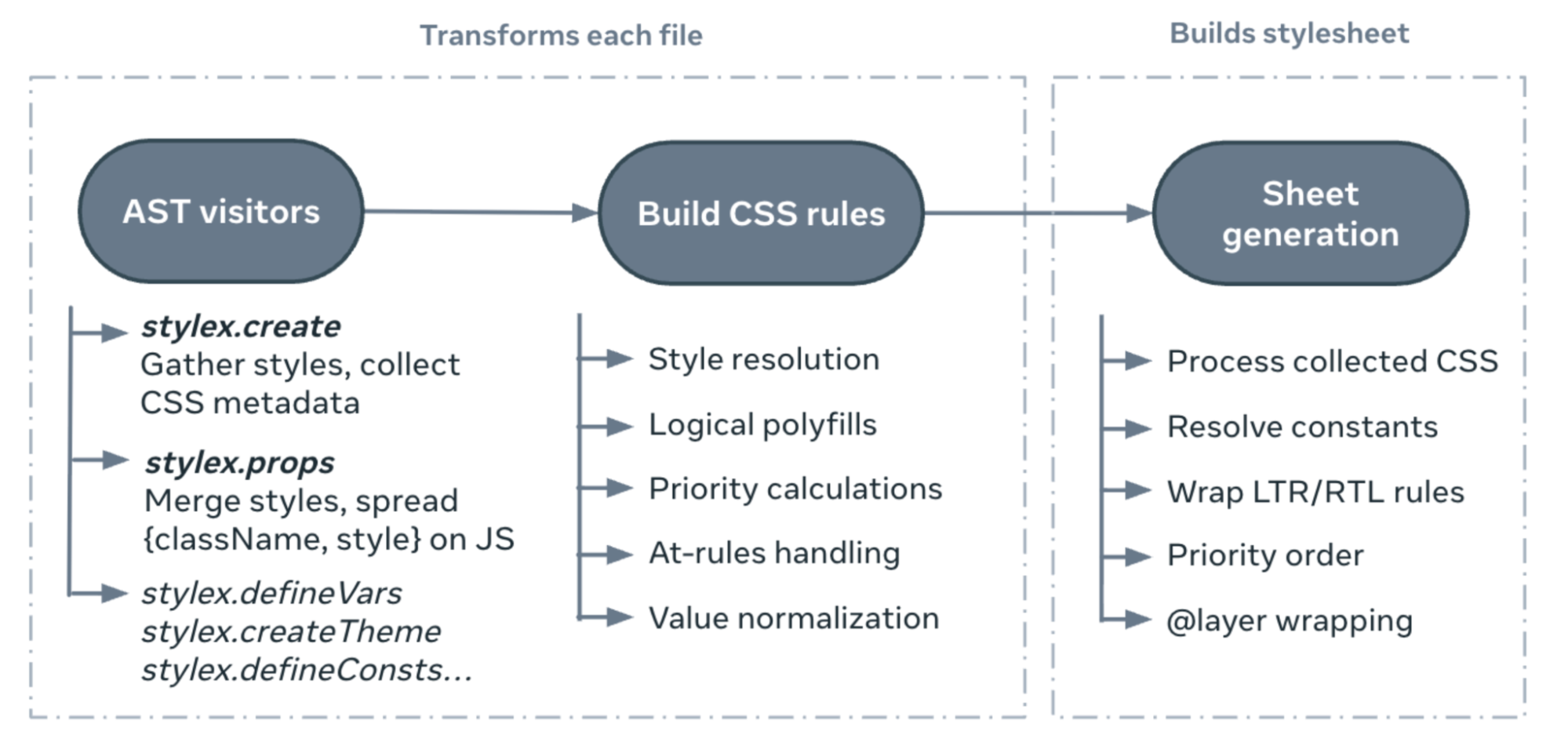
The API surface is intentionally small, built around design principles that make the compilation strategy viable.
Compile-Time Scalability
The key to StyleX’s performance profile is atomic CSS generation. Every property-value pair is hashed into its own class, so shared declarations are deduplicated and emitted once. CSS size plateaus as the codebase grows rather than expanding linearly with new UI code. The compiler analyzes all reachable styles, strips what’s not needed, and emits a stylesheet containing only the rules used at runtime.
Two core functions anchor the API:
stylex.create()defines style objects using only statically resolvable values. The compiler strips these objects at build time, hashing each property-value pair into a generated CSS class.stylex.props()merges and deduplicates style objects. Within a module it compiles to a static className string; when styles are passed across module boundaries it defers to a small runtime merge utility.
import * as stylex from '@stylexjs/stylex';

const styles = stylex.create({
  foo: { margin: 10 }
  bar: { margin: 10, color: 'red' }
});

function MyComponent({style}) {
  return (
    <>
     <div {...styles.props(styles.foo)}/>
     <div {...styles.props(styles.bar)}/>
     <div {...stylex.props(style)}/>
    </>
  )
}
After the Babel transform runs, API calls are replaced with class names and local style objects are removed from the output. A typical component compiles down to:
import * as stylex from '@stylexjs/stylex';

function MyComponent({style}) {
  return (
    <>
     <div className="m-10" />
     <div className="c-red m-10" />
     <div {...stylex.props(style)}/>
    </>
  )
}
Across all files, the collected metadata is processed, LTR and RTL variants are generated, constants are resolved, and CSS rules are ordered by priority. The bundled output can be emitted as a static stylesheet that plugs into any of the supported bundlers.
.m-10 { margin: 10px }
.c-red { color: red }
Design Constraints and Expressiveness
StyleX deliberately imposes constraints that lean on statically resolvable patterns, avoiding conflict-prone constructs like global selectors. But within those boundaries it preserves most of the CSS feature set. Four API families cover the bulk of authoring needs:
Shared Values Across Files
Because stylex.create() must be resolvable from only the file’s own JavaScript, StyleX uses an extended version of Babel’s evaluator. It never reads imported module source to build a stylesheet. Two APIs extend this reach:
stylex.defineVars()creates CSS custom property groupings. Deterministic hashes derived from variable name and import path keep references consistent across modules.stylex.defineConsts()defines constants and media queries that get inlined entirely into generated CSS, avoiding unnecessary browser-side custom property lookups.
Shared constants are fully inlined at build time; shared variables become global CSS custom properties.
// varsFile.stylex.js
const varColors = stylex.defineVars({primary: "#eee"})
// constsFile.stylex.js
const constColors = stylex.defineConsts({primary: "#fff"})

// Component.react.js
import {varColors} from 'varsFile.stylex.js'
import {constColors} from 'constsFile.stylex.js'

const styles = stylex.create({
    foo: {color: varColors.primary} // → .x { var(--hash('varsFile.varColors.primary')) }
    bar: {color: constColors.primary} // → hash('constsFile.constColors.primary') → #fff
  },
});
StyleX also provides stylex.style() for inline expressions in JSX and stylex.types() for TypeScript type inference.
Observing, Not Styling, at a Distance
StyleX disallows global and complex selectors, restricting styles to directly applied class names on elements. This encourages encapsulation and makes code easier to reason about. Baseline element-level rules and CSS resets must be authored in separate stylesheets. But it does provide a way to react to context: stylex.when() allows relational selectors that style a component based on ancestor, descendant, or sibling state. Elements marked with stylex.defaultMarker() can be conditionally styled using these contextual rules while keeping styles applied directly.
/* Unsafe: styles leak to child elements rather than being explicitly applied */
.csuifyiu:hover > div { ... }

/* Safe: styles are scoped to a specific element based on observed state */
div:hover > .ksghfhjsfg { ... }
const styles = stylex.create({
foo: {
backgroundColor: {
default: 'blue',
[stylex.when.ancestor(':hover')]: 'red',
},
},
});
<div {...stylex.props(stylex.defaultMarker())}>
<div {...stylex.props(styles.foo)}> Some Content </div>
</div>
Dynamic Values and Full CSS Coverage
Although StyleX is statically compiled, dynamic values are supported. When a value isn’t resolvable at build time, the compiler emits a CSS variable reference and the runtime writes the value through the style prop.
const styles = stylex.create({
    // Height is unknown until runtime
    foo: (height) => ({
      height,
    }),
});

// { .d-height {var(--height)}, style: {--height: height} }
<div {...stylex.props(styles.foo(height))}/>
Theming comes through stylex.defineVars() paired with stylex.createTheme(), which defines variants by overriding variable groupings at higher specificity.
/* const spacing = stylex.defineVars({sm: 2px, md: 4px, lg: 8px}) */
:root, .sp-group{--sp-sm:2px;--sp-md:4px;--sp-lg:8px;}

/* const desktopSpacing = stylex.createTheme(spacing, {sm: 5px, md: 10px, lg: 20px}) */
.sp-dktp.sp-dktp, .sp-dktp.sp-dktp:root{--sp-sm:5px;--sp-md:10px;--sp-lg:20px;}
Animations are covered by stylex.keyframes() and stylex.viewTransitionClass(), which generate @keyframes and ::view-transition-* rules respectively.
Conflict Resolution by Design
StyleX simplifies how CSS conflicts resolve. Since every rule targets a single class name, specificity boils down to class-level ordering. The stylex.props() function guarantees a deterministic merge: the last style object passed wins for repeated properties.
Problems emerge when shorthands overlap with their longhand constituents. With an element like:
<style>
  .margin-top-10 { margin-top: 10px }
  .margin-0 { margin: 0px }
<style/>

<div className="margin-0 margin-top-10" />
class-ordering alone would let margin overwrite margin-top. Adding pseudoclasses and media queries complicates the equation further:
{
   [ "m-0", { "css": ".m-10 {margin: 0}" }, 3000 ],
   [ "mt-10", { "css": ".mt-10 {margin-top: 10px}", }, 4000 ],
   [ "mt-10-mq", { "css": "@media (...) {.mt-10-mq {margin-top: 10px} }", }, 4200 ],
   [ "mt-10-mq", { "css": "@media (...) {.mt-10-mq:hover {margin-top: 10px} }", }, 4320 ],
}
To handle this deterministically, StyleX computes a numerical priority for every rule it emits. Rules are grouped by @layer and ordered to enforce longhand-over-shorthand behavior, state-dependent overrides, and user-authored order predictions.
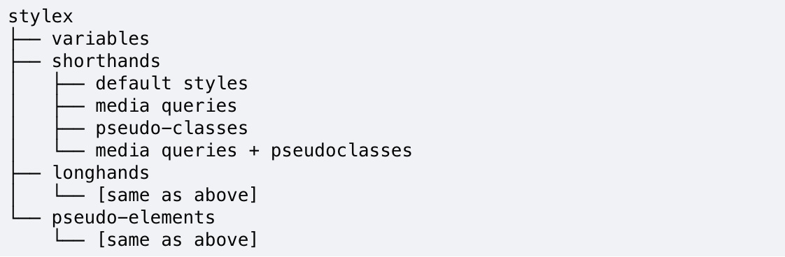
Armed with these internally computed priorities, stylex.props() and its compile-time equivalent resolve overlapping styles predictably. As a byproduct, the runtime stays lean: there is no cascade resolution, no specificity calculation, and only a minimal object merge utility shipped to the browser. Returning to the source example, the color conflict was resolved just by dropping the lingering class from the merge:
const styles = stylex.create({
  foo: { color: 'red', margin: 0 }
  bar: { color: 'black', marginTop: 10 }
});

function MyComponent() {
  // becomes <div className="c-black m-0 mt-10" />
  return <div {...stylex.props(styles.foo, styles.bar)} />
}
The outcome is that authors can combine style objects freely with stable expectations. The last object wins, states like :active correctly override :hover, media queries resolve over default rules, and shorthands behave sensibly — all without hand-authored !important or manual cascade work.
The StyleX Ecosystem and What Comes Next
StyleX is maintained by a dedicated team with a broader goal of making CSS tooling accessible to all developers. The project's monorepo extends well beyond the core compiler, including an ESLint plugin for style validation, a CLI for generating stylesheets, a PostCSS plugin for post-processing, and an experimental CSS parser.
The open source community has been a massive force multiplier for the project, and has played an instrumental role in shaping its direction. The ecosystem has grown to include a community-built playground, VS Code extensions, an SWC compiler, and multiple bundler integrations for Vite, webpack, and other toolchains. When Meta says it works with the ecosystem, it means thousands of contributors collaborating with the companies and individuals adopting StyleX.
Looking ahead, the StyleX roadmap centers on evolving alongside the browser and the platform's needs in an ongoing dialogue with the community. Planned work includes:
- An API for shareable functions
- LLM-ready context files
- Support for inline styles
- Developer extensions
- Strict compiler validation
- Logical styles utilities
- An official unplugin for bundler integrations
The project operates as an ongoing dialogue between community needs and the design values guiding the system's development, with the goal of continuing to imagine what styling on the modern web can achieve. Updates and discussion happen on the StyleX website, GitHub, and the project's Bluesky and X accounts. The core team extends particular credit to past maintainers Naman Goel and Sebastian McKenzie, the roster of contributors and advisors who shaped the work, and the lineage of systems like React Native and Linaria that continue to inspire StyleX's design.



