
A Decade Of Theme Code, Rebuilt
Shopify themes built over the better part of a decade carry baggage. Features accumulate, dependencies change, and code that once made sense becomes a liability. When Carson Shold’s team at Archetype Themes decided to tackle this, the goal was straightforward: better performance across the board — faster time to first paint, less blocking JavaScript, and reduced code complexity. The path there required removing jQuery, dropping Handlebars.js, and standardizing shared code across multiple themes. Notably, Shopify dropped IE11 support in late 2020, which finally unlocked modern JavaScript APIs that had been off-limits for years.
Removing jQuery From Thousands Of Lines
jQuery was a comfortable crutch. It handled cross-browser differences, offered CSS-like selectors, and provided convenient syntax for animations and Ajax. But with IE11 no longer a constraint, it was pure overhead. The team’s reasons for removal were simple: less JavaScript is better for performance, modern browsers don’t need it, and Shopify’s own direction favored vanilla implementations.
The refactor was executed incrementally. Each module was commented out, jQuery was removed, and modules were rewritten and re-added one at a time, starting with the simplest file and progressing to complex features like product pages and add-to-cart forms. That particular module involved 24 unique behaviors and was reduced from 1,600 lines of code to 1,000. Along the way, the team found better patterns and revisited earlier files when needed.
What became clear was that vanilla JavaScript isn’t inherently harder — it just requires more intentional structure. The rewrite surfaced plenty of legacy code that was disorganized, pushing the team toward a more modular architecture with less duplication.
Replacing Scroll Events With Intersection Observer
Shopify themes let merchants position elements anywhere on a page, which means developers can’t assume where an element will be or whether it exists. Previously, the team initialized visible elements by listening to throttled scroll events and continuously checking element visibility in JavaScript. That approach consumed call stack space and added measurable overhead that competed with other scripts.
theme.isElementVisible = function($el, threshold) {
  var rect = $el[0].getBoundingClientRect();
  var windowHeight = window.innerHeight || document.documentElement.clientHeight;
  threshold = threshold ? threshold : 0;

  // If offsetParent is null, it means the element is entirely hidden
  if ($el[0].offsetParent === null) {
    return false;
  }

  return (
    rect.bottom >= (0 - (threshold / 1.5)) &&
    rect.right >= 0 &&
    rect.top <= (windowHeight + threshold) &&
    rect.left <= (window.innerWidth || document.documentElement.clientWidth)
  );
};
The Intersection Observer API replaced this pattern with asynchronous visibility detection. Once an element is about to enter the viewport, a callback fires and initializes only what’s needed — with no scroll listeners running in the background. After initialization, the observer is removed to keep things clean:
theme.initWhenVisible({
  element: document.querySelector('div'),
  callback: myCallback
});
Callbacks handle all module-specific logic, preventing any work until the element is truly visible. A threshold can be passed to trigger initialization slightly before the element enters the viewport, which is useful for preloading resources like Google Maps.
theme.initWhenVisible = function(options) {
  var threshold = options.threshold ? options.threshold : 0;

  var observer = new IntersectionObserver((entries, observer) => {
    entries.forEach(entry => {
      if (entry.isIntersecting) {
        if (typeof options.callback === 'function') {
          options.callback();
          observer.unobserve(entry.target);
        }
      }
    });
  }, {rootMargin: '0px 0px '+ threshold +'px 0px'});

  observer.observe(options.element);
};
Although the team didn’t formally benchmark this specific change, they believe it contributed significantly to improvements in time to interactive and total blocking time.
Lazy-Loading Without Extra JavaScript
The team used the lazysizes library for lazy-loading images, including plugins for background images. While functional, those plugins required extra markup on elements and added a small JavaScript dependency that could be eliminated with pure CSS.
By switching to CSS object-fit, images can be positioned like background images while remaining regular <img> elements. This preserves all the benefits of standard lazy-loading without needing plugin support. It also positions the theme to eventually rely on native browser lazy-loading, which doesn’t work with background images. Until native support is universal, lazysizes remains as a fallback, but the goal is to remove that dependency entirely.
<script>
if ('loading' in HTMLImageElement.prototype) {
    // Browser supports `loading`
} else {
   // Fetch and initialize lazysizes
}
</script>
MatchMedia For Breakpoint Handling
The enquire.js library previously handled breakpoint changes — a need that arises when resizing elements, switching module arguments between desktop and mobile, or managing visibility that CSS alone can’t handle. The native matchMedia API now covers this with just a few lines:
var query = 'screen and (max-width:769px)';
var isSmall = matchMedia(query).matches;

matchMedia(query).addListener(function(mql) {
    if (mql.matches) {
      isSmall = true;
      document.dispatchEvent(new CustomEvent('matchSmall'));
    }
    else {
      isSmall = true;
      document.dispatchEvent(new CustomEvent('unmatchSmall'));
    }
  });
Listening for breakpoint changes updates a shared variable and triggers a custom event that individual modules can subscribe to, eliminating another dependency.
document.addEventListener('matchSmall', function() {
  // destroy desktop-only features
  // initialize mobile-friendly JS
});
Consolidating Duplicate Modules
Years of feature-building had produced near-identical implementations across modules. YouTube video initialization, for instance, was written three different ways with nearly identical callbacks and accessibility features duplicated per module. Similar duplication existed across slideshows (image slideshows, testimonials, product images, announcement bars) and overlay components (mobile menus, cart drawers, newsletter popups).
The fix was to break shared functionality down to its most basic parts. For YouTube, that meant defining default API arguments (overridable by the calling module), a div ID for the video, the YouTube video ID, event handlers, play/pause behavior when off-screen, and handling iOS low power mode when autoplay is unsupported. The team sketched this division on paper before coding, separating what’s core to the module from what’s specific to the parent that initializes it.
The result: three themes that initialize YouTube videos in nine different ways now share a single file. Similar consolidation across other modules moved nearly half of each theme’s JavaScript into shared code. That means less code shipped overall and cleaner, more maintainable development — one module, one purpose, with only what the parent requires passed back.
What The Numbers Show
The work paid off. Starting with Motion, the first and most JavaScript-heavy theme, the team saw:
- 52% less JS shipped
- Faster desktop home page loads, even with multiple videos, featured products, and large slideshow images
| Desktop home page | Before | After | Change |
|---|---|---|---|
| Lighthouse score | 57 | 76 | +33 |
| Total blocking time | 310ms | 50ms | -83.8% |
| Time to interactive | 2.4s | 2.0s | -16% |
| Largest contentful paint | 3.8s | 2.6s | -31.5% |
- Improved mobile product page performance
| Mobile product page | Before | After | Change |
|---|---|---|---|
| Lighthouse score | 26 | 65 | +150% |
| Total blocking time | 1440ms | 310ms | -78% |
| Time to interactive | 11.3s | 6.1s | -46% |
| Largest contentful paint | 13s | 4.2s | -67.6% |
Next came Impulse, the most feature-rich theme, with equally strong results:
- 40% less JS shipped
- 28% faster mobile home page loads
| Desktop home page | Before | After | Change |
|---|---|---|---|
| Lighthouse score | 58 | 81 | +39.6% |
| Total blocking time | 470ms | 290ms | -38% |
| Time to interactive | 6.1s | 5.6s | -8% |
| Largest contentful paint | 6s | 2.9s | -51.6% |
- 30% faster mobile home and product pages
| Mobile product page | Before | After | Change |
|---|---|---|---|
| Lighthouse score | 32 | 45 | +40.6% |
| Total blocking time | 1490ms | 780ms | -47.6% |
| Time to interactive | 10.1s | 8.3s | -17.8% |
| Largest contentful paint | 10.4s | 8.6s | -17.3% |
These gains are real, but the starting line was low. Shopify itself imposes a heavy baseline that themes can’t escape.
Platform Overhead And App Bloat
Shopify injects a lot of its own code: feature detection, tracking, and payment buttons like Apple Pay, Google Pay, and ShopPay. On a product page with dynamic payment buttons, that can add up to roughly 187kb of Shopify scripts against just 24.5kb of theme files. Add Google Analytics, a Facebook Pixel, or other trackers on top, and the page carries significant third-party weight.
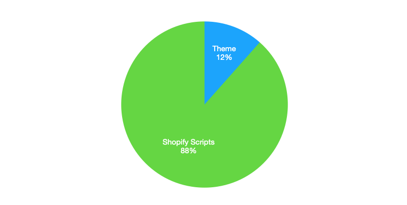
Those scripts are loaded fairly efficiently, so they don’t block rendering much, but they do hurt Lighthouse scores. The bigger problem is apps. Store owners routinely run 20 or more apps, and each one can shave 10+ points off the Shopify speed score, as shown in this breakdown of Impulse with three apps installed:
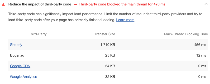
- Apps are a major bottleneck that merchants rarely notice. Even simple apps take a toll on load times.
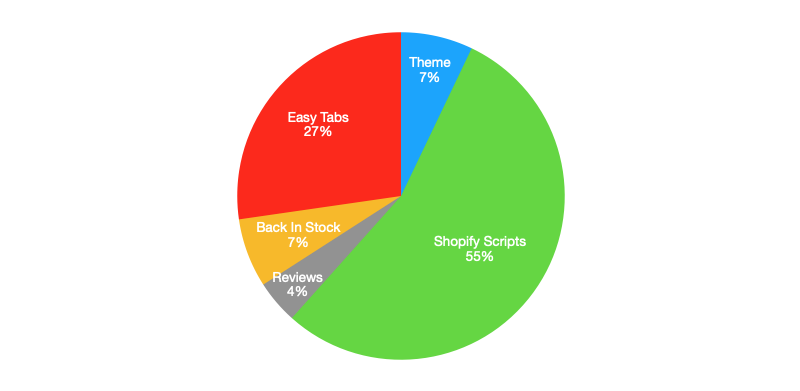
This case study on apps and performance illustrates the problem clearly.
Current Work And Known Limits
Updates to the third theme, Streamline, are still in progress. It already includes performance features the team is evaluating for other themes, such as loadCSS to avoid render-blocking CSS.
The speed improvements are meaningful. Industry research consistently shows that speed affects conversions and that even small delays cost revenue. Performance remains a core focus for future builds, with a constant push to simplify code further.
Roadmap Ahead
Performance work is ongoing. Several initiatives are on the list:
- Replace window event listeners with the Resize Observer
- Adopt native image lazy-loading fully, with a lazysizes fallback for Safari
- Load page-specific JS only, avoiding a single large bundle sent to every visitor
- Reference Smashing’s 2021 performance checklist for best practices
- Integrate Lighthouse into GitHub Actions to catch regressions during development
Resources For Shopify Developers
- Setting up a local Shopify theme development workflow
- Theme Inspector, a Chrome extension for debugging Liquid bottlenecks
- Shopify cheat sheet — overview of available Liquid objects and tags
- Official Liquid templating docs



