

Why Shops Have It Harder
Online stores face a different set of performance constraints than content-driven sites. The four big page types — home, category/search, product detail, and checkout — each demand distinct treatment. The checkout is a separate problem entirely: it carries extra JavaScript, back-end pricing logic, and shipping-provider service calls, not to mention form validation for billing and shipping addresses and the payment drop-in. Once those pages are tested and working, nobody wants to touch them again.
The first thing that comes to mind with any shop is images. Product images dominate the design, and the pressure to show more products leads to third-party carousels, zoom effects, videos, countdown timers, and chat widgets. All of it is justified by revenue-tracking and conversion goals, but the complexity and JavaScript accumulate quickly, even with lean intentions.
Caching is also more complicated. Full-page caching is rarely possible when the header shows a user-specific cart or wishlist. Physical goods mean live inventory data must stay precise, especially during peak seasons. A complex caching strategy is required to cache parts of the page while reassembling them during server-side rendering.
Even the design phase hides traps. Prototypes use tidy, uniform product names and ideal images, but real catalogs contain strings of wildly different lengths. Long names can break a layout, and with thousands of products, manual checks are impossible. Test prototypes against both very short and very long content. Similarly, avoid duplicating complex information — product details, cart contents, filter facets — in separate desktop and mobile markup. Keeping the two copies in sync becomes an ongoing maintenance headache.
Accessibility belongs in the prototyping stage, not as an afterthought. Alt text for all functional images, color-contrast compliance, keyboard navigation, and correct ARIA usage are far easier to build in from day one. Watching videos of real screen-reader or keyboard-only users is eye-opening for the whole team.
Why Speed Is Worth the Effort
The commercial case is straightforward. Each additional second of load time measurably reduces conversion. Page speed also feeds into search rankings and Google Ads quality, so the investment flows directly to the bottom line.
Shared Resources, Fixed First
Before tackling page-specific issues, we audited assets loaded across the entire site. Icon fonts and SVGs were a prime target. The original design used inline SVG symbols in the head of every page. While convenient, this prevented caching across the site. We moved the icons to an external SVG file—trimmed to only those in use—and preloaded it. Third-party icons (Font Awesome) are now loaded on demand via a lightweight script that detects their usage.
Font loading for the store required two body styles, one heading style, and one special text style. Testing revealed that removing the bold font weight, which was only used sparingly, had no perceptible impact. We dropped the font file, and where faux bold rendering proved inconsistent across browsers, we applied -webkit-text-stroke: 0.3px as a minor correction.
See the Pen [Jewellerybox Case Study (Example #1)](https://codepen.io/smashingmag/pen/MWprwyE) by Pfenya.
For products with personalized engravings, we avoided loading a dozen font files upfront. The specific typeface is fetched only when a customer selects it from the dropdown. Preview images show what each font looks like before that choice is made.
Legacy support was another area ripe for cleanup. After reviewing current best practices, we trimmed our extensive list of favicon and touch icons to only recommended sizes. We also converted a font from WOFF to the significantly smaller WOFF2 format, kept WOFF for fallback, and purged obsolete CSS directives.
On-Demand Loading And Third-Party Scripts
Reducing initial JavaScript size was key to better interaction times. We audited which page elements are essential and which could wait. For instance, zoomed product images load on first interaction, while footer images load later.
A major find was the heavyweight chat client, which alone shipped over 500 KB of JavaScript. Even with asynchronous loading, it inflated the time-to-interactive metric. We replaced it with a self-hosted, open-source widget. This gives us full control over loading; we start with just the icon and load the rest when the user opens the chat.
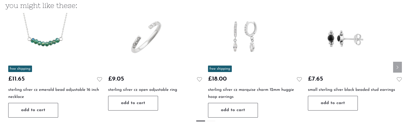
We also tackled a third-party personalization service for product carousels by integrating its API server-side. This eliminates large client-side JavaScript and allows caching via a unique cache key. It's a trade-off: initial page rendering can be slower until cached. We're now exploring a strategy to render a placeholder first and inject the personalized content later.
JavaScript Libraries And Delivery
A JavaScript audit revealed that most code came from libraries, not our own work. We evaluated each library's purpose to find faster or smaller alternatives. For sliders, we replaced Slick with GliderJS, which covers our requirements with a lighter footprint. Unused parts of self-contained libraries were also moved out of the main file to load on demand.
Since the project uses Bootstrap 4, jQuery was still present. We switched to a native version without the jQuery dependency, making the file smaller and faster. We also generate two versions of our main JavaScript—with and without polyfills—and serve the stripped-down version to modern browsers. A "polyfill-on-demand" service was tested but didn't meet our performance needs.
A key lesson emerged from testing jQuery delivery: self-hosting was faster in production than loading from a CDN, even though our test environment showed the opposite. The test environment is not the production environment, and performance fixes must be validated under real-world conditions.
Image Strategy, Responsive And Lazy
Images dominate jewelery store pages. Products from a decade of catalog updates are uneven in size and style, making full responsive support difficult. For now, product images use a single optimized size; content pages offer responsive versions in WebP with fallbacks. The main issue is payload size, so we use a blend: key above-the-fold images load directly using native lazy-loading, while the rest are loaded via a script.
Even a site logo presented an opportunity. Originally a 192 KB SVG with fine details, we simplified the paths since the logo never renders larger than 150 by 30 pixels. The result is a visually identical file at just 40 KB.

CSS, Critical And CLS
Defining Critical CSS
Critical CSS is loaded inline in the HTML for instant availability. We use automated extraction alongside manual class definitions for general, product, and category styles. A common pitfall is tooling that changes the order of CSS rules, which can break overrides written later in the stylesheet.
Addressing Layout Shifts
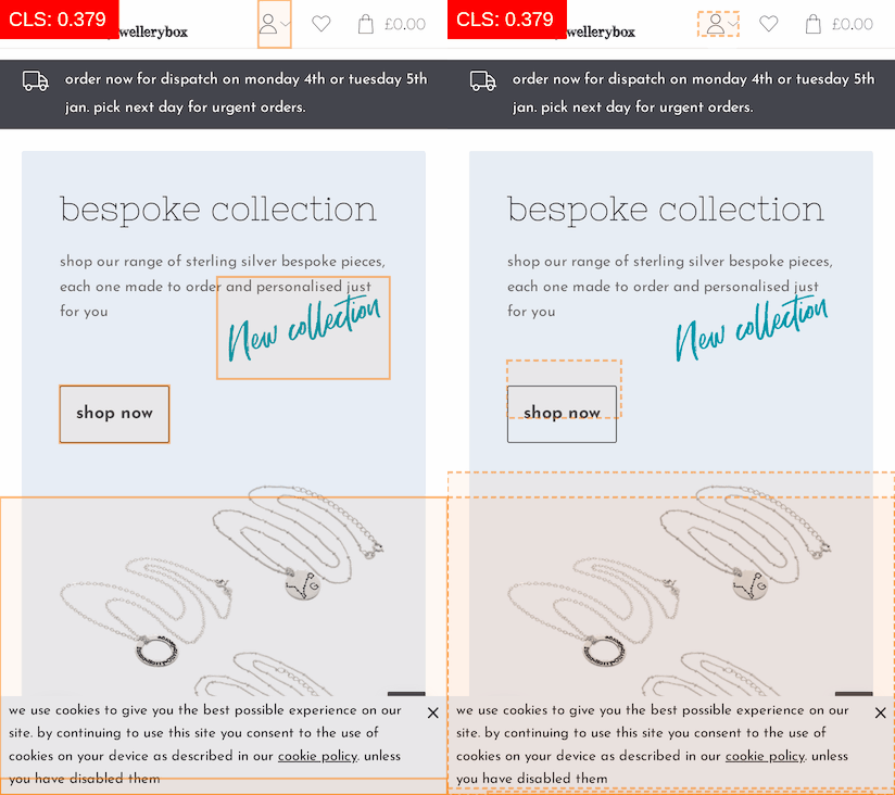
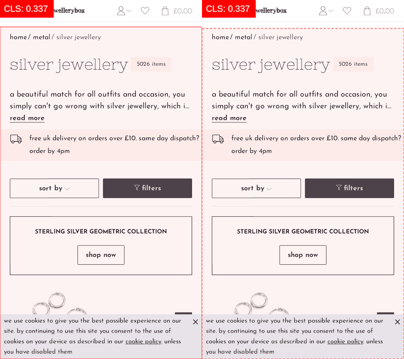
To stabilize layout, we tracked down elements causing CLS using browser tools and the Layout Shift GIF Generator. The fix often wasn't on the offending element itself but on a preceding one whose size or spacing caused a block to move. Setting explicit width and height values on images throughout the site—as recommended by Barry Pollard—was significant work but has eliminated related shifts.
One stubborn issue saw a high CLS score in Lighthouse but nothing in the Performance tab. With throttling enabled, we spotted the cause: a 2-pixel height increase in the mobile header. The header was meant to be a fixed height anyway; adding an explicit height value solved the entire problem, highlighting how imprecise current web performance tooling can be.
Restructuring The Product Page
Product pages suffered on mobile Page Speed scores due to poor layout logic and layout shifts. The desktop design uses two columns managed with flexbox. A tabbed section and a photo carousel in column A were duplicated in the HTML, with display: none toggling their state for mobile. The page's visual order was controlled by the flex: order property. This worked but reordered layout elements for mobile, hurting CLS.
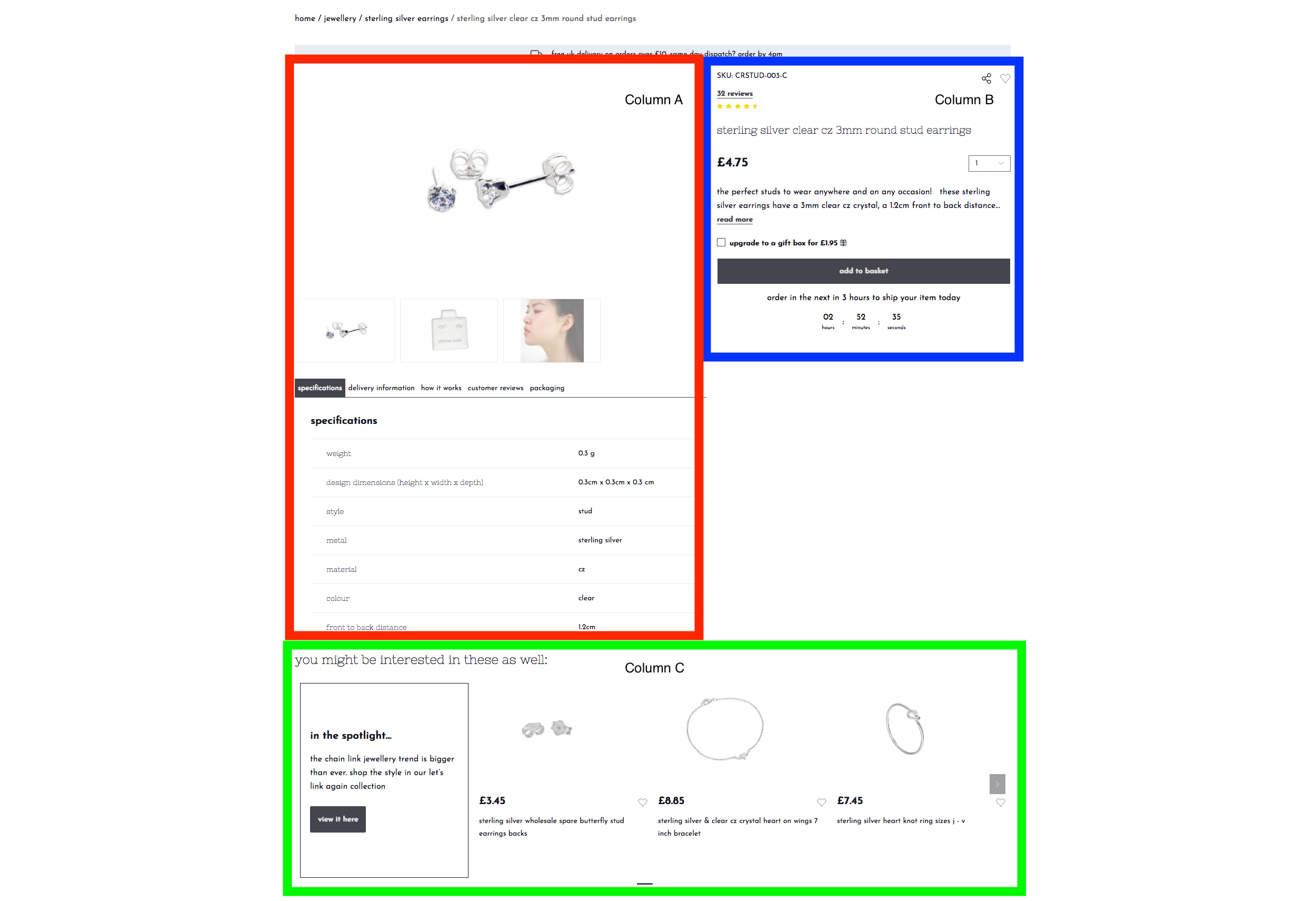
A simple experiment proved that using the CSS grid with defined areas would provide the same responsiveness without the expensive rearrangement. The redesign did more than just minimize CLS—placing the product name earlier in the HTML also proved to be a win for SEO.
See the Pen [Jewellerybox Case Study (Example #2)](https://codepen.io/smashingmag/pen/OJpzyLg) by Pfenya.
Carousel CLS Fixes
The carousels above the fold presented another particular challenge. Deferring their JavaScript load reduced time-to-interactive but left stacked slides visible until the code ran. The issue with carousels is the near-impossible task of setting fixed dimensions: image heights differ, product names can wrap unpredictably. We solved this by hiding all slides but the first until the carousel finishes loading. A class is then added to make all slides visible while keeping the row's initial layout unaffected.
Additionally, slides are set with flex-shrink: 0 and a base flex property of flex-base: 340px in a non-wrapping flexbox. This forces a single-line layout and initial width. With these fixes, the CLS footprint of the carousels is almost zero.
See the Pen [Jewellerybox Case Study (Example #3)](https://codepen.io/smashingmag/pen/vYxpNEK) by Pfenya.
What Several Months of Incremental Work Taught Us
The score improvements came from many small changes applied over several months, and the work is not finished. The front-end improvements were mostly handled by two people, with the rest of the team concentrating on the back end. That split was slower, but it meant there was no overlap, so score changes could be attributed to a specific set of changes with confidence.
At a certain point, the next optimizations stop being obvious, and changes you would not expect to matter end up making a real difference. Perhaps the more important lesson from the project is that performance goals and the metrics that measure them need to be planned from the start—during design, prototyping, and template implementation. Small choices made early are easy to overlook, then become significant work later when you must undo them.
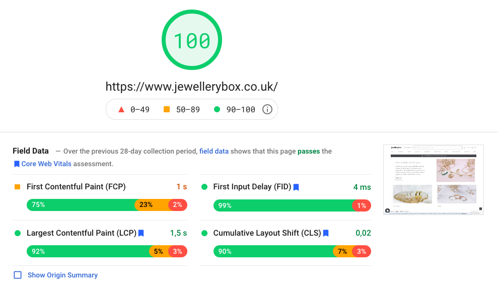
Some of the most useful takeaways:
- Loading JavaScript on demand is more effective than trying to optimize the code itself;
- Greater score gains come from CSS optimization than from JavaScript optimization;
- Write CSS classes with CLS in mind and plan for extracting critical CSS;
- Tools for detecting CLS issues are still imperfect; combine several tools and look beyond the obvious;
- Audit every third-party service for file size and performance timing; when possible, reject integrations that would slow the site down;
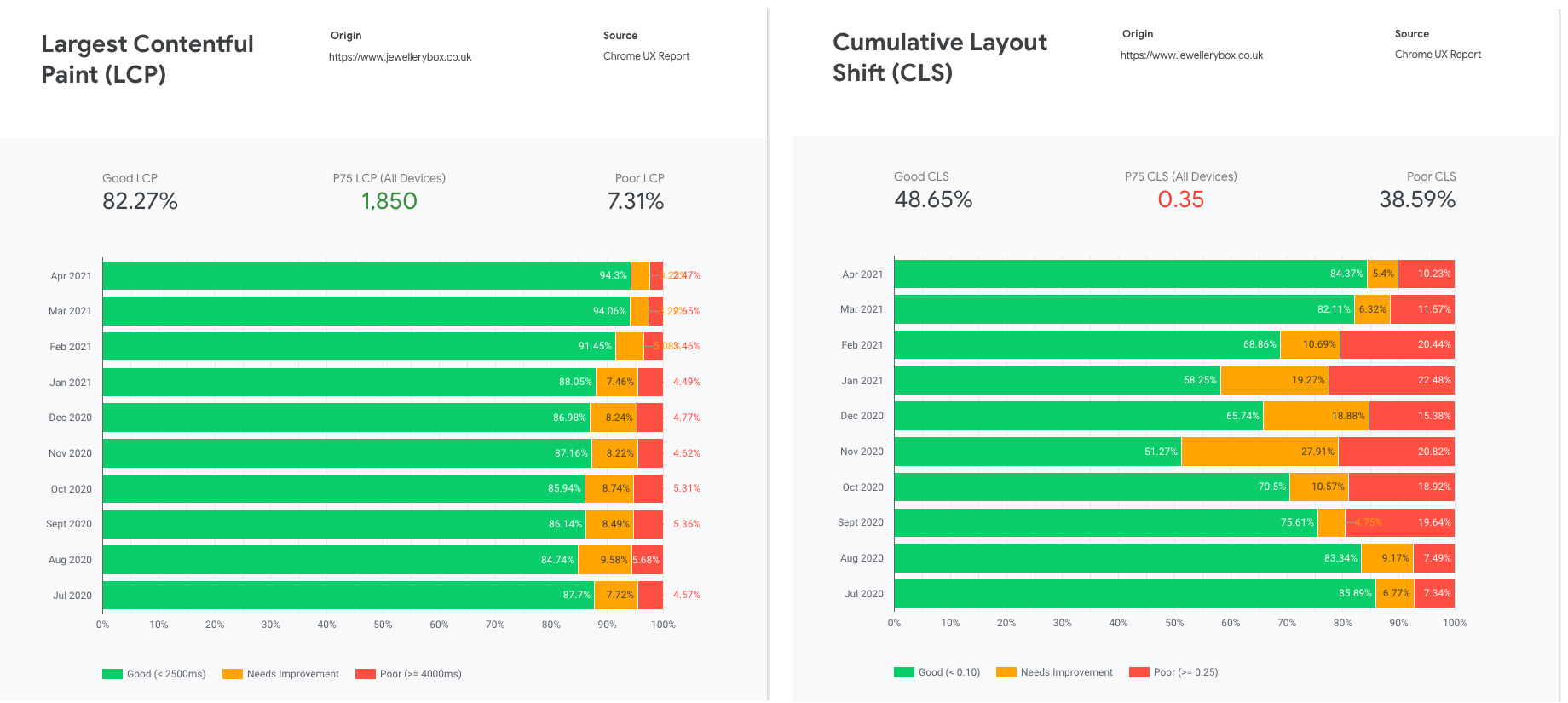
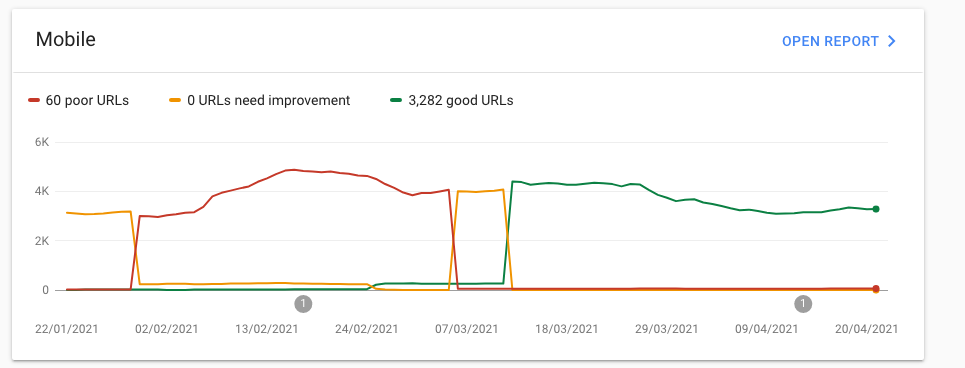
- Re-run tests regularly to catch CrUX changes, especially shifts in CLS;
- Review legacy support entries periodically to see whether they are still needed.
Still on the Improvement List
The remaining work is spread across several areas:
- Removing unused CSS from the main stylesheet;
- Eliminating jQuery entirely, which means rewriting parts of the checkout code;
- Running further experiments on integrating the external sliders;
- Improving mobile scores, which still have room for growth;
- Adding responsive images to all product images;
- Reviewing content pages, particularly their CLS behavior;
- Replacing Bootstrap’s collapse plugin with the native HTML
detailselement; - Reducing the overall DOM size;
- Integrating a third-party search service, which will bring a large JavaScript dependency that needs to be handled;
- Working on accessibility through automated checks and manual testing with screen readers and keyboard navigation.
We still have a backlog of improvements we want to tackle:
- There is a substantial amount of unused CSS left in the main file to remove;
- jQuery should be dropped completely, which requires rewriting some sections, especially the checkout;
- More testing is needed on how to properly embed the external sliders;
- Mobile performance scores should be better, so future work will focus there;
- Responsive images are not yet in place for every product image;
- Content pages will be reviewed for possible improvements, mainly around CLS;
- Bootstrap’s collapse plugin is to be swapped out for the native HTML
detailstag; - The DOM size needs to come down;
- A third-party service will be integrated for better and faster search, and that comes with a large JavaScript dependency to manage;
- Accessibility improvements will come from automated tools and our own testing with screen readers and keyboard navigation.




