Craft as a Competitive Edge in an AI-Driven Workflow
As AI tools make it easier than ever for anyone to generate a working prototype from a simple prompt, the gap between good products and great ones increasingly comes down to the human judgment applied along the way. AI can produce output that checks all the boxes on paper, but it often misses the mark in practice. The differentiating factor is craft—the combination of curiosity, intuition, taste, and intention that shapes raw generated ideas into something that actually works for real users.
Curiosity: Questioning the Scope Before Refining It
Curiosity is the habit of asking "why" and "what if" before committing to a direction. It means exploring multiple paths, testing assumptions, and iterating until the right solution validates itself. AI has lowered the barrier to this kind of exploration. Product managers can use tools like Figma Make to generate prototypes from prompts without writing code, and marketers can spin up campaign outlines in minutes with Claude or ChatGPT to compare against their brand voice. But AI has real limitations here: it cannot decide to wander off the original scope, question whether the scope itself should change, or sense when an unexpected hunch deserves deeper investigation.
Wide exploration at the start pays off later in the process with fewer second guesses and less rework. Figma Product Designer Natasha Tenggoro used Figma Make to test different ways to add video playback to Figma Buzz, generating prototypes that helped her explore more directions and test edge cases early. Engineers on her team also benefited, gaining a clearer understanding of the feature's scope and feasibility before significant time was invested.
Tim Van Damme, a product designer at Figma, took this further when creating icons for four new products. The task seemed straightforward—design four new icons—but he stepped back and asked whether a full overhaul of the entire icon suite was in order. Adding weeks to his timeline, he expanded the scope to revisit existing icons alongside the new ones, exploring hundreds of variations. The result was a refreshed suite that was more unified yet more distinctive, with each icon working for its product while remaining clearly part of the Figma family.
Intuition: Designing for Emotional Response
AI can accelerate time to market, but it cannot predict what will resonate emotionally with a customer. That instinct lives with product builders who can sense a confusing interaction even when it technically works in the prototype, or advocate for more white space in a cramped layout. As Eliel Johnson, Vice President of User Experiences and Design at CVS Health, puts it: "True design is when you're facilitating a vision of what could be. We want to be designing and asking, 'Does it feel good?'"
The shift toward emotional resonance is a strategic one. Andrew Hogan, Figma's Head of Insights, argues that building moats through features alone no longer works. If a team cannot intentionally design for an emotional response, competitors will copy functionality at a fraction of the cost. This requires understanding users' deep fears, hopes, and motivations—insights often only visible outside of a screen.
Plaid's rebrand illustrates this dynamic. After expanding beyond banking connections into identity verification, financial insights, and fraud prevention, the company needed a visual identity that served consumers, banks, and regulators alike. An initial partnership with an external agency stalled, and the project moved back in-house. The internal team had to move fast, embracing gut feelings instead of lengthy research cycles. The tradeoffs included more risk and time, but the resulting brand identity was flexible enough to grow with the company while remaining grounded enough to build trust across its diverse audiences.
Taste: Knowing What to Keep and What to Kill
Taste is distinct from intuition. Where intuition is a gut feeling that something might work, taste is the judgment to decide which ideas deserve refinement and which should be discarded. Early Figma investor Sarah Guo distinguishes this from mere aesthetics: "Real taste runs deeper—it's in the error messages, the loading states, the features you killed because they were merely good, not essential."
This kind of discernment often hurts. It means walking away from work you have invested days in, as Tim Van Damme did when he scrapped a bee icon for Figma Buzz after hundreds of iterations. It means prioritizing core interactions over extra features, as the Duolingo Math team did when testing new math games. And it means knowing when to stop refining and ship, even when endless tweaks remain possible.
As AI generates more ideas than a team could have produced on its own, taste becomes the editing function. AI can follow rules, enforce consistency, and detect visual irregularities, but it cannot weigh which of two technically correct solutions creates more trust or delight.
Building the horizontal scroll bar for Figma's Layers panel demonstrated this principle in practice. The panel needed to handle thousands of elements with shifting states without disorienting users. Some promising options failed in testing—auto-jumping to a layer made people lose their place, and small markers for hidden layers cluttered the panel. Other decisions, like how much blank space to leave above visible layers, had no single right answer. The design and engineering teams iterated until the interface felt balanced and unobtrusive, using heuristics to determine when and how far to auto-scroll when users clicked deeper into layers. The final result feels seamless, but achieving that required meticulous judgment applied to the smallest details.
Intentional systems beat fast outputs
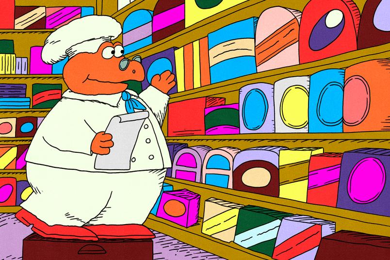
Speed is the easy part of AI-assisted design. The hard part is making sure the output actually fits the brand. AI tools need guardrails, and those guardrails come from a well-structured design system. Without one, the model is guessing — and it will guess wrong about things like the 8px padding your team prefers over 12px, or why red-500 never appears in a call-to-action. AI also can't recognize when a growing brand needs its system reimagined with new components, colors, or typography. That judgment is human design expertise.
“AI is really good at understanding the structure of a design system. You want your website or your application to look like your identity, so being able to provide that context of your design system to AI is worth investing in.” — Marcel Weekes, VP of Product Engineering at Figma
Polaroid rebuilds its foundation
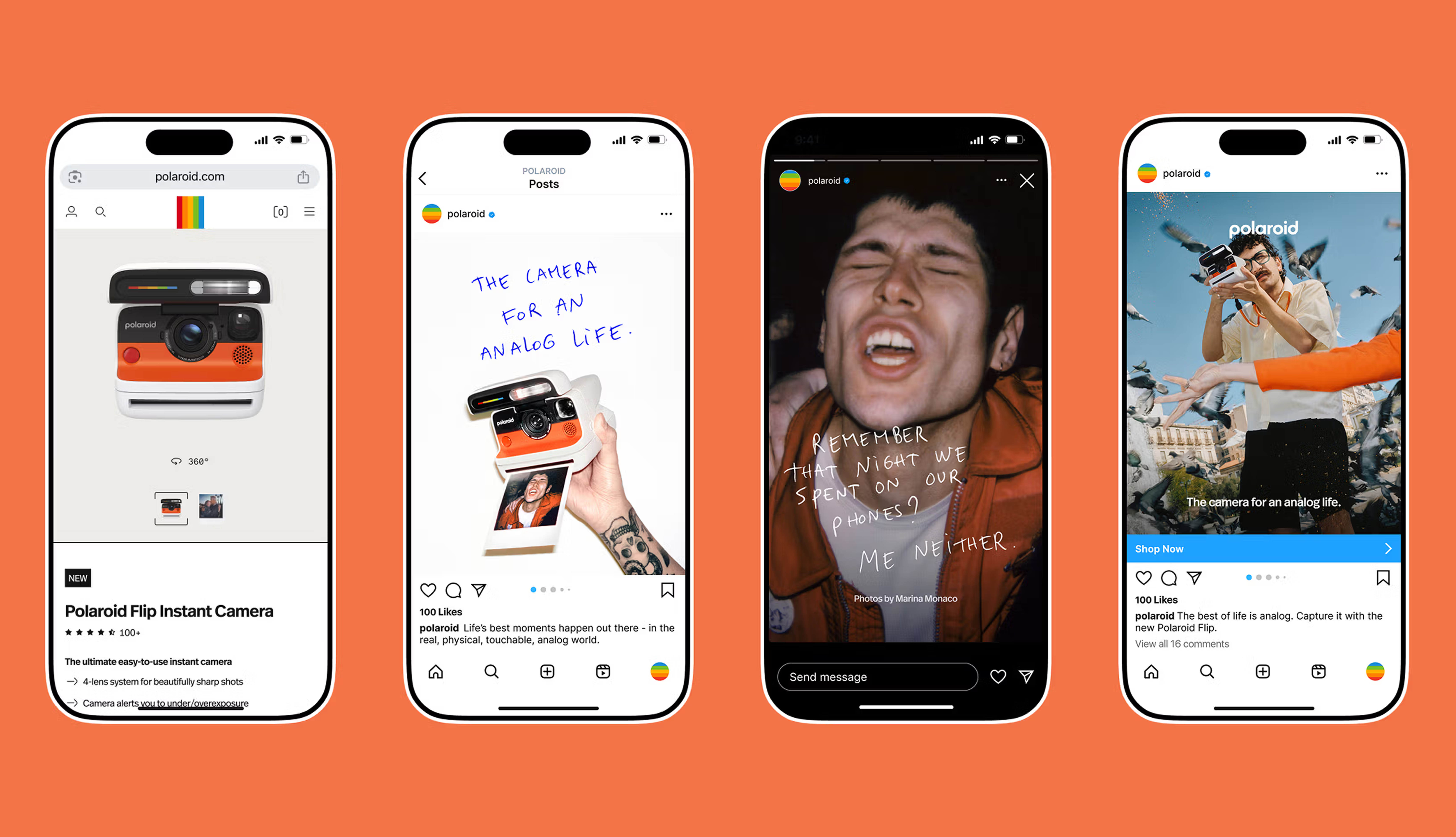
When Polaroid pivoted to the digital era, its design process was held back by fragmented tools and isolated files. There was no centralized system unifying the brand, and the friction was so severe that the team produced only an iOS app. The UX team's answer was to build a design system in Figma as a single source of truth, starting with shared components, tokens, and variables for colors, fonts, and themes. Standardizing core components let iOS and Android designs be maintained side-by-side, eliminating duplicate effort.
The result is faster shipping with greater consistency. Designers can scale across more products and platforms, and developers work from the same explicit rules, keeping every output cohesive and unmistakably Polaroid.
What AI makes abundant is scale. What remains scarce is the human curation that gives software its feel. Features and functionality can be reproduced; taste cannot. As Sarah puts it, in a world where AI can generate a CRUD app or clone any website instantly, the sensation of using something built with intention is the final line of defense.