

A Different Kind of Performance Metric
Among the Core Web Vitals, Cumulative Layout Shift (CLS) stands apart. The other two metrics — Largest Contentful Paint (LCP) and First Input Delay (FID) — map to familiar territory: loading speed and interaction responsiveness. CLS, by contrast, measures something that hasn’t traditionally been quantified: how much of the page visibly jumps around as content arrives late.
The metric is a unitless score, not a time measurement. Anything at or below 0.1 is considered good; above 0.25 is poor. It’s also calculated over the entire lifetime of a page, not just initial load — which makes it hard to reproduce in lab settings like Lighthouse, since shifts can happen any time a user scrolls and triggers new content to load below the fold.
Not all movement counts. Shifts that occur within 500ms of certain user interactions are excluded, on the assumption that if a user clicks a button and content appears, the resulting movement is expected. Pointer events and scroll are excluded from that rule. The metric is also evolving: a recent change moves the score from a sum of shifts over a page’s whole life to the largest burst of shifts within a bounded time window. That helps long-lived pages such as single-page apps, which were previously penalized for accumulating small shifts over time.
Reserve Space for Images and iFrames
The simplest fix for much CLS is to give your media elements explicit dimensions. Without width and height attributes, an image starts at zero size and pushes content down when it loads.
Change this:
<img src="hero_image.jpg" alt="...">
To this:
<img src="hero_image.jpg" alt="..."
   width="400" height="400">
Use the image’s intrinsic dimensions — the actual size of the source file — and let CSS scale it down for responsive layouts. You can find those dimensions in DevTools by hovering over the element.
For responsive images that use CSS constraints like max-width: 100%, the width and height attributes let the browser compute the correct aspect ratio if you override the height to auto in your stylesheet:
img {
  max-width: 100%;
  height: auto;
}
The technique works for <picture> elements and srcset images when set on the fallback img element, and for native lazy-loaded images. One caveat: it doesn’t yet handle images with different aspect ratios at different breakpoints, though work is underway.
Use the aspect-ratio Property
For non-image elements, the newer CSS aspect-ratio property generalizes the idea. It’s supported in Chromium browsers and Firefox, and appears to be heading to Safari soon.
For an embedded video, you can reserve a 16:9 space without a wrapper element:
video {
  max-width: 100%;
  height: auto;
  aspect-ratio: 16 / 9;
}
There’s a subtlety here: browsers that don’t know about aspect-ratio will ignore the height on responsive video elements and fall back to a default ratio of 2:1, so this property is necessary to prevent shifting there. The same approach works for custom <div> components that need a responsive box.
An older fallback, the padding-bottom hack, still exists for unsupported browsers, but it’s cleaner to use aspect-ratio where possible — especially since Chrome, which is the only browser feeding CLS data back to Google, supports it.
Reserve Space for Dynamic Content
For elements that need a fixed rather than proportional size, min-height is your tool. A header with a specific height is a typical case, and you can adjust the value at different breakpoints with media queries.
The same approach works for content injected by JavaScript. If a page initially renders without a div that will later be added:
<div class="container">
  <div class="main-content">...</div>
</div>
And JavaScript inserts it later:
<div class="container">
  <div class="additional-content">.../div>
  <div class="main-content">...</div>
</div>
You can target the container in CSS to reserve space before that injection happens:
.main-content:first-child {
   margin-top: 20px;
 }
This does create a shift on the container itself, since the margin belongs to that element. A cleaner alternative is to apply the space via the ::before pseudo-element so the main content doesn’t move at all:
.main-content:first-child::before {
   content: '';
   min-height: 20px;
   display: block;
 }
The most reliable approach, though, is to include the placeholder div in the HTML from the start and put a min-height on it — then there’s no layout change to measure in the first place.
Check Fallback States for Element Mismatches
Progressive enhancement can introduce subtle CLS problems when the no-JavaScript version of an element differs from the enhanced version. One recent example involved a “Table of Contents” menu button in a site header: without JavaScript it was a plain link styled as a button; with JavaScript it became a dynamic menu. Although the two elements looked nearly identical, the fallback link was a couple of pixels shorter than the button.

That small difference was enough for Chrome to register a layout shift. Since the element sat in the header, the entire page moved down a few pixels, pushing the CLS score into the “Needs Improvement” range. The fix was straightforward: align the dimensions of both versions (or set a min-height on the header). Remember that all users experience the no-JavaScript state briefly while scripts download — not just those with JavaScript disabled.
Web Fonts and Layout Shifts
Web fonts commonly cause CLS because the browser first reserves space using fallback fonts, then recalculates layout when the webfont arrives. Even preloading the font doesn’t eliminate the shift — it only shortens the fallback window, which helps LCP but not CLS. Prefetching can help if you know the next page requires a particular font.
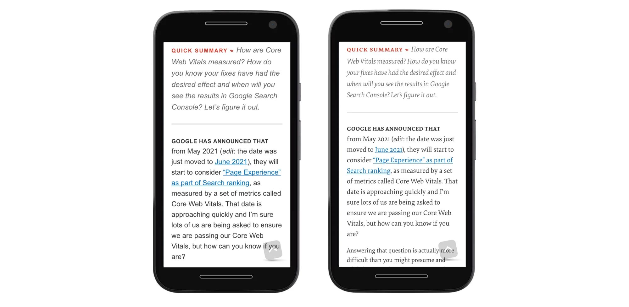
Options to reduce font-induced shifts include using system fonts, font-display: optional, or reserving space with min-height on elements likely to change size (e.g., an <h1>) so content below isn’t pushed down. These approaches work best when the fonts won’t alter line counts.
More promising are the upcoming CSS Font Descriptors, which simplify adjusting fallback font metrics directly in CSS. Previously, this required the Font Loading API in JavaScript, which was more complex. The CSS approach should make it easier to avoid font-related shifts.
@font-face {
  font-family: 'Lato';
  src: url('/static/fonts/Lato.woff2') format('woff2');
  font-weight: 400;
}

@font-face {
    font-family: "Lato-fallback";
    size-adjust: 97.38%;
    ascent-override: 99%;
    src: local("Arial");
}

h1 {
    font-family: Lato, Lato-fallback, sans-serif;
}
Review Initial Templates for Client-Side Rendering
Single-page apps often render a basic HTML/CSS shell before hydrating with JavaScript. As features grow, these initial templates can fall out of sync with the JavaScript version, causing shift when components are injected later. Regularly review that the templates serve as accurate placeholders, and size any empty <div>s appropriately.
Give the root div a min-height so it isn’t rendered at zero height before hydration. A min-height greater than most viewports prevents the footer from shifting up, for example. CLS only affects what’s visible, so an initially collapsed container can cause a noticeable shift for anything below it.
<div id="app" style="min-height:900px;"></div>
Keep Post-Interaction Shifts Within 500ms
Layout shifts that occur within 500 ms of a user interaction are excluded from CLS. If an action takes longer — for example, fetching content over the network — and then inserts content, the resulting shift will count toward the score.
Chrome DevTools can confirm whether a shift was excluded. Use the Performance tab to record a session and interact with the page. In the Experience section, shifts appear as reddish boxes. Selecting one shows details such as the Had recent input flag, which indicates the shift was not included in the cumulative score.
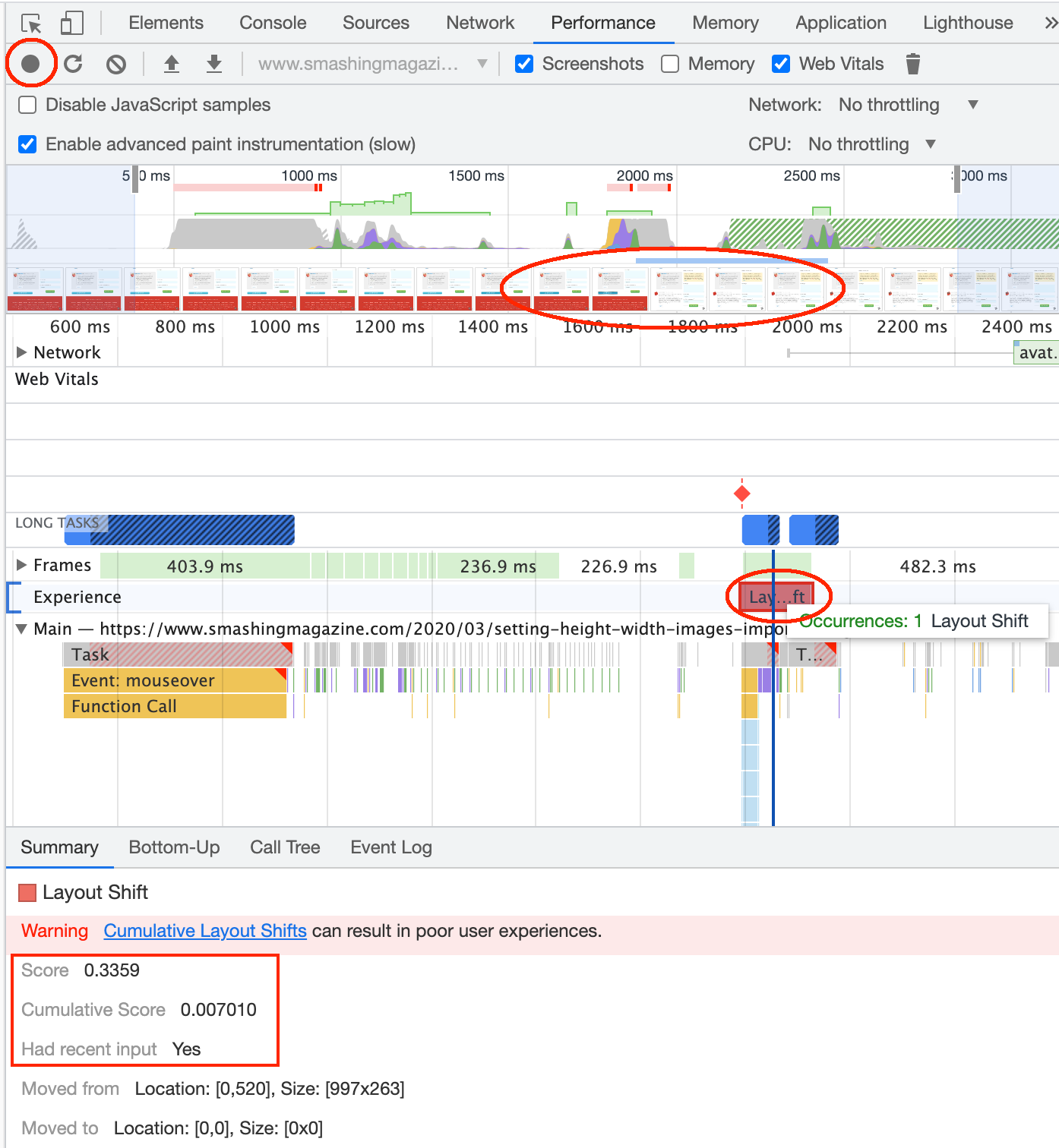
Ideally, interactions complete within that window, but when network latency is unpredictable, reserve the needed space in advance so any late shift is already accounted for. Also, watch animations longer than 500 ms, which can push content and affect CLS. If that limit feels too tight for a particular use case, the Chrome team accepts feedback on the web-vitals forums.
Delaying Render to Avoid Shifts
One less conventional technique is to avoid rendering content until layout has settled. If an element will cause a shift, hide it, run render-blocking JavaScript to populate it, then unhide it. Because the script blocks rendering, nothing below is painted first, so no shift occurs.
<style>
.cls-inducing-div {
    display: none;
}
</style>

<div class="cls-inducing-div"></div>
<script>
...
</script>

<style>
.cls-inducing-div {
    display: block;
}
</style>
Inline the CSS so it applies in order, and keep the reveal in a separate style block so content still appears if JavaScript fails. The technique also works with external JavaScript, though that adds network delay; preloading the script can minimize it.
<head>
...
<link rel="preload" href="cls-inducing-javascript.js" as="script">
...
</head>
<body>
...
<style>
.cls-inducing-div {
    display: none;
}
</style>
<div class="cls-inducing-div"></div>
<script src="cls-inducing-javascript.js"></script>
<style>
.cls-inducing-div {
    display: block;
}
</style>
...
</body>
This runs counter to general advice about avoiding render-blocking scripts, but it’s useful when content can’t be predetermined. For example, a cookie banner that must read a cookie on a static site can shift content down when it appears. Placing the banner elsewhere or overlaying it is an alternative, but if it must sit at the top, deferring its render avoids the shift.
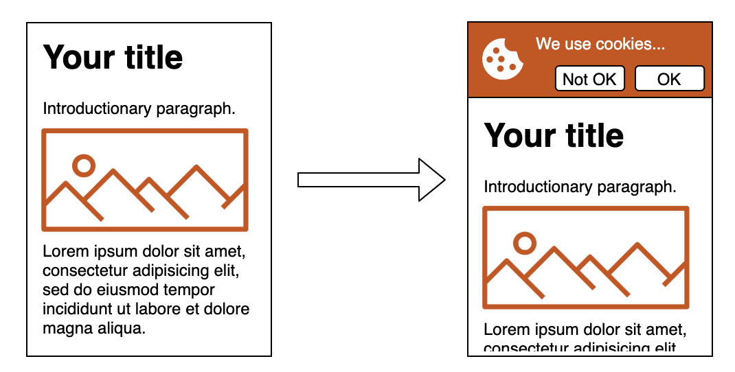
The same approach can handle JavaScript that rearranges content into different columns when the markup can’t be structured that way server-side. Hiding the container until the rearrangement completes prevents the CLS penalty, and the graceful fallback shows the original layout if scripts don’t run. Be aware this may affect LCP and First Contentful Paint since rendering is delayed, but it remains an option when no other solution works.
Why CLS Still Matters
Layout instability rarely comes from a single mistake. More often, it is the result of several small oversights — images without dimensions, fonts that swap after rendering, or scripts that inject content into an already-painted page. Combined, these create the jarring shifts that hurt user experience and Core Web Vitals scores.
The fixes are equally incremental. Setting explicit width and height attributes, reserving space for late-loading elements, and being deliberate about when and how third-party scripts run all go a long way. Modern CSS features like aspect-ratio and content-visibility make some of these patterns easier, but the underlying principle has not changed: the browser should know how much space content will occupy before it is painted.
A Persistent Problem Worth Solving
What makes CLS particularly insidious is that it is invisible in a way that other performance metrics are not. A slow load is easy to feel; a layout that shifts subtly while the user is reading or about to click is easier to miss in testing but immediately noticed in practice. The renewed attention from Core Web Vitals has pushed this issue back into the spotlight after years of being treated as a minor annoyance.
That attention is overdue. Many production sites still ship with avoidable sources of shift — unconstrained embeds, dynamically injected banners, and font loading strategies that leave visible text unresolved. Auditing for CLS does not require exotic tooling. A careful pass with Chrome DevTools or a field-data report will surface the offenders, and the remedies are usually straightforward.
Toward a Stable Page
A score of zero is possible, but not every site needs to chase that milestone. What matters is eliminating the shifts that users actually notice. In practice, that means:
- Always giving media and iframes explicit dimensions, or using
aspect-ratiowhere dimensions vary. - Keeping
font-displaystrategies aligned with how much layout change you can tolerate. - Reserving space for async content, ads, and embeds rather than injecting them blindly.
- Using
transformanimations over properties liketopormarginthat trigger layout.
These habits also tend to improve other aspects of performance. A page that is stable is often one that is also more predictable to render, easier to maintain, and less surprising for users on slow connections or older devices.
Further Reading
- The Core Web Vitals documentation from Google, including the dedicated CLS guide, covers measurement and thresholds.
- The Chromium CLS changelog tracks how the metric has been refined across Chrome releases.
- Community guides, such as Jess Peck's and Karolina Szczur's write-ups, offer pragmatic examples of diagnosis and mitigation.
- Tools like the Layout Shift GIF Generator help demonstrate the problem visually when reporting bugs or explaining the issue to stakeholders.



