

Patterns Over Elements
Calling something a “design pattern” can get fuzzy fast, so it helps to separate elements from patterns. An element is a small, isolated component: a button, a chip, a card. A design pattern is a reusable combination of elements built for a purpose — a larger module that does meaningful product work on its own.
Most design systems I’ve seen focus on elements. Creating a solid library of buttons and inputs is real work, and it matters. But a good set of elements alone doesn’t unlock the value of a design system. It won’t save you much time, and it certainly won’t keep designers and engineers aligned. With mature open-source component sets available from Tailwind, Bulma, Skeleton, or MUI, many teams can skip much of the element-building and restyle existing ones. The elements are necessary — everyone needs to use the same primitives — but they don’t implement a feature or deliver an experience.
Some of those libraries do package combinations of elements. MUI ships pre-built “Data Grid” components; Salesforce Lightning Web offers “blueprints” like a “List Builder.” Those are patterns, technically, but they aren’t likely to work as-is for your situation. Your product has constraints no generic library anticipates. You can treat them as inspiration, but reworking them into something that actually fits usually takes longer than building what you need from scratch.
What makes a pattern useful is that it encodes a reusable part of your own product — the combinations you find yourself assembling again and again. Product-specific patterns show up everywhere:
- A tile in a streaming TV app, used to browse content in rows. It resembles a “card,” but it isn’t really one: each service’s tiles carry different content and controls tuned to that product.
- A dashboard meter in an analytics tool like Google Analytics. It’s similar to a “panel” but far more specific, mixing titles, category labels, “big numbers,” charts, text snippets, and filters in proportions that vary from app to app.
- A tree view in a genealogy app, letting users explore family relationships in a layout that adapts to a phone screen. One app may prioritize research; another may prioritize visualization.
In each case, the team built something particular to their product. That investment pays off: once a pattern exists, the next project gets meaningfully easier. The team accumulates a kit of parts they can polish and refine over time. The patterns — not the elements — are the real heart of a design system. A team succeeds when its focus shifts to patterns first, making each one completely reusable and polished for every context the product throws at it.
Collaboration By Way Of Patterns
Pattern work also gives designers and developers a concrete way to collaborate — a way to align how something is designed with how it gets built. For this, a pattern doesn’t need to be a polished mockup. It can start as a rough wireframe, something both sides sketch out together. No special tooling is required, and anyone on the team can contribute and iterate. That shared artifact is what lets designers and developers work in parallel instead of waiting on a hand-off.
The clearest way to see how this works is to walk through an example.
A Pattern-Driven Workflow
To see how patterns work in practice, imagine a small team building an app called “WeTrip,” which helps groups of travelers propose and vote on daily plans. The team includes designers, engineers, and product people, and they want to move fast without blocking each other on design work.
They start by agreeing on a few core objects. On a whiteboard, they define a “Person” — someone on the trip who votes on where the group goes — along with its properties.

That becomes their first pattern. They continue with a “Place” (a location someone wants to visit) and an “Occasion” (a scheduled time for the group to do something together).

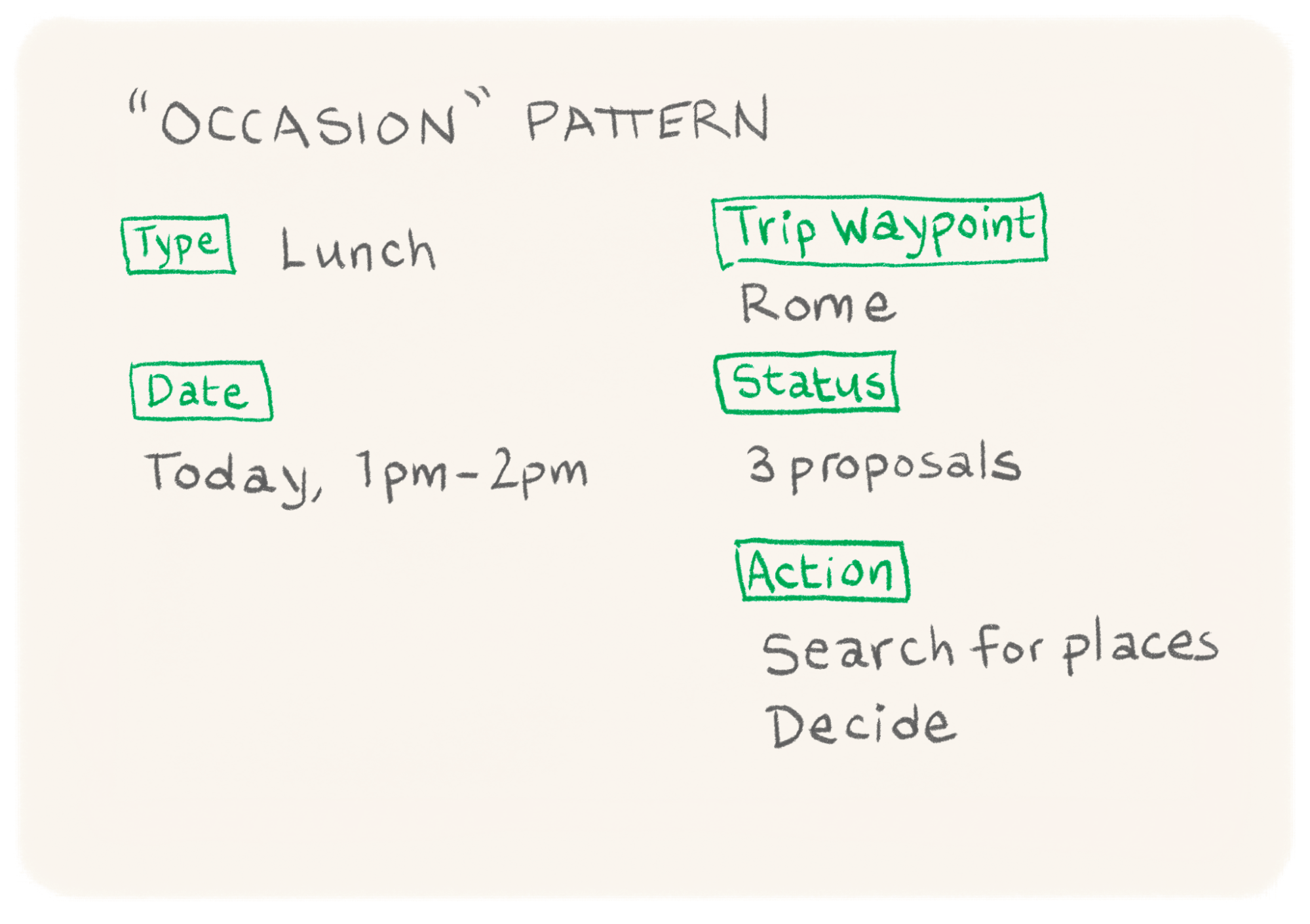
The medium doesn’t matter — whiteboard, shared document, or collaboration app. What matters is that everyone participates, so the team is aligned on names and details before work begins.
Some pattern components can come from an existing design system. The team decides to reuse restyled MUI elements, which already have defined properties like color and content. They pull these into Figma and into their React app, which already uses MUI as a dependency, adding the standard element properties to each pattern.
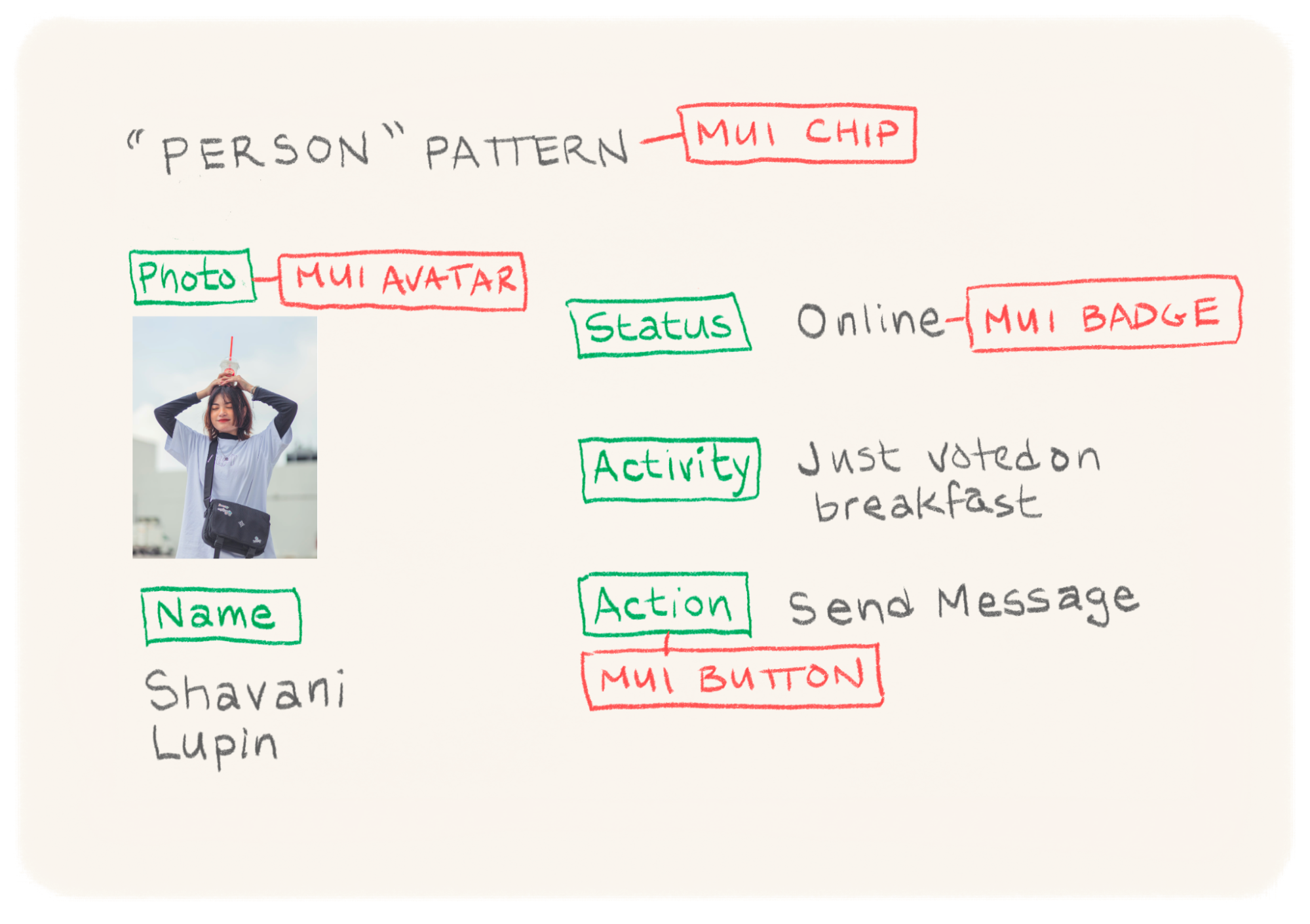
For every pattern, they create a shared Notion page that anyone can edit. They start by listing the MUI element properties they’ve chosen, then flatten and group those properties by importance — primary versus secondary.


In Figma, each important property (such as activity or actionsAvalable) becomes a component variant. In development, those properties become part of the component as well. Design and code stay aligned in the ways that matter without being identical in every detail.
Discussing properties is low-stakes: adding one to the document doesn’t mean it ships. It just means the idea is on the table, and final decisions can come later.

After doing the same for “Place” and “Occasion,” the team has a shared vocabulary and a clear list of important properties. Designers and developers can start work immediately. An engineer might stub out a Person component while a designer sketches the same pattern in Figma, with no handoff bottleneck.


Iteration continues without waiting. Engineers discover they need a presence property to know whether a user is currently active (which affects how notifications are shown) and add it to the shared document.
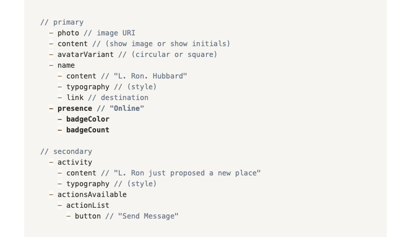
Designers see the addition, decide to create a presence indicator, and group it with the primary elements. Because the pattern document stays current, the team doesn’t stall while someone updates a spec.
When bigger product questions come up, the team meets to define the app’s primary views: a “People” view for trip members and their status, a “Schedule” view for daily occasions and plans, and a “Proposals” view for suggesting and reviewing places. For these patterns, a product owner prefers wireframes over outlines — that works fine, as long as the format shows elements and groups.
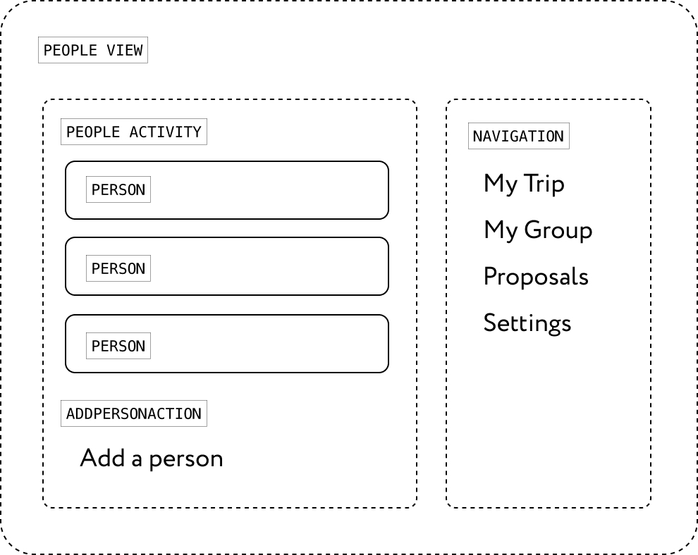


These view patterns nest lists of the Person, Occasion, and Place patterns. The team notices that “Person” appears in two different contexts, so they add a property to the pattern to account for the difference.
Engineers who get ahead of design can use standard MUI components or propose additions to the pattern document. Designers can introduce new components when needed. Either way, nobody blocks anyone else.
Patterns in Larger Organizations
This workflow assumes a small team where pattern definition is central to product work. In larger companies, other stakeholders and processes will shape how a design system is built. Patterns can still help there, especially for making a case for design system investment, because they show concrete reuse and productivity gains. They may simply play a smaller role within broader organizational processes.
For a small team, the risk is different: there’s pressure to skip design system work and ship faster. But building the patterns up front makes iteration easier later, so the team maintains the discipline even when it feels like extra effort.
From Patterns to a Maintained System
Once patterns become an established collaboration tool, they can be extracted into separate repositories and refined independently — as a dedicated Figma library or as standalone modules in development. If the team grows, each pattern can get an owner who handles bugs and polish.
A pattern’s property list can evolve into a formal API once the module is stable enough for reuse. In WeTrip, the scrolling list of places for a day later gets reused in a search results view without new design or development work.
Because patterns represent only reusable parts, they tie design system work directly to product improvement. Reuse can be tracked as a metric, just like test coverage, and used for prioritization. When patterns become widespread, they can be integrated into a federated module build process like the one built into Webpack 5, making them part of the modern development toolchain.



