

The Component Bloat Problem
For design systems serving large products, the most expensive resource is designer time. A significant portion of that time gets consumed not by actual design work but by repetitive structural debates: “Should this be a separate component or a variant?” “What should the configuration options be?” These conversations recur constantly, and even after a decision is made, the next similar component triggers them all over again.
The difficulty is that you're optimizing for multiple, sometimes competing goals: consistency, scalability, creativity, and maintainability. The list item is a prime example — an interface element with enormous reusability and an almost unbounded set of variations. If the Title-Subtitle variant is a component, where does the trailing chevron live? What if it's an info icon instead? What about a leading image or a switch? And all the while, every one of these configurations shares states like selected, pressed, and disabled.
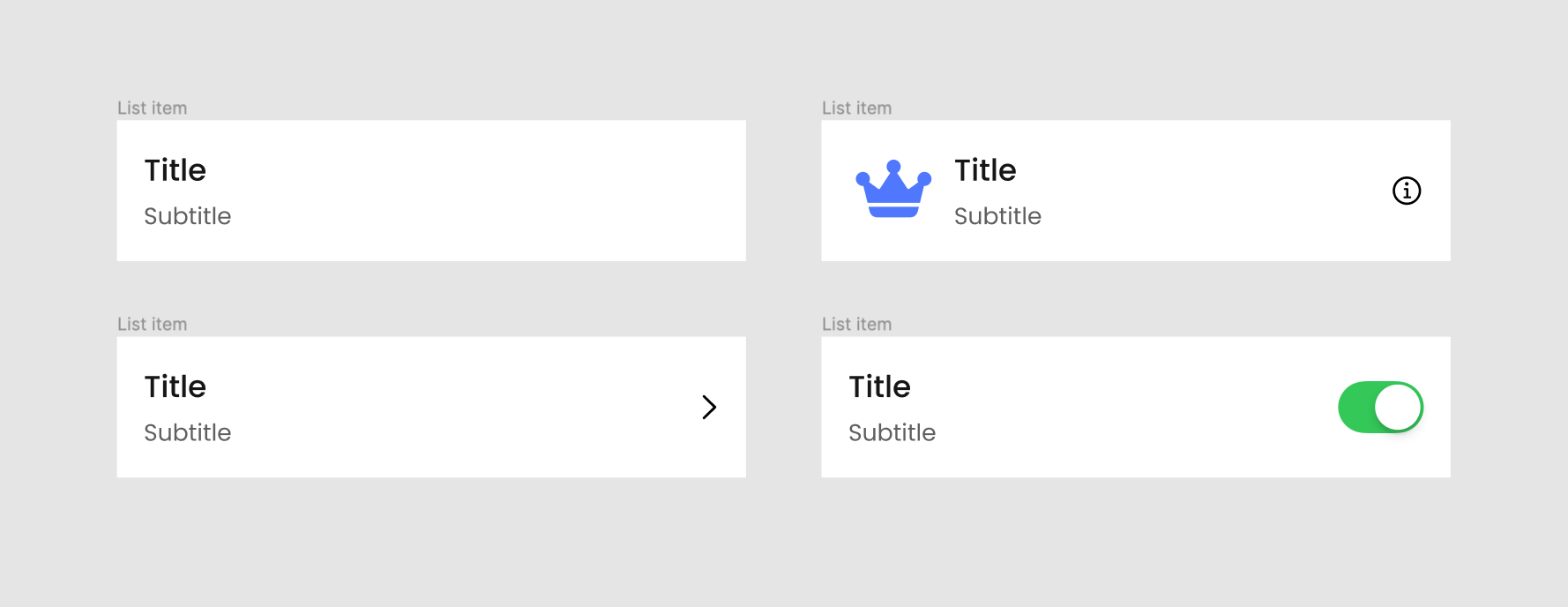
The traditional approach many teams take is to enumerate every possible combination as its own variant set. This leads to maintainability nightmares: when you need to change the background color or corner radius for a selected state, you must manually update every single variant that uses it. In one case with list items, that meant touching 32 separate variants just to change one style attribute. This is inefficient, error-prone, and scales poorly.
The Composition Approach
Modern front-end frameworks — SwiftUI on iOS and Jetpack Compose on Android — already solved this problem using composition. Rather than defining each full permutation as a discrete unit, you define small building blocks and compose them together. Figma's auto-layout, variants, and instance swapping capabilities now let designers apply the same structural patterns that developers use in code.
The concept breaks a component into two conceptual slices:
- Generic content: the area that hosts any UI content you need to slot in.
- Enhancing elements: constant elements with defined behavior — switches, chevrons, buttons, background states, and interaction patterns.
For the list item example, you start by defining a container — a background component holding styling like fills, corner radius, and shadows, plus general layout parameters like padding. Inside this container you nest an instance of a generic content placeholder. This placeholder is the swap point where other components will be inserted.
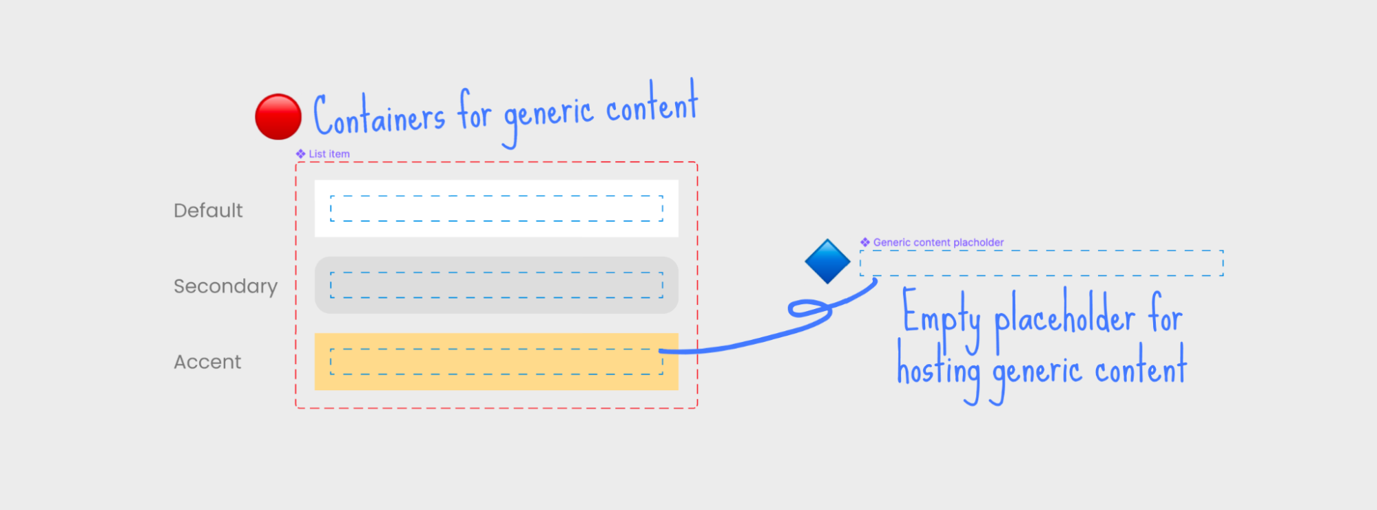
Enhancing elements follow the same structure: each one gets its own container defining the element's placement and padding, with another content placeholder nested inside. The content pieces themselves — the actual title/subtitle text blocks with images — are defined separately, without any background baked in.
Assembling a final list item means working bottom-up on the Z-axis. You pick a container state, then swap its nested placeholder with your content. When an enhancing element is needed, you first swap in that element's container, then swap its inner placeholder with content. This nested swap approach means every piece keeps a single source of truth: background styling lives in the container, the switch behavior lives in its enhancing container, and the text layout exists in the content component only.
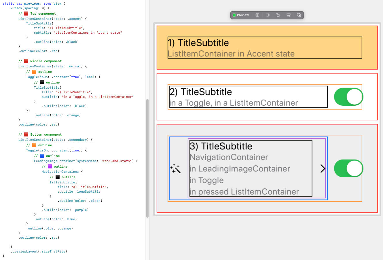
The same component structures carry over to code. In SwiftUI or Jetpack Compose, these same containers and placeholders map directly to composable functions. Native system controls, like a standard iOS toggle, plug into the composition seamlessly alongside custom components.
Why Bother?
The composition structure delivers several concrete advantages over exhaustive variant sets:
Consistency
With all background patterns defined once and reused everywhere, visual states remain visually identical across features and teams regardless of how many designers touch the files. Ad-hoc designs get eliminated because there is no way to redefine a state subtly differently each time.
Error-Proof Design
Since a designer selects an existing container and swaps content into a fixed slot, accidental padding modifications and misplaced states become impossible — unless the instance is detached. The structure itself enforces correct usage.
Flexibility
Because the content placeholder accepts any component, you are not restricted to a predefined list of content types. Usually flexibility falls off as consistency increases, but composition avoids that trade-off entirely.
Fewer Variants to Maintain
State definitions are stored once in the container, not duplicated per final component. The same holds true for enhancing elements. This reduces the total variant count for the system and breaks the routine of updating one style in thirty places.
Shared Language With Engineering
When design components reflect how components will actually be composed in code, documentation friction drops. Designers and developers speak the same structural language, and the Figma component tree becomes almost a pseudo-code specification for the implementation.
Applying It Elsewhere
This pattern isn't specific to list items. The same approach fits any component that shares styling across multiple content types:
- Cards: reuse the same background system for active, highlighted, and disabled states.
- Bottom sheets: define the sheet-container once, and let any screen content swap into its placeholder.
When Is Composition Appropriate?
Composition is a tool with a scope. A useful rule of thumb is to apply it when you can cleanly slice a component along the X/Y/Z axes into two logical pieces: a generic content area that can host different content, and enhancing constants — visual style, fixed controls, interaction behavior — that would otherwise duplicate across every content variation. Some interpretation is required, but multiple valid slice points are fine; that flexibility is part of the design's power.
Managing Scope in Production
Unrestricted composition has a downside made obvious in examples that combine inappropriate elements — say, a toggle plus a checkmark in the same list row. Not all compositions are meaningful, and exposing every combination promotes absurd results.
To reign this in, consider organizing components in a clear hierarchy:
- Container-backgrounds: Z-axis stacking elements defining only styling (background color, corner radius, shadow) and general layout (padding, content position). These have no semantic content of their own.
- Enhancing-element containers: containers that add consistent elements like chevrons, switches, buttons, or icons.
- Content components: the actual concrete content implementations and leaves of the composition tree.
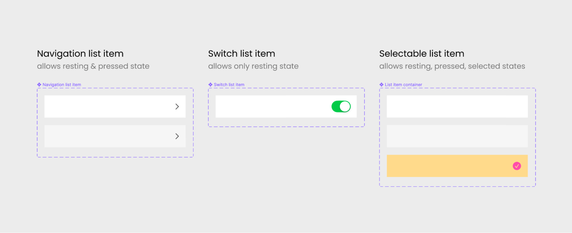
Tighter coupling within that hierarchy keeps control. For a Navigation list item, you combine the container-background (offering default and pressed variants) with the chevron enhancing container specifically. This produces a component that supports arbitrary content insertion while forbidding states out of its scope and other enhancing elements, reining the combination space.
Making Composition Sustainable
In practice, the composition-based model has proven itself across the mobile teams at Tech Report’s partner organization. Cards and list items on both iOS and Android now rely on composable components, and the reception has been strongly positive from both designers and developers.
The main trade-off is upfront complexity: constructing the nested component architecture requires more initial effort than a flat, one-off component library. However, that investment is recovered through reduced maintenance over time. Because each atomic piece is defined once and reused across multiple composite structures, updates propagate consistently without touching every instance manually.
This benefit holds even if the system is never synced with code. Keeping a composable structure solely within the design system still reduces upkeep compared to maintaining standalone variants for every permutation. The system becomes more elaborate internally, but the result is a cleaner, more elegant final product for end users.
The key is treating the composition layer as a first-class part of the design system rather than an afterthought. It requires discipline to define stable, reusable atoms and to avoid over-engineering composites that few teams will actually need. When done well, the architecture pays for itself in faster iteration and fewer inconsistencies across platforms.
Author’s note: This article was written in collaboration with Petar Kanev, an iOS developer.



