Negotiating Content Based on Device Reality
Building sites that perform well for every user is complicated by the vast range of device capabilities and network quality. While browser features can improve loading performance, they don't tell you what a user's hardware can handle or how good their connection is. That's where client hints come in.
Client hints are an opt-in set of HTTP request headers that reveal details about the user's device and network conditions. By reading this information server-side, you can alter how content is delivered based on device or connection parameters. This allows for more inclusive user experiences tailored to actual conditions rather than assumptions.
Another Form of Content Negotiation
Client hints are a type of content negotiation: changing your response based on request headers sent by the browser. A familiar example is the Accept header, which declares which content types the browser understands. For image requests, Chrome's Accept header looks like this:
Accept: image/webp,image/apng,image/*,*/*;q=0.8
All browsers support common formats like JPEG, PNG, and GIF, but this header reveals that Chrome also handles WebP and APNG. You can use that information to pick the best image variant for each browser:
<?php
// Check Accept for an "image/webp" substring.
$webp = stristr($_SERVER["HTTP_ACCEPT"], "image/webp") !== false ? true : false;

// Set the image URL based on the browser's WebP support status.
$imageFile = $webp ? "whats-up.webp" : "whats-up.jpg";
?>
<img src="<?php echo($imageFile); ?>" alt="I'm an image!">
Client hints extend this same idea to device capability and network performance. Instead of just content type, they let you negotiate based on the user's individual context. For example, you could choose to skip non-critical resources for users with slow connections. This guide walks through the available hints and how to apply them to make content delivery more responsive to real user conditions.
How to Opt In
Unlike Accept, client hints aren't sent by default (with one exception: Save-Data, covered later). To keep request headers lean, you must explicitly request the hints you want by sending an Accept-CH header when the user first requests a resource:
Accept-CH: Viewport-Width, Downlink
The Accept-CH value is a comma-separated list of hints your site will use for subsequent requests. When the browser sees this header, it understands: "this site wants the Viewport-Width and Downlink client hints." We'll explain what each hint means shortly.
You can set this opt-in header from any backend language, such as PHP's header function. You can also configure it directly in markup using the http-equiv attribute on a <meta> tag:
<meta http-equiv="Accept-CH" content="Viewport-Width, Downlink" />
Client Hints: Device and Network Signals
Client hints fall into two broad categories: those describing the user's device and those describing the network. Device hints are often screen-related but can also influence how much code or media you ship. Some key terminology helps clarify how these hints work:
Intrinsic size: The actual pixel dimensions of a media resource, as stored in the file itself.
Density-corrected intrinsic size: The intrinsic size divided by the device pixel ratio. For markup using both 1x and 2x sources, a device with a DPR of 2 will request the 2x image; its density-corrected intrinsic size equals the 1x dimensions.
Extrinsic size: The rendered dimensions after CSS properties like width and height are applied, and any layout factors are considered.
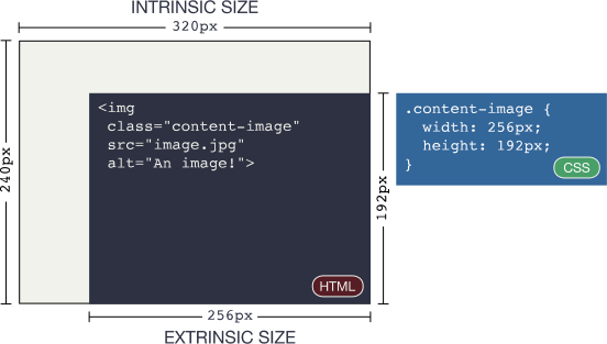
width: 256px;
and height: 192px; transforms a 320x240 intrinsically sized image
to a 256x192 extrinsically sized one.Device hints
The Viewport-Width hint reports the width of the user's viewport in CSS pixels. This can be combined with other screen hints for art direction (delivering different crops for different screen sizes) or to skip resources unnecessary for the current viewport.
Viewport-Width: 320
DPR reports the ratio of physical pixels to CSS pixels on the user's screen. This is useful for matching image sources to pixel density, similar to how x descriptors work in srcset.
DPR: 2
The Width hint appears on requests for images loaded via <img> or <source> tags that use the sizes attribute. The hint tells the server the optimal intrinsic width for the image, based on the layout's extrinsic size and the screen's DPR. For instance, on a 320 CSS pixel wide screen with a DPR of 2, an image with sizes="85vw" prompts a Width request for an image roughly 544 pixels wide (85% of viewport width, multiplied by DPR). This reconciles screen capabilities with layout needs, allowing the server to negotiate the most efficient image response.
Width: 544
When both DPR and Width are in play, the resource itself can have a different pixel ratio than the screen. The Content-DPR response header is required whenever a server selects a resource based on DPR and Width hints. Its value equals the selected image's intrinsic size divided by (Width / DPR). Including this header ensures the browser scales the image correctly for both the layout and the screen's pixel density.
Device-Memory, part of the Device Memory API, signals the approximate amount of memory in GiB on the current device. It can help you reduce the amount of JavaScript delivered to low-memory devices—since JavaScript is typically the most resource-intensive content type—or serve lower-DPR images that are cheaper to decode.
Device-Memory: 2
Network hints
The Network Information API provides hints describing the user's connection performance. These are arguably the most valuable hints, as they let you adapt delivery based on network quality.
RTT approximates Round Trip Time in milliseconds at the application layer. Unlike transport-layer RTT, it includes server processing time. Because latency so heavily influences load performance, this hint enables decisions like omitting requests to accelerate the overall experience.
RTT: 125
Downlink reports the approximate downstream bandwidth in megabits per second. Used together with RTT, it gives a solid picture of connection quality, so you can adjust content delivery accordingly.
Downlink: 2.5
ECT—Effective Connection Type—classifies the connection into one of four profiles: 4g, 3g, 2g, or slow-2g. It does not report the physical network (wifi versus cellular), but rather analyzes current latency and bandwidth to determine the closest matching profile. A slow wifi connection may still yield an ECT of 2g. This serves as a quick starting point for assessing connection quality, which you can then refine with RTT and Downlink.
ECT: 2g
Finally, Save-Data is less a description of network conditions and more a direct user preference requesting that sites send less data. The header, when present, always has the same value. Users in high-latency or low-bandwidth environments are particularly likely to enable it. Treating Save-Data as a flag to reduce payload can have a profound impact on performance—the user is explicitly asking you to send them less content.
Save-Data: on
Putting Client Hints to Work
What you do with client hints depends entirely on your use case. Because they expose so much information, the possibilities are broad. To see them in action, consider Sconnie Timber, a fictional timber company in the rural Upper Midwest. Network connections in remote areas can be fragile, which makes this an ideal scenario for client hints to improve the user experience.
Simplifying Responsive Images
All but the simplest responsive image use cases can get complicated quickly. Combining multiple art-directed treatments, variants for different screen sizes, and different formats produces markup that is very difficult to maintain. While <picture> and srcset are powerful tools, they can be time-consuming to develop and maintain for complex scenarios. Automating markup generation is possible, but the flexibility these elements provide makes that automation difficult without losing their benefits.
Client hints can simplify this process. Negotiating image responses with client hints follows a straightforward flow:
- If applicable, select an image treatment (art direction) by checking the
Viewport-Widthhint. - Select an image resolution by checking the
WidthandDPRhints, choosing a source that fits the image's layout size and screen density. - Select the most optimal file format the browser supports, which the
Acceptheader helps with.
For Sconnie Timber, a basic responsive image selection routine in PHP was developed. Instead of sending this markup to all users:
<picture>
  <source

    type="image/webp"
  />
  <img

    src="company-photo-256w.jpg"

    alt="The Sconnie Timber Staff!"
  />
</picture>
the solution was reduced to this, based on individual browser support:
<img
  src="https://web.dev/image/sizes:true/company-photo.jpg"

  alt="SAY CHEESY PICKLES."
/>
In this example, the /image URL is a PHP script rewritten via mod_rewrite. It takes an image filename plus additional parameters that help the back-end script choose the best image under the given conditions.
You might ask: “Isn't this just reimplementing <picture> and srcset on the back-end?”
In a way, yes—but with an important distinction. When an application uses client hints to craft media responses, most of the work is much easier to automate, and a CDN or similar service can handle it on your behalf. With HTML-based solutions, you must write new markup for every use case. You can automate markup generation, but if your design or requirements change, you will likely need to revisit that automation strategy.
Client hints make it possible to start with a lossless, high-resolution image and dynamically resize it to be optimal for any combination of screen and layout. Unlike srcset, which requires enumerating a fixed list of candidates (say, 256w, 512w, 768w, 1024w), a client-hints-powered solution can serve all widths without a huge pile of markup.
You don't have to write this logic yourself. Cloudinary uses client hints to craft image responses with its w_auto parameter, observing that median users downloaded 42% fewer bytes when using supporting browsers.
One caveat: Chrome 67 on desktop removed support for cross-origin client hints. These restrictions don't affect mobile Chrome, and they will be lifted entirely once Feature Policy work is complete.
Adapting to Slow Networks
Adaptive performance means adjusting how resources are delivered based on the network state that client hints reveal. For Sconnie Timber's site, the back end examines Save-Data, ECT, RTT, and Downlink headers to generate a network quality score between 0 (worst) and 1 (best).
If Save-Data is present, the score is set to 0, assuming the user wants the lightest, fastest experience possible. Otherwise, ECT, RTT, and Downlink values are weighed to calculate the score. The network score generation source code is available on GitHub. The key takeaway is that using these hints in some fashion can make the experience better for those on slow connections.

Adapting to client hints doesn't require an all-or-nothing approach. You can intelligently decide which resources to send, such as modifying responsive image selection logic to send lower-quality images when network quality is poor.
The impact is visible in practice. The WebPagetest waterfall below shows a site on a slow network that doesn't adapt to client hints:

Here is the same site on the same slow connection, now using client hints to eliminate non-critical page resources:

Client hints reduced page load time from over 45 seconds to less than a tenth of that. For users seeking critical information over fragile networks, this is a substantial improvement.
Client hints can also be used without breaking the experience for non-supporting browsers. If you want to adjust delivery based on ECT while still serving the full experience elsewhere, fall back to a default value:
// Set the ECT value to "4g" by default.
$ect = isset($_SERVER["HTTP_ECT"]) ? $_SERVER["HTTP_ECT"] : "4g";
Here, "4g" represents the highest-quality connection the ECT header describes. Initializing $ect to "4g" leaves browsers that don't support client hints unaffected.
Cache Considerations
Whenever a response changes based on an HTTP header, you need to consider how caches will handle subsequent fetches. The Vary header keys cache entries to the values of the request headers you specify. If you modify a response based on a request header, you should include that header in Vary:
Vary: DPR, Width
There's a significant caveat: You never want to Vary cacheable responses on headers that change frequently (like Cookie), because that makes resources effectively uncacheable. For client hints, avoid Varying on RTT or Downlink, since those connection factors change often. If you need to modify responses on those headers, key only on ECT to minimize cache misses.
This only applies if you're caching a response in the first place. Dynamic HTML assets shouldn't be cached, since that can break repeat visits. In those cases, you can modify responses on whatever basis is necessary without worrying about Vary.
Client Hints in Service Workers
Content negotiation isn't limited to servers. Service workers act as proxies between clients and servers, giving you JavaScript-level control over resource delivery—including client hints. In the fetch event, use the request.headers.get method to read request headers:
self.addEventListener('fetch', (event) => {
  let dpr = event.request.headers.get('DPR');
  let viewportWidth = event.request.headers.get('Viewport-Width');
  let width = event.request.headers.get('Width');

  event.respondWith(
    (async function () {
      // Do what you will with these hints!
    })(),
  );
});
Any opted-in client hint header can be read this way. Network-specific hints also have equivalent JavaScript properties on the navigator object:
| Client hint | JS equivalent |
|---|---|
| `ECT` | `navigator.connection.effectiveType` |
| `RTT` | `navigator.connection.rtt` |
| `Save-Data` | `navigator.connection.saveData` |
| `Downlink` | `navigator.connection.downlink` |
| `Device-Memory` | `navigator.deviceMemory` |
Since these APIs aren't universally available, feature check them with the in operator:
if ('connection' in navigator) {
  // Work with netinfo API properties in JavaScript!
}
From there, you can apply logic similar to what you'd use on the server—except you don't need a server to negotiate content. Service workers alone can make experiences faster and more resilient, including serving content when the user is offline.
The Bottom Line
Client hints enable fully progressive performance improvements. You can serve media based on device capabilities more easily than with <picture> and srcset, particularly for complex use cases. This reduces development effort while targeting users' screens more finely than HTML-level solutions allow.
More importantly, client hints let you detect poor network connections and adapt what you send—and how—to bridge the digital divide. Combined with service workers, you can build fast sites that work offline.
Client hints are currently only available in Chrome and Chromium-based browsers, but they can be implemented without penalizing others. Consider using client hints to create inclusive experiences that account for every user's device and network. Hopefully, other vendors will see the value and follow suit.



