

Performance Is Now A Design Responsibility
For two decades, the web design industry has operated under an implicit assumption: digital products are environmentally benign because they don’t consume paper. That assumption collapses under scrutiny. The internet runs on physical infrastructure — data centres, undersea cables, and cooling systems operating around the clock. AI-focused data centres alone match the power consumption of massive aluminium smelters, and their high geographic density intensifies localised environmental strain.
UX designers sit at the decision point for much of this energy use. Every high-resolution hero image, autoplay video, and JavaScript animation is a direct instruction for a processor to consume power. The shift toward Sustainable UX reframes design sophistication: not how much a product adds, but how thoughtfully it reduces its footprint.
Dark-First As A Default, Not An Afterthought
White backgrounds were standardised in the early 2000s because they mimicked paper. Hardware has since moved on, and the colour logic has changed with it. OLED (Organic Light Emitting Diode) screens illuminate each pixel individually, unlike LCDs which require a constantly-on backlight. When a pixel is set to true black (#000000), that diode is turned completely off and draws zero power.
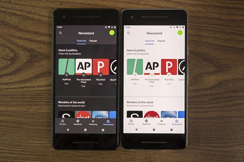
The measured savings are substantial. A 2021 Purdue University study, now the reference point for this discussion, found that at 100% brightness, switching from light to dark mode saves an average of 39% to 47% of battery power. If every major app defaulted to dark mode, the reduction in grid demand would be significant.
The design goal for 2026 is a “Dark-First” mentality: prioritise high-contrast dark themes as the default system-preferred state, rather than relegating them to a settings menu. That doesn’t mean every site must look like The Matrix — and legitimate accessibility considerations mean both options should remain available — but the default should carry the energy benefit.
Cutting “Digital Fat” From Visual Assets
Fast 5G and fibre connections have made designers careless about file sizes. The average mobile page weight has increased by over 500% in the last decade, largely driven by unoptimised visual assets. Every megabyte transferred requires electricity for transmission, server processing, and the user’s rendering engine. A 4MB photo or 15MB background video is energy spent on an image that could be equally effective at a fraction of the size.
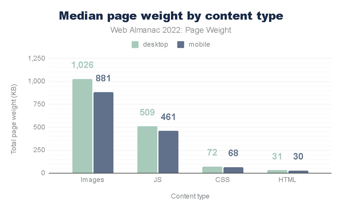
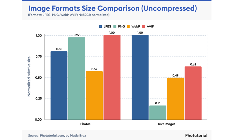
Images and video consistently account for the lion’s share of a page’s total weight, per the HTTP Archive. Modern formats help: AVIF and WebP can reduce image weight by up to 50% compared to JPEG without perceptible quality loss.
A practical example: a redesign of a cybersecurity platform’s homepage cut load from 5.5MB to 1.2MB by replacing high-resolution photography with SVG (Scalable Vector Graphics) art and CSS gradients — a 78% reduction in energy load. The working question for every visual decision should be:
“Do I need a photo for this, or can I achieve the same emotional resonance with code?”
Motion That Earns Its Energy Cost
Scroll-jacking and complex 3D parallax effects may win awards, but they are often ecological disasters. Animation is not free: rendering it requires the device’s GPU to work at high capacity, which increases CPU temperature, triggers cooling fans, and drains battery rapidly. Constantly-running background animations are the energy equivalent of leaving a car idling.
Google’s Material Design guidelines argue for “Meaningful Motion” — animation used only to orient the user or provide feedback. The practical guideline: if an animation doesn’t help a user complete a task or understand hierarchy, it’s waste. Where animation is needed, CSS transitions should be favoured over heavy JavaScript libraries like GSAP or Lottie, because CSS is hardware-accelerated and far more efficient for the browser to calculate.
The Data Budget As A Design Constraint
The most successful projects are often those with the tightest constraints. A Data Budget applies that principle directly: a hard cap on total page size — for example, “this landing page cannot exceed 1MB.” Adding a tracking script or a fancy font weight then requires “paying” for it by optimising or removing something else. This prevents feature creep from becoming carbon creep.
Quantifying the impact is possible with the Sustainable Web Design model developed by Wholegrain Digital. The average website produces about 0.5 grams of CO2 per view. For a site with 1 million monthly views, that’s 6 metric tons of CO2 per year — equivalent to driving a car 15,000 miles.
Practical levers for the design team:
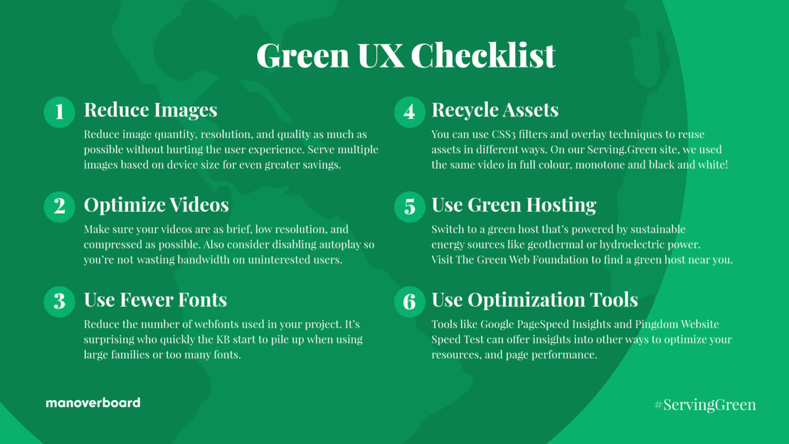
- Reduce Images
Question the necessity of every visual; use the smallest resolution and most efficient file formats (like AVIF) to minimise data transfer. - Optimise Video
Eliminate auto-playing media; prioritise highly compressed, short loops so energy is only spent on content the user intends to view. - Limit Fonts
Use a maximum of two web font weights or stick to classic system fonts to cut server requests and rendering bloat. - Recycle Assets
Repurpose a single image or video multiple times using CSS filters and overlays for visual variety without increasing total page weight. - Choose Green Hosting
Use servers verified by The Green Web Foundation to ensure they run on renewable energy. - Minimize Data Distance
Select server locations geographically close to your primary audience to reduce transmission energy.
Efficiency Is The Competitive Advantage
Sustainable design is performance design. Reducing page weight improves load times, which improves Core Web Vitals, which improves SEO ranking. It also makes products accessible to users on older devices or slower data plans — particularly in emerging markets — which is the practical definition of inclusive design.
Sustainable UX is a convergence of interests: better for the planet through reduced energy consumption, better for users through faster and more responsive interfaces, and better for business through lower hosting costs and improved conversion rates. The era of unlimited pixels is over; the most sophisticated design is now the one that leaves the smallest footprint.
One Page at a Time
Start with a single page from your current project. Run it through the Website Carbon Calculator and note the result. Then hunt for invisible waste: Could that image be an SVG? Would a static hero replace that video? Does that animation need to be loud, or can it be muted?
The most elegant fix is frequently the lightest one — the design that ships the fewest bytes. Small, deliberate reductions compound across a site, and they are the most reliable way to lower the carbon cost of every visit.




