

JavaScript: The Missing Piece For Common UI Components
CSS alone cannot deliver accessible tooltips, modals, tabs, carousels, or dropdown menus. These components require JavaScript to handle focus management, respond to keyboard events, and toggle ARIA attributes. This reality holds even though CSS provides elegant solutions for many design challenges, including the well-known “checkbox hack” for creating interactive components without JavaScript.
While CSS-only approaches can be impressive, they exclude a significant number of users from interacting with your interface. The requirements discussed here derive from the Web Content Accessibility Guidelines (WCAG) and research conducted by accessibility experts. When you use a framework or component library, use these criteria to verify that the provided components meet accessibility requirements. Note that most of these considerations won't be caught by automated accessibility tools like aXe — instead, they require manual testing or tools like Cypress to create functional tests.
Starting Point: Evaluate Before You Build
Before committing to a CSS-only approach, ask yourself these questions:
- Is this purely for your own experimentation? Then feel free to explore CSS boundaries and see what the language can do.
- Does the feature show or hide content? At minimum, you need JavaScript to toggle ARIA attributes and enable dismissal via
Esc. Some components may also require updates in an ARIA live region when state changes. - Does natural focus order maintain relationships? If a trigger and its associated content lose their connection in the tab order — or if keyboard users cannot reach the content at all — you need JavaScript for focus management.
- Does the custom control communicate its intended function? Screen reader users receive information from semantics and ARIA that help them understand what a control does. If you style radio buttons to look like tabs, a screen reader announces “radio button” while speech recognition users may say “tab” to activate them, resulting in mismatched interaction.
- Does the effect depend on hover or focus? Touch screen users and those who zoom or use magnification software may need alternative solutions that JavaScript can provide.
For any custom control you create, the Custom Control Accessible Development Checklist from the W3 “Using ARIA” guide covers these points plus additional design considerations.
Tooltips
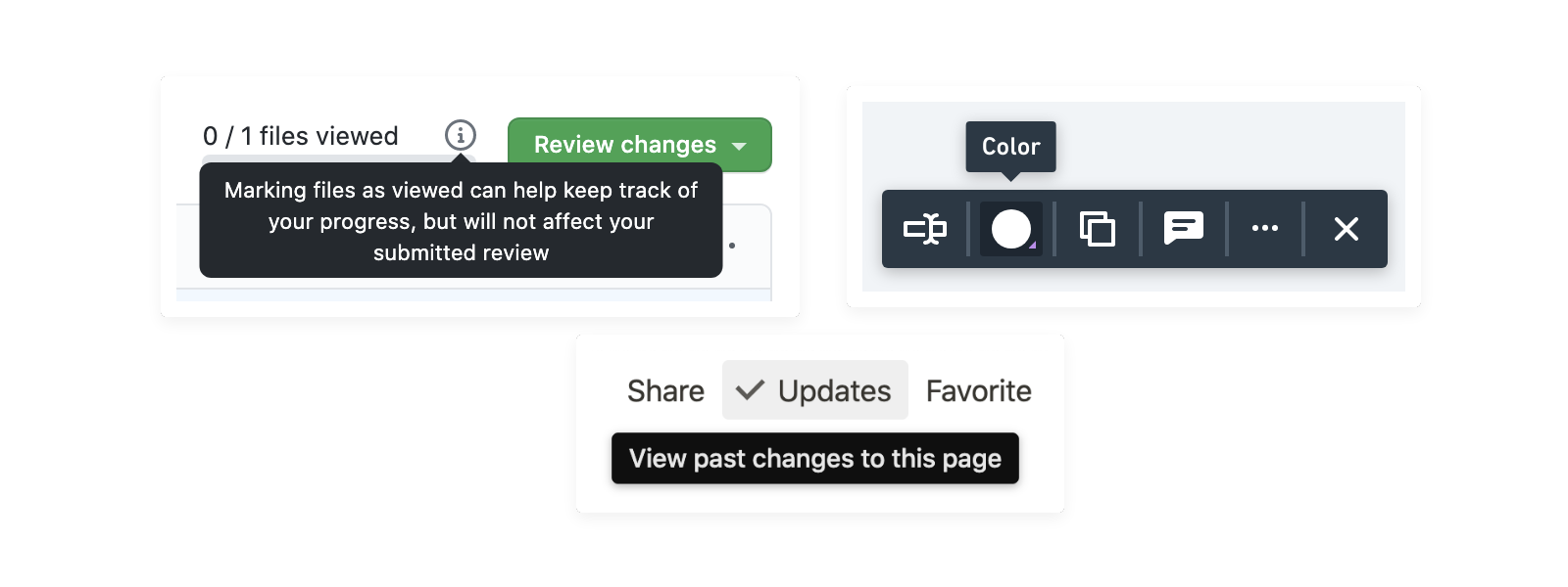
Tooltips are small text labels that appear on mouse hover near their triggering element. They overlay other content, require no interaction, and disappear when hover or focus is removed. A CSS-only tooltip implementation can appear straightforward using hover and focus pseudo-classes:
<button class="tooltip-trigger">I have a tooltip</button>
<span class="tooltip">Tooltip</span>

.tooltip {
display: none;
}

.tooltip-trigger:hover + .tooltip,
.tooltip-trigger:focus + .tooltip {
display: block;
}
However, the accessibility problems are numerous. Touch screen users won't reliably see tooltips — on touch devices, a :hover event triggers simultaneously with a :focus event. If the triggering element is interactive, such as a button or link, its action will fire at the same moment the tooltip appears, leaving the user without time to read it. For tooltips attached to elements without events, the tooltip may appear but cannot be dismissed until focus moves elsewhere, potentially blocking other interface content.
Users who rely on zoom or magnification software face their own barrier. Since panning the screen to read a tooltip can cause it to disappear, this group often loses access to the content. Tooltips also strip control from users: nothing announces that a tooltip will appear, the overlay content interferes with tasks, on-screen keyboards can obscure tooltip content for form fields, and assistive technology users may never know a tooltip has appeared unless it is properly connected to its trigger element.
WCAG Success Criterion 1.4.13 — Content on Hover or Focus defines the requirements, specifically benefitting low vision users and those using magnification. Three guiding principles apply:
- Dismissible: The tooltip can be dismissed without moving hover or focus away.
- Hoverable: Users can hover over the revealed tooltip content without it dismissing.
- Persistent: Additional content does not automatically disappear after a timeout; it waits for the user to remove hover, remove focus, or dismiss explicitly.
Meeting those principles needs JavaScript involvement. Assistive technology users expect the Esc key to close the tooltip, requiring a JavaScript listener. Accessibility research from Sarah Higley indicates a visible close button inside the tooltip, should you include one, also needs JavaScript to handle its click event. JavaScript may also need to intervene so users can move their mouse into the tooltip content without it disappearing mid-transition.
Prefer A Toggletip Alternative
Tooltips should be implemented only as a last resort. Sarah Higley, an accessibility researcher who has studied tooltip problems extensively, proposes a simple test: “Why am I adding this text to the UI? Where else could it go?”
Higley’s work at Microsoft leads to a practical alternative: a dedicated “toggletip.” A toggletip offers an explicit element for users to intentionally show and hide additional content. Unlike tooltips, toggletips can preserve semantics of the content they reveal. Most valuably, they hand the user control of the toggling, which improves discoverability and operability — particularly for touch screen users.
Do not use the HTML title attribute as a fallback tooltip; it suffers from the exact same issues as other CSS-only solutions and should be avoided for this purpose. Resources worth reviewing include Higley’s presentation on YouTube, her detailed writing about tooltips, and Heydon Pickering’s article from Inclusive Components concerning tooltips versus toggletips and title usage.
Dialog Windows Go Beyond CSS
Modals — also called lightboxes or dialogs — overlay the page with a window that holds structured content: headings, paragraphs, links, buttons, and sometimes full forms. A semi-transparent backdrop usually separates the modal from the underlying content.
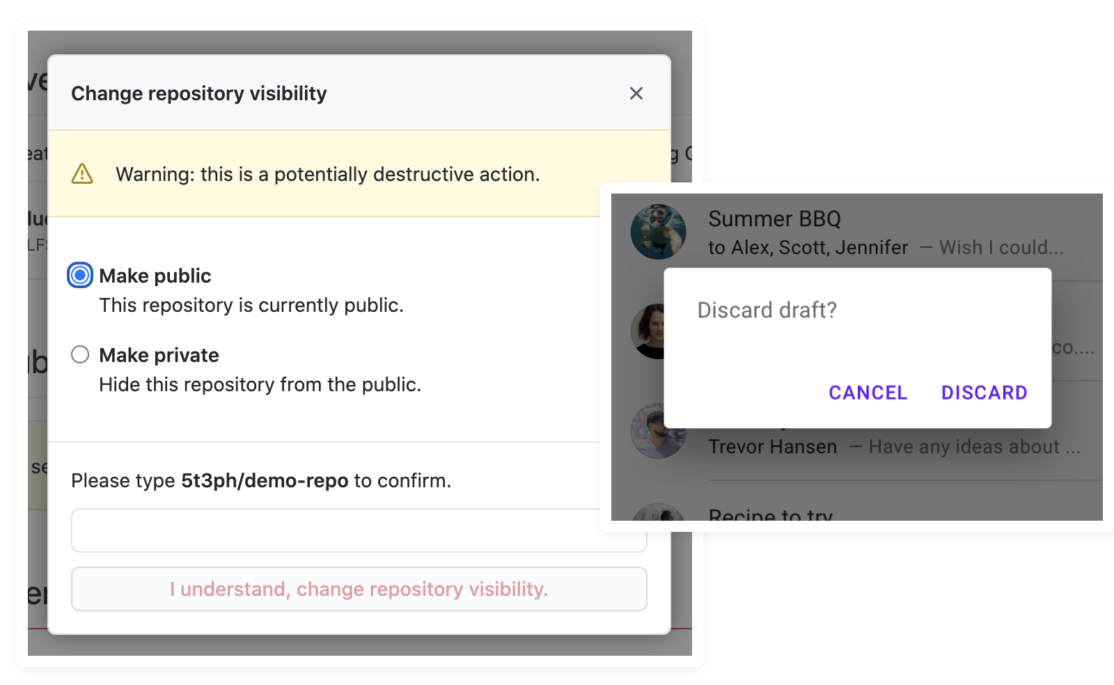
Common CSS-only approaches to modals rely on the "checkbox hack," :target, or even :focus (which generally produces an overgrown tooltip rather than a real dialog). None of these deliver the accessible behavior users need. Even the native HTML dialog element is not considered comprehensively accessible, meaning the usual "prefer native HTML" advice doesn't fully apply here.
Unlike tooltips, modals are meant for rich content, so users must be able to tab through the interactive elements inside. Arrow keys should still scroll longer modal content, and the Esc key should dismiss the dialog — none of which is possible with CSS alone.
JavaScript handles two critical pieces of modal accessibility: moving focus into the modal when it opens and trapping focus there so a user cannot tab back into the page behind it. The complete sequence of managed events looks like this:
- A button click opens the modal.
- Focus moves into the modal; the target element depends on the content (see the decision tree below).
- Focus stays trapped inside the modal until dismissal.
- The user can close it with Esc and/or a dedicated close or cancel button. If Esc is supported, clicking the backdrop should also dismiss the modal.
- If no navigation occurred, focus returns to the triggering button.
Where to Place Focus in a Modal
Based on the WAI-ARIA Authoring Practices modal dialog example, simplified guidance for the initial focus target is:
- Modal contains a form.
Focus the first form field. - Modal content is long, pushing actions out of view.
Focus a heading if present, otherwise the first paragraph. - Procedural modal with multiple actions (e.g., a confirmation).
Focus the "least destructive" action, such as "OK." - Procedural modal with a single action.
Focus the first focusable element.
When the appropriate target is not natively focusable, such as a heading or paragraph, add tabindex="-1". This makes the element programmatically focusable via JavaScript without adding it to the page's tab order.
For ready-made solutions, Kitty Giraudel's a11y-dialog covers these requirements, and Adrian Roselli has published research and a demo on how different browser/screen reader combinations announce focused elements in dialogs.
Tabbed Interfaces Need Managed Focus
Tabs show one content panel at a time, triggered by a row of controls. CSS hacks using radio buttons or :target can toggle visibility, but they cannot manage the semantic and keyboard states tabs require.
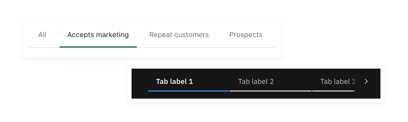
The JavaScript responsibilities for tabs include:
- Updating
aria-selectedtotrueon the active tab andfalseon others. - Implementing a roving
tabindexto separate tab selection from keyboard focus. - Moving focus between tabs with arrow keys (and optionally
HomeandEnd).
Optionally, selection can follow focus — activating a tab as soon as it receives focus. The WAI-ARIA Authoring Practices discusses this trade-off. In all cases, arrow-key listeners are what enable navigation between tabs at all, because of how the roving tabindex alters the natural tab order.
Roving tabindex in Practice
A roving tabindex means JavaScript controls tabindex values to shape the focus order. For tabs, only the selected tab gets tabindex="0"; unselected tabs receive tabindex="-1" and drop out of the keyboard tab sequence. This way, when a user tabs away from the tab list, the next stop is the tab panel or a focusable element inside it.
If the panel itself should receive focus, assign it tabindex="0". When panel content is variable or complex, consider using the same decision tree from modals to determine the right focus target.
Reference Implementations for Tabs
- Deque University's tabpanel demo
- Scott O'Hara's tab widget tests, covering several functional approaches
- Heydon Pickering's Inclusive Components piece on tabbed interfaces, which builds tabs as a progressive enhancement of a table of contents
Carousels Present Unique Control Problems
Carousels, also called slideshows or sliders, rotate through content panels with some form of control mechanism, and are often cited as an anti-pattern. CSS-only versions struggle because the only available controls impart wrong interaction semantics — checkboxes, for instance, tell assistive tech the element is a toggle, not a carousel control. Styling label text as arrows confuses speech recognition users further.

Native CSS scroll snap looks like a CSS-only answer, but automated accessibility tools flag scrollable regions as un-navigable for keyboard users when there are no keyboard-accessible controls among the interactive elements. There are other concerns too, covered in a scroll snap demo on SmolCSS.
Despite visual variety, most carousels share core traits. One solid approach is to build the carousel with tab markup, since a carousel is effectively a tab interface with a different visual presentation (and optionally previous/next controls and auto-play). JavaScript considerations depend on features:
- Paginated controls.
When a numbered item is selected, move focus to the corresponding slide. Using a roving tabindex on slide containers focuses the current slide while preventing focus from reaching off-screen slides. - Auto-play.
Provide a visible pause control. Pause automatically on hover or when an interactive element in the slide receives focus. Consider checkingprefers-reduced-motionin JavaScript to start paused and respect user preferences. - Previous/next controls.
Include a visually hidden element witharia-live="polite". When the controls fire, populate it with the current position, e.g., "Slide 2 of 4."
Carousel Building Resources
- The W3C Web Accessibility tutorial on carousels offers implementation details and complete code examples.
- Deque University's example of enhancing a tab interface into a carousel.
- The WAI-ARIA Authoring Practices' auto-rotating image carousel example.
- Smashing's roundup of accessible components includes a curated set of carousel resources.
Dropdown Menus: State, Focus, And The Escape Hatch
A dropdown menu — a button opening a list of links — often appears deceptively simple. CSS-only approaches that show the menu purely on :hover or :focus can appear functional, but they omit critical state and keyboard interactions.
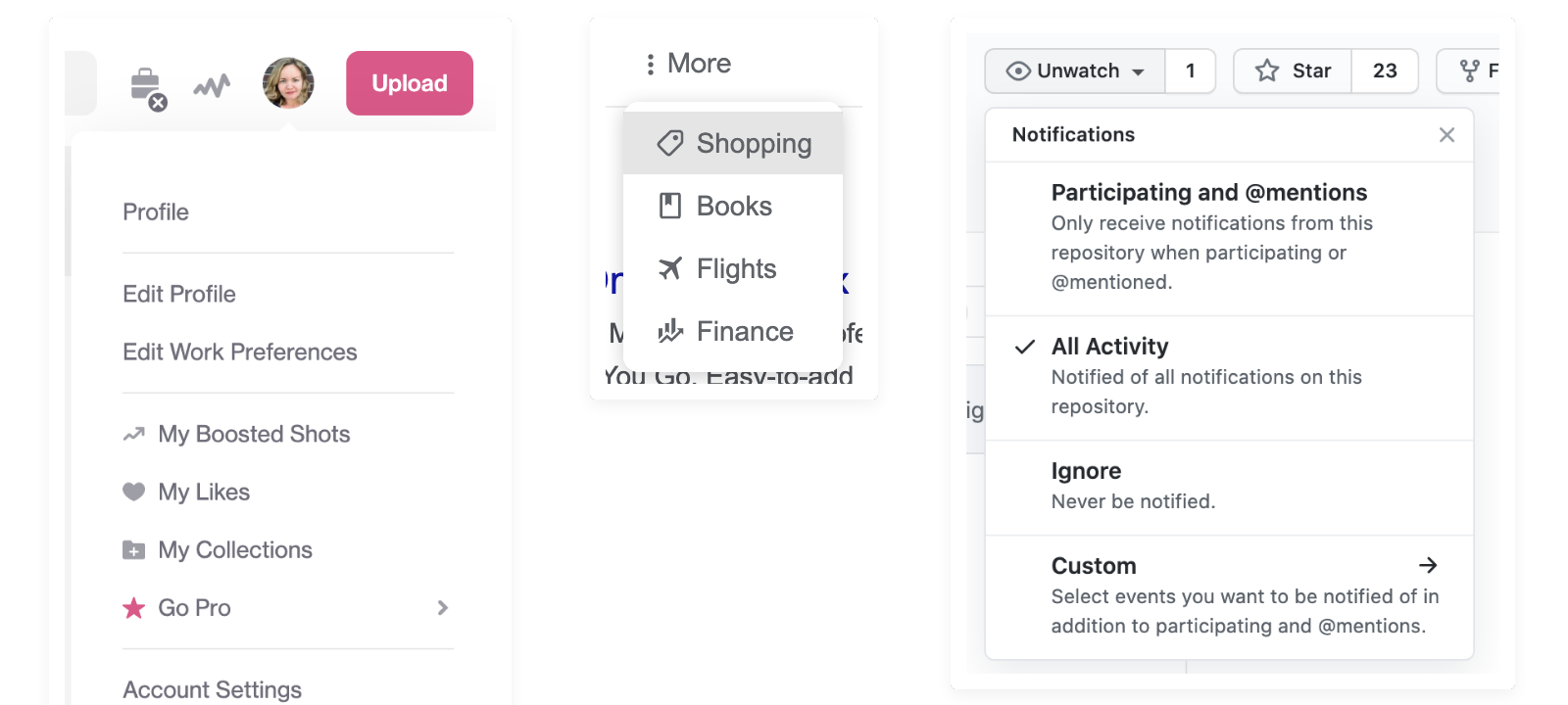
Even the more modern :focus-within technique does not fully resolve the issue. A CSS-only implementation violates WCAG Success Criterion 1.4.13 (Content on Hover or Focus), the same criterion that applies to tooltips. The missing piece is JavaScript to manage the following:
- Toggling
aria-expandedon the menu button betweentrueandfalse, driven byclickevents - Closing an open menu when the Esc key is pressed, with focus returning to the toggle button
- Closing open menus when focus moves outside the menu component
- Optional: Supporting arrow keys and the
HomeandEndkeys for navigating between top-level buttons and links within the dropdowns
Implementation tip: Instead of adding a class like active via JavaScript to control visibility, bind the menu's display directly to the state attribute: .dropdown-toggle[aria-expanded="true"] + .dropdown. This keeps the CSS declarative and simplifies the JavaScript logic.
This pattern is known as the “disclosure” pattern. The WAI-ARIA Authoring Practices provide a fully worked example in their Example Disclosure Navigation Menu.
Further Resources On Component Accessibility
- Smashing Magazine's Complete Guide to Accessible Front-End Components
- Carie Fisher's article Good, Better, Best: Untangling The Complex World Of Accessible Patterns
- The WAI-ARIA Authoring Practices 1.2 for demos and guidance on common widgets
- Deque University's Code Library
- Scott O'Hara's Accessible Components on GitHub
- Heydon Pickering's Inclusive Components



