

DevTools Has a Hidden Depth Problem
Most web developers settle into a handful of familiar panels in their browser’s DevTools. Console, Elements, Network — the same few tabs, visit after visit. But the toolbox contains far more than that. Chrome DevTools alone hosts more than thirty individual panels (Edge, being Chromium-based, offers the same set). Firefox and Safari pack fewer, but still more than most developers ever open.
The gap between what exists and what gets used is easy to demonstrate. A simple game — name as many DevTools panels as you can in under a minute — shows how quickly most people run dry. The point isn’t that memorizing tool names matters professionally. It’s that the sheer volume of available functionality reveals an interface problem worth examining.
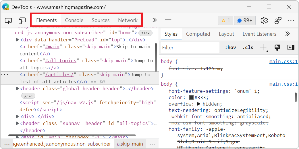
That same game, once the timer runs out and the full list appears, tends to elicit the same reaction: “I had no idea that existed.” The question is how the situation got this way — and whether it’s a problem worth solving.
From Firebug to Feature Creep
Front-end debugging in the early 2000s was a fragmented affair. Before browser-native tools existed, developers hunted down specialized extensions for each task. Venkman handled JavaScript debugging, Aardvark focused on element inspection, and Console2 provided formatted JavaScript logging. The alert() trick covered the rest.
Joe Hewitt’s Firebug changed that by consolidating these workflows into a single Firefox extension. Its layout set the template for everything that followed: a Console for logs and JavaScript execution, an HTML tab for DOM and CSS editing, a JavaScript debugger, and a Network tab for resources and HTTP requests. For a decade or more, this four-panel setup was the front-end debugging standard.
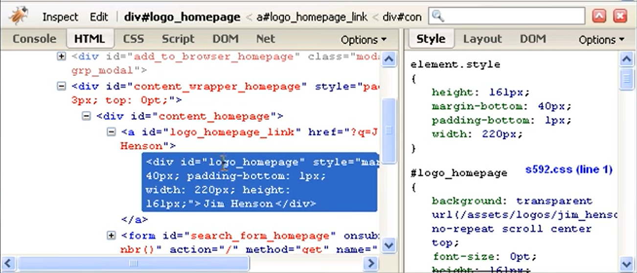
Today’s DevTools descend directly from that design — but the software has grown far beyond its ancestor. Chrome’s panel count ballooned as the platform expanded. The driving forces are predictable:
- The Web platform itself grows. New APIs and capabilities need debugging surfaces that fifteen-year-old tools can’t provide. Storage inspection, accessibility tree views, and animation debugging didn’t exist as concepts back then.
- Front-end engineering matured. The discipline now spans performance, accessibility, user experience, and progressive enhancement. Each specialization brings its own tooling demands.
- Browser teams scratch their own itches. Tools like the Protocol Monitor in Chromium started as internal utilities that eventually shipped as panels.
- Removal is risky. Deleting a panel can break established workflows, so features accumulate. Chrome currently carries three separate performance inspection tools: Performance, Performance Insights, and the JavaScript profiler.
- New features overshadow maintenance. Building fresh tooling is more rewarding than refining what exists, so complexity compounds over time.
The result is arguably the most comprehensive debugging suite any platform has ever had — and simultaneously one of the most intimidating interfaces a beginner can encounter.
Usability Meets Engineering Depth
DevTools’ complexity is a genuine usability problem. Most software targets five or six primary user scenarios; DevTools spans dozens. Need to simulate a mobile viewport? Check color contrast? Convert between font units? Read a JSON response? A dedicated tool exists for each of these and hundreds more.
That breadth creates a steep learning curve. New users face an interface packed with unfamiliar tools from the first run. Even seasoned developers rarely stray from the panels they already know, unaware of options sitting one click away. While competing developer tools increasingly polish their first-run experiences, browser DevTools remain dense and uninviting.
The fix isn’t simplification by force. The underlying engineering problems are genuinely complex, and that complexity is legitimate. But it should be opt-in, not the default experience for every newcomer. Users shouldn’t have to learn to mentally filter out irrelevant panels just to reach the one feature they need.
Why Cleaning House Doesn’t Work
The obvious answer — remove the rarely used panels — fails against real-world constraints. DevTools accommodates nearly as many workflows as it does user roles, and even obscure tools anchor someone’s daily process.
Browser teams have learned this lesson repeatedly. When Firefox developers attempted to remove the Fonts panel, the backlash was swift enough that they restored it. The 3D View panel, unsupported by a new Firefox architecture, was removed in 2016; complaints continue years later (the feature still exists in Edge). Chrome ripped out its Properties sidebar pane in 2020, then brought it back after user demand proved overwhelming.
Usage statistics alone don’t capture a tool’s value. A panel might serve a small group — but for that group, it can be mission-critical. Meaningful simplification requires user research that maps the full range of roles and scenarios DevTools supports. Without that groundwork, pruning the interface risks gutting workflows that never made it into the analytics dashboards.
Two Paths Toward Better Developer Tools
DevTools has stayed structurally unchanged for roughly 15 years, and that stagnation is costing developers. Two strategies stand out as promising ways to improve the situation: simplifying the core while opening it up to third-party extensions, and committing to a genuinely user-friendly interface redesign.
Build a Deeper Extension API
Visual Studio Code shows how a product can serve wildly different workflows without becoming bloated. Its core is deliberately minimal, covering basic editing. Everything above that comes from extensions built on a deep, powerful API. Complexity is strictly opt-in: first-time users get a clean text editor, and specialty needs — linting, custom syntax highlighting — are met through installable extensions that never burden the default experience.
DevTools does not work that way. Browser extensions can add new panels, and the major frameworks (React, for instance) ship their own, but the catalog of genuinely useful tools beyond those is thin. The browser extensions API makes creating a new panel fairly easy but does not go nearly as deep as VS Code's. In particular, there is no way to augment the existing tools — a serious limitation that likely explains the scarcity of useful extensions.
Take the Motions DevTools extension for viewing and editing web animations. It works only within its own panel container. It cannot integrate with the adjacent Elements panel, even though reusing existing components such as the color picker would clearly simplify user workflows.
Going further requires a richer set of APIs. The idea mirrors the Extensible Web Manifesto: give third parties low-level capabilities to build specialized experiences, and if those prove popular, bring them into the core later. The platform gets the features users need without saddling every developer with a cluttered default UI.
A Radically Friendlier Interface
The second lever is UI risk. Apple tried this in 2013 when Safari Web Inspector borrow design principles from XCode and iTunes to simplify its toolbar. The experiment ultimately reverted to more traditional tabbed navigation, which worked better with developers — but it demonstrated both the appetite for, and the perils of, redesigning DevTools. Big UI changes in this space require shepherding users through the transition with care.
Currently, the only team visibly working in this area is on Microsoft Edge DevTools, of which I am a part. Their ongoing experiment is Focus Mode — effectively the first attempt to redesign the entire DevTools product UI. It is being rolled out gradually across Edge's pre-release channels, with user feedback driving the rollout. The first iteration focuses on visible changes to the top toolbar:
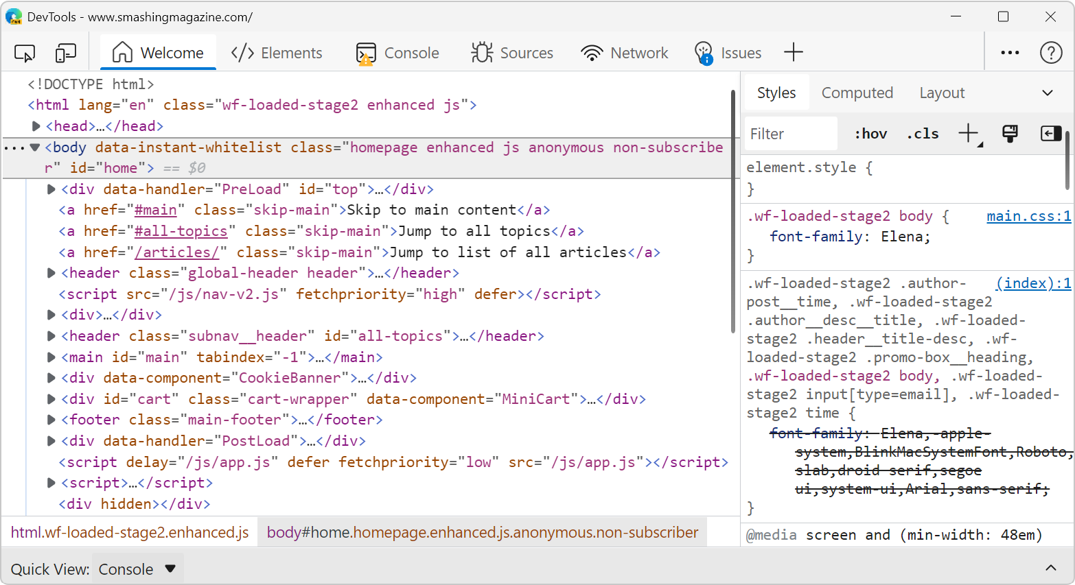
- Warning, error, and info counts no longer crowd the toolbar; they now appear as colored badges on the Console and Issues panel tabs.
- Settings, Feedback, and the main menu collapse into a single menu button in the top-right corner.
- Tabs get icons, making them easier to recognize at a glance.
Several other changes ship with Focus Mode. The + button in the toolbar lists all available tools with icons, which makes reopening a closed tool easier and invites the user to discover new ones. Tabs can also be switched to a vertical orientation on the left, with labels hidden — matching patterns found in tools like the VS Code Activity bar while reducing visual noise around the code. This orientation aligns with what developers increasingly expect from modern interfaces.
The bottom drawer was reworked too. Originally, the drawer was introduced to show the Console alongside other tools. Over years, Chrome added secondary tools there — the Rendering panel, for instance — until it became genuinely hard to know where a given tool lived. In Focus Mode, this area is replaced by Quick View, which is always visible at the bottom of the toolbox. Any tool can be displayed there; you no longer have to remember to press Escape to reveal it.
Focus Mode may look subtle at first, but it is an intentional first step in an iterative push toward a less cluttered, more streamlined interface — a journey the team is pacing deliberately, given how disruptive UI change can be in developer tools. If you want to test it, enable the “Focus Mode” experiment in pre-release Edge via F1 > Experiments, and share feedback on the team's DevTools GitHub repository.
Community pressure is ultimately what improves DevTools across the board. Each browser vendor has dedicated teams adding features and fixing bugs, but they can only do so with clear, actionable input from real users. Tell them what does not work, how many clicks your workflows take, or when you cannot find a feature. If the industry collectively asks more from its DevTools teams — on Chromium's issue tracker, the Mozilla Bugzilla, the WebKit tracker, or GitHub — those same teams will ship tools that are both more welcoming to newcomers and better fitted to the people who use them every day.


