Layout as an ASCII drawing with grid-template-areas
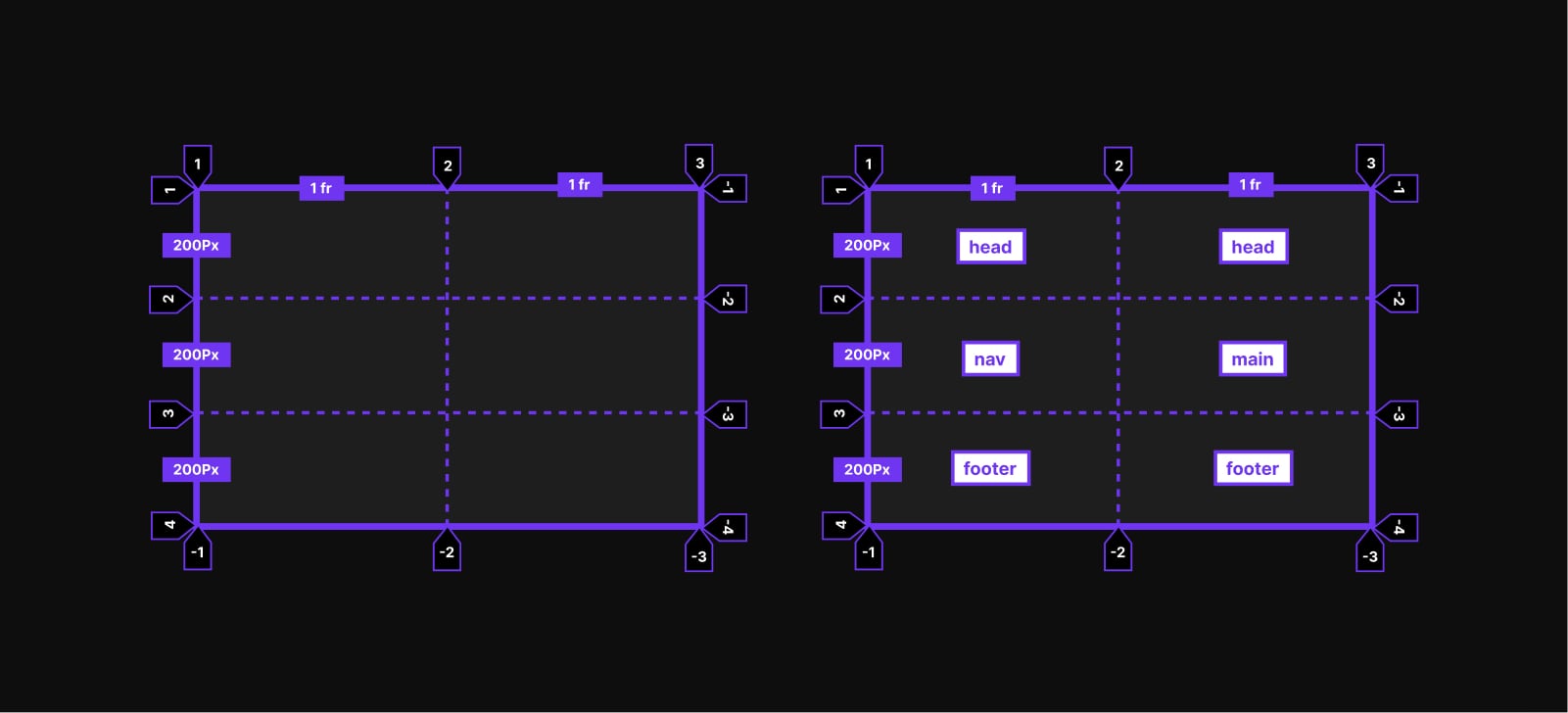
Placing items by line numbers is the default path with CSS Grid: grid lines get indexed automatically with positive and negative numbers unless you name them. The "ASCII" method instead positions items through custom-named areas declared on the grid container with grid-template-areas.
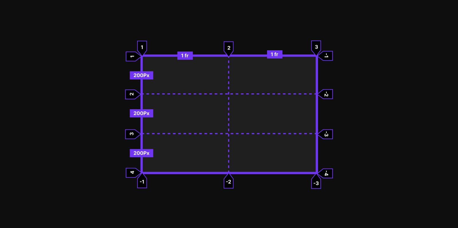
Under display: grid, a container generates a single-column track plus rows large enough to hold its children, and those children become grid items regardless of their own display value. Explicit tracks come from grid-template-columns and grid-template-rows.
.grid {
  display: grid;
  grid-template-columns: 1fr 1fr;
  grid-template-rows: repeat(3, 200px);
}
The initial value of grid-template-areas per spec is none, and its <string>+ syntax takes one quoted string per row; each cell inside the string is a grid cell.
grid-template-areas = none | <string>+grid-template-areas: "head head" "nav main" "foot foot";That value describes four named areas: head, nav, main and foot. head and foot each span two column tracks and one row track, while nav and main each occupy a single cell. The value reads like arranged ASCII characters, so the CSS itself documents the layout.
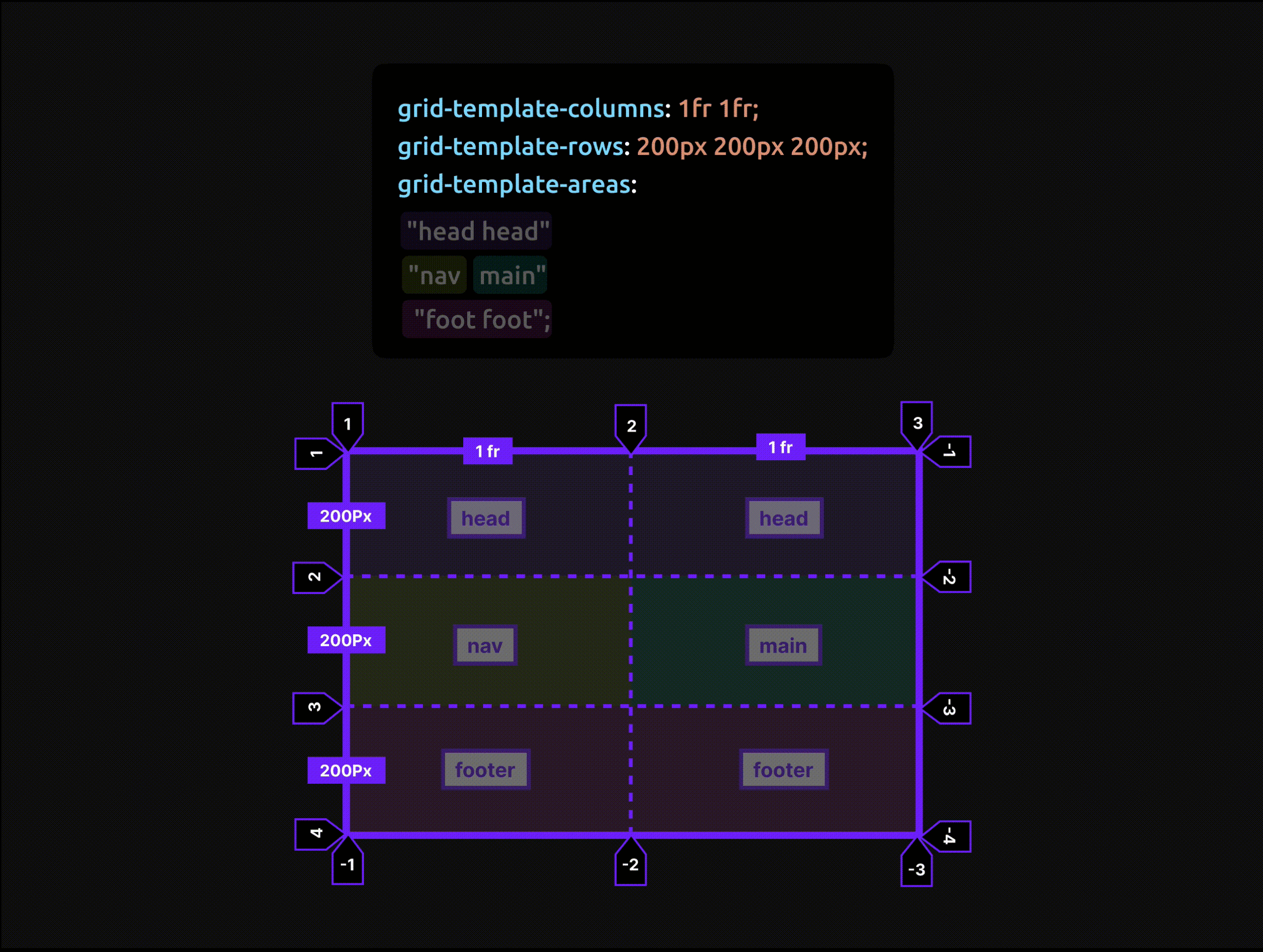
Named areas are idents. To drop a header element into the head area, reference that ident with the grid-area property; the same applies to the other elements:
header { grid-area: head; }nav { grid-area: nav; }
main { grid-area: main; }
footer { grid-area: foot; }String rules: valid cells, empty cells, errors
CSS Grid Layout Module Level 1 defines three token types for these strings:
- Named cell token — a named grid area, e.g.
head. - Null cell token — an unnamed grid area, i.e. an empty cell.
- Trash token — a syntax error, such as a mismatch between the number of cells and rows or grid items.
Every quoted string must have the same number of cells and must define the complete grid without skipping any cell.
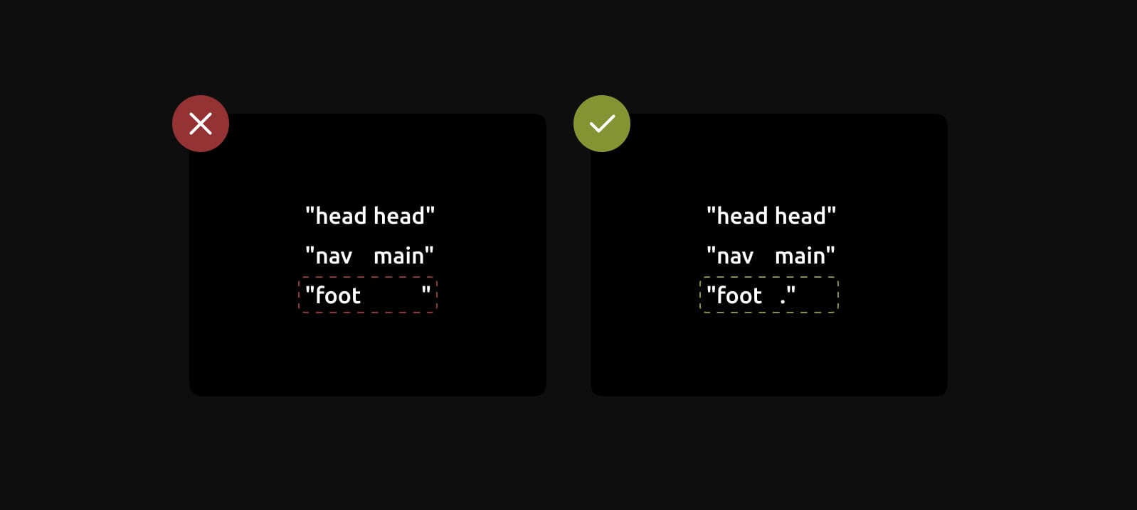
A full-stop character (.) leaves a cell empty:
.grid {
  display: grid;
  grid-template-areas:
    "head head"
    "nav main"
    "foot .";
}
For a visually better balance, multiple full stops can be written with no whitespace between them:
.grid {
  display: grid;
  grid-template-areas:
    "head head"
    "nav main"
    "foot ....";
}
A named area may span several cells, but those cells must form a rectangle, so "L"- or "T"-shaped areas are not possible. The spec does hint that non-rectangular layouts with disconnected regions may be supported in the future.
Why prefer this to line-based placement
Line-based placement uses grid-column and grid-row against automatically indexed line numbers:
.grid-item {
  grid-column: 1 / 3; /* start at grid column line 1 and span to line 3 */
}
Those numbers shift when the layout changes at a breakpoint, so line references can't simply be carried over; the code becomes harder to hold in your head. Re-declaring grid-template-areas per breakpoint on the container gives you a convenient picture of the layout inside the CSS:
.grid {
  grid-template-areas:
    "head head"
    "nav main"
    "foot ...."; /* much easier way to see the grid! */
}

.grid-item {
  grid-area: foot; /* much easier to place the item! */
}
Firefox DevTools will display this too. Open the Layout panel, go to the Grid tab, and in "Grid display settings" enable "Display line number" and "Display area names".

The "universal" full-page pattern, made responsive
Tutorials almost always introduce named areas with a header / main / sidebar / footer pattern — the "universal" use case.

Real implementations add media queries. Rather than re-declaring grid-area on every item at every breakpoint, you can change grid-template-areas and get a picture of each layout along the way. Start by assigning an ident to each element:
header {
  grid-area: head;
}

.left-side {
  grid-area: left;
}

main {
  grid-area: main;
}

.right-side {
  grid-area: right;
}

footer {
  grid-area: foot;
}
Then define a mobile-first base layout, stacked by default:
.grid-container {
  display: grid;
  grid-template-areas:
    "head"
    "left"
    "main"
    "right"
    "foot";
}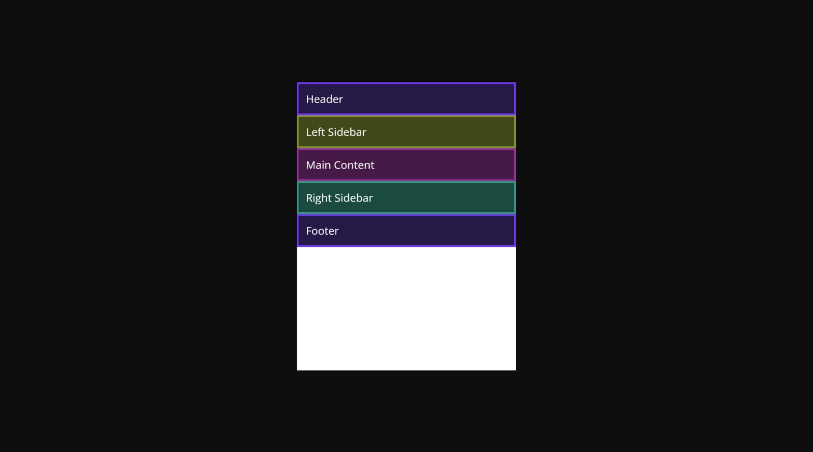
Each item is auto-sized in this configuration, which looks a little odd; min-height: 100vh on the container gives more room:
.grid-container {
  display: grid;
  grid-template-areas:
    "head"
    "left"
    "main"
    "right"
    "foot";
  min-height: 100vh;
}
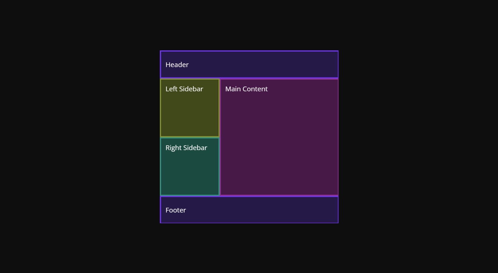
At a slightly wider viewport, re-declare the areas so main sits beside the stacked left and right sidebars:
@media (min-width: 800px) {
  .parent {
    grid-template-columns: 0.5fr 1fr;
    grid-template-rows: 100px 1fr 1fr 100px;
    grid-template-areas:
      "head head"
      "left main"
      "right main"
      "foot foot";
  }
}
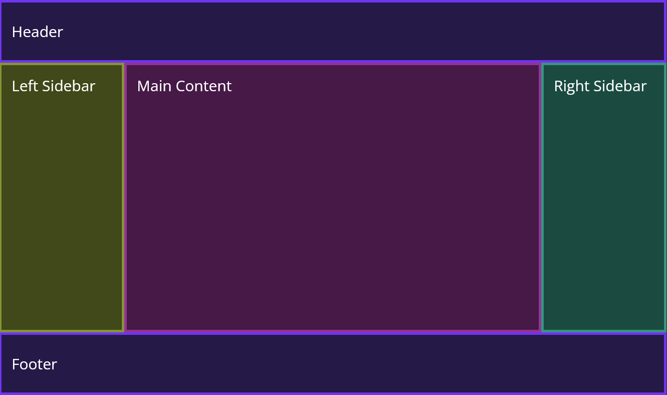
Go wider still and main moves between the sidebars:
.grid-container {
  grid-template-columns: 200px 1fr 200px; /* again, just for sizing */
  grid-template-areas:
    "head head head"
    "left main right"
    "left main right"
    "foot foot foot";
}
Implicit line names and overlays
The spec has grid-template-areas generate line names for free: each named area yields four implicitly-named lines, two in each direction, formed by appending -start and -end to the ident. An area called head therefore gets head-start and head-end on both axes.
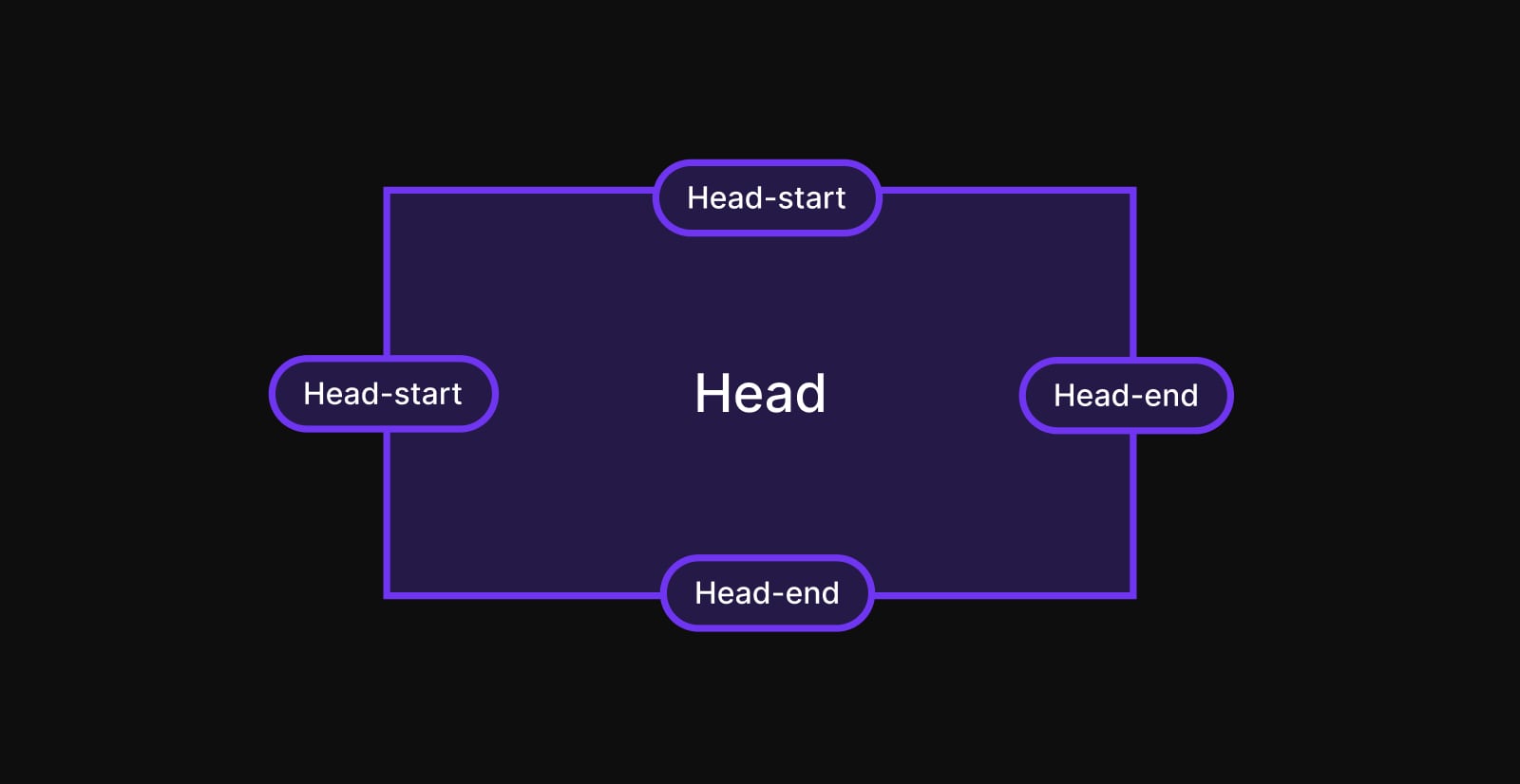
These lines solve a case the ASCII method can't: an overlay covering the main, left and right areas is non-rectangular, so no ident can express it. Implicit line names can, using grid-area on the overlay.
grid-area is a shorthand, much like margin and padding. But where margin goes clockwise (margin-block-start, margin-inline-end, margin-block-end, margin-inline-start), grid-area follows this order:
grid-area: block-start / inline-start / block-end / inline-end;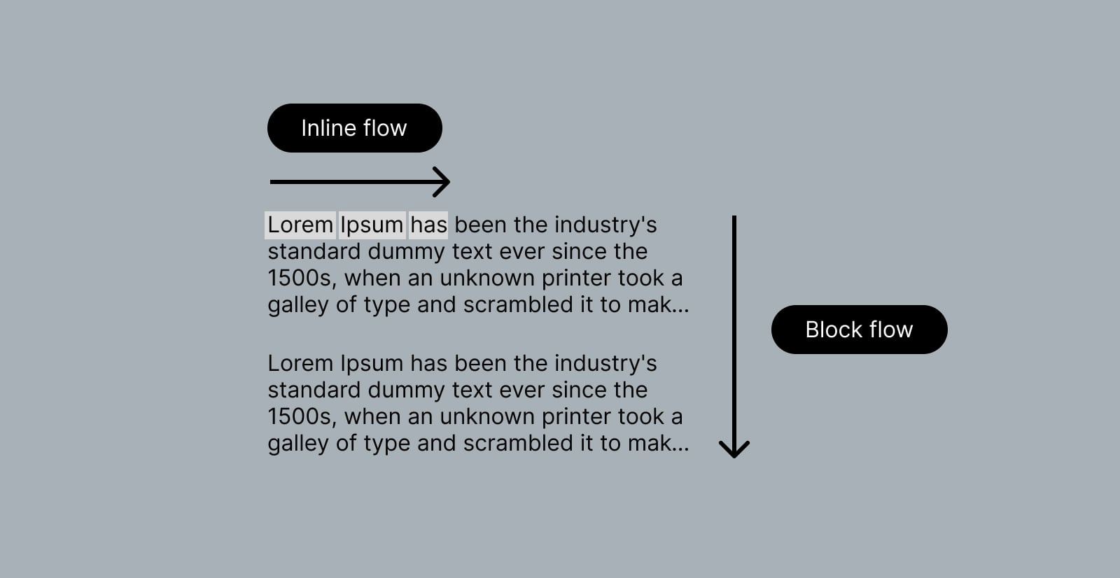
The row and column axes correspond to block and inline directions — row to block, column to inline:
grid-area: grid-row-start / grid-column-start / grid-row-end / grid-column-end;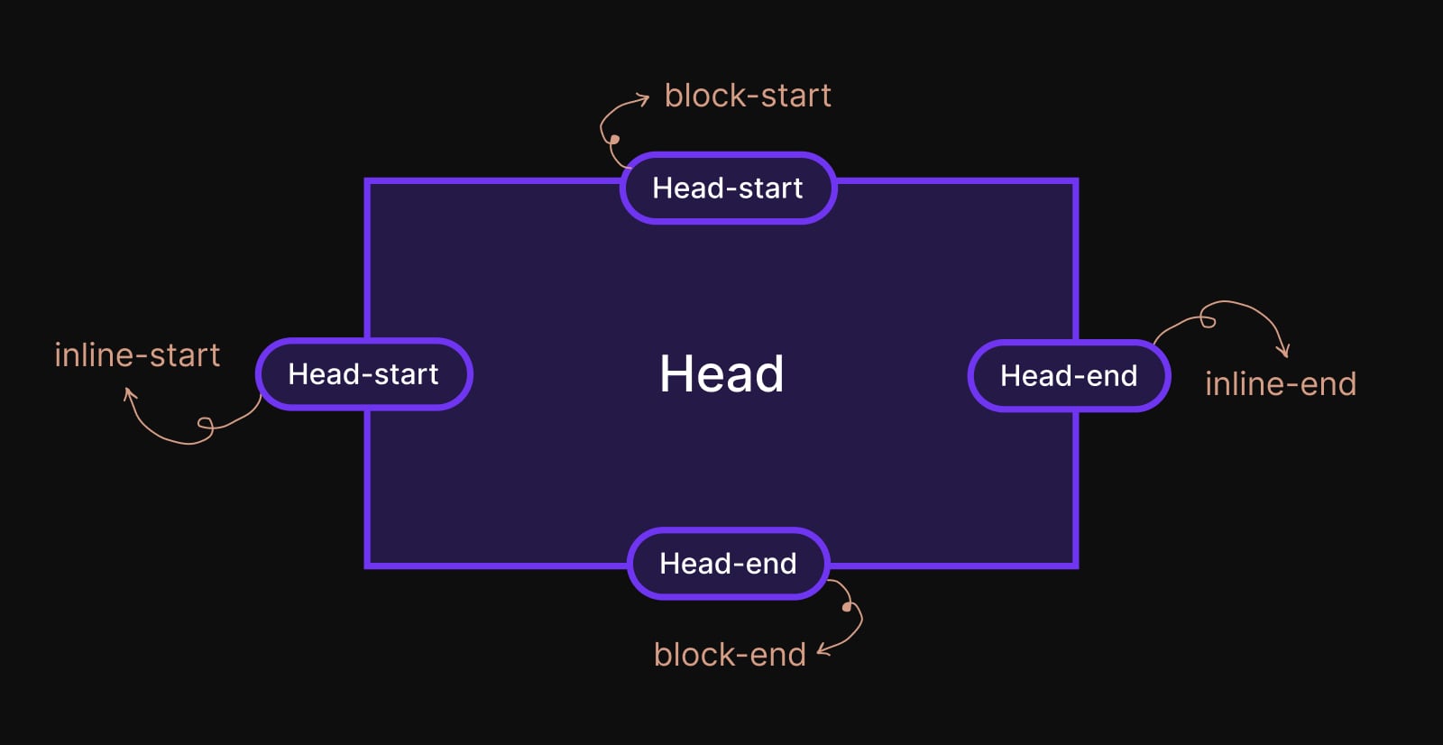
.overlay {
  grid-area: left-start / left-start / right-end / main-end;
}
Beyond one area per element: a minimal grid system
Grid areas don't have to map one-to-one to elements. Repeating an ident reserves more space; head and foot were repeated before, and main, left and right repeat in the block direction:
.grid-container {
  grid-template-areas:
    "head head head"
    "left main right"
    "left main right"
    "foot foot foot";
}
Named areas also work at component level. Take a standard hero: one row of images followed by blocks of text.

<div class="hero">
  <div class="image">
    <img src="..." alt="" />
  </div>
  <div class="text">
    <!-- ... -->
  </div>
</div>
A quick stacked layout:
.hero {
  grid-template-areas:
    "image"
    "text";
}
But narrowing the text below the images would then need padding, max-width or similar. Instead, expand the ASCII layout to four columns by repeating idents on both rows:
.hero {
  display: grid;
  grid-template-columns: repeat(4, 1fr); /* maintain equal sizing */
  grid-template-areas:
    "image image image image"
    "text  text  text  text";
}
.hero .image {
grid-area: image;
}
.hero .text {
grid-area: text;
}Both rows now span the full width, a good small-screen base:

To narrow the text at a larger width, use the full-stop character to skip columns — here the text ident skips the first and last:
@media (min-width: 800px) {
  main {
    grid-template-columns: repeat(6, 1fr); /* increase to six columns */
    grid-template-areas:
      "image image image image image image"
      "..... text  text  text  text  .....";
  }
}
Further breakpoints can add more columns:
.hero {
  grid-template-columns: repeat(8, 1fr);
  grid-template-areas:
    "image image image image image image image image"
    "..... text  text  text  text  text  text  .....";
}
Scaling to 12- or 16-column layouts like those of classic CSS frameworks keeps the ASCII picture intact:
main {
  grid-template-columns: repeat(12, 1fr);
  grid-template-areas:
    "image image image image image image image image image image image image"
    "..... text  text  text  text  text  text  text  text  text  text  .....";
}
A more complex composition
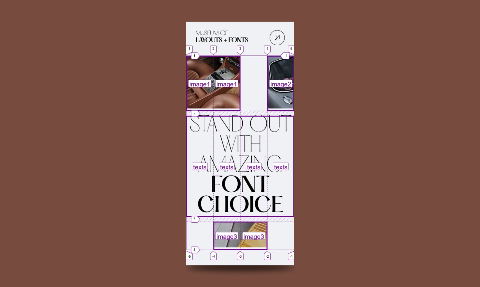
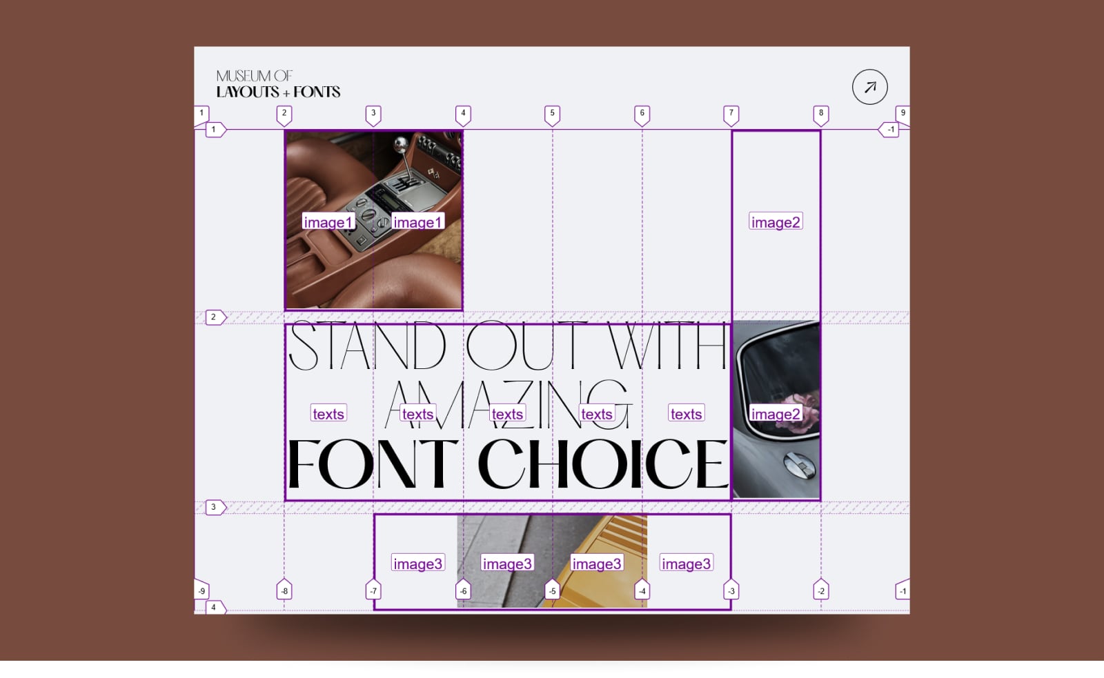
Complex layouts stay readable. Target:

The HTML is split into header and main:
<header>
  <div class="logo"> ... </div>
  <div class="menu"> ... </div>
</header>
<main>
  <div class="image"> ... </div>
  <h2> ... </h2>
  <div class="image"> ... </div>
  <div class="image"> ... </div>
</main>
Flexbox suits the header's spacing better, so no grid there:
header {
  display: flex;
  justify-content: space-between;
  /* etc. */
}
Grid suits main. Define the base layout for small screens and assign idents for .text and the three .image elements:
.grid {
  display: grid;
  grid-template-columns: repeat(4, 1fr);
  grid-template-areas:
    "image1 image1 .....  image2"
    "texts  texts  texts  texts"
    ".....  image3 image3 .....";
}
.image:nth-child(1) {
grid-area: image1;
}
.image:nth-last-child(2) {
grid-area: image2;
}
.image:nth-last-child(1) {
grid-area: image3;
}
h2 {
grid-area: texts;
}
Then widen:
@media (min-width: 800px) {
  .grid {
    grid-template-columns: repeat(8, 1fr);
    grid-template-areas:
      ". image1 image1 ...... ......  ...... image2 ."
      ". texts  texts  texts  texts   texts  image2 ."
      ". .....  image3 image3 image3  image3 ...... .";
  }
}
And widen again:
.grid {
  grid-template-columns: repeat(12, 1fr);
  grid-template-areas:
    ". image1 image1 .....  .....   .....  .....  .....  .....  .....  .....  ."
    ". texts  texts  texts  texts   texts  texts  texts  texts  texts  image2 ."
    ". .....  image3 image3 image3  image3 .....  .....  .....  .....  .....  .";
}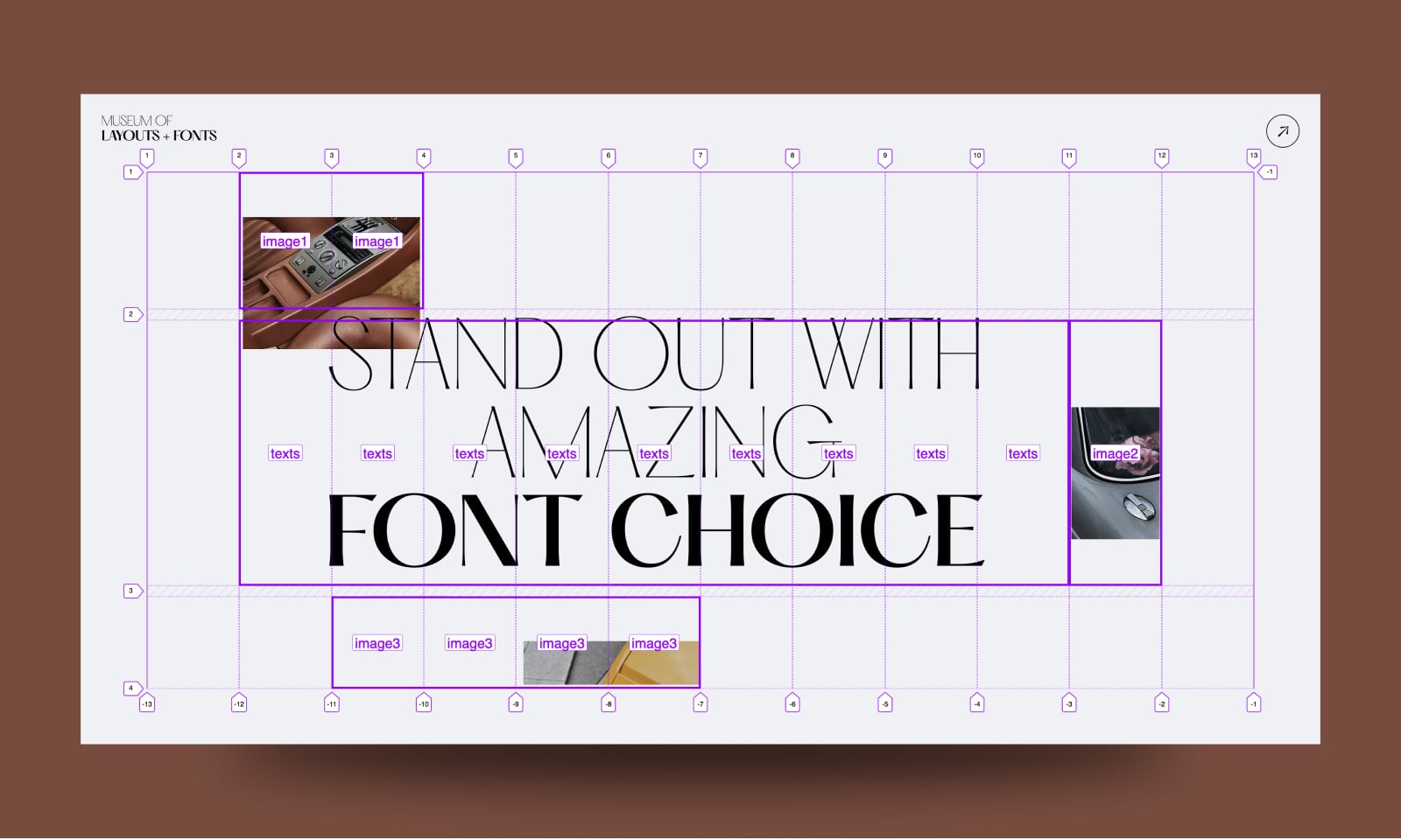
The demo uses the "negative margin hack" to overlap the first image with the heading.
Takeaways
grid-template-areascreates custom idents — named areas — that items reference viagrid-area.- It accepts three token types: named cell, null cell and trash cell tokens.
- Every row needs the same cell count; skipping even one cell produces a trash token, not a layout.
- Required whitespace between named cell tokens yields an ASCII diagram of the layout inside the CSS.
- Never put whitespace inside a null cell token (e.g.
.....); a single space between them creates unwanted empty cells and an invalid layout. - Layouts can be redefined per breakpoint purely in
grid-template-areas, without touching the items — though items can also be re-positioned withgrid-area. - Each named area implicitly receives four line names:
<custom-ident>-startand<custom-ident>-endin both column and row directions.





