

The <dialog> Basics
The native HTML <dialog> element has been around for nearly a decade, yet many of us still look up the specifics whenever we reach for it. It’s a compact feature with a surprising amount of nuance, from markup options to styling hooks. Here’s the full tour.
The core markup is minimal:
<button id="dialog-button">Open Dialog</button>

<dialog id="dialog">...</dialog>
By default, the dialog is closed. You can force it open with the open attribute, but that’s rarely what you want:
<dialog id="dialog" open>...</dialog>A more common approach is to open it with JavaScript. Grab a reference to the dialog and a button, then call the show() method:
const dialogButton = document.querySelector('#dialog-button');
const dialog = document.querySelect('#dialog');

formButton.addEventListener('click', () => {
  dialog.show();
})
That works, but show() makes the dialog behave more like a popover than a true modal. For modal behavior, use showModal() instead. The differences matter: a modal includes a backdrop, is automatically centered, traps focus, and closes with the Esc key. The show() method provides none of that.
const dialogButton = document.querySelector('#dialog-button');
const formDialog = document.querySelector('#dialog');

formButton.addEventListener('click', () => {
  formDialog.showModal();
})
It opens, positions itself, and then you can close it with Esc — which works because the dialog is in focus by default.
Closing Mechanisms
If you want an explicit close button inside the dialog, the markup is simple enough:
<button id="dialog-button">Open Dialog</button>

<dialog id="dialog">
  <button id="dialog-close">Close</button>
  <!-- etc. -->
</dialog>
That button won’t do anything yet. Pair it with the close() method:
const formButton = document.querySelector('#dialog-button');
const formDialog = document.querySelector('#dialog');
const formClose = document.querySelector('#dialog-close');

formButton.addEventListener('click', () => {
  formDialog.showModal();
})

formClose.addEventListener('click', () => {
  formDialog.close();
})
There is no closeModal() counterpart — the plain close() handles both cases. You can also close the dialog entirely without JavaScript using the form method attribute:
<dialog id="dialog">
  <form method="dialog">
    <button type="submit">Close dialog</button>
  </form>
</dialog>
That declarative approach works, though the semantic implications are worth testing on your own.
Invoker Commands
Another declarative path is the experimental “invoker commands” feature. It wires buttons directly to dialogs with command and commandfor attributes:
<button command="show-modal" commandfor="my-dialog">Show Dialog</button>

<dialog id="my-dialog">...</dialog>
The same attributes work for a closing button:
<dialog id="my-dialog">
  <!-- Close #my-dialog -->
  <button command="close" commandfor="my-dialog">Close Dialog</button>
</dialog>
You can also listen to these commands in JavaScript if you need to trigger additional logic:
// Select all dialogs
const dialogs = document.querySelectorAll("dialog");

// Loop all dialogs
dialogs.forEach(dialog => {

  // Listen for close (as normal)
  dialog.addEventListener("close", () => {
    // Dialog was closed
  });

  // Listen for command
  dialog.addEventListener("command", event => {

    // If command is show-modal
    if (event.command == "show-modal") {
      // Dialog was shown (modally)
    }

    // Another way to listen for close
    else if (event.command == "close") {
      // Dialog was closed
    }

  });
});
Support is still evolving, so keep an eye on browser status.
Accessibility and Focus
For a close button with an icon, be careful with the label. A bare “X” isn’t helpful to screen readers. The accessible pattern is to visually hide an explicit text label and mark the icon as decorative:
<button id="dialog-button">Open Dialog</button>

<dialog id="dialog">
  <button id="dialog-close">X</button>
</dialog>
<button id="form-button">Open Dialog</button>
<dialog id="form-dialog">
<button id="form-close">
<span class="visually-hidden">Close modal</span>
<span aria-hidden="true"></span>
</button>
</dialog>Note how the close button receives focus when the dialog opens. That can be convenient, but it also means an accidental Space press will close the dialog. If you have other focusable elements — like a link or a form field — consider giving one of them initial focus via tabindex.
Inert Background Content
A modal dialog makes the rest of the page inert. Text selection, clicks, focus, and input are all disabled on the background while the dialog is open. You don’t see an inert attribute in the markup; it’s applied implicitly.
That behavior only applies to showModal() dialogs, not ones opened with show(), which behave like non-blocking popovers. Also note that only the modal sits in the top layer. If you open a modal while a show-based dialog is present, the non-modal one becomes inaccessible.
Styling the Backdrop
The default backdrop is subtle — just a slight tint over the page. You can test it by opening a dialog and looking at the background:

To take control, use the ::backdrop pseudo-element. You can go with a solid color, but a semi-transparent backdrop with a blur() keeps the page context visible:
Styling the Dialog Surface
Two defaults stand out: a white background and a thick black border. You can override these directly on the <dialog> element, but for reliable application you should target its open state:
/* 👎 */
dialog {
  background-color: gold;
  border: 0;
  border-radius: 12px;
}
dialog {
/* ... */
&[open] {
background-color: gold;
border: 0;
border-radius: 12px;
}
}In DevTools you’ll see that the :modal pseudo-class has even higher specificity than :open. Use it if you need to override your own styles. A caveat on :open: Safari 26.5 only just added support. For broader compatibility, target the [open] attribute instead, or stick with :modal.
One side effect to remember: removing page scrollbars when the dialog is open changes the width of background elements. Show them to avoid unwanted layout shifts:
dialog {

  &[open] {
    scrollbar-gutter: stable;
  }
}
Positioning Controls
The default dialog is centered in the viewport via UA styles. Check DevTools and you’ll see the margin-based centering:
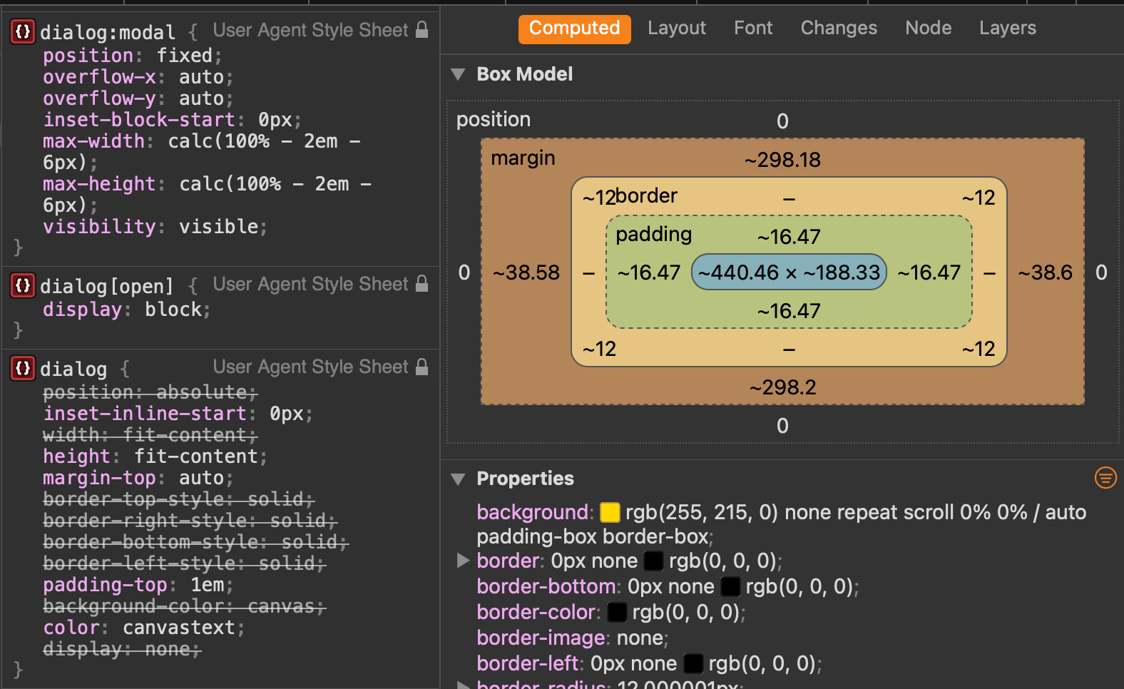
You can override margin-top to pull the dialog closer to the top of the viewport.
A more important warning: don't override the display property on a closed dialog. It’s set to none by default. Changing it to block removes the “closed by default” behavior and you lose the Esc key close. Custom styles should target the open state and leave display alone.
Preventing Background Scroll
It’s common to want the page behind a modal to stay put. The dialog element itself isn’t a scroll container, so overscroll-behavior alone doesn’t help — except that Chrome 144 changed how it works on non-scrollable containers. In recent Chrome, you can set the behavior on the dialog and its backdrop:
dialog {
  overscroll-behavior: contain;

  &::backdrop {
    overscroll-behavior: contain;
  }
}
That only works if the dialog can actually scroll, so make it a scroll container:
dialog {
  overflow: hidden;
  overscroll-behavior: contain;

  &::backdrop {
    overscroll-behavior: contain;
  }
}
For a broadly supported fallback, hide the body’s overflow when a dialog is open using :has():
body:has(dialog[open]) {
  overflow: hidden
}
The overscroll-behavior approach is nice because it’s declarative and tied to the dialog itself, but the :has() method is more widely supported right now.
Animating In and Out
Dialogs appear and disappear instantly by default. You can animate the entrance with the @starting-style rule, because the dialog starts at display: none without an initial style for its open state:
/* Nope! 👎 */
dialog {
  opacity: 0;
  overflow: hidden;
  overscroll-behavior: contain;
  transition: opacity .5s ease-in-out;
  width: 80vw;

  &:open {
    opacity: 1;
  }
}
/* Yep! 👍 */
@starting-style {
dialog:open {
opacity: 0;
}
}
dialog {
overflow: hidden;
overscroll-behavior: contain;
transition: opacity .5s ease-in-out;
width: 80vw;
&:open {
opacity: 1;
}
}View Transitions are tempting for these entrance and exit effects, but modal dialogs aren’t a great match. They live in the top layer and removal can break the old/new snapshot pairing that transitions depend on. You can get a working entrance transition that way, but the exit often falls apart — and the backdrop complicates things further.
A hybrid approach works: use a view transition on the opening state and a CSS animation for the closing state. Or skip view transitions entirely and just use CSS animations for both states. If you want something more elaborate, Chris Coyier has a demo that moves a modal along a shape() path — a fun starting point for your own experiments.
Choosing Between Dialog and Popover APIs
The Dialog API and Popover API look similar on the surface, but they serve fundamentally different purposes — and accessibility is where the difference matters most. As Zell Liew puts it:
After lots of research, I discovered that the Popover API and Dialog API are wildly different in terms of accessibility. So, if you’re trying to decide whether to use Popover API or Dialog's API, I recommend you:
- Use Popover API for most popovers.
- Use Dialog's API only for modal dialogs.
Popovers do not provide automatic focus management or an automatic ARIA connection. A dialog, on the other hand, automatically makes other elements inert, prevents tabbing into them, and keeps screen readers from reaching them. If you choose a popover but need focus trapping or inertness for background content, you will need to implement that behavior yourself with JavaScript.
Popovers also require an explicit accessible role, and selecting the right one takes consideration — there are several options to choose from. That said, the point is not that you should always reach for a dialog. Choose the API that matches your intent:
- Popover is an umbrella term for any on-demand popup.
- Dialog is a type of popover that creates a new window (or card) to hold content.
If you need a lightweight, non-modal popup, the Popover API will do. When you need true modality with focus trapping and background inertness, the Dialog API is the right tool — no hand-rolled accessibility shims required.


