

Tooltips used to be a JavaScript problem. Native popovers change that calculus
Before the Popover API, building a reliable tooltip usually meant reaching for a JavaScript library. That was not lazy engineering; it was the sensible default. Browsers offered no native concept of a tooltip that behaved consistently across mouse, keyboard, and assistive technology. If correctness mattered, a library was the only practical path.
The pattern was always the same: a trigger element, a hidden content element, and JavaScript to coordinate the two. The library managed hover and focus handling, hide-on-blur and hide-on-mouse-leave logic, and repositioning on scroll.
<button class="info">?</button>
<div class="tooltip" role="tooltip">Helpful text</div>
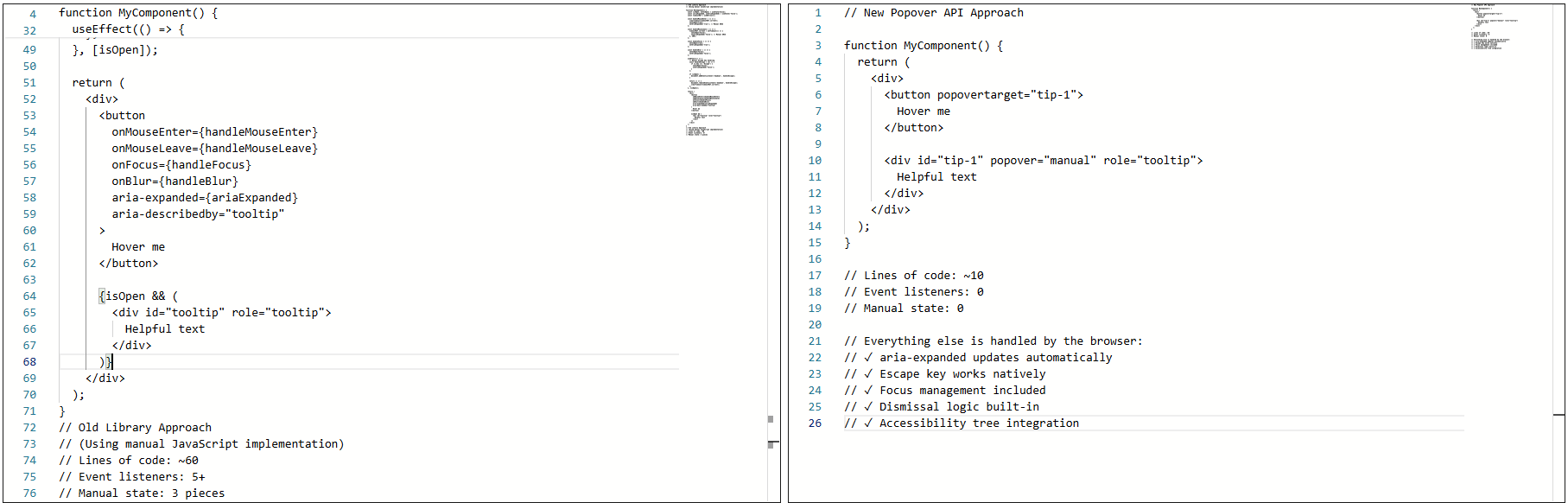
None of this was accidental. The code was merely compensating for gaps in the web platform.
The real cost of library-based tooltips
Libraries did genuine work. Positioning alone justified the dependency — handling scroll containers, transforms, and responsive layouts correctly is not trivial. But the true friction appeared in accessibility behavior, not visuals.
Problems surfaced in several areas:
- Hover and focus behavior had to be synchronized manually. Mouse users expect immediacy; keyboard users expect predictability. Supporting both meant introducing delays and handling edge cases.
- Keyboard support depended on multiple layers aligning: focus had to trigger the tooltip, blur had to hide it, and
Escdismissal required a manually wired key listener. Miss one edge case and the tooltip stayed open too long or vanished before it could be read. - Screen reader behavior was inconsistent. Tooltips were sometimes announced, sometimes not, and sometimes announced twice. Keeping ARIA attributes in sync meant manual updates for each state change, and a single miss made the tooltip confusing or invisible in the accessibility tree.
The implementation was tested and the library was solid. The core problem was not the code — it was that the platform lacked proper affordances. The browser had no real way to know that a given element was a tooltip. Everything was built on conventions: generic elements, custom event listeners, manually managed ARIA, and bespoke dismissal logic.
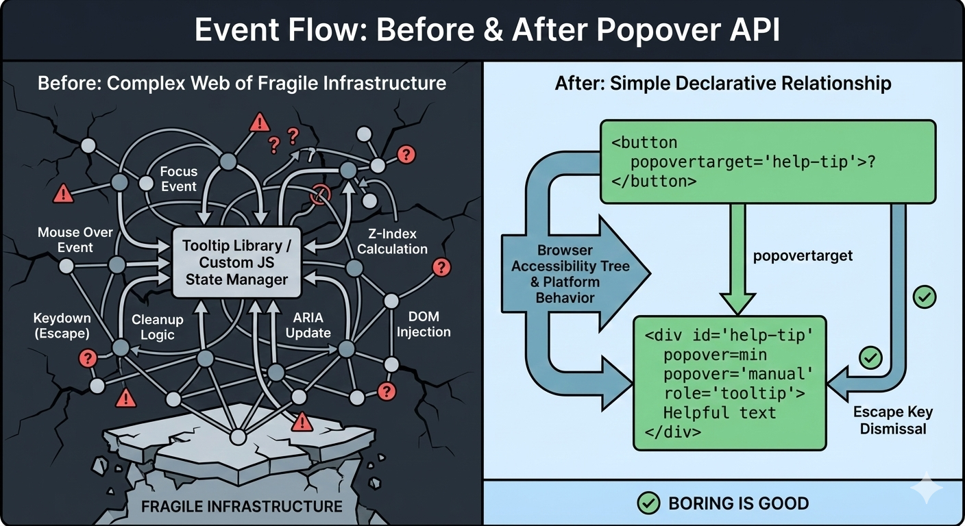
The core problem was not the code. It was that the web platform lacked proper affordances.
That fragility meant small changes carried risk. Adding new tooltips inherited the same complexity. Things technically worked, but never felt settled.
What changed with native popovers
When the tooltip was rebuilt with the Popover API, the most striking result was not the reduced code volume — it was the shift in ownership. The tooltip no longer existed because JavaScript said so. It existed because the browser understood its role in the markup, as a component participating in the focus model, the accessibility tree, and native dismissal rules.
<!-- popovertarget creates the connection to id="tip-1" -->
<button popovertarget="tip-1">?</button>

<!-- popover="manual": browser manages this as a popover -->
<!-- role="tooltip": tells assistive technology what this is -->
<div id="tip-1" popover="manual" role="tooltip">
  This button triggers a helpful tip.
</div>
No event listeners. No state tracking. No ARIA updates in JavaScript. Focus the trigger button and the tooltip appears; press Esc and it disappears.
aria-expanded automatically updating from false to true as the popover opens.Invoker commands handle the wiring
The popovertarget and popovertargetaction attributes are part of HTML's invoker commands, a declarative way to control interactive elements without JavaScript.
popovertarget="id": connects a button to a popover elementpopovertargetactionspecifies what should happen:show: only opens the popoverhide: only closes the popovertoggle(default): opens if closed, closes if open
This allows multiple triggers for the same tooltip, with the browser coordinating everything.
<button popovertarget="help-tip" popovertargetaction="show">
  Show Help
</button>

<button popovertarget="help-tip" popovertargetaction="hide">
  Close Help
</button>

<div id="help-tip" popover="manual" role="tooltip">
  Help content
</div>
Three accessibility problems that disappeared
1. Keyboard behavior became a browser guarantee
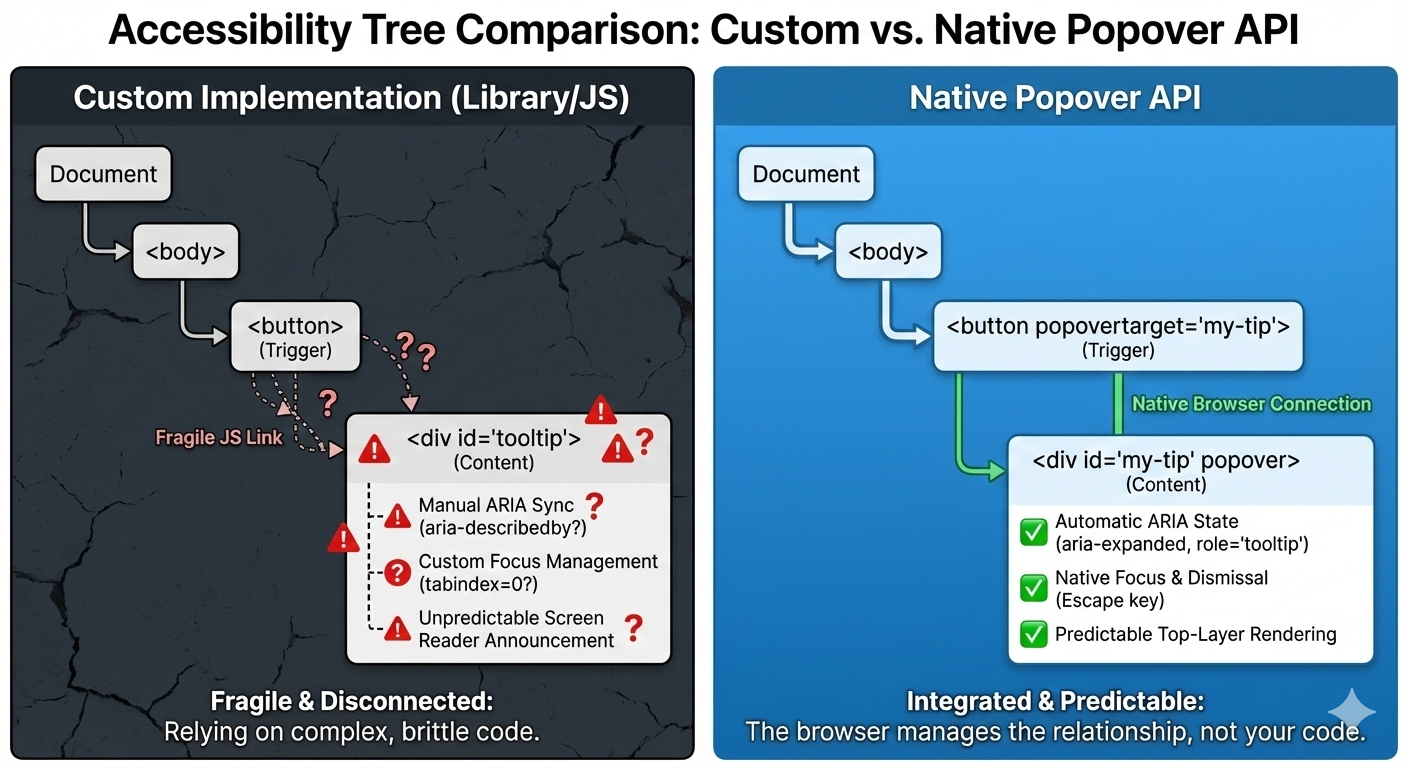
Previously, keyboard support required managing global keydown handlers, Esc-specific cleanup, and state checks during navigation. With the popover attribute — whether set to auto or manual — the browser handles the basics. Tab and Shift+Tab behave normally, and Esc closes the tooltip every time.
<div popover="manual">
  Helpful explanation
</div>
The keyboard experience stopped being something to maintain. It became a browser guarantee.
2. Screen reader behavior became predictable
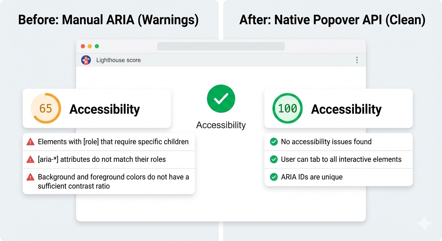
With a proper role assigned to the popover, screen reader announcements became stable. An unexpected side effect: Lighthouse stopped flagging incorrect ARIA state errors, because there were no longer custom ARIA states to get wrong.
<div popover="manual" role="tooltip">
  Helpful explanation
</div>
3. Focus management simplified
Focus previously required rules such as "let focus trigger the tooltip, move focus inside and don't close, close only on blur when focus is too far, restore focus manually." With the Popover API, focus moves naturally into the popover. Closing it returns focus to the trigger — no hidden traps, no lost focus moments. The fix was not adding focus restoration code; it was removing it.
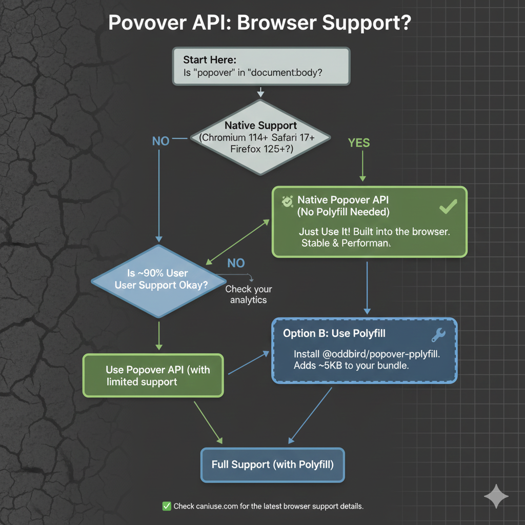
Escape to dismiss, and focus automatically returns to the trigger.Given the API's current browser support, it is a practical option today. Still, as with any new feature, some parts are being refined. It is worth watching caniuse.com for updates as the spec evolves.
Where the API Still Needs a Helping Hand
The Popover API has removed a lot of repetitive JavaScript from tooltip code, but it hasn't eliminated scripting altogether. That's not a regression — it's a shift in responsibility. The browser now handles invocation, dismissal, and ARIA state natively. JavaScript is no longer propping up basic behavior; it's reserved for the intent that the platform can't infer.
Fine-Tuning Tooltip Timing
Native popovers open and close immediately. That works for most UI elements, but it can feel unstable for tooltips. When a user's pointer moves just a few pixels too far or grazes past the trigger, the tooltip can flash and vanish, which is jarring.
Adding small delays between hover or focus and the tooltip's appearance requires JavaScript, but that script no longer defines how the tooltip works. It simply refines how it feels. In the case of hiding, I might add a short delay and cancel it if the pointer moves into the tooltip itself.
<button
  popovertarget="help-tip"
  popovertargetaction="show">
  ?
</button>

<div id="help-tip" popover="manual" role="tooltip">
  This button triggers a helpful tip.
</div>
With the browser owning invocation, dismissal, and ARIA state, nothing in the basic open-and-close cycle is scripted. The only JavaScript left is for deliberate, human-centered behavior — not accessibility hacks. CSS is starting to explore this territory too: emerging interest and invoker work suggests that entry and exit delays could eventually be expressed directly in stylesheets, which would remove even this small imperative layer.
let hideTimeout;

const show = () => {
  clearTimeout(hideTimeout);
  tooltip.showPopover();
};

const hide = () => {
  hideTimeout = setTimeout(() => {
    tooltip.hidePopover();
  }, 200);
};
Interpreting Hover Intent
The browser has no idea whether a hover or focus event is meaningful or just the pointer passing through. That judgment call has always been a developer's responsibility. What has changed with the Popover API is that this logic now layers on top of native behavior instead of replacing it.
<button
 popovertarget="help-tip"
 popovertargetaction="show">
  ?
</button>
Invoker commands handle the core open-and-close mechanics and ARIA management. JavaScript only gets involved to implement judgment calls — like delaying dismissal to see if the user is moving toward the tooltip or canceling it when they arrive.
let hideTimeout;

const show = () => {
clearTimeout(hideTimeout);
  tooltip.showPopover();
};

const hide = () => {
  hideTimeout = setTimeout(() => {
    tooltip.hidePopover();
  }, 200);
};
Manual Popovers and Explicit Focus
For popover="manual", the browser doesn't restore focus automatically. That obligation stays with the developer. If a manual tooltip opens on focus and closes on blur, you have to return focus to the trigger deliberately.
tooltip.hidePopover();
trigger.focus();
This isn't a platform shortcoming; it's a clear line between what the browser standardizes and where custom intent begins.
The Honest Verdict
The Popover API doesn't magically solve tooltips. It stops you from building fragile interaction infrastructure from scratch. You still write JavaScript and think through edge cases, but now you're solving product-specific problems rather than recreating a UI primitive the platform should already understand.
When a Library Still Wins
After migrating tooltips to the Popover API, libraries aren't obsolete warehouse stock — they're specialized tools for specific jobs.
Large or Mature Design Systems
For a design system used across multiple teams, a tooltip library can still be the right call. Centralized behavior, documented patterns, and consistent defaults offer organizational value. Changing an interaction model in that environment is a governance decision, not just a technical one, and libraries give distributed teams guardrails, especially when deep accessibility expertise isn't uniform.
Complex Positioning Requirements
Native positioning handles straightforward cases, but collision detection across nested scroll containers, custom flipping logic, and precise control over offsets and boundaries still call for a library like Floating UI. These are geometry problems the platform is only beginning to solve natively.
CSS anchor positioning is starting to absorb some of that load, enabling viewport-aware placement and edge flipping in pure CSS. The feature is still new with known issues, but it's part of Interop, so full consistent browser support is on the horizon. For teams shipping today with strict cross-browser requirements, a library remains the pragmatic fallback.
Teams Without Accessibility Expertise
This one matters most. A well-maintained library can act as a safety net, even if it can't guarantee perfect accessibility. It can at least prevent the most common mistakes. The Popover API offers better defaults, but it still expects you to know when to apply ARIA roles, labels, and focus management — and to test for them. Without that baseline, even native primitives get misused.
The Line in the Sand
Use the Popover API for simplicity, clarity, and platform-aligned behavior. Use a library when scale, customization, or constraints demand it. It's not about purity. It's about choosing the right level of abstraction for the problem in front of you.
The right tool for your next tooltip might be a library — but it's no longer the default choice.
The New Default
With the Popover API, tooltips are no longer simulated UI. The browser understands them as a first-class concept. Opening, closing, keyboard navigation, Escape handling, and a substantial portion of accessibility now ship with the platform, not with your bundled JavaScript.
That doesn't retire tooltip libraries. They still earn their keep for complex design systems, heavy customization, and legacy constraints. But the baseline has shifted. For the first time, the simplest tooltip can also be the most correct one. The experiment is easy: don't rewrite your whole system; swap just one existing tooltip for the Popover API and see what disappears from your code. When the platform provides a better primitive, the win isn't just fewer lines of JavaScript — it's fewer things you have to worry about at all.
Full source examples are available in the accompanying GitHub repo.
Further Reading and References
- "Poppin' In," Geoff Graham
- "Clarifying the Relationship Between Popovers and Dialogs," Zell Liew
- "What is popover=hint?," Una Kravets
- "Invoker Commands," Daniel Schwarz
- "Creating an Auto-Closing Notification with an HTML Popover," Preethi
- Open UI Popover API Explainer
- "Pop(over) the Balloons," John Rhea
- "CSS Anchor Positioning," Juan Diego Rodríguez
- MDN: Popover API



