

Why Vue.js Accessibility Is Better Than Its Reputation
JavaScript frameworks like React, Angular, and Vue have a poor reputation when it comes to web accessibility. But during research for my book Accessible Vue, I found that the situation is far better than commonly believed. What follows are three insights about accessible framework use, concrete Vue.js features that support inclusive design, and community patterns worth knowing.
The Underused Accessibility Potential of Components and Props
Component-based design, enabled by modern JavaScript frameworks, offers advantages that go beyond developer experience. The first is reusability: when a component is used in several places across your app, it only needs to be made accessible once. As Hidde de Vries puts it, this "baking accessibility into components" creates a win-win scenario for developers and users alike.
The second advantage comes from props, which allow components to inherit context from their parent environment. This forwarding of environmental data can serve accessibility in meaningful ways.
Headlines provide a clear example. A solid headline structure benefits not only SEO but also screen reader users, who rely on document outlines to quickly scan a page rather than reading every word. Just as sighted users skip through content, blind screen reader users check for the content and functionality they're interested in. Headlines hold content together while providing structural scaffolding for the entire document.
What makes headlines useful is not just their existence but their nesting. Six levels, from <h1> to <h6>, give developers and editors a reliable way to create an outline. Consider the headline tree from the GOV.UK website:
1 — Welcome to GOV.UK
  2 — Popular on GOV.UK
  2 — Services and information
    3 — Benefits
    3 — Births, deaths, marriages and care
    3 — Business and self-employment
    // …etc
  2 — Departments and policy
    3 — Coronavirus (COVID 19)
    3 — Travel abroad: step by step
…etc
Even without visiting the page, this outline acts as a table of contents, showing what sections exist on the front page. The creators used headline elements to herald the content that follows and avoided skipping levels.
So far, this is familiar territory. But component-based design introduces a subtle problem: because a component can appear in different areas of your app, hardcoded headline levels can produce a suboptimal outline. The relationships between headlines may not come across as clearly as they should.
Imagine a shop's newest products component that could appear both in the main content and a sidebar. A hardcoded <h1>Our latest arrivals</h1> makes sense above the product list in the main content because that's the central content of the view. But the same component with the same <h1> placed in a sidebar would falsely suggest that the sidebar content is most important, competing with the main content's heading.
Passing Context Through Props
This is where props come to the rescue. Consider a simplified component listing a shop's newest products, with a hardcoded <h1>:
<template>
    <div>
        <h1>Our latest arrivals</h1>
        <ol>
            <li>Product A</li>
            <li>Product B</li>
            <!-- etc -->
        </ol>
  </div>
</template>
To reuse this component without compromising the document's headline structure, we can make the headline level dynamic. Vue's dynamic component helper, appropriately called component, replaces the static <h1>:
<component :is="headlineElement">Our latest arrivals</component>
The component script now needs two additions:
- A prop named
headlineLevelthat receives the exact headline level as a string. - A computed property,
headlineElement, that constructs a valid HTML element from the stringhcombined with theheadlineLevelvalue.
The simplified script block looks like this:
<script>
export default {
    props: {
      headlineLevel: {
        type: String
    },
    computed: {
        headlineElement() {
          return "h" + this.headlineLevel;
        }
    }
}
</script>
Of course, production code should validate the headlineLevel prop, ensuring it is a number between 1 and 6. Vue's native prop validation and TypeScript are both suitable tools for this, though I've omitted that for clarity.
For those interested in the same pattern in React, Heydon Pickering wrote about managing heading levels in design systems in 2018 with JSX examples. The Tenon UI heading components take this further by attempting to automate headline level creation with "LevelBoundaries" and a generic <Heading> element.
Established Patterns for Accessible Web Apps
Web app accessibility can seem intimidating at first, but proven patterns exist for tackling common challenges. The strategies below cover accessible notifications, recommended WAI-ARIA practices, and where to look for ongoing guidance from both the Vue and React communities.
Live Regions for Dynamic Updates
Screen readers convert on-screen content into audio or braille output. The reader's virtual cursor can only occupy one position in the document at a time. When a web app updates the DOM without a page reload, and that update occurs above the virtual cursor's position, screen reader users won't know about the change — users rarely traverse backwards through a document.
ARIA live regions solve this problem. Developers mark certain HTML elements as regions the screen reader should observe. When scripting changes the element's textContent, the screen reader announces the new text regardless of where the virtual cursor sits.
Consider an e-commerce product list where each item has an "Add to Cart" button that updates the cart asynchronously. The visible change is obvious to sighted users, but screen reader users need an explicit announcement. The HTML for a simplified version looks like this:
<button id="addToCartOne">Add to cart</button>

<div id="info" aria-live="polite">
<!-- I’m the live region. For the sake of this example, I'll start empty.
     But screen readers detect any text changes within me! -->
</div>
The corresponding JavaScript for the button's click handler triggers the announcement:
<script>
const buttonAddProductOneToCart = document.getElementById('addToCartOne');
const liveRegion = document.getElementById('info');

buttonAddProductOneToCart.addEventListener('click', () => {
        // The actual adding logic magic 🪄

        // Triggering the live region:
        liveRegion.textContent = "Product One has been added to your cart";
});
</script>
When the product is added, the empty <div> with ID info gets its text content updated to "Product One has been added to your cart". Because the region is observed and set to polite, the screen reader queues the announcement until after any current output finishes. For urgent messages that must interrupt the reader immediately, the aria-live attribute can be set to assertive — but use this sparingly, only for critical errors like "Autosave failed, please save manually."
Vue.js developers can implement live regions directly with the same approach, but the vue-announcer library offers a simpler path. Install it with npm install -S @vue-a11y/announcer (or npm install -S @vue-a11y/announcer@next for Vue 3), register the Vue plugin, then follow two steps:
- Place
<VueAnnouncer />in yourApp.vuetemplate. This renders an empty live region (like theinfodiv above). Only one instance is recommended, positioned centrally so many components can reference it.
<template>
  <div>
    <VueAnnouncer />
    <!-- ... -->
  </div>
</template>
- Trigger the announcement from a method or lifecycle hook using the
.setmethod orthis.$announcer. The first parameter is the text to announce. The second optional parameter specifiespoliteorassertive— omitting it defaults to polite.
methods: {
  addProductToCart(product) {
    // Actual adding logic here

    this.$announcer.set(`${product.title} has been added to your cart.`);
  }
}
Live regions support more than polite and assertive — options include log, timer, and marquee — but screen reader support varies. Useful resources for further study include MDN's "ARIA Live Regions" documentation, Sarah Higley's video "The Many Lives Of A Notification," and the NerdeRegion Chrome extension, which emulates live region output during development (though it should not replace real screen reader testing).
WAI-ARIA Authoring Practices Worth Adopting
W3C's authoring practices offer an apparent pattern library for typical app components, but not every practice is production-ready. The purpose of the document was to demonstrate the pure use of ARIA states, roles, and widget patterns. Truly vetted patterns require solid support across assistive technologies and seamless touch-device functionality. Some entries fall short, so staying current means monitoring the authoring-practices GitHub repo and its issue discussions, where accessibility experts share their testing research.
Three patterns are widely accepted, with solid Vue.js counterparts:
- Disclosure widgets. This simple pattern works as the basis for accessible accordions, robust dropdown navigation, or toggling additional information like extended image descriptions. It requires only a trigger and a container that directly follow each other in the DOM. Details and a demo are available from Marcus Herrmann's blog and CodeSandbox.
- Modal dialogs. A modal renders all interface parts outside the dialog inactive while open. Managing this correctly requires sending keyboard focus into the modal on activation, confining focus within it, and restoring focus to the triggering control on deactivation. Kitty Giraudel's A11y Dialog component handles all of this; Vue users should look at the
vue-a11y-dialogplugin. - Tab components. These follow the metaphor of physical folder tabs and offer two activation variants — automatic and manual. Tabs enjoy good assistive technology support and are considered recommended practice, provided you test which activation mode works best. A slot-based Vue implementation with automatic activation is demonstrated in the associated CodeSandbox example.
Mind the Gap in Authoring Practices
Vue.js accessibility is gaining momentum. A notable milestone was the addition of the "Accessibility" section in Vue's official documentation, published alongside Vue 3's release. Several members of the Vue community are driving this progress:
- Maria Lombardo, a Vue community partner, authored the official accessibility documentation and offers a paid Web Accessibility Fundamentals course at vueschool.io.
- Alan Ktquez leads the community initiative at vue-a11y.com, maintaining projects like
vue-announcerfor live regions,vue-skiptofor skip links,vue-axe(a wrapper around Deque'saxe-core), and theawesome-vue-a11yresource list. - Oscar Braunert focuses on inclusive inputs, sharing talks and articles, and co-creates the tournant UI library with Marcus Herrmann. Tournant's components build on WAI-ARIA Authoring Practices and Heydon Pickering's Inclusive Components approach.
- Moritz Kröger wrote the
vue-a11y-dialogwrapper, encapsulating the semantics and focus management described above.
Borrowing Lessons From the React Ecosystem
React's broader adoption has produced significant accessibility work, and Vue developers can learn from it. Key ideas and implementations transfer across frameworks since the underlying concepts remain largely the same. The Australian Government Design System is one example of a large, accessibility-conscious React project that publishes its components as open source. React accessibility libraries worth studying include Deque's Cauldron, Tenon UI, and Uber's BaseWeb Components.
Following leading accessibility voices from the React world is also beneficial. Marcy Sutton, a freelance expert formerly at Deque and Gatsby.js, covers critical web app accessibility topics through presentations, blog posts, and workshops. Lindsey Kopacz specializes in inclusive experiences and provides courses on platforms like Egghead.io, plus her ebook "The Bootcampers Guide to Web Accessibility." Developers Ryan Florence and Michael Jackson created Reach UI to serve as an accessible component foundation. Their Reachy UI Router — built with inbuilt focus management — is merging with React Router, bringing those accessibility enhancements to the wider React ecosystem soon.
Programmatic Focus: A Rare Case Where Scripted Moves Are Right
As a general rule, scripted focus changes are bad. Users expect their cursor to stay put unless they move it. Unexpected jumps are either an annoyance or an actual barrier. But there is one exception: after a deliberate interaction such as a click, moving focus can be the only sensible way to help keyboard and screen-reader users understand what just changed. The key is that the change is predictable because it is tied to user action.
Focus management becomes necessary in two common situations:
- When the affected content is not adjacent to its trigger. A disclosure widget, for instance, assumes the toggled container sits directly after the button in the DOM. Many widgets can't guarantee that proximity — a modal dialog, for example, may live anywhere in the tree. When it opens after a button press, focus must be sent into the dialog itself so keyboard users can operate it.
- When content changes without a page reload. This is typical of route navigation in single-page apps. A static site reloads the document, which naturally sends the user to the top of the new page. An SPA merely modifies part of the same page, so no automatic repositioning happens. Focus must be actively moved to the newly rendered content.
What bad and good focus management look like in practice:
Vue makes the required code straightforward. Any element can carry a ref attribute, which registers the DOM node on the component's this.$refs object. From there, calling the native .focus() method is all it takes to move the keyboard cursor.
Suppose a button with ref="triggerButton" should regain focus when the user presses ESC. The handler is compact:
<template>
    <div @keydown.esc="focusTriggerBtn">
        <button ref="triggerButton">Trigger</button>
    </div>
</template>
<script>
export default {
//...
methods: {
    focusTriggerBtn() {
        this.$refs.triggerButton.focus();
    }
}
//...
}
</script>
Bringing Refs Into a Real Widget: Off-Canvas Navigation
A fuller exercise combines refs and focus management in an off-canvas navigation pattern. This widget typically requires two refs: navTrigger on the button that opens the panel, and navContainer on the panel itself. For the panel to be programmatically focusable, the container needs tabindex="-1". The flow is symmetric: clicking the trigger sends focus into the navigation, and closing the navigation returns focus to the trigger.
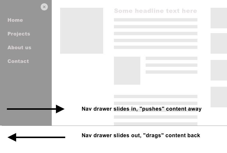
The takeaway is that the core toolkit is minimal. Understanding when to move focus matters more than the mechanics. Vue's this.$refs plus JavaScript's native .focus() are sufficient for the job, provided the move always follows a user interaction and targets a predictable location.
The broader lesson is that application accessibility is mostly a continuation of classic web accessibility. Once that is clear, the remaining gap — handling dynamic updates and complex widgets — has a paved path through focus management and live regions. The tools are not exotic; they are already part of the frameworks and browsers in daily use.



