
What the State of CSS results actually say
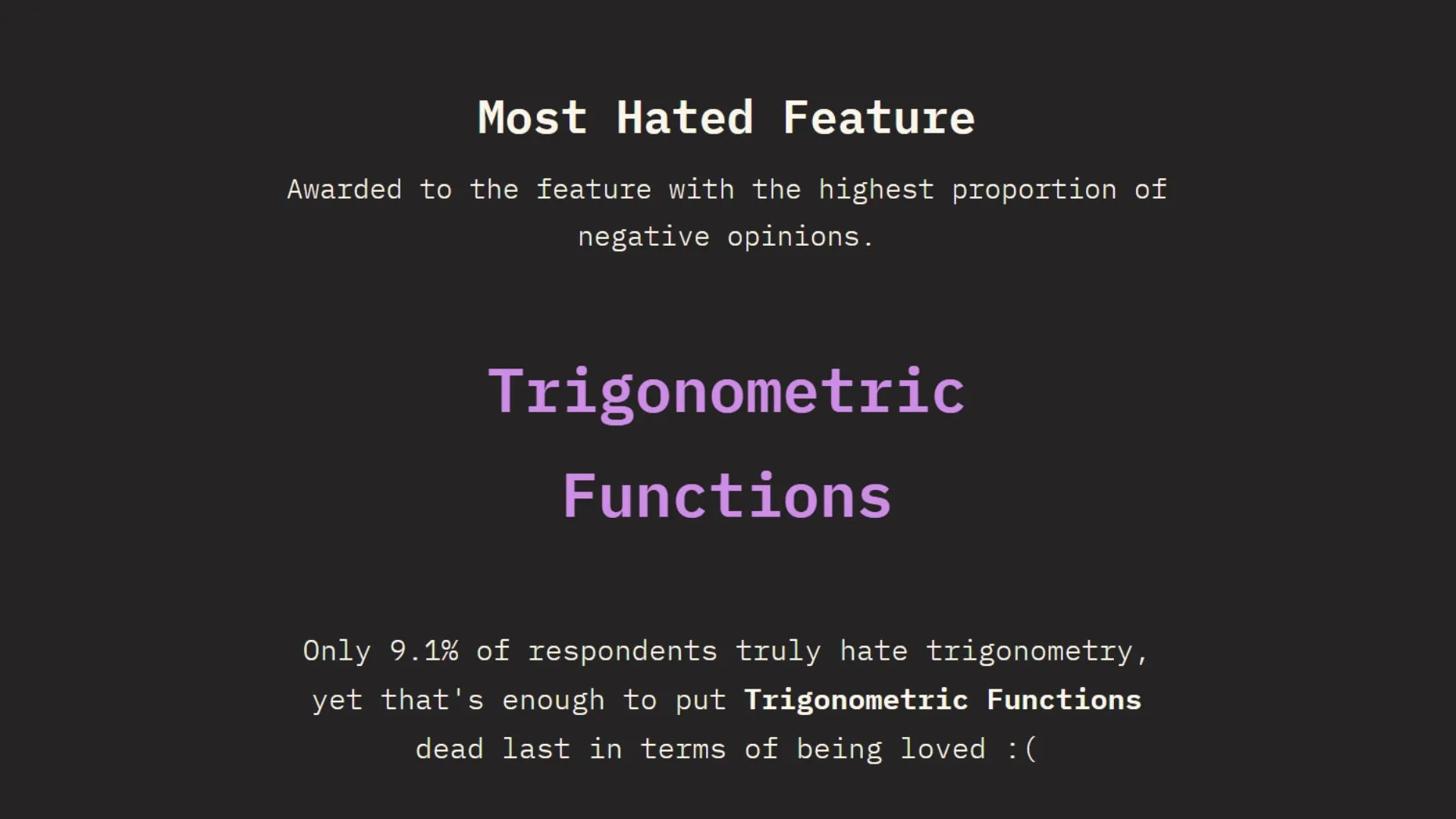
The State of CSS 2025 survey hands trigonometry an unenviable award: "Most Hated Feature." The number behind the label is narrower than the title suggests — 9.1% of respondents say they truly hate trigonometry — but it's still enough to make sin() and cos() worth a second look. Hated isn't the same as worst, and the practical case for these functions is easy to make.
The unit circle, briefly
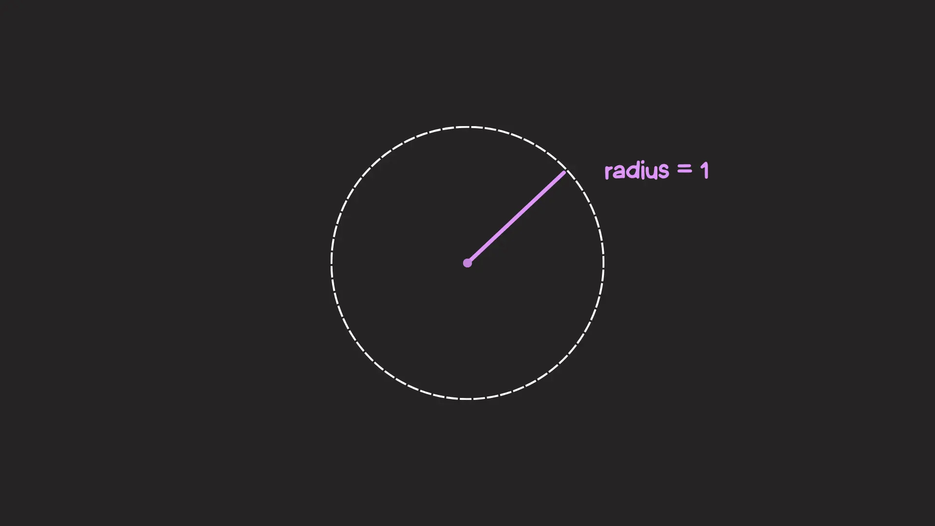
Trigonometric functions suffer from a definition problem: the descriptions available tend to be either too general to convey what the functions actually do, or too academic to read without a math degree. The unit circle is the useful middle ground — a circle with a radius of one unit.
Placed on the Cartesian coordinate system, every point on that circle has an X coordinate (horizontal position) and a Y coordinate (vertical position).
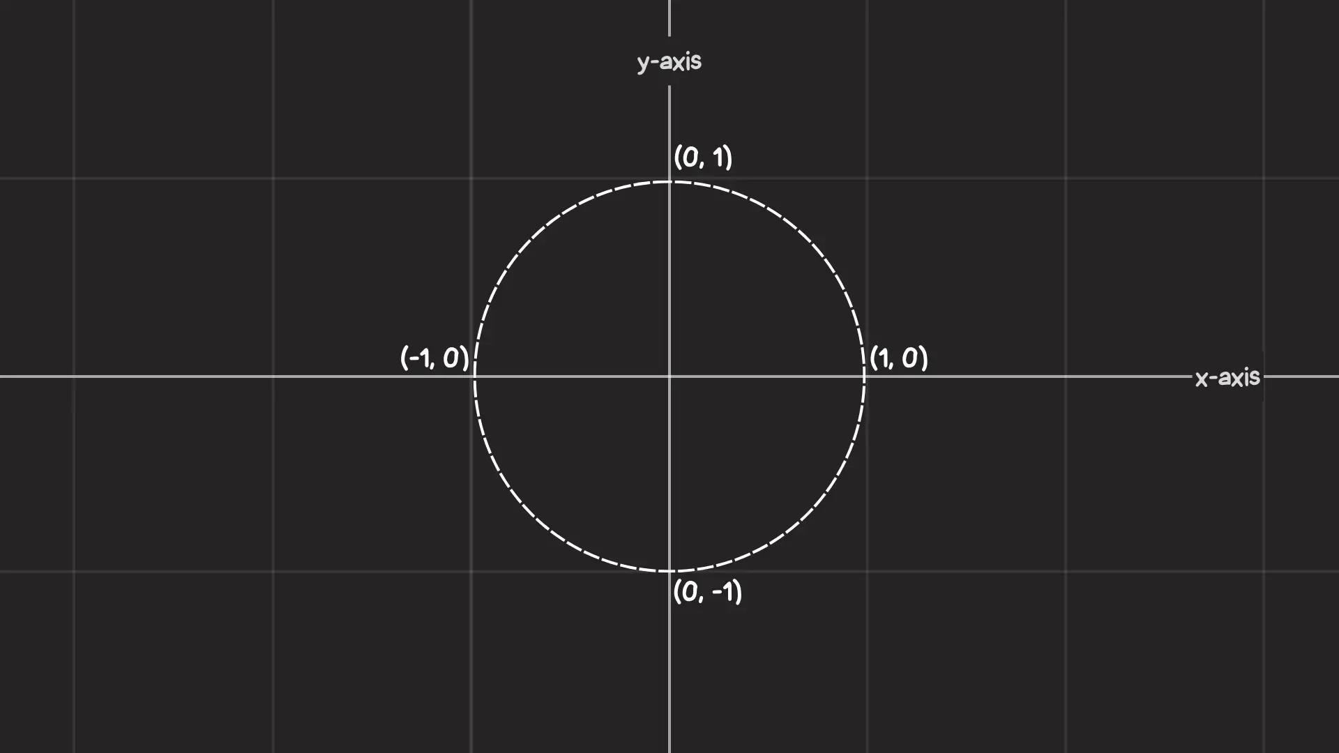
Points are reached by traveling around the circle by an angle, measured counter-clockwise from the positive X-axis. Negative angles travel clockwise. Each angle lands on exactly one point, and the coordinates for 0°, 90°, 180° and 270° are trivial — the problem is everything in between.
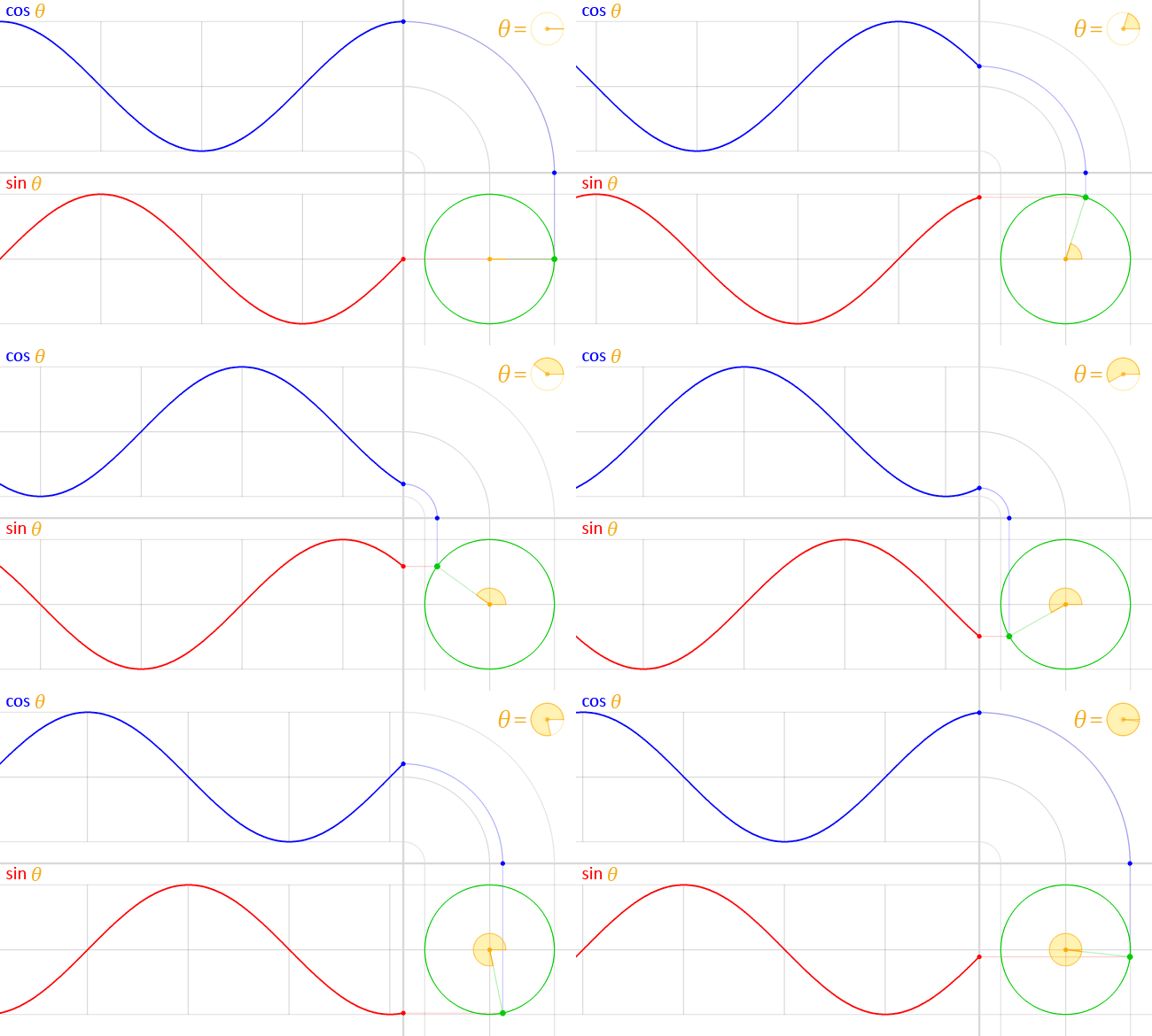
That's the gap the two functions fill. cos() takes an angle and returns the X coordinate; sin() takes the same angle and returns the Y coordinate. Because the mapping is to Cartesian coordinates, a point can be tracked around a circle of any size, not just the unit circle.
Building a circular layout
Start with a row of circular elements and the goal of arranging them evenly around the outline of a larger circle. Two values are needed per item: the total number of items and each item's index. Until sibling-index() and sibling-count() are supported, the indexes are hardcoded in an inline CSS variable.
<ul style="--total: 9">
  <li style="--i: 0">0</li>
  <li style="--i: 1">1</li>
  <li style="--i: 2">2</li>
  <li style="--i: 3">3</li>
  <li style="--i: 4">4</li>
  <li style="--i: 5">5</li>
  <li style="--i: 6">6</li>
  <li style="--i: 7">7</li>
  <li style="--i: 8">8</li>
</ul>
The angular gap between neighbors comes from dividing 360deg by the item count — eight in this example. Multiplying that gap by an item's index yields its angle:
li {
  --rotation: calc(360deg / var(--total) * var(--i));
}
A --radius variable pushes the items away from the center:
ul {
  --radius: 10rem;
}
With angle and radius known, cos() and sin() supply the coordinates. Each unit-circle coordinate is multiplied by --radius to scale it to the larger circle:
li {
  /* ... */
  position: absolute;

  transform: translateX(calc(cos(var(--rotation)) * var(--radius)))
             translateY(calc(sin(var(--rotation)) * var(--radius)));
}
No magic numbers are involved — only the radius is supplied, and the trigonometry handles placement. Swapping 360deg for 180deg produces a semicircular arrangement instead of a full ring. Transitioning the radius opens up further options, such as a circular menu whose items expand outward from a center point on hover or click.
Plotting elements along a wave
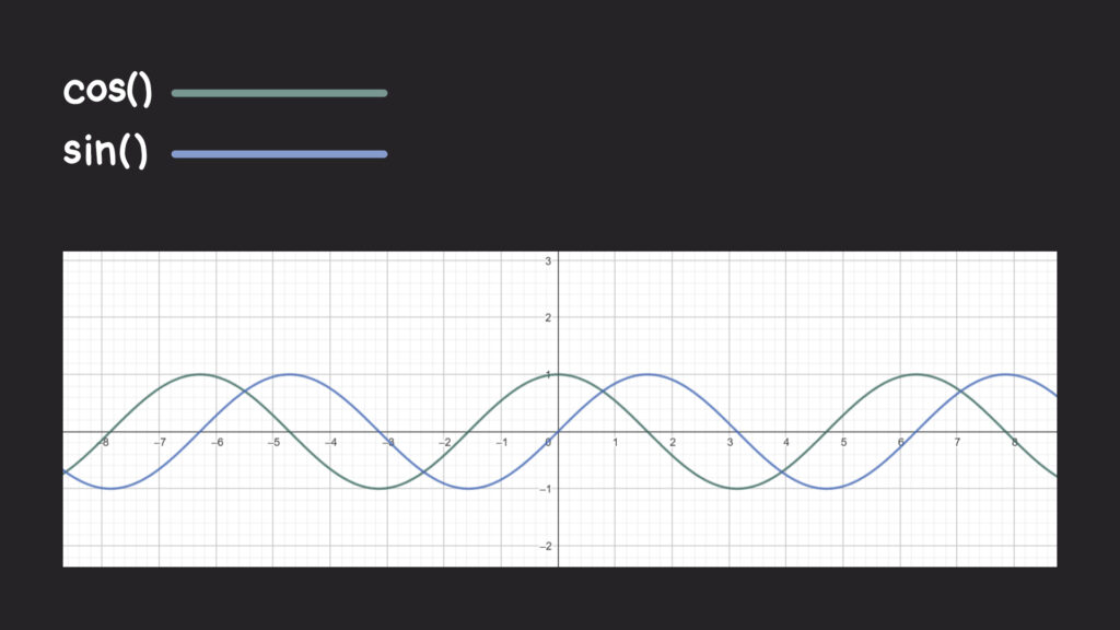
Graphed on two axes, the cos() and sin() outputs form a pair of waves that oscillate up and down, offset from one another along the horizontal axis. The values sweep between -1 and 1 as the angle moves around the unit circle, which is where the wave shape originates; the two functions behave like reflections of each other.
⚠️ Auto-playing media
Elements can follow that wave. Begin again with a single row of circular items, this time long enough to overflow the viewport. Each item still gets an index, but the total count isn't needed. The index is multiplied by an angle and passed into sin(), which returns a ratio describing how high or low the element sits on the wave. Multiplying that ratio by a length — half an item's total size, in this case — gives the vertical translation:
<ul>
  <li style="--i: 0"></li>
  <li style="--i: 1"></li>
  <li style="--i: 2"></li>
  <li style="--i: 3"></li>
  <li style="--i: 4"></li>
  <li style="--i: 5"></li>
  <li style="--i: 6"></li>
  <li style="--i: 7"></li>
  <li style="--i: 8"></li>
  <li style="--i: 9"></li>
  <li style="--i: 10"></li>
</ul>
li {
transform: translateY(calc(sin(60deg * var(--i)) * var(--shape-size) / 2));
}60deg was chosen because it produces smoother waves than some alternatives, and varying it changes the wave's intensity.
Intertwining two waves
A more involved use: two wavy chains of circles woven together like a DNA strand. The HTML nests two unordered lists inside a third; the two inner lists carry the two waves, and the outer list serves as a styling hook.
<ul class="waves">
<!-- First wave -->
<li>
<ul class="principal">
<!-- Circles -->
<li style="--i: 0"></li>
<li style="--i: 1"></li>
<li style="--i: 2"></li>
<li style="--i: 3"></li>
<!-- etc. -->
</ul>
</li>
<!-- Second wave -->
<li>
<ul class="secondary">
<!-- Circles -->
<li style="--i: 0"></li>
<li style="--i: 1"></li>
<li style="--i: 2"></li>
<li style="--i: 3"></li>
<!-- etc. -->
</ul>
</li>
</ul>The two direct <li> elements wrapping the inner lists are set to display: contents to keep them out of the way. One chain is the "principal" and the other the "secondary," with the secondary positioned behind the principal and slightly different background colors distinguishing them as the block-level overflow scrolls. A stacking context controls the reordering:
.waves > li { display: contents; }.principal {
position: relative;
z-index: 2;
}
.secondary { position: absolute; }Vertical positions come from sin() and cos(). Because the two functions act as reflections of one another, the variance between them offsets the waves into two intersecting chains:
.principal {
/* ... */
li {
  transform: translateY(calc(sin(60deg * var(--i)) * var(--shape-size) / 2));
}
}
.secondary {
/* ... */
li {
transform: translateY(calc(cos(60deg * var(--i)) * var(--shape-size) / 2));
}
}Shifting the .secondary wave by another 60deg accentuates the offset:
.secondary {
  /* ... */
  li {
    transform: translateY(calc(cos(60deg * var(--i) + 60deg) * var(--shape-size) / 2));
  }
}
The same technique adds whimsy to a hero banner.
Damped oscillatory animation
An oscillation that simply goes back and forth — a pendulum, a bouncing ball — is trivial to write in a single animation declaration.
.element {
  animation: someAnimation 1s infinite alternate;
}
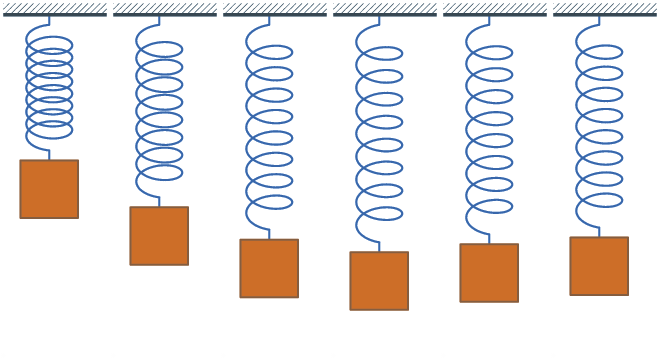
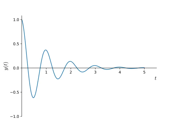
Perfect, perpetual oscillation doesn't exist in practice; movement decays over time, as a bouncing spring does. That decay is called damped oscillation, and it can be modeled in CSS with cos(): graphed over time, the motion swings back and forth while settling toward the resting position. This visible back-and-forth variety is underdamped oscillation; overdamped and critically damped cases exist but aren't covered here.
The general mathematical form has three parts:
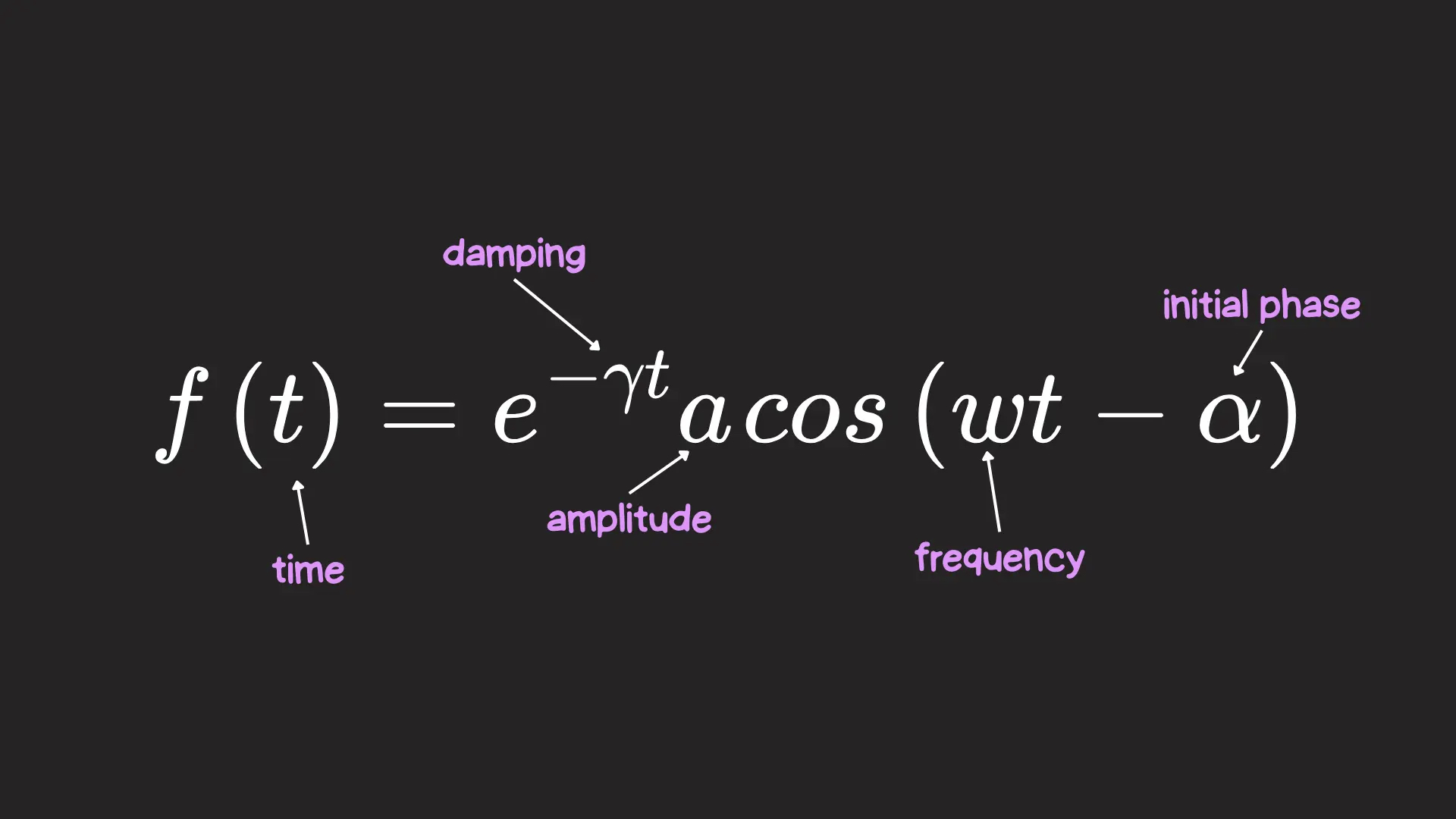
- e−γt: a negative exponent makes this shrink exponentially over time, bringing movement to a gradual stop. It is multiplied by a damping constant (γ) specifying how quickly the motion decays.
- a: the initial amplitude of the oscillation — the element's starting position.
- cos(ωt−α): the oscillation itself. Time is multiplied by frequency (ω), which sets oscillation speed, and α can be subtracted from time to offset the initial oscillation.
For a single circle sitting alone, the CSS variables follow directly from the formula:
:root {
  --circle-size: 60px;

  --amplitude: 200px; /* The amplitude is the distance, so let's write it in pixels*/
  --damping: 0.3;
  --frequency: 0.8;
  --offset: calc(pi/2); /* This is the same as 90deg! (But in radians) */
}
Graphing those values in a tool like GeoGebra shows the animation starting at 0px thanks to the offset, peaking around 140px, and dying out around 25s.
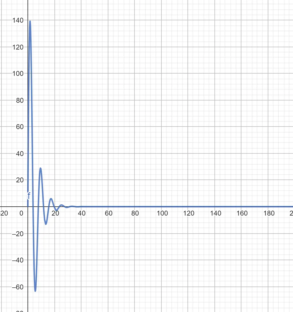
Nobody wants to wait 25 seconds. A registered --progress property animates from 0 to 25 and stands in for time in the function — it must go through @property to be animatable:
@property --progress {
  syntax: "<number>";
  initial-value: 0;
  inherits: true;
}

@keyframes movement {
  from { --progress: 0; }
  to { --progress: 25; }
}
.circle {
--oscillation: calc(
(exp(-1 * var(--damping) * var(--progress))) *
var(--amplitude) *
cos(var(--frequency) * (var(--progress)) - var(--offset))
);
transform: translateX(var(--oscillation));
animation: movement 1s linear infinite;
}The damped motion so far applies only to the x-axis. Repeating the same oscillation for the y-axis, with sin() in place of cos(), yields motion that is both circular and damped:
.circle {
  --oscillation-x: calc(
    (exp(-1 * var(--damping) * var(--progress))) *
    var(--amplitude) *
    cos(var(--frequency) * (var(--progress)) - var(--offset))
  );
  --oscillation-y: calc(
    (exp(-1 * var(--damping) * var(--progress))) *
    var(--amplitude) *
    sin(var(--frequency) * (var(--progress)) - var(--offset))
  );

  transform: translateX(var(--oscillation-x)) translateY(var(--oscillation-y));
  animation: movement 1s linear infinite;
}
That pattern has layout applications as well — menu items in a sidebar can pop into the viewport with the same damped motion.
Still ahead: tan() and the inverse functions
Finding uses for the "most hated CSS feature" turned out not to be difficult. sin() and cos() are only the start; tan() and the inverse functions asin(), acos(), atan() and atan2() remain to be explored.
sin()andcos()tan()asin(),acos(),atan()andatan2()




