
Why background-attachment: fixed breaks on mobile
background-attachment: fixed is the obvious way to pin a body background so it stays put while content scrolls, but on mobile browsers it is unreliable: at best it behaves badly, at worst it is unsupported by the most widely used mobile browsers. One alternative is to abandon the idea on small screens via media queries and let the background scroll. The other is a small workaround that treats the background as an element instead of an actual background.
The failure mode, for gradients and images alike
Take a body styled with a linear gradient intended to remain fixed on scroll:
body {
  background: linear-gradient(335deg, rgba(255,140,107,1) 0%, rgba(255,228,168,1) 100%);
  background-attachment: fixed;
  background-position: center;
  background-repeat: no-repeat;
  height: 100vh;
}
In Chrome and Firefox on Android, the gradient scrolls with the rest of the content and then jumps back:
The exact cause is unclear; a plausible guess is that when the URL bar slides away, the browser struggles to re-render the gradient in real time. The behavior appears confined to mobile browsers. iOS Safari has not been tested here, but others have reported the same problem.
Background images fare no better:
body {
  background: url(../assets/test_pic.jpg);
  background-repeat: no-repeat;
  background-size: cover;
  background-position: center;
  background-attachment: fixed;
  height: 100vh;
}A related oddity: with background-attachment: fixed applied, an explicitly set height is ignored, because the attachment computes a fixed position relative to the viewport. Declaring the body as 100vh does not make the two agree, since background-attachment: fixed appears to rely on the smallest possible viewport while elements rely on the largest. David Bokan's explanation of viewport units covers the element side of that split:
Lengths defined in viewport units (i.e.
vh) will not resize in response to the URL bar being shown or hidden. Instead,vhunits will be sized to the viewport height as if the URL bar is always hidden. That is,vhunits will be sized to the "largest possible viewport". This means100vhwill be larger than the visible height when the URL bar is shown.
Known defects are collected on caniuse:
- Firefox does not appear to support the local value when applied on a textarea element.
- Chrome has an issue that occurs when using the
will-changeproperty on a selector which also hasbackground-attachment: fixeddefined. It causes the image to get cut off and gain whitespace around it.- iOS has an issue preventing
background-attachment: fixedfrom being used withbackground-size: cover.
Replacing the attachment with a fixed element
The fix drops background-attachment: fixed entirely. Rather than relying on the property's smallest-viewport calculation, the background becomes its own element positioned with position: fixed.
Create two elements: one holding the background gradient and one holding everything else.
<div class="bg"></div>
<div class="content">
  <!-- content -->
</div>
.bg {
background: linear-gradient(335deg, rgba(255,140,107,1) 0%, rgba(255,228,168,1) 100%);
background-repeat: no-repeat;
background-position: center;
height: 100vh;
width: 100vw;
position: fixed;
/* z-index usage is up to you.. although there is no need of using it because the default stack context will work. */
z-index: -1; // this is optional
}Then wrap the remaining content — everything except the background element — in a main container:
.content{
  position: absolute;
  margin-top: 5rem;
  left: 50%;
  transform: translateX(-50%);
  width: 80%;
}
The gradient now stays fixed while the content scrolls past:
The same trick works for background images:
.img {
  background: url('../assets/test_pic.jpg');
  background-position: center;
  background-repeat: no-repeat;
  background-size: cover;
  position: fixed;
  height: 100vh;
  width: 100vw;
}

.content {
  position: absolute;
  left: 50%;
  margin-top: 5rem;
  transform: translateX(-50%);
  width: 80%;
}The result is not perfect: for images, the background scrolls somewhat while the URL bar hides, but the white patch that appeared before is gone.
What the fix reveals about viewport sizing
A fixed-position element with a height of 100% behaves much like the background-attachment: fixed property, as the purple bar in the right of this demo shows:
That contrasts with Bokan's account of fixed elements, which states:
That is, a
position: fixedelement whose containing block is the ICB will resize in response to the URL bar showing or hiding. For example, if its height is100%it will always fill exactly the visible height, whether or not the URL bar is shown. Similarly forvhlengths, they will also resize to match the visible height taking the URL bar position into account.
In practice, fixed-position elements with a 100vh height do not change height when the URL bar shows or hides; their height follows the "largest possible viewport" instead. The light blue bar in this demo illustrates it:
So, in a container that is 100vh, background-attachment: fixed appears to consider the smallest possible viewport height while elements consider the largest. The property simply stops working whenever a repaint is needed — such as when a mobile browser's address bar disappears on scroll. The browser adjusts the background for the largest possible viewport (which is then the smallest possible viewport, with the URL bar hidden) and cannot repaint fast enough, producing visible lag. Giving the content container an absolute position stacks it over the background element, and the latter is fixed; that works.
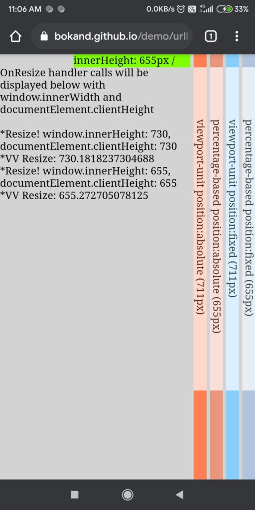
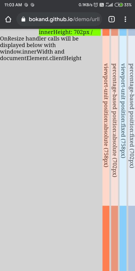
One further sizing note: viewport height is calculated excluding a bottom navigation bar if one is present. This comparison shows Chrome on Android with and without that bar:
Trade-offs
Using a plain <div> rather than a real <img> costs markup semantics, which can raise accessibility concerns. If the image conveys meaning or context, an <img> with a proper alt for screen readers is correct. But an actual <img> leads back to the original problem. And if a bottom navigation bar also auto-hides, the hack cannot compensate; where it falls short, JavaScript is an option.




