

Building responsive shape grids with floats and shape-outside
CSS Grid and flexbox are the usual suspects for tiled layouts, but float — combined with shape-outside — can produce fully responsive grids of custom shapes without a single media query or line of JavaScript. The only knobs are CSS variables: two for the basic hexagon grid, a few more as the shapes get fancier.
The hexagon building block
Each cell starts as an inline-block element whose shape comes from a clip-path, with a variable S defining its dimension. Bennett Feely's Clippy is a handy generator for the path values.
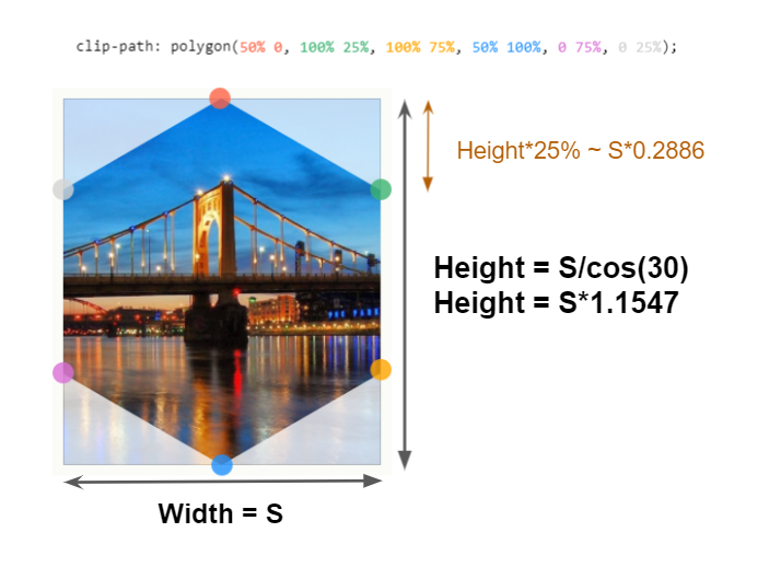
clip-pathThe markup nests a container inside a .main wrapper that holds the cells:
<div class="main">
  <div class="container">
    <div></div>
    <div></div>
    <div></div>
    <!--etc. -->
  </div>
</div>
The CSS handles the familiar inline-block whitespace issue with the font-size trick and spaces cells with a margin variable M:
.main {
  display: flex; /* we will talk about this later ... */
  --s: 100px;  /* size  */
  --m: 4px;   /* margin */
}

.container {
  font-size: 0; /* disable white space between inline block element */
}

.container div {
  width: var(--s);
  margin: var(--m);
  height: calc(var(--s) * 1.1547);
  display: inline-block;
  font-size: initial; /* we reset the font-size if we want to add some content */
  clip-path: polygon(0% 25%, 0% 75%, 50% 100%, 100% 75%, 100% 25%, 50% 0%);
}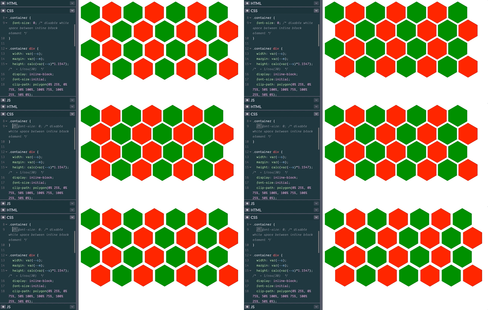
Rows now stack directly, so every other row needs a negative offset of 25% of the element height, applied through margin-bottom:
.container div {
  width: var(--s);
  margin: var(--m);
  height: calc(var(--s) * 1.1547);
  display: inline-block;
  font-size: initial;
  clip-path: polygon(0% 25%, 0% 75%, 50% 100%, 100% 75%, 100% 25%, 50% 0%);
  margin-bottom: calc(var(--m) - var(--s) * 0.2886); /* some negative margin to create overlap */
}
At this point rows overlap vertically, but the hexagons still line up in columns. The remaining job is to shove every second row sideways so the cells stagger.
Staggering rows with a float and a gradient
This is where the .main wrapper earns its display: flex. Before, it served as a flex container so a floated child could use height: 100%; it plays the same role here.
.container::before {
  content: "";
  width: calc(var(--s)/2 + var(--m));
  float: left;
  height: 100%;
}
A container::before pseudo-element floats at the left of the grid, spanning its full height, with a width of half a hexagon plus its margin:
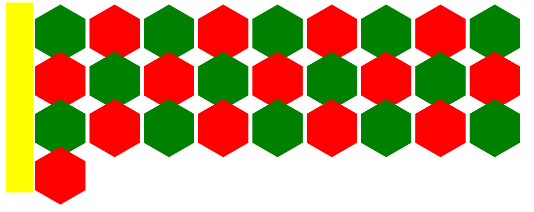
.container::before pseudo-element.Then shape-outside takes over. As MDN describes it, the property defines a shape — possibly non-rectangular — around which adjacent inline content should wrap, replacing the default margin-box wrapping. That definition is precisely why the cells must be inline-block.
shape-outside accepts gradients, and a repeating gradient fits here: only every second row needs shifting, so the pattern repeats every two rows. The gradient alternates a transparent band (leaving the first row in place) and an opaque band (pushing the second row right by half a hexagon's width).
shape-outside: repeating-linear-gradient(#0000 0 A, #000 0 B); /* #0000 = transparent */B, the repeat length, covers two rows: two hexagons with margins, minus twice the overlap, or 2*Height + 4*M - 2*Height*25% = 1.5*Height + 4*M. In CSS terms:
calc(1.732 * var(--s) + 4 * var(--m))That expression gets stored in a custom property, F. The transparent part A must be at least one hexagon wide but can be larger; setting it to B minus a few pixels leaves just enough opaque color to shift the even rows.
shape-outside: repeating-linear-gradient(#0000 0 calc(var(--f) - 3px),#000 0 var(--f));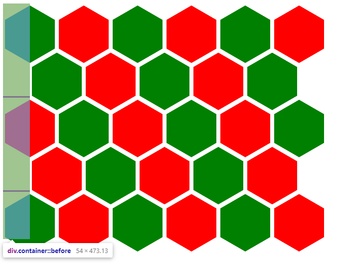
shape-outside is applied to the floated element, creating a floated area with a predating linear gradient.Putting it all together yields the responsive hexagon grid in roughly 15 CSS declarations, tunable through two variables.
.main {
  display:flex;
  --s: 100px;  /* size  */
  --m: 4px;    /* margin */
  --f: calc(var(--s) * 1.732 + 4 * var(--m) - 1px);
}

.container {
  font-size: 0; /* disable white space between inline block element */
}

.container div {
  width: var(--s);
  margin: var(--m);
  height: calc(var(--s) * 1.1547);
  display: inline-block;
  font-size:initial;
  clip-path: polygon(0% 25%, 0% 75%, 50% 100%, 100% 75%, 100% 25%, 50% 0%);
  margin-bottom: calc(var(--m) - var(--s) * 0.2885);
}

.container::before {
  content: "";
  width: calc(var(--s) / 2 + var(--m));
  float: left;
  height: 120%;
  shape-outside: repeating-linear-gradient(#0000 0 calc(var(--f) - 3px), #000 0 var(--f));
}
The -1px on F and the 120% height on the floated element are deliberate fudge factors: decimal calculations get rounded, so a few pixels are added or removed to keep shapes aligned in most cases.
Swapping shapes without touching the structure
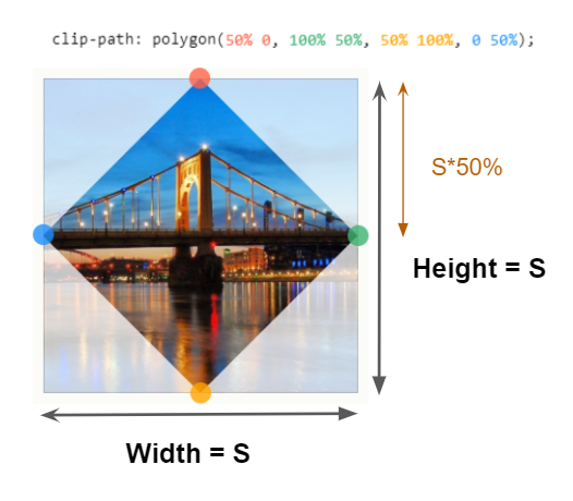
Only the clip-path and the arithmetic change to produce other grids. A rhombus grid, for instance, needs just four code changes:
| Hexagon grid | Rhombus grid | |
|---|---|---|
height | calc(var(--s)*1.1547) | var(--s) |
clip-path | polygon(0% 25%, 0% 75%, 50% 100%, 100% 75%, 100% 25%, 50% 0%) | polygon(50% 0, 100% 50%, 50% 100%, 0 50%) |
margin-bottom | calc(var(--m) - var(--s)*0.2885) | calc(var(--m) - var(--s)*0.5) |
--f | calc(var(--s)*1.7324 + 4*var(--m)) | calc(var(--s) + 4*var(--m)) |
Generalizing further, an octagon acts as a base shape from which hexagons, rhombi and rectangles can all be derived. It needs four variables: S (width), R (a height-to-width ratio), and hc and vc, which set the eight clip-path points — hc relative to the width and vc relative to the height:
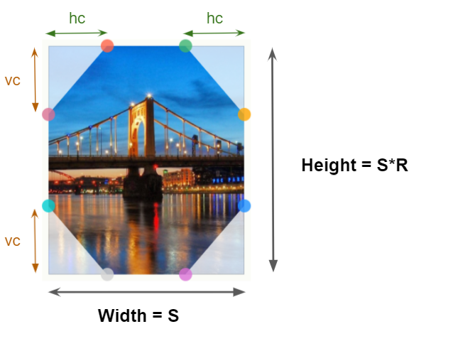
clip-path property.clip-path: polygon(
var(--hc) 0, calc(100% - var(--hc)) 0, /* 2 points at the top */
100% var(--vc),100% calc(100% - var(--vc)), /* 2 points at the right */
calc(100% - var(--hc)) 100%, var(--hc) 100%, /* 2 points at the bottom */
0 calc(100% - var(--vc)),0 var(--vc) /* 2 points at the left */
);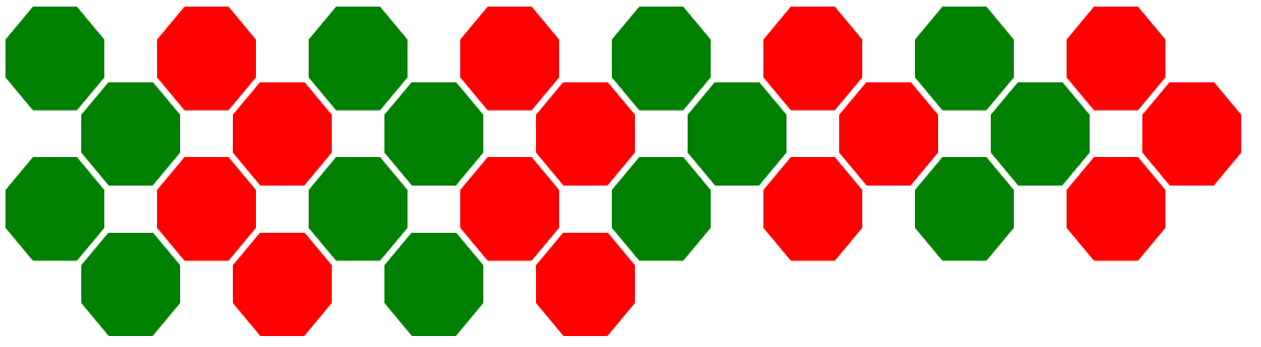
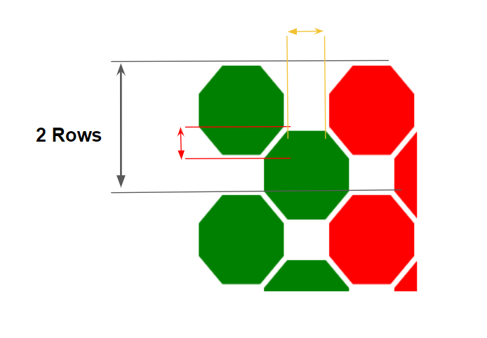
The row overlap (red arrow in the zoomed figure) equals vc, giving margin-bottom: M - vc. A horizontal margin is needed too: MH = M + (S - 2*hc)/2. Two rows then measure 2*(S + 2*M) - 2*vc high. The resulting value table:
| Hexagon grid | Rhombus grid | Octagon grid | |
|---|---|---|---|
height | calc(var(--s)*1.1547) | var(--s) | calc(var(--s)*var(--r))) |
clip-path | polygon(0% 25%, 0% 75%, 50% 100%, 100% 75%, 100% 25%, 50% 0%) | polygon(50% 0, 100% 50%, 50% 100%, 0 50%) | polygon(var(--hc) 0, calc(100% - var(--hc)) 0,100% var(--vc),100% calc(100% - var(--vc)), calc(100% - var(--hc)) 100%,var(--hc) 100%,0 calc(100% - var(--vc)),0 var(--vc)) |
--mh | – | – | calc(var(--m) + (var(--s) - 2*var(--hc))/2) |
margin | var(--m) | var(--m) | var(--m) var(--mh) |
margin-bottom | calc(var(--m) - var(--s)*0.2885) | calc(var(--m) - var(--s)*0.5) | calc(var(--m) - var(--vc)) |
--f | calc(var(--s)*1.7324 + 4*var(--m)) | calc(var(--s) + 4*var(--m)) | calc(2*var(--s) + 4*var(--m) - 2*var(--vc)) |
.main {
  display: flex;
  --s: 100px;  /* size  */
  --r: 1; /* ratio */

  /* clip-path parameter */
  --hc: 20px;
  --vc: 30px;

  --m: 4px; /* vertical margin */
  --mh: calc(var(--m) + (var(--s) - 2*var(--hc))/2); /* horizontal margin */
  --f: calc(2*var(--s) + 4*var(--m) - 2*var(--vc) - 2px);
}

.container {
  font-size: 0; /* disable white space between inline block element */
}

.container div {
  width: var(--s);
  margin: var(--m) var(--mh);
  height: calc(var(--s)*var(--r));
  display: inline-block;
  font-size: initial;
  clip-path: polygon( ... );
  margin-bottom: calc(var(--m) - var(--vc));
}

.container::before {
  content: "";
  width: calc(var(--s)/2 + var(--mh));
  float: left;
  height: 120%;
  shape-outside: repeating-linear-gradient(#0000 0 calc(var(--f) - 3px),#000 0 var(--f));
}
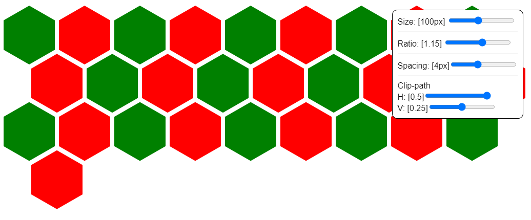
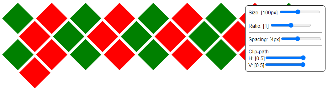
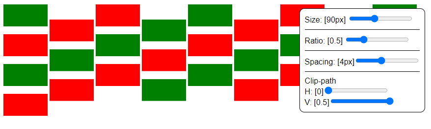
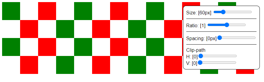
Because hc and vc can be expressed as percentages of the element's width and height, the elements scale without breaking the clip-path. Adjusting the variables reproduces the original hexagon grid, a rhombus grid, another hexagon variant, a masonry-like arrangement and a checkerboard.

Centering, with a grid assist
Since cells are inline-block, they sit left-aligned with leftover space at the right edge, so the layout alternates between two grid variants as the viewport changes:
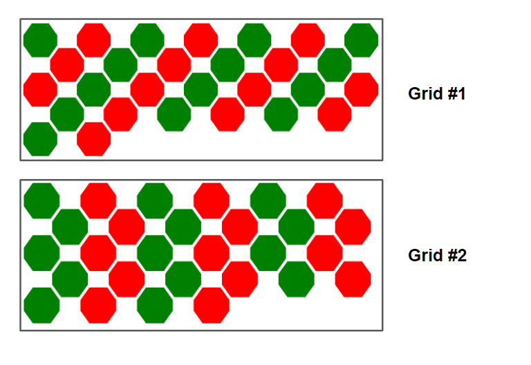
N, N-1,N, N-1, etc.)Grid #2: The same number of items per row (
N, N, N, N, etc.)To lock in the first variant, the container width must be a multiple of one shape plus margins: N*(S + 2*MH). CSS Grid makes this tractable:
.main {
  display: grid;
  grid-template-columns: repeat(auto-fit, calc(var(--s) + 2*var(--mh)));
  justify-content: center;
}

.container {
  grid-column: 1/-1;
}
.main becomes a grid container; grid-template-columns defines the column width with auto-fit, and .container spans all columns via 1/-1, so its width is always a multiple of the column size. justify-content: center handles centering.
Swapping flex for grid raises the question of the percentage-based float height. Grid items stretch by default, and per the spec a grid area's width and height are considered definite, so a stretched grid item's size is definite as well — which makes the percentage height valid. For the second variant, add one extra column of half the usual width:
.main {
  display: grid;
  grid-template-columns: repeat(auto-fit,calc(var(--s) + 2*var(--mh))) calc(var(--s)/2 + var(--mh));
  justify-content :center;
}
Containing the overflow
The negative margin-bottom on the last row and the pushing float both cause overflow that can spill onto following content. Padding the container's bottom by one shape height compensates, though there's no universal answer: the needed space depends on many factors, so a value large enough for most cases is the pragmatic choice.
Pyramidal grids
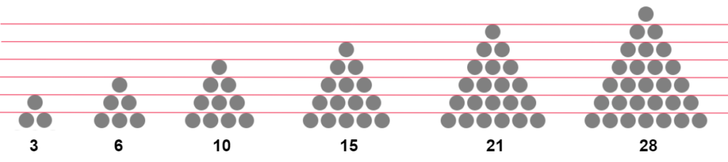
The pyramid variant tracks the number of rows, since different element counts can produce the same row count (11 to 15 elements give five rows, 16 to 21 give six), held in a variable NR. Most of the code is unchanged; the additions are:
.main {
  --nr: 5;  /* number of rows */
}

.container {
  max-width: calc(var(--nr)*(var(--s) + 2*var(--mh)));
  margin: 0 auto;
}

.container::before ,
.container i {
  content: "";
  width: calc(50% - var(--mh) - var(--s)/2);
  float: left;
  height: calc(var(--f)*(var(--nr) - 1)/2);
  shape-outside: linear-gradient(to bottom right, #000 50%, #0000 0);
}

.container i {
  float:right;
  shape-outside: linear-gradient(to bottom left, #000 50%, #0000 0);
}
The container width must match the last row, which holds exactly NR items: NR*(S + 2*MH). An <i> element is added to the markup to provide a second float element for shape-outside. Both floats take a width of half the container size minus half a shape plus margin, and a height of NR - 1 rows — or calc(var(--f)*(var(--nr) - 1)/2), with one row equal to F/2. The purple regions in the figure below mark restricted areas (opaque), the rest is free space (transparent), painted with a diagonal gradient:

shape-outside: linear-gradient(to bottom right, #000 50%, #0000 0); The other float mirrors this with left instead of right. In this raw form the pyramid is not responsive. Two options exist: fall back to the first grid when the container is narrower than the viewport (preserves element size, trickier to code), or shrink the elements to keep the pyramid (easier via percentage values, but risks tiny cells). The first is implemented here.
The pyramid needs two floats and the fallback grid needs one — and the existing structure plus pseudo-elements supplies three: container::before, i::before and i::after. A condition on container width decides which set is active, and clamp() plays the part of a conditional, switching between grids using the existing formulas while still avoiding media queries:
/* Same as before... */

/* The initial grid */
.container::before {
  content: "";
  width: calc(var(--s)/2 + var(--mh));
  float: left;
  height: 120%;
  shape-outside: repeating-linear-gradient(#0000 0 calc(var(--f) - 3px),#000 0 var(--f));
}

/* The pyramidal grid */
.container i::before ,
.container i::after {
  content: "";
  width: calc(50% - var(--mh) - var(--s)/2);
  float: left;
  height: calc(var(--f)*(var(--nr) - 1)/2);
  shape-outside: linear-gradient(to bottom right,#000 50%,#0000 0);
}

.container i::after {
  float:right;
  shape-outside: linear-gradient(to bottom left,#000 50%,#0000 0);
}
.main {
/* the other variables won't change*/
--lw: calc(var(--nr)*(var(--s) + 2*var(--mh))); /* width of last row */
}
.container {
max-width: var(--lw);
}
/* The initial grid */
.container::before {
width: clamp(0px, (var(--lw) - 100%)*1000, calc(var(--s)/2 + var(--mh)));
}
/* The pyramidal grid */
.container i::before,
.container i::after {
width: clamp(0px, (100% - var(--lw) + 1px)*1000, calc(50% - var(--mh) - var(--s)/2));
}On wide screens the container width LW equals its max-width, so 100% == LW and .container::before gets 0px, disabling it. The other floats clamp their widths:
width: clamp(0px, (100% - var(--lw) + 1px)*1000, calc(50% - var(--mh) - var(--s)/2));Their middle value, (100% - LW + 1px)*1000, becomes (0 + 1px)*1000 = 1000px — deliberately large and arbitrary — which clamps to calc(50% - var(--mh) - var(--s)/2), enabling those floats at the intended width. When the container narrows, LW exceeds 100%, so (LW - 100%) turns positive and clamps to calc(var(--s)/2 + var(--mh)), enabling the first float, while the other two resolve to 0px and switch off.
This scales to more elements and stays stable even when the last row isn't full, and it combines with the CSS grid centering trick above. To invert the pyramid, two edits suffice: flip the gradient direction (to bottom left|right becomes to top left|right) and add a margin-top equal to one row's height.

Rounding artifacts can misalign cells in some cases, particularly in the interactive demos; nudging a few values manually — the gradient percentages especially — restores alignment.
With float and shape-outside, custom and responsive grids are reachable through CSS variables and zero media queries. The grid is only scaffolding — the divs are free to carry any content, backgrounds, shadows or animations.




